10,000 search results
(0.041 seconds)
- Swiss 721 WGL by Bitstream,
$49.00 Swiss 721™ is a sans serif family that ranges in style from thin to black while mixing in a few unexpected, but beautifully made and ironically flattering, outline weights that spice up the grotesque design. Couple these upstanding letterforms with matching italic styles and you have yourself a beautiful tool that is as legible on screen as it is off, has the technical prowess to conquer even the trickiest of design riddles and will work in a myriad of projects. Swiss 721 is a staple sans serif that you’ll never be sorry you have in your library. It’s been said that a simple sans serif is one of the most difficult typefaces to design. This is because when letters are reduced to their most basic details, irregularities and inconsistencies in design become immediately visible. The Swiss 721 typeface family is a quintessential example of letterforms distilled to their essence while still possessing warmth and verve. Based on mid-century sans serif typefaces, Swiss 721 is a versatile family of weights and proportions ideally suited to a wide variety of print and interactive design projects and is equally at home as headlines on billboards as it is navigation content on small screens. Swiss 721 takes the essence of mid 20th century sans serif typefaces and melds it with modern design consistency and a systematic weight range. OpenType® fonts of Swiss 721 also benefit from a rich character set and a range glyphs supporting most Western European and many Eastern European languages.
 - Magic Growing by Sensatype Studio,
$15.00 A Sans serif that we created special for elegant branding needs, with extra style will be ready to add value of your brand. It so nice to leverage designer or product owner that need solutions to make their design look more elegant and modern. And specially for this font, We prepared any Styles to help you create unlimited variations for your creative needs. Magic Growing Elegant Sans Serif Font ready with: Any styles to get creative variations (regular, bold, italic, bold italic) Preview as a inspirations that you can do with Magic Growing font Ready with Lowercase and Uppercase characters Wish you enjoy our font. :)
 - Artwork Stencil JNL by Jeff Levine,
$29.00 Many great lettering examples were found in the 1939 French publication by Georges Léculier, "Modèles de Lettres Moderns" ("Models of Modern Letters"). One design in particular is a stencil alphabet so typical of the Art Deco movement of the 1930s. Artwork Stencil JNL is now available digitally in both regular and oblique versions.
 - Novaria Vista by Sipanji21,
$20.00 "Novaria Vista" is a futuristic display font. Fonts with a futuristic theme often embrace technological and forward-looking aesthetics. They are commonly used in various design projects that aim to convey modernity, innovation, and a vision of the future. With "Novaria Vista," you can create designs that exude a sense of advancement and a futuristic touch. This font is suitable for projects related to technology, science fiction, space exploration, and other themes where a futuristic style is desired.
 - Strong Girls by Sarid Ezra,
$15.00 Introducing, Strong Girls - a layered font based on serif style! Strong Girls is a layered serif font that have 4 total font including regular, outline, extrude and long extrude. Like other layered font, you can stack all the style in the text so the design will looks 3D. You can use this font for any purpose like poster, sticker, vintage design, or anything. This font also support multi language.
 - Cute Squishy by Gassstype,
$23.00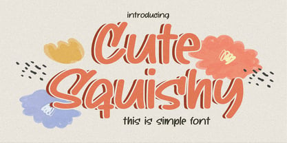 Hello Everyone, introduce our new product Cute Squishy This Is Simple Font with a natural feel. It is perfect for any design project as Invitation,logo, book cover, craft or any design purposes. Cute Squishy is Inspired by Food Logo style and combination with Unique Craft style. that will fulfill your design needs for quotes,sporty theme, logotype, wordmark, etc. This has many opentype features and support multi language.
 - Pen Nib Square JNL by Jeff Levine,
$29.00 The idea started with the 1934 sheet music of “Mazurka Amabile”. Its hand drawn title had most of the letters rendered in a rectangular shape [‘square’ in the sign trade] that featured rounded corners and terminals made by the shape of the lettering pen nib. A few letters were rounder in design than others, so those were scrapped in favor of a more consistent character shape throughout the font. Pen Nib Square JNL is available in both regular and oblique versions.
 - Coigum by Keristyper Studio,
$14.00 Coigum is a modern display font that is perfect for creating attention-grabbing headlines, titles, and logos. Its bold and fat lettering style is sure to make a statement and capture the viewer's attention. This font is ideal for projects that require a bold, strong, and impactful appearance, such as posters, advertisements, packaging, and branding materials. With its unique and modern design, Coigum is a great choice for designers who want to add a touch of boldness and energy to their projects. Featured: Standard, Uppercase & Lowercase Numeral & Punctuation Multilingual : ä ö ü Ä Ö Ü ß ¿ ¡ Alternate & Ligature PUA encoded We recommend programs that support the OpenType feature and the Glyphs panel such as Adobe applications or Corel Draw, so you can use all the variations of the glyphs. Hope you enjoy our fonts!
 - Ganley by Craft Supply Co,
$20.00 Introducing Ganley Cute Font Ganley cute font is a contemporary display font that radiates fun and playfulness, making it perfect for children’s themes and light-hearted designs. Playful Design Ganley’s design is characterized by whimsical and cheerful letterforms. Its cute and quirky appearance instantly adds a touch of joy to any project. The font embodies a sense of innocence and laughter. Child-Friendly Readability This font maintains readability while embracing a delightful style. The letter spacing and proportions are thoughtfully crafted for easy comprehension, ensuring that children can enjoy reading and interacting with it. Versatility in Design Ganley isn’t limited to just one application. It’s a versatile font that suits various creative endeavors, from children’s books and posters to party invitations and websites. Its adaptability knows no bounds.
 - TT Nooks by TypeType,
$39.00 TT Nooks useful links: Specimen | Graphic presentation | Customization options TT Nooks is an experimental font family that includes a high contrast serif, TT Nooks, and an upright italic, TT Nooks Script. Despite the difference in style, both subfamilies get along well, which is partially thanks to their similar proportions. Each of the subfamilies includes 4 weights: Light, Regular, Bold and Black. The main subfamily is TT Nooks—a stylish high-contrast serif with a light touch of self-centeredness. If TT Nooks were a person, it would be an elegant lady with an independent and firm personality. In the original sketches of TT Nooks there were traces of a broad pen, but in the course of further evolution the typeface moved away from this style, retaining only the high contrast of strokes. In addition, in the process of design searches TT Nooks has obtained a touch of geometricity. The serifs in TT Nooks stand out especially visibly thanks to their geometric shape that resembles slippers. In addition to their peculiarity, such serifs add stability to the font and allow better compensation of the black and white ratio within the letters. TT Nooks has small capitals for Latin and Cyrillic alphabets, as well as a set of stylistic alternates (including some figures) that makes the typeface a bit more geometric. In addition, we have drawn more than 25 ligatures, including ligatures for capital letters, slashed zero and many other useful OpenType features. TT Nooks Script is a complementary family designed to harmoniously extend the main family and expand its scope. The forms of the characters in bold and light fonts of TT Nooks Script are quite different. For example, Black & Bold have high contrast strokes and an open aperture, and in Regular & Light the aperture of the characters is closed. TT Nooks also has small capitals for Latin and Cyrillic alphabets, ligatures, oldstyle figures and other OpenType features. In light faces, TT Nooks Script is more humanist and has artifacts inherent to the continuous movement of a flat pen. In bold faces, TT Nooks Script has a very dense and dynamic typing rhythm, and the shape of the letters begins to geometrize. We had had the difficult task of preserving the continuity of forms between bold and light faces, and we have managed to solve it thanks to the found rhythm, which united different fonts, and proximate stylistic solutions.
 - Tsotsi by Scholtz Fonts,
$19.00Tsotsi, a recent addition to the Scholtz Fonts range, is highly legible, strong, African and contemporary in design. It is a sans serif font, however, the gently splayed terminals to the strokes subtly hint at a serif. It has been designed to be easy on the eye and readable at all font sizes and can be used either as a body (text) font or in headings and larger scale design. The font has an irreverent insouciance which is suggested by the verticals which all vary from true perpendicular by a few degrees, and by the slightly top-heavy nature of all characters - hence the name "Tsotsi" -- a rascal who is very sure of himself (and a little big-headed). Above all, however, the Tsotsi (both the font and the person) has an appealingly cheeky and mischievous style. It includes characters for English, French, Italian, German, and Portugese. all upper and lower case letters, all special characters as well as all numerals and punctuation. The numerals are mono-spaced so that they will line up correctly in columns of figures. The letters of the alphabet are correctly kerned so that they appear correctly in text. - The Shensie by Soft Creative,
$20.00 Introducing The Shensie. The Shensie Font, is a classic thin font with an italic style. Here you will get beautiful classic fonts. this font is available in several modern swirls that can make your work look elegant, sweet and perfect. With this style, this font would be perfect for logos, branding projects, household designs utensils, product packaging, mugs, quotes, posters, shopping bags, logo, t-shirt, book cover, business card, invitation card, greeting cards, and all your other beautiful projects.
 - Meetha Script by FadeLine Studio,
$18.00 Meetha Script is modern calligraphy script font. This is a beautiful script font with italic style. Made gently and danced to give the character of modern writing that is sweet, simple, stylish and firm. With a style like this, this font will be suitable in use for logo's, branding projects, homeware designs, product packaging, mugs, quotes, posters, shopping bags, logo's, t-shirts, book covers, name card, invitation cards, greeting cards, and all your other lovely projects.
 - Thamarind by FadeLine Studio,
$15.00 Thamarind is a new fun and unique new handwritten script font. This font adopts a bold, cute, firm, and trendy style. Very suitable to meet your various design needs that are trending now. With a style like this, this font will be suitable in use for comics, logo's, branding projects, homeware designs, product packaging, mugs, quotes, posters, shopping bags, logo's, t-shirts, book covers, name card, invitation cards, greeting cards, and all your other lovely projects.
 - Radiate Sans by Studio Sun,
$20.00 Radiate Sans is a Humanist - Geometric Sans Serif fonts, Simple geometric letters shapes, medium contrast character style, It was designed lately 2018. and published on April 2020. Radiate Sans is a neutral typeface, have stroke modulation (strokes that clearly vary in width along their line) or alternating thick and thin strokes. Radiate Sans intended as a display typeface that could be used for posters and advertisements, as well as for the text of documents that need to be clearly legible at small sizes or from a distance, such as book blurbs, timetables and price lists. The family include 5 font weights, with a bonus 4 Widths in the OpenType version. It supports ISO Adobe 2, Adobe CE, Latin Extended characters, Standard Greek, and Standard Cyrillic. OpenType features include small caps, old style figures, superscript and subscript, ordinals, proportional lining figures, and case forms.
 - FP København by Fontpartners,
$35.00 Copenhagen has been in need of a typeface that unites the city’s many visual expressions. The three designers Morten Rostgaard Olsen, Henrik Birkvig and Ole Søndergaard have designed and developed the typeface FP København. Now available from MyFonts in 20 styles: Uprights & Italics, small caps, pictos-characters, stencils, sprayed style, OT-features, ligatures, contextual alternates etc. The shapes of the letters are inspired by the city’s culture and the visual environment and design in Denmark in the 20th century. It is relatively low and wide as the city itself and with rounded corners that give it a warm visual mood. “You can find examples of the use of a typeface with the same purpose in other parts of the world, for example, to identify local areas or urban tourism materials. FP København is our take on that kind of typeface” the designers add.
 - Zest by Scholtz Fonts,
$22.00 Zest is an informal brush script drawn with quick, thick brush strokes. While it is based on everyday handwriting, the expansive and easy flow of the script hides the care that has been given to the crafting of each character. In style it harks back to the hey-day of American lettering and calligraphy, yet it has a looseness that is thoroughly modern. Zest comes in three styles: -- Zest-Medium, which is medium-weighted and appropriate to a wide range of applications; -- Zest-Drama, in which the contrast between the the thicker and thinner parts of a brushstroke has been dramatically enhanced; and -- Zest Bezel, in which the brush strokes have been given a contemporary, square-cut appearance. Zest is ideal for invitations to stylish but relaxed events, for advertisements that are intended to create a special ambiance, for posters and for announcements.
 - Garlic Embrace by PizzaDude.dk,
$15.00 Ever wanted to be embraced by garlic? Probably not! But this font could surely embrace your designs that need an authentic brush look! Comes with 7 contextual alternates that automatically cycles as you type! Also, Garlic Embrace is FULL of accented letters! :)
 - Seravee by Stawix,
$35.00 Seravee was inspired by the significant style of Modern (Didone) Typography. The bolder they become, the more exquisite and stylish along with excellent legible at the same time. Designed by Stawix Ruecha, Bangkok based type designer. Rather than programing process, geometric forms as they were, each weight was well-crafted manually by hand as a result of humanistic sense. Through various weight ranges (Black, Bold, Regular and Light), to ensure that Seravee will perfectly cover all aspects of usability in every layout.
 - JetJaneMono by Ingrimayne Type,
$9.00 JetJaneMono is a large family of sans-serif faces which are monospaced. It is very plain (plain=plane=jet). The font family has two widths and three weights, with each upright style paired with an italics style. These twelve fonts are then duplicated with another set in which small caps replace the lower-case letters. The typeface was created in 1994 and in 2021 the condensed widths were added.
 - Syakira by Sulthan Studio,
$10.00 Syakira Script has a romantic and modern calligraphic style, and is ready to give your design a fresh and fabulous Style. Syakira Script comes as a single font file packed full of great features and cuteness. Perfect for weddings, branding and romantic invitations and also suitable for various purposes such as digital lettering, headings, logos, wedding invitations, t-shirts, letterheads, signage and much more! Thank You, Sulthan Studio
 - Klassisk by David Engelby Foundry,
$25.00 Klassisk is the Danish name for “classic” [’klasisg]. Taking its inspiration from a wide range of classic serif traditions, Klassisk can be your partner in crime for almost every kind of design job! It has the four classic weights PLUS two lighter display weights for headers and big letter sizes in general. Klassisk also comes with … a large variety in numerals (three styles) swashes and special ligatures a vibrant italic style.
 - Super Rich by Pista Mova,
$14.00 Super Rich Inspired by Vintage style and combined with Hand Lettering style. Each curve has a touch of my personality because I use my manual handling brush. Great for creating logotypes, branding, promotional ads, quote designs, packaging, t-shirt designs. merchandise, posters, merchandise, social media and much more. FEATURE : Uppercase lowercase Number punctuation Multilingual PUA coding open type If you have any questions, please contact me. Thank you :)
 - Luxgard by Tadiar,
$25.00 Luxgard is an authentic vintage font of 8 design styles (done as separate fonts) created for such areas as Media & Entertainment, Food & Drinks, Clothes, Music, Games & Applications, etc. with Multilingual support (Latin Extended). Well use in vintage labels, headers & titles, Posters, Street Signs and other Outdoor, Package Design. Please see the preview image with three letters S: You can make different combinations of these styles to get amazing looks of designs.
 - Ragerdo by Sealoung,
$20.00 Ragerdo is modern serif font, every single letters have been carefully crafted to make your text looks unique. Trendy, classy & modern style serif font for your fancy projects. Elegant, luxury and classic style on Ragerdo font will be great for any branding project. Lot of ligatures will help you to create unique and original logo design or website header! Enjoy :) Features : Uppercase & Lowercase Numbers and Punctuation Multilingual Ligatures PUA encoded
 - Santanelli by Pisto Casero,
$19.00 Santanelli is a rounded all caps display typeface. It is intended to be used in posters, editorial headlines and logotypes. It comes in three weights: Thin, Medium and Bold. Each letter has been designed with two different styles or flavors: decorative and clean. You can access each of them by typing uppercase and lowercase respectively. These two styles fit perfectly when combined within the same word or message.
 - Burnest by Adam Fathony,
$10.00 In collaboration with Renov Olivian who was experienced with hand-drawn lettering for a project. We've decided to create Vintage Inspirated Fonts with strong identity for an outdoor design, camping, wild, journey, adventure, masculine, and etc. Burnest Comes with 3 Weight, Thin, Light and Regular. On each Weight have 3 different style, Clean (sharp corner), Round (Rounded Corner), and Rough (Rough Version). 9 Fonts in Total for completing your design style.
 - Compiler by Identity Letters,
$39.00 Legible, technical, clear—with a hint of retro: Compiler is a no-frills font family straight from the heart of a microprocessor. Inspired by console typefaces, the humanist sans serif typeface combines a large x-height with striking serifs on certain letters such as i and l. Those serifs evoke the aesthetics of monospace typefaces for programming. Even though Compiler is a proportional typeface, this detail improves glyph recognition and helps differentiate between individual letters. Combined with vertical stroke ends, which allow for particularly even spacing, the serifs make for an extremely legible typeface. (Even in small sizes.) Brand recognition guaranteed: Compiler is ideal for applications that require a mechanical flavor without appearing offish. You can use it for websites, apps, branding, corporate design, annual reports, signage, and many other areas with perfect results. Compiler consists of two font families; the second one is Compiler Plain. In Compiler Plain, the signature letters lose their serifs and the forms of "a" and "g" are simplified. This way, the shapes are neutralized. The technical impression recedes into the background. Both families can be combined smoothly: you might use the standard Compiler fonts for display sizes and Compiler Plain styles for body copy. For total design control, you can toggle each of the defining design elements individually from Compiler to Compiler Plain and vice versa. Just use Stylistic Sets to fine-tune your Compiler fonts. Compiler provides you with 8 weights in 4 variations: Upright, Italics, Plain Upright and Plain Italics. That's a total of 32 fonts. Each style contains more than 860 glyphs, including advanced typographic tools such as proportional and tabular figures (both lining and old-style) or small caps—something you'll rarely find in this genre. Other glyphs are optimized for display sizes, such as circled figures and various arrows. There's also a set of glyphs designed for web use: with symbols for shopping carts, hamburger menus or checkboxes, you can implement your web projects elegantly and consistently without relying on third-party tools (like an external icon font). Powered by highly productive OpenType functions, Compiler is an intermedia workhorse straight from cyberspace.
 - Silent Forest by Gassstype,
$27.00 Introducing Silent Forest is a best Terrible Hand Drawn Font that is handwritten brush casually and quickly. Letters are made with brushes on Procreate. Then scanned and carefully drawn into vector format. That is why Silent Forest has charming, authentic and relaxed characteristic more natural look to your text with a more natural look to your text. You can activate Ligature OpenType panel to make these two styles. It also has many alternatives and underlines that make your text and design more interesting. Silent Forest is perfect for homeware designs,branding projects, Logo design, Quotes product packaging.
 - Positronic Toaster by Brian Crick,
$25.00 Positronic Toaster is a modern interpretation of the French upright scripts of the nineteenth century. It started off as an attempt to make a stylized script that didn't feel like it belonged on a 1950s chrome appliance. Later on, however, the design grew to embrace the qualities of that style of lettering. The result is something playful and elegant, that is not tied to any particular time period. The distinctive angular loops on the ascenders will join together in words like 'bulb' or 'wallflower' using OpenType contextual alternates. It is suitable for cards, wedding invitations, or any project requiring a fashionable, upscale look.
 - Alphabet Of Death by Celebrity Fontz,
$24.99The Alphabet of Death font is inspired by the work of Hans Holbein the Younger. This series of Northern-Renaissance-style woodcut letters shows the figure of Death in many disguises, confronting individuals from all walks of life and intervening directly in scenes of everyday life. As depicted in this detailed alphabet, Death is sometimes the dispenser of justice, denouncing greed and the abuse of power. At other times, Death plays the role of a friend or a servant. This unique font includes one set of A-Z ornamental initials conveniently assigned to both the upper- and lower-case alphabet characters and is perfect for starting off the beginning of paragraphs in artistic publications, storybooks, fairy tales, biblical texts, and any written work conveying the expressive style of typography in the 1500s. - Luce Stilren by Objectype,
$20.00 Luce Stilren is a serif font with a modern and geometric design from Objectype Studio. With clean lines and bold shapes, this font adds a professional and contemporary touch to any design project. The main feature of this font is its flexibility. Whether you’re working on a branding project, logo design, magazine headlines, or wedding invitations, Luce Stilren is the perfect choice. This font is designed to provide reading comfort, making it a great choice for both print and digital publications. Luce Stilren supports various languages and includes various typographic features such as ligatures, old-style numbers, and letter-style variations. With these possibilities, you can customize the font according to your needs. With Luce Stilren, you can take your designs to the next level. Get it now and start creating!
 - Rockglazer by Din Studio,
$29.00 Rockglazer is a script font similar to a curve writing which expresses modernity, boldness and strength, unlike the other script fonts. There are swinging curves and wipes on some of the letters to add beauty, and the differences in the line thickness of each letter are so clear that you can use this font for bigger-sized texts for a better legibility. Enjoy the available features here. Features: Stylistic Sets Ligatures Multilingual Supports PUA Encoded Numerals and Punctuations Rockglazer fits for various design projects, such as posters, banners, logos, magazine covers, quotes, greeting cards, printed products, merchandise, social media, etc. Find out more ways to use this font by taking a look at the font preview. Hopefully, you have a great experience using our font. Feel free to contact us if you require more information when you are dealing with a problem. Thank you. Happy designing.
 - Logopedia Next by Bülent Yüksel,
$19.00 What makes "Logopedia Next" unique is that it has a strong body, upper and lower case letters are the same size and work in perfect harmony. All letters in the character have "alternatives" in various numbers. This feature provides you variety in your designs. It is possible to take your designs to the next level by using "Logopedia Next". "Logopedia Next" is ideal for especially logo design, advertising and packaging, branding and creative industries, banners and billboards and signage as well as web and screen design. "Logopedia Next" provides advanced typographical support for Latin-based languages. An extended character set, supporting Central, Western and Eastern European languages, rounds up the family. The designation “Logopedia Next 500 Regular” forms the central point. Logopedia Next comes 3 weights and italics total 6 types. The family contains a set of 543 glyphs. Classes and Features, Stilistic Style, Fractions and Old Style Numerator just one touch easy In all graphic programs. Logopedia Next"" is the perfect font for web use. Be sure to check out the other siblings of "Logopedia". - Logopedia Now - Logopedia Now Soft - Logopedia Next - Logopedia Next Soft You can enjoy using it.
 - Plinc Goliath by House Industries,
$33.00 Vincent Pacella was a true giant of hand-lettering and typeface design. Of the dozens of styles he designed for Photo-Lettering and International Typeface Corporation, his dominant Goliath towers above the rest. The font is perhaps best known from Herb Lubalin’s American flag that the design legend created for Print magazine’s 40th anniversary cover. Pacella takes “slab” serif to heart with this colossally-proportioned font, using brawny stroke endings and minimal curves to create a powerful figure for maximum visual impact. Take advantage of Goliath’s superior stature to make viewers take notice in industrial settings, sports branding, and oversized outdoor media applications. For comparatively modest musings in accompanying running text, consider partnering it with a comparatively spartan slab serif like Municipal. Or, team up Goliath with a faceted fellow heavyweight like United Sans. Originally drawn in 1970, Goliath was digitized by Ben Kiel with Adam Cruz in 2011. GOLIATH CREDITS: Typeface Design: Vincent Pacella Typeface Digitization: Ben Kiel, Adam Cruz Typeface Production: Ben Kiel Like all good subversives, House Industries hides in plain sight while amplifying the look, feel and style of the world’s most interesting brands, products and people. Based in Delaware, visually influencing the world.
 - Logopedia Now by Bülent Yüksel,
$19.00 What makes "Logopedia Now" unique is that it has a strong body, upper and lower case letters are the same size and work in perfect harmony. All letters in the character have "alternatives" in various numbers. This feature provides you variety in your designs. It is possible to take your designs to the next level by using "Logopedia Now". "Logopedia Now" is ideal for especially logo design, advertising and packaging, branding and creative industries, banners and billboards and signage as well as web and screen design. "Logopedia Now" provides advanced typographical support for Latin-based languages. An extended character set, supporting Central, Western and Eastern European languages, rounds up the family. The designation “Logopedia Now 500 Regular” forms the central point. "Logopedia Now" comes 3 weights and italics total 6 types. The family contains a set of 543 glyphs. Classes and Features, Stilistic Style, Fractions and Old Style Numerator just one touch easy In all graphic programs. "Logopedia Now" is the perfect font for web use. Be sure to check out the other siblings of "Logopedia". - Logopedia Now - Logopedia Now Soft - Logopedia Next - Logopedia Next Soft You can enjoy using it.
 - Logopedia Next Rounded by Bülent Yüksel,
$19.00 What makes "Logopedia Next Rounded" unique is that it has a strong body, upper and lower case letters are the same size and work in perfect harmony. All letters in the character have "alternatives" in various numbers. This feature provides you variety in your designs. It is possible to take your designs to the next level by using "Logopedia Next Rounded". "Logopedia Next Rounded" is ideal for especially logo design, advertising and packaging, branding and creative industries, banners and billboards and signage as well as web and screen design. "Logopedia Next Rounded" provides advanced typographical support for Latin-based languages. An extended character set, supporting Central, Western and Eastern European languages, rounds up the family. The designation “Logopedia Next Rounded 500 Regular” forms the central point. "Logopedia Next Rounded" comes 3 weights and italics total 6 types. The family contains a set of 543 glyphs. Classes and Features, Stilistic Style, Fractions and Old Style Numerator just one touch easy In all graphic programs. "Logopedia Next Rounded" is the perfect font for web use. Be sure to check out the other siblings of "Logopedia". - Logopedia Now - Logopedia Now Rounded - Logopedia Next - Logopedia Next Rounded You can enjoy using it.
 - Logopedia Now Rounded by Bülent Yüksel,
$19.00 What makes "Logopedia Now Rounded" unique is that it has a strong body, upper and lower case letters are the same size and work in perfect harmony. All letters in the character have "alternatives" in various numbers. This feature provides you variety in your designs. It is possible to take your designs to the next level by using "Logopedia Now Rounded". "Logopedia Now Rounded" is ideal for especially logo design, advertising and packaging, branding and creative industries, banners and billboards and signage as well as web and screen design. "Logopedia Now Rounded" provides advanced typographical support for Latin-based languages. An extended character set, supporting Central, Western and Eastern European languages, rounds up the family. The designation “Logopedia Now Rounded 500 Regular” forms the central point. "Logopedia Now Rounded" comes 3 weights and italics total 6 types. The family contains a set of 543 glyphs. Classes and Features, Stilistic Style, Fractions and Old Style Numerator just one touch easy In all graphic programs. "Logopedia Now Rounded" is the perfect font for web use. Be sure to check out the other siblings of "Logopedia". Logopedia Now Logopedia Now Rounded Logopedia Next Logopedia Next Rounded You can enjoy using it.
 - Gallos by W Type Foundry,
$25.00 What comes to your mind if I say Architype, Geometric, Gaelic, and Uncial? An impossible combination of features? An unrealistic setup of tastes as weird as your music list? Or some part of a joke told by your favourite comedian? Just chill and stick to the idea that is possible. Gallos combines the conceptual historical elegance of the Uncials with the practical rationalism of the Geometric style. Moreover, this typeface is composed by two sub families: Gallos Uncial and Gallos Architype. The letters “M”, “N”, “W”, “a”, “m”, “n”, “r”, and “w” differ between these two models. The first one is related to both: The Uncial script aspect displaying the leaned “a” with a closed bowl, and the classical geometric style depicting more conventional uppercase and lowercase letters “m” and “n”. The Architype one is inspired by Paul Renner’s Architype model, thus the leaned “a” has an open counter, the “r” is composed by a stem and a dot, and the rest of the mentioned letters were built using square rational features. Both models are connected by classical Uncial features such as the curved stroke “e” and curved shaft “t”, and with Gaelic vibes which can be seen in uppercase and lowercase letters “K” and “X”. Also, the curved descender “g” and “y”, alongside the curved stem “z” connect really well with the rest of the system and provide more uniqueness to the Gallos type family. Without further ado, we say to you: let’s make Uncials popular again!
 - Cindie Mono by Lewis McGuffie Type,
$34.99 Cindie Mono is a multi-width display font. Six different widths – A (condensed) through F (super extended) – mathematically correspond with one-another creating a stackable type family. Each face contains all caps full West, Central and East European language support. All diacritics and marks are done in a hairline to add style and contrast. And Cindie Mono is ideal for posters, headlines and display lettering. The inspiration for Cindie Mono came from the lettering styles on optometrists sight-test posters. Then through several stages of development the overall concept for Cindie became of a half-broken Commodore64 and the computer from the 1985 movie 'Weird Science' hooked up to a dot-matrix printer spitting out reams of mechanical but distorted mono-lettering all the while an old modem you can't seem find keeps beeping and beeping and beeping...