10,000 search results
(0.09 seconds)
- Garamond Premier by Adobe,
$35.00Claude Garamond (ca. 1480-1561) cut types for the Parisian scholar-printer Robert Estienne in the first part of the sixteenth century, basing his romans on the types cut by Francesco Griffo for Venetian printer Aldus Manutius in 1495. Garamond refined his romans in later versions, adding his own concepts as he developed his skills as a punchcutter. After his death in 1561, the Garamond punches made their way to the printing office of Christoph Plantin in Antwerp, where they were used by Plantin for many decades, and still exist in the Plantin-Moretus museum. Other Garamond punches went to the Frankfurt foundry of Egenolff-Berner, who issued a specimen in 1592 that became an important source of information about the Garamond types for later scholars and designers. In 1621, sixty years after Garamond's death, the French printer Jean Jannon (1580-1635) issued a specimen of typefaces that had some characteristics similar to the Garamond designs, though his letters were more asymmetrical and irregular in slope and axis. Jannon's types disappeared from use for about two hundred years, but were re-discovered in the French national printing office in 1825, when they were wrongly attributed to Claude Garamond. Their true origin was not to be revealed until the 1927 research of Beatrice Warde. In the early 1900s, Jannon's types were used to print a history of printing in France, which brought new attention to French typography and the Garamond" types. This sparked the beginning of modern revivals; some based on the mistaken model from Jannon's types, and others on the original Garamond types. Italics for Garamond fonts have sometimes been based on those cut by Robert Granjon (1513-1589), who worked for Plantin and whose types are also on the Egenolff-Berner specimen. Linotype has several versions of the Garamond typefaces. Though they vary in design and model of origin, they are all considered to be distinctive representations of French Renaissance style; easily recognizable by their elegance and readability. Garamond Pemiere Pro was designed by Robert Slimbach, and released in 2005." - Model by Lián Types,
$49.00 When designing a typeface, one has to be conscious of superfluous details. Although I am always tempted to add little personal touches, experience taught me that the phrase -less is more- is totally true. In Model, the letters (like models do) participated of a contest: An event in which models engage in competition against each other, often for a prize or similar incentive. The prize was staying in the font! yay! Tall, delicate, refined, the right amount of elegancy: These were some of the aspects to be chosen. Typographically speaking, these things were achieved thanks to a tall x-height (which leaded the font to be somehow condensed), a subtle contrast between thicks and thins, and just the right amount of decorative swirls. The result is a nice script that can be used in magazines, invitations, posters, book-covers and works very well when used over photographs. Get Model and let it be the star of the catwalk. STYLES Model Pro and Model Small Pro are the most complete styles of the font. Both have all the ligatures and decorative glyphs seen in posters above (OT programmed). Model Std One, Std Two and Std Three are reduced versions of Pro. This means they have less glyphs inside. TIP If you are planning to print the font in small sizes, it’s highly recommended to purchase Model Small Pro. Its thins are thicker so they will be better printed.
 - Casira Script by Krafted,
$10.00 We live only to discover beauty, all else is a form of waiting. --- Khalil Gibran Wait no more, this beautiful font can be yours right now! This custom made font was specifically designed to fit whatever you need! The curvature of the Casira Script was fully thought out to easily meld inside your designs. These fonts make a good foundation of what you want it to be! Discover the beauty in your own imagination while this font gives you a quick kickstart to what it can be. Everything’s well with cursive! Show your opulence and decadence with this fancy font and blow your audience’s mind away as you put these cursive letters in your projects. Communicate the extent of your mind so that whoever views your designs understand not just what you write, but also the tone and feel of it! The Casira Script makes a perfect addition for your collection of fonts, show love and bring out the true you! Feel free to contact us if you need anything else! If you have a request on what kind of fonts you’d like to see, tell us that too!
 - Fluze by CozyFonts,
$20.00 The Fluze Fonts This is the 21st font release from CozyFonts Foundry, a California Font Foundry established in 2011 with it’s first Official Release in 2012 with the Aladdin Bold Family. Inspirations for the design of this font family, by California Graphic Designer/Illustrator/Font Designer Tom Nikosey, is based on the wacky, weird & quirky films that have graced the screen with their offbeat styles and characters. Movies that come to mind are Mary Poppins, Beetlejuice, Wizard of Oz, Edward Scissorhands, Alice in Wonderland, Little Shop of Horrors, Addams Family, Labyrinth, Ghostbusters, etc. The absurd, the sublime, the animated, the scary, and the illustrated are all descriptors to define the possibilities Of the many uses and applications of Fluze and Flute Outline as presented in a sampling of the posters here. The intentional crooked hand drawn’ glyphs and extras lend their personalities to create this effect. Whether in black, white & grays or psychedelic color combos, Fluze can be comical, frightening and Downright irreverent. This font works as main titles, end titles, branding, signage, numeric displays and even logotypes and monograms. Have fun and let your inner cartoonist inspire.
 - Silver Raven by Ferry Ardana Putra,
$12.00 Hello there! We are introducing our new font - Silver Raven! This font is font created and inspired from the street writing of New York, and generated by creative hands of graffiti addictions. It has an incredibly unique design that can be perfect for a range of creative branding and packaging projects. Take your designs to the next level with this stunning font! You can apply this font to t-shirt designs, posters, covers, video thumbnails, merchandise, wall, and so on to make it look special. ——— Silver Raven features: A full set of uppercase and lowercase Numbers and punctuation Multilingual language support PUA Encoded Characters OpenType Features Layered Style +257 Total Glyphs Graffiti Swashes and Ornaments included! ——— Silver Raven Includes: Silver Raven (OTF/TTF) ——— ⚠️To enable the OpenType Stylistic alternates, you need a program that supports OpenType features such as Adobe Illustrator CS, Adobe InDesign & CorelDraw X6-X7, Microsoft Word 2010 or later versions. There are additional ways to access alternates/swashes, using Character Map (Windows), Nexus Font (Windows), Font Book (Mac) or a software program such as Pop Char (for Windows and Mac). ⚠️For more information about accessing alternative, you can see this link: http://adobe.ly/1m1fn4Y ———
 - Fountaine by Unicode Studio,
$15.00 Fountaine script is a fresh new font script that comes in both clean and rough styles, so this font can provide an alternative, new sensation and vintage feel for the designer or craftsperson working on various projects. This font is perfect for all your projects such as wedding invitations, greeting cards, branding materials, business cards, quotes, posters, insignia, badges, greeting cards, vintage logos, or you can use this font for logo projects (logotypes) and more! Fountaine script comes with a total of 325 glyphs. The alternative characters are divided into several Open Type features such as Swash, Stylistic Sets, Stylistic Alternates, Contextual Alternates, and Ligatures. The Open Type features can be accessed by using Open Type savvy programs such as Adobe Illustrator, Adobe InDesign, Adobe Photoshop, Corel Draw X version or Microsoft Word. And this Font includes PUA Unicode (specially coded fonts) so that all the alternate characters can easily be fully accessed by a craftsperson or designer on either Windows or Mac computers without the requirement for fancy design software. Mail support: If you have any question, please contact me Via e-mail "unicodestudio@gmail.com" Thank You!
 - Mariachi by FontMesa,
$25.00 Mariachi is a new condensed version of our Maison Luxe font which is a revival of an old 1800's classic ornate French font. This new 2021 condensed version takes this old classic to an all new level by adding small caps, italics and a new solid black version. Mariachi is perfect for headlines and logos from advertising to product labels, t-shirt lettering and restaurant menus. Fill fonts are also part of this family, new to this font style is the half fill font for creating a two color effect on the letters, you'll need an application that works in layers to use the fill fonts in Mariachi. The regular fill font for Mariachi isn't meant to be used as a stand alone font so we've created a solid black version with thicker serifs on top and adjusted outlines throughout for a better appearance as a solo font. The difference between Mariachi and our Mi Casa font is that Mariachi has a squared off shadow on the top half of the letters. We hope you enjoy Mariachi as much as we did making it. Mariachi is a trademark of FontMesa LLC
 - Stairway by Cooldesignlab,
$12.00 Stairway is a modern and elegant calligraphy script font that comes with exquisite character changes, a kind of decorative script with a modern twist, designed with high detail to present an elegant style. This font is very interesting for you to use because it is smooth, clean, feminine, sensual, glamorous, simple and very easy to read, because there are many luxurious and simple letter relationships. This font style is perfect for your various designs, such as invitations, labels, restaurant menus, logos, fashion, makeup, stationery, novels, magazines, books, greeting / wedding cards, packaging, labels and others. Stairway has 602 glyphs and 392 alternative characters, including multiple language support. With OpenType features with alternative styles and elegant ties. The OpenType features do not work automatically, but you can access them manually and for the best results required for your creativity in combining variations of this Glyph. The Open Type feature can be accessed using smart Open Type programs such as Adobe Illustrator, Adobe In Design, Adobe Photoshop Corel Draw X version, and Microsoft Word. And this font has provided PUA unicode (special code font). So that all alternative characters can be easily fully accessed by the craftsman or designer.
 - Patihan by Jehoo Creative,
$19.00 Introducing Patihan, the font that will bring your designs to life! With sharp, strong, bold characters. Patihan font family is a combination of three different styles – Sans, Slab, and Serif – each with nine different weights: Thin, Extra Light, Light, Regular, Medium, Semibold, Bold, Extrabold, and Black. This font has beautiful Ligature and Stylistic Alternate settings, Patihan font is also equipped with the Smallcaps feature which gives more control over the typography, allowing you to create elegant and unique typography. Sans version of this typeface is versatile and easy to read, with a minimalist but impactful aesthetic. The Slab version is characterized by its solid, powerful strokes, while the Serif style has that extra classic flair with elegant curves and extreme contrast to its look. Patihan font is optimized for readability, making it a great choice for headlines, titles, and any long-form content. Ligature settings and discretionary styling add an extra layer of sophistication, making this font a great choice for magazines, branding and advertising. Overall, this font is a great choice for those looking to make a lasting impression. Its versatility, readability and unique features make it an excellent choice for any project.
 - Vendetta by Emigre,
$69.00 The famous roman type cut in Venice by Nicolas Jenson, and used in 1470 for his printing of the tract, De Evangelica Praeparatione, Eusebius, has usually been declared the seminal and definitive representative of a class of types known as Venetian Old Style. The Jenson type is thought to have been the primary model for types that immediately followed. Subsequent 15th-century Venetian Old Style types, cut by other punchcutters in Venice and elsewhere in Italy, are also worthy of study, but have been largely neglected by 20th-century type designers. There were many versions of Venetian Old Style types produced in the final quarter of the quattrocento. The exact number is unknown, but numerous printed examples survive, though the actual types, matrices, and punches are long gone. All these types are not, however, conspicuously Jensonian in character. Each shows a liberal amount of individuality, inconsistency, and eccentricity. My fascination with these historical types began in the 1970s and eventually led to the production of my first text typeface, Iowan Old Style (Bitstream, 1991). Sometime in the early 1990s, I started doodling letters for another Venetian typeface. The letters were pieced together from sections of circles and squares. The n, a standard lowercase control character in a text typeface, came first. Its most unusual feature was its head serif, a bisected quadrant of a circle. My aim was to see if its sharp beak would work with blunt, rectangular, foot serifs. Next, I wanted to see if I could construct a set of capital letters by following a similar design system. Rectangular serifs, or what we today call "slab serifs," were common in early roman printing types, particularly text types cut in Italy before 1500. Slab serifs are evident on both lowercase and uppercase characters in roman types of the Incunabula period, but they are seen mainly at the feet of the lowercase letters. The head serifs on lowercase letters of early roman types were usually angled. They were not arched, like mine. Oddly, there seems to be no actual historical precedent for my approach. Another characteristic of my arched serif is that the side opposite the arch is flat, not concave. Arched, concave serifs were used extensively in early italic types, a genre which first appeared more than a quarter century after roman types. Their forms followed humanistic cursive writing, common in Italy since before movable type was used there. Initially, italic characters were all lowercase, set with upright capitals (a practice I much admire and would like to see revived). Sloped italic capitals were not introduced until the middle of the sixteenth century, and they have very little to do with the evolution of humanist scripts. In contrast to the cursive writing on which italic types were based, formal book hands used by humanist scholars to transcribe classical texts served as a source of inspiration for the lowercase letters of the first roman types cut in Italy. While book hands were not as informal as cursive scripts, they still had features which could be said to be more calligraphic than geometric in detail. Over time, though, the copied vestiges of calligraphy virtually disappeared from roman fonts, and type became more rational. This profound change in the way type developed was also due in part to popular interest in the classical inscriptions of Roman antiquity. Imperial Roman letters, or majuscules, became models for the capital letters in nearly all early roman printing types. So it was, that the first letters in my typeface arose from pondering how shapes of lowercase letters and capital letters relate to one another in terms of classical ideals and geometric proportions, two pinnacles in a range of artistic notions which emerged during the Italian Renaissance. Indeed, such ideas are interesting to explore, but in the field of type design they often lead to dead ends. It is generally acknowledged, for instance, that pure geometry, as a strict approach to type design, has limitations. No roman alphabet, based solely on the circle and square, has ever been ideal for continuous reading. This much, I knew from the start. In the course of developing my typeface for text, innumerable compromises were made. Even though the finished letterforms retain a measure of geometric structure, they were modified again and again to improve their performance en masse. Each modification caused further deviation from my original scheme, and gave every font a slightly different direction. In the lower case letters especially, I made countless variations, and diverged significantly from my original plan. For example, not all the arcs remained radial, and they were designed to vary from font to font. Such variety added to the individuality of each style. The counters of many letters are described by intersecting arcs or angled facets, and the bowls are not round. In the capitals, angular bracketing was used practically everywhere stems and serifs meet, accentuating the terseness of the characters. As a result of all my tinkering, the entire family took on a kind of rich, familiar, coarseness - akin to roman types of the late 1400s. In his book, Printing Types D. B. Updike wrote: "Almost all Italian roman fonts in the last half of the fifteenth century had an air of "security" and generous ease extremely agreeable to the eye. Indeed, there is nothing better than fine Italian roman type in the whole history of typography." It does seem a shame that only in the 20th century have revivals of these beautiful types found acceptance in the English language. For four centuries (circa 1500 - circa 1900) Venetian Old Style faces were definitely not in favor in any living language. Recently, though, reinterpretations of early Italian printing types have been returning with a vengeance. The name Vendetta, which as an Italian sound I like, struck me as being a word that could be taken to signifiy a comeback of types designed in the Venetian style. In closing, I should add that a large measure of Vendetta's overall character comes from a synthesis of ideas, old and new. Hallmarks of roman type design from the Incunabula period are blended with contemporary concerns for the optimal display of letterforms on computer screens. Vendetta is thus not a historical revival. It is instead an indirect but personal digital homage to the roman types of punchcutters whose work was influenced by the example Jenson set in 1470. John Downer.
 - Road Stencil by Wundes,
$15.00Road Stencil is a font based on painted street markings. The letters are stretched roughly six times their normal height so that when viewed from an angle, the text is seen as proportional. If you're looking to Photoshop a street scene, this is your font. This is an all caps font, but the letters were copied to lower-case for convenience. In these forms, I've preferred to use horizontal and diagonal dividers instead of verticals which can weaken the fonts readability. This font embodies a pleasant aesthetic while maintaining a coherent and believable feel. Check out the 'Rough' version of this font, which has more of a 'drawn on asphalt' look. The rough version's lower case letters have eroded alternates. - Madeni by Twinletter,
$12.00 Madeni, our newest sanserif typeface, is now available. In the end, this brand is a typeface that may be used in a variety of styles. You can choose from a large range of flying machines, each of which is meticulously crafted to create a gorgeous appearance. Madeni features a number of on-trend features, such as precisely produced and balanced display fonts and characters. Use this beauty in your work, and you will undoubtedly get the greatest results possible. of course, your various design projects will be perfect and extraordinary if you use this font because this font is equipped with a font family, both for titles and subtitles and sentence text, start using our fonts for your extraordinary projects.
 - RaseDowne by Graffiti Fonts,
$39.99RaseDowne is unique amoung all of our other Graffiti Fonts. This font is intended to be rotated 90 degrees clockwise so the text reads downward. This single font includes 2 alphabets with capitals that extend downwards. The RaseDowne font was created from hundreds of handwritten samples. This style was created by RaseOne & is often used to create tattoo designs, fashion designs and mountable artwork. There are actually nearly 3 full alphabets plus numbers, symbols and a variety of embellishments all included in this one font. The rough, natural style and imperfect lines help maintain a handmade look. Using the optional glyphs you can try multiple letter combinations until you get just the right configuration for whatever word or phrase you are trying to make. - Spencerian Palmer Penmanship Pro by Intellecta Design,
$38.90 The concepts of Spencerian Palmer Penmanship PRO come from the Palmer’s Penmanship guides and calligraphy manuals from XIX century. This enhanced OpenType version has complete set in Latin alphabet with Central European, Vietnamese, Baltic and Turkish complete resources with all diacritic signs and punctuation marks plus extra characters belonging this ranges. Spencerian Palmer Penmanship PRO presents you with extra sets of stylistic alternates, swashes, ornaments, tails (to artistic increase any letter of this font) and plus over of 120 contextual alternates solutions - ligatures providing a lot of letterform variations that make this type family looks like a real handwriting on a page or the exact fancy text you wish. Over 500 glyphs which you have total access using software such as InDesign, Illustrator, QuarkXpress and others.
 - Southern Belle by Angie Makes,
$12.00 Southern Belle, a cute little handdrawn font with a ton of character and a slow, southern drawl, was inspired by sweet tea and southern blossoms. Its uppercase letterforms would be a great fit for logos, envelope addresses, and more! This Southern Belle font features repeating borders, and a ton of cute little doodles. (try using + + +, = = = , and _ _ _ to see borders repeat). To access all of the characters in this font, we recommend using the glyphs panel in Adobe Illustrator. This font works best in open type aware software. Comes as an .otf font file. NOTE: To access all of the cute extras in this font that are not accessible from your keyboard, you will need software with open type glyph capabilities such as ADOBE ILLUSTRATOR or ADOBE INDESIGN.
 - Bilokos by AukimVisuel,
$9.00 Bilokos is a cool and modern display font. Expertly designed to make your creation look out of this world, this font has the potential to take your creative ideas far further. This is a condensed sans serif display font. On the one hand, it has rounded curves with very open terminals that make this font family elegant, user-friendly and contemporary and on the other hand very useful for writing titles in any medium. It also comes with stylistic alternates of 0-9, A-Z and a-z to satisfy the most demanding professionals. With its large character set, it meets the needs of professionals because it will support several languages of Western Europe, Eastern Europe, Central Europe, Greek and Cyrillic for international communication.
 - Akageeh by Twinletter,
$18.00 We are pleased to present Akageeh Retro Condensed Sans, a contemporary, elegant, and bold font. Your projects will have a timeless, refined, and contemporary feel thanks to this font. This font is excellent for branding and logo design. Akageeh is a lovely option to add elegance to your designs because of this font’s special qualities, which include ligatures, alternatives, and many others. You can play around with this font easily to produce fancy designs. What’s Included : - All glyphs to fulfil ISO Latin 1 - Alternate, ligatures - Simple installation - We recommend using applications supporting OpenType features and Glyphs panels like many Adobe apps and Corel Draw so that you can see and access all Glyph variations. - PUA Encoded Characters – Fully accessible without additional design software. - Fonts include multilingual support
 - 1470 Jenson Latin by GLC,
$38.00 This family was inspired by the pure Jenson set of fonts used in Venice to print De preparatio evangelica in the year 1470. The present font contains all of the specific latin abbreviations and ligatures used in the original. Added are the accented characters and a few others not in use in this early period of printing, also small caps, these, contained in a separate file in the Mac TT version. This font supports strong enlargements as easily than small size remaining very smart, elegant and fine. Decorated letters like 1512 Initials, 1550 Arabesques, 1565 Venetian 1584 Rinceau or other fonts from GLC Foundry, can be used with this family without anachronism. If Italic style is required, we recommend the use of 1557 Italique.
 - Chunky Retro by HansCo,
$15.00 Chunky Retro is a modern, clean and smooth retro font style. This font comes with a unique shape where every corner is smoother and more rounded. You will also get extra shadow/outline fonts in this font pack to make your design projects perfect. Use this display font to add that special retro touch to any design idea you can think of!. Equipped with all complete characters ranging from uppercase letters, lowercase letters, numbers, punctuation marks and multi-lingual support, this font is ready to be used in any project. Very suitable for logotype, Stickers, Packaging design, Cricut Project, headlines, brand identity, t shirt or apparel industry, posters, magazines, books, YouTube, Instagram, websites, or any of your creative design projects. Enjoy!
 - Contempo Elan by Poole,
$36.00Where's the party? Don't forget Contempo Elan! This stunning new font comes with it's own party ornaments. The right solution for any festive occasion, this super innovative face comes in two flavors. Contempo Elan Grand Script is a surprisingly elegant alternative to a more traditional formal script. Designed by Wesley Poole of Hawaii, this alphabet is definitely a hip script. Early reviews call this font "remarkable" and "a masterwork". Contempo Elan Ornamental is elegant and fun! Just perfect for those last minute Holiday announcements or any use that requires a classy, celebratory typeface, Contempo Elan Ornamental fits the bill. Equally at home on board the Enterprise or beckoning revelers at Mardi Gras, Contempo Elan belongs in every type library, just for fun. Party on. - FS Neruda by Fontsmith,
$80.00 A literary font FS Neruda takes its name from Chilean poet Pablo Neruda, described as “the greatest poet of the 20th century in any language”. As such, it’s a font that references the very best literary typeface traditions. Smart, sharp and classical, FS Neruda bridges the gap between the classical and the offbeat. This font started life in the world of newspapers and books and is the perfect storytelling typeface for savvy, inquiring readers whether in printed journals, hard news, short online missives or poetry. Idiosyncratic precision FS Neruda is clear and legible in body text, while also being a space-saver fitting in more characters on each line than the typefaces that inspired it. In larger sizes it becomes a different beast – livelier, quirkier, but no less sharp. This is a truly classic typeface designed with long text setting in mind, thanks to its large x-heights, and short ascenders and descenders. FS Neruda mixes suave, sharp confidence with a sense of fragility and quirkiness. It’s knowledgeable, informative and idiosyncratic; one for readers and enquiring minds. Subtle weight modifications The construction and details of the letterforms differ across each of the five weights, with each cut separately to evoke different flavours: Thin is typewriter-like, Light is classy, Regular is canonical, Bold is robust, Black is magazine-esque. FS Neruda also boasts a radiant italic companion, a wide set of small caps, lower and uppercase ligatures, case punctuation and spacing, four sets of figures, and some ageless typographic symbols such as manicules, fleurons and teardrop crosses. Suggestive simplicity “The key to success in the current type design landscape is to design a typeface which looks conventional at text sizes but has a few small, suggestive touches visible at bigger sizes that make it distinct,” says designer Pedro Arilla. “Another thing we wanted to achieve with this typeface is simplicity.” FS Neruda is available in ten carefully crafted styles: it’s designed to work perfectly at text sizes, but still glows as a display typeface.
 - Markerfield by Typodermic,
$11.95 Hey there, looking for a typeface that screams “I’m spontaneous and creative, but also a little bit messy”? Look no further than Markerfield. This typeface is like the lovechild of a whiteboard and a permanent marker—it’s got that super-satisfying squeaky texture that you can almost feel in your fingers. But wait, there’s more! If your program supports OpenType ligatures (which, let’s be real, it totally should), Markerfield will automatically swap in custom pairings to make it look even more like you just scribbled this message on a whiteboard during a brainstorming session. And let’s not forget about the most important part—the message itself. With Markerfield, your words will have an instant aura of authenticity and urgency. It’s like, “Hey, I may not have spent hours crafting this message, but that’s because I’m a busy person with important things to do!” So if you want to inject some playfulness and spontaneity into your designs (or just make your coworkers think you spent all day brainstorming on the whiteboard), give Markerfield a try. Most Latin-based European writing systems are supported, including the following languages. Afaan Oromo, Afar, Afrikaans, Albanian, Alsatian, Aromanian, Aymara, Bashkir (Latin), Basque, Belarusian (Latin), Bemba, Bikol, Bosnian, Breton, Cape Verdean, Creole, Catalan, Cebuano, Chamorro, Chavacano, Chichewa, Crimean Tatar (Latin), Croatian, Czech, Danish, Dawan, Dholuo, Dutch, English, Estonian, Faroese, Fijian, Filipino, Finnish, French, Frisian, Friulian, Gagauz (Latin), Galician, Ganda, Genoese, German, Greenlandic, Guadeloupean Creole, Haitian Creole, Hawaiian, Hiligaynon, Hungarian, Icelandic, Ilocano, Indonesian, Irish, Italian, Jamaican, Kaqchikel, Karakalpak (Latin), Kashubian, Kikongo, Kinyarwanda, Kirundi, Kurdish (Latin), Latvian, Lithuanian, Lombard, Low Saxon, Luxembourgish, Maasai, Makhuwa, Malay, Maltese, Māori, Moldovan, Montenegrin, Ndebele, Neapolitan, Norwegian, Novial, Occitan, Ossetian (Latin), Papiamento, Piedmontese, Polish, Portuguese, Quechua, Rarotongan, Romanian, Romansh, Sami, Sango, Saramaccan, Sardinian, Scottish Gaelic, Serbian (Latin), Shona, Sicilian, Silesian, Slovak, Slovenian, Somali, Sorbian, Sotho, Spanish, Swahili, Swazi, Swedish, Tagalog, Tahitian, Tetum, Tongan, Tshiluba, Tsonga, Tswana, Tumbuka, Turkish, Turkmen (Latin), Tuvaluan, Uzbek (Latin), Venetian, Vepsian, Võro, Walloon, Waray-Waray, Wayuu, Welsh, Wolof, Xhosa, Yapese, Zapotec Zulu and Zuni.
 - MohoBis Pro by John Moore Type Foundry,
$36.00 MohoBis is a fancy font based on the multiplication of a source in many strokes way to create a texture called kinetic. This can mean substantial savings in printing ink. Parallel serves to create unusual headlines and prominent texts that provides an attractive modern typeface, ideal for packaging, editorial design and logos.
 - Fondly Yourz by Outside the Line,
$19.00 Fondly Yourz is a less than serious, hand drawn serif font. This headline font has nice thick and thin lines. Pair it with a sans serif font for body copy for a fresh contemporary look. Fondly Yourz can be seen in the 2012 Typodarium Page-A-Day Calendar on 8-13-2012.
 - Wu by Gajana Aslanjan,
$34.99 Wu is a font that flows through the page like waves in the sea. The font is based on the shape of an Ancistrus fish swimming through water. The shapes of the letters flow into each other and move out again in perfect harmony. Purchase this font and come see it swim.
 - Conteza by Mevstory Studio,
$10.00 Introducing Conteza Font: Redefining Modern Blackletter Elegance Unleash the power of typography with "Conteza," a remarkable font that seamlessly blends the timeless essence of blackletter style with a captivating contemporary twist. This font is a true masterpiece, meticulously designed to elevate your designs, projects, and artworks to new heights of sophistication and creativity.
 - Grasstrack by Gassstype,
$33.00 Hello Everyone, introduce our new product Font Grasstrack This Is Rough Brush Font.This is a Textured Natural Style and classy style with a clear style and dramatic movement. That is has charming, authentic and relaxed characteristic more natural look to your text. You can activate 29 Ligatures and 5 Alternate glyphs OpenType panel.
 - Curly Millie by Typesthetic Studio,
$12.00 Curly Millie is modern & fresh signature style script font. This font looks natural, classy and perfect for any awesome projects that needs a handwriting taste. With exaggerated strokes and a bouncy baseline, Curly Millie has an unmistakable charm; perfect for logos, wedding stationery, cards, gift designs, photography, watermark, product packaging and handwritten quotes.
 - Raguki by Saga Studio,
$20.00 Raguki is a sans serif display font with a modern and unique style. Aesthetic letterforms with stylistic ink traps make this font have bags of personality. Raguki has open-type features (salt and ss01) that enable the user to transform the letterforms to create different designs. We hope you enjoy it. Saga Studio
 - Stabillo by HansCo,
$15.00 Stabillo font family is specially designed for food logo brand identity and packaging design projects. There are several ligature in both fonts and alternate characters just in the Italic version. Some projects that are suitable for this font are food and beverage brand logo, including clothing, flyer designs, posters or brochures. Enjoy!
 - Kidszones by Krakenbox Studio,
$15.00 Kidszones is a cute and fun display and decorative font. Its cool, playful & childish look makes it a fantastic choice for fashion, signature, album covers logos, branding, magazines, social media posts, advertisement, and many more. Use this display font to add that special cool touch to any design idea you can think of!
 - Steel Leg by Gatype,
$9.00 Steel leg is a font that was scratched with a brush pen, to get a natural texture, this font will show the characteristics of the hand.This font is perfect for various places such as clothing, posters, title books, stationery designs, quotes, branding, logos, invitations, greeting cards, t-shirts, packaging designs and more.
 - Rostave by Din Studio,
$29.00 Introducing Rostave Font. Rostave Font is created from our talented font designer. The design of typeface will make your project more powerful and inspiring. This font will suitable for any project that needs futuristic touch. Features : Accents (Multilingual characters) PUA encoded Numerals and Punctuation (OpenType Standard) Thanks for visiting and purchasing my font!
 - The Hungry by Zeenesia Studio,
$14.00 The Hungry font. It has a bold and smooth style and is perfect for making any design stand out. Best suitable for branding, packaging, print titles, tshirt design, food design, and similar projects. more than 50 stylistic alternates and some natural ligatures to make this font very classy and look so beauty.
 - Bylum by Adam B. Ford,
$16.00 Bylum is put together with a bulbous line segment that makes up the bulk of the font. The verticals bulge out in the middle, the curves vary in width along their lengths. This gives the font a relaxed sway to it even while its verticals are upright and its design is fairly regimented.
 - Arabhella by Krakenbox Studio,
$15.00 Arabhella is a cute and fun display and decorative font. Its cool, playful & childish look makes it a fantastic choice for fashion, signature, album covers logos, branding, magazines, social media posts, advertisement, and many more. Use this display font to add that special cool touch to any design idea you can think of!
 - Frelline Script by Soft Creative,
$14.00 Frelline looks beautiful on wedding invitations, thank you cards, quotes, greeting cards, logos, business cards and more. Perfect for use in ink or watercolors. Including beginning and end letters, alternative support and many languages. I made this font very carefully so that each letter looked very unique and had various beautiful alternatives.
 - Bolyvina by Almarkha Type,
$33.00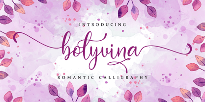 Bolyvina is a beautiful script that feels classy, elegant, and modern. It is perfectly suited for a wide variety of projects! This font is PUA encoded which means you can access all of the magical glyphs and swashes with ease! It also features a wealth of special features including alternate glyphs and ligatures.
 - Nouveau Nights JNL by Jeff Levine,
$29.00 The deep well of creativity that is the era of the hand lettered sheet music title page brings forth Nouveau Nights JNL. Re-drawn from a period example of the 1920s, this titling font perfectly captures the warm "human" look of pen and ink lettering, long before the advent of "perfect" digital type.
 - Dattge Hurty by Stringlabs Creative Studio,
$25.00 Dattge Hurty is a cute and casual handwritten font with an incredibly friendly feel. It features gorgeous swashes and ligatures that make this script incredibly versatile. Whether you’re looking for fonts for Instagram or calligraphy scripts for DIY projects, Dattge Hurty will turn any creative idea into a true piece of art!