10,000 search results
(0.043 seconds)
- Threat by Ronny Studio,
$19.00 Threat is an all caps font that has a very bold body, but still has high contrast. This font looks very modern when paired with contrasting design colors. This font is impressive and features a clean and elegant font, professionally shaped, and as a result, it will easily match a variety of creations that require a different touch. Add it with confidence to your projects, and you'll love the results. This typeface is perfect for elegant logos, branding, promotions, book covers, magazine layouts, or simply as a stylish text overlay onto any background image. Features : - All Caps - numbers and punctuation - multilingual - Ligature - alternates - PUA encoded Please contact us if you have any questions. Enjoy Crafting and thanks for supporting us! :) Thank you
 - Rocklie by Canden Meutuah,
$20.00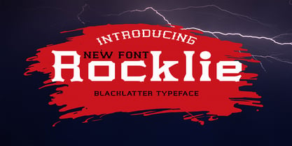 is a modern font packaged in a modern and classy style, complete with access to your OpenType feature to access a large selection of alternative letters and ligatures, the choice of letters you like from various uppercase and lowercase letters for a luxurious impression and elegant appearance. A new elegant serif font that will add a touch of luxury and style to your projects. This is a very versatile font that works well in both large and small sizes. This font is Perfect for branding projects, logo design, clothing branding, packaging, magazine titles, advertisements, t-shirts, postcards, editorials, magazine headlines, product packaging, and displaying masculine and feminine qualities. this is equipped with full uppercase, lowercase, numbers and punctuation + Multi-language support
 - Brandy Keita by Canden Meutuah,
$25.00 Serif is a modern serif font packaged in a modern and classy style, complete with access to your OpenType feature to access a large selection of alternative letters and ligatures, the choice of letters you like from various uppercase and lowercase letters for a luxurious impression and elegant appearance. A new elegant serif font that will add a touch of luxury and style to your projects. This is a very versatile font that works well in both large and small sizes. This font is Perfect for branding projects, logo design, clothing branding, packaging, magazine titles, advertisements, t-shirts, postcards, editorials, magazine headlines, product packaging, and displaying masculine and feminine qualities. this is equipped with full uppercase, lowercase, numbers and punctuation + Multi-language support
 - Slugs Racer by Ronny Studio,
$19.00 Slugs Racer is an all caps racing display font that has a very thick body, but maintains high contrast. This font looks very modern when paired with a contrasting design color. This font impresses and features a clean and elegant font, professionally shaped, and as a result, it will easily match any creation that calls for a different touch. Add it confidently to your projects, and you'll love the results. This typeface is perfect for elegant logos, branding, promotions, book covers, magazine layouts, or simply as a stylish text overlay onto any background image. Features : - All Caps - numbers and punctuation - multilingual - Ligature - alternates - PUA encoded Please contact us if you have any questions. Enjoy Crafting and thanks for supporting us! :) Thank you
 - Zaniola Lavolce by Balpirick,
$15.00 Proudly Presenting, Zaniola Lavolce Font. Zaniola Lavolce is a Modern Callihgraphfont that is perfect for product packaging, branding project, megazine, social media, wedding, or just used to express words above the background. This font includes TTF and multilingual support.
 - Megalithic by IC Fonts,
$20.00 3D Chiseled Rock type font based on the ideas of Ancient Megalithic Structure and Stone Masonry. This Font comes in a Solid Bolder type or Outlined Type for that Chiseled Ice Block Look. Based on Hulkbusters by Dan Zadorozny.
 - Chisel Tip by m u r,
$15.00The evolution of letters is something obsessed over by graffiti writers and font fanatics alike. This font is authentic and can be used both by other graffiti writers as well as by people looking to create that particular style. - Kiks by David Engelby Foundry,
$25.00 Kiks is the Danish name for biscuit. Just like a biscuit this font throws its crums in every direction with curvy, bold letters. A display font made for headlines and everything else that needs to be visually loud. Enjoy!
 - MBF Raveny by Moonbandit,
$19.00 Raveny is a high contrast modern display font by moonbandit, This typeface is a unicase font, meaning that the uppercase and lowercase has the same height. Raveny also comes with multilingual support and several alternates for you to explore.
 - TG Neuramatica by Tegami Type,
$25.00 Neuramatica is a low contrast sans serif font. Simple letter form makes that this font has a high level of legibility. Thus making Neuramatica look very modern. Neuramatica has five different weights, ranging from Light, Regular, SemiBold, Bold and Black. This font is highly recommended for use as a bodytext or headline, because it has good legibility. Design with a swiss style is perfect to use this font because it gives the impression of a modern and simple but still able to read well.
 - Chelsie Hilton by PeachCreme,
$19.00 We're excited to present to you our new font, "Chelsie Hilton"! A great thing about this font is that it is both chic and legible at the same time. You can confidently use it on such machines as Cricut since its edges are smooth enough and this font will fit just right. When creating this signature font, we took care to make it as crisp and modern as possible. "Chelsie Hilton" is perfect for logos, wedding designs, quotes, cards, stationery, signature, display text, and many more.
 - Bugilo by Say Studio,
$15.00 Bugilo - Modern Bold Font Bugilo feels playfully nostalgic and delivers an incredible vintage aesthetic. Use this serif font to add that special retro touch to any design idea you can think of! Masterfully designed to become a true favorite, this font has the potential to bring each of your creative ideas to the highest level! This font is PUA encoded which means you can access all of the glyphs and swashes with ease! Features : uppercase & lowercase numbers and punctuation multilingual ligatures alternates PUA encoded Enjoy!
 - Clover by KA Designs,
$12.00 Clover is a modern retro font with a light, bubbly feel! This font is perfect if you are after a fun script font that has a lot of edge! The versatility of this font reaches wide. Use this one for branding, logos, advertisements, shirts, stickers, social media, invitations and more! The complete package includes a complimentary shadow version for easy and perfect layering every time! Clover will take you right back to the 70's but still provide a fresh look to your designs!
 - PAG Karogs by Prop-a-ganda,
$19.99Prop-a-ganda offers retro-flavored fonts inspired by lettering on retro propaganda posters, retro advertising posters, retro packages all the world over. This is perfect font for your retrospective project. PAG Karogs is geometric, art-deco font that had been used for a match box. The bowls of this font is based on a positive circle. The contrast of a circle and straight line effective in producing brisk structural rhythms. This is great for branding, packaging and posters or any other kind of display use. - Bollolo by YuliusParyadi,
$11.00 Bollolo (Handwritten) is a fun and playful font. Bollolo name is made from bolo-bolo which is mean lets be friend. This font is readable, catchy, and easy to use. This font is suitable for quotes, logo designs, kids toys, story book, and many other design projects. Bollolo is includes: - full set uppercase and lowercase letter; - numerals; - multilingual support; - large number of punctuations; - ligatures. Please add this font as your favorite, hit like button, or follow me. I'll very happy for that and appreciated it.
 - Puanto by Larin Type Co,
$15.00 Puanto is a elegant serif font that includes two styles: regular and true Italic. This font has a lightweight and looks amazing in logos, branding, arranging wedding invitations, business cards, packaging, titles and much more, it is very readable and recognizable. This font includes alternates and ligatures for Uppercase and Lowercase, with them you can make your project more elegant and unique and italic style will add dynamics to your design, it also includes alternates and ligatures This font is easy to use has OpenType features.
 - Cumhuriyet World by Fontuma,
$34.00 Cumhuriyet means “the form of government in which the nation holds the sovereignty and uses it through deputies elected for certain periods”. The reason why I gave this name to the font is that 2023 is the centennial anniversary of the Republic of Turkey, which was founded by Atatürk. This typeface, which is sans serif, consists of three families: ▪ Cumhuriyet: Font family with Latin letters ▪ Cumhuriyet Pro: Font family including Latin, Arabic and Hebrew alphabets ▪ Cumhuriyet World: Font family including Latin, Cyrillic, Greek, Arabic and Hebrew alphabets Cumhuriyet World is a family of multi-purpose typefaces designed in a geometric style. This font is suitable for use in printed products, media and digital media, as well as in every field that is the subject of writing.
 - Innoxious by Gassstype,
$25.00 Here comes a New font, Introducing INNOXIOUS is a Annoying Rough Brush Font with a natural handwritten feel. This handmade font will make your design has a beautiful natural touch for each details. It is perfect for any design project as Invitation,logo, book cover, craft or any design purposes. This font INNOXIOUS is great for your next creative project such as logos, printed quotes, invitations, cards, product packaging, headers, Logotype, Letterhead, Poster, Design this font is great for your creative projects such as watermark on photography, and perfect for logos & branding, invitation,advertisements,product designs, stationery, wedding designs,label ,product packaging, special events or anything that need handwritting taste. That is has charming, authentic and relaxed characteristic more natural look to your text You can activate Ligatures OpenType panel.
 - Toisy by Letrizmo,
$21.00When the right late seventies / early eighties message is needed, Toisy comes to the rescue. Founded on a mix of references from letterforms of the time, this new original nods to a style that defined an era. A sexy theme font that conveys a clear image of what was truly chic thirty years ago, this alphabet is deeply rooted in sultry memories of soft, endless nights. Exaggerate contrast between strokes and angular lines combine with rounded corners to provide a unique character and a look that sharply differs when set in all caps or lower case, thanks to an uncommon treatment of density and proportions. Set it real tight, as was typographically in fashion circa 1981. Toisy and Toisy Greek include a set of 13 matching images inspired in leisure stuff and the clothing of the last days of disco. They are different from the set included with Toisy Alt. - Kimberley by Typodermic,
$11.95 Introducing Kimberley, the cutting-edge sans-serif typeface that will bring your message to the forefront of the modern era. Inspired by the bold and timeless corporate industrial logos of the 1970s, Kimberley’s squarish design and sleek angles will captivate and inspire your audience with its effortlessly cool, machine-made aesthetic. With seven distinct weights and accompanying italics, Kimberley is the ultimate tool in your design arsenal. Whether you’re creating a sleek corporate identity or crafting eye-catching advertising campaigns, Kimberley’s versatility ensures that your message will be delivered with clarity and distinction. So don’t settle for less, choose Kimberley and let its contemporary style and sophisticated edge elevate your design game to new heights. Upgrade your typography today with Kimberley and unleash the power of a truly modern typeface. Most Latin-based European writing systems are supported, including the following languages. Afaan Oromo, Afar, Afrikaans, Albanian, Alsatian, Aromanian, Aymara, Bashkir (Latin), Basque, Belarusian (Latin), Bemba, Bikol, Bosnian, Breton, Cape Verdean, Creole, Catalan, Cebuano, Chamorro, Chavacano, Chichewa, Crimean Tatar (Latin), Croatian, Czech, Danish, Dawan, Dholuo, Dutch, English, Estonian, Faroese, Fijian, Filipino, Finnish, French, Frisian, Friulian, Gagauz (Latin), Galician, Ganda, Genoese, German, Greenlandic, Guadeloupean Creole, Haitian Creole, Hawaiian, Hiligaynon, Hungarian, Icelandic, Ilocano, Indonesian, Irish, Italian, Jamaican, Kaqchikel, Karakalpak (Latin), Kashubian, Kikongo, Kinyarwanda, Kirundi, Kurdish (Latin), Latvian, Lithuanian, Lombard, Low Saxon, Luxembourgish, Maasai, Makhuwa, Malay, Maltese, Maori, Moldovan, Montenegrin, Ndebele, Neapolitan, Norwegian, Novial, Occitan, Ossetian (Latin), Papiamento, Piedmontese, Polish, Portuguese, Quechua, Rarotongan, Romanian, Romansh, Sami, Sango, Saramaccan, Sardinian, Scottish Gaelic, Serbian (Latin), Shona, Sicilian, Silesian, Slovak, Slovenian, Somali, Sorbian, Sotho, Spanish, Swahili, Swazi, Swedish, Tagalog, Tahitian, Tetum, Tongan, Tshiluba, Tsonga, Tswana, Tumbuka, Turkish, Turkmen (Latin), Tuvaluan, Uzbek (Latin), Venetian, Vepsian, Võro, Walloon, Waray-Waray, Wayuu, Welsh, Wolof, Xhosa, Yapese, Zapotec Zulu and Zuni.
 - Areplos by Storm Type Foundry,
$53.00To design a text typeface "at the top with, at the bottom without" serifs was an idea which crossed my mind at the end of the sixties. I started from the fact that what one reads in the Latin alphabet is mainly the upper half of the letters, where good distinguishableness of the individual signs, and therefore, also good legibility, is aided by serifs. The first tests of the design, by which I checked up whether the basic principle could be used also for the then current technology of setting - for double-sign matrices -, were carried out in 1970. During the first half of the seventies I created first the basic design, then also the slanted Roman and the medium types. These drawings were not very successful. My greatest concern during this initial phase was the upper case A. I had to design it in such a way that the basic principle should be adhered to and the new alphabet, at the same time, should not look too complicated. The necessary prerequisite for a design of a new alphabet for double-sign matrices, i.e. to draw each letter of all the three fonts to the same width, did not agree with this typeface. What came to the greatest harm were the two styles used for emphasis: the italics even more than the medium type. That is why I fundamentally remodelled the basic design in 1980. In the course of this work I tried to forget about the previous technological limitations and to respect only the requirements then placed on typefaces intended for photosetting. As a matter of fact, this was not very difficult; this typeface was from the very beginning conceived in such a way as to have a large x-height of lower-case letters and upper serifs that could be joined without any problems in condensed setting. I gave much more thought to the proportional relations of the individual letters, the continuity of their outer and inner silhouettes, than to the requirements of their production. The greatest number of problems arose in the colour balancing of the individual signs, as it was necessary to achieve that the upper half of each letter should have a visual counterbalance in its lower, simpler half. Specifically, this meant to find the correct shape and degree of thickening of the lower parts of the letters. These had to counterbalance the upper parts of the letters emphasized by serifs, yet they should not look too romantic or decorative, for otherwise the typeface might lose its sober character. Also the shape, length and thickness of the upper serifs had to be resolved differently than in the previous design. In the seventies and at the beginning of the eighties a typeface conceived in this way, let alone one intended for setting of common texts in magazines and books, was to all intents and purposes an experiment with an uncertain end. At this time, before typographic postmodernism, it was not the custom to abandon in such typefaces the clear-cut formal categories, let alone to attempt to combine the serif and sans serif principles in a single design. I had already designed the basic, starting, alphabets of lower case and upper case letters with the intention to derive further styles from them, differing in colour and proportions. These fonts were not to serve merely for emphasis in the context of the basic design, but were to function, especially the bold versions, also as independent display alphabets. At this stage of my work it was, for a change, the upper case L that presented the greatest problem. Its lower left part had to counterbalance the symmetrical two-sided serif in the upper half of the letter. The ITC Company submitted this design to text tests, which, in their view, were successful. The director of this company Aaron Burns then invited me to add further styles, in order to create an entire, extensive typeface family. At that time, without the possibility to use a computer and given my other considerable workload, this was a task I could not manage. I tried to come back to this, by then already very large project, several times, but every time some other, at the moment very urgent, work diverted me from it. At the beginning of the nineties several alphabets appeared which were based on the same principle. It seemed to me that to continue working on my semi-finished designs was pointless. They were, therefore, abandoned until the spring of 2005, when František Štorm digitalized the basic design. František gave the typeface the working title Areplos and this name stuck. Then he made me add small capitals and the entire bold type, inducing me at the same time to consider what to do with the italics in order that they might be at least a little italic in character, and not merely slanted Roman alphabets, as was my original intention. In the course of the subsequent summer holidays, when the weather was bad, we met in his little cottage in South Bohemia, between two ponds, and resuscitated this more than twenty-five-years-old typeface. It was like this: We were drinking good tea, František worked on the computer, added accents and some remaining signs, inclined and interpolated, while I was looking over his shoulder. There is hardly any typeface that originated in a more harmonious setting. Solpera, summer 2005 I first encountered this typeface at the exhibition of Contemporary Czech Type Design in 1982. It was there, in the Portheim Summer Palace in Prague, that I, at the age of sixteen, decided to become a typographer. Having no knowledge about the technologies, the rules of construction of an alphabet or about cultural connections, I perceived Jan Solpera's typeface as the acme of excellence. Now, many years after, replete with experience of revitalization of typefaces of both living and deceased Czech type designers, I am able to compare their differing approaches. Jan Solpera put up a fight against the digital technology and exerted creative pressure to counteract my rather loose approach. Jan prepared dozens of fresh pencil drawings on thin sketching paper in which he elaborated in detail all the style-creating elements of the alphabet. I can say with full responsibility that I have never worked on anything as meticulous as the design of the Areplos typeface. I did not invent this name; it is the name of Jan Solpera's miniature publishing house, in which he issued for example an enchanting series of memoirs of a certain shopkeeper of Jindrichuv Hradec. The idea that the publishing house and the typeface might have the same name crossed my mind instinctively as a symbol of the original designation of Areplos - to serve for text setting. What you can see here originated in Trebon and in a cottage outside the village of Domanín - I even wanted to rename my firm to The Trebon Type Foundry. When mists enfold the pond and gloom pervades one's soul, the so-called typographic weather sets in - the time to sit, peer at the monitor and click the mouse, as also our students who were present would attest. Areplos is reminiscent of the essential inspirational period of a whole generation of Czech type designers - of the seventies and eighties, which were, however, at the same time the incubation period of my generation. I believe that this typeface will be received favourably, for it represents the better aspect of the eighties. Today, at the time when the infection by ITC typefaces has not been quite cured yet, it does absolutely no harm to remind ourselves of the high quality and timeless typefaces designed then in this country.In technical terms, this family consists of two times four OpenType designs, with five types of figures, ligatures and small capitals as well as an extensive assortment of both eastern and western diacritics. I can see as a basic text typeface of smaller periodicals and informative job-prints, a typeface usable for posters and programmes of various events, but also for corporate identity. Štorm, summer 2005 - Hispanic by ryan creative,
$10.00 Introducing Hispanic fonts that have strong looking designs. In this font there is an additional taper at each end of the letter so that it seems more concentrated. Hispanic has more than 120 Ligatures that you can use in both modern and contemporary designs, and are suitable for use in a variety of fashion media, posters, model magazines, typography, promotions and other digital media. FEATURES; Uppercase and lowercase letters. Support Foreign, Numbers and Punctuation. Alternative, Ligatures Regular & Italic. Works on PC. Simple installation. Accessible in Adobe Illustrator, Adobe Photoshop. Adobe InDesign, it even works in Microsoft Word. Fully accessible without additional design software. Hispanic is encoded with Unicode PUA, which allows full access to all additional characters without having to design any special software. Mac users can use the Font book, and Windows users can use the Character map to view and copy any extra characters to paste into your favorite text editor/app. Thank you for visiting, Have a nice day;)
 - Armature Neue by fontBoy,
$15.00 Armature Neue is an extension and clarification of the original Armature family released in 1997. We made the distribution of weights more even, and added italics extra light and black weights. Originally consisting of four fonts, Armature Neue has twelve: six weights with accompanying italics. Although conceived as a display face, a number of alternate characters are included that can be used to regularize the type for text setting. Armature is one result of my interest in typefaces that are constructed, rather than drawn. Although it is basically a monoline design, there are subtle details throughout that compensate for a monoline’s evenness. As with all fontBoy fonts, there are dingbats hidden away in the dark recesses of the keyboard. When I first started designing this face in 1992, I called it Dino-I thought I would name all my fonts after famous pets-so the dingbats for Armature are dinosaurs. Designed by Bob Aufuldish with editing and production by Psy/Ops.
 - Ramadan Greeting by Nathatype,
$29.00 Ramadan Greeting is a captivating display font that pays homage to the graceful aesthetics of Arabic calligraphy. Ramadan Greeting is more than just a font; it's a bridge between heritage and modern design. It's a versatile tool that allows you to infuse your projects with the timeless beauty and cultural richness of Arabic calligraphy. The characters in Ramadan Greeting are thoughtfully designed with rounded, soft shapes that exude a sense of warmth and approachability. The high contrast between the strokes adds a traditional and authentic flair while maintaining legibility and clarity, even at display sizes. In addition, you can also enjoy the features here. Features: Stylistic Sets Alternates -Multilingual Supports PUA Encoded Numerals and Punctuations Ramadan Greeting fits in headlines, logos, posters, flyers, branding materials, greeting cards, print media, editorial layouts, and many more designs. Find out more ways to use this font by taking a look at the font preview. Thanks for purchasing our fonts. Hopefully, you have a great time using our font. Feel free to contact us anytime for further information or when you have trouble with the font. Thanks a lot and happy designing.
 - Jack Knife by Mike Zuidgeest,
$14.00 The "Jack Knife" font is a unique, handcrafted font that perfectly captures the spirit of the medieval time period. With its spiky, pointy design, this font exudes strength, courage, and boldness – making it the perfect choice for anyone looking to add a touch of daring to their brand. The sharp, jagged edges of the "Jack Knife" font give it a rugged, rustic feel that is both timeless and modern. Its bold, thick strokes make it easy to read even from a distance, while the intricate details and delicate curves add a touch of elegance and sophistication. Whether you're looking to create a bold, daring logo for a whisky brand or add a touch of adventure to your design, the "Jack Knife" font is the perfect choice. Its unique design and versatile style make it suitable for a wide range of projects, from branding and packaging to advertising and social media. So if you're looking for a font that embodies the spirit of the medieval period and exudes strength, courage, and boldness, look no further than the "Jack Knife" font – the perfect choice for anyone who wants to make a bold statement with their design.
 - Nikaru by Twinletter,
$18.00 Nikaru is a retro-inspired display font designed in a simple and contemporary style that gives it a modern feel. This elegant typography is perfect for designing any project, especially editorial work, branding, product packaging, and promotional designs with bold and fun characters. It’s time to add some zest to your next project with this font.
 - Exotile by Sylvain Zimmer,
$15.99 Hexagons are all over the place in nature : from honeycombs to snowflakes and the tiling patterns seen on fruits. That form guided me in the creation of this new font. So Exotile is a font inspired by nature. This typeface is ideal for display purposes. It comes in 3 different weights and support for different languages.
 - Fat Ink by High Peak,
$20.00 This handwritten font is as juicy as the strokes from a fat marker! Unpredictable but harmonious, the lines and shapes give this font a fun, funky vibe. Perfect for creating logos, charts, pricing, and more. Full uppercase and lowercase, it supports several languages, lots of discretionary ligatures, and alternatives that combine with each other. Have fun! High Peak
 - BROKEN STORM by Aminmario Studio,
$30.00 This is a supercharged font, with natural brush, quick strokes and sharp details. Contains ALL CAPS, numbers, some punctuation and ligature. Perfect for challenging jobs, titles, movie,logos, apparel, t-shirts, hoodies, quotes, product packaging, or anything that needs a typographic turbo-boost and a typographic unique style. Thanks for checking out this font. I hope you enjoy it!
 - BLACK PRANK by Aminmario Studio,
$20.00 This is a supercharged font, with natural brush, quick strokes and sharp details. Contains ALL CAPS, numbers, some punctuation and ligature. Perfect for challenging jobs, titles, movie,logos, apparel, t-shirts, hoodies, quotes, product packaging, or anything that needs a typographic turbo-boost and a typographic unique style. Thanks for checking out this font. I hope you enjoy it!
 - Adieu Two Pro by Hackberry Font Foundry,
$24.95 AdieuTwo is a radical revision of Adieu which was a revision of my original font, Chivalry, that was traced from Chevalier back in the mid-1990s. Its roots are obvious, but this one has small caps, small cap figures, oldstyle figures, ligatures, and more. This is a thoroughly up-to-date font ready to be used for stylish heads.
 - Sidelle by Beary,
$15.00 Sidelle is an amazing hand lettering script that is attractive and natural. Every single letter have been carefully crafted to make your text look beautiful. This font is suitable for invitations, branding, advertising, classic design, poster designs, and more. This font is PUA encoded so you can access extras from character map in most design software.
 - The Romance Island by Sipanji21,
$16.00 Hello, this is The Romance Island - Realistic Handwritten Monoline Display Font! This font designed so that users can use it more easily and make Monoline designs easier. The Romance Island is very suitable for use in various media such as; packaging, logos, labels, posters, shirt designs, bulletins, typography, and many other media, especially with Monoline look.
 - American Sensation by Megami Studios,
$12.50 This font is styled after artwork from the cola signs of old. Signs that talked about "America's Sensation", with "Cool, Refreshing Taste" and other words of a bygone era, one with cane sugar and not corn syrup. Filled with a retro feeling of sophistication and playfulness, this font can be used in a variety of fashions.
 - Mefirah by Awan Senja,
$14.00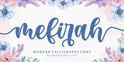 Mefirah is a cute and casual handwritten font with an incredibly friendly feel. It features gorgeous swashes and ligatures that make this script incredibly versatile. This font is PUA encoded which means you can access all of the cute glyphs and swashes with ease! It also features a wealth of special features including alternate glyphs and ligatures.
 - News Plantin by Monotype,
$29.99Originally made for the Observer newspaper, in London, this version of Plantin is more condensed than the standard typeface. This condensing is most noticeable in the capitals and the bold fonts. The News Plantin font family was designed primarily for use in a magazine supplement. It retains the robust nature of Plantin but provides better economy in text use. - Cendhany by Javatypestd,
$10.00 Introducing Cendhany is a hand lettered typeface. This font is made by handwriting naturally using a brush pen so it can produce good quality fonts. They work perfectly for you who needs a typeface for headline, logotype, apparel, invitation, branding, packaging, wedding, advertising, etc. This typeface comes in uppercase, lowercase, punctuation, symbols, numerals, alternate, ligatures, etc also supports multilingual.
 - Animal Hunter by JK Typeface,
$60.00 This unique font is characterized by the presence of only one sharp serif, skillfully positioned to give it an aggressive and distinctive appearance. This typographic singularity seamlessly blends the minimalism of sans-serif fonts with the visual intensity of a serif, resulting in a design that will undoubtedly catch the eye and make your message stand out.
 - DEAD MARKER by Aminmario Studio,
$30.00 This is a supercharged font, with natural brush, quick strokes and sharp details. Contains ALL CAPS, numbers, some punctuation and ligature. Perfect for challenging jobs, titles, movie,logos, apparel, t-shirts, hoodies, quotes, product packaging, or anything that needs a typographic turbo-boost and a typographic unique style. Thanks for checking out this font. I hope you enjoy it!
 - Aletriat by Letterena Studios,
$9.00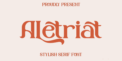 Aletriat is a classic serif font that has its own unique style & modern look. This typeface is perfect for an elegant & luxury logo, book or movie title design, fashion brand, magazine, clothes, lettering, quotes, and so much more. This font is PUA encoded, which means you can access all of the glyphs and swashes with ease!