10,000 search results
(0.029 seconds)
- ATTACK OS by OS CORP,
$25.00 ATTACK OS font version: 1.0 is the first version, including 340 characters, there are 4 types of handwriting that are: Regular; Italic; Bold; Bold Italic. We work with agencies and brands on visual identities and custom type design. Do you need a new font? Or an adjustment of the existing one? We can handle it on a best technological and creative level. New font design We create a concept and drawing of a completely new font to emphasise the character of your brand or project. Modifications to our fonts We adjust one of our retail fonts to your needs. It usually means a small change in design, an extension of the language set or icons. Let’s discuss how we can work together
 - Sheepman by Dharma Type,
$19.99 Sheepman inspired by and based on retro William Page’s No.506 typeface which is popular wooden type fonts of the 19th century. To make soft and natural impressions, the original polygonal design was changed to rounded design. All glyphs had been designed carefully to be retro-looking of the old time and to fill all with nostalgia. This modern wood type includes 3 weights and their matching slanted style and all style have sprayed ends(beginning) alternates for F, H, L, M, N, P, U, f, h, j, m, n, p, q, and u which can be accessed by using OpenType Stylistic alternates or swash alts. Sheepman will be the best solution for posters, titles and anywhere you need vintage lettering.
 - Popcorn by Fenotype,
$19.00 Popcorn is a brush script family of Regular and Bold weight and a set frisky caps, Casuals. Popcorn is a strikingly clear and smooth display face with short descenders and ascenders—it’s great for stacked layouts too. Popcorn scripts are equipped with plenty of contextual alternates and ligatures, all set in Standard Ligatures to keep the smooth flow. Besides that there’s also Swash alternates for every standard letter. Popcorn scripts are PUA encoded so you can access alternates with most design softwares. Popcorn Print is a rugged version of Popcorn with rough outlines and nice print texture. Popcorn is a great display family with roots in the past but smooth polished contemporary features. For the best price grab the whole pack!
 - Bumble OS by OS CORP,
$3.00 BUMBLE OS font version: 1.0 is the first version, including 340 characters, there are 3 types of handwriting that are: Regular (Regular); Italic (Italic); Bold (Bold). We work with agencies and brands on visual identities and custom type design. Do you need a new font? Or an adjustment of the existing one? We can handle it on a best technological and creative level. New font design We create a concept and drawing of a completely new font to emphasise the character of your brand or project. Modifications to our fonts We adjust one of our retail fonts to your needs. It usually means a small change in design, an extension of the language set or icons. Let’s discuss how we can work together
 - Pizza by FontMesa,
$25.00 Pizza is a font fusion of our Saloon Girl and Mi Casa font families. Our new Pizza font will look great for headlines in your new restaurant menu as well as the sign out front. Pizza offers different levels of ornamentation to choose from to best suit your design needs. Pizza Margherita is a solid black version for plain text. Fill fonts are also available, however, you'll need an application that works in layers to take advantage of the Pizza fill fonts. Fill fonts in the Pizza font family are not meant to be used as a stand alone font, please use the Pizza Margherita font if you need a solid black weight. Pizza is a trademark of FontMesa LLC, initial release December 6-2021
 - Walnut Cream by Nathatype,
$29.00 Want to live up the hype of your brand? It's all here. The cute elegant Walnut Cream is a beautiful combination of the handcrafted script font and the uppercase display font to beautify your designs. The font features a set of lower and uppercases, numerals, punctuations, multilingual supports, stylistic sets, ligatures and swashes. It is best to apply for various purposes, such as branding, logotypes, promotions, quotes, and more. See the previews above to get some inspiration on how to use them. Happy designing! Thank you for purchasing from Natha Studio. For further details and queries, feel free to contact us.
 - Harmonia Sans by Monotype,
$34.99 The Harmonia Sans™ typeface is a fine blend of contemporary geometric sans serif lettershapes and classic calligraphic proportions. Jim Wasco, who was aided by George Ryan in the production of the typeface family, began the design of Harmonia Sans with a single goal in mind. "I wanted to create a simple and legible typeface by pulling the best aspects of classic geometric sans designs, such as Futura and ITC Avant Garde Gothic," Wasco explained. The result is a design suitable for virtually all typographic applications, from text on low-resolution displays to high-resolution print and even architectural signage.
 - Bon Vivant Family by Nicky Laatz,
$20.00 If you've got style and love all the luxuries in life, you're Bon Vivant! Add a touch of luxury and style to your projects too, with the new Bon Vivant Font Collection. It's highly recommended to turn your Opentype features on while using the script font, to make use of it's best features - the multitude of OpenType ligatures. As you type, your text looks like natural handwriting, and less like a monotonous font. The handsome serif comes in 2 weights, regular and bold. Designed to be a perfect complimentary font to the script, its just as striking used on its own.
 - Gorgonzola Gothic by The Ampersand Forest,
$20.00 Gorgonzola Gothic is a geometrically-inspired gothic sans serif family that's robust and versatile. Inspired by the geometric quirkiness of IxD (also by The Ampersand Forest), Gorgonzola Gothic expands into a thirty-style family that works for everything from branding to text. It further mitigates IxD's quirkiness by offering two options in the round and shouldered lowercase glyphs. The standard letterforms, like IxD, have notched joins, giving them an assertive, almost futuristic look. The alternates of those letterforms (housed in Stylistic Set 01, and available as immediate hoverable glyph options in the Adobe Suite) are more conventional (as are the SS01 ampersand, Q, S, a, and s). In this way, Gorgonzola Gothic offers the best of both worlds: a flavorful, slightly futuristic family (in the same world as geometric classics like Eurostile) and a workhorse gothic sans (like the Benton classics Franklin Gothic, News Gothic, etc.). Its three widths: Skinny, Slim, and Standard, give it a wide range of applications, from display to body. Gorgonzola Gothic makes a statement with strength and sureness.
 - Sapore by Fonderia Serena,
$23.90 Sapore is a script font family, mostly monoline, inspired by the elegant handmade signs in the beautiful city of Venice, Italy, where I work and live. Many of these signs were made at the beginning of the 20th century by skillful craftsmen and artists, carrying that distinct vintage Italian flavour, and this is why I named the font Sapore, which means precisely flavour (also, one of the signs is from a pastry shop that makes the most delicious things). The design takes this retro vibe into the 21st century, making it up-to-date and fresh, while keeping it authentic. It is a script font, but I added some stand alone capitals that you can use in all caps words and texts effortlessly, as the open type code is taking care of using the right set of letters at the right time, I could have made two separate fonts, but I wanted to give you the best value I could and ease of use. Make sure contextual alternates are always on! There are also swashes, alternate styles, stylistic sets, small caps, 2 figure sets and decorative elements, all accessible through open type. I think the font is particularly suited for display use, as in logos, packaging design, branding, but it is readable enough for small text blocks. You can access the non-linking caps by clicking on the discretionary ligatures button. You can access the loopy caps by clicking on the titling alternates button. The main version has straight terminals but I included a round version and a calligraphic one, called “classico”. Hope you like it!
 - Alonzo by Fenotype,
$25.00 Alonzo is a modern cosmopolitan who speaks several languages fluently. Alonzo comes in six weights and two widths, as well as corresponding italics, making a total 24 styles. Alonzo is an elegant, simplistic, high-contrast sans that is at home in high-end fashion and cultural environments, as well as in the world of restaurants and nightclubs. While Alonzo Condensed is more illustrative and works best in display use, headlines, logotypes, labels and all that, Alonzo Regular works in a wider range of contexts, from body text to editorial and catalogs and more. Alonzo is equipped with several OpenType features such as oldstyle figures, small caps, Standard Ligatures, Superior and Inferior Figures. In addition Alonzo has Stylistic Alternate lowercase "a" with round Bowl. Me llamo Alonzo. Mucho gusto, piacere di conoscerti, nice to meet you!
 - Cormac by Typedepot,
$19.00 Cormac is a humanist typeface characterized with it's large x-height and slightly flared stems. The word that best describes our ideas in the beginning of the project is "simple" - the idea behind it was to strip the letter forms of everything unnecessary, and yet keep the typeface interesting. The typeface is friendly without being too cheezy thanks to its humanistic character, flared ascenders and stems reminding of its calligraphic origin. The proportions are closer to the traditional old style typefaces. Cormac is open and readable typeface coming in 7 weights plus their matching 'true' italics - from Extra Thin to Bold. The family comes with Cyrillic support, great range of numerals, fractions, ligatures, alternates and a lot of special characters making Cormac a great solution for greate range of design work - branding, editorial, web, wayfinding, etc.
 - ITC Goudy Sans by ITC,
$29.99 Frederic W. Goudy designed three weights of this friendly-looking sans serif font from 1922-1929 for Lanston Monotype in the United States. Goudy was attempting to impart freedom and personality to the sans serif form at a time when geometric sans serifs, such as Futura, were gaining rapid world-wide popularity. To achieve this challenging goal, he looked to lapidary inscriptions and manuscript writing for inspiration. He included elements such as slight swellings of terminal strokes, slab serifs on a few of the caps, alternate uncial forms, and a few swash strokes. The result is uniquely Goudy: charming, instinctive, and just right for adding warmth to magazine or advertising layouts. The design staff at ITC updated and filled out the family for a total of eight styles in ITC Goudy Sans. ITC Goudy Sans® font field guide including best practices, font pairings and alternatives.
 - Maybe by Twinletter,
$14.00 Introducing our new Font called Maybe This font has a young, powerful and energetic character, nuances of Halloween and Christmast, of course it is very suitable to be used for modern and vintage projects, the beautiful and beautiful lettering makes this font look charming for you to use as a title, logo or anything else in any design project. you. This charming font also offers the beauty of abstract typography harmony for a wide variety of design projects, including digital natural handwriting for designs, quote designs, for social media business designs, advertisements, trademarks, food and beverage promotion banners, text, posters, a signature, and all designs require handwriting or whatever design you want. This font is equipped with uppercase, lowercase, numbers, punctuation marks, swhases and several variations on each character including multi-language. ================================================== This font is best suited for open type friendly applications. How to get alternative glyphs from open type fonts: http://adobe.ly/1m1fn4Y PUA Character Code - Fully accessible without additional design software. do not hesitate anymore start using this font. and Feel free to send any message you want to convey.
 - Harmond by Dirtyline Studio,
$25.00 Harmond a new fresh & modern serif with a strong style, a dancing baseline! So beautiful on invitation like greeting cards, branding materials, business cards, quotes, posters, and more! Harmond Display Typeface is the part of a strong and modern display family. This typeface both impressive at display sizes and easily readable in text size, while the sharp shapes of the triangular serifs and the distinctive letter shapes show their strength in logo design and impressive editorial use. Harmond come with elegant style, strength and contrasts, with features an extended latin character set of 470 glyphs covering over 88 languages. Casta is ready to be like a top model on the design catwalk, making your projects looking classic but contemporary, finely tuned but assertive, and elegant as the best luxury fashion.
 - Todos Santos by Putracetol,
$24.00 Todos Santos - Slab Serif Font. The baseline of Todos Santos is also not the same, so it makes this font seem irregular, What makes Todos Santos unique is the difference in the height of each character. And Todos Santos is a slab serif inspired by 1970s posters but made flexible enough for everyday use. Todos Santos best uses for title, invitation, heading, cover, poster, logos, quotes, product packaging, merchandise, social media & greeting cards and many more The alternative characters were divided into several Open Type features such as Swash, Stylistic Sets, Stylistic Alternates, Contextual Alternates, and Ligature. The Open Type features can be accessed by using Open Type savvy programs such as Adobe Illustrator, Adobe InDesign, Adobe Photoshop Corel Draw X version, And Microsoft Word. Todos Santos is also support multi language.
 - Pelangi script by Sulthan Studio,
$14.00 Pelangi script is a natural handwritten font in the best style, with curves that are very beautiful in view, will be very suitable for your template, such as: greeting cards, branding materials, business cards, quotes, posters and more! Pelangi script - includes many alternative characters. Coded with Unicode PUA, which allows full access to all additional characters without having special design software. Mac users can use Font Book. Windows users can use the Character Map to view and copy one of the additional characters to paste into your favorite text editor. For people who have opentype-capable software: Alternatives can be accessed by turning on the "Alternative Style" and "Ligature" buttons on the Photoshop Character panel, or through any software with the glyph panel, e.g. Adobe Illustrator, Photoshop CC, Inkscape.
 - Mallorca Dirty Numbers by TypoGraphicDesign,
$25.00 The typeface “Mallorca Dirty Numbers Vol 1” is designed for the Typo Graphic Design font foundry in 2017 by Manuel Viergutz. The playful display font is designed on holiday photos of different numbers (house numbers, graffitis, handwritten menu cards …) from Mallorca. An alphabet built with numbers. 524 glyphs with A–Z, a–z, 0–9 and 99+ decorative extras like ornaments, arrows, dingbats, emojis, symbols, geomatric shapes, catchwords, decorative ligatures (type the word “LOVE” for ❤ or “SMILE” for ☺as OpenType-Feature dlig ) and of course many many numbers (20+ stylistic sets). For use in logos, magazines, posters, advertisement plus as webfont for decorative headlines. The font works best for display size. Have fun with this font & use the DEMO-FONT (with reduced glyph-set) FOR FREE!
 - KK3045 Pro by HS Fonts,
$39.00 The font family KK30/45 is available in 3 weights: Light, Regular, and Bold. Type Designer: Kuncho Kunev The name of family - KK30/45 is from the first letters of the designer's name (K)uncho (K)unev and from the main angles of the slanted stems - 30° and 45°. Release date: December, 2001 HermesSOFT Ltd. The design of КК30/45 incorporates a geometric variety of shapes, and have been originally designed in such a way that all slanted stems are 30° and 45°, The very high x-height and low bottom parts allow typesetting with almost 100% leading. КК30/45 is a display face suited best to sizes 16-18 point and above. There are included also all Cyrillic vowels with accents that are really necessary for the professional typesetting in Cyrillic languages. Supported Languages: Western Europe (Greek not included), Central/Eastern Europe, Baltic, Turkish, Romanian, Cyrillic. Supported Code Pages: Macintosh and Windows, any for above languages. Opentype features includes kern, fractions, ordinals, superscripts.
 - Grass Jelly by Yumna Type,
$10.00 Are you looking for a firm, prominent font for your design? Have a try on our unique, eye-catching display font. This is Grass Jelly, a somewhat circled display font to produce artistic, creative, fun nuances. It has thick, strong contrast lines to attract attention and to leave a strong impression for big text sizes to be easily legible. In addition, you can enjoy the available features here. Features: Multilingual Supports PUA Encoded Numerals and Punctuations Grass Jelly fits best for various design projects, such as brandings, posters, banners, headings, magazine covers, quotes, printed products, merchandise, social media, etc. Find out more ways to use this font by taking a look at the font preview. Thanks for purchasing our fonts. Hopefully, you have a great time using our font. Feel free to contact us anytime for further information or when you have trouble with the font. Thanks a lot and happy designing.
 - Regione by Reyrey Blue Std,
$19.00 Introducing, Regione Typeface. A modern typeface that embodies timeless elegance and aesthetic appeal. Regione Typeface accentuates uniqueness with a variety of stylish alternatives. Enhance your creative projects with the font's extensive collection of standard and discretionary ligatures, allowing you to add a touch of finesse to your text. Lunette Typeface is perfectly suitable for a layout design for quotes or body copy, best used as a display for headings, logos, branding, magazines, product packaging, invitations: logotypes, and much more. Features : All Uppercase and Lowercase Number & Symbol Supported Languages Ligatures PUA Encoded Hope you enjoy our font!
 - Mozaquen by Javatypestd,
$10.00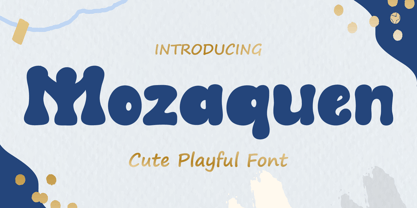 Introducing Mozaquen is a cute font with a modern style and made in a way that follows current trends, a quirky font perfect for all of your craft projects! Mozaquen best uses for Logotype, heading, cover, poster, logos, quotes, product packaging, header, merchandise, social media & greeting cards and many more. This font is also support multi language. What’s Included : - Standard glyphs - Works on PC & Mac - Simple installations - Accessible in Adobe Illustrator, Adobe Photoshop, Adobe InDesign, even work on Microsoft Word. - PUA Encoded Characters – Fully accessible without additional design software. - Fonts include multilingual support Thank you for your purchase! Hope you enjoy our font!
 - Drumbeat by EdyType,
$60.00 DRUMBEAT, a brand new face from Edy Type, coming to help resolve the necessities of loose scripts in Packaging and Editorial Design. Its' very particular thicks and thins and ups and down, makes it very suitable whenever informalities is required. Used with tiny little characters, enlarged to mammoth sizes or filling a large page with it, would show it’s perfect balance and color, almost as if where hand writen. In fact, a truly different script, a graphologist would declare that is written by a person very sure of what he wants, and besides and best of all, it’s pretty.
 - Frutiger by Linotype,
$42.99 In 1968, Adrian Frutiger was commissioned to develop a sign and directional system for the new Charles de Gaulle Airport in Paris. Though everyone thought he would want to use his successful Univers font family, Frutiger decided instead to make a new sans serif typeface that would be suitable for the specific legibility requirements of airport signage: easy recognition from the distances and angles of driving and walking. The resulting font was in accord with the modern architecture of the airport. In 1976, he expanded and completed the family for D. Stempel AG in conjunction with Linotype, and it was named Frutiger. The Frutiger™ family is neither strictly geometric nor humanistic in construction; its forms are designed so that each individual character is quickly and easily recognized. Such distinctness makes it good for signage and display work. Although it was originally intended for the large scale of an airport, the full family has a warmth and subtlety that have, in recent years, made it popular for the smaller scale of body text in magazines and booklets. The family has 14 weights and 14 companion fonts with Central European characters and accents. Another 14 Cyrillic companion fonts are available as well. See also the new revised version Frutiger Next from the Linotype Platinum Collection. Featured in: Best Fonts for Logos
 - Historic Warehouse by Just My Type,
$25.00 Gotta tell ya: think out of the box and this font is addictingly fun to use! Introducing Historic Warehouse, a substantial, yet elegant family, invoking advertising fonts of the early 20th century. Why the name? When asked to design a banner for Tucson’s Historic Warehouse District, I couldn’t find the look I wanted from any known fonts. After drawing what I wanted in Illustrator, there were three (and in the process, four) fonts just waiting to be realized. Happy to oblige. Here’s Historic Warehouse Regular, setting the stage. It’s sturdy, bold, and plays curves against rounded angular shapes. To its left is Historic Warehouse Condensed, trim, elegant and at its best at very large sizes; to the right is Historic Warehouse Wide, with charming style and presence. Finally, there’s Historic Warehouse Extended, extravagant in its proportions, with a beautifully-crafted form like a fine carriage. As the song says, “Everything Old Is New Again,” and this family looks as fresh and clean at the beginning of this century as it might have at the beginning of the last.
 - Pliego by Huy!Fonts,
$35.00 Pliego is a textface designed to offer a comfortable continuous reading, with humanist proportions, an even texture, and informal calligraphic details noticeable only at big sizes, that gives it a contemporary feeling. Pliego has been named after Pliegos de Cordel, the Spanish word for the popular books that were common during the XVI, XVII and XVIII centuries. These were rough, cheap books that basically consisted in a folded sheet attached to a string, hence the name. Their content was varied, from popular tales to ballads and songs, but also crimes and mysteries. They were cheaply made, roughly printed and bound. The name Pliego evokes the idea of a rough look, angular edges, informal taste, but classical look. To cover today’s needs, Pliego includes five weights with matching italics. Designed and engineered for continuous reading, the Book, Regular and Medium weights will perform at their best under 14 points. However, don’t be scared to use for headlines and titles: because of its quirky details and calligraphic flavour, Pliego’s personality is accentuated when enlarged. With an extensive Latin character set, Pliego covers a wide amount of Latin-based languages, including Latin Plus encoding and Vietnamese support.
 - Dream Script by Lián Types,
$49.00 One of my dreams as a type-designer was making a good looking chancery cursive. Full of life, like some of the best calligraphers around the world do on their artworks. With Julian Waters, John Stevens and Denis Brown (just to name a few of them) (1) chancery, or italic script, was transformed into a new, exciting and very fresh style of calligraphy mainly at the end of 20th Century. Dream Script may be that dream named above made true. I have been practicing chancery in the way I learnt from those calligraphers for many years now. Making a font out of my ink-sketches was a tough work, since they were closer of -being art- than of -being type-. However, this font rescues many aspects of handmade calligraphy: You have to look at it really close to notice it is actually a font, and that was one of my goals. The secret of a good looking chancery is on its subtle details: pen angle is constantly changing, even on the strokes which seem straight. Capitals and swashes have to be done a little faster than lowercase letters. The rhythm has to be even, in spite of its playful look. The fact that makes Dream look alive is that it has many alternates per glyph. This makes each word look unique like it happens in calligraphy: you will find alternates for the beginning/ending of a word/phrase, some for the middle of it, some interchangeable. Also, to accompany the script, you will find Dream Caps, which was inspired in the eternally beautiful trajan capitals. Place them like I did on the posters and you will have great results for sure. The font works great in small, middle and big sizes and can be a great selection for magazines, wedding invitations, perfumes, and posters. Close your eyes, and Dream with me... TECHNICAL Dream Script Pro is the most complete style, it contains all the alternates and ligatures (OT programmed, better if you use Adobe applications) If you plan to use the font for text, be sure to activate the less decorative capitals, which are placed in the “salt” group of alternates. Dream Script Standard has less glyphs than the Pro one, it contains just some ligatures for a better legibility. (OT programmed, better if you use Adobe applications) NOTES (1) Not only are they great artists, but also good people, who are always willing to share with their students all what they know. I would also like to thank Ricardo Rousselot, whose work inspired me this time to make “The Dream Script” exlibris; and to Alisara Tareekes, a very talented friend which international calligraphy conferences gave me: She kindly helped me with some tips to make this font better.
 - ATC Arquette by Avondale Type Co.,
$20.00 ATC Arquette, is a best-selling geometric sans-serif font created with minimal ornamentation to adhere with accessibility and visibility guidelines, and be as visually legible as possible. Contains 400+ glyphs, full alphabet, ligatures, numberals, accents and punctuation. ATC Arquette was released in 2018.
 - Cullens Shoes by Aboutype,
$24.99Decorative three-dimensional display font with cap and lowercase. Originally designed for a shoe company. Works with colors, gradients and filters. Cullens Shoes was designed for all media and works best at 30 point and above. Cullens Shoes requires subjective display kerning and compensation. - Palmergia by Ditatype,
$29.00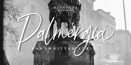 Palmergia is a modern handwritten font. With a classy and natural handwritten style, it brings a classy and chic typeface. Palmergia is best used for branding, logotype, and quotes. Includes: - Palmergia (OTF) Features: - Beautiful Ligatures - Stylistics Set - PUA Encoded - Multilingual Support - Numerals and Punctuation
 - Chalk Brush by Ditatype,
$29.00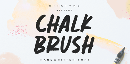 Chalk Brush is a Chalk brush font. With a playful and natural handwritten style, it brings a classy and chic typeface. Chalk Brush is best used for weddings, branding, logotype, and quotes. Includes: - Chalk Brush (OTF) Features: - PUA Encoded - Multilingual Support - Numerals and Punctuation
 - Charlie by Fype Co,
$16.00 Charlie is a contemporary and stylish display sans serif typeface. Charlie is made with inspiration from art deco style. Charlie works best for use in such as book titles, stationery designs, quotes, branding, logos, packaging designs, posters, and more. it's look classy and authentic!
 - Ellisea by cm5dzyne,
$10.00Ellisea (pronounced L-S-E) blends traditional letter shapes with straight lines to project a strong, unique image perfect for display purposes or medium-length text blocks. Ellisea is best used in printed material but is attractive in small sizes on screen as well. - Slash Signature by Din Studio,
$29.00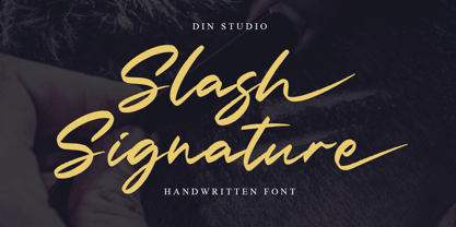 Slash Signature is a modern handwritten font. With a classy and natural handwritten style, it brings a classy and beautiful typeface. Slash signature is best used for branding, logotype, and quotes. Includes: - Slash Signature (OTF) Features: - Multilingual Support - Stylistics Set - PUA Encoded - Numerals and Punctuation
 - Pitchey Bloom by Din Studio,
$29.00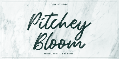 Pitchey Bloom is a modern handwritten font. With a classy and natural handwritten style, it brings a classy and beautiful typeface. Pitchey Bloom is best used for branding, logotype, and quotes. Includes: - Pitchey Bloom (OTF) Features: - Multilingual Support - Stylistics Set - PUA Encoded - Numerals and Punctuation
 - Mercearia Antique by PintassilgoPrints,
$12.00 Mercearia is a bold typestyle font, based on a 1944 Brazilian book about alphabets and letterings styles. Combining squarish letterforms and soft edges with a handcrafted feel, Mercearia is best suited for display sizes and works like a charm from 18pt and up. Try it!
 - Grogoth by Anomali Creative,
$19.00 Broken letters[1] (German: gebrochene Schrift literally "broken writing"; English: blackletter) or Gothic letters, also known as German letters, are the typeface used in Europe West from the 12th century to the 17th century. Meanwhile, Danish spoke it until 1875 and German, Estonian and Latvian spoke it well into the 20th century. Fracture is one of the broken typefaces that is often considered to represent the entire broken typeface. Broken letters are sometimes also called Old English, but not in the Old English or Anglo-Saxon sense that was born centuries earlier. This group of letters is so named because it contains Latin letters that have breaks in the curvature of the letters, either in part or in whole designs. The fracture arises from a sudden dip when writing certain parts of the letter. In contrast, letters with perfect, unbroken curves, such as Antikua, are created from smooth, flowing writing movements. Grogoth is a font inspired by the Blackletter typeface, made with a modern impression but still looks strong and unique. In addition, Young Best font is also supported with multilingual characters that can be used in several international languages. Grogoth font is very suitable for use in making music album cover designs, tattoo logos, wishkey labels, packaging pomades and so on which are made with dark and strong concepts. Thank you, and don't forget to check out our other products.
 - Maple Drive by Fenotype,
$25.00 Maple Drive is a bold rounded serif typeface with a warm and familiar feel built-in. Maple Drive delivers a recognizable nostalgic feeling polished for modern day use. Maple Drive works great as a logotype, in magazines, headlines, posters, advertising and packaging. As a product of the modern era, Maple Drive is fully equipped with plenty of OpenType goodness: Standard Ligatures are automatically on and they step in on certain letter combinations, such as ff and fi. In addition it has a wide range of, Stylistic, Swash and Titling Alternates as well as Discretionary Ligatures that you can trigger on or off from OpenType controls in any OpenType savvy program, or manually select the suitable variations from the character window. Try these alternates for more eloquent designs. Alternates are best to treat like you would treat a really strong spice: just a bit at a time. See the full range of the alternative glyphs on the specimen posters.
 - Bolton by Fenotype,
$18.00 Bolton is an ambitious font pack with three weights of script and serif and a pack of extras. Both script and serif fonts are designed with geometric shapes and same soft corners to fit together. Bolton Print is the same family with rough outline and wear-off texture. Bolton is a strong pack for creating catchy headlines and logotypes. With the whole family you can easily create a whole identity for your project. Bolton is great for branding, packaging and posters or any other kind of display use. Bolton Script has very high x-height that create very solid word shapes. Scripts are equipped with Standard Ligatures and Contextual Alternates to keep the flow. If you need flashier letters there’s a Swash Alternate for every basic character. Bolton can be purchased as a clean or textured family pack or for the best price as the complete family pack containing all versions of the font.
 - Victoria Smitters by Din Studio,
$29.00 It is critical to ensure that your design appearance represents the messages you deliver. However, it can be such a difficult task and time wasting to create a personal, lovely design. Therefore, Victoria Smitter is the answer to what you need. Victoria Smitter is a visually beautiful handwriting font which is perfect to show modern, elegant impressions in a personalized design to impress your customers and to make your messages more prominent than the others. It is designed in a cursive way in which the letters are connected to each other. Details on each letter and cursive wipes on the edges show high contrasts. Furthermore, this font is suitably applicable for big text sizes for better legibility. In addition, you can enjoy the available features here. Features: Stylistic Sets Ligatures Swashes Multilingual Supports PUA Encoded Numerals and Punctuations Victoria Smitter fits best for various design projects, such as brandings, posters, banners, invitations, greeting cards, magazine covers, quotes, printed products, merchandise, social media, etc. Find out more ways to use this font by taking a look at the font preview. Thanks for purchasing our fonts. Hopefully, you have a great time using our font. Feel free to contact us anytime for further information or when you have trouble with the font. Thanks a lot and happy designing.