10,000 search results
(0.039 seconds)
- Cristola Display by Masa Type,
$15.00 Cristola Display is a sophisticated ligature serif from us. This typeface has been made carefully to make sure its premium quality and luxury feel. The ligatures makes this typeface unique and stands out rather than the regular serif font. Very suitable for logo, headline, tittle, and the other various formal forms such as invitations, labels, logos, magazines, books, greeting / wedding cards, packaging, fashion, make up, stationery, novels, labels or any type of advertising purpose. Features : numbers and punctuation multilingual ligatures alternates PUA encoded We highly recommend using a program that supports OpenType features and Glyphs panels like many of Adobe apps and Corel Draw, so you can see and access all Glyph variations. Email us to masatype195@gmail.com if you need something! Happy Designing!
 - Sirba by TypeTogether,
$49.00 Sirba, a serif typeface family with a friendly personality, was conceived especially for the demands in complex text environments like dictionaries, academic texts, annual reports, novels and magazines. It has many design features that were particularly designed with Sirba’s purpose in mind. Because of its open counters, the large x-height and its short ascenders and descenders, this typeface conveys a pleasant reading experience and high legibility even in small sizes. Sirba is a low-contrast typeface, contemporary but with a classical touch, revealing its beauty in design details, such as the asymmetrical bottom serifs, curved bracketing and calligraphically reminiscent terminals. Furthermore, the capitals appear integrated into the text, thanks to the low cap height, and the constant width of all tabular numbers between the weights make this typeface very usable in annual reports and tables. Sirba is available in the four classic styles plus a special heavy (Black) version, which is particular in that its proportions are designed so the counters remain big enough when set in very small text sizes. This means that Sirba Black’s spacing and letter width are rather generous in comparison to other typefaces of that colour. This ensures excellent legibility. During the design of the typeface family, much attention was given to the italic and regular as counterparts of each other. The italic distinguishes itself just enough while reading without creating strange spots within the text when looking at the text as a whole.
 - Bilokos Pro by AukimVisuel,
$14.00 Bilokos Pro is a cool and modern display font. Designed by experts to make your design look out of this world, this font has the potential to take your creative ideas far. This is a condensed sans serif display font. On the one hand, it has rounded curves with very open terminals that make this font family elegant, user-friendly and contemporary and on the other hand very useful for writing titles in any medium. It also comes with stylistic variations of 0-9, A-Z and a-z to satisfy the most demanding professionals. It has OpenType features like full ligatures, tabular figures for tables, old style figures to elegantly insert numbers into your sentences. With its large character set, it meets the needs of professionals because it will support several languages of Western Europe, Eastern Europe, Central Europe, Greek and Cyrillic for international communication.
 - Horizon by Bitstream,
$29.99Horizon was inspired by the style of the lettering used in the original Star Trek TV series. Quite fittingly, this font was used 21 years later in the film Star Trek: Into Darkness. In keeping with the digital experimentation of the 90s, Horizon has a space-age look—with sharp, unexpected angles that were achieved sharply with digital tools. It was designed in 1992 by Bitstream staff designers. - Natalya by insigne,
$24.99 Natalya is a flashy and rhythmic script. The script has more space between characters than most for better legibility, and the basis point for the ornate swirls is the golden ratio. This makes for an especially harmonious typeface with timeless appeal. The typeface includes three alternates with variations of the ascenders and descenders. All three fonts include OpenType ligatures, oldstyle figures and ending swashes for an even more elaborate appearance.
 - Warna by IKIIKOWRK,
$19.00 Proudly present Warna - Bohemian Font, created by ikiiko. With a design that is both fun and retro-inspired, Warna perfectly embodies that character. The font in question moves to the beat of your imagination. Each figure has a distinctive, hand-crafted quality, as though they were lovingly and enthusiastically created on a worn-out journal from the 1960s. "Warna" is more than simply a typeface; it's a lively storyteller who tells old tales with a contemporary twist. Its vibrant and youthful appeal makes it ideal for branding with a bohemian or retro aesthetic. The letters serve as your artistic friends, encouraging you to express your ideas with bold strokes that evoke the liberation of a joyful party. This font is very suitable for making a bohomian stuff, vintage boho brand, poster, magazine layout, fashion design, quotes, or simply as a stylish text overlay to any background image. What's Included? Uppercase & Lowercase Numbers & Punctuation Multilingual Support Works on PC & Mac
 - Balance by Victory Type,
$12.00The three typefaces that make up the Balance font set are legible, funky and stylish. Every character has been spaced and designed on a uniform geometric grid to insure true typographic "balance." There are only two shapes that make up every character: a parallelogram and a quarter circle. This design renders Balance a distinct family of fonts which are appropriate for all documents. Balance Regular is legible, funky and stylish. Every character has been spaced and designed on a uniform geometric grid to insure true typographic "balance." There are only two shapes that make up every character: a parallelogram and a quarter circle. This design renders Balance Regular a distinct font that is appropriate for all documents. Balance Light is legible, funky and stylish. Every character has been spaced and designed on a uniform geometric grid to insure true typographic "balance." There are only two shapes that make up every character: a parallelogram and a quarter circle. This design renders Balance Light a distinct font that is appropriate for all documents. Balance Unicase is legible, funky and stylish. Every character has been spaced and designed on a uniform geometric grid to insure true typographic "balance." Each letter, in this unicase version of Balance uses a single character height. There are only two shapes that make up every character: a parallelogram and a quarter circle. This design renders Balance Unicase a distinct font that is appropriate for all documents. - Isabel by Letritas,
$30.00 Isabel was made out of necessity to create a new font for children and teenagers, that could be enough friendly and versatile for text in words or even easy-to- read long texts. The purpose of Isabel is to combine all the nice and friendly features of the simple letters that the teachers teach to the pupils at primary school, as they starting to learn to read, together with the normal editorial fonts we read every day. In this way it generates a very joyful serif font, or even friendly font, with some conservative aspects. In other words, Isabel is a font that, despite of being a “classic features” typography, is proud to show its innocent and ingenuous elements, this gives to the font a new point of view. The family is composed of 3 parts: the regular version, the italic version and the unicase version. Each one of them has 5 weights, 551 characters and is composed of 208 languages.
 - Eugenia by Phoenix Group,
$8.00 Eugenia is a font for display and poster needs. Each stroke reflects the strong nature of a woman who hates what she loves. This font is suitable for posters with the theme of art and enthusiasm. The name Eugenia reflects the glory and the figure who likes to do good, we hope that people who use this font can make something that is good for others.
 - Synthica by Volcano Type,
$35.00 Synthica is the advanced version of a geometrically constructed typeface – designed for a thesis project in summer 2010 in Pforzheim. In the context of electronic music and the profound analysis of its parameters, this typeface is primarly based on a strict modular grid. Additionally, the ascender, descender and the x height had slightly been increased in order to even out a visual difference in size between the glyphs. The name „Synthica“ dervives from a basic principle in electronic sound synthesis. Sinus, triangle and square are some of the basic waveforms in the synthesizers’ oscillator section and were thus used as geometric modules for the grid. The modularity and geometry also derive from different structures of electronic music. The strong emphasis on diagonal lines creates a rhythmic typeface that connotates electronic music patterns with highly recognisable glyphs. The contrast between digital and analog is another basic idea of this typeface: while Synthica Outline has a more synthetic and fragile character, the filled version Synthica Black serves as the analog counterpart.
 - Brohero by Alit Design,
$16.00 Presenting ⚔️The Brohero Typeface⚔️ by alitdesign. The Brohero font is inspired by action movie posters with the theme of war or knights in the Japanese Samurai. The bold character of The Brohero font is perfect for making hero movie titles, game titles, logotypes, t-shirt designs and so on with heroic themes. Apart from the regular font, the Brohero also has an italic style which makes the design more dynamic and cool. The Brohero font has alternatives that you can combine between swashes and symbols that have the theme of heroes and war. Besides that this font is very easy to use both in design and non-design programs because everything changes and glyphs are supported by Unicode (PUA). The Brohero Typeface has a total of 789 glyphs including symbol, multilingual. Language Support : Latin, Basic, Western European, Central European, South European,Vietnamese. In order to use the beautiful swashes, you need a program that supports OpenType features such as Adobe Illustrator CS, Adobe Photoshop CC, Adobe Indesign and Corel Draw. but if your software doesn't have Glyphs panel, you can install additional swashes font files.
 - Bunken Tech Sans Wide by Buntype,
$49.00 The Bunken Tech Sans superfamily: A reminiscence of constructed fonts of the modern age designed with considerably cleaner forms. •See other members of the Superfamily: Bunken Tech Sans •For further details, view the Specimen PDF. Bunken Tech Sans Wide follows in the best tradition of the straight-lined and somewhat angular structures of its predecessors while offering a much more open and mild design. The shapes of the letters are therefore reduced to the most essential elements: The spurs on a, b, n and other lower case letters occur just as little as decorative or style details, the lightly rounded inside edges are more pleasing to the eye than certain historic role models and make for a harmonic, flowing style. Use In particular Bunken Tech Sans Wide stands out as an easy, distinctive headline font with its straight-lined, technical design. Open counters and large x-height make it equally suited for use in shorter texts. It is also perfectly complemented by Bunken Sans or Bunken Slab in longer texts (available soon). Features Available in 16 styles with widths ranging from Light to Heavy with associated Italics. All of the styles are very extensive: Support for at least 58 languages, Small Capitals, 9 number sets (e.g. Lining, Oldstyle, Tabular and Small Cap Figures), ligatures, alternate characters, numerous Opentype functions, and lots of other small features that make it more pleasant to work with the font on a daily basis as well as fulfilling typographic desires. Each style contains more than 870 characters! Each style is available in a professional (Pro) standard (Std) and Small Caps (SC) edition with a different range of functions. (Language support, OpenType features and number of glyphs). Details can be found on the respective pages. Bunken Tech Sans Wide is part of the Bunken Tech superfamily and is available in Condensed, Normal and Wide. Also of interest: The slab serif variation Bunken Tech Slab Features in Detail: 16 Weights: -Light -Book -Medium -SemiBold -Bold -ExtraBold -UltraBold -Heavy and corresponding Italics 3 Widths: -Condensed -Normal -Wide Alternate Characters: A, E, F, L, S, e, f, t, s, y, etc. Small Capitals 5 Sets of Figures: -Lining Figures -Old Style Figures -Tabfigures -Old Style Tabfigures -Small Cap Figures Automatic Ordinals Automatic Fractions Extended Language Support and more...
 - BiIuend Vibes by Ridtype,
$50.00 This font is inspired by summer nuances that convey the long-awaited vacation of enjoying the summer atmosphere outdoors and spending time with friends, girlfriends, and family. This font was created to give the impression of a summer atmosphere as a digital form that can be implemented both for printing t-shirts, stickers, and supporting tools for graphic design needs that can represent a summer atmosphere.
 - Onick by Wordshape,
$- While researching the history of Onitsuka Tiger's branding and graphic design, I came across an odd, yet highly appealing piece of custom lettering on the company's ONICK ski boots from the 1970s. Reminiscent of aspects of the typeface Black-Out by Eli Carrico (released by my type foundry Wordshape), yet vertically compressed with razor-sliced counters and odd stencil element that makes up one of the legs of the "K", the ONICK lettering is a potential source for an intriguing modular font. I immediately thought of Ryoichi Tsunekawa as a potential collaborator to bring this piece of lettering to full-fledged life in the contemporary context. Based in Nagoya, Tsunekawa runs an independent type foundry called Dharma Type, including three specialized foundry sub-labels: Flat-It, devoted to display lettering; Prop-A-Ganda, a series of fonts inspired by and based on retro propaganda posters, movie posters, retail sign lettering & advertisements in the early 20th century; and Holiday Type, a series of decorative and retro scripts for holiday use. The past year has seen a flurry of notice of his work abroad, having been featured in both MyFonts' "Creative Characters" and YouWorkForThem's newsletter. As the work of most Japanese type designers is almost wholly unnoticed abroad, for Tsunekawa to be interviewed by two of the most popular type distribution companies in the world is definitely something beyond the norm. Perhaps it is because he works independently, or perhaps it is due to the charm and friendliness with which his typefaces are infused. Either way, this attention is both welcome and appreciated. Beyond mere charm, Tsunekawa's work is nuanced, detailed, and accessible due to its high level of finish. His fonts stand apart from his contemporaries in Latin typeface design in Japan due to his fascination with pop, vernacular and historical lettering from "non-pure" sources- whereas type designers like Kunihiko Okano and Akira Kobayashi have spent years analyzing the essence of Western letterform construction and unlocking the essence of Latin forms, Tsunekawa views surface and the awkward nature of his sources as being of value, as well. His irreverence for the formal doctrines of history imbue his typeface designs with a rugged inventiveness that would be missed by most- glyphs without source designs are guessed at and approximated, often in a manner wildly divergent from what Western eyes would assume. It is in these moments that I find sheer delight in Tsunekawa’s work and what make me most pleased to invite him aboard Neojaponisme and Onitsuka Tiger’s type development project. His assorted typefaces show an eclecticism in finish and as holistic systems- Tsunekawa's return email to me about the proposed type project showed a digital sketch of how a completed typeface family from the source lettering might look, rendered with an effortlessness and dedication to detail that belies a skilled craftsperson. Further development showed Tsunekawa’s rigor- the typeface in development rapidly featured glyphs ignored by many: a full set of fractions, Eastern European diacritics and accents, superior and inferior numerals, alternate characters, and custom ligatures - all designed with regulated, detailed spacing. ONICK is a typeface Tsunekawa should be proud of- an homage to a moment in history rendered in the absolute best fashion. We are proud to present it to the world! --Ian Lynam
 - TT Livret by TypeType,
$39.00 If you still think that an antiqua is a typeface with a strong historical character that difficult to apply in modern realities, meet the new typeface from TypeType! TT Livret is an elegant, modern and functional antiqua featuring a calm text and an expressive display subfamily. TT Livret useful links: Specimen | Graphic presentation | Customization options This font looks harmonious in books and other periodicals, on posters or on magazine covers. The scope is not limited to the printing industry, because TT Livret looks aesthetically pleasing wherever text is used. The text subfamily has uniwidth proportions and a calm spirit, oval round characters, free spacing and more open apertures. The glossy display subfamily is proportional and has round signs that are as close to a circle as possible, the apertures are closed, and the spacing is dense. The font has an intermediate subfamily - Subhead, which can look more relaxed when used as text font, or be contrasting and used as a display font. In TT Livret, we have embodied the idea of an antiqua that will be comfortable to use in modern realities. This is a functional font, where the text face does not distract from reading, and the display face, on the contrary, attracts attention. The TT Livret font family consists of 32 faces: 15 upright, 15 oblique, and 2 variable fonts. Each face has 1031 glyphs. The font contains 26 OpenType features, as well as a large number of ligatures. There are many alternative characters in italics, which are especially diverse in Cyrillic.
 - Dustine Script by Letterfreshstudio,
$14.00 Dustine script is an extraordinary and bold script, suitable for a large number of designs. This font has two styles, Regular and Italic. With two styles, you can choose according to the project that you are working on.
 - Breakfast by PizzaDude.dk,
$15.00 This is close to insane! My Breakfast font has got 8 (yes EIGHT!) different versions using contextual alternates! They cycle nice and easy AS you type! How cool is that?! Ofcourse, the font is also loaded with diacritics!
 - Adamantium by Comicraft,
$39.00Looking for sharp-looking characters in ferocious action? Then look no further than this font, originally designed by Senior Comicraftsman John Roshell for GHOST RIDER 2099. Adamantium has also been featured in WOLVERINE and THE UNCANNY X-MEN. - Home Style by FontMesa,
$25.00 Home Style is a revival of a very old font previously thought to have been designed by Joseph Gillé in or around the year 1820, however recent evidence from France suggests that an artist by the name of Silvestre from the same time period may be the true designer of this font. You may have seen this font in the past under the names of Circus, Roma, Madame and Gillé Classic. Originally designed in France, this very decorative font was only available in uppercase including numbers. Today this font has been re-mastered and updated with the addition of a newly designed lowercase set of letters. Home Style with its diagonal or cast shadow lines breaks away from the original design which has squared off shadows. If you're looking for the original version of this font please refer to the FontMesa version named Maison Luxe. New in 2016 for Home Style is an uppercase German Double S (versal eszett), opentype features including case sensitive forms and old style numerals.
 - Bloody Charm by PizzaDude.dk,
$20.00 Is it blood, melted ice, water or something slimy? Choose yourself, because Bloody Charm can be used for all purposed that needs something either scary or melting. I've added two versions: Regular and Drips. The Drips versions is (you may have guessed it already!) a bit more drippy than the regular version. Both versions uses contextual alternates, which in this case means that there is 3 different versions of all lowercase letters - and these automatically cycles as you type!
 - Torio by DSType,
$55.00 Our main purpose while developing this typeface was to reconstruct, in the most precise way, the first ten plates of the “Arte de Escribir”, in a chapter named “Enseñanza de la letra italiana, y sus principales variaciones, autores, sistemas, &c.”, dedicated to the analysis of the Italian Script. We decided by this plates because those are the few that don’t refer, directly or indirectly, to any author in particular. We strongly believe that these plates reflect the freedom of his very own calligraphy and are closely related to the calligraphic style that was a success among the spanish calligraphers: the Spanish Bastarda.
 - Bushwhacked NF by Nick's Fonts,
$10.00Central Type Foundry of St. Louis issued this quirky little gem under the name of Quaint Roman around the turn of the twentieth century. This version is a little less gnarly than the original, but retains all of its eccentric charm. - Basile by Tipo,
$85.00 Basile is the conclusion of a process that began with the learning of italic handwriting in a roballos-Naab studio course. In this workshop I developed a variation of chancery handwriting which had a more pronounced wider than its historical model. While making the digitalization, the forms were modified to obtain a similar spirit to the one in the handwriting, but thinking about the text in small sizes. Also incorporating three sets of forms enlarged the family: italic, swash and extra swash. And the addition of initials and terminals sets.
 - Close Together by Ingrimayne Type,
$9.00 Close Together was designed to alternate convex and concave letter sets, with convex letters on the upper-case keys and concave shapes on the lower-case keys. The OpenType feature of contextual alternatives (calt) does this automatically. Individually some of the letter shapes are strange and unsightly. They have the shapes that they have so that they fit snuggly with adjacent letters. The family has three weights: regular, bold, and extrabold. The letter spacing is set very tight and the user may want to loosen it by altering characters spacing. (Either the convex or concave set the letters can be used alone if the character spacing is adjusted.) The typeface has four OpenType stylistic sets of alternates, one for numbers and the others for letters D, T, and Y.
 - Auntie Pat by Hackberry Font Foundry,
$24.95 Auntie Pat is a new script font in my continuing objective of designing scripts that I can really use. Of course, I am looking for readability in booklets. In many ways, Auntie Pat is a very unusual script in that it has caps, lowercase, small caps with the appropriate figures for each case. This is font has all the OpenType features in the set for 2009. I didn't bother with the CE accents (though I can add them upon request). There are several ligatures for your fun and enjoyment: bb gg ff fi fl ffi ffl ffy fj ft tt ty Wh Th and more. Like all of my fonts, there are: caps, lowercase, small caps, proportional lining figures, proportional oldstyle figures, & small cap figures, plus numerators, denominators, superiors, inferiors, and a complete set of ordinals 1st through infinity. Enjoy!
 - ITC Jeepers by ITC,
$29.99Designer Nick Curtis found the inspiration for this typeface on a 1920s poster for a German bookseller, by Berlin poster artist Paul Scheurich. ITC Jeepers retains the spontaneity and playfulness of Scheurich's original lettering and adds a few surprises of its own, one being the somewhat exclamatory ear on the lowercase "g". It was, in fact, the excited look of this particular character that gave rise to the font's name. Not to be outdone, the exclamation point takes on an even more startling demeanor. The monoweight, slab serif design has a friendly personality, perfect for headlines and other display uses. - Gorgeous Angels by ErlosDesign,
$19.00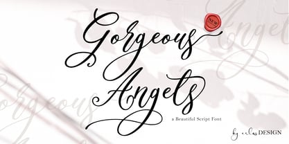 Gorgeous Angels - A Beautiful Script Font by erlosDESIGN Gorgeous Angels is a beautiful and magical modern calligraphy font, with characters that dance along the baseline. It has a casual, yet elegant touch. This font is PUA encoded which means you can access all of the glyphs and swashes with ease!
 - P22 Catalan by IHOF,
$24.95 Catalan is inspired by such influential artists as Antonio Gaudi, Joan Miro, and Salvador Dali with glimmers of the work of Jean Arp and Pablo Picasso. Surrealist shapes and motifs dance in this highly creative alphabet. This new design has a fresh immediacy that makes it perfect for festive occasions.
 - Nerve Brush by Create Big Supply,
$15.00 Invention is a sans serif brush font that has bold, strong, bold characters. This will add a very unique and powerful touch to your design. This font is PUA encoded which means you can access all the glyphs and sweeps easily Features: All Uppercase Numbers and punctuation Multilingual PUA Encoding
 - Sally Script BH by BluHead Studio,
$25.00Sally Script BH, is based on the handwriting of a BluHead friend. This fun design has a round, open feel which lends itself to conveying warm messages for that personal touch in all your cards, journals, etc. Plus, the character set includes support for many languages, along with some cool ligatures! - Miss You by Beary,
$15.00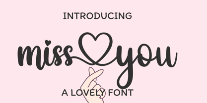 miss you is a romantic and sweet calligraphy typeface with characters that dance along the baseline. It has a casual, yet elegant touch. This font is PUA encoded which means you can access all of the glyphs and swashes with ease! Files Include : - Multilingual Support - Ligature Character - Alternates Character Thanks
 - Spyced by Essqué Productions,
$35.00 This stylized font was inspired by the personal style of the designer’s sister. It has a mixture of Gothic, Arabian, & Persian styles, with elements inspired by thorns and smoke. It can be ideal for projects that require an air of mystery or intrigue, or have an exotic or dangerous flare.
 - Bright Gabbemy Cyr Gr by Ira Dvilyuk,
$20.00 The Bright Gabbemy Cyrillic Greek is handwritten monoline signature script font and additional symbols font with extras. It is the font pair with will be the best option for branding, logos, wedding invitations, social media, packaging, business cards, DIY projects, social media, and many others. Bright Gabbemy Symbols is the font with 36 lovely hand-drawn flourishes and illustrations. Bright Gabbemy Cyrillic script font contains the Cyrillic and Greek glyphs too. Bright Gabbemy script Latin part contains a full set of uppercase letters and 2 full sets of lowercase letters, (standard, and final forms with flourishes or teils. To make a needed form just type a letter with a number such as a1, b1, c1...after that select the word and apply the Open Type Features in programs such as Adobe Illustrator, Photoshop, and others) And 53 ligatures - which can be used to create a handwritten calligraphy look. The Cyrillic part of the font contains uppercase letters and 2 full sets of lowercase letters, (standard, initial and final form. To make a needed form just type a letter with a number such as a1, б1 в1... After that select the word and apply the Open Type Features in programmes such as Adobe Illustrator, Photoshop, and others) Bright Gabbemy Symbols is a font with over 36 hand-drawn elements, floral illustrations, and swashes and can help to make your design unique and matchless. Combine and merge swashes and illustrations to create your own designs and make borders, frames, dividers, logos, and more (just use A-Z or a-z and 0-9 keys in the included Bright Gabbemy Symbols font). A different symbol is assigned to each uppercase or lowercase standard character, so you do not need graphics software, just type the letter you need. Multilingual Support for 33 languages: Latin glyphs for Afrikaans, Albanian, Basque, Bosnian, Catalan, Danish, Dutch, English, Estonian, Faroese, Filipino, Finnish, French, Galician, Greek, Indonesian, Irish, Italian, Malay, Norwegian Bokmål, Portuguese, Slovenian, Spanish, Swahili, Swedish, Turkish, Welsh, Zulu. And Cyrillic glyphs support Russian, Belorussian, Bulgarian, Ukrainian, and Kazakh languages.
 - Feel Script by Sudtipos,
$79.00 Feel Script is based on lettering that calligrapher and logo designer Rand Holub created for Intertype for his face Monterey. Fortunately, I didn’t have the technological limitations today that Intertype had back then. Holub’s lettering is presented in its entirety within Feel Script. Some letterforms were redrawn from vintage American magazine ads (some by Holub himself), along with many new alternates, ligatures, ending forms, and strangely beautiful character combinations. The experience I’ve accumulated from my previous calligraphy typefaces (Ministry Script, Affair, Buffet Script, Burgues Script, et al.) made it easier for me to apply Holub’s lettering in a new context using OpenType technology. The usual extended treatment was given to Feel Script, all the way into the implementation of three-letter ligatures and the dreamiest swashes I could imagine. I changed some of the connections between the lowercase letters in order to fit Holub’s calligraphy as opposed to the limited Intertype metal attempt. I hope you like Feel Script. I also hope what I contributed to this particular Holub design is somewhat of a happy ending to a calligraphy story that crosses many technologies. From the pen to computer Bézier. My part of this story stops here ... and yours begins. Feel Script has more than 1200 glyphs including: stylistic alternates, contextual alternates, titling alternates, swashes, and ligatures. Check out the PDF!
 - Rolling Brush by Ditatype,
$29.00 Rolling Brush is a script font that gives handwriting appearance with original and personal brush details. This font is made beautifully so that the letters are connected to each other, creating a continuous and flowing look. Each letter is attached to the previous letter and continues to the next letter, creating beauty in writing unity. This font shows brush details on each letter. Brush strokes displays a rough, organic texture to the edges of the letters, adding dimension and visual life. These details give a unique impression to this script font. On the other hand, even though it has a rough border, this script still maintains a natural and elegant aesthetic touch. Some letters may have dramatic twists, while others are simpler. This flexible shape creates an expressive and creative look to the lettering. Because it is designed with a rough border, it would be better if you use this font at a large text size so it is more easy to read. Enjoy the various features available in this font as well. Features: Alternates Ligatures Multilingual Supports PUA Encoded Numerals and Punctuations Rolling Brush is suitable for any designs that want to convey a warm, personal and alluring impression. You can use this font in the design of greeting cards, invitations, logos, labels, and many other design projects that want to create uniqueness through a natural, handwritten touch. Find out more ways to use this font by taking a look at the font preview. Thanks for purchasing our fonts. Hopefully, you have a great time using our font. Feel free to contact us anytime for further information or when you have trouble with the font. Thanks a lot and happy designing.
 - Grabnika Unix by DePlictis Types,
$46.00 Grabnika Unix is a unicase style typeface with a straight and a bit tall look and it has a residual influence of monospaced fonts. One of the major characteristics of this typeface are those sharp cuted ears and joints that appears repeating at some of the letters and gives him a distinctive personality and a minimalist design approach on other group of letters that creates an alternative interesting fill of the spaces. It is suitable for signage purpose and headlines or relatively short body texts and also for logo design and branding. It is a loud and fresh display that could give a certain distinctive and young personality to your designs. As a fun fact, the name of this font comes from the romanian word “grabnic” that means “fast” and I developed this font by chance as a custom lettering for a logo design project, so I saw it proper as an alternative in the actual wide font markets and I decide to finishing it as a multilingual support typeface. Enjoy!
 - Minnak by Esintype,
$18.00 Minnak, as a whole geometric display type is our take on Square Kufic (Makili) style Latin script fonts, comes in eleven weights with linear progression. It is an Uniwidth typeface at the core. From Hairline to Black, all multiplexed weights take up the same space in width and can be used interchangeably. Supports wide range of Open Type features, with many stylistic alternates in 12 context. Minnak is also have a close relation with pixel fonts, because in spite of its based on Makili forms, it all started as a pixel font in the drawing stage before further steps came into play. The key difference between Minnak and Makili style is that the latter must have the exact square counters with no diagonal strokes, and any other components of a letterform must conform to be proportional. Such style-specific requirements determine the overall dimensions of the glyphs and therefore, there can be only minor differences between the typefaces. In Minnak, counters are rectangular because of its narrow and condensed proportions, but the Makili form influence is still manifest. This impression is best confirmed with Medium weight where negative spaces and stem thickness are equal. Contrast and virtually no optical correction were presented, as characteristic of its genre had to have equal horizontal and vertical line thicknesses. As per the minimal and authentic look of the type, all glyphs are drawn as straight or only as 45-degree diagonal strokes. The representation of the ‘diagonalless’ approach is preserved by stylistic alternatives, making its similarity in visual aesthetics clearly visible. Marks and punctuation is another feature that doesn’t follow the strict rules of the origin style. Although not a pixel font, all building parts of the glyphs in Minnak share the same unit precision as they are designed with pixel equivalents in mind. Even space characters are designed to match glyph widths, meeting the demands of certain typesetting or multi-line lettering compositions. With its Pseudo Ancient and Runic alternates, extention parts and ornaments included in all weights, Minnak is suitable for branding, logo and monogram designs, the screen titles and headlines, packaging, posters, book covers and more, where it shines at big sizes. Its pixel font-like appearance makes it a significant choice for the modern compositions. Thanks to mostly uniform width design, it is possible to use Minnak also as a system for lettering. This feature can be used as vertical fitting of the letters between the lines. As a casual expression in Turkish, “Minnak” is one of the seven typeface designs in Esintype's ancient scripts of Anatolia project, Tituli Anatolian series — representing Seljuk period in the medieval Anatolia and their tradition of architectural stone ornamentation.
 - Soutumi by MYSTERIAN,
$9.00 SOUTUMI Features: 6 Ampersand options per weight Extended Latin characters 2 Pi symbols Capital and lowercase 'sharp S' Loathing the time it took me to complete the family for my personal freelance identity, Multipolar (& the first font I ever authored myself), I vowed to take the challenge of working within considerable record time. Soutumi was conceived of this challenge; it's vain purpose as such is more meaningful than the forms or any other semiotics that make up itself. Whereas Multipolar took me 9 months to complete, Soutumi was finished within the span of 3, and also sports three times more ampersand alternatives (as that theme was a running joke in Multipolar).
 - Broken Console by Arterfak Project,
$14.00 Proudly present "Broken Console", the geometric pixel font inspired by the old school game console which displaying pixel art in the game view. Broken Console created in 3 styles: Regular (one pixel), Bold (double pixels), and Shadow. This font is an all-caps font that is suitable for the contemporary era of graphic design nowadays. This font has a distinctive look in letterforms that makes it so unique, and suitable for specific themes like Techno, Digital, Retro, New Wave, Cyberpunk, Night, Gaming, Sporty, and much more! Font featured : All-caps alphabet Numbers Symbols & punctuation Multilingual support Thank you for visiting. Hope you like it!
 - Flank Steak by Mysterylab,
$17.00 This duo of handlettered-style vintage Americana fonts is a versatile package that can not only provide that subtle secret sauce that transports the viewer back 60 or 70 years to the neighborhood grocery store, it's also capable of conjuring up a very forward-looking and relaxed modern vibe. Whether it's the extra bold mid-century signpainter style of the sans serif, or the quick-brush liveliness of the casual script, you'll find this versatile pair is a real go-to for a variety of great looks.