10,000 search results
(0.034 seconds)
- New Prairie by Aboutype,
$24.99A modern text design with a medium x-height and short ascenders. The axis of the curves is inclined to the left in the Old Style tradition. New Prairie was kerned for text point sizes but requires subjective display kerning and compensation. - FlyHigh by Ingrimayne Type,
$12.95 FlyHigh is a decorative text face with slab serifs. It comes in eight styles: plain, semibold, bold, extrabold, italic, semibold italic, bold italic, and extrabold italic. Its low x-height makes it more appropriate for uses such as invitations than for book text.
 - Schism One by Alias,
$55.00 Schism is a modulated sans-serif, originally developed from our Alias Didot typeface, as a serif-less version of the same design. It was expanded to three sub-families, with the thin stroke getting progressively heavier from Schism One to Schism Three. The different versions explore how this change in contrast between thick and thin strokes changes the character of the letterforms. The shape is maintained, but the emphasis shifts from rounded to angular, elegant to incised. Schism One has high contrast, and the same weight of thin stroke from Light to Black. Letter endings are at horizontal or vertical, giving a pinched, constricted shape for characters such as a, c, e and s. The h, m, n and u have a sharp connection between curve and vertical, and are high shouldered, giving a slightly square shape. The r and y have a thick stress at their horizontal endings, which makes them impactful and striking at bolder weights. Though derived from an elegant, classic form, Schism feels austere rather than flowery. It doesn’t have the flourishes of other modulated sans typefaces, its aesthetic more a kind of graphic-tinged utility. While in Schism Two and Three the thin stroke gets progressively heavier, the connections between vertical and curves — in a, b, n etc — remain cut to an incised point throughout. The effect is that Schism looks chiselled and textural across all weights. Forms maintain a clear, defined shape even in Bold and Black, and don’t have the bloated, wide and heavy appearance heavy weights can have. The change in the thickness of the thin stroke in different versions of the same weight of a typeface is called grading. This is often used when the types are to used in problematic print surfaces such as newsprint, or at small sizes — where thin strokes might bleed, and counters fill in and lose clarity, or detail might be lost or be too thin to register. The different gradings are incremental and can be quite subtle. In Schism it is extreme, and used as a design device, giving three connected but separate styles, from Sans-Didot to almost-Grotesk. The name Schism suggests the differences in shape and style in Schism One, Two and Three. Three styles with distinct differences, from the same start point.
 - Schism Three by Alias,
$55.00 Schism is a modulated sans-serif, originally developed from our Alias Didot typeface, as a serif-less version of the same design. It was expanded to three sub-families, with the thin stroke getting progressively heavier from Schism One to Schism Three. The different versions explore how this change in contrast between thick and thin strokes changes the character of the letterforms. The shape is maintained, but the emphasis shifts from rounded to angular, elegant to incised. Schism One has high contrast, and the same weight of thin stroke from Light to Black. Letter endings are at horizontal or vertical, giving a pinched, constricted shape for characters such as a, c, e and s. The h, m, n and u have a sharp connection between curve and vertical, and are high shouldered, giving a slightly square shape. The r and y have a thick stress at their horizontal endings, which makes them impactful and striking at bolder weights. Though derived from an elegant, classic form, Schism feels austere rather than flowery. It doesn’t have the flourishes of other modulated sans typefaces, its aesthetic more a kind of graphic-tinged utility. While in Schism Two and Three the thin stroke gets progressively heavier, the connections between vertical and curves — in a, b, n etc — remain cut to an incised point throughout. The effect is that Schism looks chiselled and textural across all weights. Forms maintain a clear, defined shape even in Bold and Black, and don’t have the bloated, wide and heavy appearance heavy weights can have. The change in the thickness of the thin stroke in different versions of the same weight of a typeface is called grading. This is often used when the types are to used in problematic print surfaces such as newsprint, or at small sizes — where thin strokes might bleed, and counters fill in and lose clarity, or detail might be lost or be too thin to register. The different gradings are incremental and can be quite subtle. In Schism it is extreme, and used as a design device, giving three connected but separate styles, from Sans-Didot to almost-Grotesk. The name Schism suggests the differences in shape and style in Schism One, Two and Three. Three styles with distinct differences, from the same start point.
 - Schism Two by Alias,
$55.00 Schism is a modulated sans-serif, originally developed from our Alias Didot typeface, as a serif-less version of the same design. It was expanded to three sub-families, with the thin stroke getting progressively heavier from Schism One to Schism Three. The different versions explore how this change in contrast between thick and thin strokes changes the character of the letterforms. The shape is maintained, but the emphasis shifts from rounded to angular, elegant to incised. Schism One has high contrast, and the same weight of thin stroke from Light to Black. Letter endings are at horizontal or vertical, giving a pinched, constricted shape for characters such as a, c, e and s. The h, m, n and u have a sharp connection between curve and vertical, and are high shouldered, giving a slightly square shape. The r and y have a thick stress at their horizontal endings, which makes them impactful and striking at bolder weights. Though derived from an elegant, classic form, Schism feels austere rather than flowery. It doesn’t have the flourishes of other modulated sans typefaces, its aesthetic more a kind of graphic-tinged utility. While in Schism Two and Three the thin stroke gets progressively heavier, the connections between vertical and curves — in a, b, n etc — remain cut to an incised point throughout. The effect is that Schism looks chiselled and textural across all weights. Forms maintain a clear, defined shape even in Bold and Black, and don’t have the bloated, wide and heavy appearance heavy weights can have. The change in the thickness of the thin stroke in different versions of the same weight of a typeface is called grading. This is often used when the types are to used in problematic print surfaces such as newsprint, or at small sizes — where thin strokes might bleed, and counters fill in and lose clarity, or detail might be lost or be too thin to register. The different gradings are incremental and can be quite subtle. In Schism it is extreme, and used as a design device, giving three connected but separate styles, from Sans-Didot to almost-Grotesk. The name Schism suggests the differences in shape and style in Schism One, Two and Three. Three styles with distinct differences, from the same start point.
 - Brightwall by Din Studio,
$22.00 Brightwall is made with a natural brush. This texture will make your design more beautiful and powerful. This font is suitable for any design like branding, quotes, t-shirt printing and more. Features: Accents (Multilingual Characters) Many Alternates Extra Swashes PUA encoded Numerals and Punctuations (OpenType Standard)
 - ITC Newtext by ITC,
$40.99ITC Newtext was designed by Ray Baker, who created a well designed and legible typeface and built into it every design refinement which could optimize its usefulness. The expanded shapes are generous and legible and the economical vertical set results in more lines to the page. - Alessyia by Umbra95,
$15.00 Alessyia is a classic style typeface font. This font has classic but at the same time a fresh look. "Alessia family" includes 3 font types: Regular ( Classic and elegant with straight geometric lines ) Grunge ( Dirty and messy ) Retro ( Hand drawn brush font with an uneven texture )
 - Hadesz PRO by JOEBOB graphics,
$28.00 Hadesz is a lusty and playful font with a rough, brushy texture. It comes with an abundance of opentype features, which make for the handwritten authenticity one looks for in a handwriting font. Hadesz comes in two versions: Basic (without ligatures) and PRO (the complete set).
 - Wildstreet by Runsell Type,
$18.00 Wildstreet – Script Urban Street Style A natural script textured brush, matching for urban street themes. The features uppercase, lowercase, numeral, punctuation & symbol, ligatures, alternates, multilingual support, PUA encoded (fully accessible without additional design software). It inspires a handcrafted aesthetic that pairs so well with san serif display.
 - Sheepfold by Letterara,
$14.00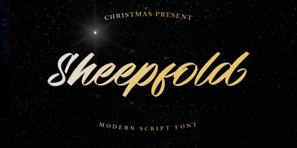 Sheepfold is a casual and natural handwritten font, with an incredibly friendly feel and a stunning brush texture. It is the perfect font for making original and outstanding designs. This font is PUA encoded which means you can access all of the glyphs and swashes with ease!
 - Glover by Fype Co,
$16.00 Glover is a Vintage Slab font available in regular and texture, it has styles a spooky, grungy, unique, covering a wide range of project types such as poster design, book covers, prints, headlines, magazines, packaging, branding. It will turn any design project into a true standout!
 - Arundel Sans by Rocket 88 Foundry,
$35.00 The design of Arundel Sans was inspired by Arundel Castle in West Sussex, England. It has a strong vertical emphasis, with a solid, geometric feel. It is a quirky mix of medieval and modern. Arundel Sans is ideal for use as a distinctive headline or display font.
 - PeterPierre by Ingrimayne Type,
$6.95 PeterPierre is a stiff, awkward sans serif face. It has little variation in stroke width and the vertical and horizontal elements are connected with short, sharp curves. The condensed style was developed first and then, in a quest for legibility, it was widened into the regular style.
 - Prestige 12 Pitch by Bitstream,
$29.99Limited to a single width for all characters and a rough image transferred through a ribbon to the paper, in 1953 Clayton Smith at IBM, Lexington, adapted the classical serifed letterform to this difficult medium to obtain a typewriter face of good readability and interesting texture. - Silverway by KA Designs,
$14.00 Silverway is a mix of fun and elegance - with a unique take on modern calligraphy. This font has a strong brush texture, making all of your projects looking handwritten! Silverway is perfect for all modern projects, headings, branding, logos, advertisements, bloggers, business cards, social media and more!
 - Britannic by Linotype,
$40.99Britannic is a sans serif face with a vertical axis and a high degree of stroke contrast, especially in the heavier weights. This typeface exudes a degree of elegance that has not often been matched during the Century that has passed since it was first drawn. - Horror Monster by Yoga Letter,
$18.00 "Horror Monster" is a scary horror font. It has a writing texture with small holes in each letter. This font is equipped with uppercase, lowercase, numerals, punctuation, and multilingual support. This font is perfect for posters, banners, stickers, Halloween, horror movie titles, action movies, and more.
 - Paisu Howard by Realtype,
$17.00 Paisu Howard is a Comics fonts was creating with a brush pen. Friendly-looking, it is inspired by the lettering of the comics typeface with an adventurous and humorous font-style. It is chunky, marked and brush textured. This fonts created to make an freestyle of design.
 - Kohler by Hustle Supply Co,
$16.00 Köhler Köhler is a Condensed Headline Type Family. Köhler comes complete with 6 OTF files. Regular, Rough, Clean & Textured with Oblique counterparts. Köhler is a super condensed typeface with a vintage aesthetic but also doubles as a great modern typeface depending on the final use. Thank you!
 - Asia Impact by Gleb Guralnyk,
$14.00 Introducing a conceptual script font: Asia Impact. It's a brush handwritten typeface inspired by asian traditional calligraphy. Each letter has two shapes versions for uppercase and lowercase characters. It works both in horizontal and vertical orientation. Asia Impact is perfect for tattoo design and authentic eastern lettering.
 - Ruddy by Inhouse Type,
$33.32 Ruddy is a display sans serif type family. It has a playful and mischievous presence. Exaggerated geometry and varied vertical character stem placement contribute to its animated appearance. Ruddy comes in 4 weights with matching italics. OpenType features include Contextual Alternates, Tabular Figures, Fractions, Numerators and Denominators.
 - Nowie Vremena by ABSTRKT,
$30.00Nowie Vremena is a sequel to a previously released Vremena Grotesk, a sans serif typeface, inspired by Arial’s apalling combination of grubby tidiness. The sequel travels back in time and explores Arial’s elder brothers and some 19th century sans serifs, through initial concept of hectic neutrality. - Front Lines by Gassstype,
$27.00 Hello Everyone, introduce our new product Font Frontlines This Is All Caps Sporty Font.This is a Textured Natural Style and classy style with a clear style and dramatic movement. This font Frontlines is great for your next creative project such as logos, printed quotes, invitations, cards, product .
 - Raverist by Gassstype,
$27.00 Hello Everyone, introduce our new product Font Raverist This Is Modern Sport Display Font.This is a Textured Natural Style and classy style with a clear style and dramatic movement. This font Raverist is great for your next creative project such as logos, printed quotes, invitations, cards.
 - Arco Crayon by Okaycat,
$29.95 Real crayons were used in the making of this font. Yes, design can be fun again! Need to create the textured look of crayon, chalk, conte, or charcoal? Use Arco Crayon. Arco Crayon is extended, containing West European diacritics & ligatures, making it suitable for multilingual environments & publications.
 - Angelicy by Stringlabs Creative Studio,
$25.00 Angelicy is a script font with textured hand brush style. The Angelicy font made with digital hand brush pen strokes that making this font look authentic and unique concept. This font is perfect for fashion brand, wedding invitation, business card, logo brand, and then calligraphy project.
 - Tegar by Gassstype,
$29.00 Hello Everyone, introduce our new product Font TEGAR This Is Modern Bold Display Font.This is a Textured Natural Style and classy style with a clear style and dramatic movement. This font TEGAR is great for your next creative project such as logos, printed quotes, invitations, cards, product
 - Naname Kun by Julmeme,
$15.00 Naname Kun is a geometric typeface created with oblique lines as a main texture. Its unique particularity is to be filled with diagonal hatching that varies in thickness to create different styles and weights. Applicable for any type of graphic design, especially for posters and logotypes.
 - Polina by GRIN3 (Nowak),
$16.00Polina (previously named Dobra) is a handmade, layered type family which includes several textures and shadows. Different font types can be created using various combinations of Polina fonts and colors. Language support includes Western, Central and Eastern European character sets, as well as Baltic and Turkish languages. - Jhoiboy by OCSstudio,
$12.00 Jhoiboy is a casual grunge texture with many variations of font shapes to create a perfect and unique design. Jhoiboy has 8 alternatives, 7 alternatives for lowercase letters and 1 alternative for uppercase letters, along with ligature and multi-lingual support that will match your desires.
 - Black Panther by Gatype,
$12.00 Black Panther is textured brush font, a contemporary approach to design, with a handmade natural and irregular baseline. Suitable for use in title design. Such as apparel, invitations, book tittles, stationery design, quotes, branding, logos, greeting cards, t-shirts, packaging design, posters and more. Designers: khaidir
 - Hadesz BASIC by JOEBOB graphics,
$17.00 Hadesz is a lusty and playful font with a rough, brushy texture. It comes with an abundance of opentype features, which make for the handwritten authenticity one looks for in a handwriting font. Hadesz comes in two versions: Basic (without ligatures) and PRO (the complete set)
 - La Carte Pen by AVP,
$19.00 La Carte Pen is a paper textured version of the popular La Carte font. Inspired by a series of handwritten menus produced in 1980, La Carte is a stylish but easy-to-read script that sets as well in body copy as it does in headlines.
 - Gambino by Monotype,
$15.99 Childlike, sure; utterly affable, yes, but ultimately actually very cool. Yup, that’s Gambino. This chalky, super textured, semi connected script is a kooky playground pal and a grown-up technically savvy typeface all rolled into one. Upright yet tumbling, these simple, crayon-like letterforms are a delight.
 - Oggie Marker by Dear Sue,
$15.00 Oggie Marker is a hand drawn thick marker display font with a textured edge. It has a raw but whimsical feel, which makes it perfect for posters, signage, menus, comics and toys/ product/ packaging for kids. Try it on themes of summer, Halloween, camping/ outdoors, and more!
 - Tisha by Epiclinez,
$18.00 Tisha is an authentic brush display font. It has a bold, rough texture and as a result, it makes each of your creative designs stand out. So what's included : Basic Latin A-Z & a-z Numbers, symbols, and punctuations Swashes and ligatures Accented Characters : ÀÁÂÃÄÅÆÇÈÉÊËÌÍÎÏÑÒÓÔÕÖØŒŠÙÚÛÜŸÝŽàáâãäåæçèéêëìíîïñòóôõöøœšùúûüýÿžß Thank you
 - Oliver Label by Jen Wagner Co.,
$12.00 Oliver Label solves a problem many creatives face – the endless search for a realistic pencil-textured font to add handwritten notes to images, quotes, blog posts, and more without having to do it themselves. With Oliver Label, you can easily add handwritten notes to your images! BIGGEST BENEFITS: Vector pencil texture 26 hand drawn elements so your quotes look beautiful and custom No more wasted time trying to add your own notes and handwritten feel to your work (or worrying about your handwriting!) INFO: Oliver Label Regular: A textured vector font that works with any Desktop application (Word, Photoshop, Canva, etc.). Includes ligatures ll, ss, and tt. Oliver Label Alternates: 'Alt' version of Oliver Label, where you'll get a whole new set of letters and numbers. This way, you can swap out regular letters for the alternates when you have two of the same letters close to one another (i.e. oo or bb) to look as realistic as possible. Includes ligatures ll, ss, and tt. Oliver Label Drawn: You'll also get 26 different hand-drawn shapes to add to quotes and graphics. Non-English support for the international designer
 - MVB Diazo by MVB,
$59.00 Mundane information—the sort you might ignore—often appears in the form of very simple, utilitarian lettering, devoid of personality, the sort of industrial lettering you find on old blueprints, park restrooms, and electrical boxes. MVB Diazo is such a thing. It looks like lettering done earnestly with a plastic template. The monoline caps—constructed from straight lines and simple curves—have rounded details as if rendered by a blunt pen on a topographical survey or by a router on a rustic campground sign. The MVB Diazo fonts are compact, available in two widths: Condensed and Extra Condensed. Each width offers four weights from Light to Black. The fonts are perfect for wherever plain and boring letterforms are required. All widths and weights are also available in two distressed textures (#1 and #2) that accentuate the industrial character of the design. Rough #1 is gritty, with finer texture for use at larger sizes. Rough #2 exhibits more damage, the roughness apparent when used at smaller sizes. The Rough fonts include alternates of a number of glyphs so that variation of texture is possible when letters repeat in a word.
 - Aure Wye by Aure Font Design,
$23.00 Aure Wye wraps a carefree dispassion with the dignity of tradition. The precise engraving and organic finials of these decorative serif forms engage the reader with a subtext of elegance. Wye brings an unpretentious grace to titles and drop-caps and provides dignity to astrological expressions and chartwheels. In Regular, Wye presents a formal presence; in Italic, Wye offers a more romantic feel. Its small-caps add a stately variety to Wye's typographic textures. Wye is an original design developed by Aurora Isaac. After more than a decade in development, 2018 marks the first release of the CJ and KB glyphsets, now available in regular and italic. The CJ glyphset is a full text font supporting a variety of European languages. A matching set of small-caps complements the extended lowercase and uppercase glyphsets. Supporting glyphs include standard ligatures, four variations of the ampersand, and check-mark and happy-face with their companions x-mark and grumpy-face. Numbers are available in lining, oldstyle, and small versions, with numerators and denominators for forming fractions. Companion glyphs include Roman numerals, specialized glyphs for indicating ordinals, and a variety of mathematical symbols and operators. The CJ glyphset also includes an extended set of glyphs for typesetting Western Astrology. These glyphs are also available separately in the KB glyphset: a symbol font re-coded to allow easy keyboard access for the most commonly used glyphs. Aure Wye will stand up as a text font, but for extended text, try pairing Wye with its close cousin, Aure Declare. Used in titles and drop-caps, Wye will provide a striking elegance that will blend well with the serifed forms of Declare. Give Aure Wye a trial run! You may discover a permanent place for this font family in your typographic palette. AureFontDesign.com