10,000 search results
(0.202 seconds)
- Combi by AVP,
$25.00 The Combi collection includes Sans, Sans Oblique, a true Italic, Serif, Serif Oblique and a set of Openface capitals. Combi fonts have 5 compatible weights and metrics allowing them to be used in free combination. Inspiration came from Jan Van Krimpen’s 'Romulus' (Enschedé, 1931). In addition to the Roman style, Van Krimpen created a set of open capitals, a simple oblique variant and subsequently, an attractive calligraphic italic, Cancelleresca Bastarda. In addition to Van Krimpen’s idea, Combi has been influenced by features from many faces including Bembo, Melior and Optima. The object was to create a versatile family of body text and titling faces for use in books, magazines and on the web. Glyphs are available for most Latin based languages and all text fonts include small caps, proportional numerals and other Opentype features.
 - Edith by Dominik Krotscheck,
$12.00 Edith is a handmade serif typeface that can be used for long texts. To make it even better suitable, it is equipped with all the major features you’d expect from a traditional text-font, such as case sensitive forms, old style figures (lining figures are accessible via an opentype feature), fractions and good kerning. To keep up the handwritten appearance, two versions of each letter (A-Z & a-z with diacritics) and number are available and substituted automatically if the same ones meet. Edith is also nice to look at in larger sizes and therefore a great fit for any packaging, advertisement or headline. Edith is for you, if you plan on doing childish things, DIY things, traditional things, illustrated things, nautical things, grungy things or any handmade related things.
 - Rhodes by Eurotypo,
$19.00 Rhodes is a modern geometric sans serif consisting of 5 weights ranging from Extra Light to Bold with matching true italics. Its variety of weights provide a range of choices that will help you find the best typographic color for your project. Lighter weights are well-suited for body text while heavier ones are ideal for high impact headlines. Rhodes has been designed purposely to enable brands to appeal more emotionally to modern consumers. The balanced characteristic of Rhodes with unique details, such as the geometric form and the prominent x-height makes it perfect for strong headlines and outstanding logos, but also suitable for long text. Rhodes includes a set of ornaments in regular and italic to be able to combine it with the glyphs and thus, to give your designs more exclusivity.
 - Symbojet by SIAS,
$56.00 Symbojet is the first professionally designed font equally covering alphabetic and pictographic characters on a large-scale scheme. It’s typographically based on Andreas Stötzner’s recent “Lapidaria” design and uses brandnew standard Unicode-6.0 codepoints for about 340 symbol characters. Use Symbojet for combined text/signage composing to design wayfinding, tourism and leisure, sports and transport matters, for media and communication, for birthday invitations or bistro menu cards … With Symbojet the combined usage of text and signage becomes as easy and elegant as it has never been before. Symbojet is available in a Regular and a Bold version. Both fonts contain about 340 alphabetic (full Latin and Greek) and 400 pictographic characters; in total they count about 1000 glyphs each. The pictographic content is the same in both fonts.
 - Roadhouse by Kimmy Design,
$10.00 Roadhouse is a layering typeface family that is part of the greater Evanston type collection, which is inspired by American typefaces commonly used at the turn of the century leading up to Prohibition. Roadhouse reflects the style of lettering used on tavern signage and printed ephemera during the early 20th century. The family comes with 31 layering fonts, from top layers like bevels, highlights, stripes, outlines, as well as extruding and drop layers. It also includes 2 script fonts, upright and oblique, as well as 9 complimentary text fonts for smaller text settings. Either get the entire family of extrusions, bevel angles or the basic family with ready to use fonts that don’t need to be layered. Roadhouse is a great display typeface for logos, branding, packaging, and advertising.
 - Aure Declare by Aure Font Design,
$23.00 Aure Declare officiates with dignity and dispassion. These traditional serif forms engage the reader with a no-nonsense subtext of reliability. Declare’s capacity to showcase the message rather than the medium brings a welcome legibility to extended text and a formal assertion to astrological expressions and chartwheels. Declare is an original design developed by Aurora Isaac. After more than a decade in development, 2018 marks the first release of the CJ and KB glyphsets in regular, italic, bold, and bold-italic. The CJ glyphset is a full text font supporting a variety of European languages. A matching set of small-caps complements the extended lowercase and uppercase glyphsets. Supporting glyphs include standard ligatures, four variations of the ampersand, and check-mark and happy-face with their companions x-mark and grumpy-face. Numbers are available in lining, oldstyle, and small versions, with numerators and denominators for forming fractions. Companion glyphs include Roman numerals, specialized glyphs for indicating ordinals, and a variety of mathematical symbols and operators. The CJ glyphset also includes an extended set of glyphs for typesetting Western Astrology. These glyphs are also available separately in the KB glyphset: a symbol font re-coded to allow easy keyboard access for the most commonly used glyphs. In addition to Aure Declare’s versatility as a text font, Declare pairs well as a no-nonsense foil to any decorative design. Aure Sable, for example, will shine all the more beside Declare’s practicality. Aure Declare pairs especially well with its close cousin, Aure Wye. Wye’s decorative forms provide elegant titles and drop-caps for Declare’s extended text. Give Aure Declare a trial run! You may discover a permanent place for this font family in your typographic palette. AureFontDesign.com
 - FS Sally by Fontsmith,
$80.00 Bookish A little bit bookish, but quietly elegant and well-proportioned, FS Sally is a graceful font family. It’s a refreshingly uncomplicated design that brings sophistication to text and display type, and a distinctive aplomb to both large and small volumes of text. Hidden talents There’s more to FS Sally than meets the eye. Choose Standard for the Latin alphabet or Pro if you work with Cyrillic and Greek typography. There’s a large range of special features, including elegant small caps and a set of discretionary ligatures to add a traditional flavour to figures and fraction sets. Rhythmic There’s a rhythm and flow to FS Sally – the result of the classic but asymmetric design of its serifed feet and shoulders. The inward curve of the serif at the shoulder and the outward curve at the foot subliminally guide the eye through each letterform, and the flicked feet of the “a”, “d” and “u” add an extra kick of energy to the rhythm. The italic forms have their own flow, too, with a pen-like fluency that retains the formal discipline required for a text type. Regular to heavy FS Sally’s five weights, all with italics, cover every kind of print application. The regular weight is elegant in display and an easy read in longer texts. A subtle step up from the regular is the medium, which was created to deliver a stronger colour and finish in poorer printing conditions. The semibold offers a strong alternative to the regular at smaller sizes, and its intermediate feel suits it to sub-headings, title pages and calmer designs. The bold works excellently in book and title headings, and FS Sally Heavy lends weight and punch to poster headlines and logotypes.
 - FS Sally Paneuropean by Fontsmith,
$90.00Bookish A little bit bookish, but quietly elegant and well-proportioned, FS Sally is a graceful font family. It’s a refreshingly uncomplicated design that brings sophistication to text and display type, and a distinctive aplomb to both large and small volumes of text. Hidden talents There’s more to FS Sally than meets the eye. Choose Standard for the Latin alphabet or Pro if you work with Cyrillic and Greek typography. There’s a large range of special features, including elegant small caps and a set of discretionary ligatures to add a traditional flavour to figures and fraction sets. Rhythmic There’s a rhythm and flow to FS Sally – the result of the classic but asymmetric design of its serifed feet and shoulders. The inward curve of the serif at the shoulder and the outward curve at the foot subliminally guide the eye through each letterform, and the flicked feet of the “a”, “d” and “u” add an extra kick of energy to the rhythm. The italic forms have their own flow, too, with a pen-like fluency that retains the formal discipline required for a text type. Regular to heavy FS Sally’s five weights, all with italics, cover every kind of print application. The regular weight is elegant in display and an easy read in longer texts. A subtle step up from the regular is the medium, which was created to deliver a stronger colour and finish in poorer printing conditions. The semibold offers a strong alternative to the regular at smaller sizes, and its intermediate feel suits it to sub-headings, title pages and calmer designs. The bold works excellently in book and title headings, and FS Sally Heavy lends weight and punch to poster headlines and logotypes. - FS Kim by Fontsmith,
$80.00 Unconventional beauty FS Kim is bold and intriguing – exuberant and unmissable, but playing a supporting role when needed. This typeface shines brightest as a display font, and is perfect for applications across fashion, theatre, cultural projects and pretty much any brand that wants to make a statement. While FS Kim is dramatic, it’s incredibly versatile, too, and works to showcase content in a stylish, striking way. This font makes you look, and makes you curious – perfect for brands and publishers that relish unconventional beauty. A playful text version While FS Kim’s text version is more constrained than the display, the strength and playfulness remain. Modifications for the text version include larger x-heights, longer ascenders and descenders, wider proportions and spacing, longer and more defined serifs and a lower contrast. “The overall idea is that it’s not an optical size,” Radoeva explains. Text and display maintain a strong connection that mean they can be used together. A display with a twist The calligraphic starting point helped to create familiar forms, while a contemporary display feel is achieved through short wedge serifs, with bold touches added through the font’s exaggerated forms and details. FS Kim’s narrow proportions, short ascenders and descenders, and tighter spacing make the font suitably compact for display use. The overall aesthetic feels bold and sharp, but closer inspection reveals that all the corners are softened. Decorative inlines In an unusual twist, FS Kim’s display version was first drawn using a broad-nib pen to create familiar forms and elegance while still breaking from serif traditions and making it all about standout character. There are also two additional styles, based on the Regular and Black with inlines – in uppercase, figures and symbols. The inline brings an extra option for an even stronger, more decorative display use.
 - Aure Teddy by Aure Font Design,
$23.00 Aure Teddy emanates the trusting tenderness of a favorite teddy bear. The hand-penned look of these forms engages the reader with a subtext of comfort. Teddy is delightfully legible as a text font and works well where a more organic look is wanted. It brings an unassuming charm to text and titles and a welcome empathy to astrological expressions and chartwheels. Its engaging charcter serves well in labeling diagrams and personalizing nametags. Teddy is an original design developed by Aurora Isaac. After more than a decade in development, 2018 marks the first release of the CJ and KB glyphsets in regular, italic, bold, and bold-italic. The CJ glyphset is a full text font supporting a variety of European languages. A matching set of small-caps complements the extended lowercase and uppercase glyphsets. Supporting glyphs include standard ligatures, four variations of the ampersand, and check-mark and happy-face with their companions x-mark and grumpy-face. Numbers are available in lining, oldstyle, and small versions, with numerators and denominators for forming fractions. Companion glyphs include Roman numerals, specialized glyphs for indicating ordinals, and a variety of mathematical symbols and operators. The CJ glyphset also includes an extended set of glyphs for typesetting Western Astrology. These glyphs are also available separately in the KB glyphset: a symbol font re-coded to allow easy keyboard access for the most commonly used glyphs. Aure Teddy fills a unique niche, being a modestly decorative font as well as a competant text font. Like Aure Jane, Aure Teddy serves well paired with the decorative touches of Aure Brash and Aure Sable. Give Aure Teddy a trial run! You may discover a permanent place for this font family in your typographic palette. AureFontDesign.com
 - FS Kim Variable by Fontsmith,
$349.99Unconventional beauty FS Kim is bold and intriguing – exuberant and unmissable, but playing a supporting role when needed. This typeface shines brightest as a display font, and is perfect for applications across fashion, theatre, cultural projects and pretty much any brand that wants to make a statement. While FS Kim is dramatic, it’s incredibly versatile, too, and works to showcase content in a stylish, striking way. This font makes you look, and makes you curious – perfect for brands and publishers that relish unconventional beauty. A playful text version While FS Kim’s text version is more constrained than the display, the strength and playfulness remain. Modifications for the text version include larger x-heights, longer ascenders and descenders, wider proportions and spacing, longer and more defined serifs and a lower contrast. “The overall idea is that it’s not an optical size,” Radoeva explains. Text and display maintain a strong connection that mean they can be used together. A display with a twist The calligraphic starting point helped to create familiar forms, while a contemporary display feel is achieved through short wedge serifs, with bold touches added through the font’s exaggerated forms and details. FS Kim’s narrow proportions, short ascenders and descenders, and tighter spacing make the font suitably compact for display use. The overall aesthetic feels bold and sharp, but closer inspection reveals that all the corners are softened. Decorative inlines In an unusual twist, FS Kim’s display version was first drawn using a broad-nib pen to create familiar forms and elegance while still breaking from serif traditions and making it all about standout character. There are also two additional styles, based on the Regular and Black with inlines – in uppercase, figures and symbols. The inline brings an extra option for an even stronger, more decorative display use. - FS Brabo Paneuropean by Fontsmith,
$90.00Worldly Even though it’s a new arrival, FS Brabo has seen the world. Designed by a Brazilian working in London and studying in Belgium under a Dutchman, it’s certainly well-travelled. And it was inspired by the extraordinary archive of early book typefaces at the world-renowned Plantin-Moretus Museum in Antwerp, while Fernando Mello was attending Frank Blokland’s Expert class Type Design course at the Plantin Institute of Typography. It was there that Fernando became engrossed in the collection of early metal type, matrices, punches and type samples by figures such as Garamond and Granjon. So much so that he took on the mighty task of developing ‘a beautiful, functional, serifed text font’ of his own. Heroic FS Brabo’s journey from sketch to font family took an epic three years, starting in Antwerp, continuing at Fontsmith in London, and reaching its conclusion back in Fernando’s home city of São Paulo. No wonder Fernando was reminded of another titanic face-off: that of Antwerp’s Roman hero of legend, Silvius Brabo, and the evil ogre, Antigoon. Brabo came to the town’s rescue after the tyrannical giant had been charging ships’ captains extortionate taxes and chopping off the hands of those who refused to pay up. Having finally downed Antigoon after a long and terrible duel, Brabo cut off the giant’s own hand and threw it into the river Scheldt, unwittingly giving the town its name: the Dutch for ‘hand-throw’ is hand werpen. What better way for Fernando to name his literary typeface than after the hero of Antwerp’s oldest tale? The garalde factor FS Brabo is not a revival, but a very much a contemporary, personal interpretation of a garalde – a class of typeface originating in the 16th century that includes Bembo, Garamond and Plantin, with characteristically rounded serifs and moderate contrast between strokes. Brabo’s ‘ct’ and ‘st’ ligatures, upper-case italic swashes and contextual ending ligatures – ‘as’, ‘is’, ‘us’ – all preserve the beauty and character of traditional typefaces, but its serifs are chunkier than a garalde. Their sharp cuts and squared edges give them a crispness at text sizes, helping to bring a beautifully bookish personality to hardworking modern applications. A workhorse with pedigree It may give the appearance of a simple, four-weight typeface, but FS Brabo has hidden depths beneath its simplicity and beauty. OpenType features such as cap italic swashes, contextual ending swashes – programmed only to appear at the end of words – and stylistic alternatives make this a complete and well-equipped typeface. Comprehensive testing was carried out at text and display sizes, too, to prevent counters from filling in. All of which makes FS Brabo a very modern take on a traditional workhorse serif typeface: colourful and versatile enough to adorn not just editorial projects but also signage, advertising and logotypes. - FS Brabo by Fontsmith,
$80.00 Worldly Even though it’s a new arrival, FS Brabo has seen the world. Designed by a Brazilian working in London and studying in Belgium under a Dutchman, it’s certainly well-travelled. And it was inspired by the extraordinary archive of early book typefaces at the world-renowned Plantin-Moretus Museum in Antwerp, while Fernando Mello was attending Frank Blokland’s Expert class Type Design course at the Plantin Institute of Typography. It was there that Fernando became engrossed in the collection of early metal type, matrices, punches and type samples by figures such as Garamond and Granjon. So much so that he took on the mighty task of developing ‘a beautiful, functional, serifed text font’ of his own. Heroic FS Brabo’s journey from sketch to font family took an epic three years, starting in Antwerp, continuing at Fontsmith in London, and reaching its conclusion back in Fernando’s home city of São Paulo. No wonder Fernando was reminded of another titanic face-off: that of Antwerp’s Roman hero of legend, Silvius Brabo, and the evil ogre, Antigoon. Brabo came to the town’s rescue after the tyrannical giant had been charging ships’ captains extortionate taxes and chopping off the hands of those who refused to pay up. Having finally downed Antigoon after a long and terrible duel, Brabo cut off the giant’s own hand and threw it into the river Scheldt, unwittingly giving the town its name: the Dutch for ‘hand-throw’ is hand werpen. What better way for Fernando to name his literary typeface than after the hero of Antwerp’s oldest tale? The garalde factor FS Brabo is not a revival, but a very much a contemporary, personal interpretation of a garalde – a class of typeface originating in the 16th century that includes Bembo, Garamond and Plantin, with characteristically rounded serifs and moderate contrast between strokes. Brabo’s ‘ct’ and ‘st’ ligatures, upper-case italic swashes and contextual ending ligatures – ‘as’, ‘is’, ‘us’ – all preserve the beauty and character of traditional typefaces, but its serifs are chunkier than a garalde. Their sharp cuts and squared edges give them a crispness at text sizes, helping to bring a beautifully bookish personality to hardworking modern applications. A workhorse with pedigree It may give the appearance of a simple, four-weight typeface, but FS Brabo has hidden depths beneath its simplicity and beauty. OpenType features such as cap italic swashes, contextual ending swashes – programmed only to appear at the end of words – and stylistic alternatives make this a complete and well-equipped typeface. Comprehensive testing was carried out at text and display sizes, too, to prevent counters from filling in. All of which makes FS Brabo a very modern take on a traditional workhorse serif typeface: colourful and versatile enough to adorn not just editorial projects but also signage, advertising and logotypes.
 - Portaso by Larin Type Co,
$12.00 PORTASO This is a vintage display font inspired by signage, logos in the style of the wild west of the old time. This is a great find for creating logos, various kinds of designs in vintage and wild West style. Portaso font family has only Capital letters and alternates to them. Also the Stamp style has a different texture for upper and lowercase. This collection includes 14 font styles: regular, rough, two shadows for regular style and two shadows for rough style and stamp style, also vintage, vintage rough, two shadows for vintage style and two shadows for vintage rough style and stamp style,
 - ITC Ballerino by ITC,
$29.99Vienna designer Viktor Solt has a love affair with handwriting. “Usually” he says “when I start with a specific calligraphic style I take some historic specimens and try to integrate their main features into my own handwriting.” Although there are hints of various 18th-century calligraphic styles in Ballerino it was not based on any historical model. The swash ascenders and descenders on the lowercase are all slightly different; this and the rough texture of the edges gives Ballerino a distinctly hand-written feel. The swash caps are meant to be used only in conjunction with the lowercase not to be combined with each other. - Penster Bross by Letterhend,
$17.00 Penster Bross is a standout bold font with rough and stamp version. The texture of the font makes this font looks great for retro and vintage theme.This font is also suitable to be applied especially in logo, and the other various formal forms such as invitations, labels, logos, magazines, books, greeting / wedding cards, packaging, fashion, make up, stationery, novels, labels or any type of advertising purpose. Features : - rough and stamp version - numbers and punctuation - multilingual - PUA encoded We highly recommend using a program that supports OpenType features and Glyphs panels like many of Adobe apps and Corel Draw, so you can see and access all Glyph variations.
 - Notorious by W Type Foundry,
$15.00 Notorious is a brush script typeface with features that come from gestural calligraphy plus a touch of personality, therefore, it delivers wider freedom in both rhythm and composition of words. As a result, this typeface is highly suitable to convey expression in a most natural way. Notorious is composed by two styles; the first one is black and the other one textured. Both generate a more natural look when it comes to writing. Every weight includes alternative characters, ligatures, numbers, final forms, swashes, extras and catchwords giving you more options in terms of fostering your creativity. If you are looking to create expressive and gestural messages Notorious is your ideal choice.
 - White Oleander by Nicky Laatz,
$20.00 White Oleander is a stylish handwritten font, with subtle texture imperfections, to appear as authentic as possible while remaining clearly legible in your projects. With four versions of the font: Regular, Slanted, Upright, and Compact, each with a slightly different feel, White Oleander is a truly versatile font — displaying a sophisticated, casual, and even playful tone — depending on which style you use. A comprehensive set of upper and lower case letter alternates, as well as a second set of lower case alternates is accessible via its handy Opentype features. White Oleander also features 32 natural-looking ligatures, along with ten swooping swashes, to add authentic variation to your design.
 - Ceria by Omotu,
$16.00 DETAILS Ceria! A handwritten fun font with two styles, textured and clean. Clean font is suitable for branding, logotype, apparel, T-shirt, Hoodie, product packaging, quotes, flyer, poster, advertising, etc. Whats Include? 1. Uppercase and lowercase characters 2. Multilingual support. 3. Numerals, punctuations, and alternates 4. Accessible in the Adobe Illustrator Glyphs panel, or under Stylistic Alternates in the Adobe Photoshop OpenType menu, Adobe InDesign, Corel Draw, even work on Microsoft Word. Please message me if you're unsure of any language support. Thanks for looking, and I hope you enjoy it! Please don't hesitate to drop me a message if you have any issues or queries. Omotu Studio
 - IMA ISO GPS No Frame by Iain Macleod Associates Ltd,
$27.00 ISO GPS symbols without frames for producing ISO GPS specifications in documents such as CAD drawings, word processor documents, spreadsheets, and slideshow presentations. Full set of symbols and modifiers from ISO 1101:2017 (without frames), ISO 1660:2017 (without frames), ISO 14405 (including all size modifiers), ISO 1302 (surface texture symbols) and ISO 8062 series (castings). Fully compliant with the ISO 3098 series and ISO 7083. Use in conjunction with IMA ISO GPS Frame font to create the full range of ISO GPS specifications This fonts is sold with a single user licence, contact Iain Macleod Associates Ltd (www.macleod.co.uk) for multi-user licences, site licences or corporate licences.
 - Core Circus by S-Core,
$20.00 Core Circus is a layered type family consisting of seven 3D effect layers, eight 2D effect layers and one shadow effect layer. Uppercase and lowercase letters are separated by such features that counters are opened or closed. Core Circus provides other closed counter styles such as numbers with opentype feature (Stylistic Alternatives). Also available Core Magic (Slab- Serif version of Core Circus) and Core Circus Rough(Textured version) The shape of Core Circus is simple but the combinations of effect fonts are impressive. Core Circus makes your works charming and special with endless combinations (at least 262,551 kinds). This family is really nice for book titles, headlines, logotypes and any artworks.
 - QR by T-26,
$29.00QRc is based on a 2-D, space-saving optical code widely used in Japan. The code was originally intended for use in factories but quickly crossed into the consumer sector. With an enabled handset, a QR code -- which can appear on an ad, postcard, or almost anywhere else -- can be instantly interpreted to reveal its underlying message. QR contains 219 images. You can use the QRc font to accurately encode the letters you type, or just use it to create fields of lovely, semi-random pixel texture! The counterpart font, QR Type, is also a celebration of entropic pixelation, but the formations are alphabetic and human-readable. - Script Typewriter Rough by Jeremia Adatte,
$19.00 Script Typewriter Rough from Jeremia Adatte Studio is the very first complete cursive typewriter font ever made after the original 1960 Smith-Corona Electra 210 typewriter that comes with a unique script typeface design. It’s loaded with more than 270 ligatures to avoid letter texture repetition in a word (switch Discretionary Ligatures on) and is extremely detailed to imitate the subtle letterpress effect you get with a real typewriter. During the typewriting era, only a few models came with this rare type style that was created to imitate hand-lettering to add more personality in a correspondence. You can send letters around the world in more than 80 languages!
 - Bizzle-Chizzle by Terry Biddle,
$20.00 Bizzle-Chizzle is an expansion of lettering sketches initially made for my personal website. Each glyph is drawn by hand and inked by brush to simulate the texture of letters chiseled out of stone. Bizzle-Chizzle is meant to be used for dynamic layouts and prefers to be as large as possible. Bizzle-Chizzle is an OpenType font package that consists of four individual fonts: 1. Bizzle-Chizzle Outline 2. Bizzle-Chizzle Front 3. Bizzle-Chizzle Sides 4. Bizzle-Chizzle Solo The first three combine to form Bizzle-Chizzle’s three dimensions, while Bizzle-Chizzle Solo can be used individually. Feel free to mix and match for fun effects!
 - Eksellena by Typehand Studio,
$16.00 Eksellena is a blackletter font desiged in a modern style, minimalist and still classic look. this font is designed in 3 Style, each style have italic. That Style is Regular, Textured and Outline. Ekselllena creation idea was inspired by books, blackletter font and various feeds on instagram, This font is perfect for use as a poster design, branding, logos, apparel design, tattooo or other design needs. Eksellena modern blackletter font containing uppercase and lowercase, plus numerals and a full range of punctuation. There are alternate stylystic version and ligature. To access these, simply turn on 'Stylistic Alternates' or access them via a Glyphs panel.
 - Big City Vibes by Roland Hüse Design,
$25.00 Big City Vibes is a display font designed for posters and texture or pattern like designs. The font is based on "Quixotic Sans Bold" and features its sliced and adjusted uppercase lettershapes. This font covers Eastern, Central and Western European accented characters and symbols, as well as Rovas Script (Old Hungarian). In place of the lowercase letters there are the uppercase letters shifted a little differently and set under "Contextual Alternate" OpenType feature, when you enable this feature and type all caps, it will alternating between the lowercase and uppercase for a mixed variety of the 2 versions of each letters that are cycling randomly.
 - Samrose by Letterhend,
$16.00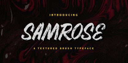 Introducing, Samrose. A unique textured brush typeface with bold and strong feel. This font perfectly made to be applied especially in logo, and the other various formal forms such as invitations, labels, magazines, books, greeting / wedding cards, packaging, fashion, make up, stationery, novels, labels or any type of advertising purpose. Features : uppercase & lowercase (alternates) numbers and punctuation Ligatures and alternates multilingual PUA encoded We highly recommend using a program that supports OpenType features and Glyphs panels like many of Adobe apps and Corel Draw, so you can see and access all Glyph variations. Email us to letterhend@gmail.com if you need something! Happy Designing!
 - Bestlady by Dhan Studio,
$19.00 Bestlady is a romantic textured brush font suitable perfectly for invitations, brand projects, logos, greeting cards, news, product packaging, posters blogs, everything including personal charm etc. This font is alternates all lowercase,also have equipped with 69 ligatures unique and beautiful: zz yy ww vv uu tt tl th st ss sh rr qq pp oz oy ow ov ou ot os or op oo on om ol ok oj oi og of od oc ob nt nn nl ng mm lt ll lh kk is ii id hh gg ff et el ee cl ck ch cc bl bb aw at ap an am al ah af ab aa
 - Wolfgang by Aronetiv,
$9.99 The typeface is influenced by early Italian-French serifs such as Garamond, Jenson, Griffo. The font has clear serifs and slightly sharp shapes. It has a modern character. The font has a uniform texture typical for this type of serif. This font family is well suited for the decoration of solemn and graceful materials. The font has a nice and appropriate italics. Wolfgang is legible and easy to read at small sizes. The font family contains 6 styles The font is equipped with a Variable file. Supports languages ??of central Europe Contains old style figures There are several alternates in the font The font has more than 1000 kerning pairs
 - Melango by IbraCreative,
$27.00 Melango is a captivating and artistic brush signature font that exudes a sense of flair and personality. With its handcrafted and expressive strokes, Melango captures the essence of a genuine signature, as if written with a brush. Each letter carries a unique and fluid charm, adding an element of authenticity to any design. The brush-like texture and varying thicknesses create a natural and dynamic appearance, making Melango an ideal choice for logos, branding, and creative projects seeking a touch of artistic elegance. Whether used for invitations, greeting cards, or social media graphics, Melango effortlessly infuses designs with a sense of warmth and creativity, making it a standout brush signature font.
 - Indigena by Latinotype,
$29.00 Mapuche means ‘man of the land’ and it is also the name of a group of indigenous inhabitants in South America. During the southern Winter solstice, between June 21 and June 24, the We Tripantu, the Mapuche New Year fest, takes place with a magical rite in the middle of the nature. Indigena is a dingbat font that remakes the artistic expression of the Mapuche people in Chile, recovering the handmade stroke they used in textiles and ceramics, but with a fresh look. This dingbat is based on pre-Columbian iconographic drawings shown in the book Dibujos Indígenas de Chile (1929) by chilean art teacher Abel Gutiérrez.
 - Faxnes by Dumadi,
$35.00 Faknes – Handwritten is a design font with a natural brush style and unique texture that can enhance the quality of your designs. Faknes – This handwriting is perfect for designs, logos, social media, brands, advertisements, product designs, handwritten quotes, product packaging, headers, posters, merchandise, and other designs. What’s Included: + Standard glyph + Ligature + Web Fonts + Multilingual Accent + Works on PC & Mac, Simple installation Accessible in Adobe Illustrator, Adobe Photoshop, Adobe InDesign, even works in Microsoft Word. PUA Coded Characters – Fully accessible without additional design software. Fonts include multilingual support + Images used: All photos/images/vectors used in the preview are not included, are meant for illustration purposes only. Thank You
 - Marilyne by Silverdav,
$15.00 Marilyne is a modern calligraphy font with handwritten, sophisticated flows. It is full of hearts and glyphs. It is perfect for branding, wedding invites, and cards. Marilyne includes a full set of lovely and swashes lowercase letters, multilingual symbols, numerals, punctuation and ligatures. Also it includes: -short lowercase beginning and ending swashes (This is so perfect for invitations, monograms) -long lowercase beginning and ending heart swashes. Marilyne includes 12 beginning and ending swashes lowercase The font has a smooth texture, so it would be perfect for all types of printing techniques you can do embroidery, laser-cut, gold foil, and is ideal for cutting.
 - Kamaniya by ErlosDesign,
$15.00 Kamaniya is a lovely and magical script font, with characters that dance along the baseline. It has a casual, yet elegant touch. This font is PUA encoded which means you can access all of the glyphs and swashes with ease! Kamaniya Font includes a full set of lovely uppercase and lowercase letters, multilingual symbols, numerals, punctuation and ligatures. Also it includes: long lowercase beginning and ending swashes. The font has a smooth texture, so it would be perfect for your design. The file you will get is: • Works on PC & Mac • Simple installation • Encoded PUA Character - Can be accessed completely without additional design software. Enjoy!
 - Granesta by Arterfak Project,
$19.00 Introducing Granesta, a freestyle brush font moving with energy. This font was created with digital brush strokes, carefully vectorized to keep the textures. Granesta is a street font that delivers a loud message and strong. This font is an all-capitals font, equipped with stylistic alternates and swashes to gives a more powerful design. Granesta is ideal for logos, merchandise, apparel, banner, quotes, books, social media posts, posters, flyers, stickers, and many more! What you'll get : Granesta TTF & OTF Uppercase Smallcaps Numbers Punctuation Stylistic alternates Swashes (simply type underscore + number. eg. _1, _2, _3, etc) Multilingual support Thank you for watching. Never give up!
 - Katherina Signature by Scratch Design,
$10.00 Introducing, Katherina its a handwriting with signature style and brush texture. This font will look outstanding in any occasion design concept, whether it’s being used on colorful backgrounds or as a stand as a headline in the minimalist background! Katherina has alternative uppercase and lowercase letters that you can change by selecting the letter you want to change, and automatically there is an option to change the letters under the letter you selected. Katherina has multi-language support, swashes, and ligature dan you can apply in OpenType mode at adobe photoshop or adobe illustrator. Please enjoy the Katherina font and makes some stunning designs.
 - Carnegie Classic by Wilton Foundry,
$59.00 Carnegie Classic differs from Carnegie 1 & 2 in that the capital letters are larger in height; several connecting strokes and letter shapes have also been refined. Classic also has many more ligatures and is only available in Open Type. Like Carnegie 1 & 2, Classic is a based on my own functional hand lettered calligraphy. Characters are disciplined yet fluid and spontaneous, creating a unique overall texture that is visually very pleasing. Carnegie Classic is ideally suited for wedding and event invitations, certificates, maps, menus, place cards, announcements, memorial documents, titles, testimonials, birth and death certificates, etc. In the gallery is a an image with all the ligatures available in Open Type.
 - Aurelia Michelle by Letterhend,
$16.00 Meet Aurelia Michelle, the hand-drawn font that exudes effortless femininity and chic sophistication. With its brush texture and delicate curves, this font is perfect for adding a touch of elegance to any design project, especially in logo, and the other various formal forms such as invitations, labels, logos, magazines, books, greeting / wedding cards, packaging, fashion, make up, stationery, novels, labels or any type of advertising purpose. Features : Uppercase & lowercase Numbers and punctuation Alternates & Ligatures Multilingual PUA encoded We highly recommend using a program that supports OpenType features and Glyphs panels like many of Adobe apps and Corel Draw, so you can see and access all Glyph variations.
 - Hibrush by Omotu,
$18.00 Hibrush is a font that comes in 2 versions, a brushed texture regular version and a solid style. Hibrush is perfect for logos, apparel, T-shirt, hoodies, product packaging, or anything else. It includes Uppercase and lowercase characters, Supports international languages, contains numerals, punctuations, ligatures, stylistic alternates, and stylistic sets. Those are accessible in the Adobe Illustrator Glyphs panel, or under Stylistic Alternates in the Adobe Photoshop OpenType menu, Adobe InDesign, Corel Draw, even work on Microsoft Word. Thanks for looking, and I hope you enjoy it. Please don't hesitate to drop me a message if you have any issues or queries. Omotu (ibnu.blawong2@gmail.com)
 - Gimana by Hazztype,
$20.00 Introducing gimana sans serif display font, meticulously designed with deep inktrap details. Crafted for optimal legibility and aesthetic appeal, this font seamlessly blends modernity and tradition. Its generous proportions and balanced letterforms provide exceptional clarity and readability across various digital and print mediums. With its deep inktraps, this font showcases subtle details that enhance its overall visual texture, adding a touch of sophistication to your projects. Its humanist characteristics ensure legibility and readability, making it an ideal choice for a wide range of applications. The deep experimental inktraps add an intriguing element to the font, creating an interplay of light and shadow that captures attention.