10,000 search results
(0.037 seconds)
- EB Bellissimo Display by Erik Bertell,
$15.95 Bellissimo Display boasts an impressive range of handsome all caps ligatures that would make even Herb Lubalin jealous. Despite its iconic features, Bellissimo works surprisingly well as a text face as well. Small capitals, alternate glyphs and both lower and upper case figures are intrinsic in the design.
 - Parity by Shinntype,
$39.00 There is no bicameral Parity. It has been designed from scratch to be an exceptional unicase typeface, uncompromised by the priorities of mixed case or all-cap setting. Each glyph is shaped, proportioned and detailed for one purpose only: to optimize text set in the lining unicase format.
 - Gusset by Pesotsky Victor,
$10.00 Gusset is a simple modular font. It was created for headlines and posters. It creates a dense and interesting texture in the text set. Simple rounded curves contrast with "wedges". Gusset supportsBasic Latin, Cyrillic and more than 100 languages all together. The font was designed by Viktor Pesotsky.
 - Drab by Pesotsky Victor,
$12.00 Drab is a neutral grotesque, but with decorative elements. Suitable for texts and titles. When you do not need a strong accidental but a boring set, Drab is also not suitable. Drab supportsBasic Latin, Cyrillic and more than 100 languages all together. The font was designed by Viktor Pesotsky.
 - Almarose by S&C Type,
$22.00 Almarose is a geometric sans serif OpenType font designed by Fanny Coulez and published by S&C Type. Functional with a little distinctive touch, Almarose comes with 9 weights with italics, from Thin to ExtraBlack, and was designed for all uses like texts, web or headlines. Merci beaucoup.
 - Nadsat by Typogama,
$19.00 Nadsat is a unicase display typefaces with a condensed, art deco styling. Best suited for short texts or display settings, the lowercase and capital letters can be combined to offer more layout possibilities. The typeface also includes a series of ligatures and alternate characters for even more layout options.
 - Vanquish by Aboutype,
$24.99A traditional Sans serif with a modern flair and uniform consistent weight to the vertical and horizontal stokes. Vanquish was designed for all media and can be used in a wide range of point sizes. Vanquish was kerned for text point sizes but requires subjective display kerning and compensation. - Rafellia by Tiny Hand Letter,
$12.00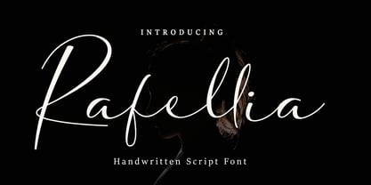 Rafellia is a handwritten script font, with an elegant and beautiful look. Rafellia will look perfect for elegant logos, wedding stationery, posters, quotes, short text, branding, web, graphic design, and more. This font is PUA encoded which means you can access all of the glyphs and swashes with ease!
 - Macella by Johannes Hoffmann,
$19.90 The Macella font family is the proportional version of the monospaced Vivala Code. Both families are well matched and have a comprehensive character set. The Sans Serif contains five weights with matching italics. It is suitable for headlines of all sizes, as well as variations of text lengths.
 - Rostel by Dieza Design,
$10.00 Rostel is great for headlines of all sizes, as well as for text blocks that come in both maximum and minimum variations. This font are applicable for any type of graphic design in web, print, motion graphics, and perfect for t-shirts and other items like posters and logos.
 - Underdoug by PizzaDude.dk,
$15.00 All caps font with squarish letters. At first sight, it may look a little bit ordinary, but watch it with massive text - then you will notice the bounciness and the contextual alternates that automatically switches between the 5 different versions of each letter! Comes with massive language support!
 - Donau by Renzler Design,
$12.00 The font Donau is named after the german name for the river Danube. It is an art nouveau inspired sans and slab serif typeface, sharing proportions and widths across two weights. It is intended for any kind of display use as well as short amounts of text. Enjoy!
 - Old Dreadful No. 7 by Bitstream,
$29.99Old Dreadful No. 7 is truly a unique typeface design. Bitstream’s designers and other employees all contributed individual letterforms to the character set. This typeface is definitely not recommended for long blocks of texts! David Robbins expanded his contribution of the capital I into a complete typeface, Eyeballs. - Disposable by PizzaDude.dk,
$20.00 Disposable is somewhat similar to some letters that are about to disintegrate. The letters are a little worn and give a good impression of something eco or organic. I've created 6 different versions of all the letters, just so your text will look even more organic and handmade!
 - FS Albert by Fontsmith,
$80.00 The x factor How do you make a font like FS Albert unique, distinctive? “When designing a font I try to question every letter,” says Jason Smith, “but all you need is a few that have an x factor. With FS Albert, they’re the lowercase ‘a’ and ‘g’ and the uppercase ‘I’ and ‘J’. “I remember a friend saying, ‘Why on earth have you designed the ‘a’ like that? Isn’t it too friendly for this kind of font?’ And, in a way, that’s what I wanted – honesty and warmth, because a lot of big brands at the time really needed to show a more human side.” Range of weights and styles FS Albert is a charismatic type: a warm, friendly sans serif face with a big personality. Open, strong and amenable, and available in a wide range of weights and styles, FS Albert suits almost every task you put it to. Fontsmith has crafted five finely-tuned upright Roman weights and four italic weights, as well as a special Narrow version to provide the best coverage and give headlines and text an easy-going character. The chunky kid “FS Albert was inspired by – and named after – my son, who was a bit of a chunky kid,” says Jason Smith. “I designed an extra bold weight because I always felt that the really big font heavy weights had the most personality. “I recently told Albert this story. He laughed, and forgave me for thinking he was a fat baby. He liked the big personality bit, though.” 1000s of glyphs Not content with a character set that covered Europe and the whole of the Western world, the studio decided to go further afield. There are now FS Albert character sets that cover western and eastern European languages, including those of Russia, as well as Cyrillic, Arabic and Greek scripts. In fact, the font now covers more than 100 languages, making it ideal for bringing a consistent typographic style to the communications of global brands.
 - FS Albert Paneuropean by Fontsmith,
$90.00The x factor How do you make a font like FS Albert unique, distinctive? “When designing a font I try to question every letter,” says Jason Smith, “but all you need is a few that have an x factor. With FS Albert, they’re the lowercase ‘a’ and ‘g’ and the uppercase ‘I’ and ‘J’. “I remember a friend saying, ‘Why on earth have you designed the ‘a’ like that? Isn’t it too friendly for this kind of font?’ And, in a way, that’s what I wanted – honesty and warmth, because a lot of big brands at the time really needed to show a more human side.” Range of weights and styles FS Albert is a charismatic type: a warm, friendly sans serif face with a big personality. Open, strong and amenable, and available in a wide range of weights and styles, FS Albert suits almost every task you put it to. Fontsmith has crafted five finely-tuned upright Roman weights and four italic weights, as well as a special Narrow version to provide the best coverage and give headlines and text an easy-going character. The chunky kid “FS Albert was inspired by – and named after – my son, who was a bit of a chunky kid,” says Jason Smith. “I designed an extra bold weight because I always felt that the really big font heavy weights had the most personality. “I recently told Albert this story. He laughed, and forgave me for thinking he was a fat baby. He liked the big personality bit, though.” 1000s of glyphs Not content with a character set that covered Europe and the whole of the Western world, the studio decided to go further afield. There are now FS Albert character sets that cover western and eastern European languages, including those of Russia, as well as Cyrillic, Arabic and Greek scripts. In fact, the font now covers more than 100 languages, making it ideal for bringing a consistent typographic style to the communications of global brands. - MC Sarling by Maulana Creative,
$14.00 Sarling monoline script font. This font is good for logo design, Social media, Movie Titles, Books Titles, a short text even a long text letter and good for your secondary text font with signature or script typeface. Make a stunning work with Sarling font. Cheers, Maulana Creative
 - MC Hittre by Maulana Creative,
$16.00 Hittre brush font. This font is good for logo design, Social media, Movie Titles, Books Titles, a short text even a long text letter and good for your secondary text font with signature or script typeface. Make a stunning work with Hittre brush font. Cheers, Maulana Creative
 - Neue Haas Unica by Linotype,
$53.99 The Neue Haas Unica™ family is an extended, reimagined version of the Haas Unica® design, a Helvetica® alternative that achieved near mythical status in the type community before it virtually disappeared. Originally released in 1980 by the Haas Type Foundry and designed by Team ’77 — André Gürtler, Erich Gschwind and Christian Mengelt— for phototypesetting technology of the day, the design was never successfully updated for today’s digital environments – until now. Toshi Omagari of Monotype Studio has given this classic a fresh, digital facelift with more weights, more languages and more letters to meet today’s digital and print needs. Available in 18 styles, the Neue Haas Unica family is remarkably appropriate for a wide range of applications, possessing a delicate gradation of weights and clear character shapes. The family's lighter weights are perfect for headlines and other large settings, as well as small blocks of copy at typical text sizes. The regular, medium and bold weights know no boundaries and the heavy and black designs are ideal for when typography needs to be powerful and commanding. Like the Neue Helvetica and Univers Next typefaces, the Neue Haas Unica family can be used just about anywhere – or for any project. In addition to its 9 tailored weights and complementary italics, the Neue Haas Unica family also possesses additional characters for Eastern and Central European, Greek and Cyrillic language support, which did not exist in the original design. A cosmopolitan typeface for today's modern, discerning design needs, the Neue Haas Unica collection is a new classic in the making—one that every designer should surely have at their disposal.
 - Engel New by The Northern Block,
$30.36 EngelNewSans is sans serif family of 12 weights and an upgrade of the typeface Engel also published by Die Gestalten Verlag. The project began with an extension to the original Engel character set and freshening up the typeface to suit the OpenType format. EngelNewSerif came about as a sibling to EngelNewSans as a corresponding serif family also of 12 weights, matching those of EngelNewSans. Both families are designed for a wide usage in running text and headlines. EngelNewSans is an evolved version of the original Engel typeface, which undergone improvements to the individual letterforms and the overall look which resulted in this sans serif type family with a more mature confident character and with softer, rounder and more harmonious shapes. The characteristics between the two could perhaps, very fittingly, be compared to a person showing different sides to their personality at different stages in life. With EngelNewSans portraying the more mature role while the original Engel shows traits of a cool teenager with rough edges, not yet fully developed. To make the light weights function with serifs attached for EngelNewSerif, the same low stroke contrast as seen in EngelNewSans was applied. Further discovery found that the serifs and the stem width had to be optically similar for the light weights not to appear too fragile. In the heavy weights however, the stroke contrast was higher than in the Sans versions, this was done to open up the counters and make room for the serifs to breathe. The intention of the families is to motivate an element of play and give the designer a larger selection to work with.
 - Varius by Linotype,
$29.99The shapes of the f-holes on a violin reminded German designer André Maaßen of an italic letter "f". Maaßen used these captivating contours as the theme for his type family, Varius. The name "Varius" is an homage to the manufacturer of the violin that inspired Maaßen's project, Antonio Stradivarius, the most famous manufacturer of violins in music history. Varius has three separate styles. Varius 1 and its italic are the base style of the family, and are typefaces in the baroque serif manner. Varius 2 and its italic are slab serif egyptiennes, slightly heavier than Varius 1's more classical forms. Varius 3 and its italic are semi serif faces; their characters are serifed, but some of the serifs have been cut off. The family is rounded out with two pi faces: an ornaments font (which can be used in conjunction with the text fonts, or on its own to create beautiful borders or individual decorative elements), and a font of musical symbols and notations. Each of the six text fonts has dozens of supplemental ligatures included in their character sets. When these fonts are used in an OpenType-supporting application, such as Adobe InDesign, these ligatures automatically appear in text when the "Discretionary Ligatures" feature is activated. Additionally, the character sets include added alternate glyphs, such as a swash "m" or "n" to finish off a line of text. These can be inserted manually in applications that include glyph palettes (e.g., Adobe InDesign or Illustrator CS). All of the Varius family's letterforms appear slightly narrow, and traces of the wide-nibbed pen can be seen within their forms. Additionally, the shape of a violin's f-hole is a reminiscent element within all of the family's curves. Varius is particularly suited for use many applications, such as body text, newspaper text, display text, headlines, posters, books, screen design, and corporate identity. Use in sizes ranging from body copy text to display and poster format allow the different facets of the typeface to effectively present themselves. The effects can be as versatile as the possibilities! Due to its special character, the typeface could be used in the design of a logo, or within an appropriate corporate design context, to particularly stress individuality. - The Jumbalo font is an extremely heavy and playful display typeface, characterized by its thick, bulbous, and completely rounded characters. It evokes a strong sense of retro aesthetics, reminiscent ...
- Telder HT Pro by Huerta Tipográfica,
$45.00 Telder HT Pro is a humanist sans serif family with 10 weights, conceived as a web font with nice legibility at normal text sizes. Originally based on grid fitting shapes it became a multi-purpose typeface with low contrast, open counter forms, wide proportions and a touch of freshness. It is ideal for paragraph text on websites as blogs and news sites and works great for printed text. Its extreme weights are suitable for display sizes. This PRO version contains 10 weights and 2 styles. All the fonts contain small caps, alternate glyphs in stylistic sets (such as B, P, R, a, f, g, w, x, y & z), four number sets (lining and old style, proportional and tabular), ordinals, superiors, inferiors, fractions, disctretionary ligatures, arrows and more. Each font contains +1000 glyphs.
 - Bemack by Dhan Studio,
$17.00 BEMACK is handwritten made with a brush pen, this font will tear through your text with unmistakable energy, dynamic and spontaneous flow. To help you create stunning custom handwriting displays. BEMACK comes with alternates character, ligature, punctuation, numerals. Also included is a bonus extras swashes, handmade designed to perfectly for headlines and short texts. Use it for magazines, t-shirt, packaging, logos, advertising, quotes, branding, posters, editorials, cover artwork, movies, websites, etc BEMACK is coded with Unicode PUA, Allows full access to all the extra characters without having special software designing. Mac users can use Font Book, and Windows users can use Character Map to view and copy any of the extra characters to paste into your favorite text editor / app. Thanks so much for looking and Enjoy it!
 - Chistodella by Keristyper Studio,
$14.00 Chistodella is a calligraphy handwriting with classic style and elegant touch, inspired by lettering on the vintage. Which was created to meet the needs of your next design project. Carefully designed to work together in harmony for creating awesome typographic designs in a flash. This font is good for logo design, Social media, Movie Titles, Books Titles, short text even long text letters, and good for your secondary text font with sans or serif. Make a stunning work with Roselites font. Featured: -Standard Uppercase & Lowercase -Numeral & Punctuation -Multilingual : ä ö ü Ä Ö Ü ß ¿ ¡ -Alternate & Ligature -PUA encoded We recommend programs that support the OpenType feature and the Glyphs panel such as Adobe applications or Corel Draw. so you can use all the variations of the glyphs. Hope you enjoy our fonts!
 - Bambe by Gian Studio,
$10.00 INTRODUCING BAMBE is handwritten, made with a brush, this font will rip your text with unmistakable energy, a dynamic and spontaneous flow. To help you create a stunning custom handwritten look, Bambe is perfect for magazines, t-shirts, packaging, logos, advertisements, quotes, branding, posters, editorials, cover artwork, films, websites, etc. BAMBE contains uppercase letters and some alternative characters, punctuation marks, numbers. Also includes the added bonus of a handcrafted, perfectly designed swash for headlines and short text. BAMBE encoded with Unicode PUA, Allows full access to all additional characters without designing any special software. Mac users can use Font Book, and Windows users can use Character Map to view and copy any additional characters for pasting into your favorite text editor / application. Thank you very much for viewing and Enjoying it!
 - 1484 Bastarde Loudeac by GLC,
$38.00 Font designed after that used in Brehan-Loudeac (Britanny, France) by Robin Fouquet and Jean Crès in years 1480s to print a lot of texts and books. This font include “long s”, naturally, as typically medieval, and a few special characters and abreviations, also some variants, like for “d”, “r” or “v”. The small “y” is accented, just like in British alphabet of the time, though the texts were printed in French. Added, a lot of accented characters no longer existing on this time. A render sheet, in the font file, makes it more easy to identify on a keyboard. This font is used as variously as web-site titles, posters and flier designs, editing ancient texts... all you need. This font supports easily as large than small size, remaining readable, original and pretty.
 - MC Ronttsly by Maulana Creative,
$15.00 Ronttsly script brush font. This font is good for logo design, Social media, Movie Titles, Books Titles, a short text even a long text letter and good for your secondary text font with signature or script typeface. Make a stunning work with Ronttsly script brush font. Cheers, Maulana Creative
 - MC Begalih Brush by Maulana Creative,
$15.00 Begalih brush handmade font. This font is good for logo design, Social media, Movie Titles, Books Titles, a short text even a long text letter and good for your secondary text font with signature or script typeface. Make a stunning work with Begalih handmade brush font. Cheers, Maulana Creative
 - Evadare by Scriptorium,
$18.00Evadare is a decorative text font inspired by the designs of Rudolf Koch and Nicholas Cochin. It has a freehand, calaligraphic look, yet is regular and works well at small sizes as required for text uses. It's a sort of a romantic, rustic alternative to more traditional text fonts. - MC Slecter Cirus by Maulana Creative,
$15.00 Slecter Cirus monoline script font. This font is good for logo design, Social media, Movie Titles, Books Titles, a short text even a long text letter and good for your secondary text font with signature or script typeface. Make a stunning work with Slecter Cirus font. Cheers, Maulana Creative
 - Chrinol by Maulana Creative,
$15.00 Chrinol handmade brush font. This font is good for logo design, Social media, Movie Titles, Books Titles, a short text even a long text letter and good for your secondary text font with signature or script typeface. Make a stunning work with Chrinol handmade brush font. Cheers, Maulana Creative
 - Hogie Rough by Maulana Creative,
$14.00 Hogie Rough handmade script font. This font is good for logo design, Social media, Movie Titles, Books Titles, a short text even a long text letter and good for your secondary text font with signature or script typeface. Make a stunning work with Hogie Rough font. Cheers, Maulana Creative
 - Immortal - Alternates - Unknown license

- Off The Wall JNL by Jeff Levine,
$29.00Off the Wall JNL is a unique typeface that combines graffiti-style lettering with a brick wall background. special keystroke features give you a complete "wall of text": { (left bracket) places a smaller closed end cap on the left side of the text. } (right bracket) places a medium closed end cap on the right side of the text. [ (left brace) places a regular closed end cap on the left side of the text. ] (right brace places a regular closed end cap on the right side of the text. | (vertical bar key) adds a space between words. \ (backslash) adds a larger space between words. - Type Tile by Konst.ru,
$19.00 The fastest and easiest way to create original images. It is necessary to take any text and use it with Type Tile. Create pictures, patterns and backgrounds from real texts. Font can be used in various encodings and you can type texts in many languages. Type Tile supports Central European languages that use Latin script, (Polish, Czech, Slovak, Hungarian, Slovene, Serbian, Croatian, Romanian and Albanian), Cyrillic alphabets, Western languages, Greek, Turkish, Hebrew, Arabic, Baltic languages, Vietnamese, Thai and Japanese. You can make the background from the original text for the page on which can print the translated text. This symbiosis can create a feeling of presence in the original text. Decorate the packaging in which the text is written in the form of ornament. Several layers of the texts with Type Tile shows an incredible pictures. Use a pair of letters can give a regular pattern. Type Tile provides endless and fantastic opportunities for design on any surfaces and for different purposes in publish, fashion, textiles, industry, animation, Internet and so on.
 - Gloria Monoline by IM Studio,
$15.00 Gloria Monoline is a text serif with an editorial focus designed by Ikhsan Maulana. The idea for a typography job came from a design school letter-making exercise: Get a pair of scissors and some large sheets of paper, and start cutting. The resulting letters and the act of cutting them from paper inform the type design process, resulting in strong, simple shapes and open, inviting textures. The tone is crisp and straightforward. The classic letterforms, with a playful touch, give the design a personality that is both practical and spontaneous. The text weight is capable of adjusting copies at various sizes to print and render clearly on screen. Its lightest and heaviest weights work best at display sizes. Great care has been taken to save typists time with OpenType features including contextual punctuation and symbols to match case-sensitive, lower-case, and all-caps settings, as well as set images set for each use.
 - Geller by Ludka Biniek,
$29.00 A truly faithful ally for every designer looking for fresh yet familiar and reliable font choice. Geller was created as a part of graduation project in Typowa Pracownia at Academy of Fine Arts in Warsaw. It is a typeface family especially intended for newspapers, magazines, and advertising. Geller family comes in two optical sizes - headline and text, so it is a complete solution for editorial purposes. During the design process, the technical needs of certain typographic fractions were examined. The capital letters were specially and purposely designed: its modern proportions (derived from Didone fonts) with optimized inner lights as well as short ascenders and descenders work very well within titles and leads. In addition to a wide range of OpenType features, Geller contains bullets & dingbats providing many possibilities of entry points in editorial design. Compact diacritics, proportionally tall x-height, narrow letter construction, all these features allow easy typesetting of narrow text columns and spreads.
 - Bodoni Classic Cyrillic by Wiescher Design,
$55.00 One day shortly after Christmas 2004, the art-director of Vogue Moscow called me. Would I maybe make a Cyrillic version of my Bodoni Classic Text typeface? Well, since I had been thinking about doing it since a long time, this was the perfect reason to finally do it. It was not an easy venture, since I do not have the faintest idea of Russian but, together with those nice people in Russia and a fellow helpful type designer in Kiev, I managed. I did an enormous amount of kerning, thanks to the help of the Moscow Vogue office. Here the fonts are now for all of you: five text cuts, plus one standard roman cut that has no Cyrillic letters but an extra set of medieval numbers. At Vogue they are happy with the fonts, even though I did not quite adhere to Bodoni's originals in this case. Nastarowje (or whatever you say in Russia), Gert Wiescher
 - Pagewalker by Kostic,
$40.00 The name of the font is chosen to suggest its main purpose—setting multiple pages of text. All the features in this family were made with that in mind—legibility, distinct italics, small caps and various OpenType features, all make this font a useful tool for typographers. On the other hand, for packaging, posters, logotypes, etc. setting heavier weights in large size brings out its display qualities. Pagewalker is very legible and appears to be larger than other text typefaces. That is because the lower-case characters are made large compared to the capital letters. This means it can be used for setting text in, e.g. 9 pt size—while appearing to be 10 pt, but occupying less space. Pagewalker has a character set to support Western and Central European languages, and an extended set for monetary symbols which, in combination with tabular numbers, is perfect for financial reports. Each weight includes small caps, ligatures, proportional lining and oldstyle numbers, tabular figures, fractions and scientific superior/inferior figures.
