10,000 search results
(0.024 seconds)
- Autriche - Unknown license

- Cheltenham by Wooden Type Fonts,
$15.00 A revival of one of the popular text fonts of the 19th century, suitable for text or display, short descenders, tall ascenders, the regular text version.
 - BeachBar by DearType,
$40.00 BeachBar is a modern bold script with a sunny mood. It is inspired by, well, Beach bars, the summer and the sea, the hot afternoons with a cocktail in your hand and the sound of splashing waves. Beachbar turns our love for summer into a dynamic and vivacious font that comes in three different styles to choose from: BeachBar (connecting small letters, disconnected basic caps, ideal for text), BeachBar Alt (all letters are disconnected) and last but not least BeachBar Script (connecting letters, script-like caps and a bold set of swash capitals for more eye-catching designs). All three styles come in six weights making the font versatile and useful both for web and print; think websites, posters, menus, logotypes, cards, signage, packaging and whatnot. BeachBar is friendly, sturdy and it makes a statement, but most of all, it is fun to play with.
 - Fairweather by Dharma Type,
$19.99 Fairweather is a fresh air. Clear, transparent, and lucid as if it is the spring and autumn sky. By designed condensed, legible and perspicuous, Fairweather is perfect for titles and captions. But "Title and Captions" are the just examples. Very neutral and plain letter forms make the font versatile. The condensed forms can be very effective for body text in narrow space and the clean and clear letterform doesn't intrude your art works. Consists of nine weights and their matching italics. Supporting almost all latin languages.
 - Pinatas Marks by Piñata,
$12.00 Original Foundry: TypeType Original name: TT Marks The typeface Pinatas Marks is made in the style of the traditional American sign painting, which is the traditional art of painting on buildings, billboards and signage for the purpose of announcing or advertising of products, services, and activities. Font family Pinatas Marks consists of 32 fonts and has 8 different weights: Thin, ExtraLight, Light, Regular, Medium, Bold, ExtraBold, Black. Pinatas Marks is looking great on all the modern information media, ranging from small labels to entire text blocks.
 - Smoke Signals by Ana's Fonts,
$18.00 Smoke Signals is a calligraphy font handmade using a real dip pen and ink with lots of bonus goodies. Smoke Signals includes: tons of ligatures for a smother text small caps that act as an all caps font a bonus set of ornaments a bonus set of grunge elements, such as splatters, ink blots, scratches Smoke Signals is perfect for any design that needs a vintage calligraphy look. Use it in signatures and logos, notes and quotes, social media posts, and branding and packaging.
 - Artnoova by Popskraft,
$18.00 The Artnoova typeface combines the inimitable mastery of the great styles of the early twentieth century and at the same time looks organic among modern ones. Like the famous Art Deco typeface, Artnoova is designed for a strong yet elegant typography. In addition, a balanced set of capital letters allows you to type large sections of text. All this allows the Artnoova font to be used in almost any area of design, such as corporate identity, typography, posters, web design and other design areas.
 - Misquote Note by Bogstav,
$15.00 Here's my all-purpose handwritten font. Actually, it's my own handwriting - in speed mode! Well, speed mode but still concentrating on creating letters that are legible! :) Misquote Note is an all-purpose text font. Suitable for anything that needs a hasty yet legible look. That could be recipes, invitations, postcards, posters, chore lists, diaries etc.
 - Moving Forward by Crumphand,
$20.00 Introducing, Moving Forward a Slab Serif Font. inspired by vintage and modern letterforms with alternate characters and full symbol sets. Moving Forward can be used for posters, web headers, and display text of all kinds. good kerning and readable.
 - Faculty by Device,
$39.00 Faculty is a robust, warm and rational sans, with a large x-height that lends clarity in text and headline. Functional, clear and authoritative, it still has character. Stroke terminals are cut vertically or horizontally, minimising inter-letter gaps and lending it an even 'colour' in extended settings. Suitable for both headlines and text, the family has extensive language support, alternative characters, lining, tabular and old style numerals, making it a versatile all-purpose type system.
 - Wayfinder CF by Connary Fagen,
$35.00 Wayfinder® CF imparts both elegance and urgency to any text. Equally warm and intense, Wayfinder is a display font family made for logos, headlines, titles, and other short texts. Seven weights cover everything from an airy thin to a brilliant heavyweight. Wayfinder® CF pairs nicely with simple, unadorned typefaces. Great options include Artifex Hand CF and Greycliff® CF. All typefaces from Connary Fagen include free updates, including new features, and free technical support.
 - Arae GT by Ably Creative,
$12.00 Arae GT is all caps font created by the ably creative team, inspired by the look of comics and Japanese written text, Arae GT comes in regular and shadow line styles and comes with ligatures and a simple look, making this font very easy to use for your design needs. Arae GT is very suitable for text on comics. cover, company logo, unique and funny qoute, branding t-shirts, bags and so on. enjoy imagining designs.
 - Nosta by Protimient,
$29.95Nosta is a modern text typeface. It was designed to be easily legible and therefore expressly suitable for setting sizeable lengths of continuous text such as magazine articles, books and essays. It achieves this through, amongst other things, finely balanced proportions, optimal character spacing and an adherence to predictable letter forms. Despite this, however, Nosta manages to retain a contemporary look and feel by using a variety of modern type design devices such as the efficacious wedge serif. The italic avoids using too many of the cursive elements that are often found in traditional italics and has only a modest slant, giving it a modern look that does not overly disrupt the text while still providing emphasis. While designed for continuous text, Nosta can also be used as a display face, making it a good all round typeface, suitable for many applications. - Shpinoza MF by Masterfont,
$59.00 A practical font family with 5 weights for all your day by day design needs: headlines, body text, signage etc. High legibility at small sizes. An extended sans serif typeface with rounded endings that provides unique softness appearance without losing legibility.
 - Roamer by Loreley Design,
$56.00 The Roamer is big, bold and ready to be used by designers all over the globe. The appearance is quite rough and used like weathered wood or paint on concrete. It is perfect for big headlines or bold text passages.
 - Darbuka MF by Masterfont,
$59.00 A practical font family with 4 weights for all your day by day design needs: headlines, body text, signage etc. High legibility at small sizes. An extended sans serif typeface with rounded endings that provides unique softness appearance without losing legibility.
 - Meteor Condensed MF by Masterfont,
$59.00 A practical font family with 8 weights for all your day by day design needs: headlines, body text, signage etc. High legibility at small sizes. An extended serif typeface with elegant endings that provide unique softness appearance without losing legibility.
 - Plance by Hsan Fonts,
$16.00 Plance is a font for simplified logo design. The font is suitable for creating headlines, logos, text and advertising tags All alternate options for characters are included in each font. You can use the alternatives in most major photo editors.
 - Inkie by Turtle Arts,
$20.00Inkie is a hand drawn pen and ink alphabet with scratchy embellishments, and works great whenever you want a handwritten look to your art, but with a bit of extra flair. Inkie looks great both as text and as headlines. - Avegra by Letteralle,
$24.00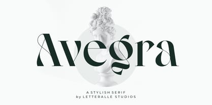 Avegra is stylish modern serif font. Contains uppercase & lowercase characters, all punctuation & numerals. Diaspora is absolutely perfect for editorial projects, Logo design, Wedding, Clothing Branding, product packaging, magazine headers, or simply as a stylish text overlay to any background image.
 - NowGrotesk by Hot Russian Pancakes,
$- Retro-futuristic unicase with alternates and ligatures, specially designed for magazine headlines and cheerful logos. Inspired by the art deco geometry and late 2000s trends in graphic design. Works well as text pattern. It is better suited for large type sizes.
 - Thinkerbery by Mightyfire,
$15.00 Need a semi-formal yet unique font? Thinkerbery is the answer! The look of Thinkerbery is like a digital typing style but still has its uniqueness. We bring a strong looks for your text. Enjoy in creating unique arts using Thinkerbery! :)
 - Schism One by Alias,
$55.00 Schism is a modulated sans-serif, originally developed from our Alias Didot typeface, as a serif-less version of the same design. It was expanded to three sub-families, with the thin stroke getting progressively heavier from Schism One to Schism Three. The different versions explore how this change in contrast between thick and thin strokes changes the character of the letterforms. The shape is maintained, but the emphasis shifts from rounded to angular, elegant to incised. Schism One has high contrast, and the same weight of thin stroke from Light to Black. Letter endings are at horizontal or vertical, giving a pinched, constricted shape for characters such as a, c, e and s. The h, m, n and u have a sharp connection between curve and vertical, and are high shouldered, giving a slightly square shape. The r and y have a thick stress at their horizontal endings, which makes them impactful and striking at bolder weights. Though derived from an elegant, classic form, Schism feels austere rather than flowery. It doesn’t have the flourishes of other modulated sans typefaces, its aesthetic more a kind of graphic-tinged utility. While in Schism Two and Three the thin stroke gets progressively heavier, the connections between vertical and curves — in a, b, n etc — remain cut to an incised point throughout. The effect is that Schism looks chiselled and textural across all weights. Forms maintain a clear, defined shape even in Bold and Black, and don’t have the bloated, wide and heavy appearance heavy weights can have. The change in the thickness of the thin stroke in different versions of the same weight of a typeface is called grading. This is often used when the types are to used in problematic print surfaces such as newsprint, or at small sizes — where thin strokes might bleed, and counters fill in and lose clarity, or detail might be lost or be too thin to register. The different gradings are incremental and can be quite subtle. In Schism it is extreme, and used as a design device, giving three connected but separate styles, from Sans-Didot to almost-Grotesk. The name Schism suggests the differences in shape and style in Schism One, Two and Three. Three styles with distinct differences, from the same start point.
 - Schism Three by Alias,
$55.00 Schism is a modulated sans-serif, originally developed from our Alias Didot typeface, as a serif-less version of the same design. It was expanded to three sub-families, with the thin stroke getting progressively heavier from Schism One to Schism Three. The different versions explore how this change in contrast between thick and thin strokes changes the character of the letterforms. The shape is maintained, but the emphasis shifts from rounded to angular, elegant to incised. Schism One has high contrast, and the same weight of thin stroke from Light to Black. Letter endings are at horizontal or vertical, giving a pinched, constricted shape for characters such as a, c, e and s. The h, m, n and u have a sharp connection between curve and vertical, and are high shouldered, giving a slightly square shape. The r and y have a thick stress at their horizontal endings, which makes them impactful and striking at bolder weights. Though derived from an elegant, classic form, Schism feels austere rather than flowery. It doesn’t have the flourishes of other modulated sans typefaces, its aesthetic more a kind of graphic-tinged utility. While in Schism Two and Three the thin stroke gets progressively heavier, the connections between vertical and curves — in a, b, n etc — remain cut to an incised point throughout. The effect is that Schism looks chiselled and textural across all weights. Forms maintain a clear, defined shape even in Bold and Black, and don’t have the bloated, wide and heavy appearance heavy weights can have. The change in the thickness of the thin stroke in different versions of the same weight of a typeface is called grading. This is often used when the types are to used in problematic print surfaces such as newsprint, or at small sizes — where thin strokes might bleed, and counters fill in and lose clarity, or detail might be lost or be too thin to register. The different gradings are incremental and can be quite subtle. In Schism it is extreme, and used as a design device, giving three connected but separate styles, from Sans-Didot to almost-Grotesk. The name Schism suggests the differences in shape and style in Schism One, Two and Three. Three styles with distinct differences, from the same start point.
 - Schism Two by Alias,
$55.00 Schism is a modulated sans-serif, originally developed from our Alias Didot typeface, as a serif-less version of the same design. It was expanded to three sub-families, with the thin stroke getting progressively heavier from Schism One to Schism Three. The different versions explore how this change in contrast between thick and thin strokes changes the character of the letterforms. The shape is maintained, but the emphasis shifts from rounded to angular, elegant to incised. Schism One has high contrast, and the same weight of thin stroke from Light to Black. Letter endings are at horizontal or vertical, giving a pinched, constricted shape for characters such as a, c, e and s. The h, m, n and u have a sharp connection between curve and vertical, and are high shouldered, giving a slightly square shape. The r and y have a thick stress at their horizontal endings, which makes them impactful and striking at bolder weights. Though derived from an elegant, classic form, Schism feels austere rather than flowery. It doesn’t have the flourishes of other modulated sans typefaces, its aesthetic more a kind of graphic-tinged utility. While in Schism Two and Three the thin stroke gets progressively heavier, the connections between vertical and curves — in a, b, n etc — remain cut to an incised point throughout. The effect is that Schism looks chiselled and textural across all weights. Forms maintain a clear, defined shape even in Bold and Black, and don’t have the bloated, wide and heavy appearance heavy weights can have. The change in the thickness of the thin stroke in different versions of the same weight of a typeface is called grading. This is often used when the types are to used in problematic print surfaces such as newsprint, or at small sizes — where thin strokes might bleed, and counters fill in and lose clarity, or detail might be lost or be too thin to register. The different gradings are incremental and can be quite subtle. In Schism it is extreme, and used as a design device, giving three connected but separate styles, from Sans-Didot to almost-Grotesk. The name Schism suggests the differences in shape and style in Schism One, Two and Three. Three styles with distinct differences, from the same start point.
 - Showcard - Unknown license

- TT Octas by TypeType,
$29.00 TT Octas is a narrowly proportioned font family built upon the principle of octagonal forms: all circles in this font family are actually octagons. Thanks to small serifs, TT Octas has a saturated and vintage character to it. Simple depiction of the letters and the serifs make the family easily readable even in the smallest sizes. Narrow proportions allow for positioning of large text arrays even in small text fields. This font family is well fitted for brand visual identity and product labeling as well as for all digital media, such as web interfaces and gameplays. It is also great for mobile apps’ interfaces.
 - Classic Trash BRK Pro by CheapProFonts,
$10.00 A typical Art Deco font with high contrast. I have mirrored the uppercase A and M to give the strokes a correct direction, and shortened/widened a few lowercase letters to give the text a more even color. A stylistic 30s-looking font is ready for international text-setting! ALL fonts from CheapProFonts have very extensive language support: They contain some unusual diacritic letters (some of which are contained in the Latin Extended-B Unicode block) supporting: Cornish, Filipino (Tagalog), Guarani, Luxembourgian, Malagasy, Romanian, Ulithian and Welsh. They also contain all glyphs in the Latin Extended-A Unicode block (which among others cover the Central European and Baltic areas) supporting: Afrikaans, Belarusian (Lacinka), Bosnian, Catalan, Chichewa, Croatian, Czech, Dutch, Esperanto, Greenlandic, Hungarian, Kashubian, Kurdish (Kurmanji), Latvian, Lithuanian, Maltese, Maori, Polish, Saami (Inari), Saami (North), Serbian (latin), Slovak(ian), Slovene, Sorbian (Lower), Sorbian (Upper), Turkish and Turkmen. And they of course contain all the usual "western" glyphs supporting: Albanian, Basque, Breton, Chamorro, Danish, Estonian, Faroese, Finnish, French, Frisian, Galican, German, Icelandic, Indonesian, Irish (Gaelic), Italian, Northern Sotho, Norwegian, Occitan, Portuguese, Rhaeto-Romance, Sami (Lule), Sami (South), Scots (Gaelic), Spanish, Swedish, Tswana, Walloon and Yapese.
 - Sabio by Greater Albion Typefounders,
$11.95 I regard Sabio as an evolutionary face. By this I mean that it merges elements of script and Roman design into one elegant whole. The design was 'evolved' somewhere between these two classic approaches. The resulting family of faces makes an excellent display family, but is also clear and legible at small sizes and can be used as a text face with a distinctive flair. Sabio is a wonderfully flexible face that can sit happily alongside artwork that owes its inspiration to any era from the Art Deco onwards. The regular form is gently and subtly oblique, and the glyphs have a slight hint of swash about them. Alternate and perpendicular forms are also offered. The regular, alternate and perpendicular forms are all in turn offered in regular, and bold weights as well as in a condensed form. All in all Sabio is a humanist face with which almost anything can be done offering flair and elegance for almost any project. Whether it's a distinctive way of setting paragraph text, or poster work that's eye catching yet flowing and clearly legible, Sabio offers the answer.
 - Trade Gothic Next by Linotype,
$97.99In 1948, Mergenthaler Linotype released the first weights of Trade Gothic, designed by Jackson Burke. Over the next 12 years Burke, who was the company’s Director of Typographic Development from 1948 through 1963, continued to expand the family. Trade Gothic Next is the 2008 revision of Jackson Burke’s design. Developed over a prolonged period of time, the original Trade Gothic showed many inconsistencies. Under the direction of Linotype’s Type Director Akira Kobayashi, American type designer Tom Grace, a graduate of the MA Typeface Design in Reading, redesigned, revised and expand the Trade Gothic family. Many details were improved, such as the terminals and stroke endings, symbols, and the spacing and kerning. Moreover, there are newly added compressed widths and heavy weights perfect for setting even more powerful headlines. Trade Gothic Next brings more features and better quality for today’s demanding typographers. Trade Gothic Next® font field guide including best practices, font pairings and alternatives. - Leidener by Talavera,
$40.00 This font family is inspired by printed work made by the Elzevir family back in the XVIIth century at Leiden (NL). They worked with material from several type designers, but further investigations sends us to the tracks of one in particular: Robert Granjon. Granjon italics were way ahead of his time, making some really beautiful signs like swashy ampersands and minuscule v letters. This font also contains old style figures in the same fashion as they were printed, like the flipped number 8 and open forms in 6 and 9. This is as much a revival as an original design, because of their weights bold and heavy (both with italics) that were inspired on some titles. In this font you can also find a lot of ligatures, small caps, diacritics and even a fleuron for each weight and variation. Leidener came up from two books: Constantini Imperiatoris (1611) and Exercitationum Mathematicarum (1657), printed by Louis and John Elzevir on their Leiden Workshop, back in the day.
 - Komet Pro by Jan Fromm,
$65.00 Komet is a sturdy typeface with a calm and upright feel. Although it derives inspiration from classical English sans-serifs, it’s not too closely related to that model. Komet, instead, feels rather more lively and contemporary. Its compact spacing, low stroke contrast and heavy dots and accents give it an almost monolinear quality. The diagonals are slightly curved and the counters of the round letters such as b, o and q are generously wide. The muted, understated middle weights are built for extended body copy, while Komet’s thin and dark weights look brisk and assertive and make for subtly expressive headlines. Komet is an ideal choice for editorial design, branding and corporate design. The Komet Pro family comes in eight weights with matching italics, from Thin to Black. Each font contains around 850 glyphs, including a rich repertoire of OpenType features. Small caps, ligatures, ten different figure sets with matching currency symbols, stylistic alternates and arrows make Komet Pro a comprehensive toolkit for ambitious typography.
 - Virginia Neo by Type Associates,
$39.00 Virginia Neo is more than an update to the original Virginia family, designed in 1970 and strongly influenced by the popularity of Futura and Kabel in that era. Virginia Neo is a completely redrawn version based on the original design which won its designer first place ahead of 5,000 other submissions to the Lettergraphics International Typeface Design Competition in the same year. The original typeface family comprised 5 weights, the lightest of which was omitted from the initial 2008 digital offering but has now been included in the Neo version, along with a new Heavy weight rounding out a family of 6. Each typeface includes more than 450 glyphs, enough to satisfy more than 80 languages plus a smattering of ligatures, useful geometric ornaments and arrows. Virginia Neo fits the compact, comfortable-tightness of seventies-retro typography currently re-emerging in today’s advertising. Its high readability, femininity and elegance makes it suitable for subheads, headlines, posters, branding and the web.
 - Komet by Jan Fromm,
$45.00 Komet is a sturdy typeface with a calm and upright feel. Although it derives inspiration from classical English sans-serifs, it’s not too closely related to that model. Komet, instead, feels rather more lively and contemporary. Its compact spacing, low stroke contrast and heavy dots and accents give it an almost monolinear quality. The diagonals are slightly curved and the counters of the round letters such as b, o and q are generously wide. The muted, understated middle weights are built for extended body copy, while Komet’s thin and dark weights look brisk and assertive and make for subtly expressive headlines. Komet is an ideal choice for editorial design, branding and corporate design. The Komet family comes in eight weights with matching italics, from Thin to Black. The glyph set of each font contains around 520 glyphs and provides good everyday support for most Latin-based languages. For a wider range of advanced OpenType features, Komet Pro is also available.
 - Epoque Seria by Rafaeiro Typeiro,
$24.00 Époque Seria is that kind of person who looks really cute when angry. This font was derived from the Époque family. She is the little sister to Époque - a little shorter with her smaller x-height and — how do you say it in the typographic circle — your eyes are also smaller (and you know you squint when things get serious, isn't it?). The genealogy of these font face is undeniable, but Époque Seria has a ‘personality’ very different from her older sister. The reduction of the x-height also shakes somewhat with the cap that had crossbar. To accompany the package of standardization, the letters that don't have their straight axes were changed, which brought to the set more Cs and Gs contemporaries. In addition, other measures were taken as a greater softness in the variation of the weights and the abandonment of the black weight, being considered too heavy for this version.
 - Mynaruse Flare by insigne,
$39.99 Mynaruse Flare is a new version of the Mynaruse superfamily. This version eliminates the elongated serifs of the original, and instead stems end with a flare. You will find that the thinner weights are delicate and beautiful, while the heavier weights provide impact and strength. Mynaruse is inspired by the elegant and regal Roman inscriptional types. The face shines in environments that require elegance and splendor. The eight weights of Mynaruse flare range from a subtle, delicate thin to a heavy and powerful Black weight. Mynaruse Flare includes many useful OpenType features, including a set of swash alternates, alternate titling forms, ligatures and miscellaneous alternates. OpenType-capable applications such as Quark or the Adobe suite can take full advantage of the automatically replacing ligatures and alternates. This family also includes the glyphs to support a wide range of languages. This is a titling font that is ideal for logotypes, posters or other high-end luxury applications.
 - Laborat by Monotype,
$50.99 Typeface Laborat™, designed by Kristína Jandová, is a Grotesk typeface that combines the geometry of a circle and a square. The visual message of geometry is applied to stylistic sets and modified by special characters, including abstract forms or symbols, that turn the typeface into a visual “graphic” language. The basic character of the typeface lies in the default set based on the circle-like shapes of letters. The stylistic sets 01 to 03 are characterized by different geometrical modifications of the growing character and the idea “from circle to square” applied on the letters a, f, g, l, r, t, u, y. By using these different alterations of consistent letterforms, it offers a playful space for everyone. The first inspiration of the typeface origins in Paul Renner’s Futura sketches, that were a celebration of geometrical playfulness of modernism meeting constructivism. It is modified into a new contemporary “wave” of typography as a graphical method. Laborat comes in six weights, from Hairline to Heavy.
 - Core Sans AR by S-Core,
$19.00 Core Sans AR Family is a rounded version of Core Sans A that is clean, simple and highly readable. It is a part of the Core Sans Series such as Core Sans N, Core Sans M, Core Sans E, Core Sans A, Core Sans D, Core Sans G, Core Sans R and Core Sans B. Letters in this type family are designed with genuine neo-grotesque and neutral shapes without any decorative distractions. The spaces between individual letter forms are precisely adjusted to create the perfect typesetting. Core Sans AR family consists of 8 weights (Thin, Extra Light, Light, Regular, Medium, Bold, Extra Bold, Heavy) with their corresponding italics. Core Sans AR contains complete Basic Latin, Cyrillic, Central European, Turkish, Baltic character sets. Each font includes proportional figures, tabular figures, numerators, denominators, superscript, scientific inferiors, subscript, fractions and case features. We highly recommend it for use in books, web pages, screen displays, and so on.
 - Trade Gothic Next Soft Rounded by Linotype,
$53.99 In 1948, Mergenthaler Linotype released the first weights of Trade Gothic, designed by Jackson Burke. Over the next 12 years, Burke, who was the company’s Director of Typographic Development from 1948 through 1963, continued to expand the family. Trade Gothic Next is the 2008 revision of Jackson Burke’s design. Developed over a prolonged period of time, the original Trade Gothic showed many inconsistencies. Under the direction of Linotype’s Type Director Akira Kobayashi, American type designer Tom Grace, a graduate of the MA Typeface Design in Reading, has redesigned, revised and expanded the Trade Gothic family. Many details were improved, such as the terminals and stroke endings, symbols, and the spacing and kerning. Moreover, there are newly added compressed widths and heavy weights perfect for setting even more powerful headlines. Trade Gothic Next brings more features and better quality for today’s demanding typographers. Trade Gothic Next Soft Rounded introduces a new friendliness and warmth to the family.
 - Shopping Script by Roland Hüse Design,
$15.00 Shopping Script is designed after and inspired by my handwritten shopping list that was originally a lot less stylish, I have written each words multiple times to achieve the organic and natural flow with a bit spaced out style. This font is an existing work of mine that came in only one weight. Now I added multiple weights I as well as expanded and condensed instances, along with a weight and width variable font file that can be set to anything in between Thin Condensed to Heavy expanded. There are standard ligatures for it, jt, ll and tt, stylistic alternates for uppercase "A" and lowercase "e". For lowercase r and s there are contextual/initial variants when they are first letter of a word. A guide of open type features and how to activate them is available at https://drive.google.com/file/d/1q4j4X8ZntqgEUB8gUmflUNtmlX4IVQBq/view?usp=sharing Most latin based languages are covered from Western European to Eastern.

