10,000 search results
(0.036 seconds)
- Sweet Treats by Jeff Levine,
$29.00 A piece of British sheet music for “You’re Sweeter than I Thought You Were” [from the 1935 film “Jack of All Trades” starring Jack Hulbert] provided inspiration for a digital typeface based on the credits for Hulbert and the film that rather than the song’s title. What’s interesting is the lettering style was influenced by Art Nouveau at a time when Art Deco was gaining in popularity. The result is Sweet Treats JNL, which is available in both regular and oblique versions. (According to Wikipedia, John Norman ‘Jack’ Hulbert (April 24, 1892 – March 25, 1978) was a British actor, director, screenwriter and singer, specializing primarily in comedy productions, and often working alongside his wife Cicely Courtneidge.)
 - Sabler Titling by insigne,
$- Make the right statement with the elegant Sabler Titling. This showstopping font features an inherent grace combined with the classic style of the Art Deco period. The subtle beauty of its letters is highlighted by the typeface’s stems, which taper towards the baseline highlight--a feature that adds clear distinction to your design. Originally inspired by a WPA poster, this typeface has been expanded to include three equally elegant proportions. Sabler Titling includes more than 60 free alternative forms, including support for most Latin-based languages. Add a hint of seduction to your work with Sabler’s high-contrast letterforms--ideal for magazines, advertisements and books on fashion, fine arts, and luxury goods of all kinds.
 - Inola by WildOnes,
$12.00 Inola Hand Lettered Font in modern calligraphy style. It resembles actual handwritten letters that can make a great font for branding, logo design, and graphic identities. Inola includes ligatures and stylistic alternates for some letters and floral symbols to include in your designs, find them all in the glyphs panel. Inola Hand Lettered Font is perfect for logo design, branding, art prints, wedding cards and invitations, packaging, business cards, greeting cards, posters, magazines, social media, home decors, stationary, blogs, and website design, and more. Inola Hand Lettered Font contains all uppercase and lowercase letters from A to Z and numbers from 0 to 9. Latin Extended letters are supported together with other bonus characters.
 - Uptown Review JNL by Jeff Levine,
$29.00 Cover art for the 1933 sheet music of Harold Arlen and Ted Koehler's "Stormy Weather" (from the musical production "Cotton Club Parade") listed the cast of the show in a condensed hand lettered sans that typified the 1930s and the Art Deco era. This served as the inspiration for Uptown Review JNL; available in both regular and oblique versions. The Cotton Club was a whites-only night club which showcased black acts, and was originally located on 145th Street in Harlem from 1923 to 1935, then existed for a short time in the New York theater district from 1936 to 1940. After the Broadway incarnation of the club closed, its space was taken over by the Latin Quarter.
 - Alfazine Script by Mysterylab,
$24.00 Alfazine Script is a bold and spirited script with extensive ornate detailing. This versatile font is evocative of antique signpainters' letters, circus wagon & carnival booth graphics, groovy 1960s psychedelic scripts, and even sportswear team insignias, all combined with a modern approach towards lively curlicues and ball finial stroke ends. As with all other font offerings from Mysterylab Designs, we take great care with artful kerning and weight-matching of glyphs to allow this font to be used not only at attention-grabbing headline and logo sizes, but also at small body copy sizes in extended passages. Alfazine also features an extruded shadow version that's very useful for designing logos and customized layered lettering.
 - Silvercrush by IKIIKOWRK,
$17.00 Introducing SILVERCRUSH Typeface, created by ikiiko. A rough letters with expressive strokes and have a strong character for street art typeface. Silvercrush typeface is perfect for an poster event, urban brand, hipster magazine, fashion stuff, quotes, and all the design elements that require a street vibes. What's included? Uppercase & Lowercase Number & Punctuation Bonus Alternates Multilingual Support Enjoy our font and if you have any questions, you can contact us by email : ikiikowrk@gmail.com
 - Micaroline by Martype co,
$19.00 MICAROLINE The Classic Art Deco Font with Alternates & Ligatures Micaroline is a family Sans Serif font designed with carefully handcrafted. Also suitable for branding, T-shirt, Wedding Invitation, Classic Design, Logotype, and any project. Comes with a tons of ligature make your life more than comfortable, easier to design and adjust frustrating space in font. All Caps Fonts. You can access the stars by typing (S+1) and then put it anywhere you want.
 - Bloemgracht by Hanoded,
$15.00 In the old Amsterdam neighborhood of 'De Jordaan', you will find a canal called Bloemgracht (Flower Canal). For many years, a coffee store called Schildmeijer could be found here. Their paper coffee bags and advertisements sported a hand made font which I have tried to recreate and the result is Bloemgracht typeface. It is an all caps art deco font, quite angular, but very legible and distinct. Bloemgracht comes with extensive language support.
 - Marcheile by Arterfak Project,
$15.00 Marcheile is a display font, inspired by Gatsby & Vintage looks. The All-Caps font which comes from a combination of art deco and retro style. Luxury shapes, clean & solid that very possible to apply in many design project. Marcheile also has some OpenType features to gives you many alternatives in your creative process. There's some ligatures, many alternates, and 18 accents. Great choice for your headline, editorial, logotype, quotes, typography and more!
 - PAG Novembris by Prop-a-ganda,
$19.99Prop-a-ganda offers retro-flavored fonts inspired by lettering on retro propaganda posters, retro advertising posters, retro packages all the world over. This is perfect font for your retrospective project. PAG Novembris is narrow and serif font with art deco look. “A”, “G”, “H” and “M” have different letter form in uppercase and lowercase, and they give decorative accents on your typography. PAG Novembris is perfect font for your retrospective project. - RMU Siegfried Pro by RMU,
$35.00 RMU Siegfried Pro is another breathtaking Art Nouveau font from the fin-de-siècle period which underlines your stylish projects in a remarkable way. The font was carefully redesigned, some oddieties abolished, and the font was extended to make it usable for Central European languages too. Three embedded graphic elements let you make a fitting frame. The letter k has an alternative form, so look for all OT features in this font.
 - Spirodelic by Mysterylab,
$16.00 Spirodelic is a funky pop-art font with a sassy vintage vibe. This all-capitals design incorporates coiled spirals into the letters, and will add a lot of swirly psychedelic fun to your designs. It's great for retro seventies looks of course, but really also works well on anything modern that needs a loose and lighthearted touch, like kids books, toy packaging, flavored drinks, clothing lines, surf gear, logos... you name it.
 - Swing Era JNL by Jeff Levine,
$29.00 Hand lettered Art Deco lettering for the title on the cover of the 1930s-era song "And I Still Do" provided the inspiration for Swing Era JNL. A bold, casual and friendly typeface, it features an intersecting inline through some of the characters. One could almost picture the hottest big band of the day promoted on a lobby card with this alphabet, beckoning all to come on in and "cut a rug".
 - RMU Edelgotisch by RMU,
$30.00 RMU Edelgotisch is a carefully redrawn revival of the then trend-setting Schelter & Giesecke hot-metal original from the fin-de-siècle period. This fine vintage font elevates all your projects in an Art Nouveau style. To reach the historical long s, either type the integral sign [ ∫ ] or turn the round s into the long s by using the OT feature historical forms. It is also recommended to activate the OT feature discretionary ligatures.
 - Raittens by Gassstype,
$22.00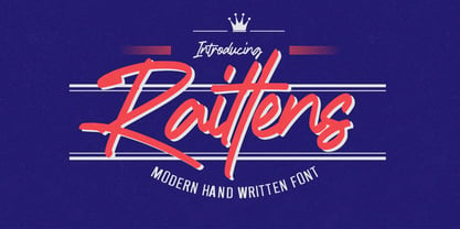 Introducing Raittens is Modern Handwritten Font is a Authentic Style and classy style, Raittens a natural handwritten feel. This handmade font will make your design has a beautiful natural touch for each details. It is perfect for any design project as Invitation,logo, book cover, craft or any design purposes,photography overlays, signs, window art, scrapbooking, tags and so much more! This font is PUA encoded which means you can access all of ligatures.
 - Saxo by Eurotypo,
$35.00 The Saxo family is based on the typefaces of the twenties and thirties, where through the Art Deco and Futurism were built the foundations of the modern movement. Designed from basic geometric shapes (triangle, circle and square). This font transmits his solid character and modern spirit, through 470 glyphs, including Opentype features like ligatures, stylistic alternates and borders based on the geometry of the typeface. All Saxo fonts come with CE languages support.
 - Grand Central JNL by Jeff Levine,
$29.00Grand Central JNL is named for the most luxurious train depot in the nation—Grand Central Station in New York City. This multi-line Art Deco font is reminiscent of all of the glitz and glamour associated with Manhattan in the 1930s and 1940s. Modeled from Jeff Levine's Parkitecture JNL, its roots go back to the popular typeface best known as Eagle—a lettering design most associated with the NRA posters of the Depression era. - Marsheila by Arterfak Project,
$15.00 Marsheila is a display font, inspired by Gatsby & Vintage looks. The All-Caps font which comes from a combination of art deco and retro style. Luxury shapes, clean & solid that very possible to apply in many design project. Marsheila also has some OpenType features to gives you many alternatives in your creative process. There's some ligatures, many alternates, and 18 accents. A great choice for your headline, editorial, logotype, quotes, typography and more!
 - Creazy Xeon by SimpleType Studios,
$23.00 Crazy Xeon is stylish graffiti brush inspired from graffiti street project art. This gorgeous font includes all lowercase and uppercase characters, numbers, punctuation, an array of standard ligatures and a selection of international characters as well. Whether you are using it for cartoon-related designs, lable, children’s games, quotes, t-shirts, titles, merchandise, brand names, book covers, posters, or just any creation that requires a touch of beauty, this font is a great choice.
 - Annadalea by EVCco,
$12.00 This typeface pays homage to numerous Victorian and Art Nouveau predecessors, while straying somewhat beyond their usual conventions. All lowercase letters ascend in unison, whereas capitals descend below the baseline. A rigid set of uniform strokes keeps the chaos reigned in, while various calculated inconsistencies affect a vaguely hand-drawn quality to this quirky, downright decadent font. Comes packaged with the standard complement of alpha-numeric glyphs, punctuation marks, mathematical symbols, and Western European diacritics.
 - Jackleen by Create Big Supply,
$15.00 Jackleen is a signature font with ligature. Be mesmerized by its beautiful style and use it to create beautiful wedding invitations, beautiful stationary art, eye-catching social media posts and more! This font is PUA encoded which means you can access all the amazing glyphs and ligatures easily Features: Uppercase & lowercase Numbers and punctuation Multilingual Ligatures PUA Encoding Full Character Set !"#$%&'()*+,-./0123456789:;?@ABCDEFGHIJKLMNOPQRSTUVWXYZ[\]^_`abcdefghijklmnopqrstuvwxyz{|}~¡¢£¤¥§¨©ª«®¯°±²³´¹º»¿ÀÂÃÄÅÆÇÈÉÊËÌÍÎÏÑÒÓÔÕÖ×ØÙÛÜÝÞßàáâãäåæçèéêëìíîïñòóôõö÷øùúûüýþÿ•†‹›‒–ˆˇ˜€“‘ŸœŒš˚”’ıžŠ
 - Suffragette by muccaTypo,
$33.00 Suffragette, an all-caps typeface introduced for the branding of the Hermitage Hotel in Nashville, is inspired by the Hotel’s Beaux-Arts architecture injected with a healthy 2020’s aesthetic. This unique roman capital design, with its sans serif-medium contrast shapes and slightly pronounced serifs, is the perfect match for luxury packaging and high-end couture. If your brand wants to project elegance with a playful edge, Suffragette is the font for you!
 - Spirit of 69 by Mysterylab,
$21.00 Here's a lively new take on the swirly psychedelic type we all know and love, Spirit of '69 brings in some subtle dimensions of waviness to the vertical strokes, upslanted horizontal strokes, and alluring paisley shapes formed out of the negative spaces. This is a unicase font, in the grand tradition of the Art Nouveau lettering of the early 20th century, and the melty groovy fonts of the 1960s. Lots of fun and beautiful too!
 - Supper Club JNL by Jeff Levine,
$29.00After creating the all-caps version of Supper Club JNL, a conversation between Jeff Levine and fellow font designer Ray Larabie brought forth the idea that one of Ray's freeware fonts had a lower case that would perfectly fit Jeff's design. With Ray's permission, Jeff adapted the lower case to his capital letters and the final version of Supper Club was born. Two separate ideas become one stylish Art Deco type design. - Stickley Decorations by Woodside Graphics,
$19.95Stickley Decorations contains 26 classic images from the pages of "The Craftsman," the foremost journal of the American Arts & Crafts Movement of the early 20th Century. These are graphic elements that can be used in many ways and for all occasions, whether creating a custom greeting card or designing and producing unique personal stationery. They can be used exactly as intended, as "decorations" on a printed page, or they can be combined into unusual borders. - Vennesia by Andrey Font Design,
$10.00 Vennesia is a sweet handwritten font. Fall in love with its authentic feel and use it to create gorgeous social media posts, wedding invitations, beautiful stationary art and much more! It also features a wealth of special features including alternate glyphs and ligatures. This font is PUA encoded which means you can access all of the cute glyphs and swashes with ease! Whether you’re looking for fonts for Instagram or calligraphy scripts for DIY projects.
 - Posterama by Monotype,
$40.99 The Posterama™ typeface family contains 63 fonts and is a true journey through space and time. Designed by Jim Ford, each Posterama family contains 7 weights from Thin to Ultra Black, in 9 distinct families. What makes Posterama so unique and versatile are the eight alternative display families. By making use of a collection of alternative glyphs, Posterama sets an evocative flavor to visualize an entire century of futuristic reference points from art, architecture, poster design and science fiction into one family. Posterama Text is the base family. It has the most robust character set including upper and lowercase glyphs and pan-European language support (including Greek and Cyrillic). Note: all the other Posterama variants described below do not have lowercase letters or Greek and Cyrillic support. Posterama 1901 recalls the decoratively geometric style of Art Nouveau from the turn of the 20th century. Letterforms such as the slender, snaking ‘S’, the high-waisted ‘E’ and the underlined ‘O’ revive the spirit of Charles Rennie Mackintosh and the designers of the Viennese Secession. Posterama 1913 pays homage to the Armory Show, or 1913 Exhibition of Modern Art, which brought the revolutionary work of European artists such as Picasso, Duchamp and Kandinsky to the US for the first time to the shock and astonishment of press and public. Near-abstract, angular characters such as the ‘A’, ‘E’ and ‘N’ hint at cubism’s jagged and clashing planes. Posterama 1919 uses a small, but important, variation to set a tone when the Bauhaus was founded, and the surge in radical European typography that followed. The straight-sided, roundheaded ‘A’ adds a flavor of 1919 – this style of ‘A’ can still be seen in the Braun logo, designed in 1934. Posterama 1927 captures the year of Metropolis, The Jazz Singer and Paul Renner’s pioneering, geometric Futura typeface from 1927, which had a profound influence on design in the US and Europe. Posterama 1933 – With its low-waisted, sinuous designs, the Posterama 1933 typeface family echoes lettering of the Art Deco period, which in turn had its roots in Art Nouveau, the key influence on Posterama 1901. The two fonts make a great team and can be used interchangeably. Posterama 1945 features a few Cyrillic characters to conjure up an era when Russian art and political posters made their mark in cold war propaganda, espionage and also giant aliens and monsters. Posterama 1984 takes its typographic influences from George Orwell’s classic novel, publicity for the dystopian action and sci-fi movies (Blade Runner, Videodrome and Terminator) and games like Space Invaders and Pac-Man that made an impact at that time. Posterama 2001 was inspired by Stanley Kubrick’s science fiction masterpiece, which made extensive use of the Futura typeface. Posterama 2001 finds its cosmic orbit with its nosecone-style ‘A’ from NASA’s much-missed ‘worm’ logotype. There’s an echo, too, in Bauhaus designs from as early as 1920, whose minimalist, geometric lettering also featured a crossbar-less ‘A’.
 - Fragua Pro by deFharo,
$14.00 Fragua Pro is a family of 14 fonts (Latin Extended-A and the Cyrillic alphabet) Condensed Sans Serif of geometric construction inspired by the Russian constructivism of the mid-20th century; the typography has a rounded finish in all corners to avoid the coldness of the rectilinear fonts and providing warmth and docility, the ascending and descending short and a high height of the x make it very compact, all this results in a unique typeface with maximum readability due to the careful configuration of metrics and Kerning. The cursive styles have an inclination of 8 degrees and a narrower proportion than the regular ones, they also have their own letters and meticulous optical corrections to compensate for the deformations produced by the inclination. Fragua Sans has Advanced Open Type functions, several alternative letters, full support for numbers, monetary symbols and crypto currencies and more. 681 glyphs. This typography is specially designed for advertising and editorial composition, behaving correctly in both short and medium texts and headlines where horizontal space saving is needed, being an ideal typographic system for signage, editorial or corporate design. This typography is dedicated to the memory of my grandfather C·ndido (Pa), the blacksmith of my town. THE COMPLETE 14 FONTS PACKAGE INCLUDES THE REGULAR VERSION IN "VARIABLE FONT" FORMAT, compatible with Adobe CC 2018.
 - Winter Flowers by Great Studio,
$14.00 Winter Flowers, a font duo, is a unique and modern hand script that provides a large selection of alternative characters to choose from as well as ligatures that look natural and add to the authenticity of the letters. Winter Flowers is a modern handwritten font, loaded with awesome OpenType features, and a set of alternative characters for uppercase and lowercase letters. Make all the extra decorative and unique choices you wish with the included swashes, endings, and alternative letters. Designed to work harmoniously, Winter Flowers is also equipped with a sans font, to perfect your design. This font is perfect for branding, logos, web and editorial design, branding, prints, invitations, handicrafts, quotes, and more. Winter Flowers features OpenType stylistic alternates, ligatures and International support for most Western Languages is included. To enable the OpenType Stylistic alternates, you need a program that supports OpenType features such as Adobe Illustrator CS, Adobe Indesign & CorelDraw X6-X7, Microsoft Word 2010 or later versions. Winter Flowers is coded with PUA Unicode, which allows full access to all the extra characters without having special designing software. Mac users can use Font Book , and Windows users can use Character Map to view and copy any of the extra characters to paste into your favourite text editor/app. Need help? If you need help or advice, please contact me by e-mail Greatstudio92@gmail.com Thank you, Great Studio
 - Agatized Formal by ULGA Type,
$25.00 Agatized Formal is a chunky stencil typeface with slightly condensed letterforms and tight spacing. Designed primarily for display use, it’s ideal for posters, logos, advertising, book cover designs or small chunks of text such as pull-out quotes. It exudes authority without taking itself seriously, like a plump jolly uncle in charge of a brass band. Agatized Formal is a big, bold typeface with a charismatic presence that commands attention – in a friendly way, of course. But what really makes this typeface come alive is its arsenal of alternative characters and ligatures. There is a saying: Use sparingly. Whoa! Not here, no, no, no. Make your Glyphs palette earn its money. Flex your OpenType muscles: get stylized, contextualized, indulge in some ligaddiction. This typeface is a peacock that likes to put on a show, spread its plumage and strut around in all its blazing glory. Agatized, according to Wiktionary, means: A living thing converted into the form of agate; fossilized. I felt the name suited the solid, almost rock-like letterforms, but most of all I just wanted a typeface name that began with the letter A. Although Agatized Formal is a single-weight typeface it has a sibling, Agatized Informal, an older, more casual brother, rougher round the edges with craggy good looks and an altogether more jaunty style.
 - Pulse JP Arabic by jpFonts,
$29.95 النبض - the Pulse Pulse JP ME is a constructivist text and display font that differs from comparable fonts due to its special sharpness and harmonious balance. Its technical and constructed form creates a somewhat artificial impression of particular appeal. It is ideal for display on the screen and can be used in many projects. Pulse JP ME is a super family consisting of 48 fonts from compressed to expanded in six weights each. This opens up a wide designspace with the possibility of combining typefaces of the same character in a wide variety of variants and being able to adapt them to very different conditions. The details of the individual fonts are coordinated with each other with great precision and perfectly implemented in terms of craftsmanship. In all variants, this leads to a very balanced design with particular sharpness. The very extensive character set supports 120 Latin + 7 Arabic languages + Hebrew. The Arabic characters were designed in close collaboration with the Iranian designer Prof. Raafat Negarandeh. Here the constructivist approach is repeated within Arabic proportions. This leads to a very reduced and clear design with high legibility. Additional typographical adjustments can be made in the variable font, which is also available. There all variants are stored in a single font and can be continuously fine-tuned between them.
 - Garino Variable by Julien Fincker,
$185.00 About Garino: Garino is a modern sans-serif typeface family. It gains its expressive character from a dynamic sweep in the curves and high-contrast transitions. The thinner and thicker weights are particularly suitable for strong headlines, while the middle weights can be used for typographic challenges and body text. As a result, it can be used in a reserved as well as an expressive way. Thanks to an extensive character collection, it becomes a real workhorse. A versatile allrounder that is up to all challenges – for Corporate Identity, Editorial, Branding, Orientation and Guidance systems and much more. Variable Font The Variable font contains 2 axes: weight and oblique – all in just one file. Features: With over 1165 characters, it covers over 200 Latin-based languages. It has an extended set of currency symbols and a whole range of Open Type Features. There are alternative characters as stylistic sets, small caps, automatic fractions – just to name a few. Arrows and numbers: In particular, the extensive range of arrows and numbers should be highlighted, which are perfectly suited for use in orientation and guidance systems. Thanks to Open Type Features and an easy system, the various designs of arrows and numbers can also be simply "written" without first having to select them in a glyph palette. Get the static version of the Garino family here: https://www.myfonts.com/fonts/julien-fincker/garino/
 - Raqib by Twinletter,
$18.00 Introducing Raqib, a distinctive and eye-catching font that gives any project a robotic, sci-fi edge. Raqib is ideal for creating futuristic and intriguing designs due to its bold font shape and distinctive robot style. Raqib is the ideal option if you’re working on a project with a sci-fi theme or want to incorporate robotics into your branding. Because of its bold design, it’s perfect for headlines, posters, and social media graphics, and its distinctive font shapes give your text a standout, memorable appearance. For those looking to stand out in the modern era and add a touch of innovation and futurism to their designs, the Raqib font is ideal. This font is a must-have for anyone looking to create designs that really stand out. Don’t miss this limited-time offer, get the unique and versatile Raqib font today and start creating designs that will be remembered. With Raqib, you can create stylish and professional designs, with a futuristic robotic look that’s sure to stand out. What’s Included : - File font - All glyphs Iso Latin 1 - Alternate - Simple installations - We highly recommend using a program that supports OpenType features and Glyphs panels like many Adobe apps and Corel Draw so that you can see and access all Glyph variations. - PUA Encoded Characters – Fully accessible without additional design software. - Fonts include Multilingual support
 - Amira Madison Script by Jamalodin,
$17.00 Introducing Amira Madison Script! Amira Madison Script is modern calligraphy script font, every single letters has been carefully crafted to make your text looks beautiful. With modern script style this font will perfect for many different project, example: invitations, greeting cards, posters, name card, quotes, blog header, branding, logo, fashion, apparel, letter, stationery and more! Amira Madison Script come with 780+ glyphs. The alternative characters were divided into several Open Type features such as Swash, Stylistic Sets, Stylistic Alternates, Contextual Alternates. The Open Type features can be accessed by using Open Type savvy programs such as Adobe Illustrator, Adobe InDesign, Adobe Photoshop Corel Draw X version, And Microsoft Word. And this Font has given PUA unicode (specially coded fonts). so that all the alternate characters can easily be accessed in full by a craftsman or designer. Amira Madison Script Contains: - Uppercase & Lowercase - International Language & Symbols - Punctuation & Numbers - PUA Unicode - Standard Stylistic Alternates - Stylistic Set 1-23 - Character Variant Contextual. The ZIP file are include the following : Amira Madison Script.otf If you don't have a program that supports OpenType features such as Adobe Illustrator and CorelDraw X Versions, you can access all the alternate glyphs using Font Book (Mac) or Character Map (Windows). If you have any question, don't hesitate to contact me by email: jamalodin11@gmail.com
 - Pagnol by Typorium,
$15.00 The Pagnol typeface has been designed with a principle developed by A. M. Cassandre in 1937, when the great French designer created the Peignot typeface following paleographic studies on the evolution of letterforms. Researches in the history of writing have proved that the lowercase "a" is at its origin nothing but the "A" shape transformed through centuries by scribes until the invention of printing. A large number of lowercases meanwhile kept their original shapes. If the scribes’ hand didn’t find the necessity to simplify them, it is only because these letters could be easily written. Integrating the classical shapes of capitals to the lowercases has already been used, keeping the lowercases which are only a deformation of capitals. Nevertheless, the respect of readability imposes to keep ascendants and descendants from traditional lowercases which serve as optical focus points in a text and make reading easier. The particularity of Pagnol is to use rounded shapes on top and bottom of pointed capital letters to make them fit with corresponding lowercases (Aa, Mm, Nn, Vv, Ww, Zz). Lowercases proportions are wide, to be in tune with classic lowercase shapes in order to optimize readability. Five weights in roman and italic have been designed to offer a wide palette of typographic possibilities in all sizes and all paper and screen supports.
 - One Heart by Bal Studio,
$12.00 Introducing One Heart is a handwritten font, using a brush and ink effects that combine calligraphic brush styles, irregular base lines, rough edges, thick and organic movements. One Heart Script includes 242 characters, ligatures as well as multi-language support. One Heart can be used for various purposes such as posters, logos, t-shirts, signage, business cards, magazines, book covers, wedding invitations, greeting cards,brand projects, product packaging, invitations, news, blogs, everything including personal charm ,etc. Files included: ~One Heart ( otf ) ~One Heart ( ttf ) ~One Heart Swash ( otf ) ~One Heart Swash ( ttf ) To enable OpenType Stylistic Ligatures, you need a program that supports the OpenType feature. such as Adobe Illustrator CS, Adobe Indesign & CorelDraw X6-X7.How to get access ligatures glyphs from open type fonts : http://youtu.be/iptSFA7feQ0 One Heart is coded with PUA Unicode, which allows full access to all the extra characters without having special designing software. You can use the Character Map to view and copy any of the extra characters to paste into your favourite text editor/app. Using Character Map (Windows), Nexus Font (Windows), Font Book (Mac) or a software program such as PopChar (for Windows and Mac).How to access all alternative characters, using Windows Character Map with Photoshop : https://www.youtube.com/watch?v=Go9vacoYmBw Thanks so much for looking and please let me know if you have any questions.
 - ITC Tyke by ITC,
$29.99Tomi Haaparanta got the idea for the Tyke typeface family after using Cooper Black for a design project. He liked Cooper's chubby design, but longed for a wider range of weights. “I wanted a typeface that was cuddly and friendly,” recalls Haaparanta, “but also one that was readable at text sizes.” He started tinkering with the idea, and Tyke began to emerge. Even though Haaparanta knew his boldest weight would equal the heft of Cooper Black, he began drawing the Tyke family with the medium. His goal was to refine the characteristics of the design at this moderate weight, and then build on it to create the light and bold extremes. Haaparanta got the spark to design type in 1990, when he attended a workshop held by Phil Baines at the National College of Art and Design in Dublin. “I've been working and playing with type ever since,” Haaparanta recalls. He released his first commercial font in 1996, while working as an Art Director in Helsinki. After about two dozen more releases, he founded his own type studio, Suomi Type Foundry, early in 2004. At five weights plus corresponding italics, Tyke easily fulfills Haaparanta's goal of creating a wide range of distinctive, completely usable designs. The light through bold weights perform well at both large and small sizes, while the Black is an outstanding alternative to Cooper for display copy. - FHA Broken Gothic by Fontry West,
$15.00 More than a century ago, Frank H. Atkinson presented this hand lettered style as Broken Poster. It was one of a hundred styles he demonstrated in his manual on sign painting. Even before his book was published (and certainly after), Broken Poster was a favorite with sign painters and letterers. It has graced show cards and movie posters, signs and windows displays, and advertisements of all varieties. We presented the our first digital revival of this classic in 2000. It is long overdue for an upgrade. Broken Gothic expands the basic Broken Poster to four weights, two specialty formats and some cool layed effects. The language base includes Greek, Cyrillic, Latin A, and some of Latin B and Latin Extended. There are also some nice alternates and ligatures. All weights are quite suited to posters, headlines, display copy, web headers, etc. At first glance, Broken Gothic may seem to have limited uses. Give it a chance and it will surprise you. Broken shouts out that there is a sale, a giant monster or the end of the world. Broken Gothic is comfortable in a wide range of themes and applications from zombie movie titles to salsa jar labels. While I can't recommend it for text, Broken is great for headers, banners, signs, titles, product presentation and other display applications. When you need a rough customer, Broken Gothic fills the bill.
 - Aure Wye by Aure Font Design,
$23.00 Aure Wye wraps a carefree dispassion with the dignity of tradition. The precise engraving and organic finials of these decorative serif forms engage the reader with a subtext of elegance. Wye brings an unpretentious grace to titles and drop-caps and provides dignity to astrological expressions and chartwheels. In Regular, Wye presents a formal presence; in Italic, Wye offers a more romantic feel. Its small-caps add a stately variety to Wye's typographic textures. Wye is an original design developed by Aurora Isaac. After more than a decade in development, 2018 marks the first release of the CJ and KB glyphsets, now available in regular and italic. The CJ glyphset is a full text font supporting a variety of European languages. A matching set of small-caps complements the extended lowercase and uppercase glyphsets. Supporting glyphs include standard ligatures, four variations of the ampersand, and check-mark and happy-face with their companions x-mark and grumpy-face. Numbers are available in lining, oldstyle, and small versions, with numerators and denominators for forming fractions. Companion glyphs include Roman numerals, specialized glyphs for indicating ordinals, and a variety of mathematical symbols and operators. The CJ glyphset also includes an extended set of glyphs for typesetting Western Astrology. These glyphs are also available separately in the KB glyphset: a symbol font re-coded to allow easy keyboard access for the most commonly used glyphs. Aure Wye will stand up as a text font, but for extended text, try pairing Wye with its close cousin, Aure Declare. Used in titles and drop-caps, Wye will provide a striking elegance that will blend well with the serifed forms of Declare. Give Aure Wye a trial run! You may discover a permanent place for this font family in your typographic palette. AureFontDesign.com
 - Halenoir by Ckhans Fonts,
$34.00 • Composed of 3 sets: Normal, Compact, Expanded. • Consisting of 3 distinct optical sizes: Display and Text, Expanded. • Comprises 102 fonts • Support for 28 languages: Afrikaans Albanian Catalan Croatian Czech Danish Dutch English Estonian Finnish French German Hungarian Icelandic Italian Latvian Lithuanian Maltese Norwegian Polish Portugese Romanian SlovakSlovenian Spanisch Swedish Turkish Zulu Swedish Turkish Zulu • Contains OpenType features with alternates or substitutes • Tabular Figures • Ordinal numbers • 74 icons (It will keep updating.) • 72 graphic patterns for designer (It will keep updating.) • 28 brand symbols (It will keep updating.) • 27 arrows glyphs • 0-99 line circled glyphs • 0-99 solid circled glyphs • A-Z line circled glyphs • A-Z solid circled glyphs Halenoir is a modern sans serif with a geometric touch that support for 28 languages. It comes in 10 weights, 102 uprights and its matching outlines, Obliques, pattern, so you can use them to your heart’s content, in each of which there are more than 801+ glyphs. Halenoir is composed of 3 types: Original, Compact, Expanded, and each is designed to be suitable for mobile, graphic, and editorial design. Halenoir comprises 102 fonts, consisting of three distinct optical sizes: Display and Text. Each one has been carefully tailored to the demands of its size. The larger Display versions are drawn to show off the subtlety of Halenoir and spaced with headlines in mind, while the Text sizes focus on legibility, using robust strokes and comfortably loose spaces. In the typeface, each weight includes extended language support, fractions, tabular figures, arrows, ligatures and more. Perfectly suited for graphic design and any display use. It could easily work for branding, web, signage, corporate as well as for editorial design. documents and folders, mobile interface. Useful links: Gravitica PDF Type Guide and Specimen (You can know how to use icons and arrows, other glyphs.)