10,000 search results
(0.048 seconds)
- CA Texteron by Cape Arcona Type Foundry,
$40.00 CA Texteron is a modern text font family to cover the most common typographical needs with a minimum of weights. It is aiming for a serious but unconventional look, which is achieved by combining round and edgy forms in the same font, often in the same glyph, and by using Humanist and modern form-principles at the same time. It merges classical type-design with an experimental spirit. CA Texteron combines elements of the dynamic renaissance principle with the static neo-classic style, which makes it hard to classify. The result is a post-modern hybridization. The Regular weight works best in text size, and with more letter-space also for footnotes. The low contrast makes it robust and legible even in very small sizes. Bold, Italic and Small Caps are intended for emphasis. Bold, Bold Italic and Heavy make good headlines, that reveal the unconventional details. The Italic is not just a slanted version of the Regular weight but has individual forms and typical italic characteristics.
 - Core Narae Pro by S-Core,
$25.00 Core Narae Pro is an improved version of Core Narae released in 2012. This type family has improved a lot. First of all, we have rearranged a rhythmic text line to make it work well both as a headline and a text font. And this new version has more OpenType features, including Proportional Figures, Tabular Figures, Numerators, Denominators, Superscript, Scientific Inferiors, Subscript, Fractions and Standard Ligatures. We have also added one more weight and improved kerning for using this type family effieciently. Finally, we exclude MS Windows 949 Korean consisting of 11,172 Korean letters and Symbols except Chinese to reduce the file size and price but added more glyphs that support latin,cyrillic,greek. Now, Core Narae Pro Family consists of 2 weights (Regular & Bold) and it supports WGL4, which provides a wide range of character sets(CE, Greek, Cyrillic and Eastern European characters). Its bending strokes and rhythmic feeling of this typeface make your works more friendly.
 - Isabel by Letritas,
$30.00 Isabel was made out of necessity to create a new font for children and teenagers, that could be enough friendly and versatile for text in words or even easy-to- read long texts. The purpose of Isabel is to combine all the nice and friendly features of the simple letters that the teachers teach to the pupils at primary school, as they starting to learn to read, together with the normal editorial fonts we read every day. In this way it generates a very joyful serif font, or even friendly font, with some conservative aspects. In other words, Isabel is a font that, despite of being a “classic features” typography, is proud to show its innocent and ingenuous elements, this gives to the font a new point of view. The family is composed of 3 parts: the regular version, the italic version and the unicase version. Each one of them has 5 weights, 551 characters and is composed of 208 languages.
 - Marco by TypeTogether,
$49.00 Marco is a lively text face, with an informal touch, inspired by 15th century Italian letter-forms with strong calligraphic traces and intended to be used primarily in continuous and intensive reading conditions. Marco is full of features required for high-quality book typography, including: strong language-support in extended Latin, Cyrillic and polytonic Greek, a multitude of swashes in the italic styles of Latin and Cyrillic, stylistic alternates to obtain the best possible solutions and other typographic niceties. Inspiration for Marco goes back to Italian humanist typography such as those of Nicholas Jenson or Aldus Manutius, and general influences from calligraphy. As a result, Marco has matured into a personal and unique text face where its lively and somewhat informal style is an ideal counterpart to its careful and ingenious crafting. Toshi Omagari’s Marco features a huge set of over 1900 characters per style —and almost 2600 in the italics— and is available in Regular, SemiBold, Bold with matching Italics.
 - Buddy Suit by PizzaDude.dk,
$15.00A drippy text font, or slimy if you prefer! - ADD by Sea Types,
$20.00 A minimalist typography for short texts and individual words.
 - ArTarumianKhachatur by Tarumian,
$40.00 This is a font imitating the stage of outline construction of letters using drawing tools - compass and ruler. It is very geometric (with auxiliary lines, axes, centers of circles, tangents, and conjugation of circles), although the circles are somewhat compressed from four sides. The second style, which plays the role of Bold style, is a hatched version of the Regular style. The font has very small elements that appear in a sufficiently large size, so it is better to use it for large compositions, in particular, advertisements, posters, large headings, etc. The family is named "Khachatur" after the name of the father of designer Ruben Tarumian — architect Khachatur Hakobyan, his first master.
 - Ridtype Pro by Ridtype,
$30.00 Ridtype Pro is a custom font for our brand, and later this font will work in all roles in the type of brand we use. both in units of typography, printing, and type texting. This font is equipped with a modern semi-classic category type, so this font can work in all lines of business, both for supporters of implementation in modern and classic business. This font has been designed as best as possible, both in terms of letter design and the type of weight that is made to be compatible in all roles.
 - Exceptional by Studio&Story,
$16.00 Exceptional Is a super trendy Handwritten font, Elegant & modern with gentle brush texture , Exceptional comes with a complete set of lowercase and uppercase alternates(Uppercase letters can be used alone), It gives you the option to customize your text and to make it much more unique (It's very fun). And more great extra is the bonus Swash, this set come with 26 swashes, which allows you to add elegant & trendy finishing touches to your work. It's the perfect choice for personal branding projects, product packaging, social media, fashion, advertising and more!...
 - Palaima by John Moore Type Foundry,
$19.00 Palaima is a geometric display font, its name means word-image and is inspired by our aboriginal pictographs, Palaima was created to compose texts informal, where each character is an entertainment, featuring several variations of this font letters to make more enjoyable composition. Palaima has a set of characters that include swash, stylistic alternates, ligatures, fractions and twenty funny icons. Palaima was selected in the third Biennial of Latin American Typography "Tipos Latinos" also was honored by the Ruben Fontana's JournalTipográfica of Argentina "Best Latin American Typographic Creativity".
 - Stroma by Tokotype,
$39.00 Stroma is a serif display faces with moderate contrast and quirky cuts. Intended to use it on headlines in the editorial design environment or big type style graphics, The function of this typeface allows it to use on larger and compact text for any graphical elements that need special treatment. The details interpreted from the straight axis pointed into flourish calligraphic serif, the shape of the letter contains straight details and cuts, this gives them a rich and fine looks. The Stroma family includes four weights, ranging from Light to Bold with italic uprights.
 - WILK by Edyta Demurat,
$20.00 Do you need a hand-drawn, heavy, creative typeface? If so, WILK is perfect for you! This font was created specially for fairy tale "Little Red Riding Hood" and it was inspired by the fairy-tale's character of wolf . The typography is tight- knit and fat but also free and funny. It consists only of uppercases, but it has two up to five alternative gifs for each letter. This great choice of gifs makes WILK perfect for long texts but not only! It's also great in a large magnification.
 - Linotype Alphabat by Linotype,
$29.99Jan Tomáš studied at the Universität der Künste, Berlin. He is a multi-talent – the author of many ideas, a font creator, designer, modeller, technician and web designer. In 2011, he founded Future Typo, the first web portal for advanced typography with original design typefaces and 3D typefaces. When you look closely to Linotype Alphabat, the figures start to change from letters into flying bats and scary faces. Linotype Alphabat can be used for very short texts however it is particularly effective for headlines in larger point sizes so that its details are emphasized. - Queenly by Anmark,
$18.00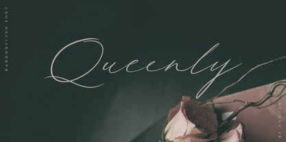 I’m pleased to introduce my handwritten font Queenly. Queenly is an elegant, feminine font. Modern calligraphy uppercase letters are ideal for your wedding monograms and logos. Use this font for wedding invitations, branding, packaging, magazines, florist shops, social media, restaurant menus, greeting cards, headers and many more. This font includes ligatures and a full set of lowercase alternates to make your text as close to a natural handwritten script as possible. It's perfect for wedding design projects, instagram, invitations, signatures, watermarks, logos, letterpress address, titles, birthday invitations, handwriting and other.
 - The Rounded Font by Sven Pels,
$15.00 the rounded font is a slight condensed and fun rounded typeface that comes in three weights: light, regular & bold. all letters are designed in the same line thickness. the fun way that the characters flow makes the font a useful but also unique typeface to use. it works great as both body text and headers. especially when you use the different weights in the right way. as graphic designer sven pels often deletes the dots of both the i’s en j’s to make it unique but also just to break some rules… svenpels.com instagram.com/svenpels
 - Wak by ParaType,
$30.00 Wak is a lively calligraphy-based sans serif. The simplicity and smoothness of its forms is combined with the sharpness and suddenness of the details. There are six weights from light to extra bold, with a variety of alternative signs, additional ligatures and initial and final forms with swashes. Lowercase letters repeat the uppercase pattern. The font is intended for short inscriptions and texts and is adapted for use on the screen. Wak was designed by Viktor Fitzner, character set expanded by Alexander Lubovenko. The font was released by ParaType in 2018.
 - Linotype Fehrle Display by Linotype,
$29.99Erich Fehrle designed this robust alphabet for headlines and titles in 1976. The constructed figures of Linotype Fehrle Display were built on the geometric form of the rectangle. Lines of text look closed and compact. The letter forms are the result of fine open spaces. Design-specific characteristics of Linotype Fehrle Display are its serif-like additions to the strokes of the figures a, c, G or M, and the alternating rounded and angular outlines of the figures a, e, s and others. Typefaces similar to Linotype Fehrle Display: Bigband, Frutiger 95. - Getlost by Alcode,
$18.00 Getlost is an organic signature font inspired by natural brush typography. Written in rapid motion using a slightly dry brush pen. This will give you a fresh and elegant design. Getlost comes with uppercase and lowercase letters, large sets and small sets, numbers, alternative styles for several lowercase characters are also available that make your text and design more attractive. Try Getlost, enjoy the richness of OpenType features and let her fun and elegant excitement make you happy and enhance your creativity! You can use this font very easily. Included multilingual support and special ligatures
 - Billionaire Club by VP Creative Shop,
$30.00 Introducing Billionaire Club - Art Deco Serif Font Billionaire Club is luxury, Art Deco typeface loaded with 8 alternate glyphs for every letter and multilingual support. It's a very versatile font that works great in large and small sizes. Billionaire Club is perfect for branding projects, home-ware designs, product packaging, magazine headers - or simply as a stylish text overlay to any background image. Uppercase, numeral, punctuation & Symbol Alternate glyphs Ligatures Multilingual support Feel free to contact me if you have any questions! Mock ups and backgrounds used are not included. Thank you! Enjoy!
 - Corso by Dominik Krotscheck,
$7.99 Corso is a clean condensed sans serif font family. It comes in upright, slanted and italic, in six weights each. It includes useful typographic features such as fractions, ligatures and case sensitive forms. Also included are double- or single-storey versions of a and g, you can switch via stylistic OpenType sets. Other letters with alternative forms accessible the same way are ß and ampersand. Corso works especially great for larger size uses such as signage, headlines or posters. But that doesn’t mean that it isn’t also useable for short texts.
 - Emperator by Latinotype,
$35.00 Marcelo's new typeface Emperator —based on his knowledge gained from instruction by master calligraphers— provides a fresh perspective on classic typefaces. Emperator comes in 3 variants that make your designs look elegant, legible and expressive. This font is perfectly suitable for a wide range of applications such as titles, wedding invitations, short text, logos, labels, book covers, posters, packaging, etc. Emperator's character set includes small caps (letters, figures and symbols), fractions, stylistic alternates, ligatures, mathematical symbols, etc.— more than 750 glyphs in all, supporting over 200 Latin-based languages.
 - Mondera by Twinletter,
$17.00 Introducing MONDERA, our newest san serif font. We created this font by paying close attention to the harmony between each letter, resulting in a lovely blend of words when viewed or read. If you use this font for all of your projects, both official and informal, everything will look the same. of course, your various design projects will be perfect and extraordinary if you use this font because this font is equipped with a font family, both for titles and subtitles and sentence text, start using our fonts for your extraordinary projects.
 - Bastina Sindey by HansCo,
$17.00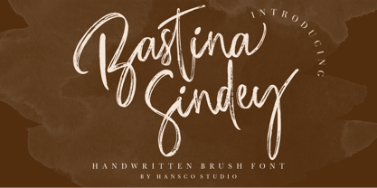 Bastina Sindey is a natural handbrush font. This texture is very detailed. You can get also the swash brushes include in this font pack. This font is suitable for logos, shirts, fashion, blogs, websites, product branding, posters, flyers, any print template or for text overlay to any background image. Comes with a full uppercase, lowercase, numbers and punctuation + standard multilingual support. It’s great for branding, logo designs, lettering, logotype, craft, posters, packaging and much more. We recommend using Adobe Illustrator or Photoshop. Tutorial how to Install & use Alternate / Special Character : https://hanscostudio.com/tutorial/ Enjoy!
 - Banner by ITC,
$29.99The calligraphy font Banner was designed by Martin Wait in 1986 and mixes the character of the 1940s with that of the 1980s in its forms. The round and somewhat reserved lower case letters make a balanced basis for the generous capitals. Black outer contours surround a white inner area and are heavier on the right side of the figures, making the characters look as though they have shadows. Banner should be used in point sizes of 18 and larger and is meant for lighthearted short texts or headlines. - Linotype Algologfont by Linotype,
$29.99Linotype Algologfont is part of the Take Type Library, chosen from the contestants of Linotype’s International Digital Type Design Contests of 1994 and 1997. Designed by German artist Bjorn Hansen, the font contains exclusively capital letters and the forms of the characters look like branches or driftwood bent to form an alphabet and punctuation. The font is very flexible and can give text either a myterious and strange impression or a free and natural one, dependent on context. Linotype Algologfont is best suited to headlines in larger point sizes. - Tabac by Suitcase Type Foundry,
$125.00 The Tabac type system is a static typeface with modern shapes and distinct, wedge-shaped serifs. It is primarily designed for the setting of newspapers, magazines and books. Tabac boasts great variability in terms of letter weight in all of its styles. Each style works as a font of its own, featuring the full set of glyphs. The styles may be combined depending on the user; the choice of text and title face thus depends fully on the designer’s own taste, on the needs of the readers and the technologies of printing in use.
 - Matchmaker by Angie Makes,
$30.00 Matchmaker, a modern calligraphy typeface, was inspired by the various works of modern day calligraphers. Its tall, quirky, and juxtaposed letterforms provide a deviation from traditional calligraphy-inspired typefaces. Matchmaker features smart contextual alternates and swashes that add to the front and beginnings of letters (using lowercase letters, enter === before the word then +++ after the word to see the feature in action). Also watch as letters on the end of words magically receive a shortened tail. This font works best in OpenType aware software so that you can take advantage of its many tricks and features. Comes as an .otf (OpenType font) file. Here is a great article on open type aware software: http://www.myfonts.com/info/opentype-support-in-applications/ Chocked full of swashes, alternates, and ordinals, Matchmaker just might be the perfect match for your next project.
 - Parshanut MF by Masterfont,
$59.00 A modern touch to a Biblical oriented font. High legibility as text font.
 - Banknote 1948 by Ingo,
$39.00 A very expanded sans serif font in capital letters inspired by the inscription on a bank note Old bank notes tend to have a very typical typography. Usually they carry decorative and elaborately designed markings. For one thing, they must be practically impossible to forge and for another, they should make a respectable and legitimate impression. And in the days of copper and steel engravings, that meant nothing less than creating ornate, shaded or otherwise complicated scripts. Designing the appropriate script was literally in the hands of the engraver. That’s why I noticed this bank note from 1948. It is the first 20 mark bill in the then newly created currency ”Deutsche Mark.“ All other bank notes of the 1948 series show daintier forms of typography with an obvious tendency toward modern face. The 1949 series which followed shortly thereafter reveals the more complicated script as well. For whatever reason, only this 20 mark bill displays this extremely expanded sans serif variation of the otherwise Roman form applied. This peculiarity led me in the year 2010 to create a complete font from the single word ”Banknote.“ Back to those days in the 40’s, the initial edition of DM bank notes was carried out by a special US-American printer who was under pressure of completing on time and whose engravers not only engraved but also designed. So that’s why the bank notes resemble dollars and don’t even look like European currency. That also explains some of the uniquely designed characters when looked at in detail. Especially the almost serif type form on the letters C, G, S and Z, but also L and T owe their look to the ”American touch.“ The ingoFont Banknote 1948 comprises all characters of the Latin typeface according to ISO 8859 for all European languages including Turkish and Baltic languages. In order to maintain the character of the original, the ”creation“ of lower case letters was waived. This factor doesn’t contribute to legibility, but this kind of type is not intended for long texts anyway; rather, it unfolds its entire attraction when used as a display font, for example on posters. Banknote 1948 is also very suitable for distortion and other alien techniques, without too much harm being done to the characteristic forms. With Banknote 1948 ingoFonts discloses a font like scripts which were used in advertising of the 1940’s and 50’s and were popular around the world. But even today the use of this kind of font can be expedient, especially considering how Banknote 1948, for its time of origin, impresses with amazingly modern detail.
 - Details Details NF by Nick's Fonts,
$10.00Another gem from the Blandford Press Pen and Brush Lettering and Practical Alphabets, this in-your-face typeface features strong geometric elements, delineated in blueprint fashion. A surefire attention-getter. Both versions of the font include the 1252 Latin and 1250 CE character sets (with localization for Romanian and Moldovan). - Retail Price JNL by Jeff Levine,
$29.00 Redrawn from lettering found on a British publication circa the 1930s, Retail Price JNL is an extra bold display inline sans that’s great for catchy headlines, price cards, banners or any other attention-getters. Retail Price JNL is offered in regular, oblique, solid and solid oblique versions. Caps only Fonts.
 - MEXURY by Product Type,
$15.00 Welcome to Mexury, a font that transports you to the future with an alluring modern and futuristic twist. Are you looking for the perfect solution for modern, futuristic, sci-fi, and future-themed projects? Mexury is the right choice. Mexury is a font designed to create a unique and sophisticated atmosphere. Each letter has a unique design, exuding a dazzling future and presenting an elegant look. With Mexury, your project will be in the spotlight and create an unforgettable impression. The main benefit of Mexury is its ability to deliver stunning styles. Each letter carries great visual uniqueness, giving your project a modern, stylish, and futuristic look. Inspired designs will steal the show and capture your audience’s imagination. Apart from that, Mexury also supports multilingualism, allowing you to display text in multiple languages without any restrictions. This flexibility ensures that you can easily reach a global audience and convey your message with consistent clarity across cultural contexts. Take your projects to the next level with Mexury. Let this font be the catalyst for the creation of eye-catching visuals and set the scene for a future full of innovation. Explore Mexury’s limitless potential and let your creativity flourish. With this font, you’re ready to enter the futuristic and stunning world of design. Choose Mexury and let this font be the perfect choice for your vibrant, modern, futuristic, sci-fi, and future projects.
 - Whimsical Musical by Harald Geisler,
$34.56 Whimsical Musical is a vivid, hand drawn font with 405 alternate letters, all caps. Developed from a lighthearted drawing in my sketchbook saying the German word “MUSIK” cheerfully over and over in twenty vivid variations. Next to it was the date “6th April 2007”. This initial idea has burst into a font that is full of surprises and whimsical turns. It is dynamically suggestive, like music, and humorously chaotic, as in Dada. Each uppercase letter is enriched with ten stylistic alternates (OpenType stylistic sets) to create a heap of playful variations amounting to a mountain of possibilities. Recommended for display usage: gonzo headlines, fantastical picturesque covers, extravagant quirky flyers, chichi posters, individual labels and fun logos.
 - ITC Franklin by ITC,
$40.99 The ITC Franklin™ typeface design marks the next phase in the evolution of one of the most important American gothic typefaces. Morris Fuller Benton drew the original design in 1902 for American Type Founders (ATF); it was the first significant modernization of a nineteenth-century grotesque. Named in honor of Benjamin Franklin, the design not only became a best seller, it also served as a model for several other sans serif typefaces that followed it. Originally issued in just one weight, the ATF Franklin Gothic family was expanded over several years to include an italic, a condensed, a condensed shaded, an extra condensed and, finally, a wide. No light or intermediate weights were ever created for the metal type family. In 1980, under license from American Type Founders, ITC commissioned Victor Caruso to create four new weights in roman and italic - book, medium, demi and heavy - while preserving the characteristics of the original ATF design. This series was followed in 1991 by a suite of twelve condensed and compressed designs drawn by David Berlow. ITC Franklin Gothic was originally released as two designs: one for display type and one for text. However, in early digital interpretations, a combined text and display solution meant the same fonts were used to set type in any size, from tiny six-point text to billboard-size letters. The problem was that the typeface design was almost always compromised and this hampered its performance at any size. David Berlow, president of Font Bureau, approached ITC with a proposal to solve this problem that would be mutually beneficial. Font Bureau would rework the ITC Franklin Gothic family, enlarge and separate it into distinct text and display designs, then offer it as part of its library as well. ITC saw the obvious value in the collaboration, and work began in early 2004. The project was supposed to end with the release of new text and display designs the following year. But, like so many design projects, the ITC Franklin venture became more extensive, more complicated and more time consuming than originally intended. The 22-font ITC Franklin Gothic family has now grown to 48 designs and is called simply ITC Franklin. The new designs range from the very willowy Thin to the robust Ultra -- with Light, Medium, Bold and Black weights in between. Each weight is also available in Narrow, Condensed and Compressed variants, and each design has a complementary Italic. In addition to a suite of new biform characters (lowercase characters drawn with the height and weight of capitals), the new ITC Franklin Pro fonts also offer an extended character set that supports most Central European and many Eastern European languages. ITC Franklin Text is currently under development.
 - Body by Zetafonts,
$39.00 Body graphic project at Behance Body is a type family designed for Zetafonts by Cosimo Lorenzo Pancini with Andrea Tartarelli. Conceived as a contemporary alternative to modernist superfamilies like Univers or Helvetica, Body tries to maximize text readability while providing a wide range of options for the designer. It comes in two variants (Body Text and Body Grotesque), each in four widths and four weights: regular and bold for basic typesetting, light and extrabold for display use. Body Grotesque applies to the sans serif modernist skeleton little imperfections and quirks inspired by our research in early 20th century type specimens. Curves are slightly more calligraphic and a light inverse contrast is applied to bold weights, giving the typeface a slight vintage appearance in display use. Body Text, on the contrary, challenges the modernist aesthetics maximizing horizontal lines and using open terminals for letters like “s” and “a” that appear normally dark in modernist grotesques. For both variants, the normal width family is slightly condensed in an effort to maximize space usage; the Slim width is provided for extremely dense texts or side notes while the Fit width is optimized for display usage as in logos, headings or titles. The Large width manages to look elegant in its light weight while becoming a valid heading or subtitle font in its extrabold weights. All the 64 fonts in the Body superfamily include a complete latin extended character set with small caps for over 70 languages, Russian cyrillic, open type positional numbers, stylist sets and alternate forms.
 - Romantico by Kustomtype,
$25.00 Kustomtype's "Romantico" font is a sans serif font family with a regular & oblique version. It contains all upper & lower cases. The "Romantico" family is coordinated into letterforms, metrics, and weights to work better together. Why still looking for old school types for your posters, advertising, text, design, artwork, headtext, editoral design, magazines, etc.? "The true genius shudders at incompleteness - imperfection - and usually prefers silence to saying the something which is not everything that should be said." Edgar Allan Poe
 - Monotalic by Kostic,
$30.00 Monotalic was created as a fun experiment, exploring better solutions for the monospaced type design. Most monospaced (fixed-width) typefaces have the same main design problem regarding the lowercase – filling the empty space around l, f, i, j and r. That usually brings the addition of slab serifs to those narrow characters, causing many monospaced fonts to look and feel alike. Monotalic solves that problem by adopting the handwritten (or cursive) form for those problematic characters, which allows them to be defined in more strokes, thus getting a better distribution of form in that fixed-width space. On the other hand, cursive writing usually lacks the legibility of a Roman (Regular upright) style, so Monotalic was created to be a hybrid, taking the best of both worlds. Monospaced fonts today are mostly used for coding. Modern code editors use colored text in order to differentiate between different kinds of code. So, in that environment there’s actually no need for traditional text styling by adding Italics, Bold or other styles, because the code lines are overstated as it is. That is why Monotalic focuses on one style only, in three widths and four weights. The weights allow users to choose the perfect contrast of text on screen, depending on their monitor resolution and background color in the editor. Movie scripts are almost exclusively set in 12pt Courier. It became the industry standard because when set in the specific “screenplay format" it helps with the breakdown of the schedule and budgeting process of the film production. Although it looks completely different, text set in Monotalic (Normal width) will take the same amount of space as Courier.
 - VLNL Boulangerie by VetteLetters,
$35.00 VLNL Boulangerie was originally an incomplete set of early 20th century wood type letters, that Donald Roos found in a dust covered carton box stashed away somewhere at the Royal Academy in The Hague. Charmed by the letter forms Donald decided to print them on paper with a printing press. Next he digitised the prints as they came out, including small imperfections and damages. The missing characters were composed and added digitally to complete the alphabet. (See if you can spot those!?) We think VLNL Boulangerie is a little French in appearance (hence the name), it's joyful, warm, a little crunchy and round-ish. It defenitely has that ‘je-ne-sais-quoi’ that seperates it from most wood type grotesques. It can be perfect for lettering on a storefront window of – let's say a bread shop or a lunchroom. Or a logo for a downtown hipster café. VLNL Boulangerie hardly has any limitations actually.
 - Acre by Jonathan Ball,
$24.00 Acre is a geometric sans-serif type family of eight weights that's both inspired by and named after my great grandfather, Tex Acre. Tex was an artist and sign maker whose handcrafted signs illuminated the roadsides of the American Midwest and typified mid-century Americana. Acre is a tribute to him, his work, and many of my favorite early 20th century geometric typefaces. With eight weights ranging from Thin to Black, Acre is an extremely versatile family that can be used for display, text, or anything in between. Acre offers full European language support plus many OpenType features such as tabular and oldstyle figures.
 - Gelion by Halbfett,
$30.00 Gelion is a large family of geometric sans serif fonts. It ships both as two Variable Fonts or as 16 traditional fonts. Those static fonts span eight different weights, ranging from Extralight to Black. Each has an upright and an italic font on offer. The italics are carefully crafted, with an 8° slope. Gelion is inspired by 20th-century geometric sans serifs and classic neo-grotesque designs from the late 19th century and the middle of the 20th century. Its forms remain true to the gracefully geometric look of its classic predecessors, which will surely tick off any client’s long list of branding requirements. Letters in all of Gelion’s weights are drawn with virtually monolinear strokes. Its lowercase letters have a tall x-height. Yet, that still leaves enough room for the fonts’ diacritical marks. Gelion’s default “a” and “g” each have single-storey forms by default. The dots on the ‘i’, ‘j’, and diacritics are round, as are the punctuation marks. Gelion is an excellent choice for both corporate design and editorial design projects, thanks to its range of weights and its legibility in text. The fonts include a lot of ligatures, some monochromatic emoji, a set of arrows, lovely Roman Numerals, and more. Thanks to Gelion’s stylistic alternates, if a project comes up where you do not need a geometric vibe, you can activate Stylistic Set 1. That will replace many of the fonts’ letters with more humanistic-sans alternates, giving your text the feeling of a whole other type design with just one click. Last but not least, the descending “f” available in Gelion’s italics is a nice typographic trait.