10,000 search results
(0.015 seconds)
- Anlinear by Linotype,
$29.99Anlinear is part of a series of constructed typographic experiments from the young Swiss designer Michael Parson. In the Anlinear family, which contains three separate weights, Parson has successfully created a fabulous display of alphabets out of the sole arrangement of lines at right angles to each other. The letters in this face virtually groove with the beat as you set them in text. Like a musical score, they provide a fantastic look just right for your next flyer. This family of fonts looks best when set in larger point sizes, in headlines or other display settings. - Hand Cursive by Okaycat,
$25.50 Hand Cursive design is a cute cursive font, written by hand—careful writing with a steady pen! The applications of this full-out cursive font are many. It is designed to be creative & free-flowing, but I also wanted it to be at least somewhat proper. Use Hand Cursive any time you want fancy, legible, and luxurious text. Works great for logo design and beautiful for titles. Go ahead and have fun with it. Hand Cursive is extended, containing the full West European diacritics & a full set of ligatures, making it suitable for multilingual environments & publications.
 - Berliany by Ably Creative,
$10.00 Berliany As the name suggests, berliany are handwritten fonts that look like they were written by hand perfect mix modern calligraphy, Add a touch of luxury and style to your projects too, with Berliany font Collection. It's highly recommended to turn your Opentype features on while using the script font, to make use of it's best features - the multitude of OpenType ligatures. As you type, your text looks like natural handwriting, and less like a monotonous font. Berliany font was created to help you designing makes gorgeous logos, posters, wedding invitations, blog posts, social media etc
 - Hiroshima Gyoshi by 38-lineart,
$14.00 Hiroshima Gyoshi is a handwritten font inspired by ancient Japanese calligraphy. The thick and random strokes look very prominent and play with negative space. You will feel the rhythm in irregularity. it is a bold handwritten font, carefully handcrafted to become a true favorite. Its casual charm makes it appear wonderfully down-to-earth, readable and, ultimately, incredibly versatile. This fantastic font is best suited for headlines of all sizes, as well as for blocks of text that have both maximum and minimum variations. Whether it’s for web, print, moving images or anything else – Hiroshima Gyoshi will look spectacular
 - Amsterland by Zeenesia Studio,
$16.00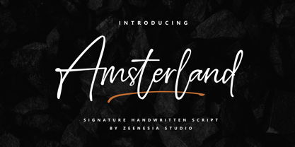 Amsterland Signature is a natural script font with handwritten signature Style.Amsterland Signature font was created with original handwritting pen. This collection of scripts is perfect for personal branding. this works well for many applications. Amsterland Signature would perfect for photography, watermark, social media posts, advertisements, logos & branding, invitation, product designs, label, stationery, wedding designs, product packaging, special events, fashion, website or anything that need handwriting taste. Amsterland Signature is equipped with many additional features that allow you to customize your text. You will get a complete set of uppercase and lowercase, multilingual, punctuation, ligatures, swash and more.
 - Rassie by Gassstype,
$23.00 Hello Everyone, introduce our new product Font Rassie is a Rough Brush Font.This is a Textured Natural Style and classy style with a clear style and dramatic movement. This font Rassie is great for your next creative project such as logos, printed quotes, invitations, cards, product packaging, headers, Logotype, Letterhead, Poster, Design this font is great for your creative projects such as watermark on photography, and perfect for logos & branding, product packaging, special events or anything that need handwritting taste. That is has charming, authentic and relaxed characteristic more natural look to your text. You can activate 13 Ligatures OpenType panel.
 - Backstabber by Gassstype,
$23.00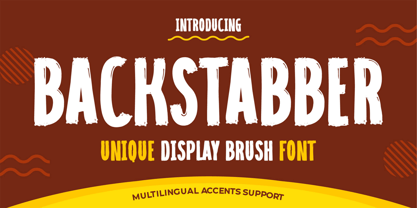 Hello Everyone, introduce our new product font Backstabber is a Unique Display Brush Font.font is a Natural Style and classy style with a clear style and dramatic movement. This font Backstabber is great for your next creative project such as logos, printed quotes, invitations, cards, product packaging, headers, Logotype, Letterhead, Poster, Design this font is great for your creative projects such as watermark on photography, and perfect for logos & branding, invitation,advertisements,product designs, stationery, wedding designs,label ,product packaging, special events or anything that need handwritting taste. That is Backstabber has charming, authentic and relaxed characteristic more natural look to your text.
 - Pseudo-Hellenic by Simeon out West,
$18.00 Pseudo-Hellenic is a font based the Greek typeface of Firmin Didot. The original Greek typeface became standard during the Victorian era and remained popular until the last part of the twentieth century. Pseudo-Hellenic seeks to create an environment reminicent of the many Greek texts and is meant to re-create their ethos while communicating with a non-Greek speaking audience. Pseudo-Hellenic with full punctuation, a character 221 glyph character set that allows the user to type in most Western European Latin alphabet languages. Being a decorative font, it works best at larger point sizes.
 - UT Triumph by Uniontype,
$29.00 UT Triumph Script by Uniontype is a modern type family inspired by classic Americana scripts. The family consists of regular, vintage, and press styles. Also it contains shadow layers with which you can quickly & easily add depth of UT Triumph Script by duplicating the text layer and switching it to Shadow. Choose сolor and offset according to your taste. UT Triumph Script provides advanced typographical support with contextual alternates, ligatures and swashes. UT Triumph Script is good for menu, signs, packaging, posters, letterings and logos. Use the vintage and press styles to feel the true spirit of new retro!
 - MVB Gryphius by MVB,
$39.00MVB Gryphius is a digitization of uncommon type from an era normally associated with the work of Nicolas Jenson. Produced by Otto Trace, the fonts come from types used by Sebastian Gryphius in Lyon in the early 16th century. The italic appears in a book from 1524 and the roman and small caps appear with the same italic in another book printed by Gryphius in 1541. Retaining the rough contours and uneven texture of its source, MVB Gryphius is best used at text sizes from 12- to 15-point, but its old world character can work in display settings too. - Linotype Scott by Linotype,
$29.99Linotype Scott Mars, from German designer Hellmut Bomm, is part of the TakeType Library, chosen from the entries of the Linotype-sponsored International Digital Type Design Contest 1999 for inclusion on the TakeType 3 CD. Bomm constructed this typeface from a consciously limited repertoire of forms, producing a strictly constructed font with a cool, technical look. Worthy of note are also the exalted numeral forms and the unusual size relation of the lower case and capital letters. Scott Mars is best used for headlines and short to middle length texts in point sizes of 10 or larger. - Marwah Signature by Zeenesia Studio,
$16.00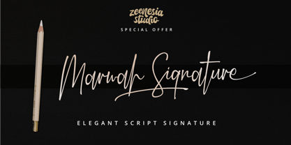 Introducing Marwah Signature Marwah Signature is a natural script font with handwritten signature Style. Marwah Signature font was created with original handwritting pen. This collection of scripts is perfect for personal branding. this works well for many applications. Marwah Signature would perfect for photography, watermark, social media posts, advertisements, logos & branding, invitation, product designs, label, stationery, wedding designs, product packaging, special events, fashion, website or anything that need handwriting taste. Marwah Signature is equipped with many additional features that allow you to customize your text. You will get a complete set of uppercase and lowercase, multilingual, punctuation, ligatures, swash and more.
 - Glitter Girl by Comicraft,
$19.00 Glitter Girl is a naive but romantic and flirty face with fragments of tinsel in its hair. Here's a font with a fresh attitude dressed in frilly flowing flower child fabrics sparkling with sequins. If you're looking for a light feminine aesthetic to grace your chic fashionista blog or livejournal, give it a little Glitter Girl Gossip, a safe text with long legs that will treat your thoughts with a twinkle and a touch of magic. These chic, cozy, clean, warm and fuzzy fonts are BFF -- Best Fonts for Facebook statements you want to share with your social network!
 - Karsten by Nasir Udin,
$25.00 The first development of Karsten typeface was inspired by signs on some old Dutch-buildings in Java. Then in the making, it blends with modern style. It's a synthesis between two cultures, the East & the West. The typeface was named after the Dutch architect who gave major contributions to architecture and town planning in Indonesia, Herman Thomas Karsten. It comes in nine weights from thin to black with matching italics. Its mixture of weights provide a wide range of styles that will help you find the best vibe for your projects, for headlines or a short paragraph. See the full presentation on Behance
 - Harmonia Sans by Monotype,
$34.99 The Harmonia Sans™ typeface is a fine blend of contemporary geometric sans serif lettershapes and classic calligraphic proportions. Jim Wasco, who was aided by George Ryan in the production of the typeface family, began the design of Harmonia Sans with a single goal in mind. "I wanted to create a simple and legible typeface by pulling the best aspects of classic geometric sans designs, such as Futura and ITC Avant Garde Gothic," Wasco explained. The result is a design suitable for virtually all typographic applications, from text on low-resolution displays to high-resolution print and even architectural signage.
 - Bang by ITC,
$29.00Bang was designed by David Sagorski in 1993 as a playful font of spirals. It consists of two capital alphabets which can be combined like the usual capitals and small caps, although both have the same height. They differ from one another only in the decorative forms which adorn them and the highly decorated characters of one set are complemented by the slightly more reserved characters of the second. Serious this font is not, rather, with its circles and spirals, Bang is best in point sizes 12 and larger and is meant for short texts and headlines. - Xotor by Typogama,
$19.00 Xotor is a double styled typeface family destined for use in titling and headlines. The main style, the Triline weight, is a modular typeface composed of three strokes and is best used in large sizes. For smaller bodies of text, the second Regular style is based on the same letter construction but in a simple, solid stroke. Both weights can either be used individually or combined to add extra effect to any layout. With an extended Latin language support, Xotor covers most Latin based scripts and equally features a range of Opentype features, from ligatures, alternative letters or different styles of numerals.
 - Jalliestha by Zeenesia Studio,
$16.00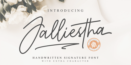 Jalliestha Signature is a monoline script font with handwritten signature Style. Jalliestha Signature font was created with original handwritting pen. This collection of scripts is perfect for personal branding. this works well for many applications. Jalliestha Signature would perfect for photography, watermark, social media posts, advertisements, logos & branding, invitation, product designs, label, stationery, photography, wedding designs, product packaging, special events, fashion, website or anything that need handwriting taste. Jalliestha Signature is equipped with many additional features that allow you to customize your text. You will get a complete set of uppercase and lowercase, multilingual, punctuation, ligatures, stylistic alternates a-z and more.
 - Reywak by Product Type,
$15.00 Reywak is an impactful new font that merges the clean look of sans-serif fonts with the powerful symbolism of Arabic characters. Its readability makes it the perfect choice for headlines and long reads, while the unique allure of its arabesque design lends itself beautifully to posters and greetings. Reywak: use it to make your content a cut above the rest. of course, your various design projects will be perfect and extraordinary if you use this font because this font is equipped with a font family, both for titles and subtitles and sentence text, start using our fonts for your extraordinary projects.
 - Conglomerate by Typetanic Fonts,
$39.00 Sans or serif? Square or rounded? Calligraphic or geometric? Conglomerate is both all and none of these things — a subtle yet unorthodox blend of typographic traits resulting in a clean, unique, and versatile font family with large, open counters for legibility in text yet crisp, sharp details that sparkle at display sizes. Conglomerate is sturdy but never stiff, crisp but never stark — perfect for projects that require a more contemporary feel than either a traditional serif or geometric sans might bring. Conglomerate received a PRINT Magazine Best in Class award, and was one of Typographica’s Favorite Typefaces of 2016.
 - Montix by Linotype,
$49.00Montix is a narrow, constructed type family that developed by the German designer Diana Fischer in 2003. With five weights (light, light italic, regular, regular italic, and bold), Montix is a particularly effective small family, especially when used for headline or display purposes. Montix's letterforms have relatively long ascenders and descenders, which compared with its horizontally compact body gives it its unique style. Words or lines of text set in Montix would look best when some amount of white space is left around them. Because of this, the faces are well suited for logos and corporate identity uses. - Comma Base by Martin Majoor,
$- Comma Base is a sans typeface for it has no serifs. No wait, it is a typical serif typeface because it has a high contrast. Strictly speaking, Comma Base is a missing link between serif and sans, offering the best of both worlds. Comma Base supports several OpenType features for advanced typographic control. It consists of 16 styles, 8 weights from Hairline to Ultra, in both roman and italic. Comma Base is a uniwidth font. This means changing a text from normal to bold doesn’t effect the set width, a professional feature that is highly appreciated by graphic designers.
 - Bon Vivant Family by Nicky Laatz,
$20.00 If you've got style and love all the luxuries in life, you're Bon Vivant! Add a touch of luxury and style to your projects too, with the new Bon Vivant Font Collection. It's highly recommended to turn your Opentype features on while using the script font, to make use of it's best features - the multitude of OpenType ligatures. As you type, your text looks like natural handwriting, and less like a monotonous font. The handsome serif comes in 2 weights, regular and bold. Designed to be a perfect complimentary font to the script, its just as striking used on its own.
 - ITC Oldbook by ITC,
$29.99For some time, Eric de Berranger had wanted to create a distressed typeface design - one that gave the appearance of antique printing and showed signs of wear, yet was still highly readable. He was busy designing a new face called Maxime, when an idea struck: I realized that I could use these lettershapes as the basis for my antique typeface," he says. The two faces ended up being designed in tandem. While ITC Oldbook clearly captures the flavor of aged, uneven and imperfect printing, it also meets de Berranger's goal of being exceptionally readable in text sizes. Beginning with well-drawn characters was the key, and these were carefully modeled into the distressed forms. "The process was more difficult than I originally thought," says de Berranger. "The antique letters had to be tested and modified several times to work correctly." ITC Oldbook elegantly simulates antique printing in both text and display sizes. And while stroke weights are uneven and curves are irregular, the design has remarkably even color when set in blocks of text copy. Add to this the design's inherent legibility, and ITC Oldbook acquires a range far beyond replication of things old; it's suitable for any project that calls for warm and weathered typography. ITC Oldbook is available in roman and bold weights with complementary italic designs. Small caps, old style figures and a suite of alternate characters and ornaments provide additional flexibility and personality to the design." - Fantasy Clipart - Unknown license

- Sindelar by Willerstorfer,
$95.00 Please note: Sindelar webfonts are exclusively available at willerstorfer.com Sindelar is a capable, contemporary text face addressing today’s news design requirements. Its large x-height, low contrast and robust serifs grant a high legibility in small sizes. The balanced, well chosen proportions make the typeface economic (i.e. space saving) without giving it a too narrow appearance. These characteristics make it the ideal choice for extensive text setting in newspapers and magazines – on paper and on screen. Named after famous Austrian football (soccer) player Matthias Sindelar (1903–1939), one of the best players of his time, the typeface shares two major qualities with its namesake: their technical brilliance and their way of performing aesthetically to the last detail. The football player’s nickname »Der Papierene« (the Paper-man) elegantly refers to the media too. Although optimised for small sizes, Sindelar’s low contrast and robust serifs give the typeface a strong impact and an unmistakable personality in larger sizes. Sindelar’s calligraphic influences can be noticed in the Italics best. The italic letters are inclined by slightly different angles, respecting the letters’ shapes and proportions and resulting in a balanced, yet vivid appearance. Sindelar comes in 18 styles – nine weights in Roman and Italic each. Each font is equipped with a huge character set of about 980 glyphs and various OpenType features.
 - Velo Serif Display by House Industries,
$33.00 Velo leads layouts with a grand tour champion’s panache but is also a hard-working design domestique for text-heavy applications. Superelliptical shapes and sturdy serifs will keep pace with contemporary culture with an aesthetic agility that will never go out of style. Velo Serif includes sixteen fonts: Twelve display styles ranging from thin to black with complementary italics and four text styles designed for longer settings. Velo Serif Display features an increased x-height for more illustrative headlines while Velo Serif Text maintains a readable cadence in high word count environments. Typeface design by House Industries, Christian Schwartz, Mitja Miklavčič and Ben Kiel. FEATURES Text vs Display: Velo Text maintains the distinctive style of its Display siblings, but is enhanced for optimum legibility in running text settings. Key ligature combinations keep headlines and running text flowing smoothly. Velo Serif Text includes a complete small cap alphabet to add another typographic dimension to your layouts. Select Velo Serif figures include illustrative alternates to display numerical superiority.
 - Plathorn by insigne,
$24.00 Vast and untamed, the American West once stretched as free and wild as imagination itself. Still beautiful, the Wild West of long ago and the new West of today is now to be found in insigne’s new face, Plathorn. That’s right, folks. When the West called, Jeremy Dooley reached up like Pecos Bill, grabbed it by the reins and pulled it in, then using its wide, roaming elements to design this functional font that still has an unbroken spirit burning deep inside. This down right, no-nonsense, orthodox face leaves off any of that extra fancy stuff that doesn't belong on a ride. Plathorn comes with a family of cowhands as wide as the Rockies, bringing specifically tailored condensed and extended sub-families along with it too. By design, it’s not very obtrusive like its unorthodox reversed tension brethren. Leave those for the next font rodeo. This mount features barely a hint of a serif that hearkens back a hundred years or so to sign painters and package lettering artists of early twentieth century. They're sure to put the sharpness, gumption and grit you need into your copy. So grab a tall glass of Plathorn and drink in the deep taste of America’s big country. Put it in your next magazine. Put it in your brand. This typeface’s offbeat appeal is bound to bring a bit of wild U.S. to your free-spirited work.
 - Northwoods Rough by Cultivated Mind,
$19.00 Northwoods Rough is a handwritten sans serif collection by Cultivated Mind. This collection includes 30 handwritten rough sans serif fonts. Northwoods Rough comes in three rough versions (Rough/Rougher/Roughest). Choose between light, italic or bolder versions for designing. Test out the FREE Northwoods Demo before you buy. Northwoods Rough Demo is for testing only. Northwoods supports most of Central European and Eastern European languages. Use Northwoods Rough for packaging designs, products, signage, books and magazines. Fonts are designed by Cindy Kinash and posters by featured Behance designer, Mustafa Akülker.
 - Gloria Monoline by IM Studio,
$15.00 Gloria Monoline is a text serif with an editorial focus designed by Ikhsan Maulana. The idea for a typography job came from a design school letter-making exercise: Get a pair of scissors and some large sheets of paper, and start cutting. The resulting letters and the act of cutting them from paper inform the type design process, resulting in strong, simple shapes and open, inviting textures. The tone is crisp and straightforward. The classic letterforms, with a playful touch, give the design a personality that is both practical and spontaneous. The text weight is capable of adjusting copies at various sizes to print and render clearly on screen. Its lightest and heaviest weights work best at display sizes. Great care has been taken to save typists time with OpenType features including contextual punctuation and symbols to match case-sensitive, lower-case, and all-caps settings, as well as set images set for each use.
 - 1529 Champ Fleury Initials by GLC,
$42.00 In 1529, Geofroy Tory, French scholar, engraver, printer, publisher and poet, was publishing the well known so called Champ Fleury, printed by Gilles de Gourmond, in Paris. It is a fully illustrated handbook where the author explains how to draw Roman characters. The font used for the text - a Humane/Jenson type - was not a very beautiful one, but rough and ready, and the book is well known for its capital letters designs. We are offering here the two complete historical type sets and more -- we have entirely redrawn the lacked letters: J, U and W, Eth, Lslash, Thorn and Oslash in the two initial forms. The text font, 1529 Champ Fleury Regular is now containing all characters for West European (including Celtic), Baltic, East and Central European and Turkish language, and the Initial set 1529 Champ Fleury Init is containing two complete alphabets, with a very great effort to be as close as possible to the original pictures.
 - Dufour by Scholtz Fonts,
$19.00 Dufour was named in honor of an art deco font called "Independent" designed in the 1930s by Collette and Dufour. "Dufour" is influenced by the original font, however, there are substantial differences: instead of small caps, a true lower case was created, the upper case character proportions and shapes have been greatly modified, and all missing characters have been created to make a truly modern font which nevertheless has all of the panache of the original. A related font is Collette, designed by Anton Scholtz, however, Dufour has a softer feel that is more true to the original art deco period. Dufour comes in four styles: Dufour Regular, Dufour Regular Outline, Dufour Condensed, and Dufour Condensed Outline. The font has been carefully kerned and best results are obtained if kerning is switched on. (All-caps passages work well.) It is best used to create a retro feel and in headings, subheads and in short passages of text. Very effective in marketing for products for children.
 - Edit Serif Pro by Atlas Font Foundry,
$49.00 The Edit Collection is a brand new super family designed to create multi-platform brand and editorial typography. The Renaissance construction allows the typeface to handle long texts in small, medium and large sizes, balancing its astonishing and recognisable details with high legibility. The Edit Collection with its rational, clean aesthetics and great versatility is best suited for complex typography programs. Edit Serif Pro is a modern multilingual multi purpose typeface and the first release of Atlas’ next super family. Its humanist contrast combined with modern details makes Edit Serif Pro suitable for headlines and texts that need to distinguish themselves — while still expressing rational and clean aesthetics. Each style comes with 1.540 glyphs, many features and alternative character sets. As the well known Heimat Collection and Novel Collection already are, Edit will soon become a huge superfamily like all typefaces published by Atlas Font Foundry. Designed by Christoph Dunst for Atlas Font Foundry between 2012 and 2017.
 - Aptifer Slab by Linotype,
$39.00 Aptifer Sans and Aptifer Slab are two 21st century typeface families created by Mårten Thavenius. Each family has seven weights, in roman and italic respectively, making 28 font styles in total. A heritage from two design traditions can be seen in Aptifer. One is the robust American gothic typefaces, like M. F. Benton’s, from around 1900. This is combined with the openness and legibility that comes from the humanist tradition. The sans serif part of the family, Aptifer Sans, is designed without excessive details disturbing the reading. Its sibling Aptifer Slab with its wedge slab serifs is more eye-catching but still suited for text settings. The italics fit well into the text flow of the roman. They are a bit narrower than the roman and have cursive characteristics. Both Aptifer Sans and Aptifer Slab are highly legible typefaces and can be used both in print and on screen. Featured in: Best Fonts for PowerPoints
 - CA Texteron by Cape Arcona Type Foundry,
$40.00 CA Texteron is a modern text font family to cover the most common typographical needs with a minimum of weights. It is aiming for a serious but unconventional look, which is achieved by combining round and edgy forms in the same font, often in the same glyph, and by using Humanist and modern form-principles at the same time. It merges classical type-design with an experimental spirit. CA Texteron combines elements of the dynamic renaissance principle with the static neo-classic style, which makes it hard to classify. The result is a post-modern hybridization. The Regular weight works best in text size, and with more letter-space also for footnotes. The low contrast makes it robust and legible even in very small sizes. Bold, Italic and Small Caps are intended for emphasis. Bold, Bold Italic and Heavy make good headlines, that reveal the unconventional details. The Italic is not just a slanted version of the Regular weight but has individual forms and typical italic characteristics.
 - Sonder by Fenotype,
$30.00 Sonder is a smooth brush Script and condensed Sans family of three weights on both. Both Script and Sans work as standalone fonts but they’re designed to go nicely together. Combine with Sonder Extras for smooth brush strokes for ambitious headlines, logos & posters. Sonder comes with a clean version and a “Print” version of each cut. Print versions have delicately rugged outlines and print texture inside. Sonder Script is packed with several OpenType features: Contextual Alternates and Standard Ligatures are automatically on to keep the text vibrant. If you need even more sparkly letters try Swash, Stylistic or Titling Alternates. The Scripts are PUA encoded and you can access extras from character map in most design softwares. For the best price Sonder can be purchased as “clean” Family - or as Print Family that has all cuts as printed versions. For the absolutely best price get the whole Complete Family pack that has all fourteen fonts and go wild with it!
 - Karme by PeachCreme,
$18.00 Say hello to our new classy font duo "Karme"- a combination of all-caps serif and stylish handwritten script! Karme Serif - Due to its extraordinary and eccentric characters, the serif can be more suitable for displays, headers, and short logos rather than body or long texts. Not all but some of the letters have alternatives in stunning lowercase forms. You can play with 92 different fascinating ligatures with the Karma Serif. While using the serif, we would recommend turning off the automatic ligatures and accessing them manually through the Glyphs panel (or copy/paste) so that from several options you can choose the one that fits your text best. Karme Script - a modern and realistic handwritten font with a natural flow. Featuring 112 playful and groovy ligatures, the font can be well paired with serif, sans serif, and display fonts. Works great for stationery, websites, packaging, and many other handwritten style designs.
 - Marco by TypeTogether,
$49.00 Marco is a lively text face, with an informal touch, inspired by 15th century Italian letter-forms with strong calligraphic traces and intended to be used primarily in continuous and intensive reading conditions. Marco is full of features required for high-quality book typography, including: strong language-support in extended Latin, Cyrillic and polytonic Greek, a multitude of swashes in the italic styles of Latin and Cyrillic, stylistic alternates to obtain the best possible solutions and other typographic niceties. Inspiration for Marco goes back to Italian humanist typography such as those of Nicholas Jenson or Aldus Manutius, and general influences from calligraphy. As a result, Marco has matured into a personal and unique text face where its lively and somewhat informal style is an ideal counterpart to its careful and ingenious crafting. Toshi Omagari’s Marco features a huge set of over 1900 characters per style —and almost 2600 in the italics— and is available in Regular, SemiBold, Bold with matching Italics.
 - Rafisqi by Suamzu Art,
$13.00 Rafisqi is a new font for a minimalist logo design. This font is suitable for creating word markers, titles, taglines. Use alternatives to set separate fonts in your text, unite thick and thin lines with your design techniques, so as to produce a very unique shape. Rafisqi font is perfect for designing company logos, online game logo, magazine covers, biographical book covers, business cards and all your design work, of course. to be more attractive in appearance, it helps you combine the Rafisqi font with other fonts so that your design looks more attractive Rafisqi is the display font, so it can not be the best choice for continuous text. Font contains: 3 letter styles 3 choices of basic replacement letters 3 number choices Ligature punctuation All character options are included in one font. You can use ligature in most major image editors, just look for the glyhps menu there. For example, in Adobe Illustrator you must select the Window Type glyhps menu item.
 - M Banquet P PRC by Monotype HK,
$523.99 M Banquet is a humanistic script written by a Chinese restaurant owner, which the name ‘Banquet’ comes from. It is a calligraphic style that always being seen in traditional Chinese banquet menu. Incorporated a feeling of masculinity, fill with strength and energy and attracts eyeballs of customers. It was written with a thin ball pen in a unique, personal and expressive writing style, such that it is realistic, natural and masculine. Contrast of strokes is low and the text is visible and eye-catching. Its light to medium stems (豎) make it suitable for small text to subheading with little conglutination. All strokes are irregular, inconsistent, irregularly oriented and tightly coupled. Spatial distribution, positioning, size and relative proportion of radicals fully reflect a natural and personal style. It is one of the few proportional-width font in a full scale. It is best suited for casual lively atmosphere, illustrations, set upright (non-slanted), non-condensed.
