10,000 search results
(0.054 seconds)
- Hooper dooper - Unknown license

- Royal box - Unknown license

- Smooth Batters by Balpirick,
$15.00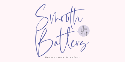 Smooth Batters is a Modern Handwritten Font. Smooth Batters feels equally charming and elegant. It looks stunning on wedding invitations, thank you cards, quotes, greeting cards, logos, business cards and every other design which needs a customized touch. This font is PUA encoded which means you can access all glyphs and swashes with ease! - also multilingual support Enjoy the font, feel free to comment or feedback, send me PM or email. Thank you!
 - Goliath Soldier by Balpirick,
$15.00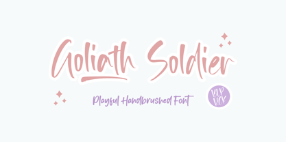 Goliath Soldier is a Playful Handbrushed Font. Goliath Soldier feels equally charming and chic. It looks fun on wedding invitations, thank you cards, quotes, greeting cards, logos, business cards and every other design which needs a customized touch. This font is PUA encoded which means you can access all glyphs and swashes with ease! - also multilingual support - Ligatures & Swash Enjoy the font, feel free to comment or feedback, send me PM or email. Thank you!
 - Grassroots Typewriter by BeckMcCormick,
$16.00This font was inspired by a 1950’s Royal Quiet De Luxe Typewriter, and features textured letters & symbols, creating a realistic look & feel without needing to source your own antique machine! Each keystroke on an old typewriter shows variations based on the ink ribbon & how hard or soft the typebars strike the ribbon & paper. This font was designed to provide multiple options for each letter so that you can further customize the look & feel of your text. - Linotype Dharma by Linotype,
$29.99Linotype Dharma is part of the Take Type Library, chosen from the contestants of the International Digital Type Design Contests of 1994 and 1997. G. Jakob and J. Meißner designed this font with an ornamental character, for example, with diagonal slashes as umlauts or dots on the i and j and the triangular serifs on the upper left of both letters and numerals. Such details make for a restless font, best used for short headlines in large point sizes. - Borrowdale by Hanoded,
$20.00 Borrowdale is a valley and civil parish in the English Lake District. In the 16th century a major deposit of graphite was discovered near Seathwaite, which kickstarted the pencil industry. Borrowdale font was made with one of my son's coloring pencils (which probably does not contain a single molecule of graphite). It is a very legible and easy-on-the-eye font, ideal for children's books, texts and product packaging. Comes with a mother lode of diacritics.
 - Prumo Poster by DSType,
$40.00 Prumo is a new type system, based on a unique skeleton that flows, like a pendulum, from high contrast to low contrast fonts, is a sort of typographic journey, from the eighteen century typefaces to the nineteen century slab serif typefaces, gathering information from the scotch roman fonts on it's journey. Prumo is a type family with classic proportions, that takes advantage of the recent type production technology while looking carefully at the most important historical references.
 - Merlove by Pixesia Studio,
$15.00 Introducing Merlove - A Contemporary Display Font Merlove is a strong and contemporary display font. It has an unique vintage style, that is perfect for branding. Add it to your most creative ideas and notice how it makes them come alive! FEATURES - Stylistic Alternates - PUA Encoded - ALL Caps - Numbering and Punctuations - Multilingual Support - Works on PC or Mac - Simple Installation - Support Adobe Illustrator, Adobe Photoshop, Adobe InDesign, also works on Microsoft Word Hope you Like it. Thanks.
 - Bitblox by PSY/OPS,
$10.00 Bitblox fonts are based on the lettering created for Glyfyx’ eponymous wooden alphabet blocks. The characters are inspired by the low-res bitmap lettering seen on early generation computer devices. The Bitblox family consists of eight pixelated fonts, including a trio of styles that stack up to create a colorful, dimensional effect. An extensive multi-styled dingbat collection is also included. The Bitblox lettering was designed by James Beall with PSY/OPS Type Foundry, for Glyfyx Inc.
 - Brer Rabbit by Kitchen Table Type Foundry,
$15.00 Brer Rabbit (or Brother Rabbit) is the central figure in an oral tradition passed down by African-Americans. Brer Rabbit is a trickster, just like the other popular trickster character in African stories called Anansi the spider. Brer Rabbit was based on an old font of mine called Rabbit On The Moon. It is a nice, cute children’s book font that comes with extensive language support and Brer Rabbit himself, in the shape of the alternative asterisk glyph.
 - Sixty - 100% free

- KG Fractions by Kimberly Geswein,
$5.00 This font was created with math teachers in mind. It is hard to represent fractions in a way that can print easily in black and white on worksheets or tests. The extra outlines on these shapes are created just for that purpose- so your student can easily identify how many parts are shaded in the image. Blanks are also included so students can color in parts of a whole.
 - Anaglyph by Luxfont,
$18.00 Introducing incredible COLOR ANAGLYPH font. Unique font family with anaglyph stereo effect - a novelty in the field of color fonts. Inspired by global trends in contemporary design with a touch of retro 90s, electric music and minimalistic purity of glyphs. Truly a reflection of modern POP culture. Font is ideal in entertainment design. Night club poster design, fashionable business card, website title, magazine illustration - there are countless options for using it. Font family has two thicknesses - bold & regular, 3 types of stereo effect, 2 font colors with stereo effect (black and white). Font consists of letters of the same height without division into uppercase and lowercase glyphs. This font family is based on the Regular & Bold fonts Boldini - which means that if necessary you can combine these two families and they will be absolutely stylistically identical and complement each other. Check the quality before purchasing and try the FREE DEMO version of the font to make sure your software supports color fonts. Features: Free Demo font to check it works. 36 OTF SVG fonts in the family 2 thicknesses: Bold, Regular 3 types of stereo anaglyph effect 6 font colors with stereo effect Kerning IMPORTANT: - OTF SVG fonts contain vector letters with gradients and transparency. - Multicolor OTF version of this font will show up only in apps that are compatible with color fonts, like Adobe Photoshop CC 2017.0.1 and above, Illustrator CC 2018. Learn more about color fonts & their support in third-party apps on www.colorfonts.wtf - Don't worry about what you see all fonts in black and not in multicolor in the tab “Individual Styles” - all fonts are working and have passed technical inspection, but not displayed in multicolor they, just because the website MyFonts is not yet able to show a preview of colored fonts. Then if you have software with support colored fonts - you can be sure that after installing fonts into the system you will be able to use them like every other classic font. Question/answer: How to install a font? The procedure for installing the font in the system has not changed. Install the font as you would install the classic OTF | TTF fonts. How can I change the font color to my color? · Adobe Illustrator: Convert text to outline and easily change color to your taste as if you were repainting a simple vector shape. · Adobe Photoshop: You can easily repaint text layer with Layer effects and color overlay. ld.luxfont@gmail.com
 - Tengwar Transliteral by Zephyris,
$- You can read more about how to use this font and how it works here. This font lets you write in accurate Tengwar (elvish) quickly and easily. While writing his Middle Earth books, JRR Tolkein invented an entire alphabet for the elves called Tengwar. His attention to detail was incredible, Tengwar is a fully functioning writing system. This is the famous Elvish writing seen all through Lord of The Rings and the Hobbit. Tengwar is an alphabet, not a language, and can be used to write many languages. Tolkein gave detailed notes on how to write English in the Tengwar alphabet. This font uses advanced font features (contextual alternates, ligatures and kerning) to automatically convert any English text, as you type, into an accurate representation in the elvish Tengwar alphabet.
 - Brightlight by Mercurial,
$10.00 Dazzling Brightlight family typeface is a versatile, modern and classy display serif font with oblique and script also. Gives a wow effect to big titles, headlines. Use it big to enjoy it’s full potential.This font is ideal for design, logo design, blog graphics, stylizing quotes, wedding stationery, art prints, collateral design, packaging, social media, magazine, fashion, creative branding, editorial design and web design. come with elegant style but still has a modern feel, with features an extended latin character set of glyphs by covering various languages in Europe and others, and includes advanced open type features like standard and discretionary ligatures, positional numerals and so on. The Open Type features can be accessed by using Open Type savvy programs such as Adobe Illustrator, Adobe InDesign, Adobe Photoshop Corel Draw X version, And Microsoft Word. And this has given PUA Unicode Font (specially coded fonts). so that all the alternate characters Easily can be accessed in full by a craftsman or designer. Don't forget to check out other cool fonts on our store and wait for new fonts. Follow our shop for upcoming updates including additional glyphs and language support. feel free to send me a message, I would like to update it.
 - Castanea by Hanoded,
$20.00 The chestnut ("castanea") is one of my favorite trees. I used to collect the chestnuts and made chestnut-figurines out of them, using bamboo sate skewers. Castanea font is a calligraphic typeface with an uneven baseline and some messy characters - not unlike the tree. It is a highly legible, highly enjoyable font and could be used for children's books and postcards. Castanea comes with various alternate glyphs and speaks most Roman-based languages!
 - DT Squished Stuff by Dragon Tongue Foundry,
$15.00 DT Squished Stuff is a font made for fun. This uneven simple blocky sans-serif font has wonky letters that adapt automatically and change shape to fit against their neighbours. Use with contextual ligatures turned on to allow Squished Stuff to operate correctly. If a particular letter decides to do something that you don’t want it to, turn ‘contextual ligatures’ off for that letter. But do remember to turn it back on afterwards. This font lives and breathes when ‘contextual ligatures’ are turned on. Also, there are easter eggs and quirky surprises hidden inside. Watch it squish and move to fit together. This is a wacky, crazy, fun, mad, party, toonified font. Enjoy
 - New Alphabet by The Foundry,
$50.00 New Alphabet was created as a four weight family in close collaboration with Wim Crouwel. His response in the late 1960s to the first device for electronic typesetting was a radical experiment designed to follow the underlying dot-matrix system. With his strong interest in grids, Crouwel worked within the constraints of existing electronic technology, to produce characters that worked with the mechanical means that conveyed them. His original New Alphabet experiments have now been further developed by The Foundry into a typeface family that also includes the dot version.
 - Greycliff Hebrew CF by Connary Fagen,
$35.00 Greycliff Hebrew CF adapts Greycliff’s soft, geometric design to the Hebrew script. Both Latin and Hebrew glyphs are included, allowing for visually cohesive multiple-script applications. Greycliff’s original nine weights are covered, alongside diacritics, cantillation marks, and wide Hebrew-script language support. Greycliff Hebrew CF works as a complete, self-contained type system, with both Hebrew and Latin scripts included and designed to compliment one another. All typefaces from Connary Fagen include free updates, including new features, and free technical support.
 - Olivette CF by Connary Fagen,
$35.00 With an extreme stroke contrast and wide, spacious construction, Olivette blends understated minimalism with elegance and expression. Olivette’s fine details shine at large sizes on screen and in print. Olivette CF pairs well with simple typefaces, set at smaller sizes, such as Greycliff CF and Artifex Hand CF. The key is to let Olivette breathe, setting it at large sizes with plenty of open space. All typefaces from Connary Fagen include free updates, including new features, and free technical support.
 - Zebramatic by Harald Geisler,
$14.99 Zebramatic - A Lettering Safari Zebramatic is a font for editorial design use, to create headlines and titles in eye-catching stripes. Constructed to offer flexible and a variety of graphical possibilities, Zebramatic type is easy to use. The font is offered in three styles: POW, SLAM and WHAM. These styles work both as ready-made fonts and as patterns to create unique, individualized type. The font design’s full potential is unleashed by layering glyphs from two or all three styles in different colors or shades. Working with the different styles I was reminded of the late Jackson Pollock poured paintings—in particular the documentation of his painting process by Hanz Namuth and Paul Falkernburg in the film Jackson Pollock 51. In Pollock’s pictures the complex allure arises from how he layered the poured and dripped paint onto the canvas. Similar joyful experience and exciting results emerge by layering the different styles of Zebramatic type. Texture In the heart of the Design is Zebramatics unique texture. It is based on an analog distorted stripe pattern. The distortion is applied to a grade that makes the pattern complex but still consistent and legible. You can view some of the initial stripe patterns in the background of examples in the Gallery. Zebramatic POW, SLAM and WHAM each offer a distinct pallet of stripes—a unique zebra hide. POW and WHAM use different distortions of the same line width. SLAM is cut from a wider pattern with thicker stripes. The letter cut and kerning is consistent throughout styles. Design Concept Attention-grabbing textured or weathered fonts are ideal for headlines, ads, magazines and posters. In these situations rugged individuality, letter flow, and outline features are magnified and exposed. Textured fonts also immediately raise the design questions of how to create alignment across a word and deal with repeated letters. Zebramatic was conceived as an especially flexible font, one that could be used conveniently in a single style or by superimposing, interchanging and layering styles to create a unique type. The different styles are completely interchangeable (identical metrics and kerning). This architecture gives the typographer the freedom to decide which form or forms fit best to the specific project. Alignment and repetition were special concerns in the design process. The striped patterns in Zebramatic are carefully conceived to align horizontally but not to match. Matching patterns would create strong letter-pairs that would “stick out” of the word. For example, take the problematic word “stuff”. If Zebramatic aligned alphabetically, the texture of S T and U would align perfectly. The repeated F is also a problem. Imagine a headline that says »LOOK HERE«. If the letters OO and EE have copied »unique« glyphs - the headline suggests mass production, perhaps even that the designer does not care. Some OpenType features can work automatically around such disenchanting situations by accessing different glyphs from the extended glyph-table. However these automations are also repeated; the generated solutions become patterns themselves. Flip and stack To master the situation described above, Zebramatic offers a different programmatic practice. To eliminate alphabetic alignment, the letters in Zebramatic are developed individually. To avoid repetition, the designer can flip between the three styles (POW, SLAM, WHAM) providing three choices per glyph. Stacking layers in different sequences provides theoretical 27 (3*3*3) unique letterforms. A last variable to play with is color (i.e. red, blue, black). Images illustrating the layering potential of Zebramatic are provided in the Gallery. The design is robust and convenient. The font is easily operated through the main font panel (vs. the hidden sub-sub-menu for OpenType related features). The process of accessing different glyphs is also applicable in programs that do not support OpenType extensively (i.e. Word or older Versions of Illustrator). International Specs Zebramatic is ready for your international typographic safari. The font contains an international character set and additional symbols – useful in editorial and graphic design. The font comes in OpenType PostScript flavored and TrueType Format.
 - Rosalen by Pista Mova,
$12.00 Rosalen Script is an amazing typeface handmade script font that we created in freestyle for those of you doing work and crafts. It's perfect for all kinds of work you do for multiple purposes like logos, wedding invitations, titles, t-shirts, letterheads, signage, labels, news, posters, badges, etc. Files include: OpenType features with alternate styles, binders, swipes, and multiple language support. To enable the OpenType Stylistic alternative, you need a program that supports OpenType features such as Adobe Illustrator CS, Adobe Indesign & CorelDraw X6-X7, Microsoft Word 2010 or later. How to access all alternative characters, using the Windows Character Map with Photoshop: https://www.youtube.com/watch?v=Go9vacoYmBw How to access all alternative characters using Adobe Illustrator: http://youtu.be/iptSFA7feQ0 Thank you!
 - Calluna by exljbris,
$- Calluna was born more or less by accident. When I needed a little break from designing Museo I was just fiddling around a bit to see if maybe a full slab serif would be something to have a look at. The first thing I did, of course, was to put slab serifs on the stems of Museo. When I did, something nice happened. Slab-serifs with a direction! I ended up using the idea for something I always wanted to do: making a rather serious text face. The goal was to make a text font, but one with enough interesting details. In the end it all came down to finding the balance in a typeface between the robustness needed to function as a text face and enough refinement to look good as a display font. Check out Calluna Sans™ which is a great pair for Calluna™.
 - Initial - Unknown license

- Tom's Headache - Unknown license

- HYPOTHALAMUS by Look Minus Today,
$14.00 Introducing Hypothalamus - Sans Liquify Serif by Look Minus Today. Hypothalamus is inspired by the flow of water that flows so beautifully. This versatile font is perfect for all design needs, from print materials to digital media. With the right balance of thickness and spacing to get the beauty of how nature can create such beautiful shapes. Its elegant lines and smooth curves make it a great choice for a variety of design applications, including branding, advertising, packaging, and editorial design. Our font is a versatile and stylish choice for any design project. ------------------------------------------------ Features: - Uppercase - Lowercase - Alternates & Ligatures - Numerals & Punctuation - Multilingual & Symbol - HOW TO ACCESS ALTERNATE CHARACTERS Open glyphs panel: In Adobe Illustrator go to Window - Type – glyphs In Adobe Photoshop go to Window – glyphs For any further questions or assistance, please feel free to contact us. Thank you and have a nice day !
 - Greenwich Mean - Unknown license

- ITC Static by ITC,
$29.99Static looks almost like it was stamped on paper: the black color is not evenly distributed and the background comes through the letters and consciously irregular forms reinforce the effect. The characters do not all have the same height, nor do they stand straight and regularly on the base line. Static is a robust font with bold, rounded serifs and is best used for headlines and short texts in point sizes of 12 and larger. - Cabragio by Aah Yes,
$3.95Cabragio is a free-flowing informal font, very curvy and quite heavy. The free-flowing effect is especially apparent in the lower case letters, and this font is definitely something a bit different -- yet is highly readable and attractive. Original and distinctive! - FS Clerkenwell by Fontsmith,
$80.00 A creative context 2003. Fontsmith was sharing a small, cold, whitewashed studio space in Northburgh Street, Clerkenwell. But things were on the up following prestigious custom type commissions for The Post Office and E4. “Slab serifs were on the brink of another revival, we could feel it,” says Jason Smith. “All we wanted to do was have a play with these slabs, go as far as we could within what was acceptable and readable.” “It wasn’t initially clear what was happening,” recalls Phil Garnham. “We were becoming very influenced by our surroundings, outside the studio space. We absorbed the essence and the designer grime of where we were.” Process Jason began by drawing stems on-screen. “The key aspect of the font is the upward bend of the leading shoulder serif, the way it kind of ramps up and then plummets back down the stem. “The regular and light characters are quite narrow – great for text but the bold is quite wide and chunky – better for headlines. I think ‘y’ is quite different for a slab design. We call it the Fontsmith ‘y’.” Promotion Fontsmith were determined to get FS Clerkenwell noticed. To launch the font, Ian Whalley, a designer friend of Fontsmith, captured words heard on the streets of Clerkenwell, set them in the new font and crafted a small book of typographic conversations. It was a first for Fontsmith. “I think that’s part of why this font has been so successful,” says Phil. “It really does embody the spirit of the area, as a special place for design, arts and crafts. And designers love that.” Contemporary twist FS Clerkenwell, based on influences in and around this part of London with a rich tradition of printing and design, mixes tradition with creation. Old-fashioned values meet new-school trends. Its quirky, contemporary character lends an edge to headlines, logotypes and any large-size text.
 - Jingo by Canada Type,
$39.95 This is the digital makeover and major expansion of a one-of-a-kind melting pot experiment done by VGC and released under the name Mardi Gras in the early 1960s. It is an unexpected jambalaya of Art Nouveau, Tuscan, wedge serifs, curlycues, ball endings, wood type spurs and swashes, geometry and ornamental elements that on the surface seem to be completely unrelated. But the totality works in a surprisingly loud and playful way that really defies categorization. Jingo is really five fonts in one: Over 1000 glyphs, four character sets, ornaments, swashes and ligatures. The forms are interchangeable in uppercase, lowercase and unicase settings. There is nothing low-key about this typeface. It is well suited for use on posters and book covers that require happy weirdness. But most of all it's great for those who like to fiddle with their type setting until amazingly conicidental pleasantnesses ensue. If you're that kind of designer and you know what you're doing, get Jingo, start up that glyph palette, and play away.
 - Kimbiso by Yukita Creative,
$14.00 Kimbiso is one of the most advanced fonts on the market. Its clean lines and ultra-modern style make it perfect for high fashion branding, cinematic videos, social media posts, and more. Best of all, it's easy to read and looks sophisticated and stylish. What do you get when you get this font? - Modern Sans is one font you need - Affordable and versatile - Multilingual support and complete characters set - Designed by a Typeface Designer - Get one font for any occasion - Multilingual support in this modern sans serif font - Well known for its exceptional readability
 - More than Enough - Personal use only

- Sue Ellen Francisco - Personal use only

- Airplanes in the Night Sky - Personal use only

- Melts Script Rough by Estudio Calderon,
$20.00 Melts Script Rough by Estudio Calderón is the textured version of Melts Script. It has a texture design in high definition that runs very good in any size and concepts. Good news! It includes a free version of “Melts Script Rough Sanscript One”. Specimen
 - Sone by Soneri Type,
$50.00 Sone is designed to be bold with stripped off nonessential details making it uncomplicated, simple in expression, yet appealing and easy to decipher, even from a distance. Serene and gentle in quality by low contrast, slow ductus and large x-height reducing the up down motion, plus enhance the legibility. It works beautifully in both, display and body copy.
 - Show Card Pen JNL by Jeff Levine,
$29.00 The 1920 edition of “How to Paint Signs and Sho’ Cards” by E. C. Matthews offered a number of examples of then-modern lettering styles for sign painters and show card writers. A bold display alphabet made with a round lettering nib is now available as Show Card Pen JNL, in both regular and oblique versions.
 - Rorschach by Kenn Munk,
$15.00How to use The Rorschach dingbat: q,w,e,r,t,y,u,i,o,p create the start of an inkblot a,s,d,f,g,h,j,k,l create a middle, you can use any number of middle-elements z,x,c,v,b,n,m create the ending. Your Rorschach is now finished, get analysing!


