10,000 search results
(0.164 seconds)
- Steak by Sudtipos,
$59.00 Here I am, once again digging up 60-year sign lettering and trying to reconcile it with the typography of my own time. The truth is I've had this particular Alf Becker alphabet in my sights for a few years now. But in the typical way chaos shuffles the days, Buffet Script and Whomp won the battle for my attentions way back when, then Storefront beat the odds by a nose a couple of years ago. Nevertheless, revisiting Alf Becker’s work is always a breath of fresh air for me, not to mention the ego boost I get from confirming that I can still hack my way through the challenges, which is something I think people ask themselves about more often as they get older. You can never tell what may influence your work, or in this case remind you to dig it out of dust drawers and finally mould it into one of your own experiences. On my recent visits to the States and Canada, I noticed that quite a few high-end steak houses try their best to recreate an urban American 1930s atmosphere. This is quite evident in their menus, wall art, lighting, music, and so on. The ambience says your money is well spent here, because your food was originally choice-cut by a butcher who wears a suit, cooked by a chef who may be your neighbour 20 minutes from downtown, and delivered by a waitress who can do the Charleston when the lights dim and who just wouldn't mind laughing with you over drinks at the bar later. So Steak is just that, a face for menus and wall art in those places that see themselves in the kind of jazzy, noirish world where one-liners rule and exclamation points are part of a foreign language. As is usual with my lettering-inspired faces, there is very little left of the original Alf Becker alphabet. Of course, the challenges present in bringing typographic functionality to what is essentially pure hand lettering gives the spirit of the original art a hell of a rollercoaster ride. But I think that spirit survived the adventure, and may in fact be even somewhat magnified here. This font is over 850 glyphs. It’s loaded with ligatures, swashes, ending forms, alternates, ascender and descender variations, and extended Latin language support. Steak comes in 3 versions. According to your taste you can choose Barbecue, Braised or Smoked. It’s up to you!
 - Wild Bunch by Hanoded,
$15.00 The Wild Bunch, also known as the Doolin–Dalton Gang, was a gang of outlaws that terrorized Kansas, Missouri, Arkansas, and Oklahoma Territory during the 1890s. They robbed banks, killed lawmen and held up trains. Of course its members were hunted down and 'wanted' posters, with that typical 'Wild West' font, appeared all over. Wild Bunch is a 'wanted poster' type font. It is an all caps font, but upper and lower case differ slightly. A set of alternate, non-eroded, glyphs for the lower case (including alternate numbers) completes this font.
 - Deca Serif by ParaType,
$30.00 Super family Deca consists of ten fonts. Six sans serif styles form the Deca Sans family and four styles of serif family named Deca Serif . These are low contrast fonts of pure design with ovals bent to rectangular shapes. They are nicely readable in small sizes and can be recommended for scientific, legal, official and business documents. Serif and sans serif fonts were designed in comparable proportions, they are balanced by color and have similar details in basic shapes. These features provide high compatibility and assume collective usage of the fonts in documents.
 - Deca Sans by ParaType,
$30.00 Super family Deca consists of ten fonts. Six sans serif styles form the Deca Sans family and four styles of serif family named Deca Serif . These are low contrast fonts of pure design with ovals bent to rectangular shapes. They are nicely readable in small sizes and can be recommended for scientific, legal, official and business documents. Serif and sans serif fonts were designed in comparable proportions, they are balanced by color and have similar details in basic shapes. These features provide high compatibility and assume collective usage of the fonts in documents.
 - Fuuld by That That Creative,
$20.00 Fuuld is a brutalist condensed modern display font that mixes organic and geometric, hand made, and digital production. it has a contemporary look perfect for logos, posters, branding, magazines, and avant garde social media accounts be it instagram, TikTok, or whatever. The cool thing about this font besides how cool it looks is that it uses less ink than a regular font in its weight. this makes it perfect for any environmentally conscious print projects. Try the font with no fill and a stroke for a whole new style.
 - Bastro by HansCo,
$15.00 Bastro is a bold retro serif fonts that feels casual and clean an incredible modern retro aesthetic. Use this Bastro serif font to add that special modern retro touch to any design idea you can think of! Masterfully designed to become a true favorite, this font has the potential to bring each of your creative ideas to the highest level! This font is PUA encoded which means you can access all of the glyphs and swashes with ease! Tutorial how to Install & use Alternate / Special Character : https://hanscostudio.com/tutorial/ Enjoy!
 - Ossuary by Wundes,
$13.00Ossuary is a font in which each letter is formed using a uniquely arranged pile of skulls. The font was originally designed to be caps only, but small caps were added for convenience. There is now a character for each typeable letter of the American English keyboard. The font was inspired by images from the Kostnice ossuary in Sedlec, Kutna Hora near Prague. (Google it.) Whether you are fascinated or repulsed, such images have a mystery about them. They demand your attention. That is the feel this font was intended to capture. - Winter Delight by Supfonts,
$15.00 Winter Delight / Casual handwritten font Winter Delight it is a casual handwritten font with exquisite accents. The font is very cute and contains a huge number of ligatures. It is perfect for branding, wedding invitations and invitation cards and many more Font includes a full set of gorgeous uppercase and lowercase letters, numbers & large selection of punctuation marks Test it out below to see how it could look for your next project! Includes: Regular Script All latin languages support Uppercase and lowercase Numbers and punctuation Check out my blog: https://www.instagram.com/leopardletters pinterest.com/dmitriychirkov7 Enjoy
 - Retro Groovy by HansCo,
$15.00 Retro Groovy Font is a retro and bold display font. Use this display font to add that special retro touch to any design idea you can think of!. Masterfully designed to become a true favorite, this font has the potential to bring each of your creative ideas to the highest level! Very suitable for logotype, Stickers, Packaging design, Cricut Project, headlines, brand identity, t shirt or apparel industry, posters, magazines, books, YouTube, Instagram, websites, or any of your creative design projects. Tutorial how to Install & use Alternate / Special Character : https://hanscostudio.com/tutorial/ Enjoy!
 - Gibson Serif by Black Studio,
$21.00 Introducing, Gibson Serif is a serif typeface crafted with elegance and luxury, exuding femininity and glamor but also a side of beauty with plenty of alternatives and ties to help you create endless variations for your creative needs. Its striking contrasts and subtle details, along with luxurious strokes and voluptuous curves, create a beautiful and powerful statement for any typographic composition, blending glamor with contemporary aesthetics. Gibson Serif elegant serifs really help you create unlimited variations for your creative needs in creating your project titles: such as fashion, magazines, logos, branding, photography, invitations, wedding invitations, quotes, blog headers, posters, advertisements, postcards, books , websites, etc. Feature • Full set of uppercase, lowercase • 51 Ligatures • 165 Alternatives • Numbers, symbols & punctuation • Characters with accents • Support Multiple Languages • PUA encoded WHAT IS INCLUDED • Gibson Serif – Regular • Gibson Serif – Italic This type of family has become the work of true love, making it as easy and fun as possible. I can't wait to see what you do with the Gibson Serif! Feel free to use the #Black Studio tag and the #Gibson Serif font to show what you've been up to, I really hope you enjoy it! Thank you!
 - The Lastone by Black Studio,
$20.00 Introducing, The Lastone is a serif typeface crafted with elegance and luxury, exuding femininity and glamor but also a side of beauty with plenty of alternatives and ties to help you create endless variations for your creative needs. Its striking contrasts and subtle details, along with luxurious strokes and voluptuous curves, create a beautiful and powerful statement for any typographic composition, blending glamor with contemporary aesthetics. The Lastone elegant serifs really help you create unlimited variations for your creative needs in creating your project titles: such as fashion, magazines, logos, branding, photography, invitations, wedding invitations, quotes, blog headers, posters, advertisements, postcards, books, websites, etc. Feature • Full set of uppercase, lowercase • 111 Ligatures • 28 Alternatives • Numbers, symbols & punctuation • Characters with accents • Support Multiple Languages • PUA encoded WHAT IS INCLUDED • The Lastone – Regular • The Lastone – Italic This type of family has become the work of true love, making it as easy and fun as possible. I can't wait to see what you do with The Lastone! Feel free to use the #Black Studio tag and the #The Lastone font to show what you've been up to, I really hope you enjoy it! Thank you!
 - Emblema Headline by Corradine Fonts,
$15.00 Based on Corradine Fonts font Emblema 65, Emblema Headline is a powerful tool for modern designers who need a vintage art deco style font with personality and high quality. The Emblema Headline family has four layers, each one with three or four different looks, for a total of thirteen different variations. Non-OT-users can select a font from these thirteen variations, also with specific flavors: Basic, Deco, Swash or Extraswash. Explore the great possibilities of Emblema Headline in your next project.
 - Richis Stiller by Hanzel Space,
$25.00 Hello, introduce our font "Richis Stiller" this font has a playful nuance so it looks more cheerful and friendly. Fonts that have a slightly irregular shape to display a unique impression on the character of the font. And it is very suitable for use as book titles, product names, packaging, posters and so on. Features: Uppercase Numerals & Punctuation Alternates & Ligatures Multilanguage Supports To access the alternate glyphs, you need a program that supports OpenType features such as Adobe Illustrator CS and Adobe Indesign.
 - Mefista by Grontype,
$18.00 The Mefista font is a masterpiece crafted from a rigorous and lengthy process. This font was written with care so as to produce a unique and diverse work by adding alternatives and some ligatures. This font can be used for print designs such as writing on invitation cards, magazine covers, greeting cards and so on. and can be used for company or logo taglines Features : Uppercase and Lowercase Ligatures and Alternates Numeral and Punctuations Thankyou for purchasing this fonts. Regards, Grontype
 - Summit by Jonahfonts,
$35.00 Summit rehashes both Circuitry Fonts, combining them into one font. To further modernize Summit, I have included all the characters required for full character set. Regular with Small Caps. Summit includes all punctuations, numerals, diacritics and special characters. The oringinal Circuitry Font was inspired by the printing on electronic circuit boards, it was interesting that most all printed font-strokes were either 90 or 45 degrees. I have kept most if not all of these angles while simultaneously giving it a contemporary feel.
 - Typnic Headline Slab by Corradine Fonts,
$19.95 Everybody likes to have a picnic: some fresh fruits, cheese, ham, wine and so on. Like a “typographic picnic,” Typnic font system gather many fonts with different flavors too, and you can enjoy them mixed or on their own. Typnic Headline Slab is just a piece created to complement the Typnic font system and as in the first headline version it comes in six layered fonts that can be mixed in a powerful variety of combinations to obtain outstanding texts.
 - Kirsty - Unknown license

- 1557 Italique by GLC,
$38.00 Italic type was invented by Aldus Manutius in 1499 or 1501, first, before to be a style name, it was a plain font familly name. This Italique style font was inspired from these who was used by Jean de Tournes in Lyon (France) to print La mÈtamorphose d'Ovide figurÈe, a splendid book with numerous gothic style wood carved pictures. The original font contains almost all modern usual characters except accented ones, no longer in use on that time. They have been added, with some others, with respect for the original design. . A render sheet, enclosed in file, help to identify various others unusual letters on keyboard. It is used as successfuly as web-site titles, posters and fliers design, editing ancien texts or greeting cards, invitations, gastronomic menus... and much more, as a very decorative and elegant font... It supports easily as enlargement as small size, remaining clear and easy to read from 8 or 9 points to 72 and more, particularly on prints.
 - Shahira Script by madjack.font,
$12.00 Shahira Script is a modern calligraphy design. Shahira is a girl's name meaning "Famous", "Known" and is of Arabic origin. This typeface is casual and beautiful with swash. Can be used for various purposes such as logos, product packaging, wedding invitations, branding, headlines, signage, labels, signatures, book covers, posters, quotes, and more. Shahira Script includes changes in OpenType language style, binders and international support for most Western languages. To activate the OpenType Stylistic alternative, you need a program that supports OpenType features such as Adobe Illustrator CS, Adobe Indesign & CorelDraw X6-X7, Microsoft Word 2010 or newer versions. How to access all alternative characters using Adobe Illustrator: https://www.youtube.com/watch?v=XzwjMkbB-wQ Shahira Script is coded with Unicode PUA, which allows full access to all additional characters without having special design software. Mac users can use Letter Books, and Windows users can use Character Maps to view and copy one of the additional characters to attach to your favorite text editor / application. How to access all alternative characters, using Windows Character Map with Photoshop: https://www.youtube.com/watch?v=Go9vacoYmBw If you need help or have questions, let me know. I am happy to help! Thank you and Happy Designing!
 - Meghan by Akrtype Studio,
$15.00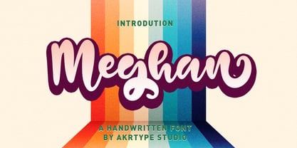 Meghan Smooth Handwritten Font is a casual and elegant handwritten font. Meghan Smooth Handwritten Font will look outstanding in any context, whether it’s being used on busy backgrounds or as a standalone headline!
 - Quantum Quill by Skinny Type,
$15.00 Quantum Quill - A Experimental Unique Display Typeface Quantum Quill font, classic clean and thoughtful, combined in one font, use this font for any beauty spot for logos, titles, cover books, magazines and more.
 - Nerone by The Ampersand Forest,
$20.00 Nerone is a quasi-unicase display type family in four weights, from light to black. In its lighter versions, it's reminiscent of dignified flared serifs like Albertus. In its black version, it's comparable to display faces like Serif Gothic, with a hint of Mostra-like despotism... Inspired by ancient Roman capitals, Nerone takes a whimsical look at how they might turn into a black fatface, and how a matching lowercase might give the whole affair a whimsical feel — specifically when applied to fun branding and marketing uses. Part of The Ampersand Forest's Sondheim Series.
 - Meleo by Alexis Luengas,
$1.00 Meleo is a semiserif consisting of 10 fonts with a few original quirks but still very legible at both text and display sizes. Since its conception, the aim was a balance of uniqueness and functionality. The typeface owes its energy to the slight suggestion of calligraphic crafting and humanist structure. But it also breaks the rules: a small x-height and a whimsical uppercase with resemblance to the lowercase may render Meleo more friendly than a conventional (semi-)serif. Titles and texts of moderate length, like those found on websites, flyers and packaging, are the natural habitat of Meleo, but it may as well thrive under different settings. Meleo supports most of western-european latin languages which are included in the ISO-Adobe character set.
 - Arkham77 by Jvne77 Studio,
$20.00 Inspired by the works of Howard Philips Lovecraft (1890-1936), and the city of Arkham lying abroad the Miskatonic River... witth all those witchcrafts secrecy and the infamous Necronomicon. The Elder Ones and the mighty Cthulhu, who lies and not dies within the dephts of the ocean in R'lyeh he's awaiting... arf, anyway this font will well set for posters, detective stories or horror books, pulps and others... *Full western latin language with most diacritics and numbers* Included in this set: - ARKHAM77 Black (More formal display) 560 glyphes - ARKHAM77 Elegante (for a creepiest rendition) 590 glyphes - ARKHAM77 Titles (as its name do not tells, for credits, or simple text) 560 glyphes - ARKHAM77 Extras (Embellish your work with this cool collection of frames and ornaments) +100 glyphes
 - Allegroost by 38-lineart,
$14.00 Allegroost is a handwritten font that uses a large brush in a horizontal position, so that the brush strokes vertically make the size large, opposite the horizontal strokes the size becomes small. To add to the natural impression, we complete many ligatures that adjust handwriting such as: ob, oc, od, og, oh, oi, oj, ok, ol, om, on, oo, op, oq, or, os, ot, ou , ov, ow, ox, oy, oz, bo, bd, bg, bi, br, bu, by, ee, ii, ll, tt, th, tl, lt, it, ti, iti, ld, ts, st , mm, nn This unique handwriting is perfect for logos, quotes, posters, fun letters, for clothing, or any design project. Equipped with 28 language support makes your brand can appear in various parts of the world
 - Funkydori by Laura Worthington,
$35.00 Funkydori is a typographic homage to the groovy ‘70s, updated for 21st century designs. Like most children of the ‘70s, I rocked the rainbow-striped bellbottoms, decorated my room with black-light posters of unicorns, and watched The Electric Company on TV. Funkydori is my tribute to the era that brought me so much happiness. Funkydori’s bodacious letterforms can be enhanced with extravagant swash capitals, alternates, and endings. Complement your design with 38 ornaments and patterns. See what’s included! http://bit.ly/2c98AZD *NOTE* Basic versions DO NOT include swashes, alternates or ornaments These fonts have been specially coded for access of all the swashes, alternates and ornaments without the need for professional design software! Info and instructions here: http://lauraworthingtontype.com/faqs/
 - FS Conrad by Fontsmith,
$50.00 Art into type In 2008, Fontsmith were approached by their friend, Jon Scott, to investigate whether a typeface could assume the aesthetic of one artist’s body of work. Jon’s not-for-profit charity, Measure, was organising an event for the artist, Conrad Shawcross, whose giant mechanical installation, entitled Chord, was going on public display in the long-disused Kingsway tram tunnel in Holborn. Chord explores the way we perceive time, as either a line or a cycle. Two enormous machines with dozens of rotating arms and moving in opposite directions, weave rope with almost infinite slowness. An unusual brief Phil Garnham visited Conrad in his Hackney studio to get a feel for his work and ideas. “Conrad is a very clever and philosophical guy. He struggled to see how typeface design had any relevance to him and his art. This was going to be a challenge.” The artist presented the type designer with a pile of rope and a huge diagram of sketches and mathematical workings. “This was, in essence, my brief.” Phil developed three concepts, the simplest of which ticked all the boxes. “The idea of the strokes in the letterforms appearing and ending at peaks or points of origin fitted perfectly with Conrad’s idea of time occurring and ending at two ends of the sculpture.” Two versions Phil planned modules for two versions of the typeface: one with five lines in the letterforms and one with seven. He then drew the modules on-screen and twisted and turned them to build the machine that is FS Conrad. “This is not a simple headline typeface,” says Phil. “It’s not a rigid structure. It has varying character widths, and it’s informed by real typographic insight and proportions so that it actually works as piece of functioning, harmonious type.”
 - ITC Aram by ITC,
$29.99Jana Nikolic was finishing her degree program at the Faculty of Applied Arts, in Belgrade, with a final project that would combine her two majors: type and book design. Three stories from William Saroyan's My Name Is Aram would provide the text for the book, to be set in a typeface that Nikolic would design. Nikolic knew something special was happening the moment she put pen to paper. The letters just emerged," she recalls. "I started to explore a few new pens and found one I loved. I was able to make its tip bend with pressure." Like the family Saroyan writes about, the design flowing from Nikolic's pen would be simple but a little quirky. "When there were a whole bunch of little black letters around me," continues Nikolic, "I saw that this was going to be a very interesting typeface family." Nikolic drew Latin and Cyrillic letters, lowercase and capital letters, wide letters and narrow letters. She was surprised at how quickly and easily the design came. "There were no badly written letters," she says. "I hardly had to rework them and they fit together remarkably well." ITC Aram's standard character complement consists of one set of lowercase letters and two sets of capitals: one narrow and the other wide. The wide caps can be used with the standard lowercase, or mixed with the narrow caps for a variation on "cap and small cap" copy. The ITC Aram create the opportunity to mix and combine the letters into playful typographic expressions. Words and sentences that twinkle; text that seems light and alive - one runs the risk of creating work that is both delightful and charming when setting copy in ITC Aram." - Plantain by CastleType,
$49.00 Plantain Stencil is based on Plantain which in turn is my interpretation of Plantin Adweight, which was one of my first commissioned projects (by Smarter Image, long before they went bankrupt). Plantin Adweight is one of the most beautiful designs of the Plantin family, which is a modern revival typeface, cut under the direction of F. H. Pierpont in 1913, who based the design on that of a famous 16th century printer, Christophe Plantin, for whom Pierpont’s font was named. The stencil cut of Plantain adds a bit of sparkle to the design. Supports most European languages that use the Latin alphabet.
 - Dai Vernon by E-phemera,
$20.00 DaiVernon is based on the handwriting of card magician extraordinaire Dai Vernon. Known as "The Professor", Vernon was a beloved expert in sleight-of-hand and card magic. These fonts are based on the penmanship in his notebooks from the 1920s, which feature almost no lowercase letters. DaiVernon Direct is based on what appears to be his hastier style, while DaiVernon Misdirect is based on his neater hand. Numerous OpenType bonus glyphs, contextual alternates and discretionary ligatures help to create the feel of his handwriting. Thanks go to Michael Albright, David Ben, and Gene Matsuura for helping to provide access to Vernon's notebooks.
 - Summer Monogram by Yoga Letter,
$16.00 "Summer Monogram" is a combination of script and monogram fonts with coconut tree and beach decorations in the monogram letters. This font is very unique and beautiful, so it is perfect for summer moments. This font is equipped with monograms, basic characters, swash, titling, alternates, multilingual support, numerals and punctuations. Very suitable for summer, spring, autumn, mother's day, christmas, holiday, winter, wedding and other moments.
 - Pecita - 100% free

- Pfennig - 100% free

- Nibby - 100% free

- Chocoball by Yumna Type,
$16.00 It is significant to have a unique font to create impressive, impactful designs because people often forget common things which may cause your work to be forgotten as well. You may have lost your candidate customers even before they know your brand and product. Let us introduce you to Chocoball, a font with firm impressions to protrude your designs. Chocoball is an uppercased display font designed in playful, modern concepts. It has firm, attractive impressions because of the inclined square letter shapes making it more unique than the others. Furthermore, it can show off your desired messages on your designs easily with the use of the uppercases. Besides, this font is able to build up a strong, recognizable brand identity. A playful display font is flexible and suitable for various design types as its advantage because it is applicable for either formal or informal designs producing interesting, consistent results. You can apply Chocoball, which gives you a clipart as a bonus, for big text sizes to be legible. You can enjoy the available features here as well. Features: Ligatures Multilingual Supports PUA Encoded Numerals and Punctuations Chocoball fits best for various design projects, such as brandings, posters, banners, headings, magazine covers, quotes, printed products, merchandise, social media, etc. Find out more ways to use this font by taking a look at the font preview. Thanks for purchasing our fonts. Hopefully, you have a great time using our font. Feel free to contact us anytime for further information or when you have trouble with the font. Thanks a lot and happy designing.
 - Ice Creamery by FontMesa,
$29.00Ice Creamery is a new variation of our Saloon Girl font family complete with italics and fill fonts which may be used to layer different colors into the open parts of each glyph. We don’t recommend using the fill fonts for Ice Creamery as stand alone solid fonts, Ice Creamery Chocolate was designed as a the stand alone solid font for this font family. Fill fonts go back to the 1850's where they would design matched sets of printing blocks and the layering of colors took place on the printing press, they would print a page in black then on a second printing they would print a solid letter in red or blue over the letters with open spaces to fill them in. Most of the time the second printing didn't line up exactly to the open faced font and it created a misprinted look. With the fill fonts in Ice Creamery and other FontMesa fonts you have the option to perfectly align the fill fonts with the open faced fonts or shift it a little to create a misprinted look which looks pretty cool in some projects such as t-shirt designs. I have some ice cream making history in my family, my Grandfather Fred Hagemann was the manager of the ice cream plant for thirty years at Cock Robin Ice Cream and Burgers in Naperville IL. In the images above I've included an old 1960's photo of the Cock Robin Naperville location, the ice cream plant was behind the restaurant as seen by the chimney stack which was part of the plant. If you were to travel 2000 feet directly behind the Cock Robin sign in the photo, that's where I started the FontMesa type foundry at my home in Naperville. My favorite ice cream flavor was their green pistachio ice cream with black cherries, they called it Spumoni even though it wasn't a true Spumoni recipe. Their butter pecan ice cream was also incredibly good, the pecans were super fresh, their Tin Roof Sundae ice cream was chocolate fudge, caramel and peanuts swirled into vanilla ice cream. One unique thing about Cock Robin and Prince Castle was they used a square ice cream scoop for their sundaes. - Nefertiti by JAB,
$12.00As you can see, Nefertiti is a font based on ancient Egyptian hieroglyphs and could be classified as a fun-font. I've always been really interested in Egyptology and a couple of years ago I thought it would be great to be able to write in hieroglyphs. I started to study them but soon realized it would take me a long time to be able to do this. Still, I was determined to find a way around this problem. At some point I came up with the idea of rearranging and reforming the hieroglyphs so as to resemble the English alphabet. During this process I tried as much as possible to preserve their ethos and appearance. However, since they are designed to write in English with, it's obvious that they are not always going to look like the real thing. Despite this, I'm really happy with the final result and I think many Pharaohphiles who just want to have some fun will be also. The only difference in this font between lower and upper case characters, is that the latter are set between two parallel, horizontal lines. These are for use with brackets (motif ends) to form cartouches - elongated ovals for names and/or titles. Try typing the following using the upper case in the sample text box. e.g. (JOHN} The zigzagged vertical lines at each end, separate the motifs from the hieroglyphs. Note the three types of ends/brackets. These lines are also used to separated words from one another and to give a more authentic appearance. So pressing the space bar gives a zigzagged line - not a space. They can also be used at any point within a cartouche to separate first and last names or titles. e.g. ; (JOHN;BROWN} walked straight home after work. Notice the eye glyph (period/full stop) at the end of the sentence. This is the only punctuation mark which can be used within a cartouche, e.g. after Mr. or to add a more Egyptian appearance to a name or title. e.g. (MR>;JOHN;BROWN} Parallel lines dividing hieroglyphical inscriptions and writing into rows or columns are very common. To incorporate these in a body of text, simple use the underline U. e.g. (OSIRUS) and {ISIS} were important gods of the ancient Egyptians. (HORUS) {HATHOR} and [RA],the sun god, were also highly revered deities. The punctuation marks available are shown below. . , " " ' ! ? "where is the king?" The font also includes the numbers 0-9, the following mathematical symbols and the hash sign(Scarab beetle). Once again, I've tried to make them look as Egyptian as possible; whether I've succeeded or not is open to debate. e.g. + - x / = # This font is named after Akhenaten's beautiful wife, Nefertiti, who's image can be seen in the graphic on this page. - Vitrina by Design is Culture,
$39.00 Vitrina is a script based on letterforms painted on a window for a restaurant called "Latin American Cafeteria". Its quirky script forms are meant to evoke a sense of hand painted signage. Vitrina means "store front window" in Spanish.
 - Checkbook - 100% free

- Snowfall by Elemeno,
$32.00Hand-lettered font, based on the designer's own handwriting. Perfect for indy comics or for lending almost anything a personal touch.


PreviousPage 250 of 250