10,000 search results
(0.058 seconds)
- Raljon by Mmarkk,
$22.22 Raljon is a display typeface created by designer and lettering artist Mark Robinson. It is a collaboration between the Mmarkk and Teen-Beat Graphica visual design studios. This single font was created over a period of five years. Mark took great care in finessing each character and making sure that each character would stand on its own and yet simultaneously, be an integral part of the whole. The typeface is inspired by Gothic letterforms, horror novels, speed metal bands of the 1980s, techno and electronic music of the 1990s, and Washington, DC football teams whose stadiums lie in the Maryland suburbs. While it doesn’t have multiple weights, Raljon does have a deep depth and breadth. It has a seemingly endless amount of alternate characters and ligatures. There are nine letter Ms, eight letter As and Fs, seven Rs and Ts, and the list goes on. Even the figures have alternates.
 - Gineso Titling by insigne,
$19.00 Before the Great War, there were great posters. Posters of elegance and grandeur. Posters calling people to the pleasures of sunny southern France and to the perfections of northern Italy’s dolce vita. Le Havre, based on a poster by AM Cassandre, was one of my first typefaces that took inspiration from this genre. Now, the golden memories of years past are the inspiration for insigne design’s new Gineso Titling as well. Gineso revives the retro forms of past poster design with its newly crafted sense of humanity, which is amplified by a great variety of texture options. While the new forms are perfect for posters, this titling font is also ideal for bringing the charm of pre-war Southern Europe to a new bottle of wine, to fine foods and beverages, and to high-end logotypes. For the grandeur and elegance you need in your titling, look to Gineso Titling.
 - Wintanceastre by Hanoded,
$25.00 I am a HUGE fan of Bernard Cornwell’s ‘The Saxon Stories’. Ever since a television series has been made, the series of books is also know as ‘The Last Kingdom’. I have read them all, at break-neck speed and I can’t wait for the next book!! Wintanceastre (Winchester) is based on a 10th century Latin manuscript. I have tried to stay close to the original letters, but since Latin does not have all modern glyphs, I found myself designing the missing ones. So, before you scold me for having made a font that is historically inaccurate: it was never meant to be an exact replica, nor would anyone want an exact replica, as it would be useless for modern texts and designs. Wintanceastre comes with a whole bunch of ligatures and alternate glyphs. Use it for any design that needs a little ‘Dark Ages’ look!
 - Amazónica - Personal use only

- Times Europa Office by Linotype,
$50.99The Times Europa Office family is designed after the model of the original serif family produced by Walter Tracy and the Linotype Design Studio in 1974. A redesign of the classic Times New Roman typeface, Times Europa was created as its replacement for The Times of London newspaper. In contrast to Times New Roman, Times Europa has sturdier characters and more open counter spaces, which help maintain readability in rougher printing conditions. Times Europa drastically improved on the legibility of the bold and italic styles of Times New Roman. Overall, text set in Times Europa is easier to read, and quicker to digest. Akira Kobayashi, Linotype’s Type Director, brought Times Europa up to speed for the new millennium in 2006. Now optimized for office communication instead of newspaper design, Times Europa Office offers a familiar yet refreshingly new appearance for serif text. Because of The Times of London’s specific printing conditions in the early 1970s, Times Europa originally had some intentional errors built into its letterform design. These inconsistencies created an even image in newspaper text in the long run. However, these design elements bear no role on modern office communication and its needs. Kobayashi redrew these problem forms, eliminating them completely. Now Times Europa’s font weights appear clearer and easier to read than ever before. - Hidden Gem by VP Creative Shop,
$20.00 Introducing Hidden Gem Serif font - latin and Cyrillic Hidden Gem is elegant and abstract font loaded with 95 languages support, alternate and ligature glyphs to make you typography truly unique! I had so much fun creating this one and I really hope you will enjoy it! Language Support : Belarusian, Bosnian, Bulgarian, Chechen, Macedonian, Russian, Serbian, Afrikaans, Albanian, Asu, Basque, Bemba, Bena, Breton, Chiga, Colognian, Cornish, Czech, Danish, Dutch, Embu, English, Estronian, Faroese, Filipino, Finnish, French, Friulian, Galician, Ganda, German, Gusii, Hungarian, Indonesian, Irish, Italian, Jola-Fonyi, Kabuverdianu, Kalenjin, Kamba, Kikuyu, Kinyarwadna, Litvian, Lithuanian, Lower Sorbian, Luo, Luxembourish, Luyia, Machame, Makhuwa-Meetoo, Makonde, Malagasy, Maltese, Manx, Meru, Morisyen, North Ndebele, Norwegian Bokm ål, Norwegian Nynorsk, Nyankole, Ormo, Polish, Portuguese, Quechua, Romanian, Romansh, Rombo, Rundi, Rwa, Samburu, Sango, Sangu, Scottish Gaelic, Sena, Shambala, Shona, Slovak, Soga, Somali, Spanish, Swahili, Swedish, Swiss German, Taita, Teso, Turkish, Ukrainian, Upper Sorbian, Uzbek (Latin), Volap ük, Vunjo, Walser, Welsh, Western Frisian, Zulu FEATURES Uppercase, numeral, punctuation & Symbol ligature glyphs alternate glyphs Multilingual support - 95 languages Cyrillic support No special software is required to type out the standard characters of the Typeface. How to access alternate glyphs? To access alternate glyphs in Adobe InDesign or Illustrator, choose Window Type & Tables Glyphs In Photoshop, choose Window Glyphs. In the panel that opens, click the Show menu and choose Alternates for Selection. Double-click an alternate's thumbnail to swap them out. Feel free to contact me if you have any questions! Mock ups and backgrounds used are not included. Thank you! Enjoy!
 - Fushar Arabic by Mikołaj Grabowski,
$19.00 Fushar Arabic is a bold comic color font family which comes in 5 layer-styles easy to compose in a multicolor manner and 3 OpenType-SVG color styles to make the work faster and easier. Character set covers Latin A-Z all caps, Arabic, Persian and Urdu with 230 ligatures, European, Arabic and Persian / Urdu localized digits, punctuation, currencies and other symbols - the total of 729 glyphs. The idea came from a custom logotype I made several years ago for a local charity organisation that helps children. The logotype was based on bold letters with light that make the "balloon" effect visible in "Holes" style. Later I expanded the family with "Cuts" and all the derivative fonts that make the whole color family. The purpose was to create a funny, friendly and playful script that would embrace the beauty of the Arabic alphabet. Solid, Cuts and Holes are classic one-color styles which can be used separately to compose a simple text. With Shadows and Lights they can produce a multicolour design, as shown on the images above. To save the time, there are three already prepared combinations in the new OpenType-SVG color format. The features include required ligatures, discretionary ligatures, proper mark attachment, contextual alternates, case-sensitive forms, ordinals, localised Persian/Urdu numerals, superscript (1, 2, 3) & fractions. Now you can buy Extended Latin character set (uppercase and lowercase) at Fushar font family page on MyFonts. European languages, Vietnamese and Pinyin included.
 - Expressway Free is a remarkable font designed by the talented Ray Larabie, a name synonymous with innovative and functional typeface design. This font is characterized by its clean lines, straightfor...
- Best Life by Sulthan Studio,
$12.00 Best life - This cool one line handwritten font is very stylish and elegant that has a great style for your work with hearts in the middle and also lowercase swashes in front and back and lowercase swashes on back and hearts in front of letters to connect.
 - Glaciar by TripleHely,
$16.00 Glaciar is a script typeface based on brush handwriting and inspired by old-style bas-reliefs. All contours were carefully cleaned of brush roughness, but at the same time, minor imperfections were left to create the unique character of this font Glaciar has a built-in auto replacement for lowercase letters without connecting strokes (in the case of word ends) and for ligatures (in the case of letter pairs that do not fit well together). In addition, there are alternates glyphs with starting and ending swashes - the last ones can be used with any OpenType software. And finally, the font has wide multilingual support and can be used in texts in 195 languages Glaciar is a good choice for branding and design projects as well as a cute text overlay to any background image
 - Fugu by Positype,
$25.00 When Baka and Baka Too did very well commercially (Baka was named the Best Cursive Rough Script in 2005), I shied away from doing rough, handwritten scripts in fear as being seen as a one-trick-pony. A few years have passed and some early sumi-e brush ‘doodles’ kept appealing to me. I initially thought this new font would just fall under the Baka mantle and just become a new sibling, but as brush hit paper over and over again, the letters took on a different personality from Baka. This new font was turning out to be far more expressive, smooth and rough, tasty but sticky. This dichotomy demanded a new name. The rough and smooth texture suggested the name Fugu—oddly delicate while rough and functional.
 - Basalt by Volcano Type,
$19.00 Basalt is a hard, black volcanic rock with less than about 52 weight percent silica. Because of basalt's low silica content, it has a low viscosity (resistance to flow). Basalt is erupted at temperatures between 1100 to 1250° C.
 - Blame by Haksen,
$15.00 Blame is a strong font family and sophisticated sans also serif Each font in the family can stand on its own, dynamic and authoritative in their own right. Bison includes ten all-caps fonts: a weight (clean and rough version), two outlines, four italics. - Blame Sans Clean and Rough Regular - Blame Serif Clean and Rough Regular - Blame Sans Clean and Rough Italic - Blame Serif Clean and Rough Italic - Blame Sans Outline Regular and Italic - Blame Serif Outline Regular and Italic FEATURES : a weight / Italics / Outlines / Numbers & Punctuation / Extensive Language Support USE Blame works great in any branding, logos, magazines, films. The different weights give you full range to explore a whole host of applications, while the outlined fonts give a real modern feel to any project. Thanks for having a peek at Blame. I hope you enjoy it and feel free to take it for a spin below! As always, if you have any questions just send me a message! I’m glad to help :) Haksen
 - Handy by Malindo Creative,
$10.00 Introducing,Handy Script Is a Beautiful font of retro style, Give your typography design a touch of retro style with Handy Script, Handy Script is one of hand lettering project. It was very inspired from the famous retro typography designs. Handy Script also comes with extra Extruded Font version. So you don’t need extra effort for create an extrude effect for this font. This mean it will saves your time. Handy Script Comes With 406 Glyphs and OpenType Features are also added to this font. The Features includes: Stylistic Alternates, Swashes, Ligatures, and Stylistic Set. You can pick the alternate for all style. If you have any questions, please contact me at: malindocreative@gmail.com. Feel free to contact me, I am happy to help you. Thank you for your kindness and support, it’s not hidden, what you see in preview is what it contains, Hopefully Useful, Good Luck For You, And Love You All.
 - Simplified by Redy Studio,
$19.00 Simplified – Casual Chic Font Simplified is a casual and natural font, with a spirit of clean-cut modern and classic. This typeface has been specially designed to give a feeling of casual luxury. This is not easy typography! We have done a lot of effort to build this font. In the past, we have experimented with a ton of fonts that are similar to Simplified, and Simplified is better in every aspect that I have found, including some OpenType features and ligatures, lowercase beginning & ending swashes that you can use to make your own style. In short, it’s a typeface that you must have! Simplified features: A full set of upper & lowercase characters Numbers & punctuation 63 Gorgeous ligatures Lowercase beginning swashes Lowercase ending swashes Multilingual symbols PUA Encoded Characters – Fully accessible without additional design software. Feel free to give me a message if you have a problem or question. Thank you so much for taking the time to look at one of our products.
 - Canari Script by Redy Studio,
$17.00 Canari – Modern Calligraphy Fonts Canari, modern calligraphy font is of great interest to all graphic designers and die-hard fans of handwriting. Canari comes with 105 extravagant ligatures, so you can give your work the personal touch it deserves. It is great for expressive projects such as using it for a logo design, wedding invitation design, social media headers, product packaging, and much more! If you are looking for a condensed font that is perfect for use as social media headers or logos then Canari would definitely be the perfect choice for you. Just take a look at this example above and you will definitely fall in love with this font! Canari features: A full set of upper & lowercase characters Numbers & punctuation 105 Extravagant ligatures Multilingual symbols PUA Encoded Characters – Fully accessible without additional design software. Feel free to give me a message if you have a problem or question. Thank you so much for taking the time to look at one of our products.
 - Little Delights by Set Sail Studios,
$16.00 Why not treat yourself to some Little Delights? This super playful & versatile brush font includes 429 glyphs in total - and is designed to perfectly recreate natural, free-flowing brush script lettering while maintaining a relatable charm. Hand painted with a real paintbrush, and packed with 48 Ligatures, you're bound to enjoy this go-to brush font for years to come on a variety of projects. As well as a full alternate set of upper & lowercase characters in it's own separate font, Little Delights also includes a set of 6 Swashes, ideal for underlining your lettering and adding that extra 'custom' style. Swashes can be accessed via a glyphs panel. Accessing Ligatures; These 48 unique double letter combinations will help letters connect and flow more naturally. The ligatures will automatically generate when using the Little Delights fonts with most software. Language Support; English, French, Italian, Spanish, Portuguese, German, Swedish, Norwegian, Danish, Dutch, Finnish, Indonesian, Malay, Hungarian, Polish, Croatian, Turkish, Romanian, Czech, Latvian, Lithuanian, Slovak, Slovenian.
 - P22 Casual Script by IHOF,
$39.95 P22 Casual Script Pro is a flexible OpenType font based on mid-20th Century hand drawn advertising lettering scripts. As an alternate to thicker casual script styles, this free-flowing thin brush style is evocative of vintage product advertisements and packaging lettering and is highly suitable for a retro flavor. The Pro font includes over 500 glyphs with at least 2 of all upper and lower case characters with OpenType scripting and ligatures for a more natural and random effect. There is also a unique feature not found in other script fonts: Small Caps! While it may seem unnatural for a script font to have small caps, these work well as an authentic variation of brush script lettering for advertising. Also included in the Pro version is a full Central European character set, swash characters and more. OpenType features include: Small Caps, ligatures, discretionary ligatures, swashes, contextual alternates, stylistic alternates, Old Style/Lining Figures
 - Arya by TipoType,
$19.90 Arya is a display typeface, based on Roman proportions. It has three versions, differentiated by the amount of the drawn lines. Single is solid. Double is sturdy but light. Triple is versatile and includes alternatives. They can be combined in layers. Capsule versions (White and Black) are designed to do quick, simple and elegant labels.
 - DF Riga by Dutchfonts,
$33.00 DF Riga is a minimal bitmap typeface which works very well in small sizes both on your screen and on paper. But... if you want to express its deep beauty, use it in display sizes and the smell of ink is there. These typefaces (DF-A BIT, DF-Riga and DF-Dudok) owe their existence to the excellent letterpress printing of Hanneke Briër at the Grafisch Centrum Groningen. Beyond ‘the perfect’ there is a lot to get, it is made, you can see that.
 - Prosaic Std by Typofonderie,
$59.00 A Postmodern vernacular sanserif in 8 fonts Prosaic designed by Aurélien Vret is a Postmodern typographic tribute to the french vernacular signs created by local producers in order to directly market their products visible along the roads. These signs drawn with a brush on artisanal billboards do not respect any typographic rules. The construction of these letterforms is hybrid and does not respect any ductus. Nevertheless the use of certain tools provokes a certain mechanism in the development of letter shapes. It’s after many experiments with a flat brush, that’s these letterforms have been reconstructed and perfected by Aurélien Vret. This is the starting point for the development of an easily reproducible sanserif with different contemporary writing tools. From non-typographical references of Prosaic towards readability innovation The influence of the tool is revealed in the letterforms: angular counterforms contrasting to the smoothed external shapes. This formal contrast gives to Prosaic a good legibility in small sizes. These internal angles indirectly influenced by the tool, open the counterforms. In the past, to deal with phototype limitations in typeface production, some foundries modified the final design by adding ink traps. In our high resolution digital world, these ink traps — now fashionable among some designers — have little or no effect when literally added to any design. Should one see in it a tribute to the previous limitations? Difficult to say. Meanwhile, there are typeface designers such as Ladislas Mandel, Roger Excoffon, and Gerard Unger who have long tried to push the limits of readability by opening the counters of their typefaces. Whatever the technology, such design research for a large counters have a positive impact on visual perception of typefaces in a small body text. The innovative design of counter-forms of the Prosaic appears in this second approach. Itself reinforced by an exaggerated x-height as if attempting to go beyond the formal limits of the Latin typography. It is interesting to note how the analysis of a non-typographical letters process has led to the development of a new typographic concept by improving legibility in small sizes. Disconnected to typical typographic roots in its elaboration, Prosaic is somewhat unclassifiable. The formal result could easily be described as a sturdy Postmodern humanistic sanserif! Humanistic sanserif because of its open endings. Sturdy because of its monumental x-height, featuring a “finish” mixing structured endings details. The visual interplay of angles and roundness produces a design without concessions. Finally, Prosaic is Postmodern in the sense it is a skeptical interpretation of vernacular sign paintings. Starting from a reconstruction of them in order to re-structure new forms with the objective of designing a new typeface. Referring to typographic analogy, the Prosaic Black is comparable to the Antique Olive Nord, while the thinner versions can refer to Frutiger or some versions of the Ladislas Mandel typefaces intended for telephone directories. Prosaic, a Postmodern vernacular sanserif Prosaic is radical, because it comes from a long artistic reflection of its designer, Aurélien Vret, as well a multidisciplinary artist. The Prosaic is also a dual tone typeface because it helps to serve the readability in very small sizes and brings a sturdy typographic power to large sizes. Prosaic, a Postmodern vernacular sanserif
 - Hubber by LomoHiber,
$16.00 Presenting my font called Hubber. This font has been inspirited by product retro posters from 60s-70s. I tried to make letters as much streamlined and gentle as possible. I hope you'll enjoy how sweet it came up. Hubber consists of such features as swashes, alternate glyphs, ligature, and additional shadow font. Hubber perfectly fits for retro designed logos, posters, prints. Hubber Features: Up to 19 alternates for each letter with swashes Contextual alternates feature will automatically match alternate letters depending on their position or pairing 21 ligatures Shadow effect font to save your time. Just place the layer with Shadow font behind Regular to make the shadow effect Carefully tuned kerning (preview above doesn't show it for some reason) If you have some issues, questions, please let me know: lhfonts@gmail.com Hope you'll enjoy using Hubber!
 - Karayel Handwritten by Tatbikililer,
$19.00 Erdogan Karayel, a master in graphic arts and a cartoon artist, has long dreamed of transforming characters made up of his own handwriting into fonts. This dream has come true with the technical support of Karayel's school friend Sabahattin Kayış, a graduate of the Istanbul School of Applied Fine Arts (Marmara University Faculty of Fine Arts). The biggest problem of handwritten fonts in the font world is the difficulty of reading in long texts due to their curved and flexible letters that create spacing problems when used side by side. The "Karayel Calligraphy", on the contrary, is created as a solution to this problem. It's a font that is sufficiently fluid, visually satisfying and easy to read. In particular, a lot of effort is made to ensure the utmost harmony between the character's spaces. The “Karayel Calligraphy” font is now available for download.
 - Graphique Next by profonts,
$41.99 The original Graphique Pro was designed by the famous Swiss designer Hermann Eidenbenz in 1945 and included one outline shadow style. His idea of a very narrow, very economic headline font became increasingly more popular over the last decades and since the recent trend of layered fonts his idea is more up-to-date than ever. profonts studio now took the idea of the Graphique Pro to its next level: Graphique Pro Next. This layered type family consists of 8 styles which can be combined in plenty of ways to create unique designs. The fonts thereby preserve the outstanding and timeless drawings of the original Graphique Pro font and will add an aesthetic and fresh look to every project. Please have a look at the Graphique Pro Next Type Specimen for more details about the language support and font layer combinations.
 - Victoria Smitters by Din Studio,
$29.00 It is critical to ensure that your design appearance represents the messages you deliver. However, it can be such a difficult task and time wasting to create a personal, lovely design. Therefore, Victoria Smitter is the answer to what you need. Victoria Smitter is a visually beautiful handwriting font which is perfect to show modern, elegant impressions in a personalized design to impress your customers and to make your messages more prominent than the others. It is designed in a cursive way in which the letters are connected to each other. Details on each letter and cursive wipes on the edges show high contrasts. Furthermore, this font is suitably applicable for big text sizes for better legibility. In addition, you can enjoy the available features here. Features: Stylistic Sets Ligatures Swashes Multilingual Supports PUA Encoded Numerals and Punctuations Victoria Smitter fits best for various design projects, such as brandings, posters, banners, invitations, greeting cards, magazine covers, quotes, printed products, merchandise, social media, etc. Find out more ways to use this font by taking a look at the font preview. Thanks for purchasing our fonts. Hopefully, you have a great time using our font. Feel free to contact us anytime for further information or when you have trouble with the font. Thanks a lot and happy designing.
 - Klatter by Scholtz Fonts,
$19.00Klatter is a font that is "in your face". It can't be ignored, and draws attention to itself no matter how noisy the environment. It is available in three styles: - Klatter Regular is a clean, spunky, non-grunge font that uses a combination of straight lines and sharp angles to make a strong, no-nonsense statement; - Klatter SmallCaps, in which the lower case is a true "small caps" and not a shrunken version of the upper case (generated by the operating system); - Klatter Grunge is based on Klatter Regular but is "dirty" and messy, giving the impression of printing problems and wet ink being smudged. Unlike many other grunge fonts, Klatter Grunge is a font that is full of character. Both styles have a full character set with upper and lower case, numerals and mathematical symbols, as well as a full set of accented and special characters. The font has been carefully letter-spaced and kerned and the vertical spacing has been appropriately set. Klatter Grunge and Regular are appropriately purchased together since they complement one another when used in the same graphic design job. - Linotype Typo American by Linotype,
$29.99Mark Stanczyk designed Linotype Typo American in 1999. The font is an excellent revival of American style typewriter type. As most of us can remember from our childhood years, or through old stories and movies, everyone used to type with typewriters before the invention of computers. Unlike computers, most individual typewriters only had one typestyle, or font, to chose from. To make matters worse, the letters in a typewriter font would wear down with use. Over time, text typed out on a typewriter would look more and more corroded, old, and uneven. Stanczyk has captured exactly these features in this “revival” font! Also like most older typewriter styles, Linotype Typo American’s letters are all mono-spaced, i.e., the letter i is the same width as the letter w. Typewriter letters also all tended to be cast in the same size, around 12 points or so. When using typewriter-style fonts, it is best to keep setting your text in similar sizes. (Of course, you can set really large and fun headlines with Linotype Typo American, too; if anything the unevenness of the design will come even more across in these applications.) - Petale by LomoHiber,
$15.00 Petale is my new elegant experimental typeface I'd love to present. At the beginning, I was intended to create a bold wide font, I started sketching options and came out with the letter 'M' design first. I thought it may be interesting and had continued developing the style with letters N, O, etc., spending hours on some letters to match the design and my vision. I liked how it looked (especially digits) and added different weighs. And it came out pretty stylish. You may like it to use in magazine designs, posters, websites, packaging, branding, logo, and so on. Petale can grant your work some graceful modern touch with a brutalist-feminine note. Works well with elegant and strict serif fonts. Also try to experiment with script fonts. I used my Stormy Youth font: https://www.myfonts.com/fonts/lomohiber/stormy-youth and Bodoni 72 Smallcaps If you have some issues or questions, please let me know: lhfonts@gmail.com Hope you'll enjoy using Petale! Language support: Afrikaans, Albanian, Bulgarian, Catalan, Croatian, Czech, Danish, Dutch, English, Estonian, Finnish, French, German, Hungarian, Icelandic, Italian, Latvian, Lithuanian, Maltese, Norwegian, Polish, Portuguese, Romanian, Russian (Русский), Slovak, Slovenian, Spanisch, Swedish, Turkish, Ukrainian (Украинский), Zulu
 - Patrilya Script by Mercurial,
$12.00 Patrilya Script A New Romantic Script Calligraphy made with a touch of lovely and charming attraction that adds to the impression of a beautiful and elegant. a charming typeface and So beautiful on invitation like greeting cards, wedding invitation, branding materials, business cards, quotes, posters, headings, signature, logos, t-shirt, letterhead, signage, label, news, posters, badges and more Patrilya Script has a script typeface and extra letters and included floral ornaments that allows you to be more fancy and more extraordinary in designing. Patrilya Script requires no special software to use or access the alternate letters. You can even use Patrilya Script in basic writing apps like Word For those with Opentype capable software ( Photoshop CC or any version of Illustrator/ Indesign), Patrilya Script also comes with Opentype features such as access to all the alternate letters and double letter ligatures. And this Font has given PUA unicode (specially coded fonts). so that all the alternate characters can easily be accessed in full by a craftsman or designer. Don't forget to check out other cool fonts on our store and wait for new fonts. Follow our shop for upcoming updates including additional glyphs and language support. feel free to send me a message, comment, like and share. Thanks
 - Brownie Buster by Balpirick,
$15.00 Introducing by Balpirick Studio. Proudly Present, BROWNIE BUSTER Font. BROWNIE BUSTER is a Fat Handbrushed Font. Brownie Buster is a fat hand-brushed font. It is perfect for product packaging, branding project, magazine, social media, wedding, or just used to express words above the background. This font includes TTF and OTF, BROWNIE BUSTER also multilingual support. Enjoy the font, feel free to comment or feedback, send me PM or email. Thank you!
 - Panderman by theulum studio,
$10.00 panderman is a simple modern san serif font with 4 font styles. Simplicity and modernity are the basis for making this font. Perfect for branding, logos, invitations, mastheads, and more. The panderman also includes the full set: Uppercase and Lowercase Multilingual Symbol Number Punctuation Alternative multilingual 4 font styles (Regular, Italic, Bold, & Bold Italic) Hope you enjoy our fonts and if you have any questions feel free to message & I'm happy to help. Thank you.
 - Vintage Machine by Balpirick,
$15.00 Vintage Machine is a Typewritter Typeface Font. This font captures the essence of vintage typewriters, with a distinct and easily recognizable aesthetic. This font is perfect for projects that require a vintage touch, such as vintage-inspired branding, editorial designs, and book covers. Embrace the nostalgia of analog writing with our typewriter fonts, a tribute to the timeless art of typography. - also multilingual support Enjoy the font! Feel free to comment or feedback! Thank you!
 - Crawling by Mevstory Studio,
$25.00 Crawling Chic & Moderf Serif. Crawling is a modern and chic typeface, best used as a display for headings, logos, branding, magazines, product packaging and invitations. Crawling come with clean lines and smooth curves give any project an extra touch of class. If there's anything else you are unsure of feel free to pop me a message :) That's it! Have fun using Crawling Typeface!!! Feel free to follow, like and share. Thanks so much for checking out my shop!
 - Argent CF by Connary Fagen,
$35.00 Argent is dashing and expressive, with a pronounced x-height and evocative, flowing letterforms. Featuring charming italics, a special superbold weight, and wide language support, Argent excels in display settings like headlines, titles, and logos. As an expressive and detailed typeface, Argent pairs nicely with clean typefaces that provide contrast, such as a sans serif like Greycliff CF, Artifex Hand CF, and Articulat CF. All typefaces from Connary Fagen include free updates, including new features, and free technical support.
 - HU Flatwhite KR by Heummdesign,
$25.00 This is a headline typeface for titles with a retro sensibility. The concave first projection of the vowel and the dot shape further add to the retro feel. It is characterized by the dot shape seen in the initial consonants and the thin ending strokes of 'ㄱ', 'ㅅ', and 'ㅈ' to create a flowing curve. Although it is a full module, the inner space created by the large contrast of strokes gives a cool feeling. This font contains KOREAN
 - Kustina by Youngtype,
$18.00 Kustina Script is a hand brush font made with brushes and ink. This typeface is ideal for use in thick watercolor designs or handwriting styles, such as blog titles, posters, wedding elements, t-shirts, clothing, book covers, business cards, greeting cards, branding, merchandise etc. How to access all alternative characters, using Windows Character Map with Photoshop: https://www.youtube.com/watch?v=Go9vacoYmBw How to access all alternative characters using Adobe Illustrator: https://www.youtube.com/watch?v=XzwjMkbB-wQ Thank you!
 - Rexlia Free, designed by the talented Ray Larabie, is a font that manages to balance a robust, industrial aesthetic with an undercurrent of playful quirkiness. This typeface is not your average font;...
- Arrow Callouts JNL by Jeff Levine,
$29.00 Here’s a set of arrow shaped callouts in two varieties within one font. The black-on-white letters are on the upper case keys, and the white-on-black characters are on the lower case keys. The numerals 1 thru 10 in black-on-white are in the standard key positions, while the white-on-black numbers are on the same keys when engaging the “shift” key. The 'zero' key houses the number '10'. For a more dynamic look, the font is also available in an oblique version.
 - DS Hiline - Unknown license

- Jadibeken by Allouse Studio,
$16.00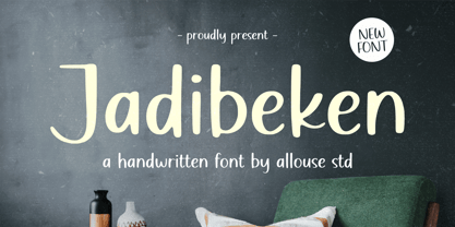 Proudly Presenting, Jadibeken A Quirky Handwritten. Jadibeken is perfect for any titles, logo, product packaging, branding project, megazine, social media, wedding, or just used to express words above the background. Jadibeken also come with Multi-Lingual Support. Enjoy the font, feel free to comment or feedback, send me PM or email. Thank You!

