10,000 search results
(0.049 seconds)
- Quick End Jerk - Unknown license

- Ben-Zion - Personal use only

- Electrofied - 100% free

- War Eagle - Personal use only

- Dufour by Scholtz Fonts,
$19.00 Dufour was named in honor of an art deco font called "Independent" designed in the 1930s by Collette and Dufour. "Dufour" is influenced by the original font, however, there are substantial differences: instead of small caps, a true lower case was created, the upper case character proportions and shapes have been greatly modified, and all missing characters have been created to make a truly modern font which nevertheless has all of the panache of the original. A related font is Collette, designed by Anton Scholtz, however, Dufour has a softer feel that is more true to the original art deco period. Dufour comes in four styles: Dufour Regular, Dufour Regular Outline, Dufour Condensed, and Dufour Condensed Outline. The font has been carefully kerned and best results are obtained if kerning is switched on. (All-caps passages work well.) It is best used to create a retro feel and in headings, subheads and in short passages of text. Very effective in marketing for products for children.
 - Yarikha by ActiveSphere,
$30.00 Yarikha is a geometric display font and works best in display applications, such as posters, logos and titles. It has five weights: regular, semibold, demibold, bold and extrabold, each available in italic, making a total of ten styles. Each style has a full upper and lower-case, accents, punctuation and a selection of monetary symbols.
 - Temporal Shift by Comicraft,
$19.00You're trapped in an endless now... seconds seem to be stretching out interminably... There’s an eternity between every tick, every tock of the clock... Your consciousness is stretched to the limit as time is expanded to fill the void between each microsecond. There’s a signpost up ahead... the letters appear to stretch into infinity. Anyone know the name of the font it’s set in? See the families related to Temporal Shift & Gap Expanded: Temporal Shift & Gap & Temporal Shift & Gap Compressed Features Four fonts (Shift Regular, Shift Bold, Gap Regular & Gap Bold) with upper and lowercase characters. - Maracatu by Bruno de Aviz,
$5.00 The family of Tipografia Maracatu was born in 2020 when we could not leave the house because of the coronavirus epidemic. I had no idea how it would turn out. I just wanted to draw letters. When I finished the regular version, I thought it looked a lot like the art and music from the Northeast of Brazil, and that is why I came up with the name Maracatu. Maracatu is a musical-style original from the Northeast of Brazil. After I had the font style and the Regular version, I thought it would be nice to have Bold and Light.
 - Temporal by Comicraft,
$19.00 You're trapped in an endless now... seconds seem to be stretching out interminably... There’s an eternity between every tick, every tock of the clock... Your consciousness is stretched to the limit as time is expanded to fill the void between each microsecond. There’s a signpost up ahead... the letters appear to stretch into infinity. Anyone know the name of the font it’s set in? See the families related to Temporal Shift & Gap Expanded: Temporal Shift & Gap & Temporal Shift & Gap Compressed Features Four fonts (Shift Regular, Shift Bold, Gap Regular & Gap Bold) with upper and lowercase characters.
 - Sondela by Scholtz Fonts,
$19.00Sondela is a gently rounded, informal font, whose name means "welcome" or "come closer". It echoes the openhearted tradition of the Zulu people, where all who come are welcome. The font is available in regular and display (Pizazz) versions. Sondela Pizazz incorporates the zig-zag pattern that has been used in traditional Zulu beadwork for generations. It is highly effective when used in conjunction with the unadorned Sondela regular. The numerals are mono-spaced so that they will line up correctly in columns of figures. The letters of the alphabet are correctly kerned so that they appear correctly in text. - Girltalk by Scholtz Fonts,
$10.00 Cute, curly, & very "little missy", Girltalk was specially designed for the pre-teen & young-teen market. Its design was inspired by the kind of curly handwriting that junior school girls use for notes to each other, diary entries, autograph books etc. Pretty & feminine, with a large dose of cheek, Girltalk is a must for all marketing media aimed at the 7-14 age group: -- “girl style” stationery -- diary covers -- clothing hang-tags -- party invitations -- greeting cards -- book covers -- movie posters -- CD covers -- toy and game advertising media Girltalk can also be used for "big girls"! Great for hen parties, baby showers, pamper parties and other occasions that bring out the "girl in" women. Think pink, think hearts & flowers, think ribbons & bows, add Girltalk to the mix, and you have a winner! Girltalk has been carefully letterspaced and kerned. All upper and lower case characters, punctuation, numerals and accented characters are present.
 - Gothic Grotesk JNL by Jeff Levine,
$29.00 In a specimen book from Stevens, Shanks & Sons, Ltd. of London (circa1930s) “Royal Gothic” was their version of a classic grotesk sans that had been in use as far back as 1899 when the Keystone Foundry called it “Charter Oak”. The terms "gothic" and "grotesk" were equally applied to early sans serif typefaces – at first not well embraced by printers as being too ugly (grotesque) for use. One familiar characteristic of early grotesk fonts (such as this one) is the numerous variations of character widths and shapes. By combining those two terms into a font name, the digital version of this design is called Gothic Grotesk JNL, and is available in both regular and oblique versions.
 - Quick Silver FS by Designova,
$23.00 Quick Silver FS is unique, fresh and cute handwritten font for branding / logo design / logotypes / greeting cards / promotional graphics and anything in between. Quick Silver FS is inspired from modern era cartoon titles and completely handmade with passion and perfection. Extended Character Sets Along with the basic Latin character set, we have added Western European, Central European, South Eastern European character sets for your convenience. Advanced Kerning We have performed advanced, in-depth kerning for all possible letter combinations. What You Get This font being a handmade typeface, comes with only single weight (Regular). CREDITS: Font designed by Lis at Fontastica, produced by Fontastica, distributed by Designova. Created with ProCreate and Fontself on iPad Pro.
 - Apothem - Personal use only

- Dustismo Roman - 100% free

- Tecna Standard by Descarflex,
$20.00 The Tecn@ Standard family was designed so that its characters are legible and easy to interpret in any writing; among them, the descriptive memory of plans for example. Tecn@ Standard complements the Tecn@ Background Light and Dark Square Triangle font family.
 - McKnight Kauffer by K-Type,
$20.00 McKnight Kauffer is a casual sans derived from poster and book cover lettering by the American designer, Edward McKnight Kauffer, who mainly worked in England through the 1920s and 1930s. The style owes much to Louis Oppenheim's Fanfare of 1927, but without the Germanic blackletter inflection. The two display fonts, regular and outline, have a playful art deco feel, and share spacing and kerning so can be overlapped for bicolor effects.
 - Cerkiymo by Hishand Studio,
$15.00 The strokes of the Cerkiymo font dance gracefully across the page, exuding an air of elegance and freshness. With its delicate curves and refined lines, the Cerkiymo font lends an elegant touch to any design, breathing a fresh sense of sophistication into each word. Perfect for logos, branding, invitations, stationery, wedding designs, social media posts, and much more. Complete with ligatures alternates regular italic hollow icon kerning multilingual support
 - Seahawk JNL by Jeff Levine,
$29.00 The 1939 sheet music for “Sea Dreams” had its title hand lettered in an unusual Art Deco style that employed many unusual character shapes and widths within the font design. A teardrop-shaped ‘D’, a slightly off-kilter ‘S’ and a number of other interesting variations became the model for Seahawk JNL, which is available in both regular and oblique versions. The term “Seahawk” is another name for an Osprey.
 - Writer Autograph by Smartfont,
$16.00 Writer Autograph font is inspired by writers and heroes. This family contains uppercase and lowercase glyphs alongside a large range of punctuation, symbols, numerals, and multilingual support. There are two weights - regular and bold - and built in OpenType kerning features for a professional touch. This font is perfect for creating slick & stylish lettering. Whether for logos, product packaging or merchandise, Writer Autograph is guaranteed to give your text an unmistakeable quality.
 - Boss Jock JNL by Jeff Levine,
$29.00 The title and credits from the 1965 film “Strange Bedfellows” were hand lettered in a style typical of the early-to-mid 1960s – casual and playful. This brought to mind similar type designs used by many radio stations when advertising their disc jockeys as cool, hip and fashionable in the slang term of the day “boss” jocks. Boss Jock JNL is available in both regular and oblique versions.
 - Throughway JNL by Jeff Levine,
$29.00 From the pages of a small book entitled “A Portfolio of Alphabet Designs for Artists, Architects, Designers & Craftsmen” [Irene K. Ames, 1938] comes a bold Art Deco sans poster display face. The digital version is called Throughway JNL, and is available in both regular and oblique versions. [To note, throughway (or sometimes spelled thruway) is a popular term from the 1950s and 1960s for a major road or highway.]
 - Sagasti by Eurotypo,
$32.00 Sagasti is a font family that contains two weights: Regular and Bold, with their corresponding Italics style. These fonts are characterized by a straight and generous serif that provides consistent stability. We have focused on controlling vertical, horizontal and oblique strokes thicknesses, as well as curved strokes. All glyphs were carefully drawn and precise kerning control has been made, providing optimal readability for texts and the beauty of the headlines.
 - Grand Junction by Bluestudio,
$15.00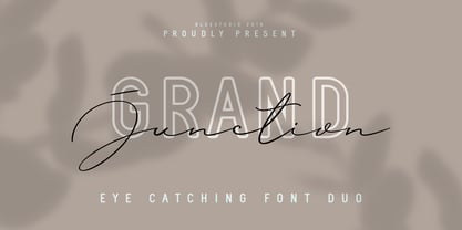 Grand Junction is a modern, elegant and stylish font duo. Grand Junction is the perfect collection of fonts for any design project that requires a light and charming feel. Use it to turn any design project into a true standout! What's include : Grand Junction Script Grand Junction Regular Grand Junction Outline Multilingual support - spread your message globally AÀÁÂÃÄÅCÇDÐEÈÉÌÍÎÏIÌÍÎÏNÑOØÒÓÔÕÖUÙÜÚÛWYÝŸÆßÞþ Encoded PUA Characters Fonts are fully accessible without additional design software. Happy designing!
 - Art Party by A New Machine,
$19.00 Art Party is a hand-drawn font suitable for headlines of all kinds when you want a handmade look. Prissy Pots owner Erin Solomon drew the playful letters, which include regular and bold versions. Each face also offers an entirely separate set of upper and lowercase letters accessible in your applications' glyphs palettes. With contextual alternates turned on, these extra letters show up automatically, yielding a more natural, random look.
 - Werklust by HandletterYean,
$13.00 Werklust is inspired by classic script calligraphy style, it is a stunning script font with a romantic feel. Fall in love with its bold swashes, and turn any design project into a standout. Werklust (Dutch) in English means the term of "zest for work" which comes from the expression "zest for life" and can roughly be interpreted as the degree of enthusiasm and satisfaction with the present work situation. Zest is an emotional capacity involving a strong will-power. When we invest in zestful practices, we experience gratitude, hope, and love from the inside. Be zestful, be werklust!
 - Pinch Remix by sugargliderz,
$15.00 Pinch Remix is a recreated version of a typeface I made in 2007. The form hasn’t changed at all, but I composed the family by increasing the number of weights and revising the spacing and kerning. At first it was created from randomly drawing an alphabet offhand on paper with a drawing pen. Then I figured that perhaps it had the framework for a typeface. Originally because it was just a memo, I had already thrown in the trash once. Yet something about it caught me, and when I turned to look down at it, I couldn’t throw it away.
 - Hercílio by Sea Types,
$25.00 Hercílio is a typographic family without condensed serif, modern and geometric inspired by the architectural forms of the Hercílio Luz Bridge in Florianopolis | Brazi Comprising eleven (11), weights of which ten (10) business are: Five weights Romans: Light, Normal, Regular, Medium and Bold Five Italics weights: Light, Normal, Regular, Medium and Bold And a weight (FREE) Hercílio Decorative Comprising 430 glyphs in each source, brings support for 56 languages (Latin and West, Central and East European) still has features Open Type, ligatures and tabular figures. http://www.cort9.com/wp-content/uploads/2016/05/Specimen_Hercilio.pdf
 - Garota Sans SC - Personal use only

- Jerky Tash by PizzaDude.dk,
$20.00Jerky Tash is supposed to look somewhat handwritten, that’s why it has got jumpy letters, different sized serifs and a loose kerning. The font is spaced to look okay when used without kerning, but the font definitely deserves to be viewed using the kerning pairs! - Tart by Suomi,
$35.00 Headline font with extremely tight kerning with more than 1600 kerning pairs. Also with some discretionary ligatures and lining figures. That’s Tart. Sweet.
 - Pexico by Setup,
$- Pexico is a pixel typeface that uses 10 by 14 grid (capital letter) in 8 styles: 4 basic styles for text setting — Regular, Bold, Narrow, and Mono and 4 stylistic variations of the Regular style for display setting — Outline, Dots, Round, and Inverse. It fits the display's pixel grid when used at 20pt size or its multiples. Pexico supports Latin, Cyrillic, and Greek Monotonic scripts, all with thoroughly designed diacritics. Moreover, Pexico makes use of advanced OpenType features, just as any other modern text typeface. Each style also has 9 sets of numbers, small capitals and is properly kerned. For more information go to Urtd.
 - WBP Nel by Studio Jasper Nijssen,
$30.00 This typeface family is developed with the designer in mind. WBP Nel is a narrow sans serif with lots of options. The Regular consists of UPPERCASE and lowercase glyphs, beautiful kerning and a nice ampersand. All other styles are just uppercase and made to give your designs some extra flair. The Brickbuild is a playful, stencil version and the Dots (freebie) is a dotted typeface. The Light and Heavy version complement the Regular beautifully. These two also come with a display variant, the WBP Nel Stamped and WBP Nel Hypno. So you get lots of options to mix and match while designing awesome prints, posters, logo's, websites or identities.
 - Urban Tags by Tomatstudio,
$15.00 Inspired from tagging graffiti marker in the streets and my real experiences in graffiti scenes, Urban Tags comes with iconic rounded tip marker, this style often used by several graffiti artist around the world because the style is very unique, very fun to write in markers. Perfect if you want realistic Street art style or hip hop for your designs, poster, props etc. Because this is real graffiti fonts, "urban Tags" is different like other fonts, the space letter is shorter, for perfect result the Kerning you can adjust manually, because it's impossible to setting kerning like other regular fonts. I put extra glyphs for make the fonts looks more street art, use "åß∂ƒ©˙∆˚¬Ω≈ç" you can see in the preview.
 - MartiniThai Neue Slab V2 by Deltatype,
$39.00 Award winning 2017 font from Demark (Thailand) and G-Mark (Japan) in Graphic Design, MartiniThai Neue Slab is now available with better taste. Deltatype created a better version of MartiniThai Neue Slab V2: refined for better outline, we fine-tuned all outlines for better letterforms. Proportion were adjusted for better consistent. Metrics got new values for increased readability. Kerning, fine-tuned kerning pair for better spacing between the letters. MartiniThai Neue Slab V2 comes in six weights: Thin, Light, Regular, Bold, Extra Bold, Black. Thai Language is included in this package. MartiniThai Neue Slab is a unique slab serif in Thai Script that creates a sense of timeless and contemporary feel and is used by a media provider and nationwide in Thailand.
 - Edo - Unknown license

- Red October - Personal use only

- Turmoil (BRK) - Unknown license

- Illuminati - Personal use only

- Utusi Star - 100% free


