9,435 search results
(0.013 seconds)
- Clear Sans by Positype,
$29.00 Clear Sans™ is a… wait for it… rational geometric sans serif. It is intended to fill a niche… to provide an alternative to the somewhat based-on-vernacular signage, somewhat geometric sans. I hear the word vernacular thrown around too much and too loosely. If a typeface is based in the vernacular, based on hand-painted or hand-crafted signage, then it should be based on the movements of the hand, retain that warmth and not on a pretty geometric model. For me, clean, geometric and precise doesn't have to be cold and expressionless. The original skeleton was hand-painted in 2008 to help determine and inform my decisions going forward. The typeface was completed shortly afterwards at the behest of an old friend for their identity. As usual, I expanded it, but considered retiring it since there were so many things similar out there. Years later, I had a chance to rediscover it and came to the conclusion that it could be improved, expanded in a logical and useful way, and introduced. I would be lying if I didn't admit that the rise of webfonts and embedded type in applications influenced many of the decisions I made about reworking Clear Sans™. Completely new Text and Screen fonts were developed that utitlize larger x-heights, space-saving widths, logical (and simplified) weight offerings… to name a few alterations. Even the pricing of each variant was considered to produce a more reasonable and simple solution for the developer, designer, professional and novice. Clear Sans™ is a departure from my previous sans serifs, but the influences of Aaux Next, Akagi Pro and Halogen are evident. Enjoy a light-hearted mini-site devoted to Clear Sans™
 - Clear Sans Text by Positype,
$25.00 Clear Sans™ is a… wait for it… rational geometric sans serif. It is intended to fill a niche… to provide an alternative to the somewhat based-on-vernacular signage, somewhat geometric sans. I hear the word vernacular thrown around too much and too loosely. If a typeface is based in the vernacular, based on hand-painted or hand-crafted signage, then it should be based on the movements of the hand, retain that warmth and not on a pretty geometric model. For me, clean, geometric and precise doesn't have to be cold and expressionless. The original skeleton was hand-painted in 2008 to help determine and inform my decisions going forward. The typeface was completed shortly afterwards at the behest of an old friend for their identity. As usual, I expanded it, but considered retiring it since there were so many things similar out there. Years later, I had a chance to rediscover it and came to the conclusion that it could be improved, expanded in a logical and useful way, and introduced. I would be lying if I didn't admit that the rise of webfonts and embedded type in applications influenced many of the decisions I made about reworking Clear Sans™. Completely new Text and Screen fonts were developed that utitlize larger x-heights, space-saving widths, logical (and simplified) weight offerings… to name a few alterations. Even the pricing of each variant was considered to produce a more reasonable and simple solution for the developer, designer, professional and novice. Clear Sans™ is a departure from my previous sans serifs, but the influences of Aaux Next, Akagi Pro and Halogen are evident. Enjoy a light-hearted mini-site devoted to Clear Sans™
 - Clear Sans Screen by Positype,
$21.00 Clear Sans™ is a… wait for it… rational geometric sans serif. It is intended to fill a niche… to provide an alternative to the somewhat based-on-vernacular signage, somewhat geometric sans. I hear the word vernacular thrown around too much and too loosely. If a typeface is based in the vernacular, based on hand-painted or hand-crafted signage, then it should be based on the movements of the hand, retain that warmth and not on a pretty geometric model. For me, clean, geometric and precise doesn't have to be cold and expressionless. The original skeleton was hand-painted in 2008 to help determine and inform my decisions going forward. The typeface was completed shortly afterwards at the behest of an old friend for their identity. As usual, I expanded it, but considered retiring it since there were so many things similar out there. Years later, I had a chance to rediscover it and came to the conclusion that it could be improved, expanded in a logical and useful way, and introduced. I would be lying if I didn't admit that the rise of webfonts and embedded type in applications influenced many of the decisions I made about reworking Clear Sans™. Completely new Text and Screen fonts were developed that utitlize larger x-heights, space-saving widths, logical (and simplified) weight offerings… to name a few alterations. Even the pricing of each variant was considered to produce a more reasonable and simple solution for the developer, designer, professional and novice. Clear Sans™ is a departure from my previous sans serifs, but the influences of Aaux Next, Akagi Pro and Halogen are evident. Enjoy a light-hearted mini-site devoted to Clear Sans™
 - Nouveau To Go JNL by Jeff Levine,
$29.00 Nouveau To Go JNL is the digital version of the hand lettered title found on the 1915 sheet music for the song "Don't Bite the Hand That's Feeding You", and is available in both regular and oblique versions.
 - Springtime Romance by Crumphand,
$20.00 Hello, introducing the new hand made fonts "Springtime Romance" Springtime Romance is a great hand made font. Made by marker, make your design looks stunning. What's Inside The Font ? Uppercase Lowercase Symbols Numerals European Multilinguals Thank You, Regards.
 - Ahoy Amigo by Konstantine Studio,
$10.00 Say hello to Ahoy Amigo! A couple of all caps and script brush hand lettering font. Fully stroked by human hand with the authentic traditional handmade vibes to catch up your vintage crafted branding feels. Absolute perfectly imperfect.
 - Candy Night by FadeLine Studio,
$15.00 Introducing CANDY NIGHT! A Hand Drawn slab serif font! Made by hand to provide a natural, unique and modern style. This font is carefully designed to maintain the balance of each letter. Very easy and convenient to use.
 - Plau by Plau,
$19.00 Futurist typeface from the programming era, Plau is a sans-serif with rounded corner personality and interestingly deliberate lettershapes. Comfortable in headlines, reads surprisingly well in longer passages of text. Includes the following OpenType features: OT All Small Caps, Small Caps, Fraction, Proportional/Tabular Oldstyle and lining figures, subscript and superscript numbers.
 - Steady Sans by District,
$20.00 English by influence with an American disposition and modernist details, Steady Sans is a blend of styles from multiple eras. Decidedly expansive letterforms make for an overall lively presence. Fluid italics, multiple weights, and alternate forms provide a variety of tone for headline use and solid construction works well for text settings.
 - Plau Italics by Plau,
$19.00 Futurist italic typeface from the programming era, Plau is a sans-serif with rounded corner personality and interestingly deliberate lettershapes. Comfortable in headlines, reads surprisingly well in longer passages of text. Includes the following OpenType features: OT All Small Caps, Small Caps, Fraction, Proportional/Tabular Oldstyle and lining figures, subscript and superscript numbers.
 - Wickedelic by Oui Studio,
$17.00 Hello, friend! 'Wickedelic' font is coming; a playful modern psychedelic font with stylistic and ligatures. Wickedelic font is highly inspired by the 60s era and psychedelic vibes. Wickedelic is perfect for display, title, logo, branding, music event, t-shirt design, merchandise, and perfect for anything that wants to show a psychedelic theme.
 - Reo by Our House Graphics,
$9.00 Reo is a novel two layered, display font with a decidedly retro look and feel, inspired by the toothy grins of 1930�s and 40�s era truck grilles and the gleaming, streamlined efficiency of the automat. Reo Front (Foreground) is where all the detail resides, and Reo Back provides a background layer.
 - Comicartoon by Bejeletter,
$14.00 Comicartoon is a playful and cheerful display font that captures the magic of cartoons from a distant era. You can use it for cartoon related designs, children games or just any creation that requires a lovely touch. Get inspired by its beautiful charm, and turn any design project into a stand out!
 - Patient by Garisman Studio,
$22.00 Patient was born in the modern era which was inspired by the letters found in various print and digital media. Comes with a modern and futuristic style that will rock your great design! It is suitable for you to use in logotype designs, posters, typography, t-shirts, tickets, and other modern designs.
 - Superstar Grotesk by Not Bad Typeface,
$30.00 Superstar Grotesk is a free interpretation of the first Cyrillic versions of Royal Grotesk and Akzidenz Grotesk, later the "Roublennaya" typeface is the same irremovable pop artist who lingered in the top of the typographic charts until the digital era, and formed the image of the Cyrillic alphabet in the 20th century.
 - Mellin by Greater Albion Typefounders,
$7.95 Mellin takes us to the simple designs of the Streamline era. It is based on heavy vertical strokes with a slight taper. Mellin is offered in a solid form as well as an open outline face, and is ideally suited for posters that aim at the elegant functionality of the 40s and 50s.
 - Bully Pulpit NF by Nick's Fonts,
$10.00This engaging headline face is based on a rather pudgy typeface named "Bullion Shadow", which was originally released somewhere on the cusp between the hippie and disco eras, and was equally at home in both. Both versions of this font include the complete Unicode 1252 Latin and Unicode 1250 Central European character sets. - Vendor JNL by Jeff Levine,
$29.00Vendor JNL is Jeff Levine's take on the popular ribbon font of the Victorian Era, but using a vertical type (Trade Journal JNL) rather than skewed letters. End caps for the ribbon can be found on the left and right parenthesis, and a blank panel is on the hyphen key. Limited character set. - MOO! - Personal use only

- Natura by Resistenza,
$39.00 Inspired by old nature field notebooks, Natura was born out of the passion for new modern hand-calligraphy, designed first with a flexible fountain pen and then digitalized glyph by glyph to get the natural feeling of the dry ink on smooth paper. This family includes five different fonts. Natura regular is an upright script with lots of swashes and ligatures and offers a wide range of flexibility with its many Opentype features. You will also find that its initial and terminal letters can enhance your designs in new and creative ways. Natura Slanted font offers the same functionality than Natura Regular but we changed the angle 16 degrees, creating an elegant feeling. Natura Notebook, is a narrow serif font with a stylised grunge effect with strong, legible vertical height. Natura Icons and Natura Stamps complete the whole family with incredible flourished elements and capital letters inspired by nature. Hand-drawn leaves, plants, flowers, as well as large and small animals add original detail while complementing the font perfectly. Natura is ideal to use for event invitations, special purpose cards, signatures, labels and packages. Check out also ‘Modern Love Slanted’ Turquoise Nautica
 - Industria - Unknown license

- Moskovi Script by Hipfonts,
$9.00 Introducing MosKovi Script, an enchanting and audacious typeface that seamlessly melds the captivating essence of vintage Soviet design with modern-day allure. This font exudes an air of mystery, evoking the clandestine charm of the Cold War era while breathing new life into the world of typography. Each stroke reflects the precision and strength of Soviet engineering, transporting you to a time when secrets were whispered in dimly lit alleys, and espionage thrived beneath the iron curtain. MosKovi Script's elegant curves and sharp edges intertwine like spies engaged in a delicate dance, daring you to uncover its hidden messages. Embark on a journey through history with MosKovi Script, a typographic marvel that captures the courage and resilience of a bygone era while captivating the hearts of modern design enthusiasts worldwide.
 - Maritote by I Can Be Your Type,
$20.00While designing a logotype for a client, she described herself as "loud and colorful." Thinking about some eras in typefaces that portrayed this idea, I instantly thought of the "Roaring 20s" and the Prohibition era where the cinema is starting to take off and the Italian mafia are running the bars. (Which is coincidental because my client has family connections to Al Capone.) One of the most iconic typefaces designed for these times was Broadway by Morris Fuller Benton in 1925. This typeface was the zeitgeist of Broadway, the big city, theater, and cinema, which can now be seen in use almost everywhere an old family run cinema is located. Using the heavy influences of the thick and thin contrast of this typeface, Maritote brings the charm of Broadway into the 21st century. - Cosmic Hippie by Hipfonts,
$9.00 Transport yourself back to the vibrant era of the 1970s with Comisc Hippie, a groovy font that embodies the essence of that extraordinary decade. This typeface is a nostalgic journey through time, with its swirling curves and playful letterforms. Inspired by the counterculture movement, Comisc Hippie exudes a sense of peace, love, and individuality. Its bold and psychedelic style captures the free-spiritedness of the era, making it an ideal choice for adding a touch of retro charm to your designs. Whether you're working on posters, album covers, or any project that calls for a dose of nostalgia, Comisc Hippie will transport you to a groovy world of colorful expression and timeless coolness. Let the spirit of the 70s shine through with this font that embodies the era's iconic aesthetics.
 - Summer of Love by Mysterylab,
$14.00 It's the Summer of Love all over again with this groovy psychedelic font. Designed in 2019, this typeface harks back to the carefree days of the late 1960s. Whimsical and offbeat with its swaying verticals, it nonetheless remains one of the more legible reimaginings of the genre, sporting all of the handlettered vibe of posters and album covers from the original hippie era, but with polished color and weight that evens out the legibility even at relatively small point sizes. Predominantly a unicase font, with a couple of alternate glyphs from upper to lowercase, Summer of Love works best as a large headline face, and benefits greatly from twisting and morphing the type blocks as was common during the original psych era. It's a real groove machine, baby.
 - Janda Christmas Doodles by Kimberly Geswein,
$5.00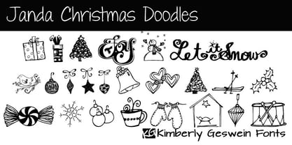 A variety of whimsical, hand-drawn Christmas doodles.
 - Handy Sans by MADType,
$21.00 Handysans is a happy hand drawn sans face.
 - Gnarlee by Gerald Gallo,
$20.00 Gnarlee is a casual hand-drawn serif font.
 - Wingbrush by Michael Browers,
$25.00Wingbrush is a whimsical, hand-drawn brush font. - High Tide AT by Arctype,
$12.00 High Tide is inspired by the lettering made by the fisherman of Cornwall. Shapes made by hand that are created to be functional with a geometric precision, yet appear hand-drawn and human for an honest and sincere quality.
 - Winsberg by Garisman Studio,
$20.00 Winsberg comes from hand scratches to get a natural and natural writing. Winsberg is very suitable for use in various media such as packaging, logo, label, poster, shirt design, quote of wisdom, hand lettering, typography and many other media.
 - Sandbrush by Typia Nesia,
$20.00 Sandbrush is a natural hand brushed font. Work great for any design needs : logo, branding, modern advertising design, logos, poster quote, book / cover Title, editorial design, website / blog, card, custom mug, pillow, t-shirts, and any hand-lettered needs.
 - KG Turning Tables by Kimberly Geswein,
$5.00 A neater version of my font Complete in Him, a hand-drawn marker font. Hand drawn with a brush marker, this font is neat but still has enough twists to make it fun. Perfect for painted or brushed looks.
 - Margot by Eclectotype,
$36.00 Like a lovechild of American Typewriter and Cooper Black, typewritten in melted chocolate, this is Margot. A bold single weight display typeface in roman and italic styles, Margot is boisterous but cuddly; warm but impactful. Margot comes fully loaded with a bunch of esoteric dingbats (grouped in the ornament feature), four figure styles (proportional- and tabular- lining, and proportional- and tabular- oldstyle), a spattering of swash capitals (K, Q and R), stylistic alternates and one discretionary gi ligature in the Roman. Stylistic alternates are split into stylistic sets thus: SS01 - alternate forms for ampersand and asterisk, and # changes to an attractive numero symbol. SS02 - in the Roman, a and g change to single storey versions; in the italic, the ae digraph changes to a less ambiguous double storey version. SS03 - the lining figure 3 gets changed to its alternate form. SS04 - the lining figure 4 gets changed to its alternate form. Margot is perfect for friendly headlines, logos, T-shirts (I love New York, perhaps?), food packaging and videogame apps. Margot gets its name from my equally boisterous and cuddly cat. Enjoy!
 - P22 Tyndale by IHOF,
$24.95Quill-formed roman/gothic with an olde-worlde flavor. Some background in the designer's own words: "A series of fonts came to mind which would be rooted in the medieval era -for me, a period of intense interest. Prior to Gutenberg's development of commercial printing with type on paper in the mid-1400s, books were still being written out by hand, on vellum. At that time, a Bible cost more than a common workman could hope to earn in his entire lifetime. Men like William Tyndale devoted their energies to translating the Scriptures for the benefit of ordinary people in their own language, and were burned to death at the stake for doing so. Those in authority correctly recognized a terminal threat to the fabric of feudal society, which revolved around the church. "This religious metamorphosis was reflected in letterforms: which, like buildings, reflect the mood of the period in which they take shape. The medieval era produced the Gothic cathedrals; their strong vertical emphasis was expressive of the vertical relationship then existing between man and God. The rich tracery to be seen in the interstices and vaulted ceilings typified the complex social dynamics of feudalism. Parallels could be clearly seen in Gothic type, with its vertical strokes and decorated capitals. Taken as a whole, Gothicism represented a mystical approach to life, filled with symbolism and imagery. To the common man, letters and words were like other sacred icons: too high for his own understanding, but belonging to God, and worthy of respect. "Roman type, soon adopted in preference to Gothic by contemporary printer-publishers (whose primary market was the scholarly class) represented a more democratic, urbane approach to life, where the words were merely the vehicle for the idea, and letters merely a necessary convenience for making words. The common man could read, consider and debate what was printed, without having the least reverence for the image. In fact, the less the medium interfered with the message, the better. The most successful typefaces were like the Roman legions of old; machine-like in their ordered functionality and anonymity. Meanwhile, Gutenberg's Gothic letterform, in which the greatest technological revolution of history had first been clothed, soon became relegated to a Germanic anachronism, limited to a declining sphere of influence. "An interesting Bible in my possession dating from 1610 perfectly illustrates this duality of function and form. The text is set in Gothic black-letter type, while the side-notes appear in Roman. Thus the complex pattern of the text retains the mystical, sacred quality of the hand-scripted manuscript (often rendered in Latin, which a cleric would read aloud to others), while the clear, open side-notes are designed to supplement a personal Bible study. "Tyndale is one of a series of fonts in process which explore the transition between Gothic and Roman forms. The hybrid letters have more of the idiosyncrasies of the pen (and thus, the human hand) about them, rather than the anonymity imbued by the engraving machine. They are an attempt to achieve the mystery and wonder of the Gothic era while retaining the legibility and clarity best revealed in the Roman form. "Reformers such as Tyndale were consumed with a passion to make the gospel available and understood to the masses of pilgrims who, in search of a religious experience, thronged into the soaring, gilded cathedrals. Centuries later, our need for communion with God remains the same, in spite of all our technology and sophistication. How can our finite minds, our human logic, comprehend the transcendent mystery of God's great sacrifice, his love beyond understanding? Tyndale suffered martyrdom that the Bible, through the medium of printing, might be brought to our hands, our hearts and our minds. It is a privilege for me to dedicate my typeface in his memory." - Penguin Attack - Unknown license

- 6th Aniversario - Personal use only

- Spindletop NF by Nick's Fonts,
$10.00One in the series of fonts called Whiz-Bang Wood Type, intended to be set large and tight. Spindletop’s ultra-condensed letterforms allow a lot of information to be packed into little horizontal space. Named for a famous East Texas oil field that made a lot of people rich in the early part of the twentieth century. Both versions of this font include the complete Unicode 1252 Latin and Unicode 1250 Central European character sets. - PF Occula by Parachute,
$33.00 Occula on Behance. Occula: Specimen Manual PDF. Occula is an exploration into high-legibility type although it’s not an effort to design the ultimate typeface in terms of economy and legibility. Instead, the goal has been to strike a balance between modern curves and lively old-style rhythm – using a rational design approach without becoming monotone. Or from another point of view: being humanistic and lively without looking old-fashioned and quirky.
 - Graffix by Studio K,
$45.00 Graffix is best described as a modern classic. A crisp geometric sans serif with just a hint of Art Deco in the roll of the capital A, D & R, and the curvaceous lines of the capital M, V & W. The distinctive tear shaped counters of the lower case a, b, d, p & q give it its essential character, together with such quirky features as the angular descenders of the lower case g and j.


