10,000 search results
(0.025 seconds)
- Oblique Rain by NREY,
$19.00 Introducing a cool monoline script font family - Oblique Rain. Typeface is based on handwriting text, like school work or retro letters. Works great applied to logos, prints, quotes, magazine headers, clothing, and many others! Features: Uppercase Lowercase Numeral & Punctuation Standart Ligatures Stylistic Alternates PUA Encoded Multilingual Support I hope you enjoy it! Thanks!
 - Westonia by Gatype,
$17.00 Westonia Script is modern script font, every single letters have been carefully crafted to make your text looks beautiful. With modern script style this font will perfect for many different project ex: quotes, blog header, poster, branding, logo, fashion, apparel, letter, invitation, stationery, etc. Westonia Script including alternate glyph and beautiful swirl.
 - Le Vin by Kellina James Designs,
$20.00 Le Vin is a calligraphy inspired font that was has a playful elegant design. It includes upper and lowercase letters, numerals, punctuation, and multilingual support. In addition, there are also special characters, alternates, and ligatures to add more flair to your projects. Great for invitations, headers, packaging, branding, wall art, and more.
 - Raks by PeachCreme,
$14.00 Meet our new font "Raks"! These eye-catchy letters work great for headings and logos. If you would like to add some vanguard touches to your design, then this font is for you! Bold and curvy lines of "Raks" will give dramatic look for nearly any text from magazine headers to product emblems.
 - Kenlan by Muksal Creatives,
$16.00 Kenlan Modern Bold serif Font typeface with beautiful alternate and Ligature, special glyphs, ornament and multilingual support. It's a very versatile font that works great in large and small sizes. Perfect for editorial projects, Logo design, Clothing Branding, product packaging, magazine headers, or simply as a stylish text overlay to any background image.
 - Doctor Drake by Gassstype,
$25.00 Hello Everyone, introduce our new product Font Doctor Drake it is Horror Display Font.This is a Textured Natural Style and Strong style with a Cool style and dramatic movement. This font Doctor Drake is great for your next creative project such as logos, printed quotes, invitations, cards, product packaging, headers, Logotype, Letterhead, Poster.
 - Rollions by Azzam Ridhamalik,
$16.00 Introducing Rollions, an unique All-Caps display serif typeface with beautiful rounded serif. This font have a Stylistic Sets, Discretionary Ligatures and Multilingual support which adds to the aesthetic that makes your work more interesting. Use this beautiful serif as a memorable logotype or header and pair it with something contrasting and clean.
 - Aerobic by Wildan Type,
$10.00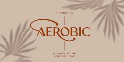 Aerobic is a Modern Elegant font with special alternative glyphs and multilingual support. It's a very versatile font that works great in large and small sizes. Classy Marisa is perfect for branding projects, Logo design, Clothing Branding, product packaging, magazine headers, or simply as a stylish text overlay to any background image
 - Camilen by Muksal Creatives,
$14.00 Camilen Modern serif Font typeface with beautiful alternate and ligature, special glyphs, ornament and multilingual support. It's a very versatile font that works great in large and small sizes. Perfect for editorial projects, Logo design, Clothing Branding, product packaging, magazine headers, or simply as a stylish text overlay to any background image.
 - Cookie Treat by Tanincreate,
$18.00 Cookie Treat casual hand-lettered font. It is suitable for recipe and cook books, promotional, packaging designs, labels, greeting cards, cosmetic brands, posters, title, typography based branding, quotes, children's book, brochure, advertising, creative headers and so much more. Fun and casual, with uneven letters, this font brings a dynamic vibe to your projects.
 - Masqualero by Monotype,
$50.99 The Masqualero™ family is a versatile solution for a deep and broad range of applications. In large sizes, the heavier designs are dark and handsome, while the lighter weights are charming and friendly in text copy. Thanks to its many variations and distinctive demeanor, both print and interactive designers will find that Masqualero expands their creative options, while setting the perfect tone to catch and hold readers’ attention. It’s About the Design Like the legendary jazz song of the same name, Masqualero is haunting and sophisticated. Drawn as a tribute to Miles Davis, its letterforms are as beautiful as his “Masqualero” composition. “I approached drawing the letters as if they were marble sculptures,” Says Jim Ford about his typeface. “Many sharp, black, modern sculptures filling a large park. All of them created with the same qualities – the flair of Miles' electric funk and rock sounds, the sparkly smooth finish and serifs like trumpet bells, the sweet lyricism and the tone and clarity of Miles’ horn.” What’s Available With six weights and italics, in addition to Stencil and Groove display designs, Masqualero is available as a suite of OpenType Pro fonts, providing for the automatic insertion of small caps, ligatures and alternate characters. Pro fonts also offer an extended character set supporting most Central European and many Eastern European languages. Thoughts About Use A book or album cover set in the Masqualero design sends a message: what’s inside is of value. Like jazz, the Masqualero typeface takes ordinary basic concepts and slips them into something special. Readers take notice and immediately recognize that what they’re viewing is a cut above – and radiates quality. “I see Masqualero as a luxurious typeface for exquisite typography,” says Ford. “I wouldn’t use it to sell toys or hot dogs. Masqualero sells diamonds, boats, real estate and champagne.” Perfect Pairings Antique Olive™ Neue Kabel® Neue Frutiger® Quire Sans™ Trade Gothic®
 - FS Neruda by Fontsmith,
$80.00 A literary font FS Neruda takes its name from Chilean poet Pablo Neruda, described as “the greatest poet of the 20th century in any language”. As such, it’s a font that references the very best literary typeface traditions. Smart, sharp and classical, FS Neruda bridges the gap between the classical and the offbeat. This font started life in the world of newspapers and books and is the perfect storytelling typeface for savvy, inquiring readers whether in printed journals, hard news, short online missives or poetry. Idiosyncratic precision FS Neruda is clear and legible in body text, while also being a space-saver fitting in more characters on each line than the typefaces that inspired it. In larger sizes it becomes a different beast – livelier, quirkier, but no less sharp. This is a truly classic typeface designed with long text setting in mind, thanks to its large x-heights, and short ascenders and descenders. FS Neruda mixes suave, sharp confidence with a sense of fragility and quirkiness. It’s knowledgeable, informative and idiosyncratic; one for readers and enquiring minds. Subtle weight modifications The construction and details of the letterforms differ across each of the five weights, with each cut separately to evoke different flavours: Thin is typewriter-like, Light is classy, Regular is canonical, Bold is robust, Black is magazine-esque. FS Neruda also boasts a radiant italic companion, a wide set of small caps, lower and uppercase ligatures, case punctuation and spacing, four sets of figures, and some ageless typographic symbols such as manicules, fleurons and teardrop crosses. Suggestive simplicity “The key to success in the current type design landscape is to design a typeface which looks conventional at text sizes but has a few small, suggestive touches visible at bigger sizes that make it distinct,” says designer Pedro Arilla. “Another thing we wanted to achieve with this typeface is simplicity.” FS Neruda is available in ten carefully crafted styles: it’s designed to work perfectly at text sizes, but still glows as a display typeface.
 - Alurea by Storictype,
$19.00 Alurea is a feminine and girly font with delicate serifs that add a touch of elegance . Unique ligatures the graceful lines and curves evoke a sense of beauty and romance. This is a font for love letters, cover novel, magazine, coffee shop, wedding invitations, and feminine branding. It whispers sweet nothings in your ear with its delicate and intimate forms. The sensual contours beckon with a coy wink and a bashful smile. Like a graceful ballerina effortlessly dancing across the page, this font brings a soft, romantic air to any design. Use it to make a statement with its delicate femininity and inner poise. This is a font that celebrates the beauty, charm, and tenderness Features : Character Set A-Z Numerals & Punctuations (OpenType Standard) Disrectionary Ligatures Accents (Multilingual characters) Thank You
 - Kasyfa by Hatftype,
$15.00 KASYFA is a cute display font. Is a work of typographic art that brings playfulness and warmth to every character. With a cute and adorable design, filled with tenderness and playfulness, each letter is an expression of joy and innocence. This display font style brings a friendly feel and is suitable for projects that want a touch of playfulness. With its gentle curves and understated design, this font provides a unique and inviting feel, making it the perfect choice for projects that require a touch of beauty and innocence. From titles in children's books to cute greeting card designs, cute display fonts take a leading role in conveying messages with warmth and happiness. They are not just letters, but a tool to bring a positive and fun feel to any design.
 - Liliane Classe by Brenners Template,
$25.00 This is a challenge for elegant but radical typography layouts. Standard styles include classic and sophisticated serifs, while italic styles are designed with more adventurous handwritten touches. This serif font family included a total of 14 styles, including 7 weights and separately created italics. It can be the best choice for a unique and meaningful logo and branding design, and it will maintain a refined sense of unity. You need to understand OpenType Features to use these fonts well. Please check first whether the your apps plan to use supports these OpenType Features. Thanks. OpenType Features Discretionary Ligatures : ac, ad, ai, ak, ar, ay, az, ce, ci, ck, co, de, do, dr, er, ft, he, ho, ng, ro, se, sp, te, to, tr Standard Ligatures : fi, fl Alternates : a, d, h, i, k, n, u, z Oldstyle Figures Tabular Figures Fractions
 - Linotype Puritas by Linotype,
$29.99The German designers Gerd Sebastian Jakob and Jörg Ewald Meißner developed the Linotype Puritas family in 1999. The family, which has six text styles as well as a ornament set, displays a very geometric design, which harks back to the German modernist experiments with typography and lettering from the 1920s. The letters in Linotype Puritas Light, Linotype Puritas Medium, and Linotype Puritas Bold all have a slight slant to them. Not to be confused with an italic-grade slant, which may be found in the Light, Medium, and Bold Italic styles, these acute slants add a dynamic quality to text. The Linotype Puritas Ornaments font contains several dingbats and border elements, all drawn in the same line style as the companion letters. The entire Linotype Puritas family is included in the Take Type 4 collection from Linotype GmbH." - Namalika by Mans Greback,
$59.00 Namalika is a beautiful calligraphy font. In a feminine and wonderful style, this flowing script will be your favorite logotype and signature lettering. This cursive handwriting is drawn and created by Toni Studio and Mans Greback in 2022, and has an optimistic character and a humble personality. Use underscore _ after any word to make a swash. Example: Namalika_ (Download required.) The Namalika family consists of four handwritten fonts: Regular, Italic, Bold, Bold Italic The font is built with advanced OpenType functionality and has a guaranteed top-notch quality, containing stylistic and contextual alternates, ligatures and more features; all to give you full control and customizability. It has extensive lingual support, covering all Latin-based languages, from Northern Europe to South Africa, from America to South-East Asia. It contains all characters and symbols you'll ever need, including all punctuation and numbers.
 - Nosta by Protimient,
$29.95Nosta is a modern text typeface. It was designed to be easily legible and therefore expressly suitable for setting sizeable lengths of continuous text such as magazine articles, books and essays. It achieves this through, amongst other things, finely balanced proportions, optimal character spacing and an adherence to predictable letter forms. Despite this, however, Nosta manages to retain a contemporary look and feel by using a variety of modern type design devices such as the efficacious wedge serif. The italic avoids using too many of the cursive elements that are often found in traditional italics and has only a modest slant, giving it a modern look that does not overly disrupt the text while still providing emphasis. While designed for continuous text, Nosta can also be used as a display face, making it a good all round typeface, suitable for many applications. - Rival Slab by Mostardesign,
$25.00 A touch of modernism for all kinds of projects Like the rest of the family (Rival Sans and Rival Serif), Rival slab has round shapes with bevelled endings on certain letters such as G, Q or Z. These are the characteristics that make Rival Slab a contemporary cast iron for all kinds of projects. It provides advanced typographical support with features such as case sensitive forms, small caps, ligatures, alternate characters, fractions, slashed zero, circled, pro kerning…It comes also with a complete range of figure set options It comes in 16 weights with corresponding italics and it’s suited for multiple purposes including editorial use, web font, apps, digital ads, ebook, and also for advertising, long text, packaging and branding. As a modern sans serif font family, Rival Sans has true italics to give more style in long texts.
 - Dakota Motors by Mans Greback,
$69.00 Dakota Motors is a bold script font. This retro font is expressive, and is constructed of sharp strokes and heavy letterforms. Use it for a cool logotype or headline to give your work that genuine look. Use underscore _ to make a swash. Example: Puch_ Use multiple underscores to make longer swashes. Example: RaceCar_____ (Download required.) The Dakota Motors family consists of four high-quality fonts: Regular, Italic, Bold and Bold Italic The font is built with advanced OpenType functionality and has a guaranteed top-notch quality, containing stylistic and contextual alternates, ligatures and more features; all to give you full control and customizability. It has extensive lingual support, covering all Latin-based languages, from Northern Europe to South Africa, from America to South-East Asia. It contains all characters and symbols you'll ever need, including all punctuation and numbers.
 - ITC Elan by ITC,
$29.99 ITC Élan combines a gothic simplicity with elegance in a distinctive yet subtle typeface design. There is also a feeling of architectural strength which is derived primarily from an optically even line-weight and a sense of vertical stress. The small, almost Latin, serifs add distinction at both display and text sizes. The large x-height, minimum stroke variance, and open counters are ideal design traits for typeface legibility. Additional characteristics which distinguish ITC Élan are the splayed M" and bowls which do not quite close in the "a," "b" and several other letters. In contrast to the roman, there is almost a calligraphic playfulness to the italic. ITC Élan is the second ITC typeface from Albert Boton of France, who also designed ITC Eras. ITC Élan comes in four weights, book, medium, bold, and black, each with a corresponding italic."
 - Column Sans by Campotype,
$25.00 Column Sans, talking about space efficiency. The character set that condensed can maximize the use of limited space without losing good legibility aspects. The typeface is very appropriate to be used as a text in a small column widths, display text, caption, title, author credit on the film, etc. Column Sans is available in OpenType format in the three weights Light, Regular, and Bold, whereby there are corresponding italics for all variants. In the same narrow italic versions, the "a" has a closed form while the "f" has a descender. Besides of standard ligature, this typeface is also equipped with some additional ligature and deligature like "fr", "tt", "cb", "ch", "ck" and so on as well as three "stylistic ligature": "the", "Mr" and "Mrs". Please find more information about the OpenType Manual of this typeface on the gallery page (pdf) if possible.
 - Altivo by Kostic,
$40.00 Altivo is a proper workhorse sans serif. Sixteen OpenType fonts in eight weights (with true Italics) range from Thin to Ultra. Meticulous care was taken to ensure high legibility in text sizes on the screen. The typeface is designed to have wide proportions, generous x-height, loose spacing, ink traps, large apertures and low stroke contrast. Altivo’s ink traps are not only a functional design feature, they also look interesting and lend character to the typeface in headlines. True Italics, small caps and multiple sets of figures, as well as a complete set of lowercase superscript were all included in the family to accommodate high typographic standards. If you need to pair it with a serif font, you can’t go wrong with Chiavettieri, since both typefaces were made with the same basic proportions, and their tabular figures are the same width.
 - Trailmade by Adam Ladd,
$18.00 Trailmade is a rugged and stylish brush font with regular, italic, and extras styles. Explore an adventurous path with this typeface that ventures a little outside the typical brush script genre but still carries echoes of it. The upright design of the regular style has a confident appearance, while the italic style gives a little more of a signature look. Hand-lettered with a brush pen on paper, Trailmade includes swash characters, automatic double-letter ligatures, and a complete second set of lowercase stylistic alternates to switch in and out for a more authentic feel. There is also a matching Extras font featuring a variety of lines and dingbats that will complement your typography. All alternates, swashes, and ligatures are PUA-encoded for more accessibility in a variety of programs. This font has extensive Latin language support for Western, Central, and Eastern European.
 - Yasmine Mutamathil by Arabetics,
$32.00 The Yasmine Mutamathil type family follows the guidelines of the Mutamathil type style. It has only one glyph for every basic Arabic Unicode character or letter. The Yasmine Mutamathil family includes all required Lam-Alif ligatures and selected marks positioning so it does use limited glyph substitutions or forming. Yasmine Mutamathil employs four fixed x-height values, two above and two below the x-axis. Values are high to give a slight vertical overall look. Its design uses full curves with equally distributed weight. Text strings composed using types of this family are non-cursive with stand- alone isolated glyphs. The Yasmine Mutamathil family includes both Arabic and Arabic-Indic numerals, all required diacritic marks, Allah ligature, in addition to all standard English keyboard punctuations and major currency symbols. It is available in regular, italic, bold, and bold italic styles.
 - Klaster Sans by Kobuzan,
$29.99 Klaster Sans is a massive geometric sans-serif typeface inspired by the first German geometric fonts. In particular, their clear, but rough forms and not perfect curves. As well as minimal optical compensators. Due to all this, the letters look weighty and powerful. Klaster Sans has 14 styles. From neat thin to extremely heavy. And it's all in italics. Or one variable font with two adjustment axes. All styles include an extended set of Latin characters and basic Cyrillic. It has support for 210 languages. Also contains stylistic alternatives, case-sensitive forms, arrows, fractions, tabular figures, circled figures and other. Features: – Total glyph set: 657 glyphs; – 14 styles (7 weights x italic) + variable; – Support 210+ languages; – Latin Extended; – Cyrillic Basic; OpenType features: – Uppercase, lowercase; – Proportional, circled, tabular numerals, superiors, inferiors, fractions; – Punctuations and symbols; – Arrows; – Stylistic sets (ss01); – Ligatures; – Case-sensitive forms.
 - Guau by Cuchi, qué tipo,
$9.95 From the abyss and the quarantine hell, drawn in absolute lonelyness, and finished during the darkest hours of confinement… "Guau" is born, the type that barks directly at your face! "Guau" is a high-contrast display font with as many weights and versions as there are types of puppies in this fantastic world. It is thought to bring up glances in middle and heavy boxing weights, although you can also take its compressed and italic styles just for a walk. "Guau" is a font with three axes (italic, weight and width) and 20 instances, and it also contains thousands of glyphs and Opentype features that means a "guaorld of posibilities". This name comes from the time when you could only go to the street to take a walk to your pooch. Definitely, "Guau!, your new best friend!".
 - Kolage by Runsell Type,
$20.00 Kolage was created from a sans humanist design with a modern twist. Characterized by the large x-height, inktrap and open appertures as the hallmarks of the Kolage a letterform. Kolage was inspired by the strong character of the letter without leaving the aesthetic of the letterforms. Each family member of Kolage also equipped with useful OpenType features such as Ordinals, Superscripts, Subscripts, Stylistic Alternates, Stylistic Sets, Oldstyle Figure, Proportional Lining, Standard Ligatures, Fractions, also Numerators & Denominators. Each font has 530+ glyphs which covers Western & Eastern Europe, and other Latin based languages – over 200 languages supported! Comes with 9 weights from Thin to Black with each matching Italic. Contain several OpenType features: Stylistic Alternates, Figures Variation (fraction, tabular lining, numerator, denominator), and also covered broad latin languages. Provided also variable fonts in two styles; Upright and Italic
 - Secca Soft by astype,
$42.00 Secca Soft is the rounded sister of Secca font family. With its workhorse qualities, Secca Soft is perfectly suited for a wide range of applications - especially where legibility and economy are important factors. It comes with a wide language support and many typographic features and extras. The family comes in nine weights from Thin to Ultra Black - each with italics, small caps and italic small caps. While the weights from Light to Bold perform well in text sizes, the more extreme styles give extra freedom for Headlines & Signage. For setting tables and charts, Secca Soft offers tabular figures, fractions, currency signs and mathematic operators which share the same fixed width throughout the entire range of weights. This special feature is called "weight duplexing" and is a time saver for designers of annual reports and other figure-heavy texts.
 - 1726 Real Española by GLC,
$42.00 This family was inspired from the set of fontfaces used by Francisco Del Hierro, to print in 1726 the first Spanish language Dictionary from the Spanish Royal Academy (Real Academia Española, Diccionario de Autoridades). These two Transitional styles are said to have been the first set of official typeface in Spain, like the French “Reale” (take a look at our "[/fonts/glc/1790-royal-printing/ 1790 Royale Printing)". In our two styles (Regular & Italic), fontfaces, kernings and spaces are as closely as possible the same as in the original. This Pro font is covering Western, Eastern and Central European, Baltic and Turkish languages, with standard and “s long” ligatures and twin letters in each of the two styles and a few Italic swashes inspired from the font used in 1746 by the same printer for another edition from the Royal Academy.
 - Tabac Big by Suitcase Type Foundry,
$39.00 Tabac Big can satisfy all expressionists desiring idiosyncratic colouring in setting because it provides black weights. But at the same time it offers solutions for orthodox environmentalists who like to save ink and toner — all the fragile hair styles are intended just for them. Less clearly-defined typographers can then choose from the six other weights, from Thin through Light, Regular, Medium, Semibold and Bold, including true italics. Tabac Big is a first and universal choice where we look for pronounced display type as a complement to text type. Its modern drawing, made up of precise arcs, sharp lines and seemingly simple segments, gives a clear and unmistakeable impression every time. And yet the typeface knows how to intrigue — especially in shaping the italics, which fully expresses the typeface’s unique details, such as its large bulbous instrokes and outstrokes and heavy wedge serifs.
 - Mrs Keppel by The Ampersand Forest,
$19.00 Remember when you first saw the credits of a Woody Allen movie and thought, "I love that typeface!" Well, maybe that was just us. That typeface—Windsor (specifically Windsor Light Condensed)—is a classic. But it has problems. The letterforms are sometimes REALLY wonky. And the ampersand is a tragedy. Plus, there's no italic, and the weights and widths available in digital form are a hodgepodge. That's where Mrs. Keppel comes in. Alice Keppel, one of the most famous illegitimate members of the Windsor household ever, lends her name to this typeface family with numerous weights and a true italic. It's a slim serif with Edwardian leanings. She's approachable, she's refined. She's equally charming and at home in mercantile settings, in elegant settings, in populist settings, and in Polite Society. She's a design response to a genuine need. She's Mrs Keppel!
 - Rockeby by My Creative Land,
$24.99 Please welcome the new grotesque family; slightly more geometric than Block Berthold but much softer than the industrial Din Next, Rockeby includes a lot of stylistic alternates and ligatures to help add character to any type of design. The slightly curved diagonal strokes give the sans serif fonts its unique personality and soft look. Even more - the family has two scripts (4 weights each) which will enhance the design even more. Combining italic with the script has never been easier - they both have the same italic angle. These scripts also benefit from contextual alternates, swashes and ligatures. And last but not least, the family also includes Extras fonts (which also have 4 weights) which can further enhance any design you are creating. There is an new addition to the family - Rockeby SemiSerif and Rockeby Brush families!
 - Burgstaedt Antiqua by Linotype,
$29.99At first glance, Burgstaedt Antiqua looks like an old typewriter face, or rather like a typeface from a typewriter that has gone hopelessly wrong! Only after your second glance will you see this font for what it really is - a thoroughly new text face. Several features of Burgstaedt Antiqua, and its companion italic face, are worth special attention: First, the terminal styles of the letters vary throughout the alphabet. This gives text set in Burgstaedt Antiqua a slightly jittery feeling. A second interesting feature is the lowercase q", which takes the form of a shrunken-down uppercase "Q". Burgstaedt Antiqua Regular and Burgstaedt Antiqua Italic may be used in both text and headlines. For use in text, we recommend employing a slightly larger point size (12 pt or 14 pt and above). British designer Richard Yeend designed this family in 2002. - Tangier by Viswell,
$17.00 Tangier is a contemporary display serif font that embodies a refined sense of style and elegance. With its sleek and modern design, Tangier is perfect for use in a variety of creative projects, such as logos, titles, and headlines. The font comes in two styles - regular and italic - both of which feature strong contrast between thick and thin lines. The regular style is perfect for creating attention-grabbing headlines or adding a touch of sophistication to body text, while the italic style can be used to add a stylish flair to subheadings or pull quotes. Tangier's strong serifs give it a classic and timeless feel, while its modern design adds a touch of contemporary flair. Its versatility makes it suitable for use in a wide range of settings, from high-end branding and marketing materials to editorial and fashion layouts.
 - Supra Demiserif by Wiescher Design,
$29.00 »Supra Demiserif« is the demi serif addition to the Supra family. I am no fan of slab serif fonts, so I designed this one with half serifs, that makes the serifs less important. Then I found, that the italic does not look nice with slab serifs, so I did only one italic cut for the normal weight. The light and normal weights and the dominant x-height with its high ascenders make for easy reading of long copy. The heavy and x-light weights are great for elegant headlines. Supra is an OpenType family for professional typography with an extended character set of over 700 glyphs. It supports more than 40 Central- and Eastern-European as well as many Western languages. Ligatures, different figures, fractions, currency symbols and smallcaps can be found in all cuts. with each other.
 - Radilen Aveline by Dora Typefoundry,
$18.00 Introducing a fancy serif font with italics. Radilen Aveline is a series of elegant serif fonts that give traditional design elements a modern feel with their clean lines, smooth curves and sharp details making them suitable for a variety of your design projects making them ideal for titles, headlines, editorial designs, monograms, branding, logos, poster designs, and more. The regular Radilen Aveline has 47 Ligatures and 28 Alternatives. WHAT'S INCLUDED: Radilen Aveline Regular Radilen Aveline Italic We highly recommend using a program that supports OpenType features and Glyphs panels like Adobe apps and Corel Draw, so you can see and access all Glyph variations. This type of family has become the work of true love, making it as easy and fun as possible.I really hope you enjoy it! Thank you Enjoy the font and go get creative :)
 - Didonesque Stencil by Monotype,
$31.99 Less is More. This stencilled version takes away some of Didonesque’s structure while adding another level of distinguished style and supreme elegance. The Elegante fonts epitomise the style required for high-end fashion and beauty applications with their crisp curves combined with tapered serifs and terminals – instantly creating a polished and fashionable aesthetic. Didonesque Stencil was designed for large display purposes, branding, corporate identities, headlines, advertising, wedding invitations and the like. Of particular note are the minimal ball terminals which are available by activating Stylistic Set 2 – they’re perfect for adding that extra bit of magic to your typographic designs. Key Features: • 4 Stencil weights in Roman and Italic styles • 4 Stencil Elegante weights in Roman and Italic styles • 4 weights in Condensed style • Small Caps, Petite Caps, Alternates, Ligatures and Contextual Alternates • Full European character set (Latin only) • 780 glyphs per font.
 - Blestive Script by Mans Greback,
$59.00 Blestive Script is a cool calligraphy typeface. This marker lettering is provided in Regular, Italic, Bold and Bold Italic. Perfect for a logotype or headline, use this handwritten type to express life and optimism. Use underscore _ anywhere in a word to make a swash underline. Example: Won_der Use # after any word to make a swash letter. Example: Cute# Use multiple underscores after any word to make swashes of different length. Example: Weat___her (Download required.) The font is built with advanced OpenType functionality and has a guaranteed top-notch quality, containing stylistic and contextual alternates, ligatures and more features; all to give you full control and customizability. It has extensive lingual support, covering all Latin-based languages, from Northern Europe to South Africa, from America to South-East Asia. It contains all characters and symbols you'll ever need, including all punctuation and numbers.
 - Mencken Std by Typofonderie,
$59.00 An American Scotch remixed in 27 fonts Mencken has twenty seven styles, divided into three widths, three optical sizes, romans and italics. Generally, optical size typeface families belong to a same common construction. It falls into the same category of type classification, while presenting different x-heights or contrasts. Mencken is unique because it is designed according to different axis and optical sizes. Firstly, Mencken Text is a low-contrast transitional typeface, designed on an oblique axis, asserting horizontal with featuring open counters. Its capitals follow Didots to better harmonize the rest of the family. On the other side of the spectrum, Mencken Head (and narrow variations) is designed on a vertical axis, high contrast, in a contemporary Didot style. The Mencken is therefore a typeface answering to different sorts of uses, whose design is different according to its uses: from oblique axis in small size to vertical axis in large sizes. Vertical proportions (x-height, capitals height, etc.) were calibrated to be compatible with many Typofonderie typeface families. Lucie Lacava and I followed the idea launched by Matthew Carter few years ago for some of his typefaces intended for publications. From Baltimore Sun’s project to Typofonderie’s Mencken It is a bespoke typeface for American newspaper The Baltimore Sun started at the end of 2004 which marks the beginning of this project. The story started with a simple email exchange with Lucie Lacava then in charge of redesigning the American East Coast newspaper. As usual, she was looking for new typeface options in order to distinguish the redesign that she had started. At the time of its implementation, a survey of the newspaper’s readers has revealed that its previous typeface, drawn in the mid-1990s, was unsatisfactory. The Mencken was well received, some reader responses was particularly enjoyable: “It’s easier to read with the new type even though the type is designed by a French.” Why it is called Mencken? The name Mencken is a tribute to H. L. Mencken’s journalistic contributions to The Sun. According to the London Daily Mail, Mencken ventured beyond the typewriter into the world of typography. Because he felt Americans did not recognize irony when they read it, he proposed the creation of a special typeface to be called Ironics, with the text slanting in the opposite direction from italic types, to indicate the author’s humour. Affirming his irreverence, the Mencken typeface does not offer these typographic gadgets. Henry Louis Mencken (1880 — 1956) was an American journalist, satirist, cultural critic and scholar of American English. Known as the “Sage of Baltimore”, he is regarded as one of the most influential American writers and prose stylists of the first half of the twentieth century. He commented widely on the social scene, literature, music, prominent politicians and contemporary movements. Creative Review Type Annual 2006 Tokyo TDC 2018