10,000 search results
(0.045 seconds)
- Egorycastle by Seventh Imperium,
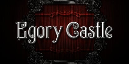
$40.00Egory castle was inspired from the history of the medieval age. The idea was to make us interested to explore in the aspect of art and decorative letters forms. Lots of studies that we have learned from history in middle age and inspiration from many different sources make very valuable references for us to develop a new idea in the development of this typeface. - Byra by Mariana Sousa,
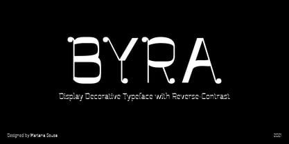
$28.31Meet Byra! A new approach to a decorative typeface. This typeface has asymmetrical terminals (round), which means than has serifs, but not in every side of the letterforms. The mix between both classic and modern elements, as terminals and the inverted contrast, gives the typeface a strong personality. Byra contains two weights, regular and bold, it’s a display typeface and great for headlines, branding and editorial proposes - Alien Argonaut AOE by Astigmatic,
$19.95The Alien Argonaut typeface is an emaciated typeface made from the lettering of beings that have lived amongst us for centuries, evolving with humankind. Study your environment, all is not what it seems. Use this typeface to try and blend into their world within ours. Purchase Alien Argonaut today, for knowing the roots of others may help you learn to live in harmony with them. - Pulp Magazine JNL by Jeff Levine,
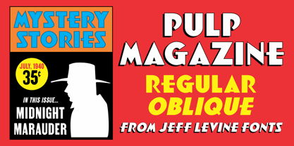
$29.00For a pulp magazine called Spicy Western Stories, it was unusual that the January 01, 1939 issue had its cover title hand lettered in an extra bold Art Deco style rather than Western influenced lettering. This did not stop the lettering from being used as the design model for a digital type revival. Pulp Magazine JNL, is available in both regular and oblique versions. - Ink Spots JNL by Jeff Levine,
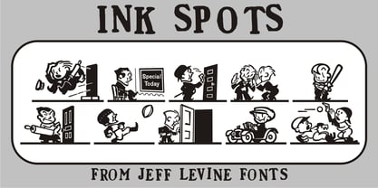
$29.00For decades, spot illustrations - whether by hot type, photoengraving, clip art or (in later years) digital means provided decorative and often lighthearted breaks in reading printed copy. This collection of twenty-six cartoon images has been meticulously re-drawn in digital format from 1920s-1930s era source material. By adding a simple caption underneath a design, your ad copy can be enhanced with these wonderful period pieces. - Organic Cotton by Dan Cotton Lettering,
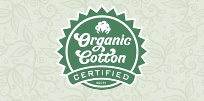
$12.00Organic Cotton is a straightforward, friendly and highly legible typeface. The lettering is based on contemporary brush/pen lettering with a little fun and lushness added. It is solid, fluid and organic without being hippie-dippy or whimsical - not that I am opposed to those things. Organic Cotton is well suited for packaging and branding and it comes with a 69 alternates, 28 swashes, and 14 ornaments. - Isolde by Linotype,
$29.99There is not much I can tell about Isolde. It is a plain typeface, rather wide and with dominant serifs. Its italics are more slanted than usual. In fact only Caslon's italic can compete about that. Its width makes it more suitable for decorations than for larger amounts of text. The name comes from the medieval tale about Tristan and Isolde. Isolde was released in 1993. - The Story Begins & Ends by Comicraft,
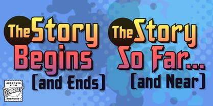
$19.00It is NOT the END, my friend. Beyond the Saga, beyond the Hype, Beyond the expectations of marketing executives and studio shareholders lie prequels AND sequels. It has been said that every journey has a first step as THE STORY BEGINS, and every Generation has a Legend, a Story, a Franchise and an inevitable descent into mindless exploitation where THE STORY ENDS. It's true, all of it! - Quintessential Pro by Stiggy & Sands,
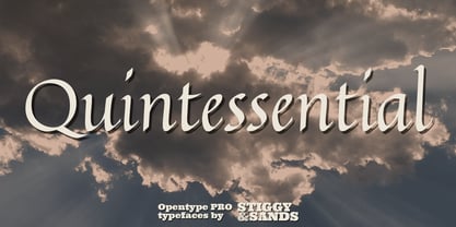
$29.00Our Quintessential Pro is based on the calligraphic lettering style known as the Italic Hand. As speed became more essential in writing hands, styles became less formal and more relaxed. Classic, clean, and casual, Quintessential fits a lot of design uses - hence its name. The SmallCaps and extensive figure sets only work to further expand the usefulness of the typeface across a wider breadth of applications. - Mail Route JNL by Jeff Levine,
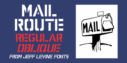
$29.00It’s not often a vintage cartoon can inspire a type design, but such is the case when the name “Daffy Duck” is hand lettered on a mailbox in the 1946 Warner Brothers cartoon “The Great Piggy Bank Robbery” (famously being a send-up of the popular Dick Tracy comic strip by Chester Gould). Mail Route JNL is available in both regular and oblique versions. - Man Of Tomorrow by Comicraft,
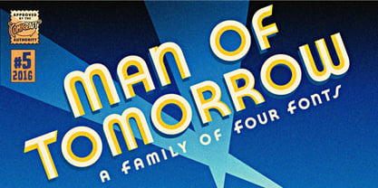
$19.00He's a man of character; a Man for All Seasons. He upholds the values of Truth, Justice and the American Way and he's never averse to a slice of Ma's homemade apple pie. He's not a man of yesteryear, nor a man caught in the here and now. He's a human being of great honor, a citizen of the world -- a Man of Tomorrow! - Alma by Sudtipos,
$69.00From the technical hand of Alejandro Paul and the creative jungle in the mind of Angel Koziupa, comes a wild-natured script. Alma may appear slightly weathered, but still maintains a sharp and determined face. The casual strokes are at times pointed, yet ultimately playful. Released in OpenType format to expand possibilities of use with lots of alternates when used with OpenType-aware applications such as AdobeCS. - Film Crew JNL by Jeff Levine,
$29.00It's not a new idea, but it's always a fun one... a typeface comprised of 35mm film frames. Film Crew JNL is Jeff Levine's version, utilizing his Koehler Sans JNL as the lettering inside the frames. The lesser and greater keys have solid black frames for end caps or word spacing, and there's an alternate pair of frames with clear centers on the brace keys. - Reverie by District,
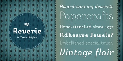
$15.00Reverie is a cheerful band of letters that bounce across the page and get together to create words in three weights. Generous spacing and a modest x-height project an airy typeface that's open but not frail. Quirky without being too whimsical. Use the regular weight for surprisingly readable text or put the light and bold weights to use for decorative headlines and titles. - Transcendental JNL by Jeff Levine,
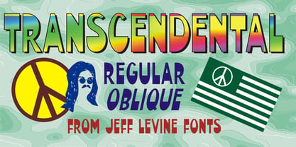
$29.00At first glance, Transcendental JNL looks like a 1960s or 1970s-era "Hippie" type face, hence its "love generation" name. However, the actual inspiration comes from a piece of sheet music from the early 1900s with Art Nouveau influences. It is often proven that what goes around certainly does come around in art, fashion and lettering. Transcendental JNL is available in both regular and oblique versions. - Blunt by Miller Type Foundry,
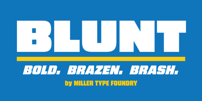
$16.99Blunt is a refreshing new bold headline typeface, designed to be an alternative to overused headline typefaces such as Impact. Blunt is more than just a one-trick-pony though, but includes 4 weights (Condensed - Wide) each with matching italics. This gives Blunt a lot more versatility when it comes to headline use. Try Blunt today and shout your most important messages with boldness! - ITC Liverpool by ITC,
$29.99Fat, bold, and comfortably bulbous; that's ITC Liverpool, designed by Kevin Bailey. The letterforms are soft and mildly eccentric, characterized by tiny counters that shift around from letter to letter like the highlights on cartoon eyeballs. Some of Liverpool's letters are reminiscent of display lettering from the '30s, yet this exuberant face would also be right at home in the '60s. Not for the typographically timid. - St Friska by Stereotypes,
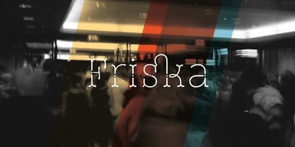
$34.00St Friska, based on old movie title lettering, is made just for headlines. It comes with a slight touch and feeling of art deco but it’s designed to be contemporary in 2010 and beyond. Friska comes with a big bunch of OpenType features, so a designer can play with it like Lego, using it alongside old or new typefaces. It has stylistic sets and lots of ligatures. - Anti Grotesk by 60 KILOS,
$20.00Anti Grotesk is a personal and internal fight. It tries to build elements capable of building personality, message, and introspection through their own shapes. How to escape from trends being part of them, how to design not establishing commercial and economical interests. Why you started designing and why are you designing today, are some of the concepts that build the universe of Anti Grotesk. - Histeagin Sans by Yahya Type,
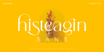
$22.00Histeagin Sans – Sans serif version of Histeagin. Histeagin Sans – this style works well for branding projects, logo, wedding designs, social media posts, advertisements, product packaging, product designs, label, photography, watermark, invitation, or whatever project you’re working on. WHAT’S INCLUDED? Uppercase & lowercase letters Numbers, punctuation Ligature & Huge Stylistic alternate Multilingual support. Still got a question? Send me a message and I’ll be happy to answer! qura.yahya@gmail.com - DF A Bit by Dutchfonts,
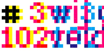
$33.00DF A Bit is made for screen display which is the final form of a lot of information nowadays. But there is more in this BIT... in display sizes it unfolds it’s skin, a beautiful ink on paper structure caused by the letterpress printing of copper lines. Analogue BITS indeed. With all the wealth of the ‘non perfect’, to please the eye and to satisfy the mind. - Malbeck by Sudtipos,
$59.00Malbeck is a script which is both as elegant as it is unique. Very playful typographic treatments can be produced using the large selection of alternate characters. This 2007 version of Malbeck is now available in OpenType format to expand possibilities of use with lots of alternates when used with OpenType-aware applications such as InDesign. Designed by Koziupa and digitized by Ale Paul. - Rustika by Linotype,
$40.99Rustika is a rather rough Oldstyle typeface. The roughness is seen in larger points only. In smaller points it is not easy to see that I tried to imitate characters cut with a chisel. The characters themselves follow otherwise totally the classic models. The name, in this spelling taken from Esperanto, refers to the rustic nature of the characters. Rustika was released in 1995. - Quickpen by Trial by Cupcakes,
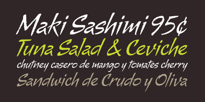
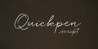
$29.00Quickpen is casual and carefree, designed to recreate the look of confident, quickly jotted script with a felt tip pen or brush. In OpenType, ligatures and contextual alternates for lowercase letters add a natural hand-written look, while swashes lend a bit more finesse. The perfect script for any design that doesn’t take itself too seriously. For a fuller brush texture, check out Quickpen’s cousin, Quickbrush. - Suit Sans Pro by Just in Type,
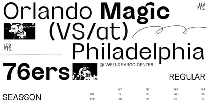
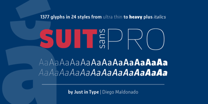
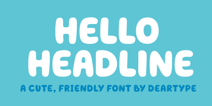
$29.00Suit Sans Pro is a typeface designed for multi-purposes with a wide range of 12 weights plus italics. The large set of 1377 glyphs embraces a lot of latin languages, and it’s perfect for multi-national brands. Take a look at the specimen. Suit Sans Pro is too much for you? Take a look on Suit Sans STD, a simpler version for Suit Sans. - Hello Headline by DearType,
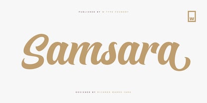
$29.00Hello Headline is a bold and friendly typeface designed specifically (believe it or not) for headlines. All of the letters are chunky and rounded, which is probably the reason why they are visible from afar. And I mean, really, really afar. The overall feel of the typeface is meant to be very casual and affable, so it is great for businesses that are fun, outgoing and sincere. - Samsara by W Type Foundry,
$15.00Samsara is a cursive typeface inspired by calligraphy tools. Its shapes and gestures convey an organic-modern style which generates the texture of a brush tip. Samsara not only has a great versatility, but also is suitably to create short texts such as branding and short messages. It comes with OpenType features, stylistic sets, special ligatures, and swashes, which were designed specially to let your imagination fly. - Blue Jay Way NF by Nick's Fonts,
$10.00Modern Caps—and lowercase, too—was how Ross George described the pattern for this typeface in his Speedball Text Book. Not surprisingly, the design was used on the Beatles' original Magical Mystery Tour album, which suggested the current name. Art Deco meets Psychedelia! Both versions include the complete Unicode Latin 1252, Central European 1250 and Turkish 1254 character sets, with localization for Moldovan and Romanian. - Funny Nature by URW Type Foundry,
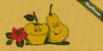
$39.99Funny Nature is not a typeface but a collection of small, comic-like symbols. Lüdicke used to work often for a supplier of gardening equipment etc. He had to come up with new, original and vivid ideas for the design of catalogues and ads. He designed Funny Nature, a wonderful collection of illustrations. Can you hear the humming and buzzuing, can you smell the flowers? - Trebla Square by Jonahfonts,
$30.00Designed with a very limited over-shoot to accentuate a horizontal appearance to increase legibility in long or short headings as well as body-texts. Note with the capital O and lower o roundness has been limited along with other lowercase b, d, g, q and p. Trebla Square is very suitable for titling, display, captions, logos and supports all if not most latin languages. - Mergansers by Tyler Jamieson Moulton,
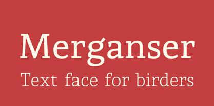
$11.00Merganser is a Typeface intended for text and copy and was inspired to serve the avid community of Birders. Birders and birding material historically have a lot to say. Merganser serves that tendency because its designed legible at small scales. The Natural world also inspires the slightly humanist strokes of Merganser. Merganser was created as part of the Type@Cooper winter certificate in Type Design. - Forged by Hemphill Type,
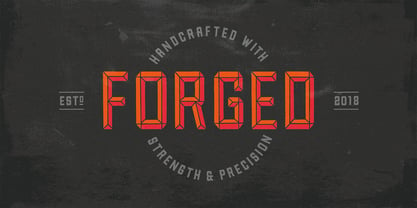
$30.00Hand forged with strength & precision – Forged is a bold, powerful typeface that stands strong. Handcrafted as if by a blacksmith, this typeface has its quirks and imperfections like any metalwork which gives it a unique character. The family consists of regular, outline, bevel and fill versions. All weights are versatile and can be used for packaging, logotype, copy and headings. Strike while the iron's hot! - Terzo by Wilton Foundry,
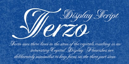
$29.00Terzo uses three lines in the main stem of the capitals resulting in an interesting display of script capitals. Flourishes are uniquely positioned and are deliberately minimalist in order to feature the three part stem capitals. Lowercase characters are also strong enough not to be dominated by the capitals. The overall result is a well balanced and refreshing script that will serve many purposes! - Pittsburgh by Greater Albion Typefounders,
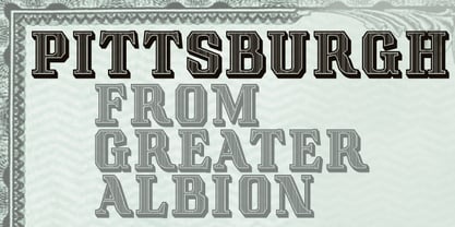
$18.00Pittsburgh is the latest (as at August 2011) in a range of inter-war American inspired commercial faces, and takes its place alongside the popular Bettendorff and the Spargo family. These shaded stab-serif capitals speak of the heyday of heavy manufacture and engineering and bring a gritty feel of the 20s and 30s to any project. Why not indulge in a little heavy engineering today? - Steel Stencil JNL by Jeff Levine,
$29.00A group of unique metal plates with stencil initials cut into them was spotted while browsing through online auctions for source material. What made these items even more interesting was how some of the stencil letters had been sectionally divided - not vertically or horizontally as in most stencils, but lines cut at angles. This is the basis for Steel Stencil JNL and Steel Stencil Oblique JNL. - CA Mechano by Cape Arcona Type Foundry,
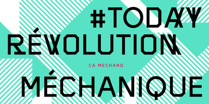
$19.00CA Mechano is quite what the name suggests – A mechanical typeface. Pretty straight forward and all-caps as long as you don’t activate the stylistic set "disorder". You will see what happens then: a lot of fun for the typographic eye. A more consumable distraction is offered by the other stylistic set. You will discover peacefully rounded letters in the neighborhood of strictly mechanically constructed glyphs. - Affair by Sudtipos,
$99.00Type designers are crazy people. Not crazy in the sense that they think we are Napoleon, but in the sense that the sky can be falling, wars tearing the world apart, disasters splitting the very ground we walk on, plagues circling continents to pick victims randomly, yet we will still perform our ever optimistic task of making some little spot of the world more appealing to the human eye. We ought to be proud of ourselves, I believe. Optimism is hard to come by these days. Regardless of our own personal reasons for doing what we do, the very thing we do is in itself an act of optimism and belief in the inherent beauty that exists within humanity. As recently as ten years ago, I wouldn't have been able to choose the amazing obscure profession I now have, wouldn't have been able to be humbled by the history that falls into my hands and slides in front of my eyes every day, wouldn't have been able to live and work across previously impenetrable cultural lines as I do now, and wouldn't have been able to raise my glass of Malbeck wine to toast every type designer who was before me, is with me, and will be after me. As recently as ten years ago, I wouldn't have been able to mean these words as I wrote them: It’s a small world. Yes, it is a small world, and a wonderfully complex one too. With so much information drowning our senses by the minute, it has become difficult to find clear meaning in almost anything. Something throughout the day is bound to make us feel even smaller in this small world. Most of us find comfort in a routine. Some of us find extended families. But in the end we are all Eleanor Rigbys, lonely on the inside and waiting for a miracle to come. If a miracle can make the world small, another one can perhaps give us meaning. And sometimes a miracle happens for a split second, then gets buried until a crazy type designer finds it. I was on my honeymoon in New York City when I first stumbled upon the letters that eventually started this Affair. A simple, content tourist walking down the streets formerly unknown to me except through pop music and film references. Browsing the shops of the city that made Bob Dylan, Lou Reed, and a thousand other artists. Trying to chase away the tourist mentality, wondering what it would be like to actually live in the city of a billion tiny lights. Tourists don't go to libraries in foreign cities. So I walked into one. Two hours later I wasn't in New York anymore. I wasn't anywhere substantial. I was the crazy type designer at the apex of insanity. La La Land, alphabet heaven, curves and twirls and loops and swashes, ribbons and bows and naked letters. I'm probably not the very first person on this planet to be seduced into starting an Affair while on his honeymoon, but it is something to tease my better half about once in a while. To this day I can't decide if I actually found the worn book, or if the book itself called for me. Its spine was nothing special, sitting on a shelf, tightly flanked by similar spines on either side. Yet it was the only one I picked off that shelf. And I looked at only one page in it before walking to the photocopier and cheating it with an Argentine coin, since I didn't have the American quarter it wanted. That was the beginning. I am now writing this after the Affair is over. And it was an Affair to remember, to pull a phrase. Right now, long after I have drawn and digitized and tested this alphabet, and long after I saw what some of this generation’s type designers saw in it, I have the luxury to speculate on what Affair really is, what made me begin and finish it, what cultural expressions it has, and so on. But in all honesty it wasn't like that. Much like in my Ministry Script experience, I was a driven man, a lover walking the ledge, an infatuated student following the instructions of his teacher while seeing her as a perfect angel. I am not exaggerating when I say that the letters themselves told me how to extend them. I was exploited by an alphabet, and it felt great. Unlike my experience with Ministry Script, where the objective was to push the technology to its limits, this Affair felt like the most natural and casual sequence of processions in the world – my hand following the grid, the grid following what my hand had already done – a circle of creation contained in one square computer cell, then doing it all over again. By contrast, it was the lousiest feeling in the world when I finally reached the conclusion that the Affair was done. What would I do now? Would any commitment I make from now on constitute a betrayal of these past precious months? I'm largely over all that now, of course. I like to think I'm a better man now because of the experience. Affair is an enormous, intricately calligraphic OpenType font based on a 9x9 photocopy of a page from a 1950s lettering book. In any calligraphic font, the global parameters for developing the characters are usually quite volatile and hard to pin down, but in this case it was particularly difficult because the photocopy was too gray and the letters were of different sizes, very intertwined and scan-impossible. So finishing the first few characters in order to establish the global rhythm was quite a long process, after which the work became a unique soothing, numbing routine by which I will always remember this Affair. The result of all the work, at least to the eyes of this crazy designer, is 1950s American lettering with a very Argentine wrapper. My Affair is infused with the spirit of filete, dulce de leche, yerba mate, and Carlos Gardel. Upon finishing the font I was fortunate enough that a few of my colleagues, great type designers and probably much saner than I am, agreed to show me how they envision my Affair in action. The beauty they showed me makes me feel small and yearn for the world to be even smaller now – at least small enough so that my international colleagues and I can meet and exchange stories over a good parrilla. These people, whose kindness is very deserving of my gratitude, and whose beautiful art is very deserving of your appreciation, are in no particular order: Corey Holms, Mariano Lopez Hiriart, Xavier Dupré, Alejandro Ros, Rebecca Alaccari, Laura Meseguer, Neil Summerour, Eduardo Manso, and the Doma group. You can see how they envisioned using Affair in the section of this booklet entitled A Foreign Affair. The rest of this booklet contains all the obligatory technical details that should come with a font this massive. I hope this Affair can bring you as much peace and satisfaction as it brought me, and I hope it can help your imagination soar like mine did when I was doing my duty for beauty. - 112 Hours by Device,
$9.00Rian Hughes’ 15th collection of fonts, “112 Hours”, is entirely dedicated to numbers. Culled from a myriad of sources – clock faces, tickets, watches house numbers – it is an eclectic and wide-ranging set. Each font contains only numerals and related punctuation – no letters. A new book has been designed by Hughes to show the collection, and includes sample settings, complete character sets, source material and an introduction. This is available print-to-order on Blurb in paperback and hardback: http://www.blurb.com/b/5539073-112-hours-hardback http://www.blurb.com/b/5539045-112-hours-paperback From the introduction: The idea for this, the fifteenth Device Fonts collection, began when I came across an online auction site dedicated to antique clocks. I was mesmerized by the inventive and bizarre numerals on their faces. Shorn of the need to extend the internal logic of a typeface through the entire alphabet, the designers of these treasures were free to explore interesting forms and shapes that would otherwise be denied them. Given this horological starting point, I decided to produce 12 fonts, each featuring just the numbers from 1 to 12 and, where appropriate, a small set of supporting characters — in most cases, the international currency symbols, a colon, full stop, hyphen, slash and the number sign. 10, 11 and 12 I opted to place in the capital A, B and C slots. Each font is shown in its entirety here. I soon passed 12, so the next logical finish line was 24. Like a typographic Jack Bauer, I soon passed that too -— the more I researched, the more I came across interesting and unique examples that insisted on digitization, or that inspired me to explore some new design direction. The sources broadened to include tickets, numbering machines, ecclesiastical brass plates and more. Though not derived from clock faces, I opted to keep the 1-12 conceit for consistency, which allowed me to design what are effectively numerical ligatures. I finally concluded one hundred fonts over my original estimate at 112. Even though it’s not strictly divisible by 12, the number has a certain symmetry, I reasoned, and was as good a place as any to round off the project. An overview reveals a broad range that nonetheless fall into several loose categories. There are fairly faithful revivals, only diverging from their source material to even out inconsistencies and regularize weighting or shape to make them more functional in a modern context; designs taken directly from the source material, preserving all the inky grit and character of the original; designs that are loosely based on a couple of numbers from the source material but diverge dramatically for reasons of improved aesthetics or mere whim; and entirely new designs with no historical precedent. As projects like this evolve (and, to be frank, get out of hand), they can take you in directions and to places you didn’t envisage when you first set out. Along the way, I corresponded with experts in railway livery, and now know about the history of cab side and smokebox plates; I travelled to the Musée de l’imprimerie in Nantes, France, to examine their numbering machines; I photographed house numbers in Paris, Florence, Venice, Amsterdam and here in the UK; I delved into my collection of tickets, passes and printed ephemera; I visited the Science Museum in London, the Royal Signals Museum in Dorset, and the Museum of London to source early adding machines, war-time telegraphs and post-war ration books. I photographed watches at Worthing Museum, weighing scales large enough to stand on in a Brick Lane pub, and digital station clocks at Baker Street tube station. I went to the London Under-ground archive at Acton Depot, where you can see all manner of vintage enamel signs and woodblock type; I photographed grocer’s stalls in East End street markets; I dug out old clocks I recalled from childhood at my parents’ place, examined old manual typewriters and cash tills, and crouched down with a torch to look at my electricity meter. I found out that Jane Fonda kicked a policeman, and unusually for someone with a lifelong aversion to sport, picked up some horse-racing jargon. I share some of that research here. In many cases I have not been slavish about staying close to the source material if I didn’t think it warranted it, so a close comparison will reveal differences. These changes could be made for aesthetic reasons, functional reasons (the originals didn’t need to be set in any combination, for example), or just reasons of personal taste. Where reference for the additional characters were not available — which was always the case with fonts derived from clock faces — I have endeavored to design them in a sympathetic style. I may even extend some of these to the full alphabet in the future. If I do, these number-only fonts could be considered as experimental design exercises: forays into form to probe interesting new graphic possibilities. - Bojimtes by Twinletter,
$12.00Introduce Bomjites font. Calligraphy fonts are made by hand in detail on each letter character so that they can be combined with various kinds of writing design needs. This font is designed to produce lovely and beautiful words and sentences, creating beautiful writing has never been easier. Not limited to that, the bold calligraphy font is designed to keep paying attention to the beauty of each letter, there are alternate options for the letters which are certainly easy for you to access, so you can automatically customize the letters you want to enhance the visual appearance of your design project. This charming font also offers the beauty of abstract typography harmony for a wide variety of design projects, including digital natural handwriting for designs, quote designs, for social media business designs, advertisements, trademarks, food and beverage promotion banners, text, posters, a signature, and all designs require handwriting or whatever design you want. ============================================================================================================ What’s Included : File font Web Fonts Standard glyphs Ligature Works on PC & Mac Simple installations Accessible in Adobe Illustrator, Adobe Photoshop, Adobe InDesign, even work on Microsoft Word. PUA Encoded Characters – Fully accessible without additional design software. Fonts include multilingual support for; Afrikaans, Albanian, Croatian, Czech, Danish, Dutch, English, Estonian, Finnish, French, German, Hungarian, Italian, Norwegian, Polish, Portuguese, Slovak, Slovenian, Spanish, Swedish Thank you for your purchase! Hope you enjoy our font! - Adventure Island by Larin Type Co,
$12.00Adventure Island this is a stunning font family that consists of two types of fonts, script and sans serif, and each has 8 weights (Regular, Rough, Halftone, Pressed, Bold, Bold rough, Bold halftone, Bold pressed,). With their help, a lot of options are opened for you to create your projects, both in vintage and in modern style. These fonts are like twin brothers, they fit perfectly and complement each other. The Script type has flowing shapes and is made to shine and lively for the full hand-signature effect. Sans serif type is also made in monoline and has rounded corners and smooth lines. The script style has alternatives for uppercases and many alternates for lowercaes, with them you can make your design more expressive, varied and playful, change them and you will see how many options you can get for your design, also use swashes touches to complement your design. Enjoy using! The font includes 8 script fonts and 8 sans serif fonts (Regular, Rough, Halftone, Pressed, Bold, Bold rough, Bold halftone, Bold pressed,) Full alphabet with Uppercase and Lowercase A-z for script Full alphabet with Uppercase for sans serif Numbers, fractions for all fonts Punctuation and mathematical symbols for all fonts Alternates Uppercase and Lowercase also ampersand for script Swashes for script Multilingual support all fonts
