8,674 search results
(0.024 seconds)
- HU Handserif KR by Heummdesign,
$25.00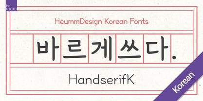 HU Handserif KR contains KOREAN words and Latin alphabets. HU Handserif KR expresses the heart written down by hand in a font. Since there are no curved serifs, it is a handwritten typeface that is easy for children to follow correctly. It was produced using the order of strokes so that Hangeul can be written in the correct order, and the shape and size of the initial consonants, middle consonants, and final consonants were produced correctly. It also has an honest and correct form based on the basic principles of letters and the structure according to the form.
 - Cambridge by AVP,
$29.00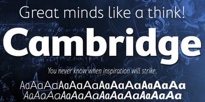 Cambridge seeks to build on the popularity of Fiendstar amongst educational publishers and advertisers who need easy-to-read text in a classic sans serif format. Cambridge is an elegant typestyle that is equally at home in a schoolbook or an annual report. Feedback from users has resulted in a handful of changed letterforms which remove any ambiguities between similar letter forms. The family contains four weights in three widths and now benefits from matching italic form for all variants. Cambridge Round provides a rounded version of all styles, useful for headings and more informal texts.
 - Gramma by CAST,
$45.00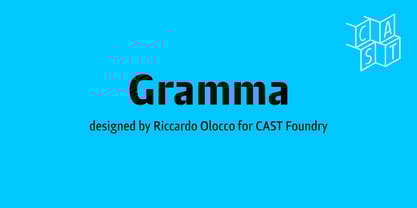 Gramma is a compact sans with big x-height, a robust and balanced typeface that work well both for headlines and main bodies of text. The initial constructions, assembled from a few well-defined geometric modules, were later polished into more organic forms; the letters’ arches are quite squared, and the counters and other internal negative spaces push outward, creating a tension that balances the forms’ compression. Gramma’s most evident characteristic is its “bird-beak” terminals (present in many letters, including the c, e, f, s...) that replicate the unconnected junctures between stem and curve, visible in the a,b,d,g,h.
 - Monotype Clearface Gothic by Monotype,
$29.99Clearface Gothic first appeared in 1910, designed by Morris Fuller Benton, the world-famously prolific typeface artist. In addition to Clearface Gothic, Benton also designed classics like Franklin Gothic, Century Expanded, and many other types. Clearface Gothic is a sans serif face with light forms displaying the Zeitgeist of the turn of the 20th century. Distinguishing characteristics are the open forms of the a" and "c," the arched "k," and the upward-tilting horizontal stroke of the "e." The relatively narrow typeface, with its open inner white spaces, is extremely legible even in small point sizes. There is no accompanying italic." - ITC Honda by ITC,
$29.99This simplified blackletter typeface shares some geometric characteristics with a line of typefaces popular that were especially popular in Germany during the 1920s and 30s. Their forms may have originally come about after a desire to mix the classical Fraktur" forms found in typefaces like Linotype Luthersche Fraktur or Fette Fraktur with more modern sans serif typefaces, like Basic Commercial or Futura. ITC Honda's letters are rather narrow and angular. The type can be used for a number of headlines or logo purposes, and is best legible when set large. A similar typeface in our library is Linotype Gotharda." - Magasin by Type-Ø-Tones,
$50.00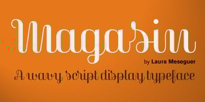 Magasin is a high contrast display typeface inspired by the pointed pen calligraphy, yet with a retro-chic twist. It combines a sense of script with geometric and slightly condensed structure resulting in idiosyncratic curves softly connecting the vertical elegance of its forms, ideally suited to use at large sizes in headlines for magazines, posters or packaging. Magasin boasts a rich set of OpenType features that provide a better flow such as Ligatures, Stylistic Alternates, Contextual Alternates, and Final Forms. It also includes a set of capital Swashes. Please check the ‘Read me’ file located in the gallery for more specifications.
 - Franklin Gothic Raw Semi Serif by Wiescher Design,
$19.50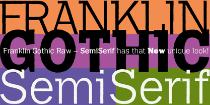 When drawing a new font, there is a time when the final form is found – almost – but the curves are not slick and clean yet, that's what I call the "raw" form. Raw – no sweeteners added! In this family I redefined this moment in type development for the eternally beautiful "Franklin Gothic". I call the design "Franklin Gothic Raw". This packet is the semi-serif addition. There never was a Franklin-Gothic with serifs but actually the font lends itself perfectly to a slab-serif. I started with adding a half serif and eventually add a full slab-serif later on.
 - Anavio by Greater Albion Typefounders,
$14.95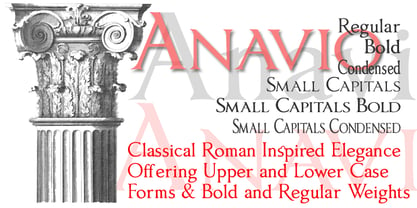 Anavio is named in honor of the ancient Roman name of an English Derbyshire town. Anavio is a classically inspired family of Roman faces, emphasizing simplicity of form and elegance. Regular and Bold weights are offered, along with condensed forms. Anavio is offered in both upper and lower case and small capitals faces. Its simple lines are immediately legible, lending it to both text and display uses. A range of ligatures, both standard and discretionary, are included as are stylistic alternates and two styles of numerals. Use Anavio to lend that indefinable air of elegance to your next project.
 - Linotype Cutter by Linotype,
$29.99Linotype Cutter was designed by Georg John in 1997. As the name suggests, the font looks like it was cut out of black cardboard pieces. Each letter has a irregular rectangle black background and they combine to form heavy rows of letter elements. The strong contrasts of the font make it good for short headlines or initials in larger point sizes and combines well with almost any text font. Georg John made a second version of this theme called Linotype Schere (scissors) it is a companion typeface where the conturs of the letters are even rougher in its form. - Chipperly by Greater Albion Typefounders,
$16.95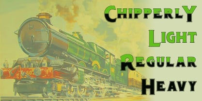 Chipperly is a brand new face inspired by the art of the Edwardian poster, especially travel posters. It’s good for clear ad legible headings which need a gentle and unobtrusive period touch, and is the latest is Greater Albion’s line of faces to explore the ‘small capitals’ idea. In its regular weight, Chipperly’s glyphs are semi-shaded within an outer outline giving a distinctive look, while the Heavy weight maintains the separate outline but is completely filled. The Light form is an outline alone. All forms unite period elegance with the modern need for clear readiility.
 - Choko Milky by Java Pep,
$10.00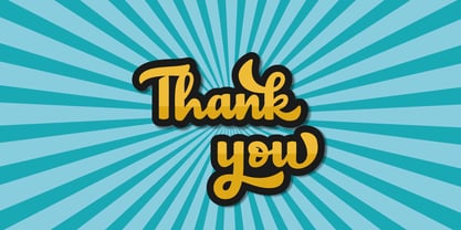 Introducing a fun and bold font called Choko Milky. This font includes an extrude style to combine with the regular version to make the Choko Milky stand out even more. Choko Milky has OpenType features such as swash, terminal form, and stylistic set s01-s02. Fonts Package includes: - Choko Milky - Choko Extrude - OpenType features ( swash, terminal form, stylistic set) How to use character map for access OpenType features https://www.youtube.com/watch?v=KV7n5nxmsLs&feature=youtu.be Thank for using this font, if you have any question don't hesitate to comment below or contact java.indonesian@yahoo.com. Have a nice day.
 - Quiet Sans by Dharma Type,
$29.99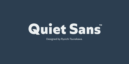 Quiet Sans is a super geometric sans-serif family for text designed by Ryoichi Tsunekawa and the whole family consists of 6 weights from ExtraLight to ExtraBold and their matching Italics. The basic concept of this family is not only to make crisp, sharp and strong impact by geometric letter form but also to be legible and readable even on small size screen by their sophisticated design. Quiet Sans supports almost all European languages: Western, Central, South Eastern Europeans and afrikaans. And proportional figures, superior figures, inferior figures, denominators, numerators, fractions, ordinals and case-sensitive-forms can be accessed by using OpenType features.
 - Olyford Variable by NicolassFonts,
$148.99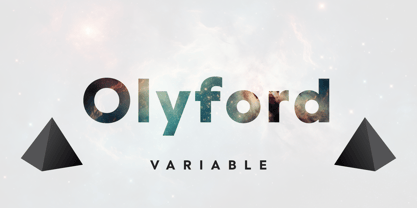 Olyford Variable font is a contemporary sans serif typeface that is derived from the Olyford font family. It features a range of weights and italics. OpenType features: Access All Alternates, Stylistic Alternates (Alternative n, m, p, q, r, u), Stylistic Set 1 (Alternative K, k), Stylistic Set 2 (Alternative W), Stylistic Set 3 (Alternative t), Stylistic Set 4 (Alternative w), Stylistic Set 5 (Alternative 5), Stylistic Set 6 (Alternative ¢, $, €, ₽, ¥), Stylistic Set 7 (Alternative Đ, Ħ, Ð, ≠, ∫), Standard Ligatures, Discretionary Ligatures, Proportional Figures, Tabular Figures, Case-Sensitive Forms, Fractions, Kerning, Denominators, Numerators, Scientific Inferiors, Subscript, Superscript, Ordinals, Localized Forms.
 - Cerulea by Cerulean Stimuli,
$36.00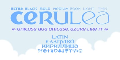 Cerulea is a unicase from the world of the sky. Drawing inspirations from Art Nouveau, Classical Roman, and Uncial styles, Cerulea's wide, spacious bowls, sharp points, and subtle wandering curves evoke airiness, flight, and fantasy. Seven weights, and true italics for each, range from zephyrous to thunderous. Vary the mood every time you choose between the serious capital form of a letter, the more fanciful lowercase form, or another variant in the stylistic sets. The more than 800 glyphs cover pan-European Latin, Greek, Cyrillic, fractions, circled numbers, planet and zodiac symbols, card suits, chess pieces, ornaments, and more.
 - Linotype Russisch Brot by Linotype,
$29.00Linotype Russisch Brot is part of the Take Type Library, chosen from the entries of the Linotype-sponsored International Digital Type Design Contests of 1994 and 1997. The inspiration of German designer Markus Remscheid is not hard to see for those who are familiar with the chocolate cookies in the form of letters which are called Russisches Brot. The font is available in six weights. The basic weight is perfectly legible and is good for both headlines and shorter texts and from there the weights become more and more nibbled away, leaving the basic form of the characters and a few crumbs. - Whisper Night by Letterhend,
$17.00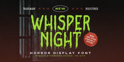 Introducing, Whisper Night - A display typeface font with bold and unusual form. This font has unique shape, very suitable for horror, thriller and spooky theme design. This font also perfectly made to be applied especially in logo, and the other various formal forms such as invitations, labels, logos, magazines, books, novels, labels or any type of advertising purpose. Features : uppercase and lowercase numbers and punctuation multilingual PUA encoded We highly recommend using a program that supports OpenType features and Glyphs panels like many of Adobe apps and Corel Draw, so you can see and access all Glyph variations.
 - Linotype Sketch by Linotype,
$29.99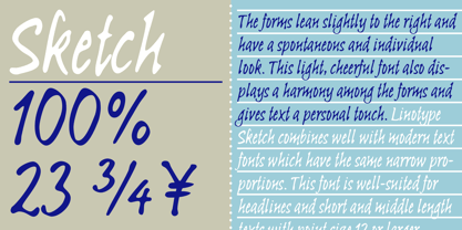 Linotype Sketch is part of the Take Type Library, chosen from the contestants of Linotype’s International Digital Type Design Contests of 1994 and 1997. German designer Dieter Kurz gave his display font a calligraphic character. The forms lean slightly to the right and have a spontaneous and individual look. This light, cheerful font also displays a harmony among the forms and gives text a personal touch. Linotype Sketch combines well with modern text fonts which have the same narrow proportions. This font is well-suited for headlines and short and middle length texts with point size 12 or larger.
 - HGB Santo by HGB fonts,
$16.00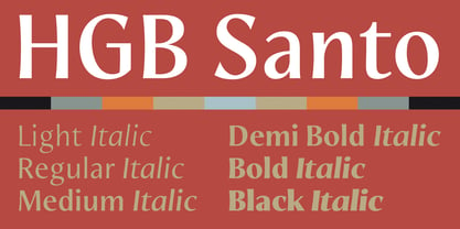 Must a letter always have a symmetrical basic form? What happens when the shape of the letters stretch like an arc in the reading direction? When writing with a broad nib, this is easily achieved. The HGB Santo examines the effect of this formal principle on the readability of a text. First attempts have shown a warm and reader-friendly typeface. Six shades from Light to Black, each with an italic should be sufficient for most applications. Small caps and old-style figures are available via OpenType features as well as some ornamental forms in the italics.
 - Linotype Not Painted by Linotype,
$29.99Linotype Not Painted is part of the Take Type Library, chosen from the contestants of Linotype’s International Digital Type Design Contests of 1994 and 1997. This fun font from German designer Robert Bucan grabs attention immediately. The forms are made up of multiple layers. The upper case’ alphabet forms, numerals and punctuation are two different styles of the same character, one over the other, and the lower case’ letters are composed of the lower case and upper case of the same letter superimposed. Linotype Not Painted is particularly good as a headline font in larger point sizes. - Gimbal Egyptian by AVP,
$19.00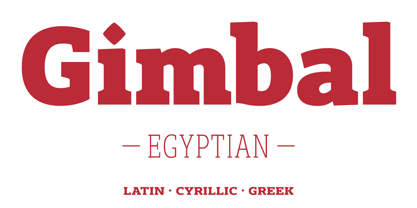 Gimbal Egyptian is a richly-featured font family providing many style options across a broad range of languages. It is twinned with Gimbal Grotesque, a sans-serif family with an identical range of weights and features. Originally conceived as a small webfont family, the letterforms have been revitalised to put a spring in their step and the family has been extended to create a versatile multi-script text face equally at home on the printed page. Carefully crafted at all weights, Gimbal also lends itself to headlines and display applications such as posters, exhibitions and signage while resolving well on-screen for general document creation and web-based applications. The letters are spaced for best readability on-screen and in the usual printed body text ranges but are tolerant of tracking adjustment to suit other uses. The styles are divided by width into four families (Compressed, Condensed, Normal, Extended), each family possessing six weights plus corresponding italics. Within each family, the 'regular' and 'bold' weights are style-linked, and all upright forms have an italic counterpart. The full opentype character set includes latin, greek and cyrillic scripts with appropriate local variants (also as stylistic sets) for Turkish, Polish and Romanian (latin) and Russian, Bulgarian and Serbian (cyrillic). All fonts contain small capitals for all scripts, superscript for latin and commonly used greek together with the usual numeral style, size and positioning options. The default numerals are 'proportional lining'. Other opentype features include case-sensitive marks, fractions, and some discretionary ligatures. A set of circled numerals and circled latin capitals is included, along with an unusual feature that composes 2-character country codes.
 - Sabine by Arabetics,
$45.00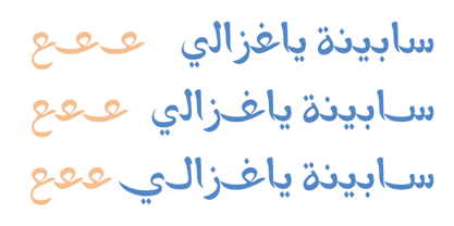 Sabine is an Arabetic type design with a calligraphic flavor. It follows the guidelines of the Mutamathil Taqlidi type style with one glyph for every basic Arabic Unicode character or letter, as defined in Unicode Standards version 5.1, and one additional, final-position, glyph for each Arabic letter that is normally connected with other letters from both sides in traditional cursive Arabic strings. Sabine employs variable x-height values. It includes all required Lam-Alif ligatures and uses ligature substitutions and selected marks positioning but it does not use any other glyph substitutions or forming. Text strings composed using types of this family are non-cursive with stand-alone isolated glyphs. Tatweel (or Kashida) glyph is a zero width space. Keying it before any glyph will display that glyph isolated form. In Sabine Kashidah, Irsal, and Tasmim keying Tatweel (shift J) after certain glyphs will replace it with a long stroke glyph. In Sabine Tasmim, keying it a second time will replace glyph with a final form swash (Irsal) glyph. In Sabine Irsal all final forms are swash glyphs. Keying Tatweel before Alif Lam Lam Ha will display the Allah ligature. Sabine family includes both Arabic and Arabic-Indic numerals; all required diacritic marks, Allah ligature, in addition to standard English keyboard punctuations and major currency symbols. Fonts are available in regular and italic styles.
 - Albiona Inked by Device,
$39.00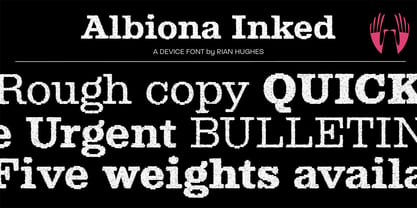 Albiona Inked is a vintage distressed version of Albiona that evokes the urgency of teletext printers, typewriter ribbons and authentic hot-metal type on rougher paper. A contemporary slab-serif, it revisits aspects of Robert Besley’s classic Clarendon, designed around 1842 for Thorowgood and Co. and named after the Clarendon Press in Oxford. Subsequently extended by Stephenson Blake in the 1950s, Albiona adds the inwardly-curved stroke terminals of the same foundry ’s Grotesque series, and includes italics and old-style and tabular numerals. The original Clarendon’s ball serifs and calligraphic eccentricities have been rationalised and streamlined for functional contemporary uses. The family consists of five weights plus italics and a stencil, and its clean readable style is perfect for both extended text as well as headline setting. A rounded “soft” version is also available.
 - Moron by Barnbrook Fonts,
$30.00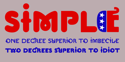 Moron is a distinctive and idiosyncratic display typeface: a winsome-but-nasty, old-and-yet-new drawing of Victorian sans-serif letterforms (with some 1970s sausage fonts thrown in). Moron started life as a sans-serif redrawing of Nylon but developed into a unique typeface with a character all its own. It is based, very loosely, upon Victorian Tuscan and Grotesque type found in the churches and cemeteries of the city of Glasgow. These letterforms originated before the dawn of modernism and at a time when the Arts and Crafts Movement was flourishing. In this age of early mass production and mechanisation, the Victorian ability to balance functionality with ornamentation had fascinating results. The typography of that period displays a unique combination of industrial heft and romantic decoration.
 - Hot, Hot, Hot - Unknown license

- Caster by Mans Greback,
$59.00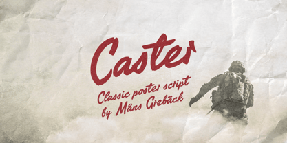 Caster is a thick poster script, created by Måns Grebäck during 2019. It is a high quality typeface and has energetic, drama-filled letter forms. It contains all necessary symbols and supports a wide range of languages.
 - Hero by Roman Polishchuk,
$20.00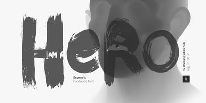 Hero is an eccentric, handwritten font. It features high detail and natural forms. Support for ligatures allows you to create a truly unique typography that resembles lettering. Each designer should have a hero who inspires him. Enjoy!
 - Lisa's Hand by Matthias Luh,
$15.00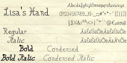 Lisa's Hand is a well-formed handwritten Font. The letters are not connected which combines the style of both handwritten and computer fonts. Lisa's Hand is offered in Regular, Bold, Italic, Bold Italic, Condensed and Condensed Italic.
 - Solfeggio by Ayca Atalay,
$22.00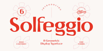 Solfeggio is a geometric display typeface with high contrast and odd but striking forms. Its calculated quirks make it an excellent, attention grabbing, eccentric typeface ideal for logos & branding as well as posters, headlines, packaging, websites, etc.
 - Pinx Niera by Sitintahitam,
$20.00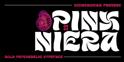 Pinx Niera is a bold psychedelic typeface. Inspired by psychedelic music and visual. The typeface looks bold, clean, and unique form. Suitable for any graphic designs such as branding materials, t-shirt, print, logo, poster, packaging .etc
 - Artica Pro by Green Type,
$46.00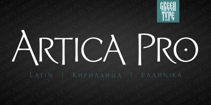 Artica is an elegant sans serif typeface, offered in five weights. It was inspired by classic Roman letterforms. Artica Pro supports Latin, Cyrillic and modern Greek scripts, and includes swash initial & final forms, stylistic alternates and ligatures.
 - Neurotic Roman JNL by Jeff Levine,
$29.00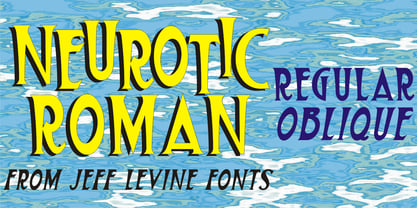 The free-form, Art Nouveau hand lettering on the cover of the sheet music for 1915's "She Was All That a Pal Ought to Be" inspired Neurotic Roman JNL; available in both regular and oblique versions.
 - Block Head by TypoGraphicDesign,
$15.00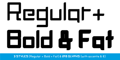 The half-round and smooth character of the typeface looks sporty and fresh. The sans-serif monoline letter-forms looks very modern, clean, fresh and fancy. From slim (regular) athletes till heavy (fat) bodybuilder or football player.
 - Lonely Cowpoke by 10four,
$20.00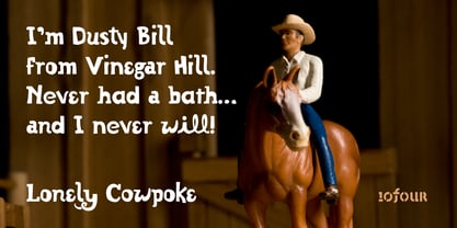 Inspired by circus billboards, old west posters and torn paper constructs, "Lonely Cowpoke" is an oddity of bold graphic forms and cheerful curving lines. Revelling in its own quirky nature, this playful font lightens up any mood.
 - Zeogari by Phoenix Group,
$13.00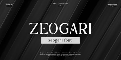 Zeogari is a classic style font that has a combination of serif and sans-serif forms, this font depicts a sense of love and loneliness, in addition, the Zeogari font has a bold shape with strong characters.
 - Belqees Pro by GHEEN Studio,
$20.00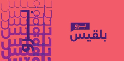 Belqees Pro is a modern Arabic and Latin typeface that belongs to the Kufi font family. This version is distinguished by an improvement in the form of the typefaces, as well as many additions for different uses
 - Kalendar by Alphabet Design,
$15.00Kalendar is a geometric display font, inspired by a calendar design by Ivica Kis, a Croatian architect. This font contains alternative letter-forms for many characters. Kalendar works best in display applications, such as logos and titles. - Outsize by Sanyukt Foundry,
$12.00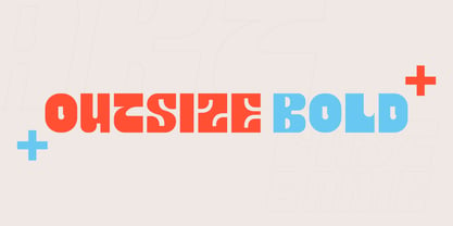 Bold Future is an extremely heavy font. It has numerous interesting characters, with the counter and aperture giving it a unique personality. Ideal for enormous titles, publicizing, naming, bundling and anything that needs a major, significant typeface.
 - Type Master by VP Creative Shop,
$39.00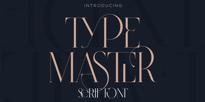 NOTE : If you want any specific ligature included, just write me a message and I will add it with next update :) Type Master is a sophisticated and delicate serif font that exudes elegance in every aspect. With its extensive collection of over 100 ligatures and alternate glyphs, this font offers endless possibilities for creative expression. Additionally, its support for 87 languages ensures that it is versatile enough to meet the needs of any project. Whether you are designing a logo, creating marketing materials, or crafting an editorial layout, Type Master is the perfect choice for adding a touch of refinement to your work. Language Support : Afrikaans, Albanian, Asu, Basque, Bemba, Bena, Breton, Chiga, Colognian, Cornish, Czech, Danish, Dutch, Embu, English, Estonian, Faroese, Filipino, Finnish, French, Friulian, Galician, Ganda, German, Gusi,i Hungarian, Indonesian, Irish, Italian, Jola-Fonyi, Kabuverdianu, Kalenjin, Kamba, Kikuyu, Kinyarwanda, Latvian, Lithuanian, Lower Sorbian, Luo, Luxembourgish, Luyia, Machame, Makhuwa-Meetto, Makonde, Malagasy, Maltese, Manx, Meru, Morisyen, North Ndebele, Norwegian, Bokmål, Norwegian, Nynorsk, Nyankole, Oromo, Polish, Portuguese, Quechua, Romanian, Romansh, Rombo, Rundi, Rwa, Samburu, Sango, Sangu, Scottish, Gaelic, Sena, Shambala, Shona, Slovak, Soga, Somali, Spanish, Swahili, Swedish, Swiss, German, Taita, Teso, Turkish, Upper, Sorbian, Uzbek (Latin), Volapük, Vunjo, Walser, Welsh, Western Frisian, Zulu Ligatures : IS, FO, OD, FA, TY, EX, NN, PI, EY, AY, SS, LL, FU, US, UT, AS, AN, AM, CI, LO, ES, RO, ET, TE, CK, OH, OO, OE, OC, KO, KE, KC, CH, SE, EA, UR, RS, KS, TH, TU, TT, TK, TL, HE, RG, EP, ER, RE, RC, LE, ND, ED, OF, HA, EN, CT, ST, NT, ON, ME, MO, NG, NC, UG, UC, OU, GH, OR, OP, EE, YO, VE, IT, WE, TI, FAS, FAST, CKS, OOD, FOOD, FOO, THEY, HEY, HYP, TYP, OUT, UST, URS, WAS, THE, WES, EST, WEST, ERS, EAST, EAS, LES, ENT, FOR, OUG, OUGH, ERE, TER, YOU, VER, HER, THER, THA, AND, ITH, THI, MENT, WERE, WER, ROM, THE How to access alternate glyphs? To access alternate glyphs in Adobe InDesign or Illustrator, choose Window Type & Tables Glyphs In Photoshop, choose Window Glyphs. In the panel that opens, click the Show menu and choose Alternates for Selection. Double-click an alternate's thumbnail to swap them out. UPDATES : COMING SOON Mock ups and backgrounds used are not included. Thank you! Enjoy!
 - Adelphi PE by Rosetta,
$70.00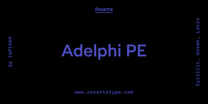 Adelphi is a geometric sans, redefined for the northern side of the English Channel. Typographic modernism was a late arrival in Britain — due partly to the Second World War and to the strong local type tradition. This delay provided for fruitful divergence, thus modernism was not adored in quite the same way as it had been in Germany and central Europe. It was instead rethought and repurposed against the backdrop of the bleak British weather and postwar social reform – a continental fashion statement reshaped into a more humanist variant. Likewise, when crafting Adelphi, Nick Job reimagined the constraints that defined the geometric sans as a genre. Whereas other typefaces seem overly bound by the rules, Adelphi feels relaxed and approachable. Elementary square and circular shapes are merely implied. A keen observer may notice that the uncomplicated letterforms occasionally reveal a subtle naïveté associated with early Grotesques. Brunel’s bridges and Harry Beck’s tube map spring to mind alongside the Bauhaus and Futura. But Adelphi is by no means nostalgic! It is a contemporary, comprehensive, and durable system with a pragmatic set of features. These include a wide array of weights, ‘uniwidth italics’, and variable extenders that go from tall and flat in Adelphi Text to short and sharp in Adelphi Display, with default Adelphi standing midway between these two extremes. You can set the extenders to your preference in the all-inclusive variable font or use one of the three static fonts that come packed together, priced as a single font. The pan-European support for Latin, Cyrillic and Greek scripts already makes for a vast character set, but Adelphi takes things a step further by including alternate glyphs to satisfy the DIN1450 legibility norm, a range of ordinals that can be used to create specialist compositions in all three scripts and two kinds of fractions and arrows. Play with the alternates or use it as-is. Either way, this understated beauty will carry you through.
 - Ongunkan Bosnia Pyramid by Runic World Tamgacı,
$100.00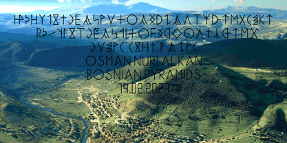 The signs of the Bosnian pyramids The pyramid researcher, Semir Osmanagic, began excavations in 2005 in Visoko, Bosnia, 30 km North from Sarajevo. Mr. Senad Hodocic, the curator at the local museum, pointed out at the pyramidal shape of the Visocica Mountain, which grabbed Osmanagic's attention. It is also suspected that the four adjacent hills, covered by plants and greenery, also hide the pyramids. The main sites of the excavations are called the Pyramid of the Sun and the Pyramid of the Moon, and the results achieved so far have already proved that those structures are man-made and artificial. The Pyramid of the Sun is bigger and older than the pyramid in Giza, which was built by Pharaoh Cheops 4600 years ago. Gábor Szakács, who went to the site in June 2006 for the first time, found the symbols on the megalithic blocks inside the tunnel of the Pyramid of the Sun, which correspond to the ancient Hungarian runic writings. Further information about the Bosnian Pyramids is available at the website http://www.piramidasunca.ba/. There are also researchers who do not accept the subject of the Bosnian pyramids. Time will tell the truth.
