8,674 search results
(0.359 seconds)
- ABC Hand by Intellecta Design,
$15.90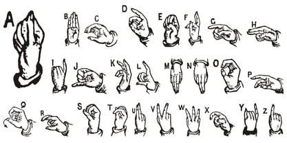 A source of hand signals. This alphabet is presented in two forms with one and two hands.
 - Degol MF by Masterfont,
$59.00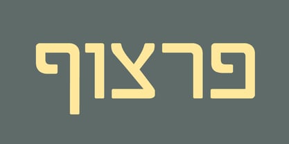 Geometric forms make this elegant font family a great companion for invitations and signs, indoor and outdoor.
 - HaverYaldut MF by Masterfont,
$59.00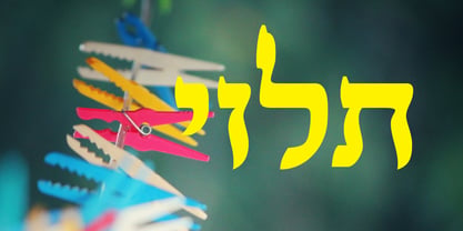 Geometric forms make this elegant font family a great companion for invitations and signs, indoor and outdoor.
 - Bomba MF by Masterfont,
$59.00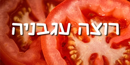 Geometric forms make this elegant font family a great companion for invitations and signs, indoor and outdoor.
 - DINosaur by Type-Ø-Tones,
$60.00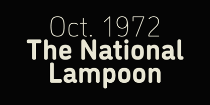 DINosaur is the typographical mise en scène of a calligraphic standard for technical writing, found in a 1967 manual. Although its base is a regular grid and its main reference is the DIN norm, it is full of a multitude of small original features. The microtypographic details refer to the tools originally used for its reproduction.
 - FF Signa Slab by FontFont,
$72.99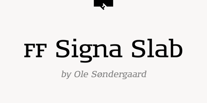 FF Signa is a typically Danish typeface, rooted in architectural lettering rather than book typography. Originally designed for signage—hence the name—FF Signa is now a typographic family with three widths. All weights include italics, small caps, and several styles of figures. Because of the quality of this “vernacular-lettering-into-typeface” conversion, FF Signa received a Danish Design Prize in 2002. FF Signa is radically different from most sans serif text typefaces that were published during the 1990s. It neither belongs in the “humanist sans” category, nor is it on the list of typefaces based on 19th-century grotesques. Its concise letterforms and a minimum of detail produce clear and harmonious word images. Yet its proportions are classical, and the underlying geometry has been subtly adjusted in order to create letterforms which are at once interesting, harmonious, and contemporary. These features make FF Signa pleasant for reading, even at very small sizes. The typeface has developed into a versatile family, with Condensed, Extended, and Correspondence versions. Later on Signa Serif, Stencil variants and a Signa Slab family added even more versatility. The resulting FF Signa type system may be used for corporate identities, brochures, magazines, communication, books, and on-screen publications.
 - Schism One by Alias,
$55.00 Schism is a modulated sans-serif, originally developed from our Alias Didot typeface, as a serif-less version of the same design. It was expanded to three sub-families, with the thin stroke getting progressively heavier from Schism One to Schism Three. The different versions explore how this change in contrast between thick and thin strokes changes the character of the letterforms. The shape is maintained, but the emphasis shifts from rounded to angular, elegant to incised. Schism One has high contrast, and the same weight of thin stroke from Light to Black. Letter endings are at horizontal or vertical, giving a pinched, constricted shape for characters such as a, c, e and s. The h, m, n and u have a sharp connection between curve and vertical, and are high shouldered, giving a slightly square shape. The r and y have a thick stress at their horizontal endings, which makes them impactful and striking at bolder weights. Though derived from an elegant, classic form, Schism feels austere rather than flowery. It doesn’t have the flourishes of other modulated sans typefaces, its aesthetic more a kind of graphic-tinged utility. While in Schism Two and Three the thin stroke gets progressively heavier, the connections between vertical and curves — in a, b, n etc — remain cut to an incised point throughout. The effect is that Schism looks chiselled and textural across all weights. Forms maintain a clear, defined shape even in Bold and Black, and don’t have the bloated, wide and heavy appearance heavy weights can have. The change in the thickness of the thin stroke in different versions of the same weight of a typeface is called grading. This is often used when the types are to used in problematic print surfaces such as newsprint, or at small sizes — where thin strokes might bleed, and counters fill in and lose clarity, or detail might be lost or be too thin to register. The different gradings are incremental and can be quite subtle. In Schism it is extreme, and used as a design device, giving three connected but separate styles, from Sans-Didot to almost-Grotesk. The name Schism suggests the differences in shape and style in Schism One, Two and Three. Three styles with distinct differences, from the same start point.
 - Schism Three by Alias,
$55.00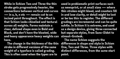 Schism is a modulated sans-serif, originally developed from our Alias Didot typeface, as a serif-less version of the same design. It was expanded to three sub-families, with the thin stroke getting progressively heavier from Schism One to Schism Three. The different versions explore how this change in contrast between thick and thin strokes changes the character of the letterforms. The shape is maintained, but the emphasis shifts from rounded to angular, elegant to incised. Schism One has high contrast, and the same weight of thin stroke from Light to Black. Letter endings are at horizontal or vertical, giving a pinched, constricted shape for characters such as a, c, e and s. The h, m, n and u have a sharp connection between curve and vertical, and are high shouldered, giving a slightly square shape. The r and y have a thick stress at their horizontal endings, which makes them impactful and striking at bolder weights. Though derived from an elegant, classic form, Schism feels austere rather than flowery. It doesn’t have the flourishes of other modulated sans typefaces, its aesthetic more a kind of graphic-tinged utility. While in Schism Two and Three the thin stroke gets progressively heavier, the connections between vertical and curves — in a, b, n etc — remain cut to an incised point throughout. The effect is that Schism looks chiselled and textural across all weights. Forms maintain a clear, defined shape even in Bold and Black, and don’t have the bloated, wide and heavy appearance heavy weights can have. The change in the thickness of the thin stroke in different versions of the same weight of a typeface is called grading. This is often used when the types are to used in problematic print surfaces such as newsprint, or at small sizes — where thin strokes might bleed, and counters fill in and lose clarity, or detail might be lost or be too thin to register. The different gradings are incremental and can be quite subtle. In Schism it is extreme, and used as a design device, giving three connected but separate styles, from Sans-Didot to almost-Grotesk. The name Schism suggests the differences in shape and style in Schism One, Two and Three. Three styles with distinct differences, from the same start point.
 - Schism Two by Alias,
$55.00 Schism is a modulated sans-serif, originally developed from our Alias Didot typeface, as a serif-less version of the same design. It was expanded to three sub-families, with the thin stroke getting progressively heavier from Schism One to Schism Three. The different versions explore how this change in contrast between thick and thin strokes changes the character of the letterforms. The shape is maintained, but the emphasis shifts from rounded to angular, elegant to incised. Schism One has high contrast, and the same weight of thin stroke from Light to Black. Letter endings are at horizontal or vertical, giving a pinched, constricted shape for characters such as a, c, e and s. The h, m, n and u have a sharp connection between curve and vertical, and are high shouldered, giving a slightly square shape. The r and y have a thick stress at their horizontal endings, which makes them impactful and striking at bolder weights. Though derived from an elegant, classic form, Schism feels austere rather than flowery. It doesn’t have the flourishes of other modulated sans typefaces, its aesthetic more a kind of graphic-tinged utility. While in Schism Two and Three the thin stroke gets progressively heavier, the connections between vertical and curves — in a, b, n etc — remain cut to an incised point throughout. The effect is that Schism looks chiselled and textural across all weights. Forms maintain a clear, defined shape even in Bold and Black, and don’t have the bloated, wide and heavy appearance heavy weights can have. The change in the thickness of the thin stroke in different versions of the same weight of a typeface is called grading. This is often used when the types are to used in problematic print surfaces such as newsprint, or at small sizes — where thin strokes might bleed, and counters fill in and lose clarity, or detail might be lost or be too thin to register. The different gradings are incremental and can be quite subtle. In Schism it is extreme, and used as a design device, giving three connected but separate styles, from Sans-Didot to almost-Grotesk. The name Schism suggests the differences in shape and style in Schism One, Two and Three. Three styles with distinct differences, from the same start point.
 - Modesta by OhType!,
$25.00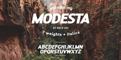 Modesta Sans is a Neo Grotesque sans serif typefamily of seven weights plus matching italics. Inspired by Didone serif fonts and the first Sans serif types from the late 19th century and early 20th century, It reduces many of the eccentricities in order to make them more suitable to modern tastes. Every weight has more than 220 characters and includes uppercase, lowercase, numbers, special characters and a powerful opentype features. Perfectly suited for graphic design, headlines, advertisements, and any display use. It could easily work for editorial design, corporate, web, signage and many other uses in print and digital media.
 - Macho Moustache by CAST,
$45.00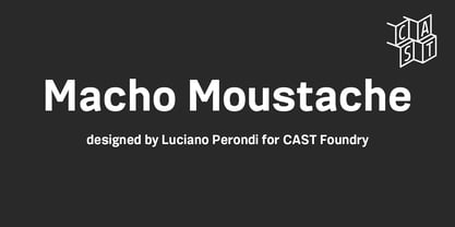 Macho Moustache is closely related to Macho Modular , the parent type with which it shares modular widths and most letterforms. The difference is that Macho Moustache follows the ‘Grotesque' tradition of tight apertures for a, c, e and s as well as some of the numerals. Original design work started together with Macho Modular in 2008. Now the range and communication potential of the Macho family has been developed with five weights. Since the Macho family was designed bearing in mind the idea of Themerson's semantic typography, Macho Moustache features all sets of modular brackets and underlinings.
 - Basic Sans Narrow by Latinotype,
$29.00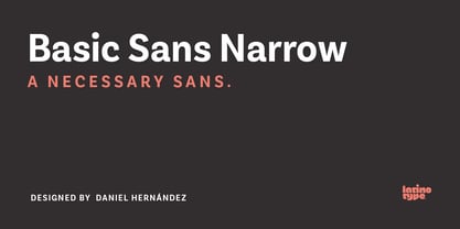 Basic Sans Narrow is a narrower version of Basic Sans. It is a family of Grotesque features with a functional, neutral and seeming clean style that looks to keep a neutral (or basic) appearance on paper, but including lots of details that give it a unique personality. Basic Sans Narrow is a sans-serif typeface well-suited for publishing projects, medium-sized text, branding, posters, headlines and more! This font family comes in 7 weights—ranging from Thin to Black—plus matching italics and it has a set of 416 characters that support 206 different languages.
 - Cerebri Sans by Hanken Design Co.,
$30.00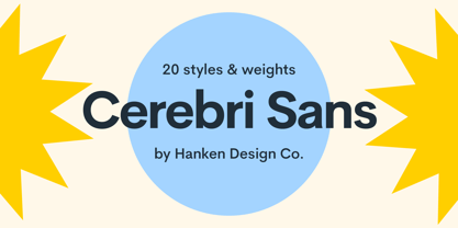 Cerebri Sans is a design inspired by early geometric and grotesque typefaces. Subtle humanist details provide an undercurrent of warmth that simmers just beneath the bones of its contemporary simplicity. Cerebri Sans’ concept involved the development of a hybrid appearance. Its soft elegance and finely-tuned legibility make it appropriate for a vast range of applications including headlines, editorials, publishing, advertising, corporate communications, white papers, educational texts, web content, and mobile applications. Cerebri Sans' multilingual support is extensive, covering Basic Latin, Western European, Euro, Baltic, Turkish, Central European, Romanian, Vietnamese, Pan African Latin, Pinyin and Igbo Onwu for global accessibility.
 - Dezen Pro by DizajnDesign,
$-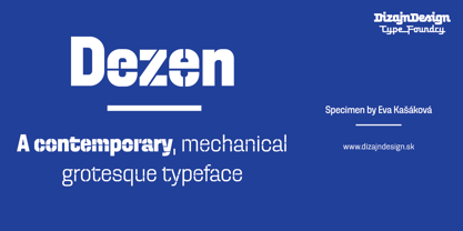 Dezen is a contemporary, mechanical grotesque typeface. Its letters were first constructed from individual modules and then optically refined to enhance its rhythm. Its tight letter spacing and narrow proportions make the typeface particularly well suited for display sizes and headlines. When you add spacing, font can be used for shorter amount of text, bigger than 12 points. The Dezen type family consists of a wide variety of styles – solid and stencil. The Dezen Pro subfamily combines all 4 styles (Solid, Stencil 01, Stencil 02, Stencil 03) in a specific sequence, which originates a “pattern” for the alphabet (or dezen, in Slovak).
 - Baradig by Asenbayu,
$15.00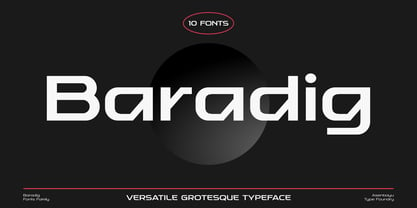 Baradig is a versatile grotesque sans serif font family. Baradig provides a unique collection of glyphs with wide spacing and strong yet subtle geometric outlines. Baradig will give you an extraordinary modern visual experience. These fonts also have alternate and ligature features which are perfect for completing various projects such as logos, brands, products, labels, websites, posters, and many more. Baradig fonts feature Open Type Format, kerning, ligature and alternate packed in 10 styles: Light, Light Italic, Regular, Italic, Medium, Medium Italic, SemiBold, Semibold Italic, Bold and Bold Italic. Baradig fonts include uppercase letters, lowercase letters, numeral, punctuation and multilingual support.
 - Realgar by Emtype Foundry,
$69.00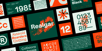 Realgar is a generic and neutral typeface but with enough personality to be different, but not as much to be unfamiliar. The name refers to an ancient natural pigment, known for its vivid orange colour. It is a multipurpose typeface in an eclectic style that combines geometric and grotesque with some humanist touches. Some of its main features are the wide proportions, closed apertures and idiosyncratic numbers that make Realgar stand out. In addition, the rounded dots convey a friendly and contemporary look. A Variable Font version is included with the family or as a separate style.
 - Dezen Solid by DizajnDesign,
$39.00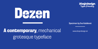 Dezen is a contemporary, mechanical grotesque typeface. Its letters were first constructed from individual modules and then optically refined to enhance its rhythm. Its tight letter spacing and narrow proportions make the typeface particularly well suited for display sizes and headlines. When you add spacing, font can be used for shorter amount of text, bigger than 12 points. Dezen type family consists of a wide variety of styles – solid and stencils. Dezen Pro subfamily combines all 4 styles (Solid, Stencil 01, Stencil 02, Stencil 03) in a specific sequence, which originates a “pattern” for the alphabet (or dezen, in Slovak).
 - Palo by TypeUnion,
$39.00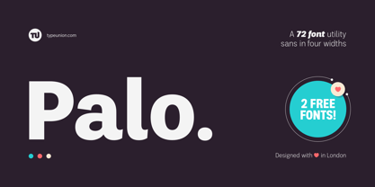 Palo is a 72 style utility type system built around 4 widths and 9 weights plus matching italics. It's semi grotesque appearance gives it a unique personality while the stylistic alternates give a true sense of flexibility and customisation. Design features within Palo are evident without being excessive. 3 stylistic sets provide a range of functional to fluid design approaches. Case sensitive punctuation & ligatures offer a professional feel. The italics have been optically adjusted to improve their weight balance and on select lower case glyphs they feature unique designs to make the italics a feature unto their own.
 - Olike Variable by Typicaltype,
$36.00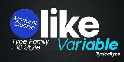 Looking for a contemporary and modern grotesque sans serif font? Look no further than Olike! This versatile font comes with 18 styles, so you can create amazing designs that look both modern and stylish. With its sans serif style, Olike is perfect for any type of project or design. You will find your way to use this family certainly. Theatre posters or party flyers, vintage t-shirt or modern web service, movie titles or magazine header and even infographic – Olike will suit you everywhere. You may use the completed styles or may use a Variable Font. To make it as you want to.
 - Olike by Typicaltype,
$20.00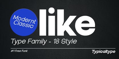 Looking for a contemporary and modern grotesque sans serif font? Look no further than Olike! This versatile font comes with 18 styles, so you can create amazing designs that look both modern and stylish. With its sans serif style, Olike is perfect for any type of project or design. You will find your way to use this family certainly. Theatre posters or party flyers, vintage t-shirt or modern web service, movie titles or magazine header and even infographic – Olike will suit you everywhere. You may use the completed styles or may use a Variable Font. To make it as you want to.
 - DT Serifia by Deveze Type,
$29.00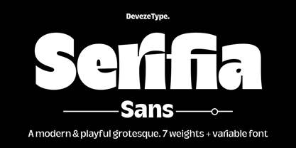 DT Serifia Sans is a modern grotesque with a playful character. The font family contains seven widths and one Variable Font. From extra thin to ultra bold, you will surely appreciate this font. Typography will take on its own mood with it. The vertical terminals give it a sense of sophistication even with all its playfulness. A wide range of weights allows using this typeface in a variety of projects, and a plethora of OpenType features will make your project look outstanding. A wonderful addition to your collection, it is perfect for branding, magazines, web, broadcasting, packaging, apparel prints, prints etc.
 - Sixties Symbols JNL by Jeff Levine,
$29.00The 1960s was the most tumultuous decade of the 20th century. Sixties Symbols JNL collects twenty-six icons and phrases from that time of change and unrest including the peace symbol, a dove, a daisy—even the militant 'power fist' that signified rebellion against mainstream society. There's also a blank lapel button on the Y/y keys and a blank protest poster on the Z/z keys for your own special message. For the more daring, the left and right brace Keys {and } have the 'one finger salute' the radical hippie factions displayed generously. Use that one with discretion! - HGB Bacco by HGB fonts,
$23.00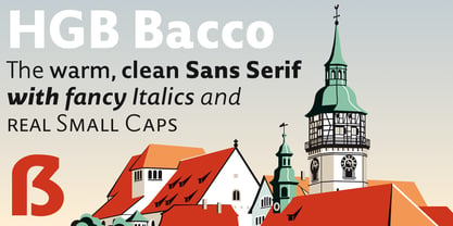 Since 2005, I have repeatedly attempted to create a neutral-looking grotesque with a humanistic character. I wanted a pleasant, soft typeface. The typeface should appear similar to Helvetica or Univers, but with more open shapes and therefore better readability. The features are deliberately reserved with 4 gradations plus italics. The onum feature for Old Style Figures contains additional alternative letters such as a looped g. The italics have a swash feature with some decorative shapes. As a sans serif, HGB Bacco does not appear to be technically constructed, but has a friendly, open character and is also suitable for longer texts.
 - Ida by ParaType,
$30.00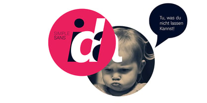 Ida is a simple and utilitarian typeface reminiscent of late 19th/early 20th Century grotesques, yet having a warm and friendly nature. Closed apertures and low contrast combined with elegant skeleton of individual characters create an impression of both rationality and comfort. Technically the font is modern and functional but still calls forth the emotion of a valve radio. Ida comes in 18 styles – 6 roman weights with companion italics and 6 narrow widths. One can also benefit from the use of small caps, alternate characters and indices. The typeface was designed by Maria Kharlamova (Selezeneva) and released by ParaType in 2017.
 - Typewalk 1915 by Typocalypse,
$39.00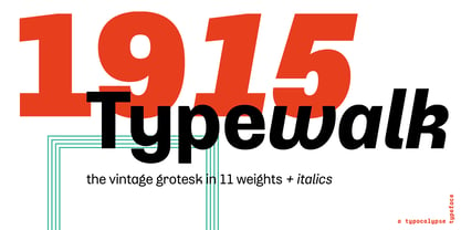 »Typewalk 1915« is a vintage and slightly quirky Grotesque branded by history. It is a homage to European sign painter and lettering traditions of the early 20th century. »Typewalk 1915« also speaks in the proto-rational and graphical language of the »Werkbund Objectivity« which was used around 1915. »Typewalk 1915« works great for cultural, editorial and branding purposes. Speaking with its unique voice, it is well-prepared and versatile for all sorts of web and print projects. »Typewalk 1915« has 11 distinct weights from thin to heavy in upright and italic. »Typewalk Mono 1915« is its fitting Monospaced Version.
 - Acherus Feral by Horizon Type,
$30.00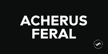 Acherus Feral is sharpened version of Acherus Grotesque. In this new version all sharp edges are flattened and rounded corners are sharpened. Alternative character "G" and optional "t" character have been added. Some of the characters like "A,K,M,N,Q,R,V,W,Z,v,w,z" have been changed completely for the stability of the typeface, in this way it looks more confident and serious. As you can see on the banners, Feral is excellent choice for many platform needs. For further information please check the pdf specimens. Behance Pdf Specimen (White) Pdf Specimen (Black)
 - Britti Sans by Nois,
$24.00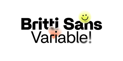 Britti Sans is a modern grotesque typeface that has geometric details and deep roots in industrial design principles. Its opentype features (alternate characters, localised characters, multilingual characters) give it greater versatility allowing it to adapt to a wide range of contexts. Among its features are contextual alternates, uppercase and lowercase localized Sharp S, numerators and denominators, a wide range of currency symbols including the Bitcoin symbol, emojis and icons, proportional and tabular numbers, fractions and circled numbers. The family has 7 styles + italics and a two-axis variable cut. Any suggestion to continue improving Britti Sans will be welcome.
 - Linked Now by Jehoo Creative,
$16.00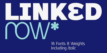 Linked Now is so named because this Typeface has Multiple Discreationary Ligatures that unite two different letters to make a striking shape. Is a powerful grotesque typeface designed to be versatile in a wide range of contexts. Having more than 50 stylish Dsicreationary Ligatures on Uppercase letters and unique Alternate on certain letters makes it seem like they have various shapes, so they are great to use as display fonts. To complete it, Linked Now typeface is equipped with 8 weights from Extralight to black and each includes italic. More than 485 glyphs on each and support most European languages .
 - Dezen Stencil 02 by DizajnDesign,
$39.00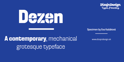 Dezen is a contemporary, mechanical grotesque typeface. Its letters were first constructed from individual modules and then optically refined to enhance its rhythm. Its tight letter spacing and narrow proportions make the typeface particularly well suited for display sizes and headlines. When you add spacing, font can be used for shorter amount of text, bigger than 12 points. Dezen type family consists of a wide variety of styles – solid and stencils. Dezen Pro subfamily combines all 4 styles (Solid, Stencil 01, Stencil 02, Stencil 03) in a specific sequence, which originates a “pattern” for the alphabet (or dezen, in Slovak).
 - Opinion Pro by Mint Type,
$35.00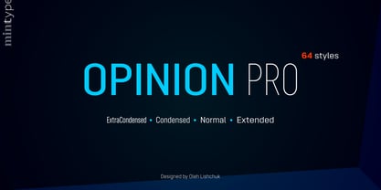 Opinion Pro is a geometric grotesque sans-serif typeface with extra-large x-height that comes in 64 styles. It is composed of 4 width variations, each in 8 weights with respective italics. Its rigid curves with pronounced vertical stems makes it useful as both display and paragraph typefaces. Also it works particularly well as a typeface for technical applications such as wayfinding or labeling of any kind. Opinion Pro features a wide range of supported languages, including all Latin-based European languages, main Cyrillic languages, plus Kazakh. The OpenType features include, among others, 4 sets of digits, small-caps, ordinals.
 - Alethia Pro by Mint Type,
$-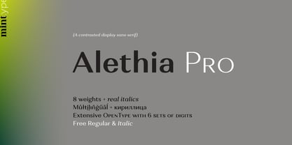 Alethia Pro is a grotesque sans-serif typeface with high contrast in all weights. It has been designed to serve as a display typeface in various editorial projects, such as magazines or corporate brochures, as a sans-serif pair to serif types of modern style. Alethia Pro comes in 8 weights + matching italics, each supporting numerous Latin-based languages as well as major Cyrillic languages. It is packed with OpenType features like ligatures, small caps, 6 sets of digits, 3 stylistic sets, superiors and inferiors, fractions, ordinals, respective punctuation varieties including all-cap punctuation, as well as language-specific alternates.
 - Typewalk Mono 1915 by Typocalypse,
$49.00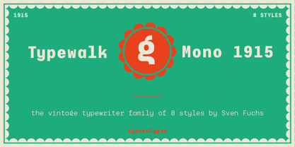 Typewalk Mono 1915, the vintage typewriter grotesque that is branded by history. It is a tribute to the European sign painter and lettering tradition of the early 20th century. Typewalk Mono 1915 also speaks in the proto-rational and graphical language of the Werkbund Objectivity which was used around 1915. It works great for cultural, editorial and branding purposes. It is versatile in small printing sizes and works great on the web. Speaking with its unique voice. Typewalk Mono 1915 is the debut release by Sven Fuchs and was designed between 2012 and 2016. It has 8 distinctive weights from thin to bold.
 - Dezen Stencil 03 by DizajnDesign,
$39.00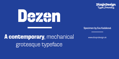 Dezen is a contemporary, mechanical grotesque typeface. Its letters were first constructed from individual modules and then optically refined to enhance its rhythm. Its tight letter spacing and narrow proportions make the typeface particularly well suited for display sizes and headlines. When you add spacing, font can be used for shorter amount of text, bigger than 12 points. Dezen type family consists of a wide variety of styles – solid and stencils. Dezen Pro subfamily combines all 4 styles (Solid, Stencil 01, Stencil 02, Stencil 03) in a specific sequence, which originates a “pattern” for the alphabet (or dezen, in Slovak).
 - Vandalismo 26 by CostaType,
$10.00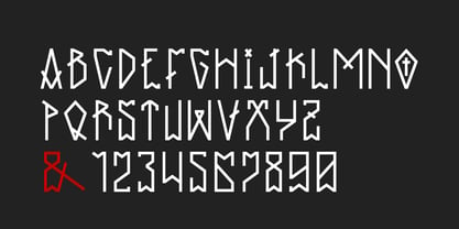 The type “Vandalismo 26” is a tribute to the calligraphy style that 'screams' over the front of the buildings in the center of São Paulo/Brazil. This underground calligraphy, known as "pichação" or "pixo”, is a movement that expresses disagreement and rejection against the system. For some critics, this “vandalism” is considered to be the most disruptive and conceptual contemporary art today. It is a type to be used in headlines. Vandalismo 26 is a mix of the chaotic pixo style representing the nonconformity of a generation. It is a protest to the system in a typographic format.
 - Triplepass by Shapovalov Fonts,
$10.00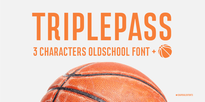 Triplepass is a narrow grotesque with 3 styles: normal, with cut corners and a stencil shape. The font has a retro character, contains both humanistic rounded designs and modern smooth alternatives. The font is suitable for logos, large headlines, posters, signs, prints, font compositions, as well as for sports-related layouts where clear numbers and space savings are needed. Triplepass contains extended Latin, Cyrillic, fractions, ligatures and two icons of a basketball. It contains OpenType features: liga, numr, dnom, calt, ss01, ss02. The font is also case sensitive, has fractions, currency signs including the rouble sign.
 - Ballasticus by Shapovalov Fonts,
$15.00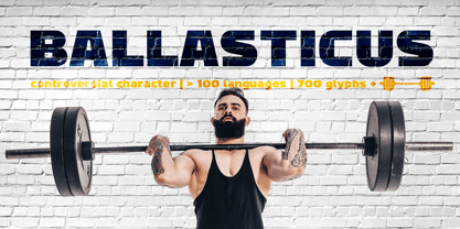 Ballasticus is a controversial bold grotesque for logos, big headlines, posters, signage, gyms, and bodybuilders. The outer contour of the beech is rounded, while the inner space is square. The font contains two barbell icons that can be immediately inserted into your company logo. The character of Ballasticus is honest, stable, open, grounded like a weight. Ballasticus contains extended Latin, Cyrillic, ligatures, barbell and peace sign, as well as alternatives for some letters, the total number of glyphs is more than 700. It contains OpenType functions: liga, numr, dnom, calt, ss01. The font is also case sensitive, has fractions, currency signs, and arrows.
 - Gradus by Brenners Template,
$19.00Gradus is a multi-purpose typeface designed to properly mix elegance and rhythm. The balance between modern and sophisticated touches and styles can achieve the effect of harmonizing well with any device and channel. The hardness of the rigid stem of the grotesque typeface is transformed into a soft touch that organically matches words and sentences. Langages. Basic Latin. Western European, Central European, South Eastern European, South American, Oceanian, Basic Cyrillic, Ukrainian OpenTypeFeatures. Standard Ligatures : fi, ff, ffi. Discretionary Ligatures : ai, ia, il, ill, illi, ma, md, mi, mu, na, nd, ni, nu. Fractions, ss01, ss02, and more. - Dezen Stencil 01 by DizajnDesign,
$39.00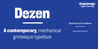 Dezen is a contemporary, mechanical grotesque typeface. Its letters were first constructed from individual modules and then optically refined to enhance its rhythm. Its tight letter spacing and narrow proportions make the typeface particularly well suited for display sizes and headlines. When you add spacing, font can be used for shorter amount of text, bigger than 12 points. Dezen type family consists of a wide variety of styles – solid and stencils. Dezen Pro subfamily combines all 4 styles (Solid, Stencil 01, Stencil 02, Stencil 03) in a specific sequence, which originates a “pattern” for the alphabet (or dezen, in Slovak).
 - OTC Eugen by Ograda Type Company SRL,
$29.00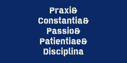 OTC Eugen is a geometric grotesque with industrial socialist aspect. It is a somewhat brute interpretation of the graphic environment and old era typography found around cities or in the country side in Romania. It works best as a display typeface used in big titles, in branding projects for clear wordmarks, or around the house where you can just go wild and make your own mark with the stencil version. Two styles: Display & Stencil. Various stylistic and contextual alternates, and a considerable amount of ligatures, arrows and more. Language support for: Basic Latin, Western, Central & Eastern European languages.
 - Kapra Neue Pro by Typoforge Studio,
$39.00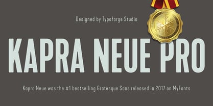 Kapra Neue Pro is a younger sister of Kapra Neue – he was the #1 bestselling Grotesque Sans released in 2017 on MyFonts and grandson of Kapra. Now you really have a lot of options to choose! New family is full of everything – 96 weights contain a wide range of instances, from Condensed to Expanded, everything with rounded corners or with sharp ones. Now, font has also: small caps, cyrillic script, and old-style figures. Kapra Neue Pro is inspired by a “You And Me Monthly” magazine, published by National Magazines Publisher RSW "Prasa” in Poland, from May 1960 till December 1973.