8,674 search results
(0.028 seconds)
- Xylo Script by Wiescher Design,
$49.50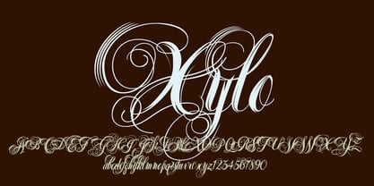 XyloScript is my first script with a woodcut look to it. Still, it is very elegant. Xylo is Greek and means “wood”. This script is another one I designed in the tradition of the 18th-century English calligrapher George Bickham and the 19th-century American calligrapher Platt Rogers Spencer. I like it, your very crafty Gert Wiescher BTW if your font manager tells you that the font is corrupted, just ignore that! This script is very complex and that’s causing some font managers to say the font is corrupted. I have tested it and it works fine!
 - Radja Wolly by Alit Design,
$19.00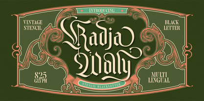 ✒️Radja Wolly✒️is a font inspired by the Blackletter typeface, made with a modern impression but still looks strong and stencil tyle. Supported by alternative options such as swash, ligature and alternative characters, making The Radja Wolly Typeface very easy to create designs with strong or vintage themes. In addition, The Radja Wolly Typeface font is also supported with multilingual characters that can be used in several international languages. The Radja Wolly Typeface is very suitable for use in making music album cover designs, tattoo logos, wishkey labels, packaging pomades and so on which are made with dark and strong concepts.
 - ITC Holistics by ITC,
$29.99Some words from the designer... Like a tree rooted in ancient philosophy with branches reaching into the new age, ITC Holistics encompasses 82 pictographs of astrology, healing, magic, nature and spirituality. In an illustration style that originates from hand-carved rubber stamps, west coast designer Teri Kahan shines new light on these timeless symbols. ITC Holistics is functional collectively and individually for graphics and logos. As with Teri's companion font ITC Connectivities, ITC Holistics can also be used as a divining tool. Just type your name in caps and lower case and see what the images tell you! - Halloween Party by Yoga Letter,
$14.00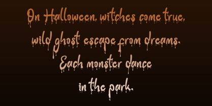 This font is named "Halloween Party". This font was intentionally made to add to the excitement of the Hallowen event that will soon arrive. This "Halloween Party" font is very scary because there is blood on it. This font is perfect for adding to the excitement and mysticism of your Halloween event. In addition to Halloween events, this font can also be used as a movie title, book title or something else that is horror, can also be used to write quote words, tell mystical things, or as a horror and mystical pickle invitation card, and others.
 - Oracul Decorative by Struvictory.art,
$16.00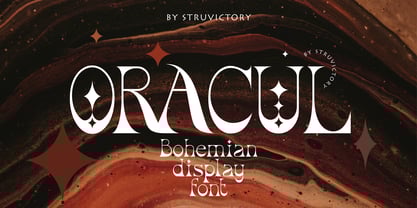 Oracul is a modern display font with Bohemian motives. The font is created in a psychedelic retro style and decorated with the stars. Oracul includes stylistic alternates and ligatures. The font is suitable for the design on the theme of astrology, mysticism, spirituality, witchcraft, magic, esotericism, fortune-telling, tarot. Oracul has extensive language support, it includes English, French, German, Italian, Spanish, Portuguese, Danish, Norwegian, Swedish, Finnish, Estonian, Turkish. Oracul font includes stylistic alternates for symbols: E, H, I, J, L, O, Q, T, U, Y. There are also ligatures: MA, RA, KA, XA, AA, AM, RM, OO.
 - Fully Automatic by Hanoded,
$15.00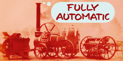 I raise chickens for eggs and meat. I usually buy fertilised eggs online and place them in my incubator, which says that it is 'fully automatic'. Of course I added that rather random introduction to tell you how I came up with the name for this new font... Fully Automatic is a handmade cartoon font: I used a sharpie pen to draw the glyphs onto rough paper. The result is a wobbly, yet quite clean cartoon font. Fully automatic comes with extensive language support and two sets of alternates for the lower case glyphs that cycle as you type.
 - Rastely by Craft Supply Co,
$20.00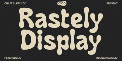 Unleash Your Joy with Rastely Dive into the fun with Rastely – Funky Typeface. It’s a joyful escape, perfect for creative minds. Inspired by psychedelic vibes, this font keeps it chill. Its playful curves promise a good time. Every letter brings a smile, designed for fun at first sight. Playful to the Core Rastely isn’t just a font; it’s a party invitation. Crafted with a relaxed approach, it’s easy-going yet bold. Let each character tell a story of cheer. Imagine your projects with a touch of whimsy. Moreover, its easy legibility makes it perfect for all ages.
 - Tough Talk by Comicraft,
$29.00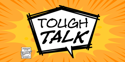 What's that, bub? Looking for a whole train full of whupass? A six pack of adamantium shred? Listen, are you talking to me or chewing a brick? Either way you're gonna get all your teeth broken. And if you think that's all just Tough Talk, make your move, bub. (Our new font, ToughTalk, put the words in Wolverine's mouth in the pages of Steve Skroce's WOLVERINE: BLOOD DEBT, but don't tell the short Canadian over there, he's likely to get upset at the mere suggestion that people put words in his --) What? No, I didn't, uh, say you were -- ulp -- short...
 - Bobbi Bee by Baseline Fonts,
$39.00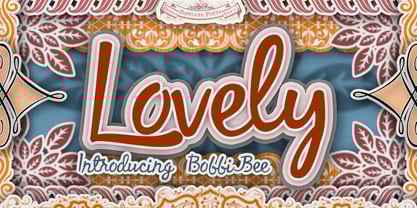 Bobbi Bee won't stop popping her bubblegum, even though that's not very ladylike. Bobbi Bee is very proud of all of her 361 numbers, letters and alternates - all of which are chock full of summer sunshine and life. The font comes in a single weight (because she's perfect just the way she is.) She's cut out for a very special book title, logotype, or love letter. Keep Bobbi's hand firmly in yours in shopping malls, as she tends to get distracted and wander, and though it's hard, always remember to tell her how smart she is, as well as how beautiful.
 - Tartufo by Hanoded,
$15.00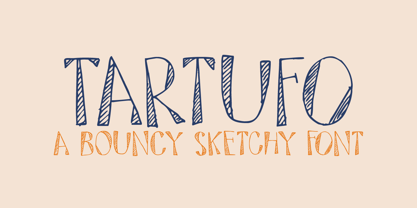 A Tartufo is a truffle in Italian. I have to admit, I have never eaten one, so I couldn’t really tell you if they’re any good. I suppose they are, but you’ll have to find that out for yourselves! Tartufo font is a bit of a weird font. It was hand made with a rollerball pen on some very expensive French paper. As I was drawing each glyph, I figured I might as well include Cyrillic and Greek. Tartufo is not a text font - I’d use it for packaging, posters, book covers and T-shirts. Comes with a whole bunch of diacritics!
 - Maiolica by Struvictory.art,
$14.00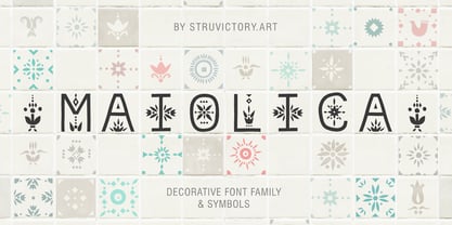 We would like to introduce a new font Maiolica. We were inspired by Italian ceramics and floral patterns on square tiles. We decorated the empty space of letters with geometric patterns. That's how this font turned out! Maiolica typeface includes three fonts: Decorative, Inline, Symbol. Mix and match them to get interesting design. The font is suitable for menu design, wedding invitations and cards, craft products branding and packaging (ceramics, floristics, soap making, natural cosmetics ect). You can create trendy lettering posters for your social media, photo overlays, printing clothes. Also use individual letters and symbols to create logos and monograms.
 - Brimley by Chank,
$49.00This slinky number will seduce you with its linking letters and special ligatures. Brimley's strokes are tight and sharp, and its characters are tied together with slender, whispy hooks. Although its elegance is timeless, this is a style that typifies lettering of last century's late '50s and early '60s. Chank Co. intern Tim Drabandt created Brimley with inspiration from antique type books. He named the font after Wilford Brimley. You know... the chubby old guy who tells you to check your blood sugar and eat your Grape Nuts and Quaker Oats. Haven't you ever seen Cocoon? - Aztech by Comicraft,
$29.00Was God an Ancient Astronaut? Are crop circles signposts for UFOs? Are we or are we not alone? Do you Want To Believe? We have No Idea. Nevertheless, we've put together a rather attractive little typeface -- by the name of Aztech -- which will undoubtedly add fuel to speculation vis-a-vis the existence (or non-existence) of Extra Terrestrial Intelligence. Yes, in our ongoing quest to spread enlightenment and dispel anxiety throughout the universe, we've created a font which will allow you to enjoy the concept of Alien Intervention without the embarrassment and discomfort of anal probing. Tell your friends. - Ultimatum by Comicraft,
$19.00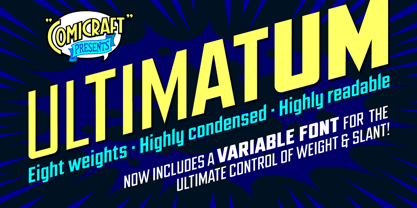 FINALLY! We’re telling you for The Last Time! This is not a Threat! This is not a Negotiation! Refusal to cooperate with the terms of this font will be considered an Act of War! There can be no Dispute! The Crisp, Sharp hooks and corners of this typeface are Not To Be Reasoned With! Gosh Darn it, we have grown tired of asking and this is merely a formality precedent to the outbreak of hostilities. It’s a little corporate, it’s a little bureaucratic, but our lawyers insisted that we propose a settlement of compromise. Ipso Facto.
 - Anthracite by Fabulous Rice,
$15.00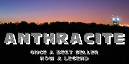 A title is something strong. Something that leaves its mark through time, in the memories and in the hearts. A title tells things about the content, its purpose, its meaning, its point. For your needs in strong titlecase letters comes Anthracite. Looking almost like they were carved out of raw wood in the 1820s, the letters of Anthracite will not only imprint well but they will also impress. Its carving gives a feeling of relief, or shades, of textures that will be unique every time you use it. The perfect font if you want to stand out and be read.
 - Clephons by Zamjump,
$13.00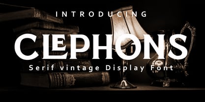 Introducing, Clephons is a captivating serif display font that exudes timeless elegance. Crafted as an all-capital typeface, this font is a homage to vintage letterforms, blending classic charm with a touch of modern sophistication. Perfectly tailored for branding, headlines, logos, and designs with a classic or vintage theme, Clephons effortlessly captures the essence of a bygone era. Its distinctive serifs and refined details make it a versatile choice for projects that demand a touch of retro flair. Elevate your designs with Clephons, where every character tells a story of refined aesthetics and enduring style. **Uppercase
 - TT Rationalist by TypeType,
$39.00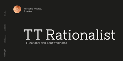 Please note! If you need OTF versions of the fonts, just email us at commercial@typetype.org TT Rationalist useful links: Specimen | Graphic presentation | Customization options We thought, "What if we provide the user with a collection of matching fonts, each of which would still be unique?"—and so we started developing TT Rationalist. For those familiar with the bestsellers TT Norms® Pro and TT Commons Pro, the new font will be intuitive to use. It has similar proportions, characteristics and functionality, but yet it is an independent and original font family. Unlike the geometric sans serifs TT Norms® Pro and TT Commons Pro, TT Rationalist is a slab serif typeface. It is functional and original. Slabs are characterized by massive rectangular serifs, but in TT Rationalist they are trapezoidal and refined, which makes them look modern. Speaking of modernity, when creating the typeface, we wanted to avoid the excessive historicism that can be seen in many slab serif fonts. We have been particularly careful working on the Black style, which in the first sketches had something in common with the Wild West posters. When we balanced out the excessive contrast caused by visual compensation, the font stopped evoking retro associations. Now TT Rationalist Black is perfect for headlines, especially on posters and posters, and works great with Light styles in TT Norms® Pro and TT Commons Pro. The new typeface works well for both headings and text arrays. It looks especially aesthetically pleasing in printed production (books, magazines, brochures). The TT Rationalist typeface consists of 22 two styles: 10 upright, 10 real Italics and two variable fonts, each with over 950 glyphs. It supports over 200 languages and contains 27 OpenType features. In addition to the standard ones, there are Small Capitals for Latin and Cyrillic languages, alternative versions of the ampersand and the letter g. The italics have two stylistic sets allowing to switch the design of style-forming characters (k, v, w, y, z) between italic and classical forms. TT Rationalist font field guide including best practices, font pairings and alternatives. FOLLOW US: Instagram | Facebook | Website
 - Karloff, a captivating typeface that intriguingly merges the realms of beauty and ugliness into a harmonious dichotomy, is an exploration of the fine line where contradictory design philosophies inte...
- Syntho by Gspr one,
$5.00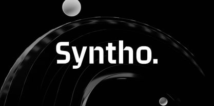 Syntho is a modular typeface with 18 variants and a Variable Font. Its structure is geometric and modular, but its proportions resemble those of classic grotesque typefaces, giving it a familiar feel to the designer. It also includes two subfamilies, 200 and 300, which are expansions of the typeface in width, providing greater possibilities for the designer in any project.
 - Arial by Monotype,
$45.99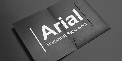 Arial is one of the most widely used designs of the last 30 years. Drawn in 1982 by Robin Nicholas and Patricia Saunders for use in an early IBM® laser printer, Arial has become a staple for textual content. While it is widely believed that Arial's design was based on Helvetica, it is more accurate to consider Monotype Grotesque as its ancestor.
 - Jealous Radio by Bogstav,
$14.00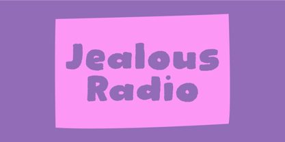 Each letter is handmade and drawn with a “blobbly” pen, leaving a wobbly and grungyline. The corners are rounded which adds a blurry look to the rough lines. All in all, Jealous Radio is kind-looking,soft, yet rough and really organic looking! Useful for a wide range of things: from kids products, comics, posters, invitations or even protest banners!
 - Hybi12 Arome by Hybi-Types,
$12.50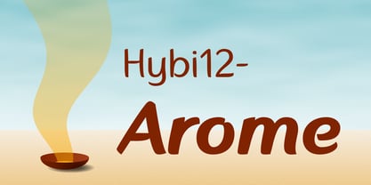 The Hybi12-Arome is another crossover font family with characteristics of Grotesque and Brushscript. It’s friendly and charming look is built out of geometrical and free-hand details. The fonts are offering a huge character set for usage in many languages. Also thousands of kerning pairs within each style are obligatory. Hybi12-Arome is perfectly suitable for advertising, posters and private printings.
 - 02-Feb by Kosinsky,
$20.00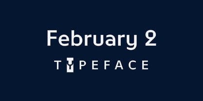 The February 2 font was developed on the experimental principle of constructing grotesques. The font combines the contrast between an oval and a rounded rectangle. The developed modular style adds a dynamic character to it. It is ideal for many projects where expressive text is required. Supports extended Latin and Cyrillic. The font was created in 2019. Type designer - Igor Kosinsky.
 - Santi by Latinotype,
$39.00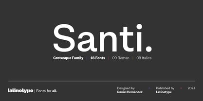 Santi, our new grotesque font offers 9 weight variants along with their corresponding italics. This typeface perfectly blends a classic character with sublime modern touches, creating a striking aesthetic without resorting to fanfare. Santi's versatility transcends current trends and gives it a timeless quality. This typeface blends effortlessly into classic or contemporary projects, offering a perfect balance between the familiar and the innovative.
 - Closer Text by Mint Type,
$35.00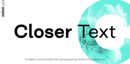 Closer Text is a narrower, more compact version of previously released Closer. Closer Text is a highly customizable Swiss grotesque with overclosed aperture. Featuring some humanistic shapes, Closer Text feels less bland though still relatively neutral. Closer Text comes in 9 weights (18 styles altogether), features extensive language support including Cyrillic and is highly customizable with 7 stylistic sets to mix and match.
 - Eurydome by Emboss,
$30.00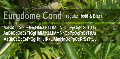 Eurydome is one of Jupiter's many moons, and was named after Eurydome, the mother of the Graces in Greek mythology. Eurydome was inspired by the Grotesque face Venus, with an additional flair added to the lowercase a, b, d and g. Eurydome was designed to complement any display face that may be used in your project. Add grace to your layout, with Eurydome.
 - Vinkel by Typolar,
$72.00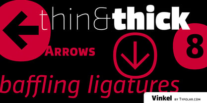 Composed, clean and slightly angular, as its name says. It's organic, warm and round in the right places too. A sanserif typeface family Vinkel is a handsome androgyne with an excellent balance of Neo-grotesque and Humanist DNA. Vinkel comes in eight weights from Thin to Extra Black, all with italics, small caps, several sets of numerals, arrows, alternate characters, and more.
 - Artime by John Moore Type Foundry,
$14.95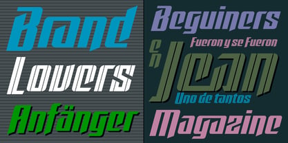 Artime is a dynamic display font based on strong graphic elements with rectilinear forms. Artime came in two style forms; a solid one called Flat and a decorative form with crisscrossed of vertical lines called Deco. Artime comes with Open Type features and interesting ligatures. Both forms are ideal for creating logos and headlines.
 - Salvatore by W Type Foundry,
$25.00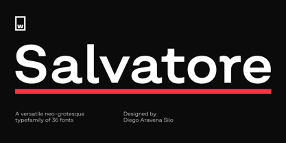 Salvatore is the neo-grotesque younger brother of Nutmeg type family. It comes with 36 weights that have been separated in two flavours. The first half is Salvatore normal, which has more neutral features; and the second one is Salvatore Roman, which has more versatility at the end of the characters. The name comes from the Mad Men character Salvatore Romano, who was a publisher in the mid 60s. In that period, grotesques typefaces ruled advertising, nevertheless, there wasn't a typeface that represented publishers as Salvatore Romano, that’s why we gave birth to this project. Designed with powerful OpenType features in mind, each weight includes alternate characters, ligatures, fractions, special numbers, arrows, extended language support and many more… Perfectly suited for graphic design and any display/text use. The 36 fonts are the first part of a larger Salvatore family. We’re proud to introduce: Salvatore.
 - Unitext by Monotype,
$50.99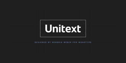 Created with the needs of branding design in mind, Jan Hendrik Weber's Unitext is a crisp, clean typeface that functions well across print and online use. It blends humanist and grotesque qualities, adopting a style that the designer describes as “neo grotesque”. Narrow spacing is what sets this typeface apart, however it also uses open counters and angled details to boost readability. “The ideal font should work at every touchpoint,” says Weber. “And designers shouldn’t need an introduction or a set of rules on how to handle this typeface. Unitext allows designers to work without explanation.” The Unitext family includes 7 weights, spread across 14 fonts with extensive Western, Central and Eastern European language support. Unitext Variables are font files which are featuring one axis and have 14 names instances: Hairline, Hairline Italic, Extralight, Extralight Italic, Light, Light Italic, Regular, Italic, Semibold, Semibold Italic, Bold, Bold Italic, Black, Black Italic
 - Lost and Foundry by Fontsmith,
$15.00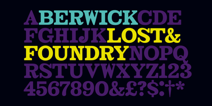 Breaking the cycle of homelessness We are partnered with The House of St. Barnabas, a private members club in Soho Square, whose work as a not for profit charity aims to break the cycle of homelessness in London. Each purchase (of the family pack) comes with a one month membership to The House and 100% of the proceeds from sales of fonts go directly to the charity to help their essential work. This unique collection of 7 typefaces is based on the disappearing signs of Soho, at risk of being lost forever due to the ever changing landscape of the area. By re-imaging the signage as complete fonts, we have rescued this rich visual history from the streets and present the typefaces into a contemporary context for a bright optimistic future. FS Berwick Thanks to its humble tiled origins, this Egyptian serif type maintains a uniform character width, creating the irregular letter proportions found in the final alphabet. Broad-shouldered, the bracketed serifs firmly ground the font, whilst its extreme hairlines become a necessity due to the uniform width. Of note is the upside down ‘S’, to be found on the original sign on Berwick Street. Perhaps due to its ceramic origins, there is a surprising ‘slippiness’ to its final appearance. FS Cattle Cattle & Son is best described as a wide, but not overly extended, grotesque-style sans serif, showing a uniform width and carrying a robust strength to its form. Whilst lightly functional overall, the purposeful diagonal legs of the ‘K’, ‘R’ and the tail of the ‘Q’ add an urgency to its appearance. The reduced size of the ampersand gives away Cattle & Son’s hand-painted origins, and the oblique compacted ‘LTD’ found on the original sign is also included in the final set. This beautiful sign is tucked away under an arch in Portland Mews, sheltering from the weather. Perhaps this is why it has lasted so long. FS Century This somewhat elongated set of Roman capitals was originally rendered in paint circa 1940, but its roots trace back to the Trajan Column in Rome. Witness the slightly unbalanced ‘W’ and the painter’s hand is revealed. Century’s flared serif style is extremely short, sharp and bracketed. The ‘M’ is splayed and has no top serifs. Century has a uniform appearance of width, probably due to its sign-written origins. Yet is elegant, classic and exudes sophistication. FS Charity A true Tuscan letterform, the original is located on The House of St. Barnabas in ceramic tiles and was revealed in all its broken glory in 2014. FS Charity retains the option of using these incorrect characters (try typing lowercase in the test drive above and compare with the more uniform uppercase characters). FS Charity features fishtailed terminals on its strokes, a curious branched ‘T’ and the ‘S’ displays tear-drop ends to its serifs. Almost uniform in width, the ‘A’, ‘M’ and ‘W’ are the widest characters in this set. FS Marlborough The elongated Marlborough features diagonal terminals to some characters and numerals. Also retained is the space-saving contracted ‘T’ glyph from the original sign, while the ‘R’ features a distinctive wedge-shaped leg. Highly individual in this form, similar signage appears around Soho, but featuring a variety of widths in their design. FS Portland The sister type to Cattle & Son, Portland is oblique rather than italic. The serifs are not overly long, yet still enhance its rather rigid cap height and baseline appearance. Its ‘A’ has a top serif, the ‘M’ is square and the ‘G’ foregoes any spur. Particularly delightful is the open ampersand. Numerals align to encourage the horizontal flavour of the oblique style. Overall, Portland is both confident and graceful. FS St James A lineal Continental style, St James also displays a true sense of ‘Londoness’ in its titling form, perhaps influenced by early Underground signage. Irregular letterforms display a continental flavour, particularly evident in its Deco style ‘W’, ampersand and numerals. The rather high cross bar in the ‘A’ is also reflected in the raised middle strokes of the ‘M’. Noteworthy are the distinctive unions found on all of the characters and the additional small caps. The original lettering is still located on Greek St.
 - Elisetta by Sudtipos,
$39.00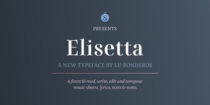 Musical notes and letterforms, silences and white spaces, pentagrams and lines, music and writing have much in common and go beyond time, cultures, styles and locations. This new typeface emerges from the blend between the lyrics and the harmony, rhythm, femininity and luminosity of the traditional musical forms. It`s not about blues or rock, tango or salsa, instead it recovers the neoclassical characteristics of the current musical notation system and revitalize the essence of its signs. Taking care of both the function and the form, Elisetta has been specially designed for the writing of texts and musical sheets considering all its elements and communication needs. This source of inspiration also makes the font really good for extensive texts, since its design is based on situations that require high line performance, great readability and high aesthetic coherence. With 5 variables that vary in weight and style, the typography gathers asymmetry and organic nature in vertical structure, narrow horizontal proportions, high x height and extreme contrast between black and white. Elisetta Book has been created for the writing of clear texts and long lines composed in small sizes inside and outside the pentagram; Elisetta Italic intensifies the organic nature of the musical keys by offering softer signs, contextual alternates and initial caps; finally, Elisetta Display increase and emphasize the contrast between vertical stems and horizontal lines to highlight short texts and titles. For those who love music and for those who like romantic forms, this typography has a lot to offer: Elisetta is the best option to write light words with style, compose clear and rhythmic lines and read comfortable paragraphs with high performance. You can tell everybody this is your font, how wonderful life is while you're in the world! * This typeface was originally designed and supervised as «Elisa», the main project of the Master in Typography at University of Buenos Aires, Argentina.
 - Rufina STD by TipoType,
$13.00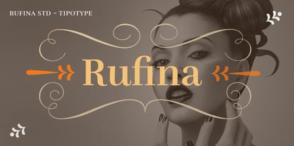 Rufina was as tall and thin as a reed. Elegant but with that distance that well-defined forms seem to impose. Her voice, however, was sweeter, closer, and when she spoke her name, like a slow whisper, one felt like what she had come to say could be read in her image. Rufina's story can only be told through a detour because her origin does not coincide with her birth. Rufina was born on a Sunday afternoon while her father was drawing black letters on a white background, and her mother was trying to join those same letters to form words that could tell a story. But her origin goes much further back, and that is why she is pierced by a story that precedes her, even though it is not her own. Maybe her origin can be traced back to that autumn night in which that tall man with that distant demeanor ran into that woman with that sweet smile and elegant aspect. He looked at her in such a way that he was trapped by that gaze, even though they found no words to say to each other, and they stayed in silence. Somehow, some words leaked into that gaze because since that moment they were never apart again. Later, after they started talking, projects started coming up and then coexistence and arguments, routines and mismatches. But in that chaos of crossed words in their life together, something was stable through the silence of the gazes. In those gazes, the silent words sustained that indescribable love that they didn't even try to understand. And in one of those silences, Rufina appeared, when that man told that woman that he needed a text to try out his new font, and she saw him look at her with that same fascination of the first time, and she started to write something with those forms that he was giving her as a gift. Rufina was as tall and thin as a reed, wrote her mother when Rufina was born.
 - Hagrid by Zetafonts,
$39.00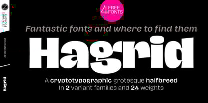 Crypto-typography - the passion for unknown, weird and unusual character shapes - is a disease commonly affecting type designers. Cosimo Lorenzo Pancini has celebrated it in this typeface family, aptly named Hagrid after the half-blood giant with a passion for cryptozoology described by R. K. Rowling in her Harry Potter books. Extreme optical corrections, calligraphic counter-spaces, inverted contrast, over-the-top overshoots: all the inventions that abound in vernacular and experimental typography have been lovingly collected in this mongrel sans serif family, carefully balancing quirky solutions and solid grotesque design. Hagrid is a typeface designed for editorial & display use, bringing dynamism to the printed and digital page thanks to its extreme contrast and unique details. It has been developed in a range of six display weights ranging from the monolinear and more traditional thin to the expressive heavy weight. For better readability in small sizes and on the web, a companion text family has been developed, with a slightly different selection of weights, wider metrics, and fine adjustments to keep the dynamic expressivity of the design without sacrificing legibility. This is evident in the design of italics: while the display italics sport a cursive feel with calligraphic terminals to lowercase letters, the text design is more restrained, with a more classical geometric grotesque slanted look. Given the crypto-typographer love for foreign specimens of letters, special care has been put into making Hagrid ready for multilingual projects, giving it an extended character sets covering over two hundred languages that use Latin, Cyrillic and Arabic alphabets and adding a selected range of OpenType features to handle alternate forms and stylistic sets.
 - Double Geometry by Zefrar,
$9.99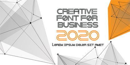 Double Geometry is designed using 2 lines to form a geometric style, inspired from geometry theme and forms.
 - Code Next by Fontfabric,
$39.00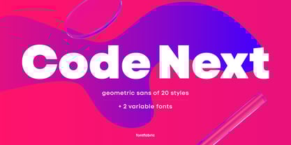 10 years later, one of the first geometric typefaces in our portfolio and a popular favorite of yours is rising to a whole new level! We’re revealing the stand-alone type family Code Next—a staggering evolution from Code Pro in functionality, versatility, and application. The transformation includes 6 new weights, 10 new Italics, full support of Extended Cyrillic and Greek, full redesign and glyphs refinement, 2 variable fonts, to name but a few. Going back to 2011, the grotesque-inspired Code Pro was designed to complement memorable pieces that make a statement. Balancing between stylization and simplification, it was encoded with the distinct voice of basic organic shapes to stand the test of time. Little did we know, it would expand and live up to the potential of a “font from the future” as the new Code Next. Today, a type family of 22 styles, this geometric sans solidifies its relevance and carries a strong constructive aesthetic through simplified forms with a twist. These fit any modern design in print, web, and display visualization. Developed to go above and beyond, Code Next comes prepared for multi-script projects with Extended Latin, Extended Cyrillic, and Greek. Explore Code Next’s versatility and switch things up with the help of 2 variable fonts, more than 1280 glyphs, and an extensive OpenType features set including small caps, standard and discretionary ligatures, contextual and stylistic alternates, stylistic sets, case sensitive forms, and much more. Overview: • Font family of 22 fonts • 10 weights • Languages - Full support of Extended Latin; Extended Cyrillic; Greek • Entirely refined design and metrics • Glyph count - 1288 • Variable fonts - 2 fonts OpenType features: • Small Caps • Standard Ligatures • Discretionary Ligatures • Contextual Alternates • Stylistic Alternates • Stylistic Sets • Case-Sensitive Forms • Ordinals • Localized Forms • Lining Figures • Proportional Figures • Tabular Figures • Oldstyle Figures • Subscripts • Scientific Inferiors • Superscripts • Numerators and Denominators • Fractions • Roman figures • Extensive mathematical support • Navigation symbols
 - Rational by René Bieder,
$39.00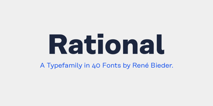 Rational is a contemporary representative of the Grotesk genre inspired by drawings dating back to the early 20th century. It is a highly utilitarian family focusing on clarity and simplicity by approaching the design with a strong modernist fused attitude. Rooted in Swiss traditional and pragmatic design, Rational contains ingredients like horizontal terminals and uniform widths which result in a highly functional and flexible font. This is juxtaposed with circular and subtle calligraphic elements creating a warm and approachable layer within an objective surrounding. With more than 800 glyphs per font, the family is optimized for numerous scenarios. It comes in 10 weights with matching italics containing opentype features like small caps, stylistic sets, case sensitive shapes, tabular figures and many more, making Rational the perfect choice for modern, contemporary and professional typography.
 - Romanovsky by ParaType,
$30.00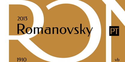 Romanovsky is the font developed on the base of samples from the catalogue of Osip Lehman foundry in Sankt Petersburg. Original Latin design that was used for Romanovsky can be found in Feder Grotesk by Jacob Erbar. The current digital font is not a scanned version of Lehman’s samples but a newly drawn typeface that differs from the original in many details. Romanovsky is a sans serif typeface with narrow proportions and noticeable contrast. It will be good for headings and display matters. Character set covers languages of Western and Central Europe and Cyrillic-based languages. It also contains around 20 ligatures of uppercase letters for the most frequent combinations. Designed by Vasily Biryukov. The bold weight was developed together with Olexa Volochay. Released by ParaType in 2013.
 - Hando Soft by Eko Bimantara,
$24.00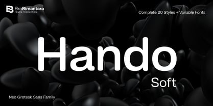 Hando Soft is a variant of Hando neo grotesk sans family. Each letter on Hando Soft has curve strokes end, which gives a soft and more ease-looking letterforms. Hando offers a wide range of usage possibilities. It's low x-height and variety of light size options make it a good choice for reading, it's tenuous white spaces in the counter letterforms make it legible enough to be recognized remotely. It's curved tensions on the circular letterforms gave a futuristic impression. It's sleek and simple strokes make it perfect for a broad range design purposes. Hando consists of 10 styles from Hairline to Black with each matching oblique. Contains more than 440 glyphs that support a broad latin language. Also some Opentype features e.g. stylistic alternates, variation of figures, e.t.c
 - Citizen Kern by Pierre Tur,
$9.00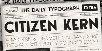 Citizen Kern is a modern, geometrical grotesk typeface. It comes in 5 different styles and opentype features for a better use of typography: it’s good for both headlines and body copy. It was made from the simplest geometrical shapes for a universal appearance, with enhanced overlaps to ensure an offbeat look. Citizen Kern is meant to work for any graphic project. You can use it for branding, editorial design, signage or even motion design : its simple shapes make it super easy to animate. Do you love the classic sans serif fonts? We all do. But what if you could add some singularity to your projects? Then Citizen Kern is the ideal pick for you. It will never be as perfect as the classics but will definitely offer an alternative, and freshness to your work.