8,674 search results
(0.023 seconds)
- 1066 Hastings by GLC,
$38.00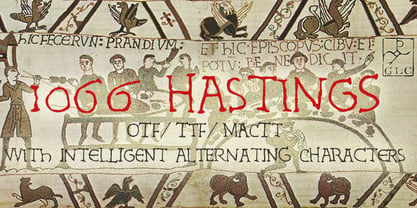 In 1066, William, duke of Normandy, was invading England. He was demanding the crown for himself, against King Harold the Saxon. He killed Harold and reached the crown at Hastings, the well-known battlefield. A few years later, in Bayeux (Normandy, French)was displayed a large tapestry (almost 70 m long) who was telling the story of the conquest. Along the tapestry was written a comment in Latin, using Roman capitals influenced a little by English or Scandinavian style (as it is visible in the Eth character). We have created the font, inspired from this design, adapted for contemporary users, making difference between U and V, I and J, which has not any relevance for ancient Latin scribes, and naturally with Thorn, Oslash, Lslash... and usual accented characters did not exist at the time. We also have reconstructed the K, German double s and Z, always using patterns of the time. We have scrupulously respected the poetic irregular and distressed original forms with two or three alternate for each characters, including reconstructed numerals.
 - Allrounder Monument by Identity Letters,
$22.00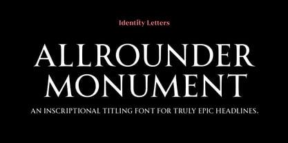 An inscriptional titling font for truly epic headlines. Allrounder Monument is an inscriptional, dignified member of the Allrounder superfamily. This all-caps typeface with delicate serifs was inspired by ancient inscriptions on columns, monuments, and buildings in Rome: letters as old as two millennia that radiate their own classic charm. Allrounder Monument picks up this atmosphere in order to create a typographic tool that lives up to contemporary demands. It infuses today’s designs with a hint of history and an air of exclusivity. Allrounder Monument is a timeless titling typeface. You might use it for posters, magazines, book covers, greeting cards, advertising or packaging work, and even signage. If you want an even more spectacular and exciting headline or title, additional Discretionary Ligatures and a Stylistic Set provide the necessary OpenType power to achieve this goal with ease. As Allrounder Monument is a part of the Allrounder superfamily, you can combine the three weights Book, Regular and Medium with the corresponding weights of Allrounder Grotesk. The Allrounder superfamily is a series of typefaces sharing the same color and horizontal metrics (cap height, small cap height and x-height): a typesetting system whose components match each other perfectly. Any other part of this design kit, e. g., Allrounder Grotesk or Allrounder Antiqua, may be easily combined with Allrounder Monument. Whenever you need a truly epic headline, Allrounder Monument is the best horse in your barn. Ad astra!
 - Paverify by Esintype,
$14.00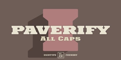 Paverify is an all-caps geometric slab serif display face inspired by a particular pavement tile component which is evoking a blocky “I” letter. All other characters were interpreted based on its look and drawn accordingly. There are three uppercase Roman fonts in different weights and widths substantially. With the additional versions, type family consisting of 7 fonts in total. Over 220 Latin, Cyrillic and Greek script languages supported. Each font contains an extensive multilingual support with more than 1600 glyphs and OpenType features, including number forms, fractions, and stylistic alternate sets those provide different looks by the typographic preferences. For the lowercase letters there are small caps variants, i.e., shorter caps. These also have identical glyphs and matching marks to enable “Small Capitals From Capitals” feature. Narrower Medium and Bold styles was produced to accompany the Black first design. Paverify comes with an ornaments font named as “Extras”, which contains geometric graphical elements, i.e., paver stone patterns, banner/sticker background sets, star comps and a collection of catchwords to simplify creating feature rich layouts. As is known as interlocking paver in certain regions — a rectangular shape with the distinctive diagonal tabs — transcribing the simplest letter to draw into the whole alphabet was a challenging task. Not only it was the single thing that can be used as a source, considering its thick form in roughly 1.2:1 proportions compared to the sophistication of letterforms was the challenge. Starting point was keeping design consistent while both avoiding and preserving a particular appearance to achieve a similar texture, basically a repeating pattern on the streets. In contrary of a traditional approach, Paverify tend to have more contrast than the other slab serifs which helps to reduce massive stem weight of the source form. This look contributes to its hand painted sign effect achieved in a certain degree, which may otherwise impractical to transform because the source material is an inorganic, static form by definition. Tight and even spacing of the pavement tiles was inspirational for the kerning balance of the letters. Although the lighter weights have more space between the letter pairs, black weight adjusted as to be close to each other as the original grid. Tight spacing can be ignored by using Capital Spacing OpenType feature for the Outline versions as layer fonts. In one stroke, this gives an extra space between the letters to avoid diagonal armed letter terminals overlap. Black typographic colour and texture gives a sturdy appearance to the lines, it is useful for the projects where a robust display faces preferred for the titling, strong headlines, letter stacks, dropcaps, initials, short names on materials such as advertisements, book covers, posters, logotypes, wordmarks, package designs, and more in print or digital. Paverify can be paired as a complimentary face in a combination with broader type systems, where vintage look compositions and woodcut style fusions requiring an extra stunning texture.
 - Eirene Sans by Tomtype,
$4.90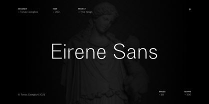 Eirene Sans is a sans serif type family inspired by grotesque typefaces with some humanistic characteristics. Simple, modern, and functional are the principal features of this type family; the uppercase glyphs present a sophisticated personality. There are 5 weights available and matching italics. It is a bit more condensed than normal width and the difference between thin and thick stems and the unique terminals make the type family have this humanistic personality. It has rounded forms in some letterforms and special characters (i, j, ., :, etc.), humanistic terminals, and very thin ink traps. Eirene Sans is perfect for digital and non-digital designs; it can be used in magazine titles, logo designs, packaging designs, and web designs. Features: 5 weights and matching italics Opentype features Arrow set Stylistic alternates (ft) Stylistic changes in italics Fractions Subscripts Inferior and superior numbers Language support (Latin extended)
 - Luzern by Gumpita Rahayu,
$- Inspired by the most common grotesque heights and boxed sans serif typefaces, Luzern Typefaces was built with low-mid contrast sans serif and was designed in quite tall caps height and lower x-height which represents the flavor of the dynamic typefaces and is subtle for the display typefaces. The typefaces comes with five weights, from light to extra bold, plus matching italics in each weights. And Luzern Typefaces is loaded with OpenType features such as some stylistic alternates in uppercase, case-sensitive forms, fractions, and another numerals features such as super and subscript characters, tabular figures, numerator-denominator, etc. It’s highly usable for display text titles such as editorial magazine headline, websites heading, poster, advertising, logo, also it works well for medium body text. It comes with more 400+ glyph support including more latin european diacritics language.
 - Uni Sans by Fontfabric,
$29.00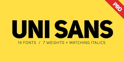 Important! There is a whole new redesigned version (remake) of Uni Sans called Uni Neue . The Uni Sans font family includes 14 weights - seven uprights with seven italics. It is characterized by excellent legibility in both - web & print design areas, well-finished geometric designs, optimized kerning, excellent web-font performance and legibility etc. Inspired by the classic grotesque strong typefaces like DIN and Dax - Uni Sans has his own unique style in expressed perfect softened geometric forms. The font family is most suitable for headlines of all sizes, as well as for text blocks that come in both maximum and minimum variations. Uni Sans font styles are applicable for any type of graphic design in web, print, motion graphics etc and perfect for t-shirts and other items like posters, logos. PDF Specimen also available - click here .
 - Union Station by Matteson Typographics,
$19.95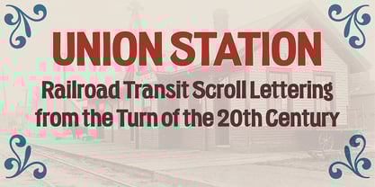 Union Station is based on the transit scroll lettering displayed in Denver’s Union Station. The letter shapes are reminiscent of grotesque sans serif typefaces of the same era with quirky details left by the artist’s brush. The typeface gives a sense of rugged Americana and a handcrafted spirit.
 - Drab by Pesotsky Victor,
$12.00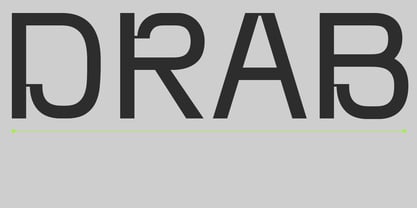 Drab is a neutral grotesque, but with decorative elements. Suitable for texts and titles. When you do not need a strong accidental but a boring set, Drab is also not suitable. Drab supportsBasic Latin, Cyrillic and more than 100 languages all together. The font was designed by Viktor Pesotsky.
 - MD Pen by Margarita Dyakovich,
$12.00 MD pen is a unique handwritten sans serif font family ( based on MD Grotesque) with a feel of elegance and with high readability. It’s versatile and can be used for a big variety of design projects. Perfect for any simple text. Each style includes Latin and Cyrillic character set.
 - Creighton by Red Rooster Collection,
$60.00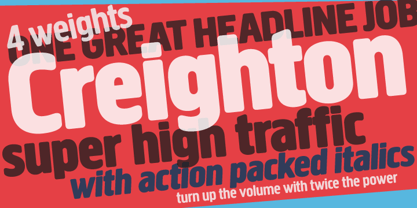 It was our initial intention to develop a suitable lowercase for Les Usherwood's Elston typeface, based on a few characters from an old German typeface called Hermes Grotesque (Woellmer, Berlin). However, the new design quickly took on a life of its own, and we decided to call it ‘Creighton’.
 - Heltar by The Northern Block,
$19.30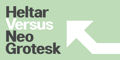 A modern neo-grotesque typeface. Having grown up in Sheffield and been completely immersed in the work of The Designers Republic I became very drawn to their treatment of Helvetica, especially the close tracking of the letter space. This visual investigation led me to the study of the font Hass Unica, a so called improvement to Helvetica. In order not to replicate and become a clone of Unica I redrew all the characters from scratch improving optical appearance, developing subtle corrections and reshaping individual letterforms. The result is a remixed neo-grotesque font that has strong general optical balance with great rhythm under close tracking. Details include 10 weights, an extended European character set, true italic, manually edited kerning and Euro symbol.
 - Ember by Device,
$29.00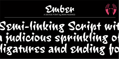 Ember is an informal script with a judicious sprinkling of ligatures that give it a flowing freehand liveliness. Neither overly formal and stuffy nor cheap and cheerful, Ember is elegant yet friendly, sophisticated yet approachable, fun and frivolous but stylish and well bred. Ligatures are set to be on automatically, and the stylistic alternates and optional final forms for some of the characters can be toggled on and off using the OpenType panel in design applications with advanced OpenType support. Designer Rian Hughes says that he felt he was "possibly channeling the spirit of Roger Excoffon". Neither pastiche nor revival, Ember does seem to evoke the famous French designer's trademark elegance.
 - Fable by Scholtz Fonts,
$19.00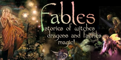 Fable is an elegant, hand-crafted typeface that evokes the magic of fantasy weddings, of castles and wizards, of dragons and dungeons. Among others it combines elements that are suggestive of Greek mythology, of runic scripts, of Scandinavian tales and of the stories of King Arthur. Difficult to categorise, Fable effectively combines features of uncial, calligraphic and script fonts. It will enhance the appearance of advertisements, wedding invitations, headlines and posters. It contains a full character set and is professionally letter-spaced and kerned.
 - Newark JNL by Jeff Levine,
$29.00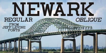 Inspired by a set of vintage alphabet game tile pieces, Newark JNL has similar traits to other slab serif Romans, but enough 'quirky' letter widths to break the rules and have it stand out on its own merits. The name derives from font work files in progress, often saved as 'new work' until a fitting name is decided upon. It seemed only right that this phrase be turned around into a font name itself. Newark JNL is available in both regular and oblique versions.
 - Norsen by Craft Supply Co,
$20.00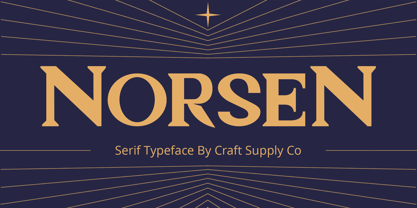 Introduction Meet Norsen – Classic Serif, where the vintage aura intertwines seamlessly with modern sophistication. Initially, its presence elevates designs with a unique classical elegance. Embodying Versatility Notably, Norsen is versatile, suiting various design necessities effortlessly. Also, it easily molds itself, fitting perfectly into different creative realms, ensuring each design shines uniquely. Classical Elegance Immersed in a classical charm, every letter in this font tells a story. Additionally, its serif details bring stories and messages to life with grace and depth, enhancing readability and visual appeal.
 - Azorath by Sryga,
$22.00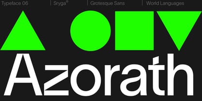 Introducing Azorath, a groundbreaking typeface that marries the bold, unyielding lines of brutalist architecture with graceful fluidity and gentle curves. Azorath's unique design defies convention, capturing attention with its juxtaposition of strength and elegance. Each glyph, meticulously crafted, tells a story of innovation and versatility, making it perfect for both powerful headlines and delicate text. Azorath is your canvas for creating captivating narratives that leave a lasting impression. Elevate your projects with Azorath, where raw power meets graceful finesse in the world of typography.
 - Brownie Fox by IKIIKOWRK,
$17.00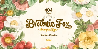 Introducing Brownie Fox - Fairytale Typeface, created by ikiiko. A vintage & classy decorative type that reminds us of fairy tale books when we were kids. This typeface is perfect for an books cover, illustration for kids, vintage poster, vintage product, packaging design, magazine header, poster, quotes, and so much more.. What's included? Uppercase & Lowercase Number & Punctuation Alternates & Swashes Multilingual Support Get also a good offer & FREEBIE at our site : www.ikiiko.com Enjoy our font and if you have any questions, you can contact us by email : ikiikowrk@gmail.com
 - Vitrines by PintassilgoPrints,
$24.90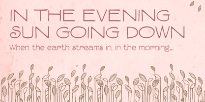 Vitrines is a digital and extended version of a charming alphabet featured in a 1913 book devoted to window signs and show cards. This version was carefully developed to preserve the original hand lettered look and feel. It includes a bold weight and a set of pattern tiles to adorn your compositions. A note about the pattern font: in order to create even patterns, be sure to set the line spacing the same size as the font and set no spaces before or after paragraphs.
 - Nursery Rhyme Initials by Celebrity Fontz,
$24.99High-quality ornamental initials superimposed on nursery rhyme backgrounds such as Humpty Dumpty, Ride a Cock Horse, Baa Baa Black Sheep, Tom Tom the Piper's Son, Rub-A-Dub-Dub, the Queen of Hearts, Old King Cole, and many others. Includes one set of A-Z ornamental initials conveniently assigned to both the upper and lower case alphabet characters. Ornate and accurate renderings that can be used for the beginning of paragraphs in any children's publication or texts relating to nursery rhymes and fairy tales. - Lubok by Linotype,
$29.99Moscow-based designer Julia Borisovna Balasheva created her Lubok face as a pictogram-based font. The term "lubok" refers to a popular style of Russian folk art printing, which dates back to the 18th Century. In Lubok, Bakasheva has digitised several whimsical characters and animals, which were common in these prints. She suggests that you use Lubok's symbols to illustrate fairy tales; we suggest that you use Lubok to decorate everything: from your next office party invitation to comic books of your own design! - Gnarly by Mans Greback,
$59.00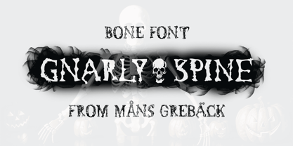 Dipping into the shadowy corridors of design, the Gnarly font family weaves a tale of both intrigue and artistry. Comprising the eerie elegance of Gnarly Bone, the spine-chilling intricacy of Gnarly Skeleton, and the vertebrae-inspired mystique of Gnarly Spine, each sub-family adds its unique touch to the overarching narrative of the collection. Perfect for those seeking a blend of the macabre and the meticulously crafted, this trio of typefaces brings a uniquely haunting aesthetic to any project, from film posters to novel covers.
 - Cosan by Adtypo,
$45.00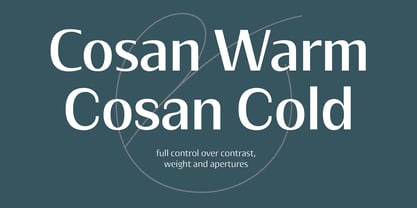 The idea was to find common intersections between the humanistic and the neo-grotesque model of sans. This variable font offers everything from the world of sans serif in one place – a broad range of weights, adjustable contrast, and a lot of alternative glyphs. As a bonus, you can choose the “cold” or “warm” impact of the text. The Cosan Cold variant has closed apertures and minimal tension in the manner of Helvetica, and the Cosan Warm is open, more dynamic, and airy. Cosan is very suitable for a parallel bilingual setting, as both types are equivalent in their proportions and text color. Like Yin and Yang, each has a piece of the other in him. The Warm version is not totally dynamic, nor is the Cold version totally rigid.
 - Skeletal Wish by Hanoded,
$15.00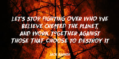 Skeletal Wish is a line from one of my favourite Opeth songs: Heir Apparent. The lyrics are pretty veiled and bleak, describing the destruction and downfall of something that once was beautiful. I am worried about what is happening with our planet: the Amazon forest is burning down, our oceans are full of plastic and the earth is warming up. I had to think of this when I created Skeletal Wish and I thought the title was perfect. Skeletal Wish is a heavy and scary halloween font. It comes with blobs, splatter, gore and whatever else you may need for your designs. It won’t help save the Amazon rainforest, nor will it stop the flow of marine plastic, but you could use it to create a protest sign. After all, the change begins with you.
 - Touch Me by Latinotype,
$69.00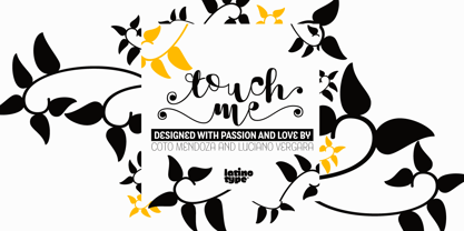 Touch Me is a Script hand-drawn style typeface—designed by Coto Mendoza—resulting from polyrhythmic exploration, sign deconstruction and altered calligraphic contrast plays with watercolour brush. Coto has been using these experimental calligraphy techniques when creating the catchwords for Macarons, the Boho Family, Bikini Season Script and Matcha Script and so forth. Touch Me was inspired by a character in a story written by Coto while attending a literary workshop with Ina Groovie in Santiago de Chile. The character is a tribal girl who lives on an island in the Caribbean. She is heir of ancestral knowledge and possesses wild beauty, very passionate and sensual: intense, strong and free. These features are reflected in the polyrhythm of the typeface's curves: an irregular baseline, variable x-height, different lengths of initial and terminal strokes (that sometimes expand and sometimes shrink) and amount of brush pressure that generates changes in contrast within the characters. This way, when composing, signs with stroke contrast randomly alternate with monolinear ones and with signs of altered contrast, thanks to the typeface's OpenType programming. The family, with more than 3,000 glyphs, provides a number of alternative characters, swashes, ligatures, initial and terminal forms, in short, a vast ocean of choices! Touch Me is a spontaneous typeface with a fresh and unique personality. It is the perfect choice for short text in both print and digital formats. The family comes with a Script Regular version and a seductive Script Drop that you will enjoy a lot! The Extras set includes some catchwords, dingbats and ornaments that allows for endless composition options. The family also comes with a Caps version —designed by Luciano Vergara—in 2 styles: a funny and big-headed condensed Sans Grotesk display of inverted vertical proportion plus a Grotesk, neutral and slightly expressive Petite. Both versions, available in 6 weights, have been especially designed to create hierarchies when composing. This allows for balance between strokes of different weight when it comes to the Sans and Script fonts. Come and dare yourself! Touch Me! Thanks Alisa for sharing your amazing and beautiful picture with us.
 - Hope Sans by Monotype,
$50.99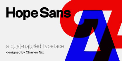 Hope Sans™ takes the jaunty style of 1950s and 60s lettering and melds it with the jubilant 1970s swashes of Bookman. The result is a sans serif family that is lively, inviting and deeply customizable. Its basic sans serif forms create engaging text, while a roaring collection of swash designs, alternate characters and ligatures make it a natural for attention-grabbing display typography. Hope Sans has been selected by the judges of the 22nd Annual TDC Typeface Design Competition to receive the Certificate of Typographic Excellence. The middle weights of the family are easy on the eyes and shine at smaller sizes and in blocks of text copy. Their friendly vibe also translates well to web and interactive design projects. Spacing is open, counters are large and Hope Sans’ range of six weights can provide just the right design for virtually any need. Headlines, subheads, banners and navigational links are naturals for its lightest and boldest weights – either with, or without, the swash letters. “Hope Sans is a paint box,” says its designer, Charles Nix. “In its basic form, it’s a sturdy grotesque, capable of setting text in a cool and relaxed way. But a bit of accenting with the alternate forms easily creates an entirely different mood and meaning. And for those that are willing to really mix with it, the variety of alternate characters can build truly unique typographic statements.”
 - Floro by Andinistas,
$29.95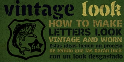 Floro is a typographic family with 3 members designed by Carlos Fabian Camargo. Its idea combines medieval ideas, grotesque, stencil and grunge for T-shirts, stickers, advertising material design. More specifically the concept of Floro join several DNAís coordinating X height, ascendant, descendant and wide, in which proportions and adaptive optics were determined to inject great visual impact when composing titles. Its forms and counter forms have imperfections controlled with vitality and consistency. Floro is useful for ranking words and phrases with corroded edges and creases between the lines of his letters. In that vein, Floro refers to improvised design, deletion and copying. For that reason, its determinants seem stencil patterns that attract the attention of the reader. Its inaccurate decisions were planned that way, in which the type of contrast seems made with a flat tip and the amount of contrast between thick and thin is medium. Its sizes, regular and italic shine by their systematic wear and terminations sometimes in pointed forms resembling medieval darkness. In short, we can say that Floro comes from the miscegenation of Gothic calligraphy texture, foundational calligraphy and some refinements of gothic writings with italic sans-serif ideas of late 19th century. Even with the blur appearance, floro has ideal proportions to pile for horizontal and vertical areas when composing titles with striking looks and robust. And finally, floro dingbats are related shields and stamps, to accompany the written resulting useful at the level of visual support and hierarchical.
 - ZT Grafton by Zeune Type Foundry,
$30.00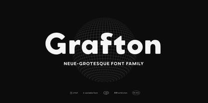 ZT Grafton is a neo-grotesque typeface based on geometric shapes with contemporary, friendly, and strong emotion. ZT Grafton was built from scratch to be calm, smooth, and clean, while subtle humanist influences add warmth to this typeface. It's available in 8 weights and includes the exciting variable font format.
 - Misdirection JNL by Jeff Levine,
$29.00Fonts can be both functional and attractive, but there's no rule against them being fun. Misdirection JNL is an assortment of 52 outrageous road signs - perfect for protests against government inefficiency or used on novelty note pads... as attention-getting spot art for ads or for whatever your imagination can deliver... - Marianne by bb-bureau,
$60.00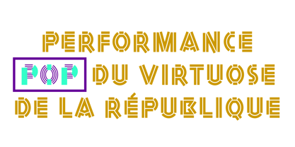 Marianne is a headline lineal designed by Benoît Bodhuin Protest writing (Caps only) made of tape modules joined by drawing a typical notch. 3 styles – Inline, Outline and Solid – each with variants Opentype, many original ligatures (including ‘HTTP’…) and alternative ‘A’ leaning on his right leg, allow many combinations and uses.
 - Codswallop by Hanoded,
$20.00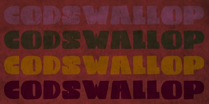 The origin of the word Codswallop is uncertain, but it might have something to do with a 19th century English soft drink brewer named Hiram Codd. Codswallop is a beautiful hand drawn font. A little weird, a tad grotesque and a wee bit over the top, but fun and useful nonetheless.
 - Legasov by AlfaBravo,
$25.00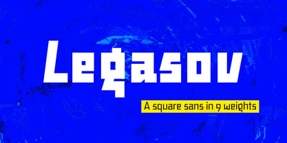 Legasov is an original font family designed for logos, titles, book covers, and branding identity. You can also use it for small text fragments. Legasov is a modern geometric grotesque inspired by the Ukrainian modernism of the last century. It has a dynamic shape of characters and an avant-garde nature.
 - Fulcanelli by Illuminaut Designs,
$10.00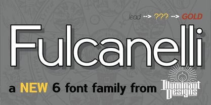 A clean and balanced humanist grotesque. Like many an alchemical process, this font had to be designed and redesigned from the ground up many times. Each time it blew up in the designer's face until finally the conditions and process were in perfect alignment and this new font was born.
 - Brotherhood by 38-lineart,
$19.00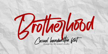 The current trend is social media, friendship connection applications and personal web portfolios. This media is used to tell about existence, most people like to upload photos on social media networks, even for personal web portfolios, sometimes people prefer to see the side of daily activities rather than products which are offered. Photos are visual responses, and there are many stories that can be told from a photo. But it will look more interesting if it is added with captions. The very appropriate caption is a text in handwriting. This is what inspired us to create attractive handwriting for social media and networking. We started to do a little research to see the trends of this type of font. Here are some of our notes; 1. Texts are usually in the form of relaxed, non-connected handwriting. 2. There are several connected glyphs, usually by the letters 'o', 'i' and 'y'. And double letters like ‘ll’ and ‘tt’. We anticipate this by making ligature for common texts written concatenated. 3. For personal web portfolio needs, provide affirmation as a characteristic. So the first letter is usually in the form of uppercase which is more prominent than the lowercase rhythm. Prominent but still in proportion. So this is "Brotherhood", a handwritten font that you can use for personal brands, captions and even paragraph writing. Expand your friendship and make your business more closely to your customers as a "Brotherhood" with this font.
 - Mi Negra by Letritas,
$25.00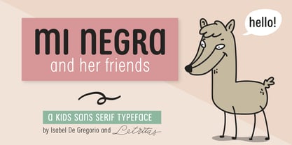 Mi negra is a funny and hilarious typography designed especially for children, thought and created by Isabel de Gregorio. It could be described as an original combination between a semi-handwright and semi sans-serif font. Thanks to its structure and nice endings "Mi Negra" is recommended for composing short texts (logotypes, packing, posters, etc.). It may similarly be used for illustrations and comics, as well as in printing press works for children from 6 to 13 years old for instance. Mi Negra has been conceived to be a useful support in all kinds of illustrations works (please note that Isabel, the type designer, considers herself primarily an illustrator). The font designer of Mi Negra tells that every time she needed to provide some text data (i.e. in children infographies) and needed to make them more understandable and suitable for children, she used this typography. The former idea was than to create a font who could be a second option to comic sans, but as the project started to reveal its forms, it was clear that it was revealing another connotation and its own character. In this way, Mi Negra went on modifying its forms and the more it developed, the more it was showing its new characteristics and concepts. The family is composed of three weighs: Light, regular and black. It provides also interesting functional ligatures. It also includes a dingbat with nice doggies. It has 434 characters and can work with 208 languages.
 - Gilway by Art Grootfontein,
$20.00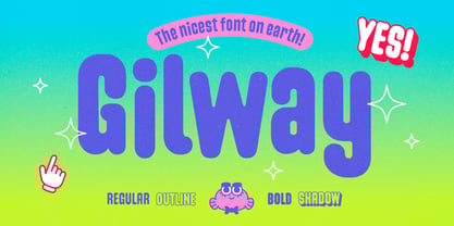 Gilway is a playful, rounded display with tons of personality. This versatile typeface is inspired by the earliest examples of rounded types from the 19th century, such as Caslon Rounded (1836) and Schmale Runde Grotesk (1885). Gilway has a distinctive hand-lettered feel because of its subtle variances, which make it powerful and impactful yet incredibly friendly. Layered options allow you to combine the various styles, and a unique Opentype feature makes your letters dance! To take full advantage of Gilway's features, please download this one-sheet pdf file. Please take a look at this video demo to see Gilway family in action ! Gilway’s design is suited for a wide range of uses, including headlines, displays, packaging and logotypes.
 - Applied Sans by Monotype,
$57.99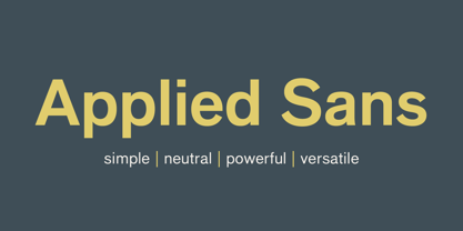 The Applied Sans™ family is a reinterpretation of the first sans serif typefaces used in what was then called, “jobbing or trade” work – typefaces like Venus and Ideal Grotesk. While built on the foundation of these late 19th and early 20th century designs, Applied Sans adds to it all the required features for modern typographic communication. The design benefits from a large x-height, open counters, generous apertures and a subtle modulation in stroke weight. These ensure character legibility and make for a design that is inviting and easy to read. Applied Sans family’s wide range, precise gradation of weights and extensive language support guarantees the design’s effectiveness in a wide and varied range of uses.
 - Promea by YXType,
$19.00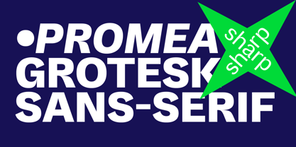 Promea is a Grotesk font meticulously designed with precise engineering in mind. Its amount of kerning, support for tabular/proportional figures, small caps, slashed zero, and fractions will make sure it performs well in all types of environments. Even the auto-centering colon among numbers will make your typography shine! The stylistic inktraps combined with low x-height and high contrast will surely bring you the sharpest typographic experience ever. The font is perfect for text environments like magazines, but it excels at displaying its full range of characteristics. Features: Smallcaps Tabular & proportional figures Small figures & fractions Slashed zero Double/single-story a & g Colon auto-centering vertically among figures (e.g. 10:00)
 - Annonce by Canada Type,
$24.95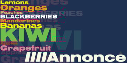 Annonce is a digitization and expansion of a 1912 Johannes Wagner Foundry classic called Aurora Grotesk, which also circulated later on in metal under the name Annonce. Bold, extended and clear as a bell, Annonce stood out as the definite big sign font long before the Helveticas of the world. With angled cuts on some of the letters, it also shows humanistic traits that make it more appealing than any other face in its genre. The Annonce set comes in two fonts, a regular and an italic, and includes a very large character set that accommodates almost all Latin-based languages, including Turkish, Baltic, Celtic, Maltese, Esperanto, and the languages of Central and Eastern Europe.
 - Acies by Alexander Stephenson,
$26.00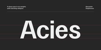 Acies is a sharp sans with accented stroke width contrast and slightly condensed proportions. Its shapes are reduced to the bare minimum, conveying simplicity and sophistication. It has steep joins, aligning horizontal stroke endings and vertically ending ascenders and descenders, freely mixing typographic norms to create something refreshing and new. It is designed to function in a wide variety of environments, ranging from screen to print. Acies is available in 6 weights with matching obliques, that have the same pitch as their upright counterparts. With 690 Glyphs per font, it supports 100+ languages and offers a wide range of OpenType features like stylistic alternates, petite caps, old style figures, ligatures or case sensitive forms.
 - ITC Static by ITC,
$29.99Static looks almost like it was stamped on paper: the black color is not evenly distributed and the background comes through the letters and consciously irregular forms reinforce the effect. The characters do not all have the same height, nor do they stand straight and regularly on the base line. Static is a robust font with bold, rounded serifs and is best used for headlines and short texts in point sizes of 12 and larger.