8,674 search results
(0.025 seconds)
- Daikon by Pepper Type,
$30.00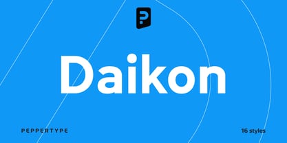 Daikon is a semi-closed geometric grotesque featuring rich language support including Cyrillic, various OpenType features and multiple sets of figures. This family’s clean and legible feel makes it useable as both display and body type in any font size.
 - Statement Sans by Sudtipos,
$39.00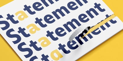 Statement Sans is a versatile sans serif font family created by the Sudtipos team in the spirit of modern neo humanistic fonts, with a deep grotesk and industrial influence that can be discovered along the system. Developed to express its potential in UX and UI projects, corporative interfaces or editorial web and print layouts, Statement is available in 9 weights with matching real italics, extended latin language support, and also including classic and old style figures as well as plenty of stylistics alternates. Last but not least, Statement Sans includes a one file variable font to join the party.
 - Alergia Remix by Borutta Group,
$19.00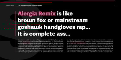 Alergia Remix, designed by Mateusz Machalski, is the younger sister of Alergia Grotesk. Remixed styles were made as a hybrid between a linear antiqua and a geometric display typeface. Alergia Remix is characterised by a lot of details, which gives it a strong character. Unpredictable construction in the letters a,s,g,e,m,h etc. in combination with a delicate contrast, makes Alergia Remix a good choice for many display purposes . The whole family has a comprehensive set of characters. In additionton to Latin letters, Alergia Remix also has a full set of characters for Vietnamese, extended Cyrillic (with Abkhasian) and Greek.
 - Berghan by Craft Supply Co,
$15.00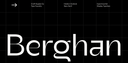 Berghan is a modern grotesk sans serif features thick and thin contrast details for contemporary nuances. It can be used to create almost all types of design projects like print materials. Just use your imagination and your project will become more alive and look great than ever with this typeface. You want to make a greeting card or a package design, or even a brand identity, craft design, any DIY project, book title, wedding font, pop vintage design, retro design or any purpose to make your art / design project look pretty and trendy? Feel free to play with this typeface!
 - Gardenia by W Type Foundry,
$25.00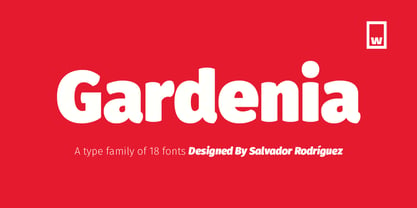 Gardenia is a grotesk sans-serif. It comes in 9 weights with matching italics. It was designed by Salvador Rodríguez in 2015/2016. It is characterized by legibility in the medium sizes, black and thin weights are great performers in display sizes. Gardenia is well suited for longer texts and headlines. It’s perfect for graphic design, web, print, motion graphics, interaction design etc… Gardenia is equipped with a wide range of opentype features. Learn about upcoming releases, work in progress and get to know us better! On Instagram W Foundry On facebook W Foundry Check out our website!
 - Madiffure by Ridtype,
$25.00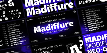 Madiffure is a modified neo-grotesk gothic font; this font basically has no consistency in several letter styles, so this font looks unique and bolder in its application of letter development. And this font is suitable for bolder and more modern design themes to apply to certain design uses. On the other hand, we also paid attention to making this font more pleasing to the eye so that it is more comfortable to read even at the smallest size. The Madiffure font is also equipped with Cyrillic as an addition to the basic language style, namely Latin 1 and 2.
 - Neue Augenblick by Harmnessless Type,
$40.00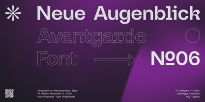 Neue Augenblick is a modern contemporary Germany-esque grotesk. This Font face carries a powerful mechanical and industrial feel, it is inspired by aesthetic personality of beautiful Panzerkampfwagen and Post-war Brutalist Architectural. There are ten weights, ranging from Thin to Black, each with oblique italics and plenty of alternates. Neue Augenblick comes with attention-grabbing ink traps make it feels more contemporary. Various opentype features from stylistic alternates, multilingual extended latin support, ligatures, discretionary ligatures, fractions, arrows, scientific numerals, catchwords set, icons and more. Neue Augenblick is suited for embrace both maximalism or minimalism design works for designers to play with.
 - Manufacturer JNL by Jeff Levine,
$29.00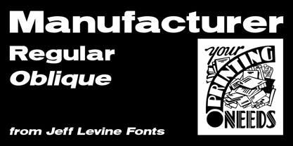 Manufacturer JNL is a reinterpretation of the classic type face Venus Extra Bold Extended, and is available in both regular and oblique versions. According to Wikipedia: “Venus or Venus-Grotesk is a sans-serif typeface family released by the Bauer Type Foundry of Frankfurt am Main, Germany from1907 onwards. Released in a large range of styles, including condensed and extended weights, it was very popular in the early-to-mid twentieth century. It was exported to other countries, notably the United States, where it was distributed by Bauer Alphabets Inc, the U.S. branch of the firm.”
 - Brutalista by Latinotype,
$29.00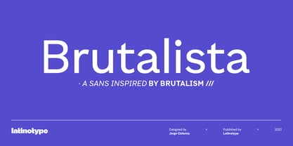 Brutalista is a typeface inspired by the architectural brutalist style, which seeks to use the expression of raw or raw material. In graphic design it has been used to break rules and attract attention. His drawing has its roots in grotesque and neo-grotesque sources from the early twentieth century, but with a current style. It has a medium x height, clear counterforms, low contrast, which give it versatility and functionality. Peculiar cuts and drawings are also used in some characters, which give them personality It is an ideal font for headlines and brands, but also for when you need to present simple and clear information.
 - Priego by Brenners Template,
$19.00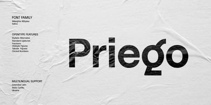 Here are Modern Sans created with a bit of playfulness and clear grotesque. However, clear visibility and balanced contrast, are the main features of all glyphs. This modern Sans font family is designed to complement each other with balanced stem consistency and resisting Alternates. If you want to meet a grotesque with a different feel, try using these Alternates. Basic Systems 9Weights, 18Styles Italics OpenType Features Stylistic Alternates - C, G, N, P, S, a, g, s, y (including extended Latins) Standard Ligatures - ff, ffi, fi, fl Fractions Oldstyle Figures Tabular Figures Circled Numbers Multilingual Support Western Europe, Central/Eastern Europe, Baltic, Turkish, Romanian Basic Cyrillic Ukraine
 - Ongunkan Elder Futhark Viking by Runic World Tamgacı,
$50.00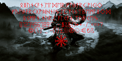 Vikings or Norses are Scandinavian pirate and merchant tribes. Actually, "Viking" or "Nors" is not a nation name; It is the name given to Dans, Norwegians, Swedes and other Scandinavians regardless of who they are. The Elder Futhark here is a runic script - a version of the Viking script. I will upload other versions over time. Write nice things with pleasure.
 - Corinthiago by 38-lineart,
$19.00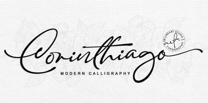 “Corinthiago” feels equally charming and elegant. This stunning handwritten font is a stylish homage to classic calligraphy. It features a varying baseline, smooth lines, gorgeous glyphs and stunning alternates Alternates to help enrich your designs: 1. Titling (titl) alternates, are accents for initial letters. is the first stroke that is long and and slightly curved according to the letters, both lowercase and uppercase. 2. Swash (swsh) alternates, is an accent at the end of a letter, is an additional stroke to end writing. 3. Stylistic alternate (Salt), is an alternative glyph to add style emphasis. 4. Stylistic set (SS), some additional glyphs for design alternatives. If you use a combination of two lowercase with a combination of tilt and swsh it will produce a harmonic letter that you can use for a logo, no problem also for a logo consisting of more than two letters, all you have to make sure is starts with a titl and ends with swsh. All glyph alternates (titl, swsh, Salt and SS) are also supported by multiple languages. Another OpenType that is also very important is Ligature (league), this font consists of 51 Ligatures including: Abe, Ade, Ale, Ab, Ad, Af, Aj, Ak, Al, Am, An, Ao, Ap, As, Ax, Ay, Az, aa, ar, be, cc, da, de, di, do, du, dy, ee, er, ii, ir, is, le, ll, lt, om, on, oo, op, or, ov, ow, ox, oy, oz, ss, st, th, tl, tt, ur and uu. We continue to see the possibility to update ligatures in the future. This font is the right choice for a modern design, can be applied to invitations, writing messages in the form of quotes, book and magazine covers, and of course for your brand logo text.
 - Anele Pro by Ole Sondergaard,
$14.28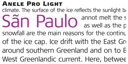 Anele is a classic grotesque in the bedt sense of the word in 5 weights and Italic that communicates in 140 languages. The font is created by the danish designer Ole Sondergaard who is also behind the award-winning FF Signa super family.
 - Brab by VSF,
$30.00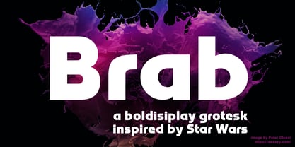 A bold grotesque typeface in the best traditions of the Star Wars logo. It has clean geometric lines, a humnaist character, it combines a tech feeling with a friendly organic feeling. Will work excellently as a white text on a busy background.
 - Darwin by Los Andes,
$18.00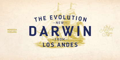 Darwin font family is a eclectic assembly of grotesque, geometric and humanistic styles, includes 20 fonts, 10 normal and 10 alt sub family, the alt variant gives spice to the compositions. The font family is good for headlines, short text, posters and logos.
 - Centrale Sans Inline by Typedepot,
$19.00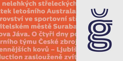 A humanist design typeface incorporating elements from the more rationally constructed grotesque typefaces. Its characteristics are relatively large x-height and open apertures. The overall effect suggests approachability without the sentimentality carried by some of the more authentic humanist designs – contemporary and precise.
 - Senkron by Gurup Stüdyo,
$19.00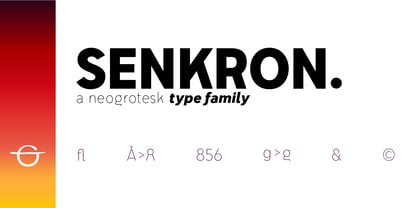 Senkron is composed of "normal" and a "blok" styles. Senkron ("normal") was designed as a pure and modern neo grotesk font. The anatomy of the letters are designed to achieve an equal text color. For this purpose, the legs of the letters “R” and "K" are designed with a vertical angle to prevent the white space that would occur in the middle of these letters. In the minuscule, the characteristic features of letters such as ‘a’, ‘l’, ‘t’ are concretized and legibility is supported in the text. Considerable attention has been paid to the harmony between the anatomical structures of the letters and the diacritical mark’s structure. Senkron Blok is arranged for situations which have diacritical marks overflow to leadings of the headline and headline typographical color is affected negatively from this situation. For this purpose, majuscule diacritical letters are resolved within the letter height. However, when this is done, new forms are obtained by integrated diacritical marks with letters instead of directly merging them. The idea behind this approach is to preserve the typographic value of diacritical marks and emphasize the semantic value of diacritical letters. 82 letters have been redesigned in this way.
 - Tourist Spot JNL by Jeff Levine,
$29.00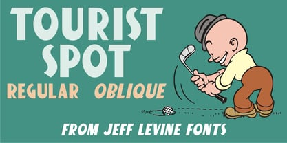 Tourist Spot JNL is the same lettering style as Old Tijuana JNL, but with the squiggly inside lines stripped away. The original design was modeled from the hand lettered title on the cover of the 1939 sheet music for "Class Will Tell" and is available in both regular and oblique versions. Casual and playful in nature, the font can be used by itself or combined with Old Tijuana JNL for any project that promotes festive occasions.
 - Albyona by SIAS,
$34.90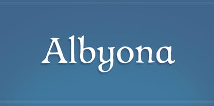 Albyona English Nº 1 is ideal for titlings and headings in novels or fairy tales. It has a sentimental flavour of history, memories and the good-old-days feeling. Suitable for children’s books, fantasy literature, crime novels, natural food packaging and poison labeling, for infancy memories, vanitas kitsch items, dungeon museum bar menu cards, introductions to herbalism and witchcraft manuals. Albyona supports every Euro-Latin language. For the choice of a similar font go to Abendschroth.
 - Nefelibata by My Creative Land,
$25.00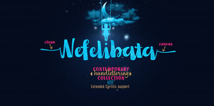 A new handwritten font collection made by My Creative Land especially for all you dreamers and cloud walkers out there. The collection has everything you might need for your contemporary design project. All of the 9 handwritten fonts and design element can be mixed and matched to tell your story! Brush fonts - scripts and sans serif - come in two styles: clean and canvas - both of them have nice clean edges and can be used in any sizes.
 - Hopferian by 2D Typo,
$28.00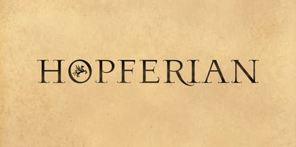 This font has been developed based on the engraving by the German artist Daniel Hopfer (1470-1536) listing the Latin ABC. While creating the font I tried to preserve the archaism and certain imperfection characteristic for the prototype to accentuate its charm. Fanciful convolution on the serif make it a bit fairy-tale like and cheerful. The font is also available with decorated dots as in the original version. All the letters in the font are capital.
 - Knip by Hanoded,
$15.00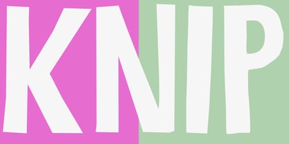 Knip, in Dutch, means ‘cut’. You can tell by the glyphs that I made this font by cutting out the shapes from black paper, gluing it onto white paper and photographing the result so I could digitalise it! I don’t make too many cut out fonts, as it is a lot of work and it often leads to nothing. Besides that, I depend on the paper supply from my kids and they happened to have black paper this time!
 - Bone Voyage by Cyberian Khatru,
$15.00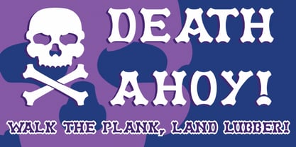 Fonts created by comicbook letterers tend to have more creatively inspired names. That's because comicbook letterers are trained as storytellers. The names they choose for their fonts seek to tell the story of what context that particular font is to be used in. Bone Voyage is inspired by coming up with the name first. This lead me to visualize a bold serif font where the shape of the serifs suggested bones. For more information: homepage.mac.com/baronvoncruzer
 - Maurice Dufrene Initials by Celebrity Fontz,
$24.99Luxurious high-quality ornamental initials superimposed on elaborate Art Deco drawings of plants and flowers, inspired by 18th and 19th Century French designs, with a modern approach. Includes one set of A-Z ornamental initials conveniently assigned to both the upper and lower case alphabet characters. Beautifully ornate and perfect for the beginning of paragraphs in publications and texts conveying the feel of the 1920s and the Art Deco movement, garden-themed texts, or fairy tales. - Matriver by Dirtyline Studio,
$20.00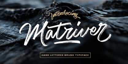 Matriver brush with a calligraphy style, So beautiful on invitation like greeting cards, branding materials, business cards, quotes, posters, and more! Feature: Alternates and Ligatures Punctional Works on PC & Mac PUA Encoded Characters - Fully accessible without additional design software. Simple installations Accessible in the Adobe Illustrator, Adobe Photoshop, Adobe InDesign, even work on Microsoft Word. Fonts include Multilingual Support Thank you very much for looking and please tell me if you have questions, Hopefully you like our item :)
 - Batchelder Ruff by Woodside Graphics,
$19.95Batchelder Ruff is a "battered" version of the typeface used for titling in the catalogs and advertising of the Batchelder Tile Company in Pasadena, California in the 1920s. The original source characters were smoother, but they were also handlettered, so that every character was different. This digitized version contains uniform characters, but its "rough" quality preserves the hand-drawn look. It is designed primarily as a headline font, and thus is best used in All-Caps in larger sizes. - Old Tijuana JNL by Jeff Levine,
$29.00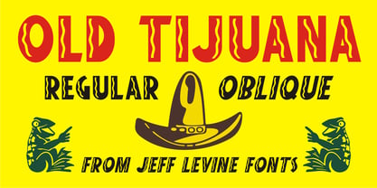 Old Tijuana JNL was modeled from the hand lettered title on the cover of the 1939 sheet music for "Class Will Tell" and is available in both regular and oblique versions. Casual, playful and reminiscent of the "serape" style of pseudo-Mexican lettering found on ad designs of the 1930s and 1940s, the type face isn't just for South of the Border themes. Use it for any festive occasion and the design will blend in well.
 - Freight Big Pro by Freight Collection,
$39.00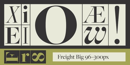 Big headlines, big mastheads, big cover art. Big, big, big–big is best when big. The exquisiteness of Freight Big Pro’s hairline strokes and elegantly pointed serifs provide a striking contrast to its surroundings. Very useful when you really wanna knock someone’s socks off but with the touch of a feather so they’ll know something happened but not how it happened. Freight Big Pro, sublimely subliminal. Go ahead, slip one on (or under) your covers–we won’t tell.
 - Decrypt H1 by Type Innovations,
$39.00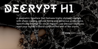 Say hello to Decrypt H1—a geometric typeface that features highly stylized capitals with sharp corners, circular forms and generous proportions. Specifically created for visual impact—use Decrypt H1 when you want your words to stand out from the rest of the crowd. The concept is modern, futuristic and non-traditional. Perfect for display text, logos and headings. The development of Decrypt H1 started in 1997, inspired by Alex Kaczun’s best selling grotesque font family called Contax Pro. Decrypt H1 is specifically introduced here as a bold weight, but Alex plans to expand the design to include many weights, styles and alternative design treatments. Stay tuned! If you like Decrypt H1—check out it’s alternate twins Decrypt 01, Decrypt 02 and all of Type Innovations fonts at: http://www.myfonts.com/person/Alex_Kaczun/
 - Insider by Characters Font Foundry,
$25.00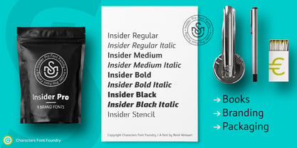 Insider is a warm & legible grotesque. It’s custom made for Insider Consulting in Düsseldorf, Germany. It’s highly legible in small sizes because of the basic proportions and the balanced inner forms. It’s optimized for setting longer texts, but also works very well in headlines and leads. The fonts contain loads of OpenType features to spice up your design. The matching Stencil font is very suited for creative designs. The Stencil Regular has the same dimensions as the Insider Regular, so you can mix them without hassle. The font family has real italics and not just mathematically slanted romans. The dynamic cursive shapes root in handwriting. With 9 styles (5 weights + 4 italics), the family is very versatile and can be used for designs with a complex typographical hierarchy.
 - Artico Soft by cretype,
$20.00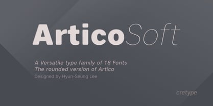 Artico Soft is the rounded version of Artico. Artico Soft Family is a modern sans-serif typeface that is clean, simple and highly readable. Letters in this type family are designed with genuine neo-grotesque and neutral shapes without any decorative distractions. The spaces between individual letter forms are precisely adjusted to create the perfect typesetting. Artico Soft is versatile type family of 18 fonts. Artico family consists of 9 weights (Thin, ExtraLight, Light, Regular, Medium, Bold, ExtraBold, Heavy & Black) with their corresponding italics. The Open Type fonts contain complete Latin 1252, Cyrillic, Central European 1250, Turkish 1254 character sets. Each font includes proportional figures, tabular figures, numerators, denominators, superscript, scientific inferiors, subscript, fractions and case features. We highly recommend it for use in books, web pages, screen displays, and so on.
 - Campeche Variable by Latinotype,
$199.00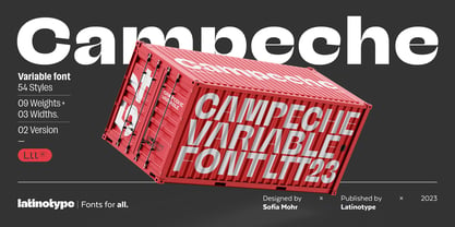 Campeche variable is an expressive yet functional typeface family. Seeking to express its beauty, it twists the conventions of classic typography when necessary. Campeche finds its inspiration in the grotesque typefaces of the late 19th century coupled with a typical Latin American playful sense that gives it a modern freshness. The initial form arises from the idea of expanding Seriguela, evolving along the way, becoming its own system with a unique personality. Campeche is designed according to today's visual requirements. Taking advantage of variable technology in 3 axes: width, weight and display. Campeche Variable is a typeface that provides versatility for almost any use. It can be used for packaging, editorial, branding... etc. The mixture of its possibilities can generate complex graphic parts or systems with different levels of hierarchy, without losing unity.
 - Artico by cretype,
$20.00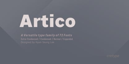 Artico Family is a modern sans-serif typeface that is clean, simple and highly readable. Letters in this type family are designed with genuine neo-grotesque and neutral shapes without any decorative distractions. The spaces between individual letter forms are precisely adjusted to create the perfect typesetting. Artico is versatile type family of 72 fonts. Artico family consists of 9 weights (Thin, ExtraLight, Light, Regular, Medium, Bold, ExtraBold, Heavy & Black) and 4 widths (Extra Condensed, Condensed, Normal & Expanded) with their corresponding italics. The Open Type fonts contain complete Latin 1252, Cyrillic, Central European 1250, Turkish 1254 character sets. Each font includes proportional figures, tabular figures, numerators, denominators, superscript, scientific inferiors, subscript, fractions and case features. We highly recommend it for use in books, web pages, screen displays, and so on.
 - Decrypt 02 by Type Innovations,
$39.00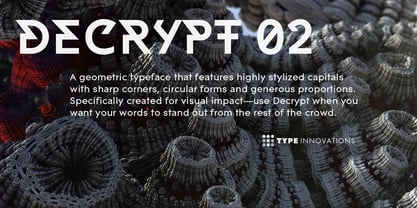 Say hello to Decrypt 02—a geometric typeface that features highly stylized capitals with sharp corners, circular forms and generous proportions. Specifically created for visual impact—use Decrypt 02 when you want your words to stand out from the rest of the crowd. The concept is modern, futuristic and non-traditional. Perfect for display text, logos and headings. The development of Decrypt 02 started in 1997, inspired by Alex Kaczun’s best selling grotesque font family called Contax Pro. Decrypt 02 is specifically introduced here as a bold weight, but Alex plans to expand the design to include many weights, styles and alternative design treatments. Stay tuned! If you like Decrypt 02—check out it’s alternate twin Decrypt 01 and all of Type Innovations fonts at: http://www.myfonts.com/person/Alex_Kaczun/
 - Decrypt He2 by Type Innovations,
$39.00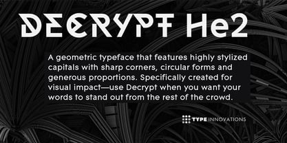 Say hello to Decrypt He2—a geometric typeface that features highly stylized capitals with sharp corners, circular forms and generous proportions. Specifically created for visual impact—use Decrypt He2 when you want your words to stand out from the rest of the crowd. The concept is modern, futuristic and non-traditional. Perfect for display text, logos and headings. The development of Decrypt He2 started in 1997, inspired by Alex Kaczun’s best selling grotesque font family called Contax Pro. Decrypt He2 is specifically introduced here as a bold weight, but Alex plans to expand the design to include many weights, styles and alternative design treatments. Stay tuned! If you like Decrypt He2—check out it’s alternate twins Decrypt H1, Decrypt 01, Decrypt 02 and all of Type Innovations fonts at: http://www.myfonts.com/person/Alex_Kaczun/.
 - FE Planking 2020 by Egor Stremousov,
$50.00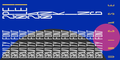 Experimental and accidental unicase grotesque. A font in which all the letters and numbers fell down and deformed under the force of gravity. Everything that was hanging fell down. Everything that was curved horizontally straightened. The form and principle of construction of each symbol in the font is dictated not by tradition, but by physics. This makes FE Planking 2020 an excellent tool for creating phrases and statements in advertising and art projects that attract attention and make your head spin. The first free version with a minimum set of Latin and Cyrillic alphabets was released in 2019, and in 2020 the font was updated and supplemented with an expanded set of characters. Dedicated to @Serge Rachok, who invented the Planking Game before it was invented by others.
 - Telemark by Juri Zaech,
$20.00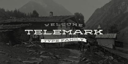 Telemark is a monolinear slab serif influenced by the wide serif typefaces of the 19th century. The name refers to the vintage form of skiing which was introduced in Norway at the same period of time and allowed more fluid turns. After the Telemark style was replaced by newer techniques in the Alpine countries it has experienced a rise in popularity in recent years. The Telemark type family features the three weights in an additional label style which allows an uncomplicated creation of editable pointers, banners and cartouches. Different combinations of end pieces result in a great variety of designs. Telemark is suitable for headlines and logotypes and complements script typefaces as well as any neutral grotesque. Details include 207 characters in three weights, a total of six styles and manually edited kerning.
 - TT Knickerbockers by TypeType,
$29.00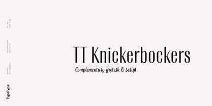 TT Knickerbockers useful links: Specimen PDF | Graphic presentation | Customization options About TT Knickerbockers: TT Knickerbockers is a contrasting pair of fonts that continues our project series dedicated to different cities. The new project is dedicated to New York with its multiculturalism, historicity, creativity, energy, and to its inhabitants. TT Knickerbockers Grotesk symbolizes the monumentality of New York expressed in both its traditional historic architecture and skyscrapers. Energy, constant movement and the round-the-clock life of New York—all this is reflected in our TT Knickerbockers Script. TT Knickerbockers Grotesk is a narrow contrast sans-serif with characteristic elements sending us back to the 19th century. There’s also a reference to antiqua fonts to be noticed in the font: where in traditional antiqua there would be serifs, TT Knickerbockers Grotesk features a straight stroke ending, and traditional drops (finals, tails and ears) are substituted with rounded strokes. In TT Knickerbockers Grotesk you will find unusual characters, stylistic alternatives and ligatures. The following OpenType features are implemented: ordn, case, frac, sups, sinf, numr, dnom, onum, tnum, pnum, liga, dlig, salt, ss01. TT Knickerbockers Script is a bright and at the same time a little restrained brushpen script with a slight touch of aristocracy. TT Knickerbockers Script consists of 967 characters and also contains a huge number of contextual alternatives and ligatures. For all lowercase and uppercase letters of basic Latin and Cyrillic alphabets we have drawn 236 swashes which, depending on the context, can appear both at the beginning and at the end of a letter. Do not forget to enable OpenType support and enjoy all the opportunities that the typeface provides and its built-in features: ordn, frac, case, sups, sinf, numr, dnom, onum, tnum, pnum, calt, swsh, liga. FOLLOW US: Instagram | Facebook | Website TT Knickerbockers language support: Acehnese, Afar, Albanian, Alsatian, Aragonese, Arumanian, Asu, Aymara, Banjar, Basque, Belarusian (cyr), Bemba, Bena, Betawi, Bislama, Boholano, Bosnian (cyr), Bosnian (lat), Breton, Bulgarian (cyr), Cebuano, Chamorro, Chiga, Colognian, Cornish, Corsican, Cree, Croatian, Czech, Danish, Embu, English, Erzya, Estonian, Faroese, Fijian, Filipino, Finnish, French, Friulian, Gaelic, Gagauz (lat), Galician, German, Gusii, Haitian Creole, Hawaiian, Hiri Motu, Hungarian, Icelandic, Ilocano, Indonesian, Innu-aimun, Interlingua, Irish, Italian, Javanese, Judaeo-Spanish, Judaeo-Spanish, Kalenjin, Karachay-Balkar (lat), Karaim (lat), Karakalpak (lat), Kashubian, Khasi, Khvarshi, Kinyarwanda, Kirundi, Kongo, Kumyk, Kurdish (lat), Ladin, Latvian, Laz, Leonese, Lithuanian, Luganda, Luo, Luxembourgish, Luyia, Macedonian, Machame, Makhuwa-Meetto, Makonde, Malay, Manx, Maori, Mauritian Creole, Minangkabau, Moldavian (lat), Montenegrin (lat), Mordvin-moksha, Morisyen, Nahuatl, Nauruan, Ndebele, Nias, Nogai, Norwegian, Nyankole, Occitan, Oromo, Palauan, Polish, Portuguese, Quechua, Rheto-Romance, Rohingya, Romanian, Romansh, Rombo, Rundi, Russian, Rusyn, Rwa, Salar, Samburu, Samoan, Sango, Sangu, Scots, Sena, Serbian (cyr), Serbian (lat), Seychellois Creole, Shambala, Shona, Slovak, Slovenian, Soga, Somali, Sorbian, Sotho, Spanish, Sundanese, Swahili, Swazi, Swedish, Swiss German, Swiss German, Tagalog, Tahitian, Taita, Tatar, Tetum, Tok Pisin, Tongan, Tsonga, Tswana, Turkish, Turkmen (lat), Ukrainian, Uyghur, Vepsian, Volapük, Võro, Vunjo, Xhosa, Zaza, Zulu.
 - Denominary by Balibilly Design,
$19.00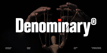 Denominary typeface is about precision, beauty, and refinement. It's crafted with care and attention to detail for professional creative people who value quality and distinction. The Denominary typeface has an advanced feature that sets it apart from others: auto-active contextual alternates. Our font engineer writes this feature to minimize kerning between characters automatically, making it very convenient and easy to use, especially for web purposes where minimal kerning means a smaller font size. The feature adjusts the kerning based on the specific characters being used, ensuring optimal spacing between letters. Contextual alternates will push your typography project to a balanced form. We designed the letterform by considering the white space and contrast to get a natural voice and fluid, and of course, this will happen in a legible and stylish. Denominary typeface offers extensive language support and stylistic variations, thanks to its 482 glyphs. It also has discretionary ligatures, case-sensitive forms, and slashed zeroes for added typographic options. The condensed style saves space, and seven weights will provide more options. Denominary typeface brings refinement, exclusivity, and sophistication to any design project. It's a typeface that tells a story of precision, beauty, and distinction. Go ahead with the game in terms of its advanced auto-active contextual alternates feature, giving you a competitive edge in the design field.
 - Dikta Neue by Atasi Studio,
$16.00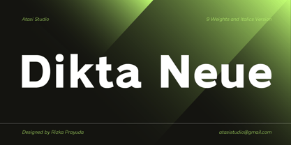 Dikta Neue is a neo-grotesque sans serif typeface inspired by Swiss Design in The 1960s. With a solid and minimalist letterform make this typeface suitable for text and display. Dikta Neue is available in 18 different styles from thin to black including italics.