2,060 search results
(0.017 seconds)
- Rude Wide by DSType,
$50.00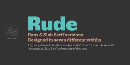 Rude was designed as a dichotomy between the Grotesque and Humanistic typographic shapes: a no-nonsense Sans and a very muscular Slab Serif companion. Showing the historically demanded consistency for such kind of typefaces, this is one of DSType's most wide-ranging and flexible type systems, introducing seven weights across seven widths, from Thin to Black and ExtraCondensed to ExtraWide, along with a wonderful set of Icons.
 - Rude by DSType,
$50.00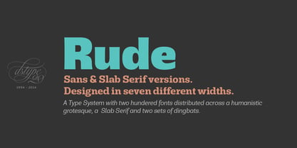 Rude was designed as a dichotomy between the Grotesque and Humanistic typographic shapes: a no-nonsense Sans and a very muscular Slab Serif companion. Showing the historically demanded consistency for such kind of typefaces, this is one of DSType's most wide-ranging and flexible type systems, introducing seven weights across seven widths, from Thin to Black and ExtraCondensed to ExtraWide, along with a wonderful set of Icons.
 - SK Sistematica by Shriftovik,
$32.00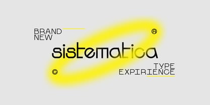 SK Sistematica is a unique modular geometric font. It combines the experimental features of the constructivist period and the strict consistency inherent in the grotesques. SK Sistematica is adapted to modern needs and technologies, which allows it to be easily combined with current design trends. The font is suitable for a wide range of applications: from corporate identification to advertising graphics, from web design to typographic design.
 - Rude Slab Condensed by DSType,
$50.00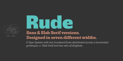 Rude was designed as a dichotomy between the Grotesque and Humanistic typographic shapes: a no-nonsense Sans and a very muscular Slab Serif companion. Showing the historically demanded consistency for such kind of typefaces, this is one of DSType's most wide-ranging and flexible type systems, introducing seven weights across seven widths, from Thin to Black and ExtraCondensed to ExtraWide, along with a wonderful set of Icons.
 - Rude Slab ExtraCondensed by DSType,
$50.00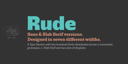 Rude was designed as a dichotomy between the Grotesque and Humanistic typographic shapes: a no-nonsense Sans and a very muscular Slab Serif companion. Showing the historically demanded consistency for such kind of typefaces, this is one of DSType's most wide-ranging and flexible type systems, introducing seven weights across seven widths, from Thin to Black and ExtraCondensed to ExtraWide, along with a wonderful set of Icons.
 - R-Flex by VType,
$25.00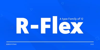 A modern sans serif font with a geometric and a bit of a grotesque touch. It comes in 12 weights, 6 straights and matching italics. Each weight includes extended language support (+ Cyrillic), fractions, tabular figures, ligatures and more. It has been designed with powerful OpenType features in mind. Perfectly suited for graphic design and display use. It could work seamlessly for web, signage, corporate and editorial design.
 - Oblivian Text by Jörg Schmitt,
$35.00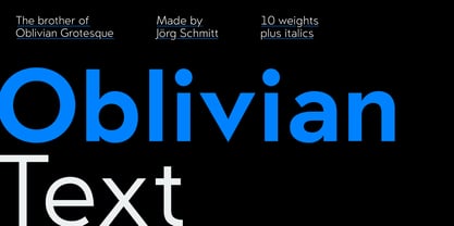 Oblivian Text is a sans serif type family of ten weights plus italics. The typeface is based on geometric forms with bits and pieces of modern humanistic grotesque fonts. It comes along with various OpenType features such as table, old style figures and a stylistic character set. Oblivian Text has an extended character set that supports Central and Eastern European as well as Western European.
 - ITC Weidemann by ITC,
$29.99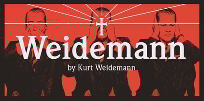 The Weidemann typeface's original name was Biblica, which was designed for the collaborative publication of a Bible by the German Catholic and Protestant Churches. The mass of text which the face was intended to set required that the design allow many characters to fit onto one line without rendering the words illegible. Thus, narrow spacing does not compromise the legibility or the elegance of Weidemann.
 - Malebu by Macrotipo,
$39.00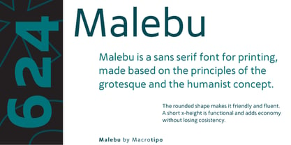 Malebu is a sans serif font that was created based on grotesque and humanist models with certain geometric features. It is clear, simple, gentle and friendly, and can be used in text sizes. It is easy to read in long texts, magazines, books and the like. The rounded shape makes it friendly and fluent. A short x-height is functional and adds economy without losing consistency.
 - Rude ExtraCondensed by DSType,
$50.00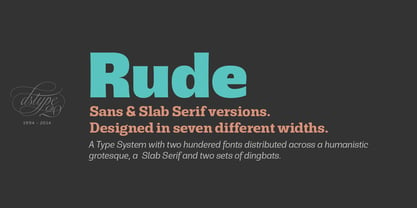 Rude was designed as a dichotomy between the Grotesque and Humanistic typographic shapes: a no-nonsense Sans and a very muscular Slab Serif companion. Showing the historically demanded consistency for such kind of typefaces, this is one of DSType's most wide-ranging and flexible type systems, introducing seven weights across seven widths, from Thin to Black and ExtraCondensed to ExtraWide, along with a wonderful set of Icons.
 - Outgribe NF by Nick's Fonts,
$10.00This rough, raw typeface is based on the lettering in Ben Shahn's iconic poster protesting the execution of Bartolomeo Vanzetti and Nicolo Sacco in 1927. All possible uppercase and lowercase forms have been kerned, and activating Contextual Alternates in OpenType-aware applications will alternate those forms for a more random appearance. Both versions contain the complete Latin 1252, Central European 1250 and Turkish 1254 character sets. - Rude Icons by DSType,
$50.00 Rude was designed as a dichotomy between the Grotesque and Humanistic typographic shapes: a no-nonsense Sans and a very muscular Slab Serif companion. Showing the historically demanded consistency for such kind of typefaces, this is one of DSType's most wide-ranging and flexible type systems, introducing seven weights across seven widths, from Thin to Black and ExtraCondensed to ExtraWide, along with a wonderful set of Icons.
 - Rude SemiCondensed by DSType,
$50.00 Rude was designed as a dichotomy between the Grotesque and Humanistic typographic shapes: a no-nonsense Sans and a very muscular Slab Serif companion. Showing the historically demanded consistency for such kind of typefaces, this is one of DSType's most wide-ranging and flexible type systems, introducing seven weights across seven widths, from Thin to Black and ExtraCondensed to ExtraWide, along with a wonderful set of Icons.
 - Molekyl by Typiskt,
$9.00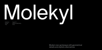 Designed in 2020 Molekyl is a modern neo grotesque family that consists of 6 weights. Rooted in simplicity Molekyl is workhorse typeface that suits many applications. The geometric details and subtleties also makes it a great fit for a clean, sharp and technical impression. The typeface has 420 glyphs (supporting many languages), arrows and opentype features such as kerning, f-ligatures, stylistic alternatives and tabular figures.
 - Ad Lib by Image Club,
$29.99Ad Lib designed by Freeman Craw for the American Type Founders (ATF) in 1961. A bold Grotesque with irregular rectangular counters in round characters. This type was designed by cutting the letter images out and thus has some wood-cut character. Some lower case characters have slight inclination. Initially numerous alternative characters were provided. Unusual shapes make this typeface useful for advertising and display work. - Morton by Deltatype,
$59.00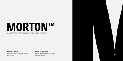 Morton, another modern grotesque typeface which deliver a extraordinary unique within typeface with the style of condensed let you create more impact with your design. Morton Type Family available in nine weights, the Thin weight deliver you a simple hair line stem until you reach the bold weight, you will get more dynamic with three stem weights which give you a modern, old school look and feel.
 - Rude Slab SemiWide by DSType,
$50.00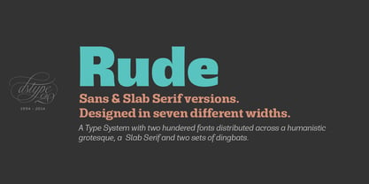 Rude was designed as a dichotomy between the Grotesque and Humanistic typographic shapes: a no-nonsense Sans and a very muscular Slab Serif companion. Showing the historically demanded consistency for such kind of typefaces, this is one of DSType's most wide-ranging and flexible type systems, introducing seven weights across seven widths, from Thin to Black and ExtraCondensed to ExtraWide, along with a wonderful set of Icons.
 - Malebu by Muykyta,
$10.00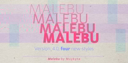 Malebu is a new sans serif font that was created based on grotesque and humanist models with certain geometric features. It’s clear, simple, gentle and friendly, can be used in text sizes. Its easy to read in long texts, magazines, books and the like. The rounded shape makes it friendly and fluent. A short x-height is functional and adds economy without losing consistency.
 - Rude SemiWide by DSType,
$50.00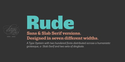 Rude was designed as a dichotomy between the Grotesque and Humanistic typographic shapes: a no-nonsense Sans and a very muscular Slab Serif companion. Showing the historically demanded consistency for such kind of typefaces, this is one of DSType's most wide-ranging and flexible type systems, introducing seven weights across seven widths, from Thin to Black and ExtraCondensed to ExtraWide, along with a wonderful set of Icons.
 - Rude Slab Wide by DSType,
$50.00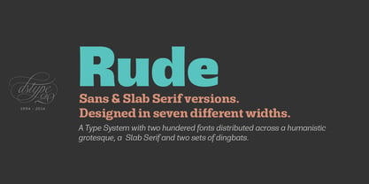 Rude was designed as a dichotomy between the Grotesque and Humanistic typographic shapes: a no-nonsense Sans and a very muscular Slab Serif companion. Showing the historically demanded consistency for such kind of typefaces, this is one of DSType's most wide-ranging and flexible type systems, introducing seven weights across seven widths, from Thin to Black and ExtraCondensed to ExtraWide, along with a wonderful set of Icons.
 - Hutsulyandiya 2D by 2D Typo,
$36.00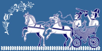 Hutsulyandiya 2D family fonts comprise folk ornaments found on Hutsul ceramics of the mid 19th to early 20th centuries. Hutsulshchyna is an ethnic region in the Ukrainian Carpathian Mountains where folk art and indigenous culture preserve up to nowadays. All images are to the maximum approximated folk prototypes. The graphics are characterized with grotesque, stylization simplicity, surprising plot moves. The font cheers up and evokes positive emotions.
 - Rhode by Font Bureau,
$40.00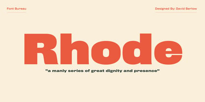 Generous curves above and below the straight-sided Railroad Gothic parallel those of Figgins’s elephantine Grotesques, lending to both British and American series their monumental qualities. Shrinking the center strokes and counters to emphasize a massive periphery, David Berlow has used this curious similarity to suspend a complete family of sanserifs between the two forms, a manly series of great dignity and presence; FB 1997
 - Urban by URW Type Foundry,
$49.99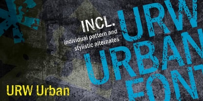 URW Urban follows the trend of pattern fonts. Each character has been provided with an individual pattern created with a special stamp technique. To create a vivid typeface, there is a stylistic alternate for nearly every character. In this way the grotesque has a modern, unconventional look. URW Urban reflects a metropolitan lifestyle and is perfect for themes like party, music, sport and film.
 - Mozer by Fontfabric,
$29.00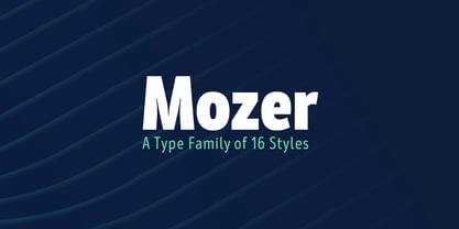 Mozer is a semi-condensed neo-grotesque type family of 16 styles ranging from Thin to Black matched with true italics. With a generous x-height, economical width, moderate contrast and overall solid appearance this typeface shows an uncompromising legibility merged with a contemporary spirit that has not lost its individuality, even in the small details like the discreet ink traps. Mozer covers Extended Latin, Cyrillic and Greek and is suited with plenty of OpenType features, such as localisations, ligatures; four type of numerals including figures and tabular; case-sensitive forms; alternatives etc. Mozer comes accessible and closer to all designer’s needs. Features: • Over 790 glyphs in 16 styles (Thin to Black); • Extended Latin, Cyrillic and Greek scripts for more than 130 languages; • Tall and balanced x-height; • Semi-condensed width proportions; • Moderate contrast and vertical stress; • Neo-grotesque characteristics and terminals with humanistic flavor. Designers: Ani Petrova, Mirela Belova, Nikolay Petroussenko
 - CA Normal Serif by Cape Arcona Type Foundry,
$40.00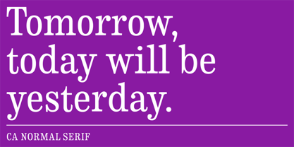 CA Normal Serif is the perfect companion to its grotesque brother CA Normal. But it is not just a serifed equivalent. It has a character of its own while preserving the principal proportions and the idea of quirkiness. It was not the aim to build a typeface that can immediately be identified as a relative of CA Normal. The intention was to create a matching typeface in aspects of aesthetic and concept. Whereas commonly serif-companions to grotesques are old-style or slab-serif, CA Normal Serif is situated between modern and slab-serif typefaces. CA Normal Serif is a little bit of an uncomfortable typeface. Nothing is smooth and cozy. It picks up elements of classic newspaper type as brought to us by Chauncey H. Griffith's legibility group, sharing the flavor of abrasive details and "slabbish" serifs. But the proportions are more condensed than the ones of its predecessors giving it a bit more elegance, which moves it closer to the aesthetic of "Scotch Romans".
 - Emy Slab by Latinotype,
$29.00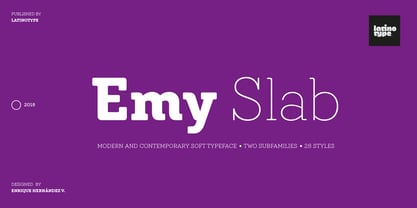 Emy Slab is a slab serif based on the classical proportions of Egyptian typefaces but with soft terminals that give the font a more friendly and modern look. Emy Slab consists of two subfamilies of 7 weights, ranging from Thin to Black with matching italics, resulting in a total of 28 fonts. The standard version is ideal for editorial design, tiles, books, magazines, corporate design and all types of publications. The Alt version—due to its display features, asymmetric shapes and contemporary appearance—is well suited for logotypes, branding, packaging, and use on web and Tv. Emy Slab contains a set of 440 characters that support 208 different languages.
 - Totally Awesome by Comicraft,
$29.00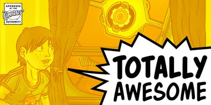 Our newest release is so Totally Awesome, we haven't even found a good NAME for it yet! It’s the kind of font you'll splash all over your covers and title pages to call out FINAL BATTLES WHEN ALL-NEW ALL-DIFFERENT TITANS CLASH! It’s gonna grab your readers and pull them into your own special house of ideas! The story this font wants to tell you is NOT a what if?, NOT a hoax, not an imaginary story. It didn't come BEFORE ELEPHANTMEN, AFTER ELEPHANTMEN or anywhere inbetween! It’s Uncanny, it’s Amazing, it’s Incredible, Invincible, it’s Mighty, Superlative and Wondrous. It’s ready to Assemble, it’s TOTALLY AWESOME!
 - Greuceanu by DePlictis Types,
$36.00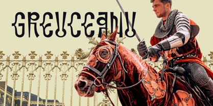 “Greuceanu” is the the name of a brave romanian fairy tale character and his mission was to eliberate de Sun and the Moon that were stolen by some Dragon like creatures that in romanian folklore they are called “ Zmei”. It inspired me to create this decorative uppercase display typeface with strong influences from old cyrillic writing and also a touch of fun and geometrical construction explorations. Besides Extended Latin Support it includes also Cyrillic and Greek alphabets as you already can expect from most of DePlictis Types releases. This decorative typeface goes well for use in book covers and headlines and only your creativity is the limit of its usability.
 - Clean Deco JNL by Jeff Levine,
$29.00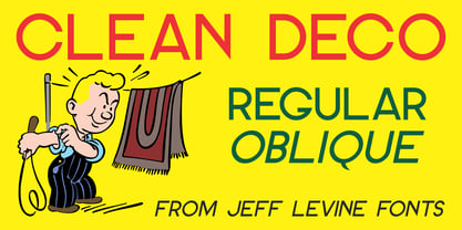 Normally, a short paragraph or two on this page tells the backstory to a font design. In this particular case, that story has been lost to time. Whatever the original source – whether a vintage bit of typography or an original idea – the beginnings of this font lay unfinished for quite a while as it was perceived to duplicate another previous release. However, after recently checking a sample of the design against other Jeff Levine Fonts, it’s reasonably certain this type face may have similar characteristics, but can stand on its own merit. That said, Clean Deco JNL is available in both regular and oblique versions.
 - Fd Massive by Fortunes Co,
$19.00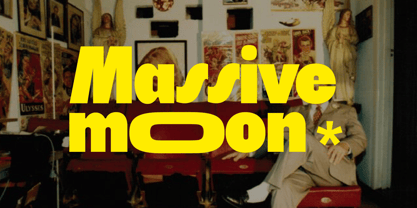 Massive moon is headline font with a retro feel transports readers to a bygone era, invoking nostalgia and charm. Its bold strokes and quirky serifs harken back to the golden age of design, reminiscent of vintage posters and classic advertisements. The typeface exudes a timeless appeal, seamlessly merging the flair of yesteryear with modern readability. Each character carries a sense of character, mirroring the craftsmanship of mid-century typography. The warm color palette and slightly distressed texture further amplify the retro vibe, adding a touch of authenticity. This font doesn't just convey information; it tells a story, bridging the gap between the past and present.
 - Soup Du Jour by PizzaDude.dk,
$18.00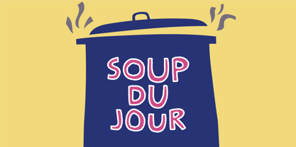 "Soup Du Jour" is French and simply means "Soup Of the Day" - may not sound interesting, but I can tell you that I have had several tasty soup of the day served. I wanted to make a font that resembles that feeling of not really knowing what you get served, but you got a feeling that it is something good! The font has got 6 different versions of each letter, and they automatically changes as you type - it makes your text organic and lively, and probably quite tasty too! :) "Soup Du Jour" is also a well-known quote from one of my favourite movies: "Dumb and dumber"
 - Empire State Deco by Comicraft,
$19.00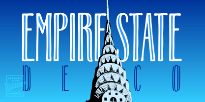 Every face tells a story but this font is 77 stories high (1,046 feet with antenna included)! A lofty companion to Empire State Gothic , Empire State Deco is a tall, stately font containing four different styles, sometimes contradictory, united by the desire to be modern. Those familiar with the Exposition Internationale des Arts Décoratifs et Industriels Modernes will notice a post-postmodernism combined with the fine craftsmanship and rich materials for which those awfully nice chaps at Comicraft are known. During its Art Deco heyday, Comicraft represented luxury, glamour, exuberance, and faith in social and technological progress -- this new font recaptures those halcyon days in letter form.
 - Fransk Nougat by Bogstav,
$18.00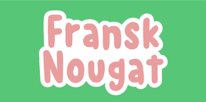 Let me tell you a secret: This font has got absolutely nothing to do with nougat or France. I just love nougat, and I actually ate some while finishing this font! My wife is a good at making cakes, and lucky for me is that she too adores nougat - that way I often get delicious cakes with nougat :) Well, back to the font - a handmade rounded sans-serif, comic, organic, all-purpose with a playful attitude. Goes very well in both UPPERCASE and lowercase. I'd say you can use this for pretty much anything, but categories such as organic, packaging, kids product or sweets come in mind!
 - Tawakkal Sans by Fontdation,
$15.00 New month means new font. Let us introduce our latest (another) sans serif; Tawakkal Sans. This font is a mix of modern and classic style, its cleanliness and irregular shapes represent the future, while its elegant curve mimicking old style typography. Tawakkal Sans is highly versatile, you can use it on many designing fields, ex: headline, editorial, quote-writing, tees/poster design, logo, etc. Packed with lots of glyphs (including OpenType chars), this font is a must have weapon on your designing arsenal. Enjoy!
 - Body by Zetafonts,
$39.00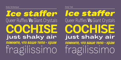 Body graphic project at Behance Body is a type family designed for Zetafonts by Cosimo Lorenzo Pancini with Andrea Tartarelli. Conceived as a contemporary alternative to modernist superfamilies like Univers or Helvetica, Body tries to maximize text readability while providing a wide range of options for the designer. It comes in two variants (Body Text and Body Grotesque), each in four widths and four weights: regular and bold for basic typesetting, light and extrabold for display use. Body Grotesque applies to the sans serif modernist skeleton little imperfections and quirks inspired by our research in early 20th century type specimens. Curves are slightly more calligraphic and a light inverse contrast is applied to bold weights, giving the typeface a slight vintage appearance in display use. Body Text, on the contrary, challenges the modernist aesthetics maximizing horizontal lines and using open terminals for letters like “s” and “a” that appear normally dark in modernist grotesques. For both variants, the normal width family is slightly condensed in an effort to maximize space usage; the Slim width is provided for extremely dense texts or side notes while the Fit width is optimized for display usage as in logos, headings or titles. The Large width manages to look elegant in its light weight while becoming a valid heading or subtitle font in its extrabold weights. All the 64 fonts in the Body superfamily include a complete latin extended character set with small caps for over 70 languages, Russian cyrillic, open type positional numbers, stylist sets and alternate forms.
 - Catseye by Device,
$39.00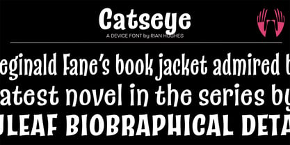 A casual sans that harks back to the very English style of book jacket and poster art of the late 50's and early 60's. The turned-in terminals are reminicent of Stephenson Blake's Grotesque 9, and the italic provides unique cursive versions of the lowercase characters. Available in a "narrow" version as well as two standard weights, this face lends itself to the wider letterspacing that evokes hot metal.
 - Ordina by Schriftlabor,
$39.00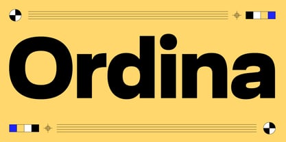 Developed by Indonesian designer Fadhl Haqq, Ordina is a grotesque-style superfamily with no less than 90 styles to choose from. It supports Latin including Pinyin and Vietnamese, Greek and Cyrillic, complete with Bulgarian alternates. Choose from Ordina’s eight figure sets, fine-tune its appearance with stylistic alternates for key lowercase letters, and put the reliable yet stylish sans-serif workhorse to good use in virtually any typographic application.
 - Tide Sans Condensed by Kyle Wayne Benson,
$6.00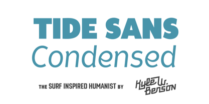 Tide Sans Condensed is fresh, carefree, and just as good looking as its extended brother, Tide Sans. The Tide Sans family includes beautiful italics and an overall affable look lost somewhere between a humanist and a neo grotesque. Tide Sans does the work for you by providing a ridiculously large stylistic alternates set, fine tuned small caps, and a whole beach of alternate (amper)sands to feel between your toes.
 - Nora Art by vve.type,
$44.99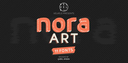 Nora Art is based on Nora Grotesque . It transformed with variations of every letter by using different styles. This amazing font family is based on layer combinations and gives endless possibilities to make various designs. Each style could be used separate or merged in order to create any kind of design you can imagine! It is the perfect solution for logos, headlines and posters that really stand out.
 - Ordina Variable by Schriftlabor,
$600.00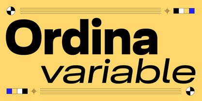 Developed by Indonesian designer Fadhl Haqq, Ordina is a grotesque-style superfamily with no less than 90 styles to choose from. It supports Latin including Pinyin and Vietnamese, Greek and Cyrillic, complete with Bulgarian alternates. Choose from Ordina’s eight figure sets, fine-tune its appearance with stylistic alternates for key lowercase letters, and put the reliable yet stylish sans-serif workhorse to good use in virtually any typographic application.