2,060 search results
(0.019 seconds)
- Lomatic by Rochart,
$25.00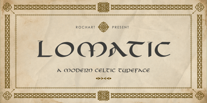 Lomatic Celtic typeface is a captivating font inspired by the enchanting world of Celtic art and symbols. With its beautifully crafted knots and intricate patterns, this font brings a touch of ancient mysticism to your designs. Perfect for projects related to mythology, folklore, or any Celtic-inspired theme. Embrace the magic of Lomatic Celtic typeface and let your creativity weave mesmerizing tales of the Celtic heritage.
 - Magic Spell JF by Jukebox Collection,
$32.99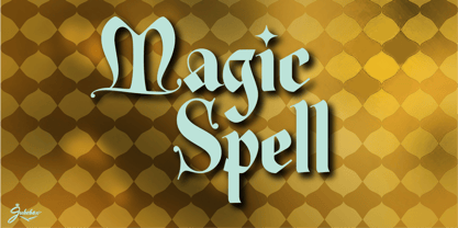 Magic Spell is a mystical, fun font based on a handlettered alphabet in an old 1930s book on lettering. It captures that old world feel of magical wizards and fairy tales. Conjur up some fantastic designs with this bewitching font! Jukebox fonts are available in OpenType .otf format and all fonts contain basic OpenType features as well as support for Latin-based and most Eastern European languages.
 - Art Deco Flowery Initials by Celebrity Fontz,
$19.99Art Deco Flowery Initials is a collection of richly decorated Art Deco letters set on a background of vines and blooming flowers. Includes one set of A-Z ornamental initials conveniently assigned to both the upper and lower case alphabet characters. Perfect for starting off the beginning of paragraphs in artistic publications, storybooks, fairy tales, and texts conveying the feel of the Art Deco period. - Bylander by Mans Greback,
$59.00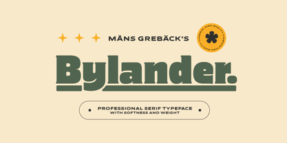 Bylander is a stateful serif typeface. With robust, heavy letterforms reminiscent of a foundry's hammer hitting molten metal, and an unpaired weight, Bylander's characters seem forged from the core of the Earth. Its rounded corners whisper tales of smoothened river stones, and its gentle curves combined with its industrial mass makes Bylander a paradox; both intimidating in its boldness and welcoming in its approach.
 - Jolly Jester by Deniart Systems,
$20.00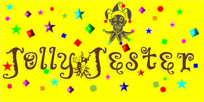 Jolly Jester is an irregular and whimsical typeface inspired by old type playing card jokers. Great for any humorous occasion, whether you're designing headlines, greetings, fairy tales or any number of other projects. Jolly Jester includes a large assortment of extended characters to support many of Europe's languages, including Czech, Danish, Dutch, Esperanto, Finnish, French, German, Italian, Hungarian, Polish, Portuguese, Romanian, Spanish, Swedish, Turkish & Welsh.
 - Roseborough by BeckMcCormick,
$14.00Roseborough is best for: - logos + branding, especially cosmetics, fashion, & clothing brands - website design + website accents - think feminine websites, creative professionals, travel blogs, fashion blogs, & more - clean print design, like magazines + flyers - header elements that need a clean, modern look - quote graphics for social media - chic graphic tees - Irish Penny by K-Type,
$20.00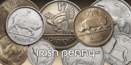 Irish Penny is based on the lettering from Percy Metcalfe's beautiful and influential pre-decimal coinage of Ireland, the Barnyard Collection. The font is more monoline than is conventional for Irish insular styles, almost giving the feel of a modern soft sans, and perfect for small and large scale display purposes. Irish Penny contains a full complement of Latin Extended-A accented characters, Irish lenited consonants with the dot accent, and the tironian et which is commonly used in Ireland instead of an ampersand. Lowercase characters are provided small caps style, slightly reduced in size and subtly thickened in weight. The licensed font comes with a faux italic, and although obliques are not common among insular typefaces, Irish Penny Italic is a useful smart and sporty extra. Although the insular G/g is usually understood, Irish Penny also includes a more latinised option as an alternate G/g. The supplemental 'Irish Penny Alternate G' font places the latinised G and g characters at the normal G/g keystrokes, and makes the original insular glyphs the alternates. An alternate E/e with an angled crossbar is also included. The font contains a selection of discretionary ligatures, these include the ligatures that were used for pre-decimal coins: AC/ac, AE/ae, AL/al, AO/ao, AU/au, AT/at (halfpenny, half crown), AX/ax, AY/ay CA/ca, CC/cc, CE/ce, CO/co (half crown), CU/cu, CY/cy EA/ea (halfpenny, half crown), EC/ec, EE/ee, ET/et, EU/eu (sixpence), EY/ey FE/fe (farthing), FF/ff, FL/fl (florin) GI/gi (penny), GU/gu KA/ka, KE/ke, KI/ki, KO/ko, KT/kt, KU/ku LA/la, LE/le (halfpenny, half crown), LL/ll (shilling), LO/lo, LT/lt, LU/lu, LY/ly RA/ra, RC/rc, RE/re (three/sixpence), RH/rh, RI/ri (florin), RK/rk, RN/rn, RM/rm, RO/ro (half crown), RR/rr, RT/rt, RU/ru, RY/ry TA/ta, TE/te, TO/to, TU/tu NOTE - Irish Penny contains some characters that are not accessible directly from your keyboard, but which may be copied from a font viewer such as Character Map, Font Book or FontExplorer, and pasted into documents. They can also be accessed from the Glyphs browsers within OpenType-aware applications like Adobe InDesign and Illustrator, and Affinity Photo and Publisher.
 - Etrusco Now by Italiantype,
$39.00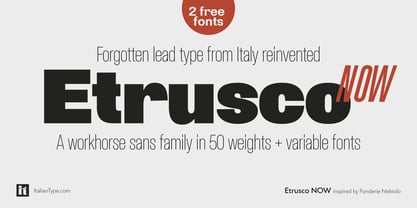 Etrusco Now is the revival of a lead typeface originally cast in lead by Italian foundry Nebiolo in the early 1920s. Heavily inspired by the design of the Medium weight of Schelter & Giesecke's Grotesk, Etrusco was, like Cairoli, an early precursor of the modernist grotesque superfamilies: a solid, multi-purpose "work-horse" typeface family that could solve a wide range of design problems with its range of widths and weights. When designing the new incarnation of Nebiolo's Etrusco, the Italiantype team directed by Cosimo Lorenzo Pancini and Mario de Libero decided to extend the original weight and width range to keep this "superfamily" approach. Etrusco Now has twenty-one styles widths in three widths of seven weights each, with matching italics; the original weights for the typeface have been collected in the Etrusco Classic subfamily. Etrusco Now new widths allowed the team to include in the design many nods and homages to other vintage classics of Nebiolo. The lighter weights of the normal width have been heavily influenced by the modernist look of Recta, while the heavy condensed and compressed widths refer to the black vertical texture of Aldo Novarese's Metropol. This infuses the typeface with a slightly vintage mood, making Etrusco at the same time warmly familiar and unexpected to eyes accustomed to the formal and cold look of late modernist grotesques like Helvetica. Contemporary but rich in slight historical quirks, Etrusco Now is perfect for any editorial and branding project that aims to be different in a subtle way. Etrusco Now's deviations from the norm are small enough to give it personality without affecting readability, while its wide range of open type features (alternates, stylistic sets, positional numbers) and language coverage make it a problem solver for any situation. Like its cousin Cairoli, Etrusco is born out of love for lost letterforms and stands like its lead ancestor from a century ago, at the crossroads between artsy craftsmanship and industrial needs.
 - VAG Rounded Cyrillic by Linotype,
$67.99Designed for Volkswagen AG in 1979, VAG Rounded is a modification of 19th-century grotesques. Exceptional in this typeface are the rounded stroke endings. Use this typeface for technical texts, instruction manuals, or advertising. - Niveau Serif by HVD Fonts,
$40.00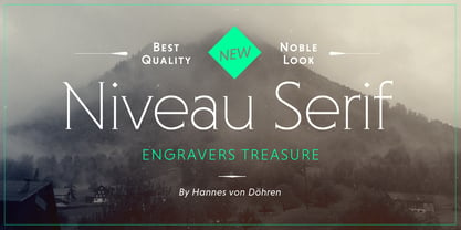 Niveau Serif - the companion of Niveau Grotesk - is a type family of six weights plus matching italics & small caps. It was designed by Hannes von Döhren in 2013. Influenced by classical nineteenth century engravers faces, the fonts are based on geometric forms. Niveau Serif has a contemporary feel and combines the clearness of a Sans with the elegance of a typeface with serifs. Niveau Serif is equipped for complex, professional typography with alternate letters, arrows, fractions and an extended character set to support Central and Eastern European as well as Western European Languages.
 - Taxon by Hoftype,
$49.00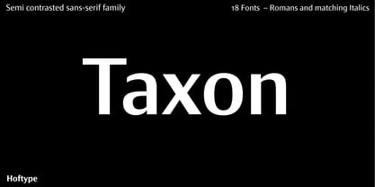 Taxon is a straightlined Sans with a clean, fresh and unsentimental look. Related to classical faces like Optima and Imago, it appears more contemporary and merges the austere linearity of the Grotesk with the elegance of the Antiqua. The Taxon family consists of 12 styles and is well suited for ambitious typography. It comes in OpenType format with extended language support. All weights contain ligatures, superior characters, proportional lining figures, tabular lining figures, proportional old style figures, lining old style figures, matching currency symbols, fraction- and scientific numerals, matching arrows and alternate characters.
 - Leon by Hafontia,
$99.00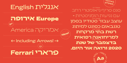 Leon is a modern wide sans serif type family in Hebrew and Latin. It comes in four styles to match any design need - Headers in Black or Thin to long text in regular and Bold. Includes full Hebrew support including punctuation. Designed in Tel Aviv by Ben Nathan, 2021.
 - Rothorn by ROHH,
$35.00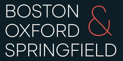 Rothorn™ is a modern, minimalist geometric sans with its own personality derived for subtle design details, such as cut diagonal corners, pointed t, very small contrast and closed aperture. The letterforms give the typeface a lot of charisma, keeping a very minimal, clear and well balanced look at the same time. Its powerful and sharp shapes together with the variety of weights from Hairline to Black make it a perfect choice for headlines and branding. Generous x-height, careful spacing and distribution of weights give it a color and legibility great for long paragraphs of text. Rothorn is a geometric member of a large type system including such families as Montreux Grotesk (Swiss-style grotesk), Lütschine (narrow headline family) and Conthey (narrow headline unicase family). The Rothorn family consists of 10 weights with corresponding italic styles, giving a total of 20 styles. Italic styles were hand drawn to get sharp and fine letter shapes. It includes a 2-axis variable font letting you adjust the weight and italic slant to your exact needs. The family has extended latin language support, as well as broad number of OpenType features, such as, case sensitive forms, ligatures, contextual alternates, lining, oldstyle, tabular and circled figures, slashed zero, fractions, superscript and subscript, ordinals, currencies and symbols.
 - Dopis by Tour De Force,
$25.00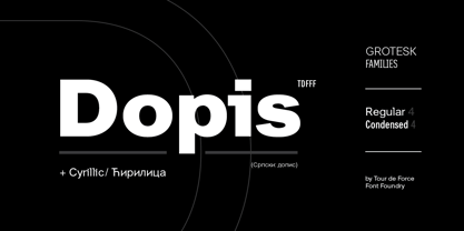 Dopis (Допис on Cyrillic) is neo grotesque family available in four weights and in two widths. It is universal and neutral typeface, fully applicable in every situation. Contains extended Latin character set with Cyrillic support.
 - Acumin by Adobe,
$35.00Acumin is a versatile sans serif intended for a balanced and rational quality. Solidly neo-grotesque, it not only performs beautifully at display sizes, but also maintains an exceptional degree of sensitivity for text sizes. - Bitters by Aboutype,
$24.99A grotesque style with extended caps, true short caps and a thin mono-weight drop shadow. Bitters was designed for all media in a wide point size range. Bitters requires subjective display kerning and compensation. - Text Book by ParaType,
$30.00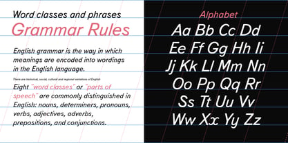 Designed at Polygraphmash in 1958 by Elena Tsaregorodtseva; Latin characters and italic were added in 1987 by Emma Zakharova. An early sans serif ('Grotesque'), it was developed for primers and the first level school textbooks.
 - Brandon Text by HVD Fonts,
$40.00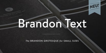 Brandon Text is the companion of the famous Brandon Grotesque type family. It has a higher x-height than the Grotesque version and is optimized for long texts, small sizes and screens. This sans serif type family of six weights plus matching italics was designed by Hannes von Döhren in 2012. Influenced by the geometric-style sans serif faces that were popular during the 1920s and 30s, the fonts are based on geometric forms that have been optically corrected for better legibility. Brandon Text has a functional look with a warm touch and works perfectly together with Brandon Grotesque . It is manually hinted and optimized for screens, so it will be a good choice for Websites, eBooks or Apps. The whole Brandon series is equipped for complex, professional typography with different sets of numbers, alternate letters, fractions and an extended character set to support Central and Eastern European as well as Western European Languages.
 - Hoffers by Konstantine Studio,
$17.00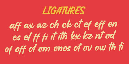 Say hello to Hoffers. A bold and casual script typeface with implementation of markers handwriting vibes. Some are connected and the others aren't. Perfectly fit for casual logotype, food and beverage branding, book covers, anytime you need to tell fun stories, Hoffers is the answer. Packed up with 30 ligatures to make it look seamlessly handwritten. Carefully crafted click by click to keep it clean in every strokes.
 - Classic Fairy by Timurtype,
$14.00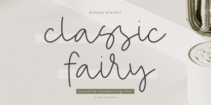 Introduced by Timurtype Studio! Classic Fairy is a Monoline Handwriting Font This font showcases the art of monoline handwritten fonts – a symphony of elegance and charm. Let charming threads weave a tale of elegance in your designs, where every curve whispers sophistication and timeless appeal Classic Fairy Font also supports multilingualism. Enhance your designs with our original fonts, feel free to comment or provide feedback, Enjoy the fonts 😊 Thank You
 - Swithin by Scriptorium,
$24.00Swithin is based on hand lettering from the titles in a Victorian fairy tale collection. It has a playful look which seems just right for the holiday season, with some rough, hand-drawn variations which make make it feel more unique. It's conceptually similar to our Candlemas and Summerisle fonts, but has its own special personality. It ought to be excellent for holiday cards and other seasonal uses. - Bubblegum Sans Pro by Sudtipos,
$19.00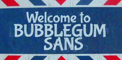 Bubblegum Sans Pro is upbeat, flavor-loaded, brushalicious letters for the sunny side of the street. It bounces with joy and tells a great story. Designed by Angel Koziupa and produced by Ale Paul, this typeface is a loud 21st century shoutout to the kind of the 1930s lettering that sold everything to everyone through every medium. Bubblegum Sans Pro version covers all Latin-based languages and includes some alternates.
 - Downtown Tessie NF by Nick's Fonts,
$10.00Here's another mosaic marvel from the New York subway system, to complement Midtown Tessie. This style is based on signage at the 34th Street station, with connections to Brooklyn. A full tile background is available at the bar position, and a marvelous meander can be found at the German double-s spot. Both versions of the font include 1252 Latin, 1250 CE (with localization for Romanian and Moldovan). - Houseplant by PizzaDude.dk,
$20.00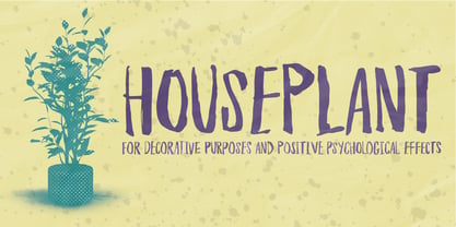 Houseplants are commonly grown for decorative purposes, positive psychological effects, keeping fresh or health reasons such as indoor air purification. Actually, just like this font has a positive effect on your artwork! This font comes with a heavy load of diacritics! On top of that, it has contextual alternates, which means your text cycles through 6 different versions of each letter! Hard to tell that this is actually a font!
 - Weeping Willow by Hanoded,
$15.00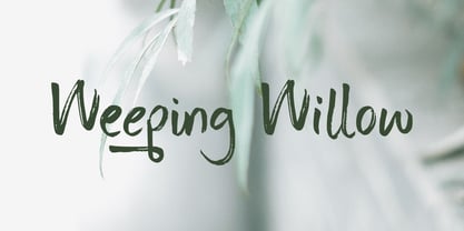 I have always liked Weeping Willows, they sort of remind me of China. During my years as a tour guide, I spent a lot of time in China and I can tell you that the Chinese love weeping willows - they plant them everywhere! Weeping Willow was created using a Japanese brush pen (bought in China actually…). It comes with double letter ligatures and a bunch of swashes as well.
 - Fleurons of Paris by Outside the Line,
$19.00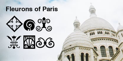 The Fleurons of Paris were inspired by an iron gate, an iron railing, a Metro tile, a Metro stop, the Eiffel Tower, Notre Dame, a rainy afternoon, a glass of wine, an outdoor cafe and the list goes on and on. Absorbing all things visual was immensely satisfying second only to coming home and reliving the trip tiny graphic by tiny graphic. Also look at the Ornaments of Paris.
 - Mystice Times by Mans Greback,
$59.00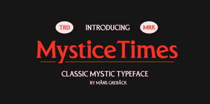 Dive into a realm where retro meets mystique with the Mystice Times font. Channeling the enchanting ambiance of 80s thriller movies, this serif typeface echoes tales of mystery wrapped in professionalism. Its characters, though rooted in the cinematic charm of yesteryears, are tinged with an unpredictable, slightly eccentric flair. Yet, there's an undeniable allure in its design - a suave nod to 70s funk, blending seamlessly with 80s charisma.
 - Gloriana by Scriptorium,
$12.00Gloriana is based on hand lettered titles from an old fairy tale book. The illustrator isn't credited, and we had to create and modify a lot of characters, but we preserved the interesting personality of the original lettering. In creating Gloriana the popularity of Folkard was kept very much in mind, so it has some of the same features, including special flourished characters accessed with the option/alt key. - Zahar by Apostrof,
$30.00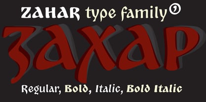 Zahar type family is based on the lettering developed by the famous Ukrainian graphic artist Georgi Yakutovich and designed for Ivan Franko's book Zakhar Berkut. It is good for the design of children's books, folk tales, songs, etc. Zahar is easy to read in short texts. It supports Extended Latin and Cyrillic (including Old Church Slavonic). A special OT-feature is added to support the Old Church Slavonic alphabetic numeral system.
 - Firelli by Typejockeys,
$60.00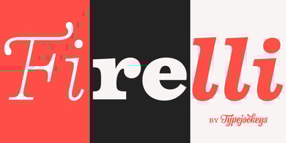 Firelli is an original family of 14 styles including 7 weights and Italics. Delighting from thin to black, Italic swash caps, ligatures, and neat alternate characters. Big headlines will love Firelli’s incorruptible details. Longer texts will benefit from a wide-ranging family with its solid posture. Go, use everything Firelli has to offer, to design your contentful magazines, powerful annual reports, or even bedtime stories and fairy tales.
 - Middle Earth by Mans Greback,
$59.00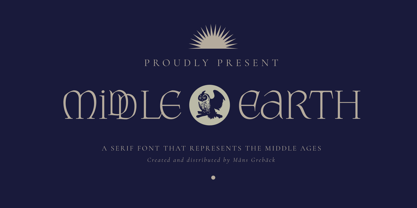 Middle Earth is a Medieval calligraphy serif font. With the historic charm of ancient manuscripts and the ethereal beauty of elven realms, Middle Earth typeface weaves tales of valor and legends. Its calligraphic allure is accentuated by rounded contours, reminiscent of Tolkien's enchanted worlds. The unusually large lowercase, almost circular in its form, seems to echo the undulating hills of the Shire, while its Irish-inspired design lends a timeless elegance.
 - Hadrian LP by LetterPerfect,
$39.00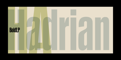 Hadrian Bold pushes the limits for an extra-condensed titling face. Though remaining in the tradition of the 20th-century 'grotesque' designs, its heavy verticality and tight spacing demand attention for headlines at virtually any size.
 - Steamer by Erik Bertell,
$29.95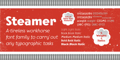 Steamer is a grimy grotesque with a thick early 20th century air to it. A tireless workhorse, it is accustomed to carrying out any typographic task from continuous text to bold headlines steadily through any conditions.
 - Anti by Type Firm,
$39.99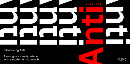 If we look up the definition of the word "grotesque", we find the following: "Odd or unnatural in shape, appearance, or character; fantastically ugly or absurd; bizarre." Following this definition, the design for Anti aims to create an un-compromised version of a grotesque sans-serif – where decorative details live in balance with brutalist shapes. The result is an alphabet with a slightly modernist feeling and an eccentric touch, that work wonders at small sizes. The typeface comes with four weights – light to bold – and features a character set supporting Central and Eastern European as well as Western European languages.
 - Peter by Vibrant Types,
$33.00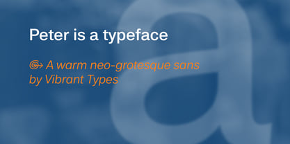 Peter started as a sketch in the static sans-serif tradition of Helvetica®. Then slight references to the calligraphic origin of type were added, giving it a more distinct character. This neo-grotesque sans has rational and clear basic letterforms, while in its details it unfolds attributes of humanist type. As a neo-grotesque sans it claims a very modest design, yet being a bit wider than its relatives and offering the warmth of humanist drafts. The early sketch grew to a type family of 18 fonts and now supports 700+ glyphs with pro opentype features.
 - Jessi Neue by Nois,
$18.00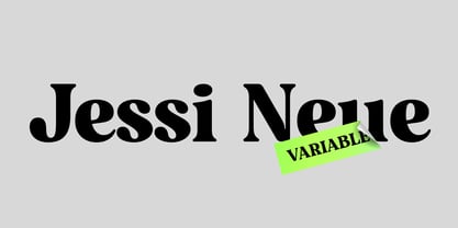 Jessie Neue in a new Serif typeface inspired by popular '70s fonts mixed with grotesque touches. It has ligatures that make it more elegant and grotesque elements that give it a modern look and make it more versatile. Jessi Neue has a great performance in large body texts and also in high impact headlines. The family has four weights and also a variable version to give more creative freedom. It has 667 characters that covers the following languages: Basic Latin, Western European, Central European, South Eastern European, Vietnamese, Pinyin and Basic Greek. The italic version will arrive soon.
 - Cavita Rounded by Underground,
$9.90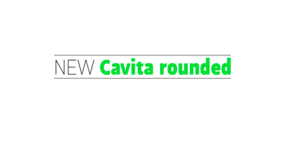 Cavita Rounded typeface is a mix between both grotesque and calligraphic models: regulars have a rough grotesque spirit, while the italics where inspired in calligraphic gestures. All of these details are reinforced with an inverted modulation (horizontals strokes are thicker than usual). The italics seem to move away from the traditional concept of type system, but work very well alongside. This typeface has very particular shapes and rhythm, itís different and identifiable from the rest, making it a very good option to use on any piece of design. Cavita Rounded is designed as an upgrade Cavita.
 - BR Cobane by Brink,
$30.00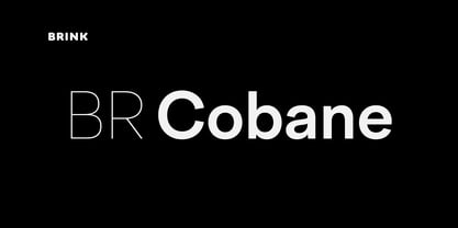 A modern neo-grotesque type family of 16 styles. BR Cobane is a fine balance of functionality and contemporary characteristics. Precisely drawn with a modern aesthetic in mind, Cobane has familiar qualities associated with the classic grotesques, but combines them with a stronger modern geometric flavour. BR Cobane is available in 16 finely crafted styles, with eight weights ranging from Thin to Black. The fonts also provide advanced typographic support with OpenType features such as case sensitive forms, icons, stylistic alternates, slashed zeros, and multiple figure sets. Also containing advanced language support as standard. For custom inquiries please contact: mail@brinktype.com
 - Rabigail by Sensatype Studio,
$15.00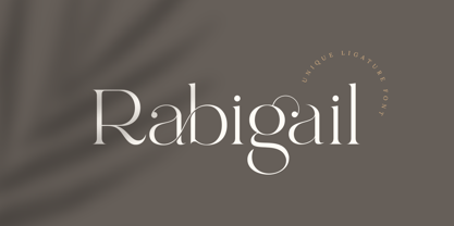 Rabigail is an unique and very elegant font for brand and logo design. Based on our experience as a graphic designer who works for a lot of companies, we often are requested to design a logo in a unique style but with an elegant shape. So, we try to brainstorming and create this font to make the idea is going out. This is perfect for BRANDING and LOGO DESIGN. You will get classy, elegant, and certainly unique logos with this font. To make it look more unique, here we prepared some ligatures: ab ah am an ar ak ap at oo cb ch ck cm cn cr ct eb eh ek em en ep er ub uh uk um un up ur st tb th tk tm tn tp tr tu ty fl fi ff ft oo cra ee ga gi it UPDATE v2 - New Additional Ligatures: ob oh om on op or Wish You enjoy it. :) Rabigail is also included full set of: uppercase and lowercase letters multilingual symbols numerals punctuation Wish you enjoy our font and if you have a question, don't hesitate to drop message & I'm happy to help :)
 - Retch by Hanoded,
$15.00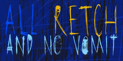 Retch - what's in a name? Retch is a unique typeface, heaving with character. It is scary and grotesque and is made to look like letters scratched onto a metal surface. Retch spits out most Latin based languages.