10,000 search results
(0.031 seconds)
- Handbag Jack by PizzaDude.dk,
$20.00Handbag Jack is all you need! A handwritten font with an attitude ... Charming ... crunchy ... smooth! - Metapsim MF by Masterfont,
$59.00 Need a tattoo? there you go. Crazy and naughty - who could ask for anything more?
 - Klaf MF by Masterfont,
$59.00 Gentle feather strokes make this font an elegant companion for whatever need the traditional touch.
 - "Ab Fangs" instantly conjures an image of a font that is as intriguing as its name suggests. This imaginary typeface draws inspiration from the world of the mystical and supernatural, with each lette...
- Ladies and gentlemen, gather round, for I have the pleasure of introducing you to one of the most charmingly whimsical typefaces to ever grace the digital page: akaDora, crafted by the one and only J...
- Ah, the NAUJOKSLOVE font, the very essence of what happens when a designer decides that the alphabet had one too many glasses of romantic comedy and decided to waltz through the moonlight! Crafted by...
- Valley of Winter by Colllab Studio,
$15.00 Presenting Valley of Winter! A Calligraphy Font. This font made with the perfect combination of each character. You can combine with Extra to get a unique combination. It looks original and can be used for all your project needs. Each glyph has its own uniqueness and when meeting with others will provide dynamic and pleasing proximity. This font can be used at any time and in any project. You can see in the presentation picture above, Valley of Winter looks versatile on design projects. So, Valley of Winter can't wait to give its touch to all your design projects such as quotes, poster design, personal branding, promotional materials, website, logotype, product packaging, etc. Besides that, Valley of Winter also has some ligature that gives a surprise when you type certain characters combining. The ligatures are tt, ll, rr, ss, ee, and cc. WHAT'S INCLUDED? 1. Valley of Winter • It comes with uppercase, lowercase, ligatures, numeral, punctuation, symbols, and Standard Latin Multilingual Support (Afrikaans, Albanian, Catalan, Danish, Dutch, English, French, German, Icelandic, Indonesian, Italian, Malay, Norwegian, Portuguese, Spanisch, Swedish, Zulu, and More). Also included some alternates for ending glyphs; a, e, d, g, h, i, j, k, l, m, n, q, r, t, and u. 2. Extra Swash • You can feature all with typing c_1 until c_4 A Million Thanks Colllab Studio
 - Circuletter JNL by Jeff Levine,
$29.00 Letters in circles are certainly nothing new typographically, but nonetheless they were a favorite tool for sign makers in past decades for emphasizing names or key words in a message. Inspired by an image of an old-time hardware store sign in New York City with Franklinesque lettering, it has been reproduced as Circuletter JNL.
 - Hasta Luego by Hanoded,
$15.00 Hasta Luego means ‘see you later’ in Spanish. It is something you say when parting, but it doesn’t really mean you’ll have to see each other again. Hasta Luego is a happy, all caps font. It’s a bit random, a bit wobbly and it comes with some interesting discretionary ligatures for you to play with.
 - Glamline by Tadiar,
$17.00 Glamline Font is classic and modern sans serif font carefully designed and well looking with Latin Extended character set. It is good for Text and Headers with lowercase and uppercase letters both! Glamline ideally works in luxury, fashion, cosmetics, wine and food areas. Please see the large preview images to see how it works.
 - Perfect Love by Goodigital13,
$20.00 wedding invitations, thank you cards, quotes, greeting cards, logos, business cards and every other design which needs a handwritten touch.well together! It is suitable for you to use in making t-shirt design, quote, label, packaging, logo type, or long writing. Because we have compiled kerning and matrices that are tailored to your needs.
 - XXII Grober Bleistift by Doubletwo Studios,
$21.99 Handwritten Pencil Capitals You need a simple pencil written look? There you go. Maybe the Bleistift fulfills your needs. It’s perfect to use on notes or handwritten lookalike products. The font uses the calt-OpenType-feature to replace every second lowercase with an alternate. This makes the look way more handwritten. Extended detail on behance.net.
 - Magic Vibes by Mvmet,
$12.00 Magic Vibes is your perfect font if you need something magical themed. You can use it for anything ranging from t-shirts, kids’ book designs, and greeting cards to stickers and posters, or anything that needs a casual touch. Fall in love with its incredibly versatile style, and use it to create lovely designs!
 - Stout by Greater Albion Typefounders,
$10.00 Stout is a deliberately aggressively solid family of four faces, offered in two weights and in serif (deliberately large serifs) and sans forms. It’s ideal for signage that needs to be read over long distances or for anything where an emphatic statement is needed. Stout is big and clear and always makes a statement.
 - Handkick by Letteralle,
$18.00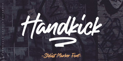 Introducing, Handkick! a smooth and silky handwritten font. handkick is equipped with multilingual support, ligature, and also a swash underline. To access swash you only need to type "_1" - "_3". Handkick is very suitable for various design needs such as merchandise, packaging, social media, ads, T-shirts, logos, events, and many more. Thank you!
 - Simple Nib by Attractype,
$10.00 Simple Nib is a simple, modern and elegant serif font. The corners of each letter are rounded, making them dynamic and eye-catching for any design project. The embedded standard features are enough to meet your standard typography needs. However, if you like this font and need additional features, please feel free to contact me.
 - Love Curly by Goodigital13,
$20.00 Perfect use for a logo for branding, typography design, christmas card, product packaging, invitation, quotes, t-shirt design, label poster, special events and anything that need elegant taste. great for Logotype, Branding Design, Logo Design, Digital Lettering Arts, T-Shirt/Apparel, Poster, Magazine, Signs, Advertising Design, and any vintage design needs. Caps only Fonts
 - Strawn by PizzaDude.dk,
$20.00 Strawn is my Wobbly and curvy funk font with bouncy serifs. Watch it bounce its way down the street, or into your next project - you know, that one that needs a fresh breath of fun! Comes with both fi and fl ligatures! You will need to use OpenType supporting applications to use the autoligatures.
 - ITC Jaft by ITC,
$29.99ITC Jaft is the work of New York designer Frank Marciuliano, an adventurous, energetic display typeface. It began with a series of posters designed by Marciuliano for the New York Times. The lettering was drawn with a bamboo pen and then filled in to create the unusual angles that give ITC Jaft its unique look. - Barbou by Besnowed,
$19.99 Barbou was originally cut in 1925 by Monotype as a counterpart to Fournier, siblings that were different in design but both based on the work of Pierre-Simon Fournier. Whether by choice, accident or oversight, Fournier was preserved digitally, and Barbou was lost to history. Barbou was notably used by Stanley Morrison, in particular as the face of The Fleuron. I fell in love with Barbou when I saw it, and knew that I wanted to bring it to a new generation of designers and readers. This is a revival of Barbou, a faithful recutting with new weights, characters and many of the best features that modern font technology brings. Particular attention was paid to the original Monotype Barbou 178 specimen sheet. Originally only available in a single weight, Barbou has been recut with a variable weight, providing a large degree of flexibility between Regular and Bold. Barbou excels as a comfortable reading face for books, and the variable weight allows you to fine tune the darkness and texture of the page in a way never before possible. Barbou has a distinctive softness, and this revival of Barbou preserves much of the effect the medium of metal type had on the letterforms. This results in a subtly rounded yet defined type, elegant not worn, with the utmost attention and respect to the smallest of details. Barbou was originally cut with disparate x-heights for roman and italic, and this revival of Barbou features both the original italic, as well as a new italic redesigned at the same height as the roman. In Fournier’s time, roman and italic would not be mixed on the same line, but the type must change to meet the needs of a new generation. Barbou also features unique ligatures and alternates, old style numbers, small caps and a full Greek alphabet. Barbou is perfect for books and anywhere a comfortable reading face is required, and excels in flexibility.
 - Power of Dragon by Alit Design,
$21.00 Introducing "Power of Dragon" Typeface - Unleash Your Inner Hero! Unleash the extraordinary with our "Power of Dragon" Typeface, a bold and dynamic serif display font designed for those who aspire to be legendary. Embrace the spirit of a super hero anime with this powerful typeface that combines strength, elegance, and a touch of fantasy. 🐉 Dragons and Wings Illustrations: Feel the might of dragons and soar high with the included intricate illustrations of majestic wings. Each character is crafted to convey the essence of mythical power, bringing an extra layer of magic to your designs. ⚔️ Swords and Pirates: Channel the bravery of a swashbuckling hero with sword illustrations that add a dash of adventure to your projects. The pirate theme brings a sense of daring and excitement, making "Power of Dragon" Typeface perfect for projects that require a touch of maritime courage. 🌟 Super Hero Anime Theme: The "Power of Dragon" Typeface is inspired by the dynamic world of super hero anime, ensuring that your designs exude strength and heroism. Whether you're working on comic books, posters, or branding projects, this typeface brings an electrifying energy to your creations. 🔠 1084 Characters: With a robust set of 1084 characters, "Power of Dragon" Typeface gives you the flexibility to express your creativity without limitations. From uppercase and lowercase letters to numerals and punctuation, every character is meticulously crafted for maximum impact. 🌐 PUA Unicode and Multilingual Support: Seamlessly incorporate "Power of Dragon" into your designs with PUA Unicode support. Additionally, enjoy the versatility of multilingual support, making it easy to communicate your message across various languages and cultures. Let "Power of Dragon" Typeface be your ally in design, helping you create captivating and unforgettable visuals. Elevate your projects to new heights with this font that embodies the spirit of heroic tales and epic adventures. Unleash the power within, and let your creativity take flight!
 - Arrow Hero by Alit Design,
$21.00 Introducing "Arrow Hero" - A Typeface of Elegance and Adventure Unleash the power of elegance and adventure with our latest font creation, "Arrow Hero." This unique serif font seamlessly blends the mystique of archers, the allure of elves, and the boldness of superheroes. Crafted with precision, this font is more than just letters; it's a journey into a world where every curve and angle tells a story of heroic feats and enchanted realms. Key Features: Elegant Serif Design: The Arrow Hero font boasts a sophisticated serif style that adds a touch of refinement to your projects. Each letter is meticulously crafted to exude an aura of strength and grace, perfectly suited for a variety of design applications. Illustrated Elements: Dive into the fantastical with Arrow Hero's unique illustrations. Arrows gracefully adorn each character, symbolizing precision and direction. Delicate elf ears and majestic wings enhance the overall aesthetic, creating a harmonious balance between the worlds of archers, elves, and superheroes. Versatile Usage: Whether you're working on branding, book covers, invitations, or digital designs, Arrow Hero is a versatile font that adapts to various contexts. Elevate your projects with a touch of magic and heroism that this font effortlessly provides. Tailored for Storytelling: Arrow Hero is not just a font; it's a storyteller. Use it to bring narratives to life, creating visual experiences that resonate with the mythical and the extraordinary. Let the characters on your screen or page become heroes in their own right, guided by the elegance of Arrow Hero. Multiple Styles: The font comes in various styles and weights, allowing you to express different moods and atmospheres within your designs. Whether you're aiming for a bold statement or a subtle enchantment, Arrow Hero has the right style for you. Elevate your design projects to new heights with Arrow Hero, where the elegance of serif meets the magic of arrows, wings, and elf ears. Download this font today and embark on a design journey that transcends the ordinary, celebrating the hero within every letter.
 - This Notes by Afkari Studio,
$13.00 Introducing This Notes - Handwritten Marker Note Font is a delightful testament to the artistry of handwriting, meticulously crafted to infuse your designs with an authentic, hand-drawn aesthetic. With a distinctive yet versatile style, This Note is poised to enhance a diverse array of design projects, serving as a conduit for creativity and expression. At its core, This Note embodies the charm of handwritten notes, capturing the nuances and imperfections that make each stroke unique. It's a natural flow and effortless elegance make it an ideal choice for a multitude of graphic endeavors, ensuring its relevance across various platforms and applications. Highlighted Features: - Complete set of uppercase and lowercase letters, numerals, and punctuation marks - Unique alternates and ligatures for added character variation - Compatible with both PC and Mac platforms - Hassle-free installation process - Seamless integration with Adobe Illustrator, Adobe Photoshop, Adobe InDesign, and Microsoft Word - No additional design software is required for full accessibility - Multilingual support encompassing characters such as ä, ö, ü, Ä, Ö, Ü, ß, ¿, and ¡ This Note transcends mere functionality; it becomes a catalyst for innovation and inspiration. Its versatility knows no bounds, seamlessly integrating into digital notes, quote designs, book covers, logos, posters, menu layouts, apparel designs, scrapbooks, comic illustrations, magazine headers, and numerous other creative avenues. The font’s adaptability is matched only by its ability to breathe life into every project it graces. Whether adorning a playful children's illustration or adding a touch of personality to a sophisticated magazine title, This Note lends an air of authenticity that captivates audiences. In conclusion, This Note Handwritten Marker Note Font isn’t merely a font; it's a conduit for creativity, a bridge between imagination and realization, poised to elevate your projects to new heights. Embrace its charm, leverage its versatility, and allow it to become the catalyst for your creative journey. Unlock the boundless potential of This Note, where each stroke tells a story and every design bears the mark of authenticity.
 - Blog Script by Sudtipos,
$39.00 Technology is making it so that we’re all connected without the need for the physical-presence kind of being connected. That is strange, fascinating, and has a certain magnetism that is very difficult to resist. What’s at stake is no less than the transformation of centuries of human behaviour, and that’s part of the fascination. But while our existence morphs and we rush headlong into our socially minimalist future, we use our present culture to helplessly signal our nostalgia about our past. We know what our future will be missing, and we’re already full of nostalgia about it, but we know that what little we can do about isn’t going to affect the outcome that much. So, almost in full hindsight now, the DIY implosion of the past few years must have really been a reaction to our technological dis/connection. In typography, the minimalist future is already here, with something as austere as the sans serif having become the preferred expression of progress and fortune, both part of the connected isolation we are undergoing. But when physical interaction must take place, like coffee shops and gin joints, our organic alphabets ride high and mighty. That sense of human heritage — elegance and exuberance in our writing, the use of flaws to charmingly brand our own individualism — keeps turning up in all kinds of places, most unexpected of which is the digital world. The overall message seems to be that we’re still creative, imaginative, and unique. In the digital world, on blogs where we write about our puny music and fashion preferences, we’re just articulating this individualism of ours, this third domain of existence our future seems eager to dismiss. These were the thoughts behind Blog Script, the second collaboration between Carolina Marando and Alejandro Paul, after their successful stint with the Distillery set of fonts. This typeface comes in two weights, alternates for most letters, and a strong aesthetic rooted in individuality and freedom of spirit. Use it to be alone together, to tell the world that we’re still human, for now.
 - TA Film Fiction Semi X by Tural Alisoy,
$25.00 Film Fiction Semi Expanded has been updated and will now beautify your designs under the name TA Film Fiction Semi-X. We've already updated and revitalized TA Film Fiction Semi-X to ensure it perfectly matches your evolving creative vision. The inclusion of tabular figures, old-style figures and alternative glyphs expands your design palette and allows you to adapt the font to your unique style. TA Film Fiction Semi-X has been updated experience the appeal – this can be your font of choice to enhance your brand identity, cinematic efforts and editorial design. This brilliant typeface is not just a typographic tool, but a creative catalyst for headlines, logos, web elements, signage, posters and fashion apparel, packaging. TA Film Fiction Semi-X does not follow trends, it defines them, imbuing each project with a true modern essence. Embrace the possibilities with 9 different styles, each boasting a large set of 758 glyphs. Discover OpenType features: Access All Alternates, Case-Sensitive Forms, Glyph Composition / Decomposition, Denominators, Fractions, Kerning, Standard Ligatures, Lining Figures, Localized Forms, Mark Positioning, Mark to Mark Positioning, Numerators, Oldstyle Figures, Ordinals, Proportional Figures, Stylistic Alternates, Scientific Inferiors, Stylistic Set 1, Stylistic Set 2, Stylistic Set 3, Stylistic Set 4, Stylistic Set 5, Stylistic Set 6, Stylistic Set 7, Subscript, Superscript, Tabular Figures TA Film Fiction Semi-X supports Khinalyg (Xınalıq) alphabet Test your alphabet, explore the nuances and witness the transformation. And if you're at any creative crossroads, I'm here for you. If you want to customize TA Film Fiction Semi-X, need font files or have any other questions, please reach out to me at t@taft.work. TA Film Fiction Semi-X be the cornerstone of your creative journey. Elevate your designs, embrace innovation and redefine possibilities with TA Film Fiction Semi-X, where each character tells a story. Questions? Contact us at t@taft.work Instagram @taft.work or @tural_a Visit us https://taft.work/
 - 99 Names of ALLAH Linear by Islamic Calligraphy75,
$12.00 We have transformed the “99 names of ALLAH” into a font. That means each key on your keyboard represents 1 of the 99 names of ALLAH Aaza Wajal. The fonts work with both the English and Arabic Keyboards. We call this Calligraphy "Linear" for obvious reasons. The first "Alef" has a "fatha", this indicates that the name can be pronounced only one way, "AR-RAHMAAN". (in the zip file you will find a pdf file explaining the differences in the "harakat", pronunciation and spelling according to the Holy Quran). This calligraphy is very clear and no letters overlap. Decorative letters used in this calligraphy: "Mim, Aain, Sin, HHe, He, Kaf, Ta & Saad". Purpose & use: - Writers: Highlight the names in your texts in beautiful Islamic calligraphy. - Editors: Use with kinetic typography templates (AE) & editing software. - Designers: The very small details in the names does not affect the quality. Rest assured it is flawless. The MOST IMPORTANT THING about this list is that all the names are 100% ERROR FREE, and you can USE THEM WITH YOUR EYES CLOSED. All the “Tachkilat” are 100% ERROR FREE, all the "Spelling" is 100% ERROR FREE, and they all have been written in accordance with the Holy Quran. No names are missing and no names are duplicated. The list is complete "99 names +1". The +1 is the name “ALLAH” 'Aza wajal. Another important thing is how we use the decorative letters. In every font you will see small decorative letters, these letters are used only in accordance with their respective letters to indicate pronunciation & we don't include them randomly. That means "mim" on top or below the letter "mim", "sin" on top or below the letter "sin", and so on and so forth. Included: Pdf file telling you which key is associated with which name. In that same file we have included the transliteration and explication of all 99 names. Pdf file explaining the differences in the harakat and pronunciation according to the Holy Quran.
 - Poeta Color by Tarallo Design,
$14.99 Poeta Color is an ornamental font for making patterns and decorating text. It contains floral and nature motifs. The symbols are versatile enough for simple decoration or thematic seasonal and holiday moods. Designers can use Poeta to make unique lines, fields, borders, or ornamentation within or around text. Try replacing a basic straight line with repeated symbols. Make a background to add visual interest to a design. Use the forms to decorate a chapter title or to mark the end of a magazine article. Replace a letter in a word with a symbol to create a memorable statement. This font began with sketches of patterns seen in ceramic tiles around Sicily. It is named Poeta because Sicily is an island rich in poetry traditions. Below is some helpful technical information. Using this font is simple. Install it and type. Symbols will appear instead of letters. Choose the precise symbols through a software’s glyph palette. Use the type/character menu controls to vary the spacing and density of patterns. All fonts are vector-based, OpenType, and fully scalable. Six of the fonts have different color or grey combinations. One of the fonts (solid) is a standard font. The font previews on this website will only display the font in black. See the slides to get an idea of the colors. Be assured that the colors are present in the files and will appear when loaded on the computer. The colors that are in each font: Primary: red, yellow, blue Secondary: orange, green, purple Tertiary: red-orange, yellow-orange, yellow-green, blue-green, blue-violet, red-violet Diverse: many different warm and cool colors Grey: three different greys from light to dark Gradient: a greyscale gradient Solid: standard font and can be colored normally Software that supports color SVG fonts: Photoshop, since 2017 llustrator, since 2018 InDesign, since 2019 QuarkXPress, since 2018 Pixelmator Sketch
 - 2 Prong Tree - Unknown license

- Nanami Handmade by Thinkdust,
$10.00 Can we get a drum roll please? It’s not every day that a new link in a best selling chain is forged. First, there was Nanami, a font which took the world of type by force, storming to the top of MyFonts Hot New Fonts list; then there was Nanami Rounded, the most successful follow-up since Terminator 2. Well, say Hasta La Vista to boring design because now, there’s Nanami Handmade. With all the geometric, Japanese inspiration and style of the first two iterations, Nanami Handmade carries a quirky, mischievous charm. The font has a charisma matched by roguish anti-heroes; bad guys you love to love and good guys the other good guys hate, but everyone knows they’re what the audience turns up to see. Nanami Handmade comes in two styles, a solid and a hand-drawn, each of which has eight weights. Mix and match between these options to create a balanced piece which makes good use of the tactile, warm, earthy nature of the font. With these sans-serif styles working well in small and large sizes, both on and off screen, Nanami Handmade’s applications are virtually endless. Get your own piece of typography’s elite now, with Nanami Handmade, by Thinkdust.
 - Pamplemousse by The Ampersand Forest,
$19.00 Meet Pamplemousse, a display font that's part fun, casual script and part elegant typeface! Pamplemousse is most decidedly a fellow who enjoys lazy Sunday mornings spent sipping mimosas or bloody marys over a plate of eggs benedict and the New York Times crossword puzzle. He enjoys dressing up for use in branding and headlines (he looks particularly dashing in all caps) and also sitting back and composing a casual note to a dear friend. Pamplemousse is mostly sweet and just a little sophisticated, and he likes being just as he is. Pamplemousse started out as a typeface based on the lettering of Gustav Klimt in his poster for the first exhibition of the Vienna Secession movement (Art Nouveau). This drifted into an homage to Rea Irvin's iconic masthead typeface for the New Yorker magazine. Finally, with the addition of a lowercase (absent from Irvin's typeface), a significant revision away from both Klimt and Irvin into a more casual space, Pamplemousse was born! Oh — why "pamplemousse?" "Pamplemousse" is French for grapefruit. What goes better in your Sunday gin and tonic than an aromatic slice of pamplemousse? Say it a few times. Preferably after a couple of those g & t's. You'll see how fun he can be...
 - Layla by Putracetol,
$24.00 Introducing "Layla," a stunning new display serif font that combines the luxury serif of the display cover with an elegant typeface style. With a lot of alternates character, you have a plethora of options to create unique and striking display lettering. Layla comes with open type features, including a vast selection of alternates and end swashes, allowing you to create stunning lettering designs. Additionally, Layla supports multi-language use, making it ideal for global designs. Layla is best used for various purposes, including Logotype, heading, cover, poster, logos, quotes, product packaging, header, merchandise, social media & greeting cards, and many more. Its versatility makes it a valuable addition to any designer's toolkit. In the zip package, you will receive Layla in otf, ttf, and woff formats, with features that include uppercase and lowercase letters, opentype alternates and ligatures, numbers, punctuation, symbols, and multilanguage support. To access Layla's alternate glyphs, you will need a program that supports OpenType features such as Adobe Illustrator CS, Adobe Photoshop CC, Adobe InDesign, and Corel Draw. Overall, Layla is an excellent font choice for anyone looking to add a touch of luxury and elegance to their designs. Its stunning design and high-quality features make it an ideal font for all your design needs, including print and digital media.
 - PF Beau Sans Pro by Parachute,
$79.00 The design of Beau Sans was inspired by Bernhard Gothic which is considered one of the first contemporary American sans serifs and was designed by Lucian Bernhard in the late 1920s. Panos Vassiliou came across this font while attempting to reduce the design elements of a text typeface, by introducing Bauhaus-like minimal forms to the characters. The first version was completed back in 2002 and introduced one year later in Parachute’s 3rd catalog, under the name PF Traffic. Some time later it was decided to make a few improvements but the project was so carried away that the new typeface which emerged needed urgently a new name. Beau Sans Pro is a modern sans-serif family of 16 fonts which includes true-italics. Just like all other Parachute fonts, it covers a broad range of languages by incorporating 3 major scripts i.e. Latin, Greek and Cyrillic in one font. Furthermore, every font in this family has been completed with 270 copyright-free symbols, some of which have been proposed by several international organizations for packaging, public areas, environment, transportation, computers, fabric care and urban life. This typeface is totally recommended for titles and/or body text when you want to give a distinct and contemporary identity to a product or service.
 - Twogether Rounded by Sudtipos,
$39.00 The new font family Twogether Rounded, designed by Raúl Plancarte and published by Sudtipos, is a Sans Serif style with a rounded appearance. The aim of its design is to establish connections with diverse audiences and create a positive "feel good" sensation. The rounded style of typography is currently appreciated for its friendly and fresh personality. It is in trend, and the internet and technology have welcomed it with open arms, giving it a new sense of purpose. The proof is in the way that brands such as Box, Cox, Gaia Online, Imgur, Instacart, Instagram, itv 4, Jio, Skype, Twitter, Viasat, Vimeo, and Zoom Video have incorporated it into their visual identities. In the case of Twogether Rounded, a technical design has been combined with avant-garde contrasts, while still maintaining an institutional feel. These modern and lively fonts allow for a personal touch to be the protagonist, making them perfect for a range of design applications. Twogether Rounded's design makes it the perfect font family for a variety of design applications, including UX/UI, apps, branding, editorial design, and more. Its versatility and modern style can adapt to different design needs, making it a valuable asset for any designer or creative professional.
 - Gramers by Dora Typefoundry,
$15.00 Gramers is an elegant and modern minimalist font family, a new roman sans serif font carefully crafted, These font ideas come from various references, from vintage, classic, art deco, to the modern era. Carefully drawn with high contrast between the strokes bold and thin with the aim of making even the simplest sans serif letters look sensual, elegant, and warm. The feeling of versatility and luxury you get in Gramers. As you can see in the display of our creations such as Branding, Header, Logotype, Posters, Magazines, Packaging, Art deco wedding invitations, and others. This shows that Gramers can accommodate various design styles. The flat lines cover five styles (each light, regular, medium, semi thick, Thick), each of which includes nearly 293 glyphs. OpenType features include 103 standard ligatures and a small number of character variants, and multilingual support (including multiple currency symbols). Features: • 5 Font weight • uppercase • Alternative & Ligature Styles • Numbers & Punctuation • Characters with accents • Supports Multiple Languages This type of family has become the work of real love, making it as easy and enjoyable as possible. I really hope you enjoy it! I can't wait to see what you make with Gramers! Feel free to use the #Dora Typefoundry and #Gramersfont tags to show what you've done!
 - Molhim by Ethar Elaagib,
$79.00 About Molhim: I first designed Molhim in 2016 as a personal project to digitalize my handwriting. Molhim 2016 was a static typeface, including two weights, and supported basic Arabic only. Since it was my first typeface to design, it had several issues regarding letterform design and aesthetics, good curve drawing, proportions, font programming, and correct OpenType features. So, in 2019 I started redesigning my handwriting font from the beginning to produce a neat Multi-lingual typeface suitable for diverse purposes. Arabic letterforms are redrawn with a focus on proportions and unity. Molhim Variable characteristics: Supports basic Arabic, and Arabic script-based languages, such as Persian and Urdu. Supports Basic and extended Latin characters. Includes 200+ ligatures and alternate styles for a natural flow of letters. Latin small letters have both separated and connected script forms. The variable font comes in two axes, Weight (wght) and Softness (SOFT): The Weight axis ranges from thin to bold, while Softness changes the stroke's cap from a round cap to a sharp projecting cap. Although I see the new Molhim Variable as a different typeface, I decided to keep the name 'Molhim' for the new typeface with the addition of 'Variable'. Molhim is an Arabic word that means 'inspiring'; this is how I hope people would perceive my handwriting.
 - Idealista by Suitcase Type Foundry,
$39.00 Idealista directly responds to its other members, Nudista and Kulturista. It shares the same proportions and the same set of weights, yet it enriches the expression means of the two typefaces with new themes — the character set is smooth, even round, and it boasts a number of special details and perky moves. Most of all, Idealista relishes juicy magazine titles, typographic logotypes and propagandist posters. Unlike cold, technicist typefaces, it has great zest for life, so there's no wonder that in each of the letters, intuition wins over intellect. Owing to this, the text set in Idealista has a special voluptuous quality and unmistakable temperament — in a single typeface Idealista combines the best of sans-serif, slab-serif, as well as geometric and calligraphic construction principles, coming down to one impressive, expressive cocktail. Some letters have serifs, some do not, some are sharp, some are smooth, and all this results in the nice hip-hop beat of the line of text. The typeface has five weights and ten styles in total, so it can easily accommodate to the needs of complex texts, unlike many of its display counterparts. Idealista is valuable partner for the more text-suited Nudista and, if need for tiny sizes arises, to Kulturista as well.
 - Frutiger Serif by Linotype,
$42.99 Frutiger® Serif is a re-envisioning of Meridien,a typeface first released by Deberny & Peignot during the 1950s. Working closely with Adrian Frutiger, Linotype's Type Director Akira Kobayashi expanded the original metal type version of Meridien into a new digital family of 20 variants. Renamed Frutiger Serif, this up-to-date Meridien has new weights, widths, and styles that correspond better with several other of Frutiger's designs. Just as Meridien has always been a fine choice for text settings, Frutiger Serif works brilliantly for large amounts of text & also at small point sizes. With its many weights and styles, this family is strong enough for most typographic projects. However, its added versatility is revealed when used in combination with other fonts. Frutiger Serif works well with the original Frutiger, Frutiger Next, and Univers - just to name a few. Paring these serif and sans serif families together is perfect for creating complex hierarchies and clear information design. Working with complicated typographic systems - involving elements such as headlines, captions, pull quotes, multilingual text, etc - is made easy by selecting Frutiger Serif and another of Frutiger's sans serif families. The designer needs simply to mix and match different weights and styles for the various textual elements to create smart and innovative layouts.
 - Voguish by Redy Studio,
$19.00 Voguish – Sophisticated Calligraphy Are you looking for an outstanding and unique font? Do you want to add some fun and playfulness to your creations? Then this is the font that you need! Say hello to Voguish – the new, exclusive, and elegant font! Voguish is a sophisticated font ideally crafted to easily create amazing results with a minimum of fuss. Voguish is a perfectly balanced font with unique, stylish letter shapes that have been combined with a sophisticated contemporary touch. Being a perfectly multifunctional font, it is the ideal fit for new season designs. It’s perfect for all those luxurious projects or designs that you want to stand out from the crowd! Download it now and make all your dreams come true! It’s so unique and elegant in look, that it will be the talk of your town! Voguish features: A full set of upper & lowercase characters Numbers & punctuation Gorgeous ligatures A full set of alternate upper & lowercase characters Uppercase beginning swashes Lowercase ending swashes Lowercase alternates characters Multilingual symbols PUA Encoded Characters – Fully accessible without additional design software. Feel free to give me a message if you have a problem or question. Thank you so much for taking the time to look at one of our products.
 - Xpress Rounded by Wiescher Design,
$12.00 »XPress-Rounded« is my new addition to »XPress«, my Sans-Serif that impresses – especially in small sizes – with its outstanding readability. »XPress-Rounded« looks very different, almost like a completely new font. But the rounded version has the same seven precisely calibrated weights from »Thin« to »Heavy« and its corresponding italics make this font-family universally usable. The »XPress« fonts got their bearings from the fabulous American »Gothic« fonts of the twenties of last century. Modern, present day elements, high lowercase letters and infinitesimal elegant slight curves in start- and end strokes make the font family not only great for body copy, but also very useful in advertising. Enjoy! »XPress-Rounded« ist meine neue Erweiterung zur »XPress« Familie, die durch aussergewöhnliche Lesbarkeit auffällt. »XPress-Rounded« sieht jedoch vollkommen anders aus als sein älterer Bruder. »XPress-Rounded« hat jedoch die selben sieben präzise aufeinander abgestimmten Schnitte von »Thin« bis »Heavy« und die dazu passenden Kursiven. Das macht die Schriftfamilie vielseitig einsatzfähig. Die »XPress« Schriften basieren auf der Formensprache der grossen amerikanischen Groteskschriften der zwanziger Jahre des letzten Jahrhunderts. Durch moderne Formelemente, große Mittellängen und unendlich leichte, elegante An- und Abstriche ist die Schrift jedoch nicht nur als Textschrift, sondern auch im gesamten Bereich der Werbung vielseitig einsetzbar. Viel Erfolg!
 - Quendel by URW Type Foundry,
$39.99 Quendel has been expanded to become Quendel Happy Family. Apart from the new Bold weight for easy distinction and emphasis, there are now four other very exciting variants, rendering different writing tools and writing materials. The basic form of Quendel was written with a Japanese bamboo tip and therefore embodies a form letter of natural flow. The new versions show other features that provide the feel of written scripts. While the styles Wood and Crayon include some alternate characters, Q Marking Pen and Q Fingertip, due to their apparently more complex enacted forms, do not need additional alternates without looking stiff or boring. The wood relief of Quendel Wood was created by a freehand wood relief drawn with oiled chalk. Quendel Marking Pen seems to be written with a felt-tip pen soon depleted. At the same time it is also reminiscent of the blooming effect, which we know from photography. The name of Quendel Fingertip suggests what can be seen - someone seems to have written with the finger in a grainy material. One would like to try it himself. The effect of broken lines which can be gained by writing with chalk as reflected in Quendel Crayon. Almost like parched sandy soil, the writing material seems to crumble.
