1,314 search results
(0.017 seconds)
- Sauce Grotesk by Creative Sauce,
$36.00 Sauce Grotesk is a compact typeface much like the classic unassuming sans serif grotesques but with softer features that shows fluidity and a sense of easiness. We wanted a typeface that can relate to a broader audience for maximum message clarity while maintaining aesthetic qualities.
 - Zierde Grotesk by Lewis McGuffie Type,
$35.00 Zierde is a take on early advertising, small-copy grotesks of the late 19th/early 20th century, and is largely inspired by Miller & Richard’s own range of Grotesques. More importantly, Zierde is accompanied by a large set of ornaments (+200) which hark back to the look-and-feel of the early-modernist arts and crafts movement. The ornaments in, and presentation of, Zierde owe much credit to J.G Schelter & Giesecke’s 1913 type specimen book ‘Die Zierde’. The strong functional uppercase sans-serifs alongside luscious, beautiful patterns in ‘Die Zierde’ make for beautiful combinations. This early-modernist use of grotesk alongside ornament looks bizarre in the eyes of us used to seeing sans-serifs in more formal, sterile settings. The face itself retains some historical flourishes such as the eccentric leaning angle of the italics, the long cross-bar on the ‘G’, the gammy-leg of the ‘R’, a strange ampersand and some irregular terminals across the weights. Zierde is display face meant for headlines, titles, short-copy, labels and logos. It comes in caps and small caps, Latin and Cyrillic.
 - Kulture Grotesk by SilverStag,
$19.00 I am thrilled to present you the KULTURE GROTESK, a brand new sans serif font meticulously crafted to elevate your design projects to new heights. This contemporary typeface seamlessly blends modernity, chic aesthetics, and boundless creativity to offer a truly unique and captivating visual experience. With its clean lines and refined forms, this grotesk font embodies a perfect balance of simplicity and sophistication. Designed with the utmost attention to detail, it brings a breath of fresh air to the world of typography. Its versatility knows no bounds, making it the ideal choice for a wide range of applications, from editorial design and branding to web design and advertising. Whether you are looking to create a sleek corporate identity or add a touch of elegance to your personal projects, this font will undoubtedly leave a lasting impression. One of the most exciting features of the new font is the inclusion of over 300 alternate letters and ligatures.These unique characters offer a world of possibilities, allowing you to create stunning and original typography. From distinctive logo designs to captivating headlines, this grotesk font enables you to break free from the ordinary and infuse your creations with a touch of individuality. KULTURE GROTESK - Modern Sans Serif Font Includes: Over 300 ligatures and alternate letters Numerals & Punctuation Language Support Web Font Kit is included as well Detailed instructions on how to use alternates in most of the apps on your computer as well for Canva Would you like to get 5 completely free fonts worth over $75? No tricks, no hidden words, terms or anything. Just subscribe to my newsletter, make sure to check your email to approve the subscription, add me to your contacts so that the emails don't end up in spam folder and you will get 5 fonts for free. The fonts are packed with alternates, ligatures and some even come with extra goodies. Happy creating everyone!
 - Altmann Grotesk by Ateljé Altmann,
$50.00 Altman Grotesk was initially planned as an internal studio typeface for the graphic design studio Ateljé Altmann based in Stockholm, Sweden. After thoroughly researching both classic and contemporary sans serif typefaces, the aim for Altmann Grotesk was set at joining unobtrusiveness yet distinctiveness in one look. As a result, the sans serif successfully embraces a polarizing image of minimalism and uniqueness. During the design process of Altmann Grotesk, it soon became clear that it had the potential to be more than a studio typeface—which ultimately led to a sans serif font family with five distinctive weights that are perfected to fit every possible typography use case.
 - Neuzeit Grotesk by URW Type Foundry,
$39.99 Neuzeit Grotesk was originally designed by Wilhelm Pischner (1904-1989) and was released by the font foundry D. Stempel in 1928-1939. In 1970, the German Standards Committee advised the standard use of Neuzeit-Grotesk for official signage and traffic directional systems, and the abbreviation DIN was added to the name of the font. DIN" stands for Deutsches Institut für Normung (The German Institute for Industrial Standards). Neuzeit Grotesk was also once the standard in the German printing industry. It has been seen as a straightforward and utilitarian typeface, with no unusual or distracting features. Like other typefaces from the 1920s, it reflects the philosophy of those times, "Form is Function." Today, however, because of its familiarity and practicality, Neuzeit™ Grotesk has acquired an almost cheerful and reassuring aura. Try it out for signage, magazine headlines, or flyers. See also Neuzeit S for text weights of Neuzeit Grotesk.
 - Nubrix Grotesk by Ensor Creative,
$19.99 Nubrix Grotesk is a condensed geometric sans full of curves, character & charm. Perfect for big statements and impact!
 - Ikhsani Grotesk by Makarsih Studio,
$9.00 Ikhsani Grotesk is a modern, contemporary font that offers an elegant and stylish look. It's perfect for any project that requires a bold yet sophisticated style. The font features strong lines and curves with sharp edges to create a unique visual effect. Its clean design makes it easy to read on both digital platforms as well as in print materials, making it ideal for logos, branding projects, websites or other graphic designs. With its versatile nature and timeless appeal, Ikhsani Grotesk is the perfect choice when you need something special yet classic!
 - Tusker Grotesk by Lewis McGuffie Type,
$35.00 Tusker Grotesk is a headline typeface designed for robust and high-impact use. The initial inspiration for Tusker came from postwar typefaces like Haettenschweiler, Impact and Helvetica Inserat which use very high x-heights. Other influences in the condensed end of the Tusker family are old grotesques like Folio Extra Condensed and Stephenson Blake Elongated Sans No.1 with their flat terminals and closed-up apertures. Then as the widths in Tusker grow, the lettering takes some more inspiration from gothic style sans such as Inland Type's Title Gothic No.8, while maintaining the optical weight established in the narrow end of the family. Each width set is duplexed, stackable and is ideal for headlines, logos and bold attention-grabbing editorial design. Tusker has extended latin coverage ideal for western, central and eastern European languages.
 - Turman Grotesk by Chank,
$99.00 Turman Grotesk is inspired by the hand-drawn painterly letterforms poster artist Adam Turman uses in his poster designs. Each character uppercase and lowercase has contextual alternates that can be used to give your type a more natural, handmade feel.
 - Amidone Grotesk by UICreative,
$23.00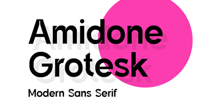 Introducing our new product the name Amidone Grotesk Modern Sans Serif Font. Modern Sans Serif font that feels beautiful classy, elegant, and modern. This font is perfectly suited for a wide variety of projects, such as signature, stationery, logo, wedding, typography quotes, magazine or book covers, website headers, clothing, branding, packaging design, and more. Also for fashion-related branding or editorial design and displays both masculine and feminine qualities.
 - HGB Grotesk by URW Type Foundry,
$39.99
- Sraben Grotesk by Yukita Creative,
$14.00 Sraben Grotesk is a beautiful, versatile font that's perfect for all kinds of projects! It features balanced and harmonious proportions, plus bold variations to make certain elements stand out. This font offers classic characteristics inspired by Grotesk typography, making it an ideal choice for posters, flyers, brochures, brand identity designs, and magazine layouts. Whether you're looking to create something new or bring a creative twist to an existing project, Sraben Grotesk can be the perfect choice. Let its clean aesthetic fuel your imagination and inspire you as you achieve your design goals!
 - Saffron Grotesk by S6 Foundry,
$20.00 Saffron is an elegant contemporary neo-grotesque sans-serif typeface with strong stylistic geometric contrasts, drawing on the aesthetics and the typographic standards of Swiss modernism. The distinctive wide-open stance was designed to give the right visual consistency for branding and communications. This authentic and original typeface represents the shifting contemporary aesthetics. Saffron is perfectly suited for headlines, large-format prints, brand identities, social media, advertising, editorial design, posters, magazines, logos, headings, and more. The Saffron family includes six weights, with their relative italics with over 700 glyphs and multi-language support.
 - Adria Grotesk by FaceType,
$- Adria Grotesk is a superfriendly and sunny humanist typeface that comes in 7 carefully crafted weights and charming upright italics. Try combine it with its stylish family member Adria Slab. You will find a fine choice of lining, tabular and old style figures, numerators, denominators, tabular figures, fractions, ligatures, some sweet symbols and even alternate arrows.
 - Hansplatz Grotesk by Heypentype,
$20.00 Hansplatz Grotesk is a sans serif type family of nine weight. Influenced by Akzidens Grotesk, Hansplatz typeface bring a new approach to this utilitarian style of grotesk. With more square proportions rather than geometric style, Hansplatz grotesk aimed to ease typesetting job when arranging a words or paragraph easily. A wide range of weight gives flexibility to every design project, hansplatz fit nicely to grid-system because of proportions. Furthermore Hansplatz Grotesk supplied with smart Opentype scripting to assist typesetter and designer very easily to Hansplatz feature. Hansplatz Grotesk truly a utilitarian, workhorse, neutral, and of course faceless. But, it makes the work done quickly. For display use, Hansplatz Grotesk Black to Semi-Bold is recommended, for paragraph heavy design, use regular and light weight. To spice up, adding Hairline or extra-light weight will make a design execution looks great and catchy but not intimidating.
 - Allrounder Grotesk by Identity Letters,
$40.00 A true workhorse. The only Grotesk you’ll ever need. Allrounder Grotesk is a neutral, powerful Neogrotesk member of the Allrounder superfamily. An unobtrusive teamplayer as well as an excellent soloist, this hard-working sans-serif typeface is ready for any task you’ll throw it at. A workhorse that lives up to its name, Allrounder Grotesk consists of ten weights ranging from a delicate Air to a powerful Black with 900+ glyphs per font. Each weight is accompanied by carefully hand-corrected italics. Allrounder Grotesk supports more than 200 Latin-based languages, containing the complete “LatinPlus” glyph set developed by Underware. It also provides you with plenty of OpenType features and additional goodies: small capitals, ten sets of figures, case-sensitive forms, ligatures, superiors, fractions and arrows. Equipped like this, you’ll be ready for any kind of sophisticated typesetting scenario you might encounter. With Allrounder Grotesk, you’ve got a sans that works great for body text, yet looks crisp and clean in headlines and display sizes. Whether annual reports, magazine and editorial layouts, nonfiction books, branding and packaging work, large-scale advertising, forms and contracts, or contemporary posters: Allrounder Grotesk is up for it. This multitalented font family was developed in a 2-year process by Moritz Kleinsorge. It was the first release of the Allrounder superfamily, a series of typefaces sharing the same color and horizontal metrics (cap height, small cap height and x-height): a typesetting system whose components match each other perfectly. Any other part of this design kit, e. g., Allrounder Antiqua or Allrounder Monument, may be easily combined with Allrounder Grotesk. Perfect Pairing: Allrounder Antiqua + Allrounder Grotesk Allrounder Antiqua is the ideal complement to Allrounder Grotesk. They both share common vertical metrics and a common color. This allows you to pair both typefaces within the same layout—even within the same paragraph—without creating visual disruption. Head over to the Family Page of Allrounder Antiqua to get more information about this typeface. Design Trick: Bilingual Design With the Allrounder Superfamily Combining Allrounder Grotesk with Allrounder Antiqua is an ideal approach for bilingual designs, wherein both languages get the same emphasis yet are distinguished with two different typefaces. It's also best practice to set headlines in a different typeface than the body text if they harmonize with each other. Allrounder Grotesk and Allrounder Antiqua provide you with the perfect pair for this purpose. In any kind of design, in any type of medium, working with Allrounder fonts is effortless. That’s why Allrounder got its name.
 - Niveau Grotesk by HVD Fonts,
$40.00 Niveau Grotesk—the companion of Niveau Serif —is a type family of six weights plus matching italics and small caps. It was designed by Hannes von Döhren in 2013. Influenced by classical nineteenth-century faces, the fonts are based on geometric forms. Because of its straight architecture, Niveau Grotesk has a “punch” in big sizes but is very legible in smaller sizes and longer texts—in print or on screen. Niveau Grotesk is equipped for complex, professional typography with alternate letters, arrows, fractions and an extended character set to support Central and Eastern European as well as Western European Languages.
 - Crique Grotesk by Stawix,
$25.00 This contemporary typeface is inspired by the neo-humanist and geometric industrial tones presented in late 2000s typefaces. The font family is also composed of the normal width and display width in order to support different applications in delicate designs.
 - Gardo Grotesk by Ayca Atalay,
$18.00 Gardo Grotesk is a bold condensed display typeface designed to make a strong impact. Armed with eye catching ligatures and catchwords, combined with its striking visual features, Gardo Grotesk grabs the attention of the reader effortlessly. Gardo Grotesk's Opentype Features include Standard and Discretionary Ligatures, Alternates, Catchwords (Contextual Alternates), Case Sensitive Forms, Fractions, Scientific Inferiors, Superscript and Tabular Figures.
 - Ridley Grotesk by Radomir Tinkov,
$25.00 Ridley Grotesk is a modern sans-serif. It comes in nine weights with matching italics, designed with powerful opentype features in mind. Each weight includes true small capitals, alternate characters, extended language support, ligatures and more. Perfectly suited for graphic design and any display use. It could easily work for web, signage, corporate as well as for editorial design.
 - Moskau Grotesk by Letter Edit,
$39.00 The design of the typeface Moskau Grotesk is based on the signage created for the Café Moskau in Berlin by the graphic artist Klaus Wittkugel in the beginning of the 1960s. The Café Moskau, across from the Kino International on Karl-Marx-Allee in Berlin Mitte was one of the prestige edifices of the former DDR (German Democratic Republic). Built in the early 1960s, it advanced over the years and changing social developments to a trademark building of the capital. The lettering display on the roof was created by the graphic artist Klaus Wittkugel (October 17, 1910 – September 19, 1985). He had been Professor at the School for Applied Arts in Berlin, and, in addition to the creation of many posters, book covers and postage stamps, he was responsible for the signage of the Kino International as well as for the complete graphic treatment for the Palace of the Republik. The signage for the Café Moskau with the words »RESTAURANT«, »CAFÉ«, »KONZERT« and »MOCKBA« set in capital letters, becomes the basis for the Moskau Grotesk which was developed by Björn Gogalla in 2013. This face should not be seen as an imitation. A few shortcomings were »fixed«. In favor of maintaining the core characteristics some unique features were, however, not relinquished. Lower case letters and the missing capital letters were designed from scratch. It is not surprising that the plain, unassuming geometrical direction of the basic character style forms a bridge to the architecture of the 1960s. Inspired by the then favored, diverse possibilities inherent in the architectural example and wall reliefs, two complementary pattern fonts emerged.
 - Varent Grotesk by Identitype Co,
$25.00 Identitype is very pleased to present Varent Grotesk, a sans serif family designed by Hendra Maulia and Aulia Rahman who was inspired by modern sans serif. The weights of the family itself contain 18 styles plus italic, ranging from Thin to Black. Ideally, it works to capture in a graphic way the universe related to technology, sci-fi, industry, and similar topics. It is a mixed family because of the construction of certain letters (as in “a”, “e”, “h”, “k”, “A”, “B”, and more). Another important line in the creative concept of this typeface is the function of its ink traps, which, in addition to fulfilling their primary function, serve to gain gestuality in its use. This font is capable of covering complex design needs by enabling association with specific themes, which makes it highly competitive in its graphic line.
 - Tee Franklin by Suomi,
$19.00 The British Vogue commissioned this typeface for their magazine re-design in 2001. After studying the originals of Morris Fuller Benton and the existing versions, this font was designed with all new thin weights. Just when the family was finished, Vogue informed that they had decided to use American Typewriter instead. Bastards. But here is a true classic typeface with a facelift. The pun intended. Tee Franklin has seven weights with obliques, the Heavy being just slightly heavier than the existing versions from Adobe and ITC, and moving down to totally new Ultra Light, using Luc(as) de Groot's formula to keep the weights optically correct. The glyphs are the same as the Morris Fuller Benton's original from 1902, except for the upper case Q, which was re-designed with a loop in the counter for added differentiation.
 - Tel Avaloz by Ilhamtaro,
$23.00 TEL AVALOZ is a vintage font with a serif base. But even though it's vintage, it's also suitable for modern designs. Also suitable for headlines, social media design and branding. To enable the OpenType Stylistic alternates, you need a program that supports OpenType features such as Adobe Illustrator CS, Adobe Indesign & CorelDraw X6-X7. Cheers!
 - Tel Aviv by Yinon Ezra,
$1.00 Tel Aviv, Display San-serif typeface, 2 Widths, 4&5 Weights. Structured Shapes with familiar look, yet unique! Can be used for wide range of uses, also function well as short text.
 - Rotek - 100% free

- SF Tattle Tales - Unknown license

- SF Tattle Tales - Unknown license

- SF Tattle Tales - Unknown license

- SF Tattle Tales - Unknown license

- EF Fairy Tale by Elsner+Flake,
$35.00 - Sacred Geo Tiling by John Moore Type Foundry,
$39.95 SacredGeo Tiling is a Dingbat font that contains a very varied pattern of classical geometry, to play with them and combining to create beautiful backgrounds, decorating pages, posters, covers, or creating lines, repeated or alternating sequences and very useful for creating frames. Due to the wide range of patterns of possible combinations is nearly infinite number of results, especially if you create different layers of colors or shades and blend them or breaking them to be colored in sections.
 - Floor Tiles JNL by Jeff Levine,
$29.00In the beginning of his typographic design work, Jeff Levine produced a large number of freeware dingbat fonts utilizing very rudimentary font creation software. Although popular in the world of home crafts, there were many issues inherent with those early font files. Jeff has chosen to clean up and update some of these fonts and make them commercially available. PLEASE NOTE: Refer to the license agreement regarding use of Jeff Levine's art-based fonts. Logos and derivative works made from these fonts are not allowed. - Type Tiles JNL by Jeff Levine,
$29.00 Type Tiles JNL is based on a ‘completed’ version of ‘Alpha-Blox’ by American Type Founders, circa 1944. The capitals, lower case and numerals shown in the sample sheet put out by ATF depicted type made with five-high blocks comprised of modular units spaced two points apart. These units could be combined in varying ways to create custom type of varying heights and widths and was available for purchase in both linear (multi-line) and reverse (white on black) formats. Using the 'reverse' model shown on the sample sheet, all of the characters were re-created digitally, and missing punctuation, foreign characters and other glyphs found in a basic computer font were drawn and added. The 'J' and 'T' in the type sample had truncations, so a more complete character was created for each of those letters. For those wanting an unbroken string of words or blank end caps, there is a double column space on the vertical bar key. A single column space is located on the broken bar key for shorter end caps. Type Tiles JNL is available in both regular and oblique versions
 - Ingy Star Tilings by Ingrimayne Type,
$9.00 IngyStarTilings allows one to create a variety of patterns that have stars. Some of them are quite common and others less so. A sample file is available that shows possible patterns that can be constructed with this typeface, including some non-star repeating patterns. As the posters indicate, some of the patterns constructed with the regular version are intended to be multicolored.
 - Pony Tale Pro by Jonahfonts,
$45.00 Pony Tale Pro is a handwritten unconnected script face in eight styles: Light, Regular, Bold and Outline with Italics and Small-Caps. Very suitable for Packaging, Greeting cards, Magazines, Posters and Advertising Ads. A space after any lower-case glyph will produce the word terminal, invoking the OpenType/CONTEXTUAL ALTERNATIVE variant. (Opentype variants may only be accessible via Opentype-Aware applications.)
 - Kiss And Tell by Comicraft,
$49.00 You wanted the best and you got the best! Originally created for the KISS: PSYCHO CIRCUS comic in the late '90s, this thick/thin font is one of our most versatile and popular offerings. Features automatic alternates, Manga characters, Western & Central European language support and Crossbar I Technology™ to place that character in exactly the right spot!
 - OL Subway Tiles by Dennis Ortiz-Lopez,
$30.00 - Nighty Tales GT by Gartype Studio,
$10.00 Inspired by thin, childly, unique handwriting style, we present to you Nighty Tales, a handwritten font with thin and childly characters that was comes with alternates and multilingual glyphs to help people around world with that unique accent with this font. Nighty Tales is very suitable like as text, cover book, posters, handwritten style, and more.That way easily change the glyphs to make more unique glyphs.
 - FS Pele Variable by Fontsmith,
$199.99Iconic Conjuring memories of chunky typefaces from the late-60s and early-70s, and named after the world’s greatest footballer of that and probably any other era, FS Pele is one of a set of Fontsmith fonts designed specifically for headlines and other prominent applications. “We wanted to create fonts that could be integral to the design of posters, album covers and magazines,” says Jason Smith. Welcome to FS Pele, iconic, like its namesake (though, perhaps, a little less nimble). Big Pele, little Pele There was only one Pele. But there are two sizes of FS Pele. FS Pele One, with the finer counters and details, adds considerable weight and style at large sizes, especially in big block headlines on posters. FS Pele Two’s thicker “slots” make it a better choice for smaller-sized text. A load of blocks FS Pele began as an exercise by Phil Garnham in turning squares into legible letters, via the least means necessary. The idea extended his ideas about logo-making, and the search for a stamp-like brand mark that lends authority, stability and instant identification. “The thought that the type was a 2D/3D jigsaw of slotted, architectural pieces was almost an after-thought. I wanted to create a strong, stacking, block aesthetic for the most contemporary poster design. “At the time there were a lot of designers creating their own versions of the same thing but I wanted to take the blocker forms to the next step, and infer a more legible text without sacrificing the idea.”


