2,538 search results
(0.018 seconds)
- Nomarch by Scriptorium,
$24.00Nomarch is a charming new Art Nouveau font based on samples of poster lettering from the beginning of the twentieth century. The relatively bold weighting of the characters makes Nomarch particularly good for use in large sizes for titles on posters and flyers. - Chalky by Alan Meeks,
$45.00 Originally designed as a supermarket point-of-sale font, Chalky is a chalk on blackboard style of lettering. More condensed than most fonts of this style, chalky can be used in relatively long settings without losing legibility. Great for headlines and subtext.
 - Grandi by Mans Greback,
$19.00 Grandi is a sans-serif in ten different styles. Carefully designed by Måns Grebäck, this typeface's great variation makes it adaptable to any size and context. It is confident and catchy, and comes in five weights, each one as upright and italic.
 - LD Dear Diary by Illustration Ink,
$3.00If you've got a secret to tell, or just crave a unique font for cool scrapbook journaling, "Dear Diary" will fit the bill. This true type font looks handwritten with tall uppercase letters, and small, narrower lowercase script. Have some fun with it! - Votrag Texture by Putracetol,
$20.00 Introducing Votrag - 10 Modern Font Collection, a versatile typeface set that encompasses a spectrum of design possibilities. With five distinct weights - thin, light, regular, semibold, and bold - each accompanied by both clean and textured versions, Votrag offers a total of ten unique fonts.
 - Kursk 205 by Talbot Type,
$19.50 A text and display font with square proportions, inspired by the type styles of soviet-era Russia. Very shallow ascenders and descenders and a large relative x-height, exaggerate the compact and geometric look. Related to Kursk 105 , its squarer-edged cousin.
 - Razlom by Pavel Boog,
$11.00 ?Razlom is a spectacular, brutal and at the same time intriguing font. Tej wide letters are filled with small cracks resembling faults. They crack, but they don't break. The font will convey confidence and strength to each project and highlight it from all
 - Rugged Rock by Comicraft,
$19.00 Around the rugged rock the ragged rascal ran, Foregoing fancy fonts, the Fontographer fawned and fell! Alliteratively allowing for assonant aspects as well, He spoke of several sentences that some should never spell! This classic title font will deliver tall tales that tell!
 - Fixture by Sudtipos,
$39.00 Fixture is our massive 72-font take on plentiful offerings of the late 19th century’s typefaces, posters and wood letterpress sundry done in the Grotesk genre. Four widths ranging from Ultra Compressed to Expanded each come in nine weights and accompanying italics. Some common sans-serif alternates, such as the a and g, are included in all the fonts. The idea with this design was to put together a workhorse font family with enough functional flexibility to work in multiple environments, from the subtlety of magazine layout or film credits to the visual drama of billboards or packaging. Aesthetically speaking, it is quite interesting — though in retrospect quite unintentional — that each different width and/or weight of this face ended up pulling a different dominant trait from the melting-pot origins of the entire family. It’s almost like a tribute album to some famous band’s covers of older songs. It may also be a good conversation piece on our tools shaping the very things for which they’re used. Can’t really get any more post-Grotesk than this. In the 21st century, this is the one genre to rule them all.
 - ITC Quay Sans by ITC,
$41.99 London-based designer David Quay designed ITC Quay Sans in 1990. One of the precursors to the long run of functionalist European sans serif faces that has been a dominating force in type design since the 1990s, ITC Quay sans is based on the proportions of 19th Century Grotesk faces. Grotesk, the German word for sans serif, defines an entire branch of the sans serif movement, which culminated in the 1950s with the design of Helvetica. ITC Quay Sans is made up of very simple, legible letters. The weights of the strokes throughout the alphabet vary very little. Microscopic flares on the ends of each terminal add a bit of dimension to the design. This helps prevent the onset of the monotony, a danger when one repeats countless near mono-weight stroked letters throughout a large body of text. ITC Quay Sans is a very readable face; it works equally well in all sizes. Six fonts of the ITC Quay Sans typeface are available: Book, Book Italic, Medium, Medium Italic, Black, and Black Italic. ITC Quay Sans is similar to Hans Eduard Meier's Syntax, and Tim Ahrens' Linotype Aroma."
 - Typical Pro by Typicaltype,
$25.00 Get ready for a modern spin on your typographic projects with the Typical Pro Sans Serif Font 9 Weight. This font offers a clean, grotesk feel that is perfect for any technical or heading design. Its contemporary design makes a perfect choice for projects with a modern flair. With clean lines, tight letter spacing, and a classic sans serif style, this font is sure to bring a unique edge to any project. Enjoy the perfect mix of texture and proportion with this modern font. Get ready to take your typography to the next level with Typical Pro Sans Serif Font 9 Weight. Typical Pro Sans Serif Font is a grotesk typeface of modern design, with technical precision and a clean finish. Its 9 weight offers clear and refined letters that provide perfect legibility for headlines and other text styles. Its line height is consistent and balanced, making it suitable for producing high-impact visual messages. Its modern, straightforward letterforms give projects an air of sophistication, while retaining a firm technical backbone. With nine different weights, it is the perfect choice for any heading or label that requires a strong, contemporary look.
 - Bruta Global by Ndiscover,
$59.00Bruta is a contemporary sans-serif grotesque typeface, conceived to become the Swiss army knife of your font library. Inheriting the modernist approach of the grotesque fonts, Bruta aims to be a rational and neutral typeface suitable for a wide range of applications. Whether it’s used for print or screen, in large or small sizes, for magazines or branding, Bruta will stay on your font library for long time. Loaded with Opentype Features, +100 emojis, Greek and Cyrillic support, Bruta can easily become your new default font. - Brandon Text Office by HVD Fonts,
$40.00 Brandon Text is the companion of the famous Brandon Grotesque type family. It has a higher x-height than the Grotesque version and is optimized for long texts, small sizes and screens. This special Office version of Brandon Text is especially for all Microsoft Office applications (Word, Excel, Powerpoint …). It contains just the 4 basic styles which are style-linked and can be easily accessed by the “I” or “B” button in Office. The fonts are manually hinted so their appearance is also optimized for these applications.
 - Osande TXT by XdCreative,
$29.00 About Osande-TXT Neo-Grotesques Sans Osande TXT was created and inspired by Osande Pro (by. faldykudo), which carries a modern sans style with a touch of neo-grotesques / neo-gothic These include a large x-height, simpler forms and more static, low contrast, and often a condensed width. Osande TXT comes with enhancements characters and more complete language support, so you will be more flexible to use this font family for your various design, both for body text or displays. Thank you in advance _xdCreative
 - Neology by Shinntype,
$49.00 To see the “auto-mix” effect, go to the Webfont page. This typeface has been designed to demonstrate a hypothesis: consistency in letter form and style is not essential to fluent reading. The Neology fonts also include both plain constituents, Neology Deco (1920s-style minimalist geometric) and Neology Grotesque (similar to Helvetica etc., but with a small x-height). All fonts have both three-quarter and full cap-height lining figures. The plain fonts have stylistic alternates (“a” for Deco and “g” and “l” for Grotesque).
 - Bergins by Craft Supply Co,
$20.00 Discover Bergins – Grotesque Sans Serif Modern Aesthetic Initially, Bergins captivates with its modern grotesque aesthetic. Designed meticulously, it embodies a fresh and contemporary vibe, ensuring visual appeal and innovation in design. Clarity and Precision Additionally, clarity reigns in its design. Every stroke and curve in Bergins speaks precision, offering optimal readability across various platforms and sizes, facilitating diverse applications. Versatility Unleashed Moreover, Bergins exhibits remarkable versatility. It seamlessly integrates with a multitude of design layouts, from digital platforms to printed materials, enhancing adaptability and usability.
 - Snorkel JNL by Jeff Levine,
$29.00 A package for a swim mask and snorkel was the basis for this decidedly unusual typeface with a wild 1970s-era design. There's no telling how to apply this font to a project, but think black light posters, psychedelic music and some cheap wine!
 - P22 Grosvenor by IHOF,
$24.95 Grosvenor is part of the Staunton Script Family of fonts designed by Ted Staunton for his historic novel centered around a family bible and the handwritten annotation through seven generations. The Grosvenor font is a loose script based on copperplate writing circa late 1800s.
 - Kursk 105 by Talbot Type,
$19.50 A text and display font with square proportions, inspired by the type styles of soviet-era Russia. Very shallow ascenders and descenders and a large relative x-height, exaggerate the compact and geometric look. Related to Kursk 205 , its cousin with a rounder look.
 - Designors by Sarid Ezra,
$15.00 Designors is a freestyle font that will make your project more stylish and free! You can use this font for any project. Suitable for quotes and your tees design. This font also support multilingual. With different lowercase and uppercase will make your design more natural!
 - KG Teacher Helpers by Kimberly Geswein,
$5.00 This handy helper is created just for teachers. Use the letter boxes, number line helper, base ten blocks, multiple lined writing options, and touch numbers to help you create printables for your classroom. Also includes a PDF guide to using the font most effectively.
 - Fan Magazine JNL by Jeff Levine,
$29.00 In the December, 1934 issue of Modern Screen magazine, a number of feature article headlines were hand lettered in a condensed slab serif with a relatively uniform stroke weight. This is now available digitally as Fan Magazine JNL, in both regular and oblique versions.
 - Klainy by Identity Letters,
$29.00 An unadorned Grotesque with a refreshingly personal touch. If “Grotesque” mainly means “industrial, mechanical, anonymous typeface” to you, Klainy might redefine your image of the genre. Yes, it’s a Grotesque—but with a contemporary look and a lot of personality. Klainy’s apertures are more closed at the top and more open at the bottom, creating an informal rhythm that sets Klainy apart: a confident, optimistic voice with a clean appearance. Terminals are subtly back-bent: these quaint “hooks” make Klainy a bit more personal, a bit friendlier. (You can find them in the a, c, f, and r.) Just like its old-style Grotesque ancestors, Klainy is optimized for display sizes and short texts. There, its unobtrusive quirks can be wholly appreciated. However, the familiar Grotesque appearance makes sure that the typeface is comfortable to read in smaller sizes, as well. Use Klainy whenever a basically classic sans-serif typeface with a modern and individual twist is called for. This font family comes in eight weights ranging from Thin to Black, each with a matching italic style. More than 500 glyphs and a bunch of Open Type Features make it a reliable companion for all of your projects. You can fine-tune the flavor of Klainy with Stylistic Alternates such as a one-story a and a two-story g. Their simple construction blends perfectly with the design concept of this typeface. Klainy is a seasoned blue-collar worker that surprises you with wit and team spirit. It’ll be a great addition to your font library.
 - Telegrafico - Unknown license

- Teacup by Hanoded,
$15.00 I remember a tea ceremony I attended in Fukuoka, Japan. The teahouse was set in a small, but beautiful garden and the whole idea of the ceremony was to appreciate the view from the porch. I thought the tea was quite bitter, but the view was unsurpassed. From time to time these memories pop up and I have to use them - that is why I named this font Teacup. Teacup is a slightly eroded all caps font, made entirely by hand with a Japanese marker pen and some high quality textured paper. It comes in a romantic open style and a more solid closed style. Teacup is filled to the brim with diacritics.
 - Werksatz by Identity Letters,
$39.00 Inspired by early grotesque typefaces such as Akzidenz Grotesk and Venus, Werksatz is our contemporary interpretation of this beloved genre. Some things are timeless. These are the things that only get better with use. The aforementioned typefaces certainly belong into this category. Rediscovered by designers from every generation again and again, they are here to stay. However, as tools evolve and technology moves on, even a well-tried design has to adapt to this evolution continuously in order to stand the test of time. Werksatz is such an adaptation, taking the best from the invincible classics and infusing them with the warm blood of today’s tech. With 10 weights from Thin to Black, each with painstakingly fine-tuned obliques, and more than 940 characters per style, this font family is ready for the future. Its Extended Latin support ensures you won’t miss a letter in any of hundreds of languages. Special glyphs like three variations of arrows and additional shapes will make your design work so much easier—for well-structured forms as well as radical editorial layouts. Among a treasure trove of OpenType features, you’ll find essentials such as Capital Spacing, Case-Sensitive Forms, and Ligatures, but also advanced functions like Small Caps, Subscript and Inferior figures and letters, plenty figure sets (Lining Figures, Tabular Figures, Old-Style Figures, circled and squared figures, figures for small caps … you get the idea), Slashed Zero, and more. You’ll discover that Werksatz is less formalistic and rigid than your average neogrotesk typeface. Sure, you can use it for serious business—whether in corporate design, branding, editorial design, publication design, or web design for industries and topics ranging from politics, government, management, or law to technology, entrepreneurship, commerce, or finance. However, Werksatz is much more versatile than that. Its more human appearance also allows for effective use in culture, fashion, art, entertainment, sports, exhibitions, leisure, and luxury. It’s an excellent choice for wayfinding applications, apps, packaging, and all kinds of nonfiction books. Other Grotesks with big names are left behind outdated by their proprietors, but Werksatz is here to stay. The classic industrial warmth of these letterforms will age like fine wine.
 - Quarion by René Bieder,
$39.00 Quarion is a clean, neo-humanist sans with a contemporary geometric approach. Its design started as an exploration of geometric fonts from the early 20th century, like Futura, Neuzeit Grotesk or Recta which allows the typeface to generate an inviting but sophisticated feel on the page. Although, less contrasting, geometric designs have been quite popular around type designers until today, Quarion finds its niche by combining circular elements with a medium stroke contrast, resulting in a versatile and robust workhorse for any analog or digital application.
 - ITC Franklin Gothic LT by ITC,
$43.99 Franklin Gothic was designed between 1903 and 1912 by Morris Fuller Benton for the American Type Founders Company. The font serves as the American Grotesk prototype. It was named after Benjamin Franklin. Even today, Franklin Gothic remains one of the most widely used sans serif typefaces. The robust character of the font gives text a modern feel. It is widely used in newspapers and advertising and is frequently seen in posters, placards and other material where space is restricted. Featured in: Best Fonts for Tattoos
 - Generisch Mono by Akufadhl,
$29.00 Generisch Mono is a monospaced version of Generisch Sans. Generisch - a german equivalent of generic - sans serif typeface has gain its own place among designers and earn such popularity due to its "simple" design. Generisch is influenced by early grotesk typefaces from early 1900's when sans was starting to get popular and used as a body type. Some old ligatures such as ch ck and ng are present in generisch (not the ct and st tho), old style numeral for better typesetting experience and more.
 - Assimilation - Unknown license

- S6 Sans by S6 Foundry,
$29.00 S6 sans is a contemporary neo-grotesque sans serif typeface with strong stylistic geometric contrasts. Its distinctive wide-open stance was designed to give the right visual consistency for branding and communications.
 - ALS Dereza by Art. Lebedev Studio,
$63.00 Dereza is a grotesque typeface designed specially for display use in children’s books and magazines. Books for little ones are usually set in grotesques, and a vigorous font would make a nice addition to the main face. Playful and lively, Dereza is great for any non-grown-up design such as games and toy boxes, cookie jars and cereal packs, clothing labels and other things meant for kids. It looks super in speech bubbles. The Dereza family includes four fonts, from light to bold, with ligatures, lowercase figures and accented characters.
 - Cavita by Underground,
$29.00 Cavita typeface is a mix between both grotesque and calligraphic models: regulars have a rough grotesque spirit; while the italics where inspired in calligraphic gestures. All of these details are reinforced with an inverted modulation (horizontals strokes are thicker than usual). The italics seem to move away from the traditional concept of type system, but work very well along side. This typeface has very particular shapes and rhythm, it's different and identifiable from the rest, making it a very good option to use on every piece of design.
 - Oskal by Pesotsky Victor,
$15.00 "OSKAL" is a font that appeared as an experiment to cross the neutral grotesque and antique. The idea is to make a strange hybrid out of a simple grotesque. The serifs are added in non-standard places and make this font unusual for perception. It's a sharp and active font that you can shout at or break down walls with. OSKAL supports Basic Latin and Extended Latin, Cyrillic — in total about 90 languages are supported. The font has one Regular weight, uppercase and lowercase, punctuation. OSKAL font was designed by Viktor Pesotsky.
 - Solidus by Brown Type,
$40.00 Inspired by the heuristic typography of the Concrete Poetry movement, Solidus is a hardworking and unobtrusive sans in the Neo-grotesque style. Its simplified features, generous spacing and squarish curves imbue a sense of sobriety and allow the textual information to take centre stage, whether in body copy or at display sizes. Solidus is available in nine distinctive weights from wafer-thin Hairline to a hefty Black, each with accompanying italics. Typical of the Neo-grotesque style the italics are slanted in construction and have the same advance width as the uprights.
 - Belgium by Craft Supply Co,
$15.00 Belgium Font Family is a modern serif font family whose design refers us to the style of modern sans serif. The distinctive features of Belgium Font Family are the relatively low contrast of strokes, the slightly squarish shapes of round characters and the emphasized business like simplicity.
 - Flo Barnum by Solotype,
$19.95No telling how old this font is, because it came from Hamilton, a firm that was late in the wood type business, but was the repository of many older patterns from earlier wood type makers. Great circus look to it. Some missing characters drawn at Solotype. - Architect by Australian Type Foundry,
$30.00Based on the text on architect's plans. The designer asked friends and relatives for the plans for their house extensions, and he studied plans in the public library, then blended the best features of all the characters he could find. Architect was designed originally in 1999. - Count Floyd by Elemeno,
$10.00Bold and simple, but shaky, Count Floyd was named for the horror host spoof from SCTV. It has the look of a spooky grunge font, but is far easier to read, even at relatively small sizes. Please note that this font has a limited character set. - Hardbones by Krntype Studio,
$16.00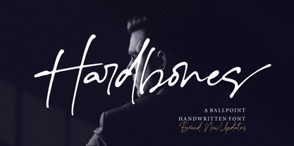 Hardbones is a stunning ballpoint signature font. font with unique natural flow and feminine style, made using a unique gel ballpoint ink. Each letter is deliberately imperfect to make it look more natural and charming. Hardbones comes with multilingual support, ligature, and ending swash from a-z.

