10,000 search results
(0.028 seconds)
- Merry Bauble Letters by Greater Albion Typefounders,
$6.00 Merry Bauble Letters is designed to complement our 'Merry Baubles' fleuron typeface. Quite simply, it's a set of Christmas Tree ornaments with letters painted on them…
 - Silverado by Red Rooster Collection,
$45.00 Based on a font design by Les Usherwood called Eldorado, we had to change the name because Linotype has a dissimilar typeface of the same name!
 - TXT Annesia by Illustration Ink,
$3.00Add a touch of flair with this one-of-a-kind TrueType font. It gives a handwritten appeal to scrapbook journaling, greeting cards, and creative publications. - Enixe by Foyezes,
$15.00 This font has the same uppercase and lowercase letters with some modifications on the uppercase letters. I included the modified letters to use however you like.
 - Fabrics - Personal use only

- Dream Script by Lián Types,
$49.00 One of my dreams as a type-designer was making a good looking chancery cursive. Full of life, like some of the best calligraphers around the world do on their artworks. With Julian Waters, John Stevens and Denis Brown (just to name a few of them) (1) chancery, or italic script, was transformed into a new, exciting and very fresh style of calligraphy mainly at the end of 20th Century. Dream Script may be that dream named above made true. I have been practicing chancery in the way I learnt from those calligraphers for many years now. Making a font out of my ink-sketches was a tough work, since they were closer of -being art- than of -being type-. However, this font rescues many aspects of handmade calligraphy: You have to look at it really close to notice it is actually a font, and that was one of my goals. The secret of a good looking chancery is on its subtle details: pen angle is constantly changing, even on the strokes which seem straight. Capitals and swashes have to be done a little faster than lowercase letters. The rhythm has to be even, in spite of its playful look. The fact that makes Dream look alive is that it has many alternates per glyph. This makes each word look unique like it happens in calligraphy: you will find alternates for the beginning/ending of a word/phrase, some for the middle of it, some interchangeable. Also, to accompany the script, you will find Dream Caps, which was inspired in the eternally beautiful trajan capitals. Place them like I did on the posters and you will have great results for sure. The font works great in small, middle and big sizes and can be a great selection for magazines, wedding invitations, perfumes, and posters. Close your eyes, and Dream with me... TECHNICAL Dream Script Pro is the most complete style, it contains all the alternates and ligatures (OT programmed, better if you use Adobe applications) If you plan to use the font for text, be sure to activate the less decorative capitals, which are placed in the “salt” group of alternates. Dream Script Standard has less glyphs than the Pro one, it contains just some ligatures for a better legibility. (OT programmed, better if you use Adobe applications) NOTES (1) Not only are they great artists, but also good people, who are always willing to share with their students all what they know. I would also like to thank Ricardo Rousselot, whose work inspired me this time to make “The Dream Script” exlibris; and to Alisara Tareekes, a very talented friend which international calligraphy conferences gave me: She kindly helped me with some tips to make this font better.
 - Ela Sans by Wiescher Design,
$39.50 Ela Sans is the sister of the typeface I originally designed for the business of my second wife and mother of my two sons, her name is - of course - Michaela. Ela - the typeface - is suitable for magazines, newspapers, posters, advertiments, books, text, documentation/business reports, business correspondence, multimedia, and corporate design. Because lately this typeface became very popular I decided to extend the Ela Sans family to eight weights and I added italic and smallcaps versions to it. So now Ela Sans and Demiserif together is a full fledged typeface family.
 - Konsider by Konstantine Studio,
$18.00 Get ready to channel your inner (cute) fear with KONSIDER—spooky yet playful fonts. It was inspired by the vintage Halloween visual campaign, with a touch of happiness and cheerful vibes. To amplify the font itself so it can be a "no-doubt" choice for your branding campaign. Packed up with Ligatures and Stylistic Alternates to double up the joy of your visual statement. Perfectly fit for logo, branding, mood board, campaign, events, poster, game, esport, fashion, snack, packaging, streaming overlay design, graphic design, toys, and many more.
 - ITC Mudville by ITC,
$29.99ITC Mudville was Christopher Wolff's entry in the 1998 U&lc Type Design Competition, for which he won an Honorable Mention (Display). Mudville evolved from variations on hand-lettering that Wolff had done on a variety of projects over the years. The underlying shapes of the letters are formal roman letterforms, but the actual strokes retain the look of letters sketched casually on a layout. Mudville straddles the line between inline and outline type designs. It recalls some of the styles of popular lettering used in display advertising in the '20s. - Leftover Crayon by Hanoded,
$15.00 My kids have a tin box filled with crayon and pencil leftovers: bits and pieces that have fallen or broken off, but are still good enough to use. For me it is a treasure trove, as I often find a nice bit of crayon to use for a new font. In this case, I created Leftover Crayon. Leftover Crayon is a fat, crumbling and seriously eroded crayon font. Completely hand made, completely legible and full of character. Use it for your bedtime stories, product packaging and invitations. Comes filled to the brim with diacritics.
 - Miss Kitty Delux by Patricia Lillie,
$49.00 A little cartoony, a little retro, a little coquettish, Miss Kitty Delux is ready for fun. Used in a non-OpenType aware application, she's a lively little typeface. Use her in an OpenType aware application and she really shines: Contextual Alternates automatically dress her up the way she was meant to be. Gussy her up even more with swashes, ornaments, and more ligatures than you can shake a stick at. Use Stylistic Sets to dress her down or dress her up even more. Take her out to play!
 - Brock Pro by Stawix,
$49.00 Brock Pro celebrate the essence of the famous 19th century wooden letterpress type, Block Berthold by bringing out its remarkable features and explicate them in relation to the modern day trend. Brock Pro is a conventional font with a twist, fun, easy to use and has a very particular tone of voice that suits numerous design purposes. Brock pro comes in 10 weights and 20 styles to support a wide range of usage, every needs and great building brands, Brock Pro also available in both ttf. and otf.
 - Ivory by FaceType,
$24.00 Ivory is inspired by a beautiful typeface used in an illustrated compendium about pomology from 1882. We separated the elegant “Swashes” from the letters – use it together with “NoSwashes” to get two-colored initials. Please note that the kerning of NoSwashes works only together with Swashes. To achieve the two tone effect shown in the samples, you need to use an application that supports layers. For example, Adobe Illustrator, Adobe InDesign, Adobe PhotoShop, CorelDRAW, and Quark. Some of the preview images were made by Arina Karen Renata Palilingan.
 - Reklame Script by HVD Fonts,
$30.00 Reklame Script is a brush typefamily consisting of four weights. It was designed by Hannes von Döhren in 2010. This family is influenced by the handlettering of printed advertisements of the 1940s and 1950s. You can combine the four weights to gain a better emphasis – perfect for headlines, posters, and other display uses. Reklame Script is equipped for professional typography. The OpenType fonts have an extended character set to support Central and Eastern European as well as Western European languages. The fonts also contain double-letter ligatures to prevent repetition.
 - Zania by Agnieszka Ewa Olszewska,
$20.00 Zania is a display typeface. Its characteristic element is cutting in the stem that makes this font very memorable and easy to recognize. Contains stylistic alternates, ligatures, diacritics, and OpenType features that will help you make your project more unique. Has an experimental vibe and nice movement from left to the right thanks to serifs placed in the top left and bottom right part of the letter. It has smooth edges that make it look more friendly. The letter contrast is high. Looks good in logotypes, branding, magazine titles, book covers, posters.
 - Chubby Monster by Sipanji21,
$17.00 "Chubby Monster" is a display font with chubby and bold characters. Fonts like this are often used in various designs that aim to convey a cute or adorable feel. The chubby and bold letterforms give a cheerful and inviting appearance, making it suitable for a wide range of design projects that want to emphasize a sense of playfulness, such as children's designs, toy products, or cute decorations. If you have further questions about using this font or need assistance in a specific design context, please feel free to ask!
 - Straight Angles by Celebrity Fontz,
$24.99Straight Angles is a precisely designed three-dimensional font with a clean and futuristic look. The predominant angles are 90 degrees and 180 degrees with parallel and perpendicular lines. Each character is surrounded by a crisp black border of even thickness throughout the font. Upper- and lower-case letters are the same, providing a constant maximum top height while the stems extending below are allowed to show off their distinct personalities in order to spice things up. The 3D extrusion effect makes text appear to stand out from the page. - Sleepy Time by Hanoded,
$15.00 Sleepy time… Ah, if only your kids would go to bed, close their eyes and drift off to sleep. This font was created when my son had some problems falling asleep: he'd cry, he wanted to sleep in a different bed, he wanted a different animal friend (he has Tij - a tiger, Meh - a sheep, Rafi - a giraffe, Moo - a cow, Woofy - a dog, Kikker - a frog). Sleepy Time font is an all caps typeface with uneven letters and a very different upper and lower case. It comes with all languages, including Cyrillic!
 - Stencil Playthings JNL by Jeff Levine,
$29.00 A circa-1951 toy set called “Kusan Kavalcade of Letters” was comprised of molded plastic letters and numbers a child could play with, trace and arrange to learn their alphabet and numerals. Typographically, the design was all over the place – from sans serif characters to those with some spurred serifs and even some stenciled characters because of the nature of manufacture. As odd as this combination seems, it was novel enough to be turned into a digital typeface called Stencil Playthings JNL, which is available in both regular and oblique versions.
 - Tang by Suomi,
$19.00 The Tang family came to be, when I started studying fonts made for use in very small point sizes, like Bell Gothic. I studied the use of ink traps and went to town with them. Instead of just using them for their purpose: trapping ink to prevent the type getting blotted; I used them as a design feature. With those features Tang works very well in both headline and text use. I use it as a house type, and I've already seen it in a beer and cider labels.
 - Holicya by Dumadi,
$35.00 Holicya is a retro-style font with a stunning style that can make the most of your design projects. This font gives a touch of the retro style that the 60-70s was famous for. This font has alternative styles for Uppercase and Lowercase, Ligature, ss01, ss02, ss03 to ss04 which can be customized to suit your design needs so you don't waste time creating extrusion effects. The total glyphs for this font is 356 so you can choose according to the right style. Sincerely, Toni Dzulham - Dumadistyle
 - Ye Paradigma by Yinon Ezra,
$30.00 Sans-serif, with clean and fresh Character. "Ye Paradigma" has been established in order to keep its forms as simple as possible - without losing the unique character of each letter, and without simplifying too much. The process was gradual, like the ripening of a sauce that leaves it to be reduced to strengthen flavors, so the letters ripened while reducing unnecessary details, until the taste became more concentrated and uniform. The result is a clean, fresh, remarkably useful 24 fonts typeface, with a clear and stable graphic language.
 - Serpentine by Image Club,
$29.99Dick Jensen (USA) designed Serpentine, is a contemporary-looking display font, for the Visual Graphics Corporation in 1972. With the rise of digital typesetting and desktop publishing, this typeface quickly became both popular and ubiquitous. This dynamic, wide, boxy design is identifiable via tiny triangular swellings at the stroke endings - what might be called semi-serifs. Serpentine is available in six different font styles: Light, Light Oblique, Medium, Medium Oblique, Bold, and Bold Oblique. Serpentine" is a greenish rock that sometimes resembles a serpent's skin, and is often used as a decorative stone in architecture. Though this font doesn't seem at all snaky or sinuous, it does have an architectural, stone-like solidity. The subtle, almost non-existent curves and semi-serifs keep it from being too stern or cold. Although the underlying strokes of each weight are similar, the six members of the Serpentine font family all present their own individual personalities. Serpentine Light lends itself well to text for onscreen displays, for instance, while the numbers from typeface's heavier weights are seen around the world on soccer jerseys! Additionally, the oblique styles convey a streamlined sense of speed, furthermore lending Serpentine well to sport and athletic applications (especially the faster, high-speed varieties). Because of its 1970s pedigree, Serpentine has come to be known as a genuine "retro" face. This makes the typeface even more appropriate for display usage, in applications such as logo design, magazine headlines, and party flyers. If you like Serpentine, check out the following similar fonts in the Linotype portfolio: Copperplate Gothic (similar serifs) Eurostile (similar width) Princetown (another "athletic" font) Insignia (similar "techno" feeling)" - Serpentine by Linotype,
$29.00Dick Jensen (USA) designed Serpentine, is a contemporary-looking display font, for the Visual Graphics Corporation in 1972. With the rise of digital typesetting and desktop publishing, this typeface quickly became both popular and ubiquitous. This dynamic, wide, boxy design is identifiable via tiny triangular swellings at the stroke endings - what might be called semi-serifs. Serpentine is available in six different font styles: Light, Light Oblique, Medium, Medium Oblique, Bold, and Bold Oblique. Serpentine" is a greenish rock that sometimes resembles a serpent's skin, and is often used as a decorative stone in architecture. Though this font doesn't seem at all snaky or sinuous, it does have an architectural, stone-like solidity. The subtle, almost non-existent curves and semi-serifs keep it from being too stern or cold. Although the underlying strokes of each weight are similar, the six members of the Serpentine font family all present their own individual personalities. Serpentine Light lends itself well to text for onscreen displays, for instance, while the numbers from typeface's heavier weights are seen around the world on soccer jerseys! Additionally, the oblique styles convey a streamlined sense of speed, furthermore lending Serpentine well to sport and athletic applications (especially the faster, high-speed varieties). Because of its 1970s pedigree, Serpentine has come to be known as a genuine "retro" face. This makes the typeface even more appropriate for display usage, in applications such as logo design, magazine headlines, and party flyers. If you like Serpentine, check out the following similar fonts in the Linotype portfolio: Copperplate Gothic (similar serifs) Eurostile (similar width) Princetown (another "athletic" font) Insignia (similar "techno" feeling)" - Capitolium 2 by TypeTogether,
$58.00 Capitolium was designed in 1998 at the request of the Agenzia romana per la preparatione del Giubileo for the Jubilee of the Roman Catholic Church in 2000. This type design was the central part of the project for a wayfinding and information system to guide pilgrims and tourists through Rome. Capitolium also continues Rome’s almost uninterrupted two-thousand-year-old tradition of public lettering . It is a modern typeface for the twenty-first century and strongly related to the traditions of Rome. Soon after the completion of this project Unger began contemplating the possibility of bringing the atmosphere of this design to newspapers. Though Capitolium works well in most modern production processes and also on screens, it is too fragile for newsprint. For newspapers sturdier shapes were required as well as more characters to a line of text, and Capitolium News has a bigger x-height than Capitolium. Capitolium News is a thoroughly modern newsface, with classic letterforms linked to a strong tradition. Capitolium News for running text comes in the variations regular, italic, semibold, semibold italic, bold and bold italic. As is possible with most of Unger’s type designs, Capitolium News can be condensed and expanded without any harm to the letterforms. The update to this beautiful font family, Capitolium News, includes the addition of over 250 glyphs featuring full Latin A language support, new ligatures, 4 sets of numerals, arbitrary fractions and superiors/inferiors. Furthermore, kerning was added and fine tuned for better performance.
 - Demetria by Andinistas,
$39.95 Demetria is a font created in 2012 by Carlos Fabián Camargo and works to form words and headlines with medieval expressiveness. Thus his concept mix uncial, Roman and italic letters resulting serifs some here and there, extended width and high amount of contrast between thick and thin strokes. That way its vigorous ups and downs are higher than its “x” height, highlighting it as a font with regular caliber,outstanding to design headlines with strong proportions and texture. Consequently, typographic and aesthetic possibilities of Demetria are visually appealing by its chaotic forms that are embedded and remain fixed in the minds of its viewers; also, “Demetria Pro” has OpenType features such as “Swash”, “Titling”, “Discretionary Ligatures”, “Standard Ligatures”, Ordinals, Fractions and Superscript that make shine what is written by their abstract shapes resembling elongated paths of black ink diluted in water. This font also works in software without opentype features, so it is recommended to use the remaining files NON-PRO. In short, the expressiveness and mysticism of Demetria is reaffirmed with some capital letters with lower height designed to be interchangeable with similar metrics to lowercase but aesthetically different.Thus the font mimics strong imperfections and splashes that get slim or grow depending on their degree of spontaneity. In that sense Demetria is recommended to compose words, phrases and typographic textures in graphic design projects related to epic, historical or legendary matters.
 - Brotherhood by 38-lineart,
$19.00 The current trend is social media, friendship connection applications and personal web portfolios. This media is used to tell about existence, most people like to upload photos on social media networks, even for personal web portfolios, sometimes people prefer to see the side of daily activities rather than products which are offered. Photos are visual responses, and there are many stories that can be told from a photo. But it will look more interesting if it is added with captions. The very appropriate caption is a text in handwriting. This is what inspired us to create attractive handwriting for social media and networking. We started to do a little research to see the trends of this type of font. Here are some of our notes; 1. Texts are usually in the form of relaxed, non-connected handwriting. 2. There are several connected glyphs, usually by the letters 'o', 'i' and 'y'. And double letters like ‘ll’ and ‘tt’. We anticipate this by making ligature for common texts written concatenated. 3. For personal web portfolio needs, provide affirmation as a characteristic. So the first letter is usually in the form of uppercase which is more prominent than the lowercase rhythm. Prominent but still in proportion. So this is "Brotherhood", a handwritten font that you can use for personal brands, captions and even paragraph writing. Expand your friendship and make your business more closely to your customers as a "Brotherhood" with this font.
 - Swily Bright by Jolicia Type,
$19.00 Say Hello to Swily Bright. Trendy, classy & modern style serif font for your fancy projects. Elegant, fashion and classic style on Swily Bright font will be great for any branding project. With 2 style Regular and Italic, alternates and ligatures will help you to create unique letters
 - Beba by Eurotypo,
$28.00 Beba is based on geometric structures, where the same formal characteristics are applied to as many letters as possible. It is a sans-serif monoline typeface. It has a modern, clean and minimalist image; ideal to use for advertising, printed or digital graphics and signage system design.
 - Honey Crafter by Lettersiro,
$19.00 Honey Crafter is modern retro font. Made carefully with digital sketch and vectorizing one by one to get best shapes. Honey crafter comes with a lot of alternate that let you make great design composition. What is inside : Multilingual Support Stylistic Alternate, Stylistic set (01,02,03,04), Swash
 - Roberta by profonts,
$41.99 Roberta goes back to the old poster fonts of the 1930s. It is an excellent alternative and combination to fonts like Arnold Böcklin or Hobo. Ralph M. Unger redrew and digitized this font in 2003. His work is based on artwork taken from old font catalogs.
 - fancyPens by JOEBOB graphics,
$9.00 In case you find yourself looking for an erratic, inconsequent and loose free-style calligraphy font, I guess you need to look no further and try fancyPens. I used several pens in several ways on several days to create it and it shows. Hope you like it.
 - Cuckoo Fat by Very Good Fonts,
$19.00Cuckoo Fat was first seen in 1988 when I painted it on a record shop's window. Since then this hand lettered font has been there and done that. Cuckoo Fat is a loud and proud, classic and informal display font designed to work well on any job. - Socialist by Balpirick,
$15.00 Socialist is a gorgeous handwritten font, carefully handcrafted to become a true favorite. Its casual charm makes it appear wonderfully down-to-earth, readable and, ultimately, incredibly versatile. Socialist will look outstanding in any context, whether it’s being used on busy backgrounds or as a standalone headline!
 - Gladiate by Solotype,
$19.95This was a favorite of job printers in late Victorian times. They used it on cards and stationery, as well as small handbills. It was made in a range of sizes from 10 point to 36 point. Good for places where you really don't want to shout. - Championa by Balpirick,
$15.00 Championa is a bold handwritten font, carefully handcrafted to become a true favorite. Its casual charm makes it appear wonderfully down-to-earth, readable and, ultimately, incredibly versatile. Championa will look outstanding in any context, whether it’s being used on busy backgrounds or as a standalone headline!
 - Qallegro by Rochart,
$12.00 Qallegro typeface is original handcrafted font. Qallegro typeface is great for Branding, Logo Design, Lettering,Logotype, Clothing, Poster, magazine and other design project. Qallegro has 8 styles, one of which gives you the ability to change colors in one style, so that makes your design more amazing!
 - Setyaki by Aisyah,
$12.00 Setyaki is a Script handwritten font, carefully handcrafted to become a true favorite. Its casual charm makes it appear wonderfully down-to-earth, readable and, ultimately, incredibly versatile. Setyaki will look outstanding in any context, whether it’s being used on busy backgrounds or as a standalone headline!
 - Theyriad Script by FallenGraphic,
$20.00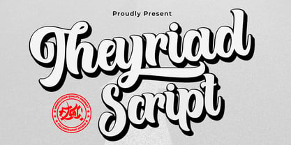 Theyriad Script is the great choice for watermarks on photography, logo designs, quotes, album covers, business cards, and many other design projects. Theyriad Script is here to elevate your work to the highest level. Features: -Accents (Multilingual Characters) -PUA encoded -Numerals and Punctuations (OpenType Standard) -Many alternates
 - Mainstream by Mans Greback,
$59.00 Mainstream is a graffiti handwriting font, designed created by Måns Grebäck. It is vivid, artistic and contains a wide range of characters. Write underscores after any word to make an underline. Example: Mainstream_ Write * after any letter to put a crown on it. Example: Mainstre*am
