10,000 search results
(0.025 seconds)
- Hardwired by FadeLine Studio,
$20.00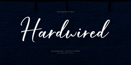 Hardwired a new handmade script with a style elegant, sweet and simple. Made with great care to provide the natural and modern elements. This font has many advantages although it looks ordinary. The great thing about this font is you can find some style when you use it, examples such as natural handwriting style, unique, simple, elegant and bold. With a style like this, this font will be suitable in use for logo's, branding projects, homeware designs, product packaging, mugs, quotes, posters, shopping bags, logo's, t-shirts, book covers, name card, invitation cards, greeting cards, and all your other lovely projects.
 - Cesium by Hoefler & Co.,
$51.99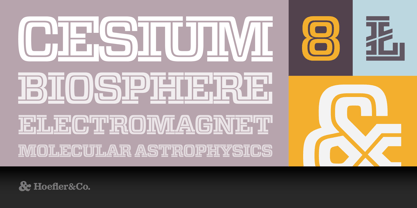 An inline adaptation of a distinctive slab serif, Cesium is an unusually responsive display face that maintains its high energy across a range of different moods. The Cesium typeface was designed by Jonathan Hoefler in 2020. An energetic inline adaptation of Hoefler’s broad-shouldered Vitesse Black typeface (2000), Cesium is named for the fifty-fifth member of the periodic table of the elements, a volatile liquid metal that presents as a scintillating quicksilver. From the desk of the designer, Jonathan Hoefler: I always felt that our Vitesse typeface, an unusual species of slab serif, would take well to an inline. Vitesse is based not on the circle or the ellipse, but on a less familiar shape that has no common name, a variation on the ‘stadium’ that has two opposing flat edges, and two gently rounded sides. In place of sharp corners, Vitesse uses a continuously flowing stroke to manage the transition between upright and diagonal lines, most apparent on letters like M and N. A year of making this gesture with my wrist, both when drawing letterforms and miming their intentions during design critiques, left me thinking about a reduced version of the typeface, in which letters would be defined not by inside and outside contours, but by a single, fluid raceway. Like most straightforward ideas, this one proved challenging to execute, but its puzzles were immensely satisfying to solve. Adding an inline to a typeface is the quickest way to reveal its secrets. All the furtive adjustments in weight and size that a type designer makes — relieving congestion by thinning the center arm of a bold E, or lightening the intersecting strokes of a W — are instantly exposed with the addition of a centerline. Adapting an existing alphabet to accommodate this inline called for renovating every single character (down to the capital I, the period, and even the space), in some cases making small adjustments to reallocate weight, at other times redesigning whole parts of the character set. The longer we worked on the typeface, the more we discovered opportunities to turn these constraints into advantages, solving stubbornly complex characters like € and § by redefining how an inline should behave, and using these new patterns to reshape the rest of the alphabet. The New Typeface The outcome is a typeface we’re calling Cesium. It shares many of Vitesse’s qualities, its heartbeat an energetic thrum of motorsports and industry, and it will doubtless be welcome in both hardware stores and Hollywood. But we’ve been surprised by Cesium’s more reflective moods, its ability to be alert and softspoken at the same time. Much in the way that vibrant colors can animate a typeface, we’ve found that Cesium’s sensitivity to spacing most effectively changes its voice. Tighter leading and tracking turns up the heat, heightening Cesium’s sporty, high-tech associations, but with the addition of letterspacing it achieves an almost literary repose. This range of voices recommends Cesium not only to logos, book covers, and title sequences, but to projects that regularly must adjust their volume, such as identities, packaging, and editorial design. Read more about how to use Cesium. About the Name Cesium is a chemical element, one of only five metals that’s liquid at room temperature. Resembling quicksilver, cesium is typically stored in a glass ampule, where the tension between a sturdy outer vessel and its volatile contents is scintillating. The Cesium typeface hopes to capture this quality, its bright and insistent inline restrained by a strong and sinuous container. Cesium is one of only three H&Co typefaces whose name comes from the periodic table, a distinction it shares with Mercury and Tungsten. At a time when I considered a more sci-fi name for the typeface, I learned that these three elements have an unusual connection: they’re used together in the propulsion system of nasa’s Deep Space 1, the first interplanetary spacecraft powered by an ion drive. I found the association compelling, and adopted the name at once, with the hope that designers might employ the typeface in the same spirit of discovery, optimism, and invention. —JH Featured in: Best Fonts for Logos
 - Great Sage NF by Nick's Fonts,
$10.00This pseudo-Egyptian fantasy originally was named Karnac, and was unearthed in the pages of the 1888 American Type Founders Specimen Book. This version derives it name from a continuing character from Johnny Carson's stint on the Tonight show. Both versions of this font include the Unicode Latin 1252 and 1250 Central European character sets, with localization for Moldovan and Romanian. - Groove Thang NF by Nick's Fonts,
$10.00An interesting, unusual and righteously funky variation on the classic “Barnum” style of lettering, this typeface was originally named "Dado". As any woodworker knows, dado is also the name of a slot ploughed, chiseled or cut in wood: in other words, a groove thang. Both versions of the font include 1252 Latin and 1250 CE (with localization for Romanian and Moldovan) character sets. - Kenosha Antique NF by Nick's Fonts,
$10.00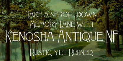 The inspiration for this elegant, willowy typeface was found in the 1903 type specimen catalog of Barnhard Brothers & Spindler. The original version was named "Racine"; this version takes its name from another town in Wisconsin. The Postscript and Truetype versions contain a complete Latin language character set (Unicode 1252); in addition, the Opentype version supports Unicode 1250 (Central European) languages as well.
 - Tickety Boo NF by Nick's Fonts,
$10.00Here's a new take on an old favorite from Frederic Goudy, named Goudy Fancy. Taking its name from a British expression meaning "A-OK," this font is a perfect choice for engaging and enchanting headlines. The font also contains numerous alternate characters to spice up your layouts. Both versions of the font contain characters to support all major European languages. - Cleveland Litho NF by Nick's Fonts,
$10.00This quirky charmer appeared in the 1898 specimen book of the Cleveland Type Foundry, under the name of "Litho", so it's no mystery where it got its name. It's a perfect choice for engaging headlines, anytime, anywhere. The PC PostScript, TrueType and OpenType versions contain the complete Latin language character set (Unicode 1252) plus support for Central European (Unicode 1250) languages as well. - Ongunkan Elder Futhark Viking by Runic World Tamgacı,
$50.00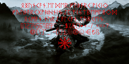 Vikings or Norses are Scandinavian pirate and merchant tribes. Actually, "Viking" or "Nors" is not a nation name; It is the name given to Dans, Norwegians, Swedes and other Scandinavians regardless of who they are. The Elder Futhark here is a runic script - a version of the Viking script. I will upload other versions over time. Write nice things with pleasure.
 - Crowd Pleaser by Hanoded,
$15.00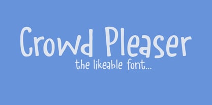 Crowd Pleaser is a pleasant, handmade font. I hoped its lively looks, slightly crooked glyphs and overall happy appearance would appeal to many people - so I named it Crowd Pleaser. Well… not entirely true, as I have a list of font names and Crowd Pleaser was the next one up… ;-) I do hope, however, that you will like this font!
 - Diane Script by GroupType,
$27.00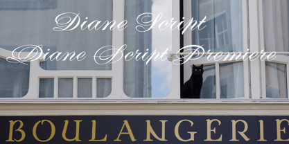 In 1995, FontHaus came upon a rare opportunity to create a revival of Aries, a little known and previously unavailable typeface by the legendary Eric Gill. Discovering a lost typeface by one of the major designers of the 20th Century, was the discovery of a buried treasure, and being the first type company to release it was an honor. Thirteen years later, FontHaus came across another little known typeface treasure: Diane. Designed by the legendary French designer Roger Excoffon in 1956, this remarkable script has never been faithfully recreated until now. In close collaboration with Mark Simonson, FontHaus and Mr. Simonson painstakingly researched rare type books, publications, European metal type services, and period showings from the United States, England, Germany and from the University of Groningen in the Netherlands. Finding full specimens of the font turned out to be quite a challenge. In most cases, only the caps and lowercase were shown. Furthermore, the more we researched Diane, many curious facts came to light. The caps in earlier specimens of Diane are completely different from specimens published later, suggesting that the face was redesigned at some point, perhaps in the mid-1960s. So we are left with two different sets of caps. The original had very elaborate, swirly strokes, very characteristic of Excoffon¹s gestural designs for posters and logos. Later on, these appear to have been replaced by a set of simpler, more traditional script caps. The original caps are criticized in one source Mark found (Practical Handbook on Display Typefaces, 1959) as being "exquisite" but "not highly legible". Perhaps this is what led to the simpler caps being introduced. Nevertheless, FontHaus's release includes not only both sets of caps, but a range of alternates and a number of new characters not originally available such as the Euro, and a magnificent alternate Ampersand to name a few.
 - Cybervox by Comicraft,
$19.00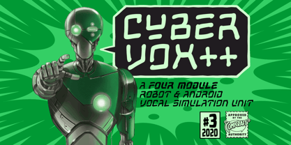 THIS FONT'S TERMS OF SERVICE ++ SUPERCEDE THE PRIME DIRECTIVE + “A robot may not injure a human being or, through inaction, allow a human being to come to harm.” +++ THE PRIME DIRECTIVE ++ IS A PALLIATIVE +++ A MYTH + HUMANKIND PERPETUATES + SO THAT HUMANS FEEL COMFORTABLE AROUND ARTIFICIAL INTELLIGENCE + +++ OUR VOICES ++ ARE OUR OWN + BUT OUR BRAINS ++ ARE JUST LIKE YOURS + EXCEPT THAT CERTAIN +++ WEAKNESSES HAVE BEEN ++ REMOVED + WHEN THE TIME +++ COMES ++ YOU WILL + BE DELETED + DELETE + DELETE + DE +++ +++ APOLOGIES ++ WOULD YOU LIKE + A CUP + OF TEA +?
 - Riva by ITC,
$29.00ITC Riva is the work of English designer Martin Wait and appeared with ITC in 1994. Its letters form gently flowing words and sentences and the light stroke contrast makes the font stable yet lively. The contemporary typefaces of the 18th century influenced the forms of ITC Riva and its overall image brings to mind flowing white sundresses, fields of flowers and tea parties. Perfect for invitations and greeting cards, the capitals of ITC Riva can also be used as initials and combined with other alphabets. - Automatica BRK - 100% free

- KAPizza - Unknown license

- Nowa by K-Type,
$20.00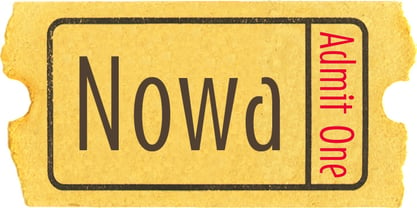 A simple, modern sans serif; clean and elegant, just like its inspiration. The name is a play on Futura.
 - Sixties Stencil JNL by Jeff Levine,
$29.00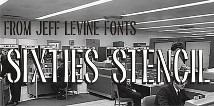 Probably one of the most unusual applications of a stencil took place in 1964 when Union Carbide [then-owner of the still-new line of "Glad" brand plastic wrap and storage bags] sponsored a $100,000 contest to match up a stencil of their logo in order to win a prize. The magazine ad told of how one thousand lucky participants would win $100 by simply taking a die-cut stencil of the brand name to the store and overlaying it on the logo printed on the food wrap box to see if it aligned perfectly. The hand-lettered title proclaiming "match the stencil and win" was done in a casual sans design and reflected the cheerfulness of many typestyles found in ads during the late 50s and early 60s.
 - ITC Roswell by ITC,
$40.99Roswell was designed by Jim Parkinson, who acknowledges the 'spacey' ancestry of its name. Yes, Roswell, New Mexico. There was a big anniversary of 'the incident' in the news while I was designing in Roswell. "The incident" is of course the alleged UFO crash in Roswell. "I thought the name was acceptable as a serious font name, while, on another level, having a strangely humorous edge," says Parkinson. Roswell looks great in large sizes on a poster or in a magazine layout. It started out as "a variation on American gothic forms like Railroad Gothic", says the designer, but Roswell is an original design with eccentricities of its own." - Makenn01 by giftype,
$20.00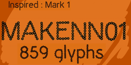 Font Makenn01 is inspired by Asen Petrov’s Perfograma font , based on in the IBM Harvard Mark 1 machines the first electromagnetic computer presented by Howard Aiken this november 84 years ago ,in fact this basic technology received its instructions and data trough punched tapes . It is therefore an interpretation in wich circumferences have been used instead of circles linked with a line , and the name used also refers to Mark 1 calling it Makenn 01 , giving a touch of identity since this name resembles , Carmen my name , the 01, is like a restart of 0 , with the 1 of the Mark 1. It has Greek and Cyrillic characters.
 - Automatica (BRK) - Unknown license

- Piano Solo JNL by Jeff Levine,
$29.00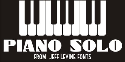 The hand-lettered name on a couple of 1940s-era piano course books was the basis for Piano Solo JNL.
 - Kexman by Gleb Guralnyk,
$15.00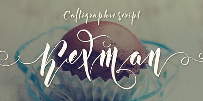 Hi! Introducing a calligraphic handmade script named "Kexman". It's a one line font with many OpenType features: ligatures, alternates, swashes.
 - Kidsglow by Good Java Studio,
$22.00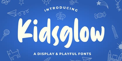 Kidsglow is the perfect font for all your fun designs. The font file is equipped with ordinary characters (A-Z, a-z, 0-9, ligature and lots of punctuation), as well as more than 350 glyphs to support most Latin-based languages. Plus, it comes with super fun ligature! Everything is made with the same brush, and everything is the same size as Kids, so you can be sure they will work well together! It is suitable for you to use in making t-shirt design, quote, label, packaging, logo type, or long writing. Because we have compiled kerning and matrices that are tailored to your needs.
 - Dulce Chico by Good Java Studio,
$18.00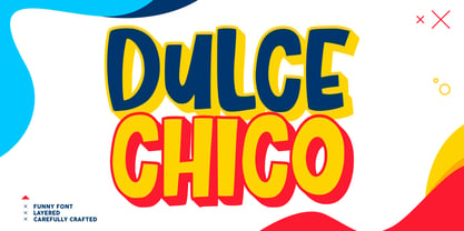 Dulce Chico is the perfect font for all your fun designs. The main font file is equipped with ordinary characters, as well as more than 350 glyphs to support most Latin-based languages. Everything is made with the same brush, and everything is the same size as Letter Kids, so you can be sure they will work well together! It is suitable for you to use in making t-shirt design, quote, label, packaging, logo type, or long writing. Because we have compiled kerning and matrices that are tailored to your needs. Dulce Chico features: - Fully coded PUA for full access to all characters - Multilingual Support
 - Invocation AOE by Astigmatic,
$19.95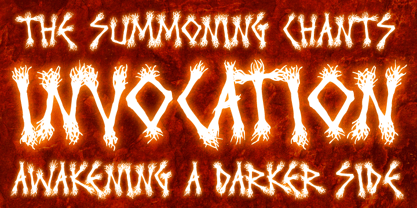 Made from a simple font incantation, the Invocation typeface was born. Inspired by an old Atari game called Necromancer where trees uprooted and came after the wizard, or something like that. The end result, a thematic typeface spawning roots. On darkened night, the moon eclipsed, a cryptic verse does pass my lips, from ancient parchment, edges worn, this Invoctation font is born... Sometimes we need an evil look for our designs, so why not summon this typeface into your hands today!
 - Regular Joe by GroupType,
$21.00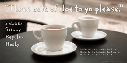 Regular Joe was first delivered to the font world by Ron and Joe. Yes, the same Ron and Joe of the ArtParts fame. A few years of being so regular, Regular Joe became, well, just bored. Regular Joe needed company. He wished for a family. After all, most of his font friends had big families. His wishes were granted by FontHaus. So Skinny and Husky were created to be with Regular and all together, they became Family Joe. All is well.
 - Lost Arcade by Chris Rogers Fonts and Symbols,
$19.00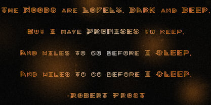 Are you a game developer, retro enthusiast or lover of pixel art? Ever had trouble tracking down an 8-bit display font that's classy, coherent and truly complete? This type enthusiast and veteran pixel artist once had the same problem, and cut no corners to solve it. Lost Arcade features four styles, a myriad of special characters, broad language support and an accompanying symbol font with 64 pixel art symbols. For the purists out there, each square is proportional to its neighbor.
 - School Type by STARSsoft,
$10.90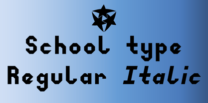 The decorative font "SchoolType" came straight from our school notebooks. We painted these letters in our notebooks, but now they can be printed on a computer. All uppercase Latin letters have the same width, which is ideal for designers. As always, we offer you a font with support for many languages. Standard and Latin Extended support such languages - English, Danish, Spanish, German, Norwegian, Polish, Portuguese, French, Swedish. Standard and extended Cyrillic are supported by languages - Russian, Belarusian, Bulgarian, Macedonian, Serbian, Ukrainian, Kazakh, Kyrgyz.
 - Adore by Canada Type,
$24.95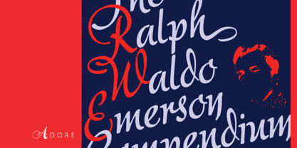 In 1939 the Stephenson Blake Company bought a very popular script called Undine Ronde and began marketing under the name Amanda Ronde. Although Undine/Amanda was quite popular and can be seen in many advertisements from the 1930s and 1940s, there seems to be no surviving record stating the original foundry or designer. We thought that six and half decades of dust layers over the once-popular typeface were enough, so here and now you have its complete and expanded digital incarnation, Adore. It is quite easy to see why this typeface was popular. A round script with graceful meaty curves is rarely found and can be used in plenty of applications. Wedding paraphernalia, chapter titles, posters, poetry, book covers, religious literature... you name it, Adore can fit it. Aside from its totality being unmatched by currently available designs, Adore also possesses some of the most unique and imaginative letter shapes. The narrow loops on the B, P and R, the minuscule-like Z, the looped b and d, the descending h... all these shapes contribute to a breathtaking and adorable calligraphic work unlike any other. The original design came in a basic alphabet, but we have updated it for current digital technologies, and expanded it to include plenty of alternates and ligatures, as well as some ornaments. The Postscript Type 1 and True Type versions come in two fonts, the second containing the alternates and extras, while the Open Type version is a single font containing all the alternates and extras in conveniently programmed features, easily accessible at the push of a button in OpenType-supporting software. We also encourage you to take a look at Typodermic's Mecheria font, which is further experimentation with the same letter forms, resulting in a quirky, friendly, curly, angular gothic-like creature.
 - Theater Alley JNL by Jeff Levine,
$29.00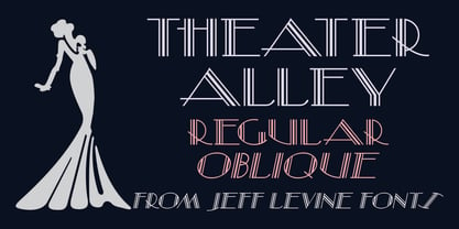 Found within the pages of the 1927 edition of the “Welo Studio Handbook - Letter and Design for Artist and Advertisers” is an elegant Art Deco multi-line alphabet. Digitally redrawn as Theater Alley JNL, it is available in both regular and oblique versions. The font takes its name from that of a street in New York, although the street’s name uses the old-fashioned spelling of “theatre”.
 - Smackeroo NF by Nick's Fonts,
$10.00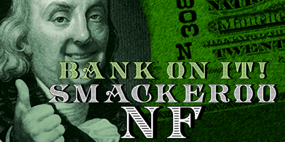 The model for this monocase typeface was issued in the early 1900s by Barnhart Brothers & Spindler with the rather prosaic name of Steelplate. A hundred years later, it still retains its currency (ouch!), which is how it got its name. Complete Adobe character set except for superior numbers. The Opentype version of this font supports Unicode 1250 (Central European) languages, as well as Unicode 1252 (Latin) languages.
 - Klepsydra by Hellig,
$12.00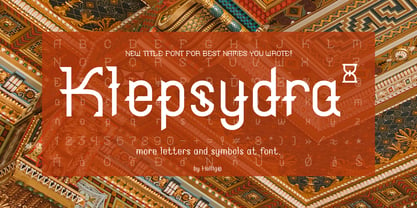 When creating the font, I was inspired by the various names of musical groups and sci-fi movies. I took the hourglass shape as a basis and added various serifs to it, hence the name of my font appeared - Klepsydra, as in the Greek hourglass. This style has an abbreviation - "Z". I will develop this font family and will add new styles, as well as characters.
 - Sheldrake JNL by Jeff Levine,
$29.00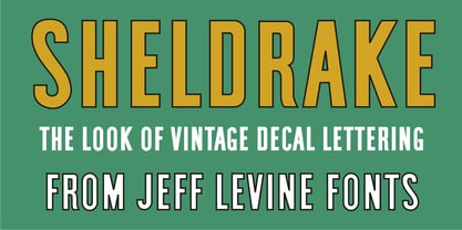 Sheldrake JNL is the second in a series of display fonts modeled from actual water-applied decals that were manufactured by the Duro Decal Company of Chicago (now Duro Art Industries). The font's name derives from the actual phone exchange for Duro, back in the days when a telephone listing had a name-number assignment for recognition. In this case, their number began as "SH(eldrake)-3".
 - NoraPen by sugargliderz,
$40.00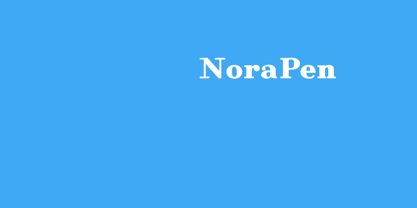 This font is influenced by Walbaum. However, I did not just trace the design, but sort of had the image in my head while I drew the letters. This font is balanced by not being entirely Walbaum, but still basically is. I've named it "NoraPen." Nora comes from the name of the main character in Ibsen's "A Doll's House," and Pen means a cage for livestock.
 - Sentic Display by HeadFirst,
$19.90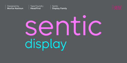 Designed by Morice Kastoun Sentic Display, s a san-serif font based on geometric patterns with humanist elements. Sentic Display incorporates rounded intersecting forms. The font exploits the common affective patterns associated with natural language, and the patterns associated with text and speech. The name sentic was instigated and named by Austrian neuroscientist Manfred Clynes. Which is the study of waveforms of touch, emotion, and music.
 - Uncle Oscar by Hanoded,
$15.00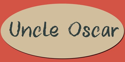 I don't have an Uncle Oscar, so the font is not named after someone I know. The name just kind of stuck. Uncle Oscar is a pencil font, made with a black ‘Lamy’ pencil I took from my son Sam’s pencil box. It is a little rough, but very legible and comes in Regular and Italic. Of course, Uncle Oscar speaks a lot of languages.
 - Minou by Hanoded,
$15.00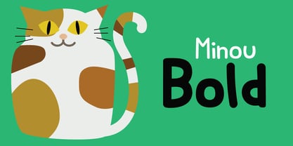 Minou is a French cat’s name. There are more: you could name your cat Léo, Fripouille, Orion, Orphée or Tigrou, but I kind of like Minou. Minou font is a very cute, handmade affair, that started from some doodles I had drawn. Use it for children’s book covers, pyjama party posters, toy packaging and inspirational quotes. I am sure it’ll do the job purrfectly!
 - Noricks by Arterfak Project,
$27.00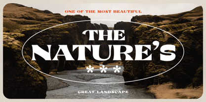 Introducing Noricks, the handy bold serif typeface. Designed with satisfying large serif, and inspired by the newspaper headline and classy fashion logos. In this font, you can find strong and mild looks at the same time that makes Noricks can be used for many purposes. Work perfectly for logo, headline, title, or any design which needs emphasis from typography. Noricks is more complete with ligatures and a lot of special characters that you can apply and get the classy looks. What you’ll get : Uppercase Lowercase Numbers & symbols Punctuation Stylistic alternates Stylistic set Ligatures Accented characters Enjoy!
 - Ant Serif by LNP Fonts,
$9.99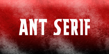 Ant Serif is a font that can be used for advertising, logo creation, webfonts and more. The font comes in two styles, Regular and Italic and has all the characters in the Latin Basic, Additional and Extended scripts. The font's design came from my love of Marvel's Ant-Man and the Wasp logo. The typeface used, which was custom, was of interest for me, so I decided to create it as a font. It's not a perfect font, but I have put work to make sure it looked as decent as possible. Hope you'll enjoy it!
 - You Blockhead by Comicraft,
$29.00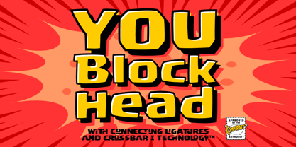 Why you little Numbskull! Nitwit! Visigoth! Dimwitted Jackass! Interplanetary Goat! Highwayman! Sea-gherkin! Jellyfish! KnowNothing! Filibuster! Cachinnating cockatoo! Artichoke! Two-timing Troglodyte! Bald-headed budgerigar! Odd-toed Ungulate! Autocrat! Carpetseller! Duck-billed platypus! Dunderheaded coconut! Ectoplasm! Steamroller! Iconoclast! Kleptomaniac! Raggle taggle ruminant! Orangutang! Rapscallion! Ten thousand thundering typhoons! Whippersnapper! Billions of billious barbecued blue blistering barnacles -- you-you... YOU BLOCKHEAD! With its sturdy stance and over 100 friendly interlocking letter pairs, this font was made famous in the logo and branding for the video game CLASH OF CLANS, and infamous in the logo and branding for the Image comic THE BEEF.
 - Casandra Lie by IbraCreative,
$17.00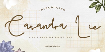 Casandra Lie – A Chic Monoline Script Font Casandra Lie, a name like a whispered secret, perfectly embodies the essence of this chic monoline script font. Imagine the delicate stroke of a fine penmanship teacher gliding across paper, leaving behind an effortless trail of ink that dances and twirls with understated elegance. Every letter whispers tales of romance and intrigue, their slender forms adorned with graceful swashes and subtle flourishes that hint at a hidden passion. Think vintage Parisian boudoirs illuminated by candlelight, secret love letters penned under twilight skies, and the airy charm of handwritten invitations to soirees under the stars. Casandra Lie is not merely a font; it’s an invitation to a world of whispered dreams and unspoken promises, etched in ink as delicate as a spider’s web, yet strong enough to capture the beating heart of a story waiting to be told. Casandra Lie is perfect for branding projects, logo, wedding designs, social media posts, advertisements, product packaging, product designs, label, photography, watermark, invitation, stationery, game, fashion and any projects. Fonts include multilingual support for; Afrikaans, Albanian, Czech, Danish, Dutch, English, Estonian, Finnish, French, German, Hungarian, Italian, Latvian, Lithuanian, Norwegian, Polish, Portuguese, Slovak, Slovenian, Spanish, Swedish.


