10,000 search results
(0.024 seconds)
- Roothinkyu by Twinletter,
$12.00 Roothinkyu is a signature font with modern and elegant styled writing, with a natural and aesthetic flow. This font has a dazzling shape when applied to your various projects, both for branding and your various creative needs. This font is perfect for business cards, photography studios, autographs, interior design, model names, coffee late, traveling, weddings, cosmetics, jewelry, social media posts, product packaging, watermarks, special events, or anything else. Start using this font to add an authentic and heartfelt vibe to any design project.
 - Attorney by Schriftlabor,
$26.99 Originally, Viktor Solt-Bittner developed Attorney as a custom font for a law firm, hence its name. Attorney shows a systematic, yet unconventional placing of its serifs, hard corners and a clean design. The typeface was produced by Schriftlabor’s type director, Lisa Schultz. Attorney consists of 7 weights, from Light to Black, each of them accompanied by an italic, totaling in 14 styles. All of them contain several figure sets, small caps and many alternative forms, which are accessible by OpenType features.
 - Chubby Cheeks - Unknown license

- Neutraface Display by House Industries,
$33.00 Although better known for his residential buildings, Richard Neutra’s commercial projects nevertheless resonate the same holistic ecology—unity with the surrounding landscape and uncompromising functionalism. His attention to detail even extended to the selection of signage for his buildings. It is no wonder that Neutra specified lettering that was open and unobtrusive, the same characteristics which typified his progressive architecture. House Industries brings the same linear geometry to Neutraface without sacrificing an unmistakably warm and human feel. FEATURES LIGATURES: This feature is on by default. It will substitute a long list of “f” and “t” ligatures. For example, open InDesign or Photoshop and type “ff” or “tt”. NEUTRAFACE DISPLAY ALTERNATES: Neutraface Display contains several stylistic alternate characters useful when a purely geometric setting is desired. Like all good subversives, House Industries hides in plain sight while amplifying the look, feel and style of the world’s most interesting brands, products and people. Based in Delaware, visually influencing the world.
 - CA Texteron by Cape Arcona Type Foundry,
$40.00 CA Texteron is a modern text font family to cover the most common typographical needs with a minimum of weights. It is aiming for a serious but unconventional look, which is achieved by combining round and edgy forms in the same font, often in the same glyph, and by using Humanist and modern form-principles at the same time. It merges classical type-design with an experimental spirit. CA Texteron combines elements of the dynamic renaissance principle with the static neo-classic style, which makes it hard to classify. The result is a post-modern hybridization. The Regular weight works best in text size, and with more letter-space also for footnotes. The low contrast makes it robust and legible even in very small sizes. Bold, Italic and Small Caps are intended for emphasis. Bold, Bold Italic and Heavy make good headlines, that reveal the unconventional details. The Italic is not just a slanted version of the Regular weight but has individual forms and typical italic characteristics.
 - Vertigirl - Unknown license

- Blackduck by Eurotypo,
$60.00 “Blackduck” font is a typical Gothic, usually named “Blackletter” . This typeface was born with the name of “Textur” and developed from Carolingian cursive. It was used in the middle age as sacred script, became increasingly narrower, his vertical lines were emphasized and his strokes very compacted to save space. Along the time the early German print typefaces derived in others styles that were more readable such as Schwabacher and Fraktur, very popular in Germany and sometimes associated to the identity of the country. The font "Blackduck" was inspired mixing carefully the last two “Blackletters”. We try to joine some characteristics of both to reach good legibility without loosing the strong impact and powerfulness of the shapes. Some minuscules like the “o” “c” “e” “d” are rounded on both sides, while both strokes join in an angle at the top and at the bottom. Some other lower cases are formed by an angular and rounded stroke. This font contains a full set of OpenType features; swashes, stylistics alternates, old style figures (Arabic numeral were carefully shape integrated), ligatures and some extras ornaments were added to help in your design. "Blackduck" includes diacritic signs for Central European languages.
 - Nimbus Sans Novus by URW Type Foundry,
$89.99 The first versions of Nimbus Sans have been designed and digitized in the 1980s for the URW SIGNUS sign-making system. Highest precision of all characters (1/100 mm accuracy) as well as spacing and kerning were required because the fonts should be cut in any size in vinyl or other material used for sign-making. During this period three size ranges were created for text (T), the display (D) and poster (P) for small, medium and very large font sizes. In addition, we produced a so-called L-version that was compatible to Adobe’s PostScript version of Helvetica. Nimbus was also the product name of a URW-proprietary renderer for high quality and fast rasterization of outline fonts, a software provided to the developers of PostScript clone RIPs (Hyphen, Harlequin, etc.) back then. Also in the 80s, a new, improved version of the Nimbus Sans, namely Nimbus Sans Novus was designed. Nimbus Sans Novus was conceptually developed entirely with URW’s IKARUS system, i.e. all styles harmonize perfectly with each other in terms of line width, weight, proportions, etc. On top of that, Nimbus Sans Novus contains more styles than Nimbus Sans.
 - Newbery Sans Pro by Sudtipos,
$49.00 Newbery Sans is a new contrasted sans serif designed by Alejandro Paul and the Sudtipos team. As Paul has lately found inspiration from different German instructional books, Newbery Sans finds its initial inspirations from the lettering work of E. Nerdinger and invokes the spirit of German designs but is imbued with personality all its own. The idea was to make the letterforms more usable and suitable for everything from corporate branding to editorial. It is an elegant, functional family with contemporary detail that will effortlessly meet the demands of the screen and printed page. From a condensed thin to an expanded black, Newbery Sans provides a usable workhorse system of three widths and seven weights, each with the original design of real italics, a selection of alternate glyphs and a complete set of small caps. Each weight is professionally crafted and includes extended Latin support for Central, East and Western Europe languages. The font’s name nods to its imagined uses in airports and street signage: Jorge Newbery was one of the first Latin American aircraft pilots, Newbery is the street where I live and it is also the name of Buenos Aires’s local airport.
 - Square Beat by Hanoded,
$15.00 After a lot of time sitting at my desk, creating fonts and trying to figure out how my new software works, I really like to work out a bit. The only thing that I do not like is the music they play at the gym; it is usually a selection of poppy tunes that appeals to a large audience. But not to me. I prefer my death metal - and eighties music, as it brings back a lot of good memories. So, I bought myself some ear buds and installed a music streaming app on my phone. Yes, I know, I am probably the last person on earth who discovered streaming... One day, during a workout session, I listened to a list of eighties music and one song that I had forgotten about started playing: Rappers Delight by The Sugarhill Gang. When I started working on the font, I had to think about the song and named it Square Beat. Square Beat font, other than the name implies, is a rounded, handmade font, ideally suited for books and magazines aimed at a young audience, toy packaging or posters. It comes with great language support, including Vietnamese.
 - Ainslie Contrast by insigne,
$35.00 Ainslie Contrast is the newest in the Ainslie series, named for the famous mountain overlooking the Australian city of Canberra. The Ainslie series currently consists of four typefaces. The Ainslie design is very unique and originally began life as a semi-serif. Also available are a normalized sans serif and slab variants. This contemporary typeface’s high contrast catches the eye. The design flows with ease and sophistication. There are a mix of influences from Australia, which gives it a unique flavor. The original Ainslie was designed for the Canberra Australia Centennial Typeface Competition and named for the mountain that overlooks the beautiful capital city of Australia. Ainslie takes Canberra's distinct geometric design and blends it with the organic, flowing essence of aboriginal art and the smooth aerodynamic design of the boomerang. The typeface includes a multitude of alternates that can be accessed in any OpenType application. There are swashes and other details such as small caps, alternative titling caps and swash alternates. If you’re searching for a contemporary high contrast typeface with geometric simplicity and a hint of antipodean flair, Ainslie Contrast is fair dinkum.
 - Basic Commercial Soft Rounded by Linotype,
$29.99 Basic Commercial is a font based on historical designs from the hot metal typeface era. It first appeared around 1900, and was created by type designers whose names have not been recorded but whose skills cannot be overlooked. This typeface's design has been popular among groups and movements as diverse as the Bauhaus, Dadaism, and the masters of Swiss/International-Style typography. It influenced for a variety of later grotesque fonts, such as Helvetica and Univers. Basic Commercial was distributed for many years in the United States under the name Standard Series. The typeface worked its way into many aspects of daily life and culture; for instance, it became the face chosen for use in the New York City subway system's signage. The Basic Commercial's font family members have a clear and objective design. Their forms exhibit almost nothing unusual, but remain both lively and legible nonetheless. Perhaps for this reason, Basic Commercial's design has been popular with graphic designers for decades. To read more about the history of typefaces like Basic Commercial, visit our font feature, The Sans Serif Typefaces. In addition several weights of this typefamily are available as soft rounded versions."
 - Ongunkan Ogham by Runic World Tamgacı,
$50.00 This font is a latin based version of the ogham alphabet used in the writing of the old irish language. It can be used on Latin keyboards. I will make a unicode font version of this font in the future. Ogham (/ˈɒɡəm/ OG-əm, Modern Irish: [ˈoː(ə)mˠ]; Middle Irish: ogum, ogom, later ogam [ˈɔɣəmˠ] is an Early Medieval alphabet used primarily to write the early Irish language (in the "orthodox" inscriptions, 4th to 6th centuries CE), and later the Old Irish language (scholastic ogham, 6th to 9th centuries). There are roughly 400 surviving orthodox inscriptions on stone monuments throughout Ireland and western Britain, the bulk of which are in southern Munster. The largest number outside Ireland are in Pembrokeshire, Wales. The vast majority of the inscriptions consist of personal names. According to the High Medieval Bríatharogam, the names of various trees can be ascribed to individual letters. For this reason, ogam is sometimes known as the Celtic tree alphabet. The etymology of the word ogam or ogham remains unclear. One possible origin is from the Irish og-úaim 'point-seam', referring to the seam made by the point of a sharp weapon.
 - Graphit by HVD Fonts,
$40.00 Graphit is a typeface designed by Lit Design Studio & curated by HvD Fonts. It combines clear, geometric shapes with edgy yet finely-crafted details. Graphit features uncompromising characters such as G, Q, f, k and 1. It works well both for impactful headlines and for reading sizes. The type family consists of six weights plus matching italics. In early 2018, Livius Dietzel & Tom Hoßfeld started developing the typeface’s essential character and released a free font named after the studio, Lit. Just a few months later, Hannes von Döhren had a look at the typeface and suggested expanding it into a family – then publishing it with HvD Fonts. They drew every single letter from scratch, and also decided to give the font a new name — Graphit. The family features six low-contrast weights, ranging from Black to Thin. Every character has been crafted to give it a distinctive and individual feel. Medium, Regular and Light are optimized for usage in copy text. For smaller font sizes & longer body copy, the alternate character set features a double-story a and a simplified Q, f, r and t for improved legibility. All fonts are manually hinted for optimal performance on digital devices.
 - Authenticity by Doehantz Studio,
$20.00 Authenticity is an authentic signature font. It made with a neat touch making it easy to read. This font is suitable for use as web logos, signatures, invitation, prints, headers, magazines, book covers, t-shirt prints, craft, product brand, business card, logo, and gift card
 - Kingdrops by Letterhend,
$19.00 Kingdrops is a cool script typeface. This font perfectly made to be applied especially in logo, and the other various formal forms such as invitations, labels, logos, magazines, books, greeting / wedding cards, packaging, fashion, make up, stationery, novels, labels or any type of advertising purpose.
 - Household by Goodigital13,
$20.00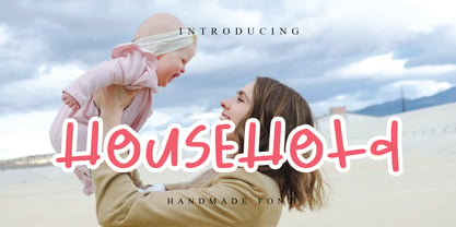 font suitable for logo, branding, greeting card, poster and any design that you create. andwritten font is a natural & modern handwritten font. I’ts Perfect for logo, invitation, stationery, wedding designs, social media posts, advertisements, product packaging, product designs, label, photography, watermark, special events or anything.
 - Local Goods by HRDR,
$10.00 Local Goods is a font combinations with a three different style, these font can include a modern vintage look and elegant look. Local Goods It is perfect for product logo, signage, branding projects, headlines, posters, packaging, clothing brand logos, Vintage design and much more.
 - Brandzet by ahweproject,
$14.00 Brandzet is a unique display font. Its random shape makes it outstanding and great for titles. This type of font is perfectly made to be applied to logos, headlines, labels, logos, magazines, books, packaging, fashion, makeup, stationery, novels, labels, or any type of advertising purpose.
 - Mulled Wine by Larin Type Co,
$16.00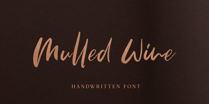 Mulled Wine is a beautiful and elegant hand drawn brush font, and will emphasize your individuality in any project. You can also use it to create a logo or templates, invitations, blog, branding, marketing, book covers, magazines, advertising, stationery, logo design and much more.
 - Maroko by Goodigital13,
$20.00 Perfectly suited to stationery, logos and much more. It looks stunning on wedding invitations, thank you cards, quotes, greeting cards, logos, business cards and every other design which needs a handwritten touch. Made your own design cards, poster, or anything else you might think of!
 - Brootahh by Alit Design,
$16.00 Presenting the 🗯️💬The Brootahh Comic Typeface💬🗯️ by alitdesign. The Brootahh Comics typeface is inspired by the style of letters in comics that have less serious and fun characters. The lettering of the Brootahh font is a sans serif with distorted characters which gives a fun and design impression for children. The Brootahh font has 2 families, namely the Brootahh Blup font which has more bubble characters that can support comic characters to be cooler. The Brootahh font is perfect for creating designs with non-serious concepts, designs for children, book headers, and of course for text on comics. The Brootahh Comics typeface also gets a bonus character of 230 Comic-themed illustrations that make creating designs even easier. Simply by downloading The Brootahh Comics typeface creating a Comic and non formal themed design is very quick and easy. The Brootahh Comics typeface is perfect for magazine cover designs, brochures, flyers. Instagram ads, Canva Design and so on with comic, non-serious, pop art, game mobile and fun design. Besides that this font is very easy to use both in design and non-design programs because everything changes and glyphs are supported by Unicode (PUA). The Brootahh Comics typeface contains 618 and Brootahh Blup 498 + 230 bonus glyphs with many unique and interesting alternative options.
 - Multiple by Latinotype,
$39.00 As its name suggests, Multiple is a family with multiple font styles. The idea that sums up the concept behind the typeface is “workhorse”. The challenge was to develop a useful font fit for any scenario and suitable for any design needs: editorial design, packaging, branding, screen use, etc. Multiple features soft, rounded shapes and large counterforms which make it well-suited for both text and display usage. The proportions are based on classic typefaces yet its design was specially created to provide a high degree of versatility. Multiple contains different stylistic sets whose variety of glyphs provides a wide range of choices for any design project. Partly humanist and partly grotesque, Multiple comes with a number of font variants that will help you choose the style that will best meet your needs. The font also includes a serif version with the same number of variants as its sans counterpart. The sans version includes 4 stylistic sets while its slab companion comes with 3 sets, both available as separate alt family packages (ideal for those seeking ready-to-use alternate glyph sets). These alternate characters are also available as OpenType features in the regular versions. Multiple comes in 5 weights—ranging from Extra Light to Bold - with matching italics, and contains a 395-character set that supports 207 different languages. Multiple: one font, multiple faces.
 - Ciclamino by TrueBlue,
$16.00 “Ciclamino” is the Italian name for a small, elegant forest flower with a sweet but strong fragrance. This font is inspired by the peculiars characteristics of this flower, to the elegant shapes of the petals and its intense fragrance but sweet and refined. The result is a font with a particularly incisive but elegant layout suitable for high-impact graphic projects with a modern and decisive flavor but with a note of balanced elegance. There are no limits to the situations in which you can use it to give a touch of originality to your graphic creations but there are some project categories in which it could be a choice of great visual impact and help you express all your creativity. The particular can give excellent results in all those situations that have a flavor of modernity, and innovative technology and express innovation and dynamism and decision. At the same time, its decisive and sinuous lines also adapt to situations with a gothic and fantasy relish and even to tribal graphics. But this is just a minimal list of situations in which it can express its potential, it is a very versatile font and you can find a lot of other situations in which its use can make a difference and help you obtain an original result with a great visual impact.
 - Cyan by Wilton Foundry,
$29.00The design of Cyan was inspired by features found in classic Roman and styles like Trajan and Bodebeck. It shows the designer's personal preference for geometric Roman proportions while incorporating open centers (B,P,R) and compact serifs. Unlike Trajan, Cyan has lowercase characters in the regular version. The characters stay true to the same features as the capitals, resulting in an unusually distinctive style. The Regular Capitals version contains Roman numerals. Cyan's weight is similar to Trajan's but the horizontal strokes are slightly bolder resulting in better legibility for small sizes, especially for lowercase characters. There are many subtle details in Cyan that become more interesting in larger sizes, for instance the subtle curves in the serifs and the overall smoothness as a result of the mostly rounded angles. Cyan is a robust font that will exceed expectations in areas never explored before. The name is inspired by the Greek word cyan, meaning "blue". The color cyan can have many different variations. One definition is a color made by mixing equal amounts of green and blue light (it also is a pure spectral color). As such, cyan is the complement of red: cyan pigments absorb red light. Cyan is sometimes called blue-green or turquoise and often goes undistinguished from light blue. Obviously the Cyan family is a perfect companion to the Cyan Sans family. - Double Porter by Fenotype,
$30.00 Double Porter - an elegant font collection. Double Porter includes following: • 6 fonts - a clean and textured version of each. • Ornaments • Catchwords • Ending swash ornaments for the script Double Porter is a clean cut script font with five strong sans fonts. All the fonts are designed to work nice together. Here’s a short introduction to the fonts: • Double Porter 1 -Clean connected script with Swash Alternates for caps and lowercase letters with ascender or descender. The Script also has Contextual Alternates that add variation & make the flow smooth. Contextual Alternates are automatically on. • Double Porter 2 -Wide Sans Serif font. • Double Porter 3 -Bold version of Double Porter 2 • Double Porter 4 -Semi condensed Sans Serif • Double Porter 5 -Condensed Bold Sans Serif • Double Porter 6 -Serif version of Double Porter 5 • Double Porter 7 -Set of 60 icons and ornaments • Double Porter 8 -Set of 68 Catchwords • Double Porter 9 -Set of 62 Ending Swashes and Strokes designed to go with Double Porter 1 - the script. In addition there is a “Printed” version of every Double Porter font. Printed versions are named Double Porter P x. Printed versions are exactly the same but the shapes have rugged outlines and a worn-out texture. Double Porter has wide language support including West European, Central European, Baltic, Turkish and Romanian character sets.
 - Kunstler Grotesk by HiH,
$12.00 Künstler Grotesk ML is one of a number of typeface designs that attempts to reconcile Germany’s blackletter tradition with the international familiarity of roman letterforms in a simple, robust design suitable for meeting the demands of a modern industrial economy, while rejecting the extraneous ornamentation of the departing Victorian era. It is an all-cap design with a number of playful ligatures. It has an appealing boldness that reverses well. Künstler means ‘artist’ in German. I had always assumed it was a person’s name until I came across the translation. Lesson: conjecture is not fact. Grotesk refers to a sans serif letterform tradition. Kunstler Grotesk was originally released by Bauer'sche Giesserei of Frankfurt am Main circa 1900. Künstler Grotesk ML represents a major extension of the original release, with the following changes: 1. Added glyphs for the 1250 Central Europe, the 1252 Turkish and the 1257 Baltic Code Pages. Added glyphs to complete standard 1252 Western Europe Code Page. Special glyphs relocated and assigned Unicode codepoints, some in Private Use area. Total of 350 glyphs, 260 kerning pairs. 2. Added OpenType GSUB layout features: pnum, salt, dlig (19) and hist. 3. Revised vertical metrics for improved cross-platform line spacing. 4. Redesigned mathematical operators. 5. Included tabular (std) & proportional (opt) numbers. 6. Refined various glyph outlines. 7. Made CcNnOoSsZz-kreska available (salt). 8. Incorporated alternate glyphs in lower case.
 - Wingdings by Microsoft Corporation,
$29.00The Wingdings™ 1 font was designed by Kris Holmes and Charles Bigelow in 1990 and 1991. Wingdings 1 originally named Lucida Icons, Arrows, and Stars to complement the Lucida text font family by the same designers. Renamed, reorganized, and released in 1992 as Microsoft Wingdings(TM), the three fonts provide a harmoniously designed set of icons representing the common components of personal computer systems and the elements of graphical user interfaces. There are icons for PC, monitor, keyboard, mouse, trackball, hard drive, diskette, tape cassette, printer, fax, etc., as well as icons for file folders, documents, mail, mailboxes, windows, clipboard, and wastebasket. In addition, Wingdings includes icons with both traditional and computer significance, such as writing tools and hands, reading glasses, clipping scissors, bell, bomb, check boxes, as well as more traditional images such as weather signs, religious symbols, astrological signs, encircled numerals, a selection of ampersands and interrobangs, plus elegant flowers and flourishes. Pointing and indicating are frequent functions in graphical interfaces, so in addition to a wide selection of pointing hands, the Wingdings fonts also offer arrows in careful gradations of weight and different directions and styles. For variety and impact as bullets, asterisks, and ornaments, Windings 1 also offers a varied set of geometric circles, squares, polygons, targets, and stars. Character Set: Picture/Symbol - Essay Text by TypeTogether,
$49.00 Essay is an elegant serif typeface intended for setting books, with many stylistic alternates and other typographic goodies, designed by Stefan Ellmer. It is a highly legible text face with a natural flow of reading. This is enhanced by a slight slant of the roman, the combination of open and closed apertures and the amalgamation of organic strokes and counters with a static, fully straight baseline. Essay Text Regular looks back to the spirit of the french Renaissance, when the roman typographic letterforms came to full emancipation. Departing from that historical reference, Essay Text gets rid of all sentimental antiquity and becomes a contemporary interpretation of the “archetypes” of that period. Essay Text Italic refers to that more vaguely, resulting in a formalised look with fairly upright and open shapes and little cursiveness. As in the Renaissance, before the mating of roman and italic, Essay Text Italic works as a separate text face and a perfect secondary type. The name Essay derives from the literary meaning of the word, attempt or trial. Therefore, the typeface Essay can be seen as an attempt to express an opinion about reading, the omnipresence of history, the importance of calligraphy and the importance to deviate from that calligraphic source; as well as an attempt to crystallise lettershapes in balance between convention and the designer’s personal idiom.
 - Roundabout by URW Type Foundry,
$35.99 Roundabout is a typeface that is extracted from an ellipse shape. Each and every character started at the same geometrical figure. By cutting it up in sections, twist and rotate the separate characters could be build. The ellipse provides this typeface with evident and smooth looking features. The name Roundabout is misleading, an ellipse is not round. But the word Roundabout has a nice ring to it and it seems to fit this typeface perfectly. The Roundabout as we know it is a place where the traffic circles. Sometimes in the greater metropoles it jams like clotting veins. Various exits are presented for those who know which way to go, for those who don’t it seems an eternal treadmill. Unlike my typeface, that seems rather careless, light weighted and knows her way around. A roundabout in a child’s mind is a playful carrousel or a merry go round. Merry go round has the sweetest sound and a match is found. My Roundabout is a joyful, optimistic and open typeface, which can be used over and over and over again for many or any purposes. ----- Roundabout ist eine Schrift die aus der Form einer Ellipse entstand. So teilen alle einzelnen Zeichen denselben geometrischen Ursprung. Durch das zerteilen, verdrehen und verflechten der elliptischen Grundform konnten die separaten Zeichen so geformt werden, dass sie einen klaren und weichen Charakter erhielten. Der Name Roundabout scheint auf den ersten Blick etwas irreleitend - ist eine Ellipse ja nicht wirklich rund. Er hat aber einen schönen Klang und doch eine tiefe Verbindung zu dieser Schrift. In unseren Gedanken ist Roundabout ein Kreisverkehr: Manchmal, in großen Städten, kann er blockieren, so wie eine verstopfte Ader. Verschiedenste Auswege zeigen sich denen, die ihr Ziel kennen; für alle anderen erscheint dieser Ort wie eine endlose Schlaufe. Dieses Bild widerspricht dem Auftreten meiner Schrift, welche eher sorglos und leichtfüßig ist; sie kennt ihren Weg. In dem Kopf eines Kindes jedoch ist ein Roundabout ein verspieltes Karussell, ein „merry go round“. ,,Merry go round“ klingt bezaubernd und so fiel die Entscheidung. Meine Roundabout ist eine fröhliche, optimistische und offene Schrift, die immer und immer wieder genutzt werden kann, zu jedem erdenklichen Zweck.
 - Austragen by Almarkha Type,
$35.00 Introducing Austragen - Beautiful Bold Serif inspired by the famous minimalist logo, perfect for the purposes of designing templates, brochures, videos, advertising branding, logos and more. Perfect for adding a unique twist to word-mark logos, monograms or pull quotes. Austragen has 11 unique ligatures and 50 Alternate Glyphs as well as numbers and punctuation making it super fantastic. Like all of my fonts it is inspired by lettering from the good old past, but it still has a strong modern appearance. Its wide range of stylistic alternates allows versatile design options and works perfectly for headlines, logos, posters, packaging,,coffee shops, restaurants, magazine's headers, signs or gift/post cards,cafe's and weddings.
 - Freewill by Gassstype,
$27.00 Freewill - Handmade Rough Brush Font with ligature and Multilanguage support.inspired by the famous minimalist logo, perfect for the purposes of designing templates, brochures, videos, advertising branding, logos and more. Perfect for adding a unique twist to word-mark logos, as well as numbers and punctuation making it super fantastic. Like all of my fonts it is inspired by lettering from the good old past, but it still has a strong modern appearance. Its wide range of stylistic alternates allows versatile design options and works perfectly for headlines, logos, posters, packaging,,coffee shops, restaurants, magazine's headers, signs or gift/post cards,cafe's and weddings.Best for halloween poster, horror poster, childrenbook, cartoon, comic etc
 - Churek by Wildan Type,
$15.00 Churek is a elegant and classy chic serif font for brand, logo and quotes design. Based on our experience as a graphic designer, we often are requested to design a logo in a unique style but with an elegant shape. So, we try to brainstorming and create this font to make the idea is going out. This is perfect for Branding and Logo design. You will get classy, elegant, and certainly unique logos with this font. Don't Worry! you also can use this font for quote design or display text. Churek is also included full set (oblique and regular) of: uppercase and lowercase letters multilingual characters numerals punctuation Wish you enjoy our font. :)
 - Barn Owl by astroluxtype,
$20.00 Vintage, country, distressed or just plain worn out. The Texas general store on the side of the highway that has been there since 1954 and they're still selling old fashion bottled soda. A renovation/excavation at a downtown urban construction site reveals the old ad on exterior brick. Barn Owl provides the headline in your project with the ultimate in aged retro visualization. It is a basic minimal font set which includes only uppercase letterforms. It is a headline font best used above 36 points in size. The first of our “Trifonictype” (Tin Sign is the 2nd) there are three components to the font, Barn Owl Outline, Barn Owl Fill and Barn Owl Shadow. These can be used in different combinations for different effects, copy and paste type then indicate a different font each time. Paste in the front or back in application to see effects in combination. Fill and Shadow could be used with irregular letter spacing for various effects. Outline could be used with just Shadow for a another effect. Use your photo manipulation program to overlay and change the transparency of your headline. There are a few extended glyphs and barn(ding)bats in the lowercase letter strokes indicated in a poster sample, these are found only in the Barn Owl Outline. Download PDF manual for complete showing.
 - PunkerChicksinLeatherJackets - Unknown license

- Drafty Windows by Ali Hamidi,
$10.00 Drafty Windows is a cute, quirky and whimsical script font. Whether you use it for cartoon related designs, children games or just any creation that requires a lovely touch, this font will be an amazing choice.
 - Tetris Quadrate by Melissa Lapadula,
$19.95This font is influenced by the advancement in graphic computer technology that has evolved since the first basic pixilated computer games. This typeface aims to be bold and brazen. The fonts primary function is heading use. - Alt Wet by ALT,
$20.00 Wet is a experimental typeface -- I drew all the glyphs by hand. I came up with this font idea after all the positive comments I received from my Type Treatments project I publish recently on Behance.
 - Bandes by Sealoung,
$20.00 Bandes is a bold, thick lettered, retro styled display font. Whether you use it for cartoon related designs, children games or just any creation that requires a lovely touch, this font will be an amazing choice.
 - Factory Heroes by Ali Hamidi,
$10.00 Factory Heroes is a cool, playful and friendly display font. Whether you use it for cartoon related designs, children games or just any creation that requires a lovely touch, this font will be an amazing choice.


