10,000 search results
(0.082 seconds)
- Tecnica Slab by Graviton,
$20.00 Tecnica Slab font family has been designed for Graviton Font Foundry by Pablo Balcells. It is a modular, geometric, slab serif typeface with a slightly condensed design and subtle rounded angles. It has been conceived to be most suitable for all sized headlines, as well as short and middle length text blocks. The standard styles give texts a classic appearence while alternate styles give texts a playfull one. Tecnica Slab consists of 4 styles, 2 weights plus alternates, each containing small caps and glyph coverage for several languages.
 - Mayblossom by Hanoded,
$15.00 Mayblossom was named after an old French fairytale (The Princess Mayblossom),which is quite similar to the tale of Sleeping Beauty. Mayblossom font is a fairytale font. It was made with a magic wand (with a Unicorn hair core) onto centuries old parchment. The font was then blessed by 12 lovely fairies. Of course, I had the evil thirteenth one kidnapped before she could cast her spell. In other words, if your work requires a certain lightness, a pinch of fairy dust and a sprinkling of magic, then Mayblossom is your best pick.
 - DIN 1451 by Linotype,
$40.99 DIN stands for Deutsche Industrienorm, German Industrial Standard. In 1936, the German Standard Committee settled upon DIN 1451 as the standard font for the areas of technology, traffic, administration, and business. The committee chose a sans serif font because of its legibility and easy-to-write forms. This font was not seen in advertisements and other artistically oriented uses, and there were disagreements about its aesthetic qualities. Nevertheless, this font was seen everywhere on German towns and traffic signs and hence made its way into advertisements because of its ease of recognition.
 - Cobalt 27 by Lee Iley,
$29.00 A typeface based on early Constructivism Design and Early 20th Century Type form the Modernist Movement. Cap Height for the font has been extended to represent early 20th century typography more closely, while rounded shoulders add a contemporary, modern feel, allowing the design to bridge both centuries. Cobalt Bold works best for headers and titles, while Cobalt Medium and Regular lend themselves to body text. Cobalt Text has smaller Cap Heights, Ascenders, and Descenders, and has been designed where smaller leadings in a body of copy is needed.
 - Shoganai by Hanoded,
$15.00 I really like the Japanese language, as it has words that describe a whole world of meaning. Like Shoganai. It literally means: ‘It cannot be helped’. That’s life, get used to it. Shoganai sums up a lot of the Japanese culture and way of thinking: if things cannot be helped, then accept it and move on. Shoganai is a set of Brush fonts: a thinner, script font and a heavy display font. Use if for book covers, product packaging and more. If you can’t use it, then, well, Shoganai.
 - Fisionada by Graviton,
$24.00 Fisionada font family has been designed for Graviton Font Foundry by Pablo Balcells in 2023. It is a condensed sans serif typeface with sharp edges and a very technical aesthetics. Its condensed design makes it very effective for space economizing and its geometric features make it a very attractive choice for display usages such as futuristics logos, video games and sci-fi content. It has been conceived to be most suitable for headlines and short length text blocks. Fisionada consists of 8 styles. Each containing small caps and glyph coverage for several languages.
 - Attic Antique by Three Islands Press,
$29.00 Attic Antique by Three Islands Press. Flipping through a friend’s old hardbound collection of John Burroughs nature essays a while back, I thought it'd be fun to try to develop a typeface with the same uneven, imperfect look to it. I picked and chose among various printed characters, enlarged them somewhat with a photocopier, then hand-rendered each. Had to custom-make some of the accents and symbols, then added a couple goofy dingbats just for the heck of it. The result: an amazingly legible serif family akin to the Century faces.
 - Smorgasbord by TypeSETit,
$25.00 It’s an all occasion Smorgasbord in this collection of 17 fonts originally designed for the social expression industry— all ranging from juvenile/cute to masculine, to formal. Whether you want to send a nice note of thanks, or create a poster for a Renaissance Festival, you can find the right look in Smorgasbord. SAVE over 85%' when you purchase the entire Smorgasbord collection! The Smorgasbord collection is composed of fonts that have not been available for several years at MyFonts, but have been updated and improved to Professional standards.
 - Vicentina by Eurotypo,
$39.00 Vicentina has been created starting from gothic cursive calligraphy, widely used in Italy during XIV century. The ductus of Vicentina has been derived from the documents redacted by Master Domenico Dominici from Vicenza, while most of the inspiration comes from books preserved in the archives of Orvieto Cathedral (Archivi dell'Opera del Duomo di Orvieto). As a result, Vicentina takes form with an elegant, but fast and simplified ductus respect to gothic graphs, rich in ligatures and with over 400 OpenType glyphs, in perfect harmony with the rules of readability of a modern typeface.
 - Kyral by Twinletter,
$13.00 Introducing “KYRAL Font” – Capturing the Essence of a Blissful Summer. KYRAL Font brings the carefree spirit of summer to life in your design projects. With its delightful summer theme, this font is your perfect choice for infusing the season’s joy into your creative works. Whether you’re crafting beachside invitations, tropical posters, or sun-soaked social media graphics, KYRAL Font effortlessly embodies the very essence of summer, immediately captivating attention and infusing your designs with the warmth and happiness of the season. Artfully crafted with the lightheartedness of summer in mind, KYRAL Font radiates the energy and exuberance of this sun-drenched time, creating a vibrant and inviting atmosphere in your designs. Its adaptability knows no bounds, seamlessly fitting into a wide range of summer-inspired projects, from travel brochures to festival advertisements. KYRAL Font enhances readability and fluidity with user-friendly OpenType features, ensuring that your text flows seamlessly. It also offers support for multiple languages, making it accessible to a diverse global audience. Elevate your creative endeavors and let the joy of summer shine through with KYRAL Font. Discover this unique typeface today and infuse your designs with the delightful spirit of the season. – PUA Encoded Characters – Fully accessible without additional design software.
 - Nortnoh by Alit Design,
$21.00 Introducing the "Northnoh Metal Modern Typeface" – where the raw power of brutalism meets the modern edge of dead metal aesthetics. Unleash the untamed spirit of your designs with this bold and brave font that boasts a prickly character, exuding strength and attitude. Designed for those who dare to be different, this typeface is a true representation of fearless creativity. With 862 meticulously crafted glyphs, the "Northnoh Metal Modern Typeface" ensures a comprehensive arsenal for your typographic adventures. Explore a world of possibilities with included ligatures and alternatives, allowing you to customize and enhance your text with a touch of unique flair. The font's distinctive personality is perfect for projects that demand an unconventional and daring approach. Whether you're working on album covers, posters, branding, or any other design where a fierce statement is required, the "Northnoh Metal Modern Typeface" rises to the occasion. Embrace the rebellious spirit of dead metal while enjoying the ease of use and versatility this typeface offers. Its multilingual support broadens the horizons of your creativity, making it a global tool for expression. Unleash the brutal beauty of "Northnoh Metal Modern Typeface" and let your designs scream with individuality. Elevate your projects to new heights with a font that challenges the norm and breaks free from the conventional boundaries of typography.
 - Pykes Peak by Sentinel Type,
$30.00Pyke's Peak is a spirit type descended from Paeleoflex: The Angel of the Odd. Wraith-like forms mix Roman inscriptional letters with an ar'deco theme for an ethereal graphic art effect. Suitable for magazines and editorial design, book jackets & interiors, posters & broadsides, art & craft objects and other things needing a touch of the extraordinary. Over 500 extra characters give Pyke's Peak unusual range and ability. Mirror capitals, phantom forms, dot phantoms, "superposed" (overlapping) ligatures, capitalized ligatures and fitted pairs for hours of trippy rub-down arcadian magic. Includes hanging numerals, lining numerals, full punctuation, standard math & monetary symbols. Accented characters for Latin 1 and Latin 2 cover the following languages: Albanian, Catalan, Danish, Dutch, English, Estonian, Finnish, French, German, Icelandic, Italian, Norwegian, Spanish and Swedish. Available in OpenType format only. Pykes Peak comes in two versions: (1) Pyke's Peak the full-blown OpenType version with over 500 extra characters, (2) Pyke's Peak Zero, the zero cost version with full Latin 1 & 2 character set but no extra characters. Pyke's Peak Zero is free to download, is licensed for commercial and personal (non-profit) use, and may be embedded on webpages using the CSS @font-face property. This typeface is dedicated to Australian musician James "Jock" Paull, who is a free spirit. - Questa Serif by The Questa Project,
$- Questa is a serif font family. This typeface has ten styles and was published by The Questa Project.
 - Nobody Home JNL by Jeff Levine,
$29.00 Nobody Home JNL is unusual in nature as it combines two vintage typestyles into one font. Both have been used for home and property identification for decades and still remain popular. Over the years the letters and numbers have been made of cast steel, aluminum, brass and plastic. The alphabet is in a distinctly bold, asymmetrical style, while the numbers almost take on a calligraphic feel. There is just a basic character set - alphabet, numerals and simple punctuation. While the font has been reasonably spaced and kerned, it's best to remember that neither type design was made with digital technology in mind, so it's suggested to adjust your layout manually for optimum results. Nobody Home JNL is best-suited for replicating street addresses, apartment numbers on doors, and homeowner (or apartment house) names on buildings - whether in print design or as plotter-cut vinyl graphics.
 - Targa Pro by Zetafonts,
$39.00 For many years license plates in Italy have been using a quite peculiar sans serif monospace typeface with slightly rounded corners and a geometric, condensed skeleton. These letterforms have been used by Cosimo Lorenzo Pancini as an inspiration for Targa, published as the first-ever Zetafonts typeface in 2003. Almost twenty years later, Francesco Canovaro has brought the project under scrutiny for a complete redesign, keeping its inventions, solving its issues, and making it into a versatile multi-weight typeface. The original type family has been developed in two subfamilies: Targa Pro Mono (which keeps the original monospace widths) and Targa Pro Roman (with proportional widths), both in five weights plus italics. The original family also included the handmade version Targa Hand which has been paired with a new Targa Pro Stencil to allow for more versatility and choice for display use. All weights of Targa Pro feature an extended latin character set covering over 200 languages, as well as a full set of Open Type features including positional numbers, alternates and stylistic sets. Halfway between postmodern appropriation of utilitarian design and rationalist design, Targa Pro sits comfortably at the crossroads between artificial nostalgia and modernist functionality, ready to surprise the user with its versatility and quirky Italian flavour.
 - TecoSans by Gaslight,
$20.00 Another techno-sans with interesting compensators, inspirit by Alexander Rodchenko works. Clean, strong, ultra here and there. Plus free symbol typeface for supporting in various situation.
 - ATF Franklin Gothic by ATF Collection,
$59.00 ATF Franklin Gothic® A new take on an old favorite Franklin Gothic has been the quintessential American sans for more than a century. Designed by Morris Fuller Benton and released in 1905 by American Type Founders, Franklin Gothic quickly stood out in the crowded field of sans-serif types, gaining an enduring popularity. Benton’s original design was a display face in a single weight. It had a bold, direct solidity, yet conveyed plenty of character. A modern typeface in the tradition of 19th-century grotesques, Franklin Gothic was drawn with a distinctive contrast in stroke weight, giving it a unique personality among the more mono-linear appearance of later geometric and neo-grotesque sans-serif types. Franklin Gothic has been interpreted into a series of weights before, most notably with ITC Franklin Gothic. But as the original type was just a bold display face (later accompanied by a few similarly bold widths and italics), how Benton’s design is expanded to multiple weights and styles as a digital type family can vary significantly. Benton designed several gothic faces that harmonize with one another, including Franklin Gothic, News Gothic, and Monotone Gothic, that can serve as models for new interpretations of his work. With ATF Franklin Gothic, Mark van Bronkhorst looked to Benton’s Monotone Gothic—originally a single typeface in a regular weight, and similar to Franklin Gothic in its forms—as the basis for lighter styles. ATF Franklin Gothic may appear familiar given its heritage, but is a new design offering a fresh take on Benton’s work. The text weights are wider and more open than some previous Franklin Gothic interpretations, and as a result are quite legible as text, at very small sizes, and on screen. ATF Franklin Gothic maintains the warmth and the spirit of a Benton classic while offering a suite of fonts tuned precisely for contemporary appeal and utility. The 18-font family offers nine weights with true italics, a Latin-extended character set, and a suite of OpenType features. Download the PDF specimen for ATF Franklin Gothic.
 - Sportfield Varsity by Rvandtype,
$9.00 Sportfield Varsity is a Sport Font Family. It’s perfect for all your athletic and sports-related designs. With its strong and angular letters, this font conveys a sense of power and motion, making it the ideal choice for logos, headlines, and other graphic elements that need to make a big impact.
 - Gamerock by Din Studio,
$29.00 Gamerock is a classic sport font. Made for any professional project especially that related to the sports. Beside that, this font can be used for printing, branding and quotes. Includes: Gamerock (OTF) Features: Alternates PUA Encoded Multilingual Support Numerals and Punctuation Thank you for downloading premium fonts from Din Studio
 - Redoura by Letterhend,
$16.00 Redoura Font is a script typeface inspired by 70's font style and Script Sports font style which is absolutely awesome for logotype / wordmark, especially for sports theme logos. Redoura Script font includes upper & lowercase characters, punctuation, numerals, and multilingual support. It also has many open type alternates and ligatures.
 - Anvil by Studio K,
$45.00 The days of hot metal may be behind us, but Anvil looks as if it has been forged in a smithy’s fire: a handsome, heavyweight display face that is both impressive and impactful.
 - Aupress by S6 Foundry,
$29.00 Aupress is a contemporary luxurious serif typeface featuring large open counters, curved, round forms, creating a modern & elegant glyph set. The family has been designed to give style and form to every project.
 - Option Sans by Cadson Demak,
$29.00 Option Sans is a rework of Anuthin Wongsunkakon's Coupe. The popular font originally sold by T26 has now been humanized. Improved legibility from the original Coup to serve better as fine text font.
 - Rouge by Dharma Type,
$14.99 This unique font has been designed and is based on lip rouge on windscreen. But it inspires a different feeling for different people; e.g. Organic, mathematical or ancient. Rising Star on April 2008.
 - Saikon by Graphicfresh,
$14.00 Saikon - A Handwritten Sans Serif, every single letter has been carefully crafted to make your text looks beautiful. it's perfect for logos, name card, magazine layouts, invitations, headers, or even large-scale artwork.
 - Redemption by Turtle Arts,
$20.00Redemption is inspired by religious doomsday flyers that have been photocopied so many times that they take on a very stressed and jaded look. A look that usually reflects their content quite well! - News Event JNL by Jeff Levine,
$29.00 A vintage newspaper front page from June 6, 1944 proclaimed “France Invaded” in a bold, condensed wood type that has been revived as News Event JNL – available in both regular and oblique versions.
 - Pierrot by Linotype,
$29.00Günter Jäntsch designed Pierrot in 1973. Its irregular flowing letterforms express the design from this time, where many personal irregular designs had been made. Pierrot is suitable for invitation cards, posters and signage. - Czech Stencil JNL by Jeff Levine,
$29.00 Czech Stencil JNL was modeled from examples of a 1930s-era typeface from Czechoslovokia called "Patrona Grotesk" as seen in the Steven Heller-Louise Fili book "Stencil Type" (published by Thames and Hudson).
 - Flintlock by CozyFonts,
$25.00 The Flintlock Font Family has a Bold personality. The 'Rough' version of the Flintlock Font has a hand-carved or hand-etched edge, carefully crafted for each of over 300 glyphs. Caps, lower case, all numbers, fractions, accents and European characters that work in over 70 languages. 'Classically Built with a Vintage Flair'. Vintage in the American West Tradition that might have been forged and implemented from the 1860s through the 1930s and consequently fresh again. Flintlock Rough can be envisioned on many things dated from 1860 to present day. The font is available in 3 basic weights as of this release date. There are other versions on the drawing board... Flintlock Rough works extremely well with Posters, Branding, Movie Titles, Invites, Stationary, Signage, Embroidery, Letterpress, Ads, Logos and anything that feels Industrial or Hand-Crafted, eg. Coffee, Breweries, Antiques, Woodcuts, Western Styles, Sports Styles, Holidays, Menus, and more. Flintlock Flat & Flintlock Flat Italic are the siblings to Flintlock Rough without the hand-carved edge but rather clean with slightly rounded corners and edges. Extremely Legible, Bold and best used in all the same application descriptions mentioned above and more, specifically contemporary uses and settings, eg. Sports, Titles, Branding, Headlines, Logos and more. Curiously the Flat & Italic versions of Flintlock work extremely well in 1960s and 1970s settings.
 - Thicker by Zetafonts,
$39.00 Thicker is a type-family designed for Zetafonts by Francesco Canovaro with Andrea Tartarelli. A geometric sans typeface on steroids, it was first designed in the muscular Extrablack weight with the aesthetics of high-power dynamic typefaces used in sports communication, and then developed in the lighter weights where the shapes show some vintage-inspired proportions and the slightly squared look that nods to Novarese famous Eurostile, eponymous with retro-futurism. With these diverse influences the typeface allows for both impressive display use and effective logo design as well as more fine-tuned editorial use in body text - with a natural inclination for effective and powerful advertising. Sports typography usually uses italics to add dynamism and impact, and Thicker complies with this by offering a choice of three alternate italic forms with different slant, made even more customizable by the inclusion of variable font technology that allows fine tuning of the weight range as well as precise choice of typeface slant. In each of the 44 weights of the typeface family (as well as in the all-in-one variable type solution) Thicker offers a extended charset of over 900 latin, Cyrillic and Greek glyphs, covering over two hundred languages and including useful Open Type features (Alternate forms, Positional Numerals, Small Caps and Case Sensitive Forms) for flawless typesetting.
 - Banks and Miles by K-Type,
$20.00 K-Type’s ‘Banks & Miles’ fonts are inspired by the geometric monoline lettering created for the British Post Office in 1970 by London design company Banks & Miles, a project initiated and supervised by partner John Miles, and which included ‘Double Line’ and ‘Single Line’ alphabets. The new digital typeface is a reworking and extension of both alphabets. Banks & Miles Double Line is provided in three weights – Light, Regular and Dark – variations achieved by adjusting the width of the inline. Banks & Miles Single Line develops the less used companion sans into a three weight family – Regular, Medium and Bold – each with an optically corrected oblique. Although the ‘Banks & Miles Double Line’ and ‘Banks & Miles Single Line’ fonts are based on the original Post Office letterforms, glyphs have been drawn from scratch and include numerous adjustments and impertinent alterations, such as narrowing the overly wide Z and shortening the leg of the K. Several disparities exist between the Post Office Double and Single Line styles, and K-Type has attempted to secure greater consistency between the two. For instance, a wide apex on the Double Line’s lowercase w is made pointed to match the uppercase W and the Single Line’s W/w. Also, the gently sloping hook of Single Line’s lowercase j is adopted for both families. The original Single Line’s R and k, which were incongruously simplified, are drawn in their more remarkable Double Line forms, and whilst the new Single Line fonts are modestly condensed where appropriate, rounded letters retain the essentially circular form of the Double Line. Many characters that were not part of the original project, such as @, ß, #, and currency symbols, have been designed afresh, and a full set of Latin Extended-A characters is included. The new fonts are a celebration of distinctive features like the delightful teardrop-shaped bowl of a,b,d,g,p and q, and a general level of elegance not always achieved by inline typefaces. The Post Office Double Line alphabet was used from the early 1970s, in different colours to denote the various parts of the Post Office business which included telecommunications, counter services and the Royal Mail. Even after the Post Office was split into separate businesses in the 1980s, Post Office Counters and Royal Mail continued use of the lettering, and a version can still be seen within the Royal Mail cruciform logo.
 - Adore Mono by GarageFonts,
$39.00 Adore Mono is a monospaced font with a split personality. Playful, yet slightly ominous.
 - Base Runner JNL by Jeff Levine,
$29.00 Base Runner JNL is Jeff Levine's continuation of his sports-oriented type design series.
 - Mogan by Flawlessandco,
$9.00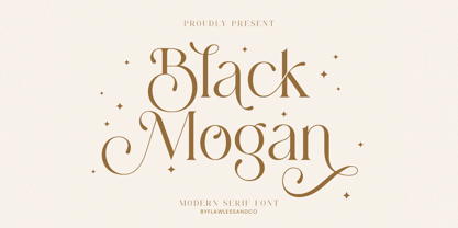 Mogan is a modern serif, with some alternates and ligatures that are perfect for branding materials, t-shirt, logo, poster, photography, quotes, and many more. An Original typeface that suitable for any graphic designs such as branding materials, t-shirt, print, business cards, logo, poster, t-shirt, photography, quotes .etc This font support for some multilingual. Modern Sweet Retro that contains uppercase A-Z and lowercase a-z, alternate character, numbers 0-9, and some punctuation. If you need help, just write me! Thanks so much for checking out my shop
 - Quarantype by Zetafonts,
$- Trapped home during the Coronavirus outburst of March 2020 the Zetafonts team found some solace from the world-wide anxiety by designing letters for the #36daysoftype challenge. To fight dark thoughts and spread some good karma we decided to add a free font twist, selecting the best glyphs drawn to develop a collection of ten free typefaces for download. We did our best to make this little gift to the community valuable, though developed in record time: although playful and excessive, these typefaces all stem from our current research in contemporary trends and historical design solutions, bridging calligraphy and design. The typefaces have been published daily starting Monday, March 30. You can download and use the typefaces in any way you desire, as they are totally free for commercial and non-commercial use. We are not asking anything back, but feel free to share the good karma and, if you want, please consider a donation for hospitals.
 - Hebrewish by JAB,
$18.00I decided to create Hebrewish because the only Hebrew Latino font I have ever seen didn't really live-up to my expectations. Each Roman letter and Arabic numeral in this font is based directly on one or more of the Hebrew characters. Originally I was tempted to create an upper case only - since there is no lower case in Hebrew that I know of. But, as this would have limited it's usefulness, I changed my mind and added a lower case also. Nevertheless, those who want to create very Hebrew looking text, need only use the upper case. I've also added some typical Judaic symbols for the artistic minded, e.g. David's star *, the Menorah ^(Jewish candelabrum) and brackets{ } based on this, as well as brackets [] which, used together, produce a 'Ten commandments' stone-tablet symbol(use this [~] for another version). In short, you can either have some fun with this font or use it for serious work - the choice is yours. - Charcuterie by Laura Worthington,
$20.00 Charcuterie is a collection of ten distinct yet related typefaces, and three ornamental typefaces. Used individually or blended with other fonts from this large family, elements of Charcuterie are well suited for headlines, titling, logos, display, packaging, signage, or advertising. The entire collection lends itself to experimentation, acting as a complete and complex toolbox, enabling you to work in extraordinarily varied ways. Each Charcuterie typeface has different, yet complementary features. Engraved features 135 swash alternates and Cursive boasts 275. Frames offers a broad and endless approach to creating frames of any proportion and style. Catchwords features nine different styles for a total of 82 glyphs. 100 Ornaments include a vast array of arrows, brackets, rules, icons, ribbons and more. See what’s included! http://bit.ly/2c5OzoK *NOTE* Basic versions DO NOT include swashes, alternates or ornaments These fonts have been specially coded for access of all the swashes, alternates and ornaments without the need for professional design software! Info and instructions here: http://lauraworthingtontype.com/faqs/
 - Frutiger Stones by Linotype,
$29.00In Adrian Frutiger, the discipline of a mathematically exact mind is joined with an unmistakable artistic sense. His independent work possesses the controllable language of letterforms. Personal and intensive, this work is the manifestation of his expressive will. Frutiger's precise sense of outline reveals itself two- or three-dimensionally in wood, stone, or bronze, on printing plates and in the form of reliefs. However, even his independent work can be understood as objectivized signs; in their symbolism, they are embedded in the fundamental questions of human existance. They might have developed in the spirit of playfulness, but their nature is always conceptual, directed towards a complex, yet harmonic, whole. Following function, form also necessarily follows the content of the language. The entire spiritual world becomes readable through letters. Essentially, Adrian Frutiger attempts to fathom the basic, central truth which defines our lives: change, growth, division - beginning and end. In a virtual synthesis, he seems to close the circle in which the world reflects itself in symbolic forms. Frutiger Stones is for Adrian Frutiger the example of his formal artistic sensibility par excellence. Searching for the fundamental elements in nature, he has discovered the pebble, rounded and polished over innumerable years by gently flowing water. And out of this, he has created his complete system, a ruralistic typeface of letters and symbols. It depicts animals and plants, as well as astrological and mythical signs. Because of its unique aura, Frutiger Stones is particularly well-suited to different purposes - in headlines and prominent pictograms, as symbol faces, illustrations, and more. - ITC Django by ITC,
$29.99Australian designer and art director Wayne Thompson has loved typography “ever since I received a battered second-hand Letraset catalog at the age of 10.” He based ITC Django on the handwriting of an acquaintance -- “a fellow I know who writes and illustrates children's books and is also a commercial artist” -- who called himself Django, after the jazz guitarist Django Reinhardt. “I felt that that name Django suited the funky, lively feel of the face,” says Thompson. But he adds, “Django has a split personality: it appears loose and easy at first, but after looking at it for some time I felt an edginess come through that was slightly psychotic.” The looseness of the lowercase contrasts with the spikiness of the capitals. The “edginess” is especially apparent in words in all caps.