10,000 search results
(0.075 seconds)
- Sanity - Unknown license

- Sanity - Unknown license

- Ultraxoid by PizzaDude.dk,
$20.00 Ultraxoid has got autoligatures for both double numbers, double letters, and a good handful of the most common letter combinations. You will need to use OpenType supporting applications to use the autoligatures.
 - Farm Wave by Authentype,
$11.00 Farm Wave Regular & italic - beauty font design include regular & italic font Image used : All photographs/pictures/logo/vector used in the preview are not included, they are intended for illustration purpose only.
 - CG Triumvirate by Monotype,
$40.99CG Triumvirate was designed for use on the Compugraphic phototypesetting system. The CG Triumvirate font family is very similar to Helvetica, and is an ideal font choice for text and display use. - Zanoix by PizzaDude.dk,
$20.00 Zanoix is based on text from an old horror poster. Comes with ligatures for both double letters and numbers. You will need to use OpenType supporting applications to use the auto-ligatures
 - Whexjable by PizzaDude.dk,
$20.00Whexjable is full of fun and quirky letters - I have included loads of ligatures to complete the original distorted look! You will need to use OpenType supporting applications to use the autoligatures. - Tel Aviv by Yinon Ezra,
$1.00 Tel Aviv, Display San-serif typeface, 2 Widths, 4&5 Weights. Structured Shapes with familiar look, yet unique! Can be used for wide range of uses, also function well as short text.
 - Bluebottle by Greater Albion Typefounders,
$14.50 Bluebottle is a lively fun family of typefaces, a boisterous fun design, BLuebottle brings a distinctive cheerful character where ever it's used. Use Bluebottle to bring life and fun wherever you will.
 - Figgins Antique by HiH,
$12.00 “Hey, look at me!” cried the new advertising typefaces. With the nineteenth century and the industrial revolution came an esthetic revolution in type design. Brash, loud, fat display faces elbowed their way into the crowd of book faces, demanding attention. Those who admired traditional book types harumphed and complained. Robert Thorne had fired the opening round with his Fatface. With the cutting of Figgins Antique, the battle was well and truly joined. Job printing came into its own and it seemed like everything changed. The world of printing had been turned upside down and the gentile book-type aficionados recoiled in horror much as the rural landed gentry recoiled at the upstart middle class shopkeepers and manufacturers. William Savage, approvingly quoted by Daniel Berkeley Updike over a hundred years later, described the new display faces as “a barbarous extreme.” These were exciting times. According to Geoffrey Dowding in his An Introduction To The History Of Printing Types, “The types which we know by the name of Egyptian were first shown by Vincent Figgins in his specimen book of 1815, under the name Antique.” Of course, dating the design is not quite as simple as that. Nicolete Gray points out that Figgins used the same “1815” title page on his specimen books from 1815 to 1821, adding pages as needed without regard to archival issues. As a result, there are different versions of the 1815 specimen book. In those copies that include the new Antique, that specific specimen is printed on paper with an 1817 watermark. The design is dated by the 1817 watermark rather than the 1815 title page. Figgins Antique ML is an all-cap font. This typeface is for bold statements. Don't waste it on wimpy whispers of hesitant whimsies. And please don't use it for extended text -- it will only give someone a headache. Think boldly. Use it boldly. Set it tight. Go ahead and run the serifs together. Solid and stolid, this face is very, very English. FIGGINS ANTIQIE ML represents a major extension of the original release, with the following changes: 1. Added glyphs for the 1250 Central Europe, the 1252 Turkish and the 1257 Baltic Code Pages. Added glyphs to complete standard 1252 Western Europe Code Page. Special glyphs relocated and assigned Unicode codepoints, some in Private Use area. Total of 331 glyphs. 2. Added OpenType GSUB layout features: liga and pnum. 3. Added 86 kerning pairs. 4. Revised vertical metrics for improved cross-platform line spacing. 5. Redesigned mathamatical operators. 6. Included of both tabular (standard) & proportional numbers (optional). 7. Refined various glyph outlines.
 - Banknote 1948 by Ingo,
$39.00 A very expanded sans serif font in capital letters inspired by the inscription on a bank note Old bank notes tend to have a very typical typography. Usually they carry decorative and elaborately designed markings. For one thing, they must be practically impossible to forge and for another, they should make a respectable and legitimate impression. And in the days of copper and steel engravings, that meant nothing less than creating ornate, shaded or otherwise complicated scripts. Designing the appropriate script was literally in the hands of the engraver. That’s why I noticed this bank note from 1948. It is the first 20 mark bill in the then newly created currency ”Deutsche Mark.“ All other bank notes of the 1948 series show daintier forms of typography with an obvious tendency toward modern face. The 1949 series which followed shortly thereafter reveals the more complicated script as well. For whatever reason, only this 20 mark bill displays this extremely expanded sans serif variation of the otherwise Roman form applied. This peculiarity led me in the year 2010 to create a complete font from the single word ”Banknote.“ Back to those days in the 40’s, the initial edition of DM bank notes was carried out by a special US-American printer who was under pressure of completing on time and whose engravers not only engraved but also designed. So that’s why the bank notes resemble dollars and don’t even look like European currency. That also explains some of the uniquely designed characters when looked at in detail. Especially the almost serif type form on the letters C, G, S and Z, but also L and T owe their look to the ”American touch.“ The ingoFont Banknote 1948 comprises all characters of the Latin typeface according to ISO 8859 for all European languages including Turkish and Baltic languages. In order to maintain the character of the original, the ”creation“ of lower case letters was waived. This factor doesn’t contribute to legibility, but this kind of type is not intended for long texts anyway; rather, it unfolds its entire attraction when used as a display font, for example on posters. Banknote 1948 is also very suitable for distortion and other alien techniques, without too much harm being done to the characteristic forms. With Banknote 1948 ingoFonts discloses a font like scripts which were used in advertising of the 1940’s and 50’s and were popular around the world. But even today the use of this kind of font can be expedient, especially considering how Banknote 1948, for its time of origin, impresses with amazingly modern detail.
 - Aerle by Hackberry Font Foundry,
$24.95 My first font for 2009 was Aerle. It is a new dark sans serif font in my continuing objective of designing book fonts that I can really use. It made a little ripple in the industry, but more than that I found that I loved it with Aramus and Artimas — my latest book font family with the same proportions. In many ways, Aerle is a very different direction for me built on what I have learned on Aramus and other recent developments in my style. The concept came to me while using Bitstream's Mister Earl on a site online—though there is no direct reference. I wanted a more playful heavy sans with a much smaller x-height than I have been using lately, plus taller ascenders. As I was using Aerle, I constantly needed a light and bold version. The new direction I am taking is a result of a decision that my fonts, though I loved the character shapes, produced an even type color that is too dark or a little dense. Aerle was an attempt to get away from that look even though the letterspacing is quite tight. For Aerle Thin I pushed a little further in that direction and increased the letterspacing. The hand-drawn shapes vary a lot, many pushing the boundaries of the normal character. This gives a little looseness and helps the lightness in feel I am looking for. It will be interesting to see where this all goes. Most new type around the world is far too perfect for my taste. While the shapes are exquisite, the feel is not human but digital mechanical. I find myself wanting to draw fonts that feel human — as if a person crafted them. In most ways this is a normal font for me in that it has caps, lowercase, small caps with the appropriate figures for each case. These small caps were very small (x-height as is proper). So Aerle's small caps are a little oversize because they plugged up too bad at x-height size. The bold is halfway between. These size variations seem important and work well in the text. This font has all the OpenType features in the set for 2009. There are several ligatures for your fun and enjoyment: bb gg sh sp st ch ck ff fi fl ffi ffl ffy fj ft tt ty Wh Th and more. Like all of my fonts, there are: caps, lowercase, & small caps; proportional lining figures, proportional oldstyle figures, & small cap figures; plus numerators, denominators, superiors, inferiors, and a complete set of ordinals 1st through infinity. Enjoy!
 - Patched Medium - Personal use only

- Dancing in the Minefields - Personal use only

- KG Heart Doodles - Personal use only

- The Only Exception - Personal use only

- The Great Escape - Personal use only

- Stars From Our Eyes - Personal use only

- Andrei - 100% free

- KG Mercy in the Morning - Personal use only

- KG Skinny Latte - Personal use only

- Tucker Handwritten - Unknown license

- KG Sweet N Sassy - Personal use only

- Christolas Gift by Ake,
$12.00 Christolas Gift is a delightful display font that uses the magic of the winter holidays to bring joy to the ones who use it. Its playful style makes it a perfect choice for a variety of products. You can use it with confidence on greeting and holiday cards, quotes. children’s books and activities, logos, mugs, gift bags, and many more.
 - Echo Ethnic by HIRO.std,
$17.00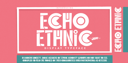 Echo Ethnic is a Display Typeface This font describes about ethnic, culture, uinque, dynamic, artistic, and easy to use. FEATURES - Support Opentype Features - Numbering and Punctuations - PUA Encoded Characters - Multilingual Support - Works on PC or Mac USE Echo Ethnic works great in logotype, craft, branding, magazine, poster, apparel and any projects that need all about Ethnic taste. Enjoy using! Thanks. HIRO.std
 - Martinaz by Typogama,
$19.00 Martinaz is a retro inspired, bold script typeface created for use in logos, posters or packaging. Through the use of extensive Opentype features, this font offers variable letter combinations that can easily be integrated or mixed. An added feature is the inclusion of a few typographic fleurons that can either be used with the text or as icons in your design.
 - Valkyrie by Brave Lion Fonts,
$9.49 Valkyrie was designed following the idea to have realy strong letters taking a lot of room. This results in a heavy appearance and gives Valkyrie its special look. It is possible to give it an even more uniform look by using the alternate characters. What can a strong font be used for? Valkyrie hopes to break rules. Use its power.
 - Ongunkan Tolkien English Runic by Runic World Tamgacı,
$50.00 Cirth was invented by J.R.R. Tolkien for use in his novels. It is modelled on the Anglo-Saxon Runic alphabet, and is used to write the language of the Dwarves (Khuzdul) in The Hobbit and The Lord of the Rings in inscriptions in wood and stone. It is also used as a alternative alphabet for English. This font is english version.
 - Upstanding Pro by Multiformis,
$10.99 Upstanding Pro is suited for use as a display typeface, but legible enough to be used in small blocks of text (lighter weights), thus providing a lot of flexibility for all kinds of projects. Upstanding Pro conveys presence, strength and speed with the italics, yet conserving certain traces of sobriety and elegance. Want to make a statement? Use Upstanding Pro!
 - Fusione by Paweł Burgiel,
$38.00 Fusione is a handwritten, informal, sketch-like typeface drawn by hand using ink and a sharp nib pen on smooth paper. It is useful for display, poster, books titling, advertising, and magazine work. Best used in Open Type apps, it has automatically exchanging alternates for better simulate true handlettering. Character set support Central and Eastern European as well as Western European languages.
 - Wagerton by PizzaDude.dk,
$20.00 Wagerton is my very legible scribbled font! The fine scribbled details are very visible at large sizes, but also leaves a good impression when used in small sizes as well. Comes with ligatures for double letters and double numbers - along with alternative letters for both upper- and lowercase! You will need to use OpenType supporting applications to use the autoligatures.
 - Warm Thanksgiving by Mvmet,
$15.00 Warm Thanksgiving is a warm and fun font for your thanksgiving day, you can use it for everyday use too for its versatility. Create something with it from regular typing notes, to t-shirts, kids’ book designs, greeting cards, stickers, posters, or anything that needs a casual touch. Fall in love with its incredible style and use it to create lovely designs!
 - Arkitech - Personal use only

- Kreepshow 'Frigid' - Personal use only

- Arkitech - Personal use only

- Fette Deutsche Schrift by Lamatas un Slazdi,
$35.00 Fette Deutsche Schrift also known as Koch-Fraktur or Kochschrift was created by Rudolf Koch for Klingspor foundry between 1908 and 1910. The basis of this font is a publication in the magazine “Das Plakat” of September 1921. The font contains swash capitals to use as dropcaps, contextual alternates, glyphs for line endings, ligatures, discretional ligatures for use in German, ornaments and other OpenType features. It supports all the European languages using Latin alphabets (including slashed S and slashed long s used in Latvian old orthography till 1930s).
 - Side Black by Zamjump,
$19.00 Side Back is a brush handwriting font following the correct writing rules in making brush letters. This font is a bit more unique because the lowercase style uses uppercase but there are some with lowercase style. Equipped with a ligature, and a wash to be used as a complement or sweetener to the design you make. very suitable for use in various designs, such as headers, websites, clothing, products, even for writing quotes. Congratulations on exploring your design using black side fonts. Included : - Multilingual support - Ligatures - Swash -character symbols
 - Dissident by Ronny Studio,
$25.00 Dissident Font is a cool alternative for you to easily create your Underground band logo or whatever. Using alternative fonts and ornaments will liven up the font and will look cooler and fiercer. It comes with a basic character set and a small group of symbols and signs frequently used in the extreme music sector - Death- and Blackmetal classics such as pentagram drops, roots, wings and more. Features : - All Caps - numbers & punctuation - Multilingual - PUA encoded Please contact us if you have any questions. Enjoy Crafting and thanks for supporting us! :) Thank you
 - Jaxell by Twinletter,
$14.00 Jaxell is a whimsical display typeface with distinct and unique qualities that may be used as the title of your project, and it’s also lovely when used in sentence text. This font is perfect for games, sporting events, branding, banners, posters, movie titles, book titles, quotes, logotypes, and more. of course, your various design projects will be perfect and extraordinary if you use this font because this font is equipped with a complimentary font family, both for titles and subtitles and sentence text. start using our fonts for your amazing projects.
 - Alcantera by Typebae,
$15.00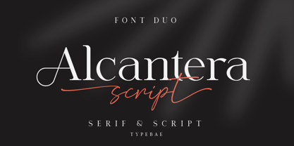 Alcantera Font Duo is a stunning pair of fancy script and serif fonts. These typography are designed to contrast and complement each other with elegant beauty and contemporary style. Use Alcantera Font Duo to create beautiful wedding invitations, beautiful stationery art, great social media posts, cute greeting cards and much more. To use the stylistic alternate, beginning and ending swashes you don't need to use software that supports opentype, because we have made it separately so it's very easy to use. Features: Stylistic Alternate, Ligature, Swashes, Multilingual & PUA Encoded


