10,000 search results
(0.021 seconds)
- Melodia by PintassilgoPrints,
$29.00 This one may look rather strange at a first sight, but it has the true power of coolify written pieces. (Please don’t use it to say “Attorneys’s Conference”, nor “Annual Statement of Accounts”, unless you mean them to be cool, which is very unlikely.) Melodia has 3 glyph drawings for each uppercase letter, 3 more for each lowercase and 2 for the numerals. There are even alternates for punctuation, go figure: there are 3 commas and 3 periods. Surprising. To activate the automatic cycling of all these alternates, simply turn on the Contextual Alternates feature in your application. And it doesn’t hurt to remind: use it only on cool stuff.
 - Romios by Letterara,
$21.00 Introducing "Romios", a modern serif and elegant font family with 10 unique styles. Each style features distinctive serifs and clean lines, resulting in a modern yet classic look. This font family is perfect for any project that requires a touch of sophistication, from editorial design to branding and advertising. The versatility of Romios font makes it an excellent choice for both digital and print media. With its PUA encoding, accessing the various glyphs and swashes is a breeze. Each style is carefully crafted to ensure legibility, making it an excellent choice for international audiences. Make your designs stand out with Romios font - the perfect balance of modern and classic typography.
 - Bulky Book by Putracetol,
$28.00 BULKY BOOK is 3 Display Font. Each font has a line thickness used. There are 3 thicknesses, namely thick at the bottom, thick in the middle and thick at the top. Each font is made from the same basic, so the three fonts can be combined or paired well and matched. With this font your project will stand out and be perfect. This font is suitable for vintage and classic themes. Suitable for logos, branding, book titles, headlines, posters, titles, stickers, t-shirts, social media, labels, lettering and more. This font can be used and supported in various programs and OS, such as procreate, cricut, windows, macOS and others.
 - TT Commons™️ Pro by TypeType,
$39.00 Introducing TT Commons™️ Pro, version 3.300! We’ve extended our bestseller and made it even better by adding the Greek alphabet and updating the OpenType features. The TT Commons™️ Pro typeface currently includes: 5 different subfamilies: Standard, Condensed, Compact, Expanded, and Mono; 102 font styles + 2 variable fonts: TT Commons™️ Pro Variable and TT Commons™️ Pro Mono; 1546+ characters in each Mono font style set and 1656+ characters in each Standard, Condensed, Expanded, and Compact font style; 275+ languages support, along with the Vietnamese and Greek alphabets (in all subfamilies but Mono); flawless kerning and manual TrueType hinting; 32+ OpenType features.
 - Bemicy by Product Type,
$17.00 Say hello to Bemicy, a display font that combines handwritten touches with scribbled elements. This font comes with uniqueness and wit, bringing an experimental feel to each character. Each letter in Bemicy exudes a touch of scribbled handwriting, creating a stunningly experimental feel. Bemicy brings artistic uniqueness to your projects, giving them a look that is full of character and distinction. Bemicy is a great choice for projects that require an experimental, scribbled hand feel. Whether you're designing promotional materials, posters, or other works of art, these fonts provide an unforgettable personal touch. Get the Bemicy Display Font now and bring artistic distinction to every character.
 - Final Parade by Putracetol,
$24.00 The Final Parade - Luxury And Elegant Font Duo is a harmonious combination of two fonts that complement each other beautifully. The first font is a luxurious serif font with strong and commanding characters, while the second font is an elegant signature font with long swashes at the end of each letter, adding an extra touch of sophistication. These fonts can be used individually for distinct purposes or together as a duo, offering versatility for various design needs. Ideal for quotes, logos, product packaging, business names, wedding materials, invitations, greeting cards, posters, and magazines, this font duo adds a touch of luxury and elegance to any project.
 - Jimmy Oh Timmy by Maculinc,
$18.00 This multipurpose script typeface includes many different alternatives for each lower case. Make this typeface cool in your Font Library. It is a lot of fun to use as each word can be changed to your liking. This typeface works really well for Logo and Apparel Designs. It's also great for making Prints or Merchandise, as you can use the illustration quality of shapes to create artwork. Mix and match with a bunch of alternative characters to fit your project. The alternative characters in this font were divided into several OpenType features such as Stylistic Alternates, Ligature and Ligature Alternates. Mail support : maculinc@gmail.com Thank you! Maculinc
 - Boronia by Studioways,
$10.00 Meet Boronia, Studioways' latest typeface release! This six weight family was developed with the single idea of redefining the simple sans serif to pair with any style of font family. It is meant to blend with a variety of media, from editorial to bridal and fashion. The Boronia family weights range from an ultra sexy thin to a voluptuous bold, each with a companion italic, making it the 'perfect type' for all tastes. Each font supports the standard Western European character set. So scoop up this great sans serif font, BORONIA, and start making your work shine! Buy them individually or get a great deal on the family pack!
 - Jet Jane by Ingrimayne Type,
$7.00 JetJane is a geometric sans-serif family. The family has two widths and each width has nine weights. Each of these 18 fonts comes with an accompanying italics version, giving the family a total of 36 members. JetJane, like other geometric sans faces, is plain, unadorned, and highly legible. It is derived from JetJaneMono, a monospaced sans-serif face. This development is unusual because one expects the monospaced variants to be created after the proportional variant, if a monospaced variant is even produced. This development history results in some distinctive differences between JetJane and two other geometric sans faces from IngrimayneType, AndrewAndreas and Yassitf.
 - Blue Venom by Linecreative,
$16.00 Blue Venom is a unique typography with a modern style, Each letter is cut into two parts, the first consists of three labyrinthine combined lines and the other is a diagonal cut line, so that the combination of these two parts into one letter that looks stunning , and each letter consists of four character choices, two character choices for numbers, and equipped with Ligatures (Opentype feature) All character options are included in one font. You can use alternatives in most major image editors, just find the Glyps (Alternate) menu item there. For example, in Adobe Illustrator you need to select the Window / Type / Glyphs menu item.
 - Moonie Eyes by IKIIKOWRK,
$19.00 Proudly present Moonie Eyes - Graffiti Type, created by ikiiko. Moonie Eyes is a handwritten font with spontaneous curves inspired by street art markings. The letters bubble and pile up on each other to become strong characters in this graffiti letters. You can play with separate characters or overlapping each other. This type is very suitable for making a streetwear brand, poster or magazine layout, fashion design, quotes, or simply as a stylish text overlay to any background image. What's Included? Uppercase & Lowercase Numbers & Punctuation Multilingual Support Works on PC & Mac Enjoy our font and if you have any questions, you can contact us by email : ikiikowrk@gmail.com
 - Reins by Craft Supply Co,
$20.00 Introduction Introducing Reins – Serif Typeface, a masterpiece that exudes classic elegance with a modern twist. Initially, it captivates with its timeless appearance and style. Versatility at its Best Moreover, it’s incredibly versatile, adapting seamlessly to a multitude of projects. From logos to editorial designs, it enhances every artwork it graces. Furthermore, it brings out the richness in your content, making each word profoundly striking. Classic Appeal This typeface carries a classic appeal, gracefully bridging the past and the present. Coupled with a sense of nostalgia, it remains relevant and attractive for contemporary designs. Therefore, each character stands out, adding a touch of historical elegance.
 - Groteska by Designova,
$9.00 Groteska is a modern & minimal sans-serif typeface inspired from some popular swiss design typefaces, having traditional grotesque oriented type characteristics while being clean & minimalist by nature. The typeface comes with a total of 14 fonts spreading between 7 weights featuring 7 uprights and matching italics for each weights. Handcrafted and designed with powerful opentype features in mind, each weight includes extended language support including Western & Central European sets. Groteska is a perfect typeface for graphic design, web, print and any display use. The typeface could be perfect choice for logo / logotype design, branding, marketing graphics, banners, posters, signage, corporate identities as well as for editorial design.
 - Scatio by Wahyu and Sani Co.,
$16.00 Scatio is squarish with vertical terminal cut, a multi-purpose sans serif which can be use for many kind of graphic design projects. The Light, Regular and Medium weight have good legibility for text, the bolder and lighter weights can be used for headlines, display, posters, and more. Each members of the Scatio family contains 400+ glyphs which covers Western and Eastern Latin based languages. Each font is also equipped with some useful OpenType Features, such as: Fraction (frac) Numerator (numr) Denominator(dnom) Standard Ligatures (liga) Localized Forms (locl) Ordinals (ordn) Proportional and Tabular Lining (pnum & tnum) Superscript and Subscript (sups & subs) Scientific Inferior (sinf)
 - Marker Aid by PintassilgoPrints,
$24.00 This expressive face was drawn with a dry chisel felt-tip marker, resulting in two striking, detail-rich fonts. Beyond its remarkable face, Marker Aid is a generous one, packed with 4 alternates for each letter, 2 for each number and yet some handy ornaments for creating a convincing - and rather cool - organic look. It is also equipped with OpenType features to instantly cycle the alternate glyphs and access stylistic alternates and ornaments. Marker Aid is available in two cuts, upright and oblique, for added flexibility. Make your mark! * Please note that these fonts have complex outlines and quite a load of glyphs, which may slow down some applications.
 - Birdman by Yock Mercado,
$9.99 Birdman is a modern blackletter font that merges rebellion and chicano style, elevating them to a new dimension of minimalism and edginess. With its trendy and condensed design, this geometric typeface captivates instantly. Its versatility makes it the perfect companion for impactful headlines, high-flying logos, and groundbreaking advertisements. Birdman challenges typographic conventions with its boldness, attracting all eyes with its simple elegance. With Birdman by your side, words take flight, releasing their rebellious and contemporary essence. Each stroke is a cry of originality, and each letter tells a tale of modernity and authenticity. Feel how this font elevates your designs, soaring toward new typographic horizons.
 - Cocomat Pro by Zetafonts,
$39.00 Cocomat has been designed by Francesco Canovaro and Debora Manetti as a development of the Coco Gothic typeface system created by Cosimo Lorenzo Pancini. It shares with all the other subfamilies in the Coco Gothic system a geometric skeleton with open, more humanistic proportions, a sans serif design with slightly rounded corners and low contrast proportions, without optical compensation on the horizontal lines, resulting in a quasi-inverted contrast look in the boldest weights. What differentiates Cocomat from the other subfamilies in Coco Gothic are some slight design touches in the uppercase letters, with a vertical unbalancing reminiscent of art deco design, notably evident in uppercase "E", "A","F","P" and "R" - while lowercase letters have been given some optical compensation on the stems, like in "n","m", "p" and "q". These design choices, evoking the second and third decade of the last century (Cocomat is also referred as Coco 1920 in the Coco Gothic Family) all give Cocomat a slight vintage feeling, making it a perfect choice every time you need to add a period vibe or an historical flair to your design, like in food or luxury branding. The typeface, first published in 2014, has been completely redesigned by the original authors in 2019 as Cocomat PRO to include eight extra weights (thin, medium, black and heavy in both roman and italic form), extra open type features (including alternate forms, positional numerals), and extra glyphs making Cocomat cover over two hundred languages using latin, cyrillic and greek alphabets.
 - Neuzeit Office by Linotype,
$50.99 The Neuzeit Office family is designed after the model of the original sans serif family Neuzeit S™ , which was produced by D. Stempel AG and the Linotype Design Studio in 1966. Neuzeit S itself was a redesign of D. Stempel AG’s DIN Neuzeit, created by Wilhelm Pischner between 1928 and 1939. Intended to represent its own time, DIN Neuzeit must have struck a harmonious chord. DIN Neuzeit is a constructed, geometric sans serif. It was born during the 1920s, a time of design experimentation and standardization, whose ethos has been made famous by the Bauhaus and De Stijl movements in art, architecture, and design. Upon its redesign as Neuzeit S in the 1960s, other developments in sans serif letter design were taken into account. Neuzeit S looks less geometric, and more gothic, or industrial. Separating it from typefaces like Futura, it has a double-storey a, instead of a less legible, single-storey variant. Unlike more popular grotesque sans serifs like Helvetica, Neuzeit S and especially the redesigned Neuzeit Office contain more open, legible letterforms. Neuzeit Office preserves the characteristic number forms that have been associated with its design for years. After four decades, Neuzeit has been retooled once again, and it is more a child of its age than ever before. Akira Kobayashi, Linotype’s Type Director, created the revised and updated Neuzeit Office in 2006. His greatest change was to retool the design to make its performance in text far more optimal. Additionally, he created companion oblique to help emphasize text.
 - Kis Antiqua Now TH Pro by Elsner+Flake,
$99.00 In the course of the re-vitalization of its Typoart typeface inventory, Elsner+Flake decided in 2006 to offer the “Kis Antiqua” by Hildegard Korger, in a re-worked form and with an extended sortiment, as an OpenType Pro-version. After consultation with Hildegard Korger, Elsner+Flake tasked the Leipzig type designer Erhard Kaiser with the execution of the re-design and expansion of the sortiment. Detlef Schäfer writes in “Fotosatzschriften Type-Design+Schrifthersteller”, VEB Fachbuchverlag Leipzig, 1989: No other printing type has ever generated as far-reaching a controversy as this typeface which Jan Tschichold called the most beautiful of all the old Antiqua types. For a long time, it was thought to have been designed by Anton Janson. In 1720 a large number of the original types were displayed in the catalog of the „Ehrhardische Gycery“ (Ehrhardt Typefoundry) in Leipzig. Recently, thanks to the research performed by Beatrice Warde and especially György Haimann, it has been proven unambiguously that the originator of this typeface was Miklós (Nicholas) Tótfalusi Kis (pronounced Kisch) who was born in 1650 in the Hungarian town of Tótfal. His calvinistic church had sent him to the Netherlands to oversee the printing of a Hungarian language bible. He studied printing and punch cutting and earned special recognition for his Armenian and Hebrew types. Upon his return to Hungary, an emergency situation forced him to sell several of his matrice sets to the Ehrhardt Typefoundry in Leipzig. In Hungary he printed from his own typefaces, but religious tensions arose between him and one of his church elders. He died at an early age in 1702. The significant characteristics of the “Dutch Antiqua” by Kis are the larger body size, relatively small lower case letters and strong upper case letters, which show clearly defined contrasts in the stroke widths. The “Kis Antiqua” is less elegant than the Garamond, rather somewhat austere in a calvinistic way, but its expression is unique and full of tension. The upper and lower case serifs are only slightly concave, and the upper case O as well as the lower case o have, for the first time, a vertical axis. In the replica, sensitively and respectfully (responsibly) drawn by Hildegard Korger, these characteristics of this pleasantly readable and beautiful face have been well met. For Typoart it was clear that this typeface has to appear under its only true name “Kis Antiqua.” It will be used primarily in book design. Elsner+Flake added these two headline weights, which are available besides a separate font family Kis Antiqua Now TB Pro. Designer: Miklós (Nicholas) Tótfalusi Kis, 1686 Hildegard Korger, 1986-1988 Erhard Kaiser, 2008
 - Fruit Syrup by Olivetype,
$18.00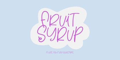 Fruit Syrup is a playful handwritten font with a dancing baseline!. This font is suitable for children craft, teaching material, or any other design that needs a splash of cuteness. So what’s included: Fruit Syrup (OTF) Basic Latin A-Z, a-z, numbers, symbols, and punctuations International Characters. Thank You
 - RNS Susana by RNS Fonts,
$18.00 RNS Susana is a hand lettered brush font, with a great groovy touch. The font has a set of alternates used on contextual substitution to give it a more organic look. The design was set with a marker brush pen, making emphasis on showing the imperfections to reach its expressive personality.
 - Grounds Crew Stencil JNL by Jeff Levine,
$29.00 The opening title from the 1943 Abbott and Costello comedy ”It Ain't Hay” shows a park bench with the words “Universal Presents” stenciled on it in a chamfered sans serif style. This served as the design model for Grounds Crew Stencil JNL, which is available in both regular and oblique versions.
 - Rocaie by astype,
$37.00 The Rocaie fonts are base on antique Rococo letters from an gilding workshop. I was very lucky to acquire this set of metal letters in early 2018. Each of the letters has ornaments engraved by hand into its cast brass shapes. When drawing the digital outlines, I tried to preserve the handmade look of the original leaf engravings. Each of the letters uses a slightly different ornament pattern: no pattern is repeated identically. I expanded the very limited character set of the original, adding all the missing characters that today’s commercial fonts are expected to contain. I made additional font styles to easily add colour layers, outlines, and 3D shadows to the typeface. It’s up to you to decide how to “build” your colour font! You can combine the predefined font styles Regular, Pearl, Solid, Outline, and Magnum with each other, or with the Fill font styles. But you don't need to use all font styles to compose something nice! Have as much fun as I did with this Baroque beauty and enjoy the vintage.
 - Ellora by 99TyppeFoundry,
$10.00 Ellora , a captivating piece of typographic art, depicts a harmony between traditional elegance and modern simplicity. With a mesmerizing design, each letter is a carefully carved work of art, creating a stunning yet easily understandable appearance. The combination of sans-serif style with a human touch elevates Ellora beyond a mere set of letters. Every curve and angle is meticulously chosen to create a captivating visual harmony, making it the perfect choice for designs that prioritize clarity and elegance. With balanced letter heights and precision in every detail, Ellora establishes a timeless classical ambiance that is invaluable. It's more than just a font; it's an expression of beauty that transcends words. With each character, Ellora Humanis Typeface radiates timeless magnificence and undeniable relevance in contemporary design. As you explore each letter, you'll feel the profound artistic beauty, inviting you to reflect on the richness of aesthetics and tranquility offered by this perfect typography. Ellorai s not just a communication tool; it's a living work of art, telling its beautiful story on every page
 - Rapid Writing by Misprinted Type,
$38.00 Rapid Writing is based on the Rapid and Muscular Methods of writing, where the whole arm instead of the wrist is used to write. Copybooks and vertical writing fostered form at the expense of freedom. Speed and muscular movement have fostered freedom at the expense of form. This font is based upon form and movement and brings spontaneity and freedom to calligraphy! The font is full contrast, swashes, round forms, ligatures, contextual alternates and other surprises. OPENTYPE FEATURES • 34 Contextual Alternates • 32 Standard Ligatures • Several Stylistic Alternates (2 options for A-Z/0-9) • Ending Swashes (Each character (A-Z) has up to 12 swash endings) Not to mention the font has 710 glyphs. HOW TO USE THE ENDING SWASHES It’s very simple! Simply write the word+ > (greater symbol). For example: Typography> Typography>> Typography>>> etc. After each “>” you get a different ending swash for each character. So there are lot’s of different combinations and alternatives to suit your needs! The font also comes with a PDF Manual. If you have any questions, please get in touch at hello@eduardorecife.com
 - Albireo Soft by Cory Maylett Design,
$25.00 Albireo Soft in a softer version of Albireo, released by Cory Maylett Design in 2019. The svelte sans-serif letterforms and rounded terminals give Albireo Soft a highly legible and informal look that's perfect for packaging, headlines, logos, brochures, digital use and anywhere else that needs a friendly condensed typeface. With a combination of seven weights in each of the three condensed widths, Albireo Soft will do the job when you need to squeeze many words into a limited amount of space. The fonts include the entire set of glyphs needed for all Western and Central European Latin-based alphabets. Meticulously crafted to ensure each glyph conforms to the highest possible quality standards, Albireo Rounded won't let you down. You may buy one font at a time or save money by purchasing packages consisting of the seven fonts in each width. Save even more by purchasing the entire Albireo Soft collection and, in addition to the 21 separate fonts, you'll receive a variable font that covers all the weights, widths and everything in between.
 - Golden Decades by Dharma Type,
$19.99 Back to the basics. In the last ten years, type design has been confronting chaotic scene. The font market is flooded with a mixture of wheat and chaff and typography becomes increasingly complex. But one golden straight path exists. The path began from the industrial revolution, passing through swiss style, now we walk along the path as a matter of course. It is sans-serif. The decades from the Swiss style, namely "less is more age" to the contemporary basic style "Less, but better age", we call it golden decades. In those decades, type design met modernism. Go back to a theory in the golden decades, we redesigned new geometric, minimal sans-serif. Less is more and better. We added cool and calm spices to the modernism in the golden decades. As a result, letterform has a contemporary, sharp, and neutral atmosphere, and geometric rounded bowls and counters create a nice rhythm. Golden Decades consists of 8 weights and their matching Italics for a wide range of usages. Farther, Golden Decades is supporting international Latin languages and basic Cyrillic languages including Basic Latin, Western Europe, Central and South-Eastern Europe. Also, Golden Decades covers Mac Roman, Windows1252, Adobe1 to 3. This wide range of international characters expands the capability of your works. Lowercase "a" has OpenType stylistic alternate for advanced typography.
 - LunchBox Slab by Kimmy Design,
$25.00 LunchBox Slab is the pair of LunchBox, a uniquely hand-drawn typeface that gives numerous customizable options and a fully authentic look. The serifs in LunchBox Slab are simple blocks, with bulbous terminals on curved letters, which creates a unique effect. Identical to its pair behind the scenes, LunchBox Slab’s OpenType features allow access to over 1,500 different characters. Contextual alternatives give each letter 4 different character styles, all cycling through each other to ensure that no two letters ever show up together. There is also a custom set of small caps, each with 4 style variations as well. Stylistic alternatives give an extra hand-drawn flourish, loop and slight variation, also with 4 different styles per letter. Discretionary ligatures pertain to both regular all caps LunchBox as well as stylistic alternatives. It gives special letter combinations a unique interaction, giving your design a unique and personalized look without spending hours creating it and outlining your text. Included are also a set of swashes that also have four style variations to both the regular and stylistic alternatives, as well as lowercase letters with ascenders and descenders. All of these options are available in Light, Regular and Bold. LunchBox Slab Ornaments includes nearly 200 different graphics, flourishes, frames, catchwords, text breaks and arrows. If you do not use OpenType but are using a program that includes a full glyph panel, you will be able to manually access each of the style variations you want. Enjoy!
 - Sure! Picture this: the font Titan by onezero is the typographical equivalent of a superhero landing in the middle of a bustling city. It doesn't just enter a room; it makes a grand, indelible impres...
- Danielle BF by Bomparte's Fonts,
$40.00 When I first saw the scrapbook pages of Danielle Paradis, I was immediately struck by the funky-cool distinction of her handwriting style. I was inspired and felt moved to ask her for samples, from which to build a complete font. This warm and friendly font is applicable to a wide variety of uses. Use it wherever a casual cool look is desired. It's right at home on trendy restaurant menus, children's publications, organic food labels, correspondence and of course, scrapbooks, to suggest a few. A number of stylistic alternates are included.
 - Kumba by AukimVisuel,
$9.00 Kumba is inspired by classic typography and brings its own unique style to any design project. This fantastic sans serif font is best suited for headlines of all sizes, as well as for blocks of text that have both maximum and minimum variations. Whether it’s for web, print, moving images or anything else – Kumba will look spectacular. It is a great sans serif font. Whether you’re looking for fonts for Instagram or calligraphy scripts for DIY projects, Kumba will turn any creative idea into a true piece of art!
 - Blanquotey by Sartstudio,
$10.00 Blanquotey is a simple and modern font. Whether it�s for web, print, moving images or anything else � Blanquotey will look spectacular. This font is very suitable for the needs of branding, logos, technology themes and others. very easy to use and can be installed on any graphics software such as Adobe illustrator, photoshop, Microsoft Office and others. Works on PC & Mac Simple installation Can be accessed in Adobe Illustrator, Adobe Photoshop, Adobe InDesign, and even works in Microsoft Word. Long-term support, Can be accessed completely without additional design software.
 - Cavita by Underground,
$29.00 Cavita typeface is a mix between both grotesque and calligraphic models: regulars have a rough grotesque spirit; while the italics where inspired in calligraphic gestures. All of these details are reinforced with an inverted modulation (horizontals strokes are thicker than usual). The italics seem to move away from the traditional concept of type system, but work very well along side. This typeface has very particular shapes and rhythm, it's different and identifiable from the rest, making it a very good option to use on every piece of design.
 - New Cuisine by Stephen Rapp,
$59.00 New Cuisine is a departure from formal, handwriting, and retro scripts. Influenced by the DIY lettering generation New Cuisine is a joyful looking script with all the right moves. Its bold graphic presence makes it ideal for packaging, online journals and blogs, signage, logos, and menus. Under the hood of New Cuisine lie precise connections, unique ligatures and alternates, and OpenType programming to orchestrate it all. Because of this, typesetting turns into a simple and playful experience. Also included are a simple fraction feature as well as Central European language support.
 - Rindu Alam by Stringlabs Creative Studio,
$25.00 Rindu Alam is inspired by classic typography and brings its own unique style to any design project. This fantastic script font is best suited for headlines of all sizes, as well as for blocks of text that have both maximum and minimum variations. Whether it’s for web, print, moving images or anything else – Rindu Alam will look spectacular. This font is PUA encoded which means you can access all of the glyphs and swashes with ease! It also features a wealth of special features including alternate glyphs and ligatures.
 - Biffo by Monotype,
$29.99Biffo was designed by David Marshall and produced in 1964. The alphabet in handwritten style has the character of writing done with a broad tipped pen. The figures are round and flexible, even its vertical strokes have rounded edges, softening the look of the characters. The basic forms show parallels with a pear shape: generous in the lower third and thinning out as they move upward. Biffo is a unique, lively typeface perfect for personal correpondence and for communicating spontaneity. It is best for short and middle length texts as well as headlines. - Prickly Pear by TYPEHEIST,
$19.00 Here's a font with a special backstory. Prickly Pear is a handwritten font, created in a moving car, on the way to the Simpson Desert. At the mercy of every bump, hump and hole in the road, this font is as rough and realistic as its conception. A unique and messy handwriting font reminiscent of the rugged landscape; it'll be perfect for that design project where you need a little raw authenticity. Prickly Pear has a comprehensive character set of over 160 custom ligature combinations and 56 multi-lingual characters.
 - Spark Sans by Primitive Spark,
$5.00 Spark a revolution for a better future with Spark Sans. Super clean and geometric, this display typeface is ideal for tech, transportation, electronic music, revolutionary products or other disruptive ideas that move us beyond the present. Spark Sans has a relatively high x-height and squared off curves that give it a distinctive look while still maintaining a minimalist aesthetic. The design originated with custom lettering for the Primitive Spark identity, which became the foundation for the bold style. With 260 glyphs, Spark Sans is a great choice for many languages with Latin characters.
 - Refinery by Kimmy Design,
$10.00 Refinery is the newest font in the Evanston Collection of square typefaces. With a similar capital structure to Tavern and Alehouse, Refinery includes both lowercase and small caps, making it an ideal typeface for paragraph text settings. It also comes in a wide array of weights and widths, with 85 font files in total. DESIGN Refinery has it’s roots in early 20th century signage and saloon typography, but has been modernized - even future-ized - to fit the 21st century digital landscape. The design was aimed at providing a type family that could work in many modern design fields, from sports, tech and military to gaming, HUD, virtual reality and augmented reality. ENGINEERING Essentially. Refinery is a simple mono-linear square design has been expertly refined into an easy-reading sans serif typeface. It was designed to be used in both display and text settings. From hairline to black in ultra-narrow or extended, the wide array of weight and width options makes it easy to find the right font for each text need. SPECS Refinery not only includes 85 font files, but each one include a wide array of Opentype Extras that allow even further customization. • Stylistic Alternatives: Letters A W Y have a styling variation that rounds the pointed apex into a square curve. The S and 2 variation straightens the spine, making all curves in the alphabet read as 90º angles. • Small Capitals: A shortened version of the capitals for alternate header settings. • Titling Alternatives: In this typeface, this feature turns on lifted small caps. Take the small capitals, raise them to level with capitals and underline at the baseline. When multiple lowercase or small capital letters are typed in a row, the underlines connect, creating unique ligatures. • Figures: There are different figure styles for different text needs. Options include, proportional lining, tabular lining (for math), old style and small capitals. • Discretionary Ligatures: A little funk to this otherwise serious typeface. Letters with a long baseline or cap height stem - F, L, T - get elongated to hug a small capital vowel. Other ligatures include Co. and No. • Catchwords: These are common words that bring emphasis to a design. In English these words include ‘and’ ‘as’ ‘by’ ‘in’ ‘of’ ‘the’ ‘to’ ‘when’, among others. Refinery also includes multilingual catchwords of ‘el’ ‘la’ ‘oder’ ‘go’ ‘para’ ‘pour’ ‘und’ ‘y’, among others. For the full list, please check out the specimen images. EXTRAS To round the typeface off, a set of over 150 ornaments, icons, arrows, patterns and line breaks is included to provide complimentary graphics. These can be found in the Ornaments labelled font, it is recommended to use the Glyphs panel to select which text glyph is needed.
 - Rough Riders Redux by FontMesa,
$35.00Rough Riders Redux along with our Rough Riders font, got its start from a small sample of letters used in the logo for the Beach Creek Railroad Co. dating back to the early 1860’s. I studied the design for one year before drawing the letters. Rough Riders and the Redux version are simply the most Wildest Western looking fonts you'll find. The Rough Riders fill font is not meant to be used as a stand alone black typeface, the fill font is designed to be layered behind the regular Rough Riders font.