10,000 search results
(0.024 seconds)
- Trapezoidal by Ingrimayne Type,
$9.00 The letters of Trapezoidal are like sheep: they do not like being alone but want to be part of a flock. Many of the individual letters of Trapezoidal look strange and unshapely in isolation because they are designed to fit into a pattern with other letters. That pattern is formed by alternating asymmetric trapezoids, with trapezoids that are wide at the top alternating with trapezoids that are wide at the bottom. The magic of the OpenType feature of contextual alternatives (calt) automatically alternates them. The fonts in the family are largely monospaced and have very tight letter spacing. (If for some reason one wants to use only one set of the letters, the letters will overlap unless one widens character spacing.) (If D and O are too similar, use the alternative versions of D.) The family has five weights and each weight has an italics formed by flipping the trapezoidal pattern over a vertical line. Like other alternating-character typeface families from IngrimayneType, this distinctive and visually-arresting family can be used for titles or advertising. (For another but very different typeface based on alternating trapezoids, see PoultrySign.)
 - Pyjpyvo 2D by 2D Typo,
$42.00 A set of pictures on the subject of beer.
 - Superwood by studiocharlie,
$28.00 Developed from Superbastone and projected to be used with all the weights of Superbastone. The letters appear through overlapping branches.
 - Alta Basilica by Blendy wine,
$9.00 This font was created to capture the delicacy of ancient art. But it can still be used today very well.
 - Ghost Train by Aerotype,
$29.00 Ghost Train features slightly alternate glyphs A-Z in the lower case that can be used to differentiate consecutive characters
 - Czaristane by Typotheticals,
$5.00 A rather light humorous font that can be used for many purposes. Updated in 2022 to add further bold versions
 - Blikfang by Bogstav,
$17.00 All caps font that just want to be your friend, and maybe the font you use for your next project! :)
 - Under Weak by Trustha,
$16.00 Under Weak is an amazing and bold script, suitable for a large number of designs. This font has two styles, clean and rough. With two styles, you can choose according to the project you're working on.
 - KillJoy by Comicraft,
$19.00 S P O I L E R A L E R T ! We don't want to be a drag, a wet blanket or a spoilsport, but we're here to tell you that everything before “but” is bulls*it! Yep, if you're a merrymaker, a carouser, a jester, a reveler or a live wire, we're here to poop your party with our latest knicker-twister, KILLJOY! Call us cynics, call us crabs, grouches, grumpy old men, sourpusses or bores, but we're the kind of Killjoys who just have to make some noise... sound effects (sic) everybody, so listen up even if you can't handle the truth... and here’s OUR truth; Keep Calm and be a Fabulous Killjoy! Yes, it’s easy to be mean -- but why should anybody else have all the fun? Or all the fonts?
 - Jugendstil Initials by HiH,
$16.00 Jugendstil Initials were designed by Heinrich Vogeler around 1905, based on the German blackletter tradition. A similar set of initials by Vogeler, but based on roman letters was released by Rudhardsche Geisserei of Offenbach at about this time. I believe the originals were woodcuts. The backgrounds to the letterforms may be seen as examples of Heimatkunst, an art movement within Germany that drew deliberate inspiration from the rural countryside. Like the Arts and Crafts Movement in England a little earlier, Heimatkunst may be seen, in part, as a romantic rejection of urban industrialization, while at the same time representing a back-to-roots nationalism. Like any river, it was fed by many streams. Jugendstil Initials is an experiment with which I am most pleased. It is far and away the most complex font HiH has produced and I was uncertain whether or not it could be done successfully. To oversimplify, a font is produced by creating outlines of each character, using points along the outline to define the contour. A simple sans-serif letter A with crossbar can be created using as few as 10 points. We decided to make a comparison of the number of points we used to define the uppercase A in various fonts. Cori, Gaiety Girl and Page No 508 all use 12 points. Patent Reclame uses 39 and Publicity Headline uses 43. All the rest of the A’s, except the decorative initials, fall somewhere in between. The initial letters run from 48 points for Schnorr Initials to 255 for Morris Initials Two, with 150 being about average. Then there is a jump to 418 points for Morris Initials One and, finally, to 1626 points for Jugendstil Initials. And this was only after we selectively simplified the designs so our font creation software (Fontographer) could render them. The average was 1678, not including X and Y. There was no X and Y in the original design and we have provided simple stand-ins to fill out the alphabet, without trying to imitate the style of the orginal design. We did a lot of looking to find a compatible lower case. We decided that Morris Gothic from the same period was the best match in color, design and historical context. We felt so strongly about the choice that we decided to produce our Morris Gothic font for the purpose of providing a lower case for Jugendstil Initials. The long s, as well as the ligatures ch and ck are provided. at 181, 123 (leftbrace) and 125 (rightbrace) respectively. This font was a lot of work, but I think it was worth it. I hope you agree.
 - Fractus by Eurotypo,
$36.00 The requirements of Middle Ages scribes who copied and produced books in monasteries were fundamentally to preserve space, due to the high cost of the writing surface. During this long period of the development of Gothic forms, many other variations of the style of black letters appear: Textur or “Gothic-antique”, another group called Rotunda preferred by Italian and Spanish scribes. In 1490, the style "Bâtarde" (according to the the French classification) began to be widely used in Germany with more rounded shapes and named Scwabacher (probably derived from the city of Schwabach, but not certified) Fractur is a more condensed and narrower form than Schwabacher. This style is attributed to Johann Neudörfer of Nuremberg, cut in 1513; it was quickly imitated, therefore a few years later became to be a German national identity that extended over the next four centuries. The shape of its characters can be considered as a fusion of Texture and Schwabacher: the lowercase actually has medium strictly vertical and half curved strokes. The first expressions of the baroque influence this writing whose appearance of movement is due to the ornaments applied to the uppercase letters and the ascending and descending features of the lowercase. Despite having spent so many years and being a typeface not suitable for extensive reading texts, the Gothic Fractur has endured over time for possessing a strong and solid characteristic, as well as being closely linked to the spirit of gothic cathedrals of countries in northen Europe. In fact, it is probably that this expressive feature leads them to be chosen in the most varied graphic communication needs, which run from from banks and financial companies, insurers, law offices, publishers, newspapers and TV networks, till alcoholic drinks, funeral tombstones, packaging and even tattoos.
 - Herschel by Tried & True Supply Co.,
$30.00 Herschel ventures into the elaborate world of late 19th-century typography to bring its winsome charm and compelling aesthetics into modernity. Staying true to the spirit of its historical era of inspiration, Herschel was designed with extreme attention to detail. Although its aesthetic roots are firmly planted in the treasury of Gilded Age typography, it has been technically constructed to withstand all the rigorous demands that modern technology places on type today. Herschel’s nostalgic, flared, and gently bifurcated serifs shine brightest when employed as display type, but are suited well for any application where inimitable character is needed. Named after designer Brian Brubaker’s maternal grandfather, a retired dairy farmer of more than 60 years, Herschel is available in six delectable weights: Skim, One Percent, Two Percent, Whole, Creamline, and Butter. Features overview: • 800+ glyphs per weight • 120+ stylistic alternates • Upper and lower case • Titling/Drop capitals with multiple and contextual ligatures • Lining, oldstyle, proportional, and tabular figures • Standard and discretionary ligatures • Unique dingbats and special characters • International language support for 200+ latin-based languages, including Vietnamese
 - White Stork by Almazova Dolzhenko,
$12.00 White Stork is a handwritten font family which contains two versions Serif and Sans. So you can combine them to get a more interesting design. The font has simple shapes so it will be versatile to use. It will look great for logotypes, quotes, greeting cards, prints, branding design and much more. Hand-drawn font White Stork contains 2 sets of uppercase (serif and sans), 2 sets of lowercase (serif and sans), alternate set of lowercase letters for serif font, ligatures for double f and t letters. Multilingual support is included. Features: Uppercase & Lowercase Serif Uppercase & Lowercase Sans Alternate set of Lowercase Serif Numerals & Punctuation Ligatures (watch preview) Multilingual support Serif and Sans I hope this font will help you to create you unique design. If you have any question, feel free to contact me! Thanks! Lena (instagram @almaz_dolzhe)
 - Vectis by Greater Albion Typefounders,
$14.95 Vectis, named in honor of the Roman settlement of Britain's south coast on the Isle of Wight, brings a fresh approach to the classic simple elegance of ancient Roman faces. Vectis is offered as a small caps face designed to add a fresh hint of character to this style of classical design. Vectis can lend a note of formal dignity to any design project or poster and is ideal for clear headings and titles with a traditional feel. Two basic weights are offered, regular and bold, as well as a range of alternate letterforms and ligatures. This popular family has now been expanded with the incised 'Monumental' display face, and well as 'miniscule' lower case forms and condensed widths. Vectis and our Anavio families compliment each other perfectly, and can also be purchased together in a value pack.
 - Monto Grotesk by Lucas Tillian,
$28.00 Monto is a superfamily — this is the Grotesk + Grotesk Display part of it. Monto Grotesk is a modern sans serif typeface that combines the strengths of the neo-grotesque and geometric genres. While maintaining an established and trusted look, the design is influenced by a contemporary geometric aesthetic, making it a modern yet timeless companion. The Grotesk is split into two sub-families (Monto Grotesk and Monto Grotesk Display). While Grotesk is intended to be used in long paragraphs and copy text, Grotesk Display is perfect for striking headlines. To achieve maximum legibility, Grotesk emphasizes its characters vertical strokes, focusing on a coherent rhythm and having more open counters in contrast to Display which features a reduced tracking and more geometric and round forms. Furthermore, individual characters change their entire shape to best suit their areas of operation.
 - Neon Love by Schriftlabor,
$29.99 Neon Love was designed originally for a circle coaster design with a quote by the Beatles’ “All you need is Love, Love is all you need”. The inspiration of the lettering was a neon sign style where a cursive script is kind of bended from those glass wires. The idea was to get the overall look and feel of neon signs into a font, as well as creating a good raw material to use for some further photoshop effects to enhance the visual presentation. Neon Love has many OpenType features that allow for choices that can make the lettering unique. Neon Love has two versions of the font a Smooth one which is connected and the Cutout version which can be used to create neons and for this it is in parts. Design by Roland Hüse and Schriftlabor team.
 - Tangier by Viswell,
$17.00 Tangier is a contemporary display serif font that embodies a refined sense of style and elegance. With its sleek and modern design, Tangier is perfect for use in a variety of creative projects, such as logos, titles, and headlines. The font comes in two styles - regular and italic - both of which feature strong contrast between thick and thin lines. The regular style is perfect for creating attention-grabbing headlines or adding a touch of sophistication to body text, while the italic style can be used to add a stylish flair to subheadings or pull quotes. Tangier's strong serifs give it a classic and timeless feel, while its modern design adds a touch of contemporary flair. Its versatility makes it suitable for use in a wide range of settings, from high-end branding and marketing materials to editorial and fashion layouts.
 - Cool Mind by Seemly Fonts,
$12.00 An adorable and straightforward handwritten typeface is called Cool Mind. Add it to your original ideas to see how it helps them stand out since it can be readily suited to a huge range of projects.
 - Brainchild by Seemly Fonts,
$14.00 An exceptional handwritten typeface with simple lettering is called Brainchild. Add it to your original ideas to see how it helps them stand out since it can be readily suited to a huge range of projects.
 - X-story by Anton Novik,
$22.75The X-story font represents shattered fragile material. It was inspired by my love to grunge elements. Best usage is to complete other grunge composition. Font is really detailed and can be enlarged to humongous size. - Raqmi Monoshape by Arabetics,
$39.00 Raqmi Monoshape is a simplified version of the Raqmi font family with unified (non-varying) shapes. This font family supports all Arabetic scripts covered by Unicode 6.1, and the latest Arabic Supplement and Extended-A Unicode blocks, including support for Quranic texts. It includes two weights: regular and light, each of which has normal and left-slanted Italic versions. The script design of this font family follows the Arabetics Mutamathil style utilizing varying x-heights. The Mutamathil type style utilizes only one glyph per Arabic Unicode character or letter, as defined by the Unicode Standards. Raqmi Monoshape includes the required Lam-Alif ligatures in addition to all vowel diacritic ligatures. Soft-vowel diacritic marks (harakat) are selectively positioned with most of them appearing on similar high and low levels—top left corner—, to clearly distinguish them from the letters. Tatweel is a zero-width glyph.
 - Philadelphian by FontMesa,
$29.00 Philadelphian is a revival of a MacKellar, Smiths & Jordan font from 1867 by the same name. The regular version with shadow outline was the only style that was offered in 1867. We've taken the original design further by creating two additional weights of medium and bold plus plain black versions. The medium and bold weights are unique because only the horizontal strokes increase in thickness while the vertical strokes remain the same in each weight. Philadelphian Nite is the plain black version of this font family, Nite is the casual spelling of the word Night meaning dark or black. In the late 1800's Philadelphian was a very popular typeface which can be seen on many billheads and letterheads through the early 1900's. If you're looking for a western style font that doesn't look like any other then Philadelphian is the right choice. While the name doesn't remind you of the cowboy genre we've kept the original name for historical reasons because this font was so popular in its day. We plan on going forward with a weathered version of Philadelphian which will be released under a southwestern style name. With Philadelphian we've decided to set the complete family price to an amount that may be considered on sale all of the time.
 - Zt Sigata by Khaiuns,
$15.00 Zt. Sigata is an experiment where combining the two font styles into one, namely sans serif and serif, maybe this sounds very strange, don't worry this has been designed with very deep consideration with the serif style superti water droplets in the foliage that present coolness in every word and simple style sans serif with softness on each side, So when combined the two will be an extraordinarily beautiful design invention. Zt. Sigata comes with 6 styles (Regular/ italic, Kozi / italic, Rame / italic) that from each style have their own uniqueness, so it further expands your design experiment, and is great for poster design, packaging, logos, films and thanks to the uniqueness of each style may look good either in magazines or kompanye branding effectively. I hope you have a blast using zt.Sigata Thanks for use this font ~ Khaiuns X zelowtype
 - Magnum Sans by FontMesa,
$19.00 Magnum Sans is a strong neutral sans serif consisting of eleven weights with true Italic, Oblique and an alt upright set called Alfa. The definition of Magnum is a large wine bottle that's twice the capacity of one 750ml bottle, today the name is used in any product offering double the capacity, Magnum Sans achieves this by offering two slanted and two upright versions plus a standard and pro set. Designed to be highly readable Magnum Sans is ideal for text, signage, headlines and media broadcasting or anywhere else quick readable lettering is needed. This standard version supports characters sets for central and eastern European countries with code-pages of 1252 Latin1, 1250 Latin 2, 1257 Baltic and 1254 Turkish. Note: for additional language support, please see our Magnum Sans Pro family, which includes Vietnamese, PinYin and Greek.
 - Love Story by Latinotype,
$29.00 Love story is a display hairline typeface for use in big sizes and short texts. It’s inspired by different kinds of love and specially designed for Valentine’s day. Its soft curves and sweet style give it a lovely personality. Designed by Luciano Vergara and his wife Guisela Mendoza who has been studying ornaments since 2007 and has done her best for each project. You can see in her dingbats specially Printa and Abel designed for generate patterns. Now she integrated her passion to the ornament in a clean set which includes dingbats, ornaments and patterns. Luciano Vergara has designed very strong fonts with a particular work in the lines study and close to the geometry since 2005, getting a structure style, you can see in his fonts specially Regia and Kahlo. Now he integrated his study of lines, in a hairline font delicate, continuous and beautiful. In this story both designers have been merged their worlds creating a gorgeous product. This is a romantic type story, a love story.
 - Côté by Studio Bayley,
$4.00 A modern geometric sans serif that comes in 2 weights with 3 styles for each; Solid, Outline and Stripes. Côté was originally designed as a purely striped typeface but evolved to more weights to create a fun and playful typeface that can be layered and scaled. The solid weight allows for title or body copy while the stripes should be used as large as possible!
 - PR Sprucewood 01 by PR Fonts,
$5.00 This font is a collection of sketched spruce trees. Some are filled outlines, some are bare trunks and branches, and some are rough squiggles. Each can be used individually to suggest a tree, and the different shapes can be layered in different colors, to suggest texture, or snow cover. There is also a glyph of a mountain range, for a horizon behind your forest.
 - Prossimo by Studio Sun,
$16.00 This font is strongly inspired by the Futurism (Futurismo) movement in the early 20th century; with its simple shapes and strong structure, this font can be used to give a contemporary look to any design. Available in 3 styles (Display, Stencil, Text), this font is great for logos, headlines, posters, and UI/UX design. It can be used in various design applications such as print or web.
 - Return Pass JNL by Jeff Levine,
$29.00 Return Pass JNL is the solid version of Forward Passed JNL and can be used as a standalone font or in combination with Return Pass Fill JNL (the inline version with the main letters stripped away) for a dual color design. In some applications the inline fill may appear to create a cast shadow effect, so it may be necessary to manually adjust any overlaid copy.
 - RM Almanack by Ray Meadows,
$19.00 Based on William Caslon’s design (c1720) which was itself based on Dutch Baroque typefaces. The old saying “when in doubt, use Caslon.” can now be updated ... “use RM Almanack instead!” Includes: Western European, Central European, Baltic & Turkish sets Due to the modular nature of this design there may be a slight lack of smoothness to the curves at very large point sizes (around 100 pt and above).
 - Kinderz by MaxnorType,
$15.00 Kinderz is a fun display font with lots of styles and multilingual support. The design has a relaxed feel and is intended for purposes related to kids and teenagers, but can also be used for all modern informal themed designs. It can be used for various purposes, especially those related to kids and teenagers, such as for logo design, branding, posters, banners, stationery, and so on.
 - Konstarica by Ilhamtaro,
$27.00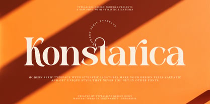 KONSTARICA is a serif font with some unique ligatures. It is suitable for branding and can be used for fonts on social media. In addition, it will also be suitable for headline fonts. To enable the OpenType Stylistic alternates, you need a program that supports OpenType features such as Adobe Illustrator CS, Adobe Indesign & CorelDraw X6-X7. Guides to access all alternates glyphs : http://adobe.ly/1m1fn4Y Cheers!
 - Hipetype Vector by Get Studio,
$17.00 Introducing Hipetype, a handwritten font with a unique and strong character crafted with high-definition paint textures. Hipetype can be used for various types of design needs such as branding materials, t-shirts, social media templates, business cards, logos, promotional flyers, posters, and more. With multilingual support, this font is also suitable to be combined with san-serif to get an extraordinary result for your design projects.
 - Manju by Eko Bimantara,
$19.00 Manju font family represents retro 70s styles which have soft and chewy characteristics. Designed to be fit for display, titling, good for logo, header, and large size usage. The light styles can be also used for short text. It consists of 10 styles from thin to heavy with matching obliques. It has several opentype features such as alternates and ligatures, it also supports broad latin languages.
 - Versica by Letrasupply Typefoundry,
$25.00 Versica is a handcrafted display font. This font family consists of multiple style fonts that can be used either as authentic individual fonts or can be combined to get cool layered type. The package is completed with swashes, shadow and serif font. Don't forget to play with stylistic alternates character that featuring the font. You may get a perfect font for any advertise or editorial work issues.
 - Green Narcu by Graphicfresh,
$8.00 Hey Guys! My new typeface Green Narcu is a playful and elegant display font, perfect for branding projects, headlines, posters and packaging!. I make this font to remind you that freshness is needed in this life. So, greenery must be cool to be seen. Therefore, we make a natural font, beauty, freshness and coolness. We hope you will feel excited when using this font.
 - Serendipity by Nicky Laatz,
$15.00 Say hello to **Serendipity** - A font that you were meant to find, and is now destined to be with you :) An elegant cousin of Saturday Script, Serendipity is a lovingly handwritten brush script , with an air of grace and flamboyancy. **Serendipity** is special in that one word can be written in a million different ways - thanks to the large selection of extra letters that it has built in. It comes with 2 sets of alternate lowercase letters, a set of alternate uppercase letters as well as a set of double letter ligatures - all for you to play with, and make your words look exactly how you need them to look. Perfect for Type-based creations, branding, websites, merchandise, packaging, quotes, invites, greetings and so much more, Serendipity will take you where you need to be. The brush script comes in 2 variants - Regular, and Wide each with its own unique feel.
 - Egovu by Twinletter,
$17.00 "Welcome to the distinctive world of typography! A genuinely distinctive sans-serif display typeface is Egovu. Egovu is the ideal option if you want a bold and distinctive style for your many different visual design tasks. What is so unique about Egovu? has incredible characteristics. Egovu allows you to be as creative as you like with its selection of ligatures and alternatives. Every project may simply be given a distinctive, personalized touch by using different letter combinations. Since we understand how crucial it is to communicate with a worldwide audience, Egovu supports numerous languages. Your message will be efficiently and clearly heard by individuals all across the world. Are you prepared to advance your design, then? Egovu is prepared to advance your initiatives. Egovu is ready to take your projects to the next level. Get this font now and see how Egovu turns every design into an unforgettable work of art.
 - Chromium One by ITC,
$29.99Chromium One is the work of British designer David Harris. With their rounded edges and shiny appearance, the characters seem to be made of smooth pieces of chrome joined seamlessly together. The unusual and distinctive Chromium One can be used for a variety of display applications. - Jana Thork by Outras Fontes,
$26.90 Jana Thork is a synthesis of stone engraved capital letterforms and uncial and half-uncial calligraphic styles. The idea of the typeface designer Ricardo Esteves was to seek for the limits between our uppercase and lowercase mental concepts. This family can be useful to compose titles, short texts, labels and letterings that need to look attractive to the eye. The family includes Regular and Bold styles, so it can be used in graphic designs that need more complex hierarchic relations or greater visual impact.