10,000 search results
(0.037 seconds)
- Compasso by Plau,
$30.00 The idea that mathematical precision and the supposed "purity" of geometric forms are part of the discourse of us graphic designers is not new. Studying typography for some time now and learning about all the small alterations and adjustments that this geometry undergoes to better adapt to the imperfect human eye, I found myself with a new way of seeing things. Compasso is, in a way, a result of my growth as a designer. Established and recognized fonts like Futura, Avenir, and their predecessors (including Tempo - published by the Ludlow foundry in the early 20th century) informed the result of Compasso at some level. Others opened my mind to possibilities. Mallory, Azo Sans, the font designed for Audi by Bold Monday, and many other contemporary sans-serif fonts that left me speechless are also responsible for details present in this font. From the first sketch, the family grew on both sides, gaining condensed and extended counterparts. From there - and from a brilliant insight from designer Nicole Rauen - I learned that Compasso was not about geometry. Compasso is about rhythm. It's about the rhythmic movement that provides a foundation, supports, and also makes you dance and swing. My musical taste is too eclectic, I can go from classical to funk in less than two songs on Spotify. Compasso is also eclectic. It's a font to take your project anywhere, a record to listen to on any occasion.
 - Neue Frutiger Tamil by Linotype,
$99.00 Neue Frutiger Tamil was created by Pria Ravichandran and a team of designers and font engineers from the Monotype Studio, under the direction of Monotype type director Akira Kobayashi. The family is available in 5 weights from Light to Bold to support the Tamil script. The typographic forms of Neue Frutiger Tamil are familiar and friendly. The Tamil shows traces of elements that is reminiscent of the calligraphic influences found in the 20th-century designs. Reflecting the modern typographic needs of the Tamil script, this type family is in the upright style. These two factors ensure that the two scripts, Tamil, and Latin pair elegantly. The result, Neue Frutiger Tamil, is an eclectic contemporary type family that bridges the past and the present. Neue Frutiger Tamil embodies the same warmth and clarity as Adrian Frutiger's original design, but allows brands to maintain their visual identity, and communicate with a consistent tone of voice, regardless of the language. It is part of the Neue Frutiger World collection, offering linguistic versatility across environments – suited to branding and corporate identity, advertising, signage, wayfinding, print, and digital environments.
 - Baveuse - Unknown license

- Nanami Handmade by Thinkdust,
$10.00 Can we get a drum roll please? It’s not every day that a new link in a best selling chain is forged. First, there was Nanami, a font which took the world of type by force, storming to the top of MyFonts Hot New Fonts list; then there was Nanami Rounded, the most successful follow-up since Terminator 2. Well, say Hasta La Vista to boring design because now, there’s Nanami Handmade. With all the geometric, Japanese inspiration and style of the first two iterations, Nanami Handmade carries a quirky, mischievous charm. The font has a charisma matched by roguish anti-heroes; bad guys you love to love and good guys the other good guys hate, but everyone knows they’re what the audience turns up to see. Nanami Handmade comes in two styles, a solid and a hand-drawn, each of which has eight weights. Mix and match between these options to create a balanced piece which makes good use of the tactile, warm, earthy nature of the font. With these sans-serif styles working well in small and large sizes, both on and off screen, Nanami Handmade’s applications are virtually endless. Get your own piece of typography’s elite now, with Nanami Handmade, by Thinkdust.
 - Rastica by Sakha Design,
$14.00 Rastica is a modern and incredibly whimsical handwritten font. Not too thin and not too thick, balanced and varied, Rastica was designed to enhance the beauty of your projects. This font is PUA encoded which means you can access all of the glyphs and swashes with ease!
 - Remissis by Typodermic,
$11.95 Introducing Remissis—the sans-serif typeface that’s the perfect balance of casual and refined. With its off-grid letterforms, Remissis has a natural and organic feel that’s hard to come by in other typefaces. It’s not too laid-back to be dismissed as whimsical, but it’s not too rigid either. It strikes the perfect balance of being approachable yet professional. If you’re looking for a typeface that can convey the idea of softness and naturalness without coming off as too playful or zany, then Remissis is the perfect choice. Its delicate horizontal angles add a touch of elegance, making it ideal for projects that require a refined and sophisticated aesthetic. Designed for high-resolution displays and print, Remissis’s unique “lining old-style” numerals are available in OpenType-capable apps, giving you even more design flexibility. And with numerous mathematical symbols, monetary symbols, and diacritical marks, Remissis is versatile and functional. Available in seven weights and italics, Remissis is a typeface that’s sure to elevate any project. So if you’re looking for a typeface that’s both approachable and refined, choose Remissis. Most Latin-based European, Vietnamese, Greek, and most Cyrillic-based writing systems are supported, including the following languages. Afaan Oromo, Afar, Afrikaans, Albanian, Alsatian, Aromanian, Aymara, Azerbaijani, Bashkir, Bashkir (Latin), Basque, Belarusian, Belarusian (Latin), Bemba, Bikol, Bosnian, Breton, Bulgarian, Buryat, Cape Verdean, Creole, Catalan, Cebuano, Chamorro, Chavacano, Chichewa, Crimean Tatar (Latin), Croatian, Czech, Danish, Dawan, Dholuo, Dungan, Dutch, English, Estonian, Faroese, Fijian, Filipino, Finnish, French, Frisian, Friulian, Gagauz (Latin), Galician, Ganda, Genoese, German, Gikuyu, Greenlandic, Guadeloupean Creole, Haitian Creole, Hawaiian, Hiligaynon, Hungarian, Icelandic, Igbo, Ilocano, Indonesian, Irish, Italian, Jamaican, Kaingang, Khalkha, Kalmyk, Kanuri, Kaqchikel, Karakalpak (Latin), Kashubian, Kazakh, Kikongo, Kinyarwanda, Kirundi, Komi-Permyak, Kurdish, Kurdish (Latin), Kyrgyz, Latvian, Lithuanian, Lombard, Low Saxon, Luxembourgish, Maasai, Macedonian, Makhuwa, Malay, Maltese, Māori, Moldovan, Montenegrin, Nahuatl, Ndebele, Neapolitan, Norwegian, Novial, Occitan, Ossetian, Ossetian (Latin), Papiamento, Piedmontese, Polish, Portuguese, Quechua, Rarotongan, Romanian, Romansh, Russian, Rusyn, Sami, Sango, Saramaccan, Sardinian, Scottish Gaelic, Serbian, Serbian (Latin), Shona, Sicilian, Silesian, Slovak, Slovenian, Somali, Sorbian, Sotho, Spanish, Swahili, Swazi, Swedish, Tagalog, Tahitian, Tajik, Tatar, Tetum, Tongan, Tshiluba, Tsonga, Tswana, Tumbuka, Turkish, Turkmen (Latin), Tuvaluan, Ukrainian, Uzbek, Uzbek (Latin), Venda, Venetian, Vepsian, Vietnamese, Võro, Walloon, Waray-Waray, Wayuu, Welsh, Wolof, Xavante, Xhosa, Yapese, Zapotec, Zarma, Zazaki, Zulu and Zuni.
 - Plathorn by insigne,
$24.00 Vast and untamed, the American West once stretched as free and wild as imagination itself. Still beautiful, the Wild West of long ago and the new West of today is now to be found in insigne’s new face, Plathorn. That’s right, folks. When the West called, Jeremy Dooley reached up like Pecos Bill, grabbed it by the reins and pulled it in, then using its wide, roaming elements to design this functional font that still has an unbroken spirit burning deep inside. This down right, no-nonsense, orthodox face leaves off any of that extra fancy stuff that doesn't belong on a ride. Plathorn comes with a family of cowhands as wide as the Rockies, bringing specifically tailored condensed and extended sub-families along with it too. By design, it’s not very obtrusive like its unorthodox reversed tension brethren. Leave those for the next font rodeo. This mount features barely a hint of a serif that hearkens back a hundred years or so to sign painters and package lettering artists of early twentieth century. They're sure to put the sharpness, gumption and grit you need into your copy. So grab a tall glass of Plathorn and drink in the deep taste of America’s big country. Put it in your next magazine. Put it in your brand. This typeface’s offbeat appeal is bound to bring a bit of wild U.S. to your free-spirited work.
 - Cotton Club by Vincenzo Crisafulli,
$30.00 Cotton Club remembers the fonts of the thirties of the last century and the Bodoni, but it does not present graces: it is a sans serif. It has 360 glyphs and is composed of two regular and italic styles. Cotton Club is characterized by a high contrast between thick and thin strokes. The emphasized signs give the font an essential, sharp and elegant look. The Italic style of the Cotton Club refers to handwriting and this is noticeable in the ligatures obtained with kerning. The name of the font, “Cotton Club,” refers to the famous Jazz Club in New York, in Harlem, active in the twenties and thirties, during and after Prohibition. At that time the Bodoni, in its many derivations, was widely used not only in lead composition, but also in neon signs, plaques, posters, as well as in many other applications. Redesigning a new font that brings back to those years wants to be, therefore, a tribute and a reinterpretation of the graphics of that period as well as, it is understood, to the glorious Bodoni. Supported Languages Bulgaro, Bosnian, Catalan, Czech, Danish, German, English, Spanish, Estonian, Finnish, French, Irish, Croatian, Hungarian, Icelandic, Italian, Lithuanian, Latvian, Maltese, Dutch, Norwegian, Polish, Portuguese, Romanian, Slovak, Slovenian, Albanian, Serbian, Swedish, Turkish. Vincenzo Crisafulli font designer Vincenzo Crisafulli graduated from the Faculty of Architecture in Palermo and works as a graphic designer. He has been designing fonts since 1996 and has published with T26 (Type-Foundry, digital foundry in Chicago-California USA): Crisafulli, Chocolat, LST, Luminaria, and Stitching; with MyFonts: Rétrospectif, Bella Copy, Jasmin and Noahs Ark.
 - Prêt-à-porter by Latinotype,
$39.00 Prêt-à-porter is a project developed as part of a series of type experiments appearing on the blog ‘Letritas’. Prêt-à-porter is a very expressive friendly font with a handwritten look, smooth curves and strong identity. Its counterforms make it a carefree, wild, cheerful, light and highly readable typeface. This type system consists of two Script families—Contrast and Linear—and a Slab family. The Contrast set works as a complement, providing more elegance and formal refinement. Both Linear and Contrast come in 5 weights plus Ornaments, which can be used as initial and terminal forms since they have been designed for connecting with each letter. Linear and Contrast families include ligatures and the whole font family supports 208 different languages.
 - ZT Gatha by Khaiuns,
$14.00 ZT Gatha is a continuation of the "Gatha Duo font family", which focuses only on more complete variations of sans serif, this font has two variants, one of which is a normal sans font and the other is unique in that it minimizes edges. of each letter produces a unique character with a smoothly curved groove. ZT Gatha features 10 styles covering a complete set of beautiful upper and lower case letters, numbers, and various punctuation marks, providing a clean and realistic sans serif style with great versatility. With a lot of weight, this typeface can be used successfully in Magazines, Posters, Branding, Websites, etc. I hope you have fun using ZT Gatha. Thanks for using this font ~ Khaiuns X zelowtype
 - Dutch Mediaeval Book by Canada Type,
$29.95This is the elaborately expanded version of what is arguably the most classic and popular of all historic Dutch faces: Sjoerd Hendrik de Roos's Hollandse Mediaeval from 1912. Over the decades, many pressmen and typography connoisseurs have gushed loving prose about this typeface. An extended family of two weights, corresponding italics, small caps, four condensed fonts, four book fonts, a set of initials and some very Dutch ornaments, Dutch Mediaeval is a versatile workhorse that flows comfortably and artistically, with the elegance of the main weights nicely complemented by the sturdiness of the bolds. Very few text faces are this clean and inviting while being crafty as well. The Dutch Mediaeval family comes with quite a few OpenType features and extended Latin language support. - Leonardian by Cubo Fonts,
$25.00 The Vitruvian Man is a world-renowned drawing created by Leonardo da Vinci circa 1487. The drawing depicts a male figure in two superimposed positions with his arms and legs apart and simultaneously inscribed in a circle and square. The drawing and text are sometimes called the Canon of Proportions or, less often, Proportions of Man.The drawing is based on the correlations of ideal human proportions with geometry described by the ancient Roman architect Vitruvius in Book III of his treatise De Architectura. Vitruvius described the human figure as being the principal source of proportion among the Classical orders of architecture. That's how "Leonardian" was buid as well: a quest for ideal proportions, a harmonious design springing up from a geometric "collision", circle and square's intersections.
 - Dutch Mediaeval by Canada Type,
$29.95This is the elaborately expanded version of what is arguably the most classic and popular of all historic Dutch faces: Sjoerd Hendrik de Roos's Hollandse Mediaeval from 1912. Over the decades, many pressmen and typography connoisseurs have gushed loving prose about this typeface. An extended family of two weights, corresponding italics, small caps, four condensed fonts, four book fonts, a set of initials and some very Dutch ornaments, Dutch Mediaeval is a versatile workhorse that flows comfortably and artistically, with the elegance of the main weights nicely complemented by the sturdiness of the bolds. Very few text faces are this clean and inviting while being crafty as well. The Dutch Mediaeval family comes with quite a few OpenType features and extended Latin language support. - Ale by Linotype,
$29.99The Ale symbol fonts designed by Alessio Leonardi supply a large range of different characters. The two "Ale Ornaments" fonts contain a large set of different spirals, which can be used on tapestries, or as placeholders in presentations. The four separate "Ale Signs" fonts contain a set of daily glyphs, like male and female, smoking and non-smoking, danger, ying and yang, arrows and mathematical signs. The "Ale Transport" font is a large collection of funny pictures for the various kinds of transportation available over air, land and water. Here you can see Alessio's Italian design joy, which he has presented in many ways. Have fun in discovering the various pictures such as the submarine on the railway, or the airplane with a "Do it again" banner. - Isla by Sudtipos,
$39.00 Eugene Grasset, the popular 19th-century Swiss graphic designer, dabbled in a multitude of disciplines such as ceramics, furniture, tapestry, jewelry and stamp design. Known mostly for his commercial posters and illustrations, he left a legacy of design that still fascinates scholars and professionals alike. One of the rarely mentioned Grasset treasures is the italic he designed in 1898 for use in two of his posters. Grasset's italic has an irregular quality that makes it seem much older than it is. It can be a very meaningful face in many contexts, such as map-related design or historical publications. Isla was digitized by Alfredo Graziani and completed by Alejandro Paul, maintaining the utmost respect for its historical flavor. The typeface includes a wealth of ligatures and alternates.
 - Linotype Startec by Linotype,
$29.99Linotype Startec, from Jan Tomás, is part of the TakeType Library, chosen from the entries of the Linotype-sponsored International Digital Type Design Contest 1999 for inclusion on the TakeType 3 CD. This is another fun font from Tomás, who also designed Alphabat, and the two share some characteristics. Linotype Startec is an outline font whose unique forms are reminiscent of futuristic dreams and space adventures. It should be used in point sizes of at least 18, but the phrase 'the bigger the better' fits this font well. The careful details and figures of the alphabet turn into UFOs and space ships from another world when set in very large point sizes. Linotype Startc is best for very short texts and headlines. - Los Lana Pro by Latinotype,
$39.00 Los Lana Pro is a handmade display typeface. Unlike other font families, this type has not a modular structure, that is, each character has been individually designed. The coherence of structure elements across different characters is given by irregular strokes. This curveless typeface is perceived as being curved because of its straight lines, which form different-size angles. Los Lana Pro is a rustic typeface that captures the stereotypical “Andean hippie” handmade aesthetics. Irregular shapes and broken lines give it a distinct personality. Los Lana Pro looks better in larger sizes. Includes many ligatures, two groups of alternate characters, and titling caps characters. Languages include: Basic Latin, Western European, Euro, Catalan, Baltic, Turkish, Central European, Romanian and Pan Africa Latin. Photos by Sergio Recabarren.
 - Glotona Black - Personal use only

- Blomma by Up Up Creative,
$16.00 Blomma is a hand-lettered all-caps display font with intricate botanical details. It includes full support for 201 languages, plus a full set of punctuation, numerals, and more, all drawn in the same botanical style. The uppercase and lowercase versions of each letter were drawn independently of one another, so that means you get two versions of each letter to play with. This is so helpful if you want to give a more authentic hand-lettered look to type with repeating letters. Blomma is perfect for monograms, logos, headlines, editorial design, branding, poster design, and more. Blomma includes approximately 390 glyphs.
 - Silent Forest by Gassstype,
$27.00 Introducing Silent Forest is a best Terrible Hand Drawn Font that is handwritten brush casually and quickly. Letters are made with brushes on Procreate. Then scanned and carefully drawn into vector format. That is why Silent Forest has charming, authentic and relaxed characteristic more natural look to your text with a more natural look to your text. You can activate Ligature OpenType panel to make these two styles. It also has many alternatives and underlines that make your text and design more interesting. Silent Forest is perfect for homeware designs,branding projects, Logo design, Quotes product packaging.
 - Handwritten Note JNL by Jeff Levine,
$29.00 The movie poster promoting the 1962 James Cagney comedy "One, Two Three" had it's text done in free-style hand lettering. Starting with an auto-trace in order to have an isolated version of the black letters separated from the red poster background, the tracing kept the basic forms intact, but with limited accuracy. Cleaning up and digitally reshaping the letters manually to form a more correct version [closer to the original movie poster], additional figures, foreign characters, accents and punctuation were drawn from scratch. This is now available as Handwritten Note JNL in both regular and oblique versions.
 - Like A Cat by PizzaDude.dk,
$20.00 As a kid I used to write my favourite football teams name with 3D letters over and over again. I spent hours doing this - often to find out I had the colors wrong, or I had made a spelling error or two - but now, several years after, I have created the "Like a cat" font - so that you can make "handmade" headlines or funny quotes or even your favourite football teams name in a swoosh! If you get the colors wrong, or you make a spelling error, it's fast and easy to correct! :) Like a cat comes with substitution characters for double letters!
 - Battina by Attype Studio,
$15.00 Introducing Battina - Inspired by typeface on 70s era, Battina has the vintage font & retro font style. with 2 font style, It's super easy to use 3D effect with Battina family font. Two style Font: Regular & Extruded Battina is perfect for children product, branding, logo, invitation, stationery, product packaging, merchandise, monogram, blog design, game titles, cute style design, Book/Cover Title and more. Features : - Battina Extruded - Battina Ending Swash - Ligatures - Multilingual Support - Made it into separated file to make it easier to use by beginner & separated file user can use the font with software which doesn't accept open type features.
 - Zapatista by MADType,
$29.00 Zapatista is derived from a typeface that I designed in 1998 but never released. It is a playful slab serif with a texture that is sometimes subtle and reminiscent of the irregularities of letterpress printing. Like a fine wine, this face has been aged to perfection and is now ready for public consumption. It includes a full character set with accented characters as well as a second full set of alternate uppercase, lowercase, and numbers. OpenType makes it easy to mix and match the two sets of letters to create custom designs. It's like having 2 fonts in one!
 - MapleOaks by Ingrimayne Type,
$14.95 In the early days of PostScript fonts, I designed a font of leaves called XLeafMeAlone. In 2006 I decided to revisit this topic and the result was two sets of new leaf fonts: MapleOaks and MoreLeaves. MapleOaks contains almost 100 images of maple, oak, and sycamore leaves, and MoreLeaves has almost 100 images of leaves of various other species. There are four MapleOak fonts. They have identical images; only the orientation of the images is different. In MapleOaksUR the tips of the leaves point to the upper right, in MapleOaksDR the tips point down to the right, etc.
 - Democrasweet by Allouse Studio,
$16.00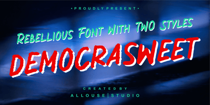 Proudly Present, Democrasweet a Rebellious Handwritten font With Two Styles, Rough and Smooth. Democraswwet come with 6 ampersand styles each, underline styles and Multilingual-Support to fulfill your need. We highly recommend using a program that supports OpenType features and Glyphs panels like many of Adobe apps and Corel Draw, so you can see and access all Glyph variations. Democrasweet is perfect for any tittle, logo, product packaging, branding project, megazine, social media, wedding, or just used to express words above the background. Enjoy the font, feel free to comment or feedback, send me PM or email. Thank You!
 - MFC Fantasie Monogram by Monogram Fonts Co.,
$169.00 The inspiration source for Fantasie Monogram is another hand-drawn design from a vintage embroidery publication which relies on rigid geometric letterforms on a dynamic slant stepping downwards. This monogram, which evokes visions of it embossed or printed on antique cookie tins, was originally intended to adorn handkerchiefs, but the possibilities of its use are up to your imagination. This is one of many monogram designs from the early 1900’s which fall into a two letter format that is either adorned or interwoven decorative elements. Download and view the MFC Fantasie Guidebook if you would like to learn a little more.
 - Kagomechan by Allouse Studio,
$14.00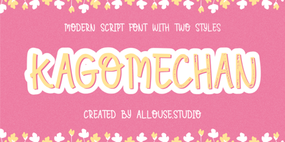 Proudly Presenting, Kagomechan a Modern Script Font With Two Styles Regular and Textured which will you give an a stamp effect. Kagomechan come along with multi-Lingual Support to fulfill your need. We highly recommend using a program that supports OpenType features and Glyphs panels like many of Adobe apps and Corel Draw, so you can see and access all Glyph variations. Kagomechan is perfect for any title, logo, product packaging, branding project, megazine, social media, wedding, or just used to express words above the background. Enjoy the font, feel free to comment or feedback, send me PM or email. Thank You!
 - Delmon Delicate by Atharuah Studios,
$19.00 Delmon Delicate is a classy font duo, with elegant sans and script fonts. The two fonts are made with a balance that produces a beautiful blend to support all your design needs. For example, social media content, branding, merchandising, advertising, packaging, etc. Delmon Delicate includes 2 fonts: Delmon Delicate (Sans Serif) and Delmon Delicate Script, each of which has uppercase, lowercase letters, numbers, punctuation, and multilingual support. That's it! I hope you enjoy it. Feel free to comment if there are issues or queries. You can also say hello to me on Instagram: https://www.instagram.com/atharuah_ Thank You!
 - Anavio by Greater Albion Typefounders,
$14.95 Anavio is named in honor of the ancient Roman name of an English Derbyshire town. Anavio is a classically inspired family of Roman faces, emphasizing simplicity of form and elegance. Regular and Bold weights are offered, along with condensed forms. Anavio is offered in both upper and lower case and small capitals faces. Its simple lines are immediately legible, lending it to both text and display uses. A range of ligatures, both standard and discretionary, are included as are stylistic alternates and two styles of numerals. Use Anavio to lend that indefinable air of elegance to your next project.
 - Wild Heart by PeachCreme,
$19.00 Introducing you "Wild Heart", our new lovely script font. Featuring handwritten, refined flows, "Wild Heart" includes beautiful uppercase and lowercase letters, numerals, punctuation, and adorable heart swashes. Repeating every inch of it the ending heart swash is a mirrored replica of the beginning heart swash. Also, there is a connecting heart swash which serves to bind two words or letters together. The font characters are thick enough to fit perfectly for all types of printing techniques, especially Cricut, Silhouette, etc. "Wild Heart" can add a charming touch to your branding design, wedding invites, cards, monograms, and so many other projects.
 - Friz Biz by studiocharlie,
$24.00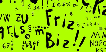 Friz Biz is an handwritten font; your designs will be really funny and fancy!
 - Narrow Path by Ingrimayne Type,
$9.00 NarrowPath is a family of 18 condensed and ultra-condensed sans-serif typefaces. The family was derived from the font family NarrowWay by adding true lower-case letters. Some alternative letters forms can be reached with the OpenType feature of stylistic sets. The character spacing in most of the styles is quite loose and it can be tightened with an application's character spacing if needed. These typefaces are display faces that can be useful for squeezing tall lettering into tight spaces. Uses may include packaging, signage, and titles.
 - Mashq by Arabetics,
$29.00 The Mashq script is the oldest documented Arabic Jazm calligraphy style. It was invented by the early Muslims in the Arabian cities of Mecca and Medina, exclusively for writing the Quran and other Islamic religious texts. The Mashq style employed complex ligature and multi-level baseline rules, and therefore it went through a continuous simplification process. Around the time period Mashq was developed, the early Arab Muslims experimented with another short-lived Mashq-like style with heavily slanted vertical stems, which closely resembled the common Ḥijazi style. This style is commonly referred to as the Ma’il (slanted) style. Eventually, the early complex Mashq style was replaced as the main Islamic Arabic script, by a more simplified Mashq-derived calligraphy style that was developed in the city of Kufa, modern day Iraq, which was commonly referred to as Kufi. The Kufic style became the official Arabic script style for centuries before it was replaced by the more developed Naskh, the modern Arabic script style used today. The Mashq font family by Arabetics includes three styles of Mashq. The first is Mashq regular, which closely follows the script style of Musḥaf ‘Uthman (currently displayed in the Topkapi Museum in Turkey) with only the initial and final Haa’ baselines shifting. The second is Mashq Maail, which emphasizes the features of the Ma’il style shared with Mashq. The third is Mashq Kufi, which closely follows the script style in an adequate sample from the Quran manuscripts of the Bergstraesser Archive. All three fonts include two styles, with and without Tashkeel (dots). The Mashq and Mashq Kufi fonts include two more styles, with and without Harakat (soft vowels), and Hamza. Only three soft vowels are implemented along with their Tanween (double) forms. The Sukoon vowel is the default shape before inserting a soft vowel. Hamza was treated as a vowel in the Mashq and early Kufi manuscripts. Kashida is a zero width character. In the Mashq fonts, inserting one Kashida before the final ‘Ayn glyph group will trigger alternative shapes. In the Mashq Kufi fonts, inserting one Kashida (or two) before the final Yaa’, ‘Ayn, and Ḥaa’ glyph groups will trigger alternative shapes. The Mashq font family by Arabetics was designed to be as compatible as possible with the Arabic keyboard and Unicode alphabet used in computers today. Calligraphic variations were implemented only when they marked significant and permanent script features.
 - Gersio by Rosario Nocera,
$16.00 Gersio is a revisiting of a lapidary typeface from the 19th century designed for the horror and thriller genre but thanks to its strong distinctiveness it’s also suitable for branding. Gersio is available in light, regular and bold weights in two versions: solid and Scratched, it also offers a large selection of alternative letters. Gersio is suitable for display works, posters and billboards.
 - Arazatí by TipoType,
$9.99 Arazatí was inspired by Edward Johnston’s typefaces, although its design is not based on a literal reconstruction. It has 48 variants of 422 glyphs each. In addition, it offers two monospaced variants for free. Arazatí is the name of the place where Johnston was born in 1872, located in San José, Uruguay. This typeface is a tribute to his birthplace.
 - Mezitha by Koray Özbey,
$10.00 Mezitha is display font that has an ethnic view with modern style. It's suitable for branding, packaging, printing, poster designs, natural products etc. Mezitha Ornaments contains 3 groups of symbols. 1- Combining Ornaments 2- Repeating glyphs to create borders with finishes. 3- Single symbols. Most of the glyph has alternates and all of them has two version (thick and thin).
 - Syntho by Gspr one,
$5.00 Syntho is a modular typeface with 18 variants and a Variable Font. Its structure is geometric and modular, but its proportions resemble those of classic grotesque typefaces, giving it a familiar feel to the designer. It also includes two subfamilies, 200 and 300, which are expansions of the typeface in width, providing greater possibilities for the designer in any project.
 - Jorgey by Gatype,
$12.00 Jorgey's casual brush script has a nice texture and flow. Jorgey has many alternatives to make it look like real handwriting; four sets of lowercase and two sets of uppercase. suitable for design projects; logos, branding, posters, quotes, beautiful wedding invitations, beautiful stationery art, eye-catching social media posts, and cute greeting cards and other designs. It is unique, very natural and attractive
 - Cleodify by Namara Creative Studio,
$15.00 Inspired by bold & retro typefaces in the ’90s, Cleodify comes with a retro-ish style. The bold design combined with classical proportions gives a choice for creative work. Cleodify Sans is available in two style : Regular and Rounded. Features : Full Set of standard characters and punctuations. Alternates, ligatures and multilingual support characters. PUA Encoded | no special software needed to access extra characters.

