10,000 search results
(0.056 seconds)
- Wolvercote by Greater Albion Typefounders,
$14.50 Wolvercote is one of two new ‘Masthead’ typefaces from Greater Albion. This Victorian inspired face makes the construction of ribbon or cartouche banners and mastheads the simple work of a few moments. Wolvercote is also particularly designed to complement our Wolverhampton and Mexborough families.
 - 9 Months by Tkachev,
$25.00 9 months is a decorative face with two font styles. It would look nice on candy and food package, in children's books and magazines. This work is devoted to the period in my wife's life when she was pregnant during 9 months with our daughter.
 - Bastard by Barnbrook Fonts,
$30.00 Bastard is a contemporary blackletter typeface and was one of the first created using a personal computer. It was drawn using primitive font design software in 1988, and refined and published two years later. It has now been revised to feature an expanded character set.
 - Bettendorff by Greater Albion Typefounders,
$14.50 Bettendorff is one of two new ‘Masthead’ typefaces from Greater Albion. This 1900’s inspired face makes the construction of ribbon or cartouche banners and mastheads the simple work of a few moments. Bettendorff is also particularly designed to compliment our Spargo and Mexborough families.
 - Neeskens by Type-Ø-Tones,
$40.00 Neeskens, by Enric Jardí. A few years ago we used to talk about Neeskens as the font preferred by the crew of Ganimedes' commercial vessels. Now we see it as one of most solid geometrics of our typefaces. Neeskens has two versions: solid and inline.
 - Chamy by Rosario Nocera,
$12.00 Chamy is a handwrite font family inspired by nature, sweets, comics and cartoons. It is available in three weighs from light to bold and two version: Solid and Sweet. Chamy is ideal for logo design, branding, titles, games, app and playful, cheerful and positive things.
 - Sqair by Superfried,
$- Sqair is an experimental display typeface designed by Superfried. It is available in two formats, stencil and solid. The inspiration for this font originates from fond memories of the classic Sinclair Spectrum logo. Consequently Sqair lends itself to any project with a technology related theme.
 - Custard by Device,
$39.00 Playful and funky. The ideal choice for candy wrapping, teen magazines, toy packaging and the like. The reweighted condensed is useful where space is at a premium, and mixing the two weights freely leads to intriguing results. Use with bright fresh colors for added "bounce".
 - Trio CT by CastleType,
$39.00 I was commissioned by Publish magazine to digitize Trio in 1990. Originally designed in a Light weight only, Trio is now available in Medium and Bold weights as well. Uppercase only, but each weight includes two alphabets, one more "deco," the other more "modern."
 - Krok by ParaType,
$30.00 Krok is an experimental geometric sans serif designed by Zhanar Bereketova. It’s suitable for posters, packaging, brand elements and short memorable texts. Each character of this font adds a visual accent to the message. There are many alternative forms, designed in two stylistic sets and one contextual set that allow you to create a different mood of the text -- from electronic folk to science fiction. The font was released by ParaType in 2018.
 - Tyrumate by Differentialtype,
$12.00 Tyrumate is an elegant serif font with a vintage touch and classic. Comes in two styles, regular and italic. Its clean lines and meticulous attention to detail embody the essence of classic typography, making it a chic serif font. Tyrumate is suitable for template design, brochures, videos, advertising branding, logos, invitations, layout designs, elegant crafts, beauty designs, and much more. It will add a splash of luxury to any design project you want to create!
 - No Bad Days by Cardigan,
$25.00 Get RAD with this unique, fun, handwritten font by Cardigan. This pack includes two fonts. A bold, brush font with a supporting thin, handwritten script font. These typefaces ooze good vibes, adding a fun and edgy style to any design. Whether you need a hand drawn feel to a logo or a bold organic font that jumps off any page. No Bad Days has your back and is a total dream to work with.
 - Yellow Balloon by Hanoded,
$15.00 Yellow Balloon is a typeface named after my two year old son's favorite book: The Yellow Balloon by Dutch author/illustrator Charlotte Dematons. Every night before he goes to sleep, he wants to read the book and manages to find the yellow balloon on every page. Yellow Balloon is a cartoonesque font with an uneven baseline. It would look great on book covers or posters. Yellow Balloon comes with extensive language support.
 - Aromanis by Oui Studio,
$14.00 Hello friends! The 'Aromanis' font is coming, a playful and sweet font in two variants: Regular and Shadow. Aromanis font comes with a complete package of uppercase, lowercase, numeric, punctuation, multilingual characters, and some of the alternative glyphs to add an extra to your word. It's perfect for branding, logo, invitation, greeting card, packaging, graphic tee, poster, anything that you need to make a playful, fun, neat and sweet effect in your works. Happy creating :)
 - Vallejo Serif by Estudio Calderon,
$35.00 A serif display type family inspired by two popular fonts: Albertus and Friz Quadrata. We made an hybridization matching those kind of fonts that have flared and oversized serifs. Vallejo Serif is a versatile font because of the shapes that are adaptable to many sort of typographic compositions, we recommend to use it in headlines. The OpenType fonts have an extended character set to support Central and Eastern European as well as Western European languages.
 - Stellafox by ZetDesign,
$15.00 Stella fox is a font with a neat brush stroke style. This font gives you a free and boundless impression. This font is available in two styles, regular and italic. and is equipped with an open type feature to give creative designers many style options to create stunning works. so you can use and enjoy again and again, for anything from promotional material and handwritten quotes, to product packaging, merchandise and branding projects.
 - Prism by Stereotypes,
$- Prism was mainly inspired by two things, the sketches of Rudolf Koch for Prisma and the proportions of Avant Garde by Herb Lubalin. Even when the proportions and widths stay the same from ExtraLight to Black, you get the opportunity to change the weight and get a complete new look for that typeface by changing the grayscale or color. It is a modern combination for headlines, that want to have a different look.
 - Catalpa by TypeTogether,
$35.00 The Catalpa font family is José Scaglione and Veronika Burian’s wood type inspired design for an overwhelming headline presence. It has no regular weights, only four slender and four hulking weights. Catalpa wasn’t made to be normal; it was made to overwhelm, to stand out, to bellow. Catalpa is the first font family within a trilogy that will be released through 2020. Each of the three have a distinct purpose and their own look, but they serve a common goal: to act as a complete family covering an editorial’s wide array of needs. As the first of the three, Catalpa is the bookend font family with a headlining purpose. What requirements are there for a great headline typeface? Distinction, weight, and cohesiveness are a good start. Its distinctiveness must catch attention, it must have a range of weights applicable to its purpose, and its internal consistency and external look must create a cohesive family. Catalpa is a distinct and unified family whose weights are attuned to its single-minded purpose — headlines and large text. Catalpa has only eight styles that are divided into two ranges of weights — four very light weights (Hairline, Thin, Extralight, and Light ) and four very bold ones (Extrabold, Heavy, Black, and Extrablack). The thin and heavy ends of the spectrum also have their own variable fonts, each with one axis of weight so designers can fine-tune their work. The geometric influence of the design is more obvious in the light range, with their line thickness increasing in the classical manner. The bold weights increase more in width and substance to serve well in websites, mobile apps, posters, advertisements, and magazines that aim for impact more than spreading information. As a family, Catalpa gels in big headlines, short sentences, and isolated words. The family has many recognizable features, in the bolder weights especially, like the reversed contrast ‘S, s’ or the angular design of ‘Q, M, W, w, a, f, 2, 3’. Catalpa’s headlining mixture of geometry and quirkiness leaves an impression that is so characteristic of wood type, but designed for substrates and screens.
 - Squaripeg by Andy Peat,
$9.00 About this font family Squaripeg is a funky square typeface with geometric shapes to create impactful headlines and web banners. This typeface was designed so that it takes up less horizontal space but still has a lot of prominence on the page. Some letters have been combined into one unit to save further space. Features 8 weights (from thin to black) Multi language Ligatures To be able to access alternative fonts, make sure the software you use can support opentype features such as Microsoft Word, Paint, Adobe, Corel draw, Cricut and other applications. Designed and published by Andy Peat. Released April 2022
 - Mahalini Style by Sensatype Studio,
$15.00 A Serif font that we created special for elegant branding needs, with extra unique shape will be ready to add value of your brand. It so nice to leverage designer or product owner that need solutions to make their design look more classy and modern. And specially for this font, We prepared any characters to help you create unlimited variations for your creative needs. Mahalini serif font ready with: Any characters to get creative variations Preview as a inspirations that you can do with Mahalini font Ready with Lowercase and Uppercase characters Wish you enjoy our font. :)
 - Moalina by Sensatype Studio,
$15.00 A Display font that we created special for Modern branding needs, with extra ligatures in unique shape will be ready to add value of your brand. It so nice to leverage designer or product owner that need solutions to make their design look more elegant and luxury. And specially for Moalina font, We prepared any ligatures characters to help you create unlimited variations for your creative needs. Amiora Display font ready with: Any options to get creative variations (combination of Ligatures) Preview as a inspirations that you can do with Moalina font Ready with Lowercase and Uppercase characters Wish you enjoy our font. :)
 - Maharani by Sensatype Studio,
$15.00 A Serif font that we created special for elegant branding needs, with extra ligature and alternates in unique shape will be ready to add value of your brand. It so nice to leverage designer or product owner that need solutions to make their design look more stylish and modern. And specially for Maharani font, We prepared any ligatures characters to help you create unlimited variations for your creative needs. Maharani Serif font ready with: Any options to get creative variations Preview as a inspirations that you can do with Maharani font Ready with Lowercase and Uppercase characters Wish you enjoy our font. :)
 - Fd Vienna by Fortunes Co,
$9.00 Vienna is Modern Serif is a font style that blends traditional and modern design elements to create a distinct, stylish look. This typeface is characterized by serifs, or small lines added to the end of a stroke, that give it a classic and sophisticated feel. The font is often used in high-end fashion magazines and advertisements to evoke a sense of luxury and elegance. Fashion serif typeface is versatile and can be used for various purposes, from headings and titles to body text. Overall, this typeface is a perfect choice for designers looking to create a high-end, fashionable aesthetic.
 - Flamboyan Style by Sensatype Studio,
$15.00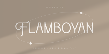 An unique font for unique feminine branding needs, with extra alternates in unique shape will be ready to add value of your brand. It so nice to leverage designer or product owner that need solutions to make their design look more unique and modern. And specially for this font, We prepared any alternate characters to help you create unlimited variations for your creative needs. Flamboyan Feminine Modern Display Font ready with: Any options to get creative variations (combination of Alternates) Preview as a inspirations that you can do with this font Ready with Lowercase and Uppercase characters Wish you enjoy our font. :)
 - Temporal Shift by Comicraft,
$19.00You're trapped in an endless now... seconds seem to be stretching out interminably... There’s an eternity between every tick, every tock of the clock... Your consciousness is stretched to the limit as time is expanded to fill the void between each microsecond. There’s a signpost up ahead... the letters appear to stretch into infinity. Anyone know the name of the font it’s set in? See the families related to Temporal Shift & Gap Expanded: Temporal Shift & Gap & Temporal Shift & Gap Compressed Features Four fonts (Shift Regular, Shift Bold, Gap Regular & Gap Bold) with upper and lowercase characters. - Easy Answer by Bogstav,
$17.00 Is there such a thing as an easy answer, or is it just because you know the question? Anyway, as a kindergarten teacher I like to make these quizzes with the kids. The object of the game is not to answer right, but to get a feeling of knowing a lot. I thought of these questions as being logical and really easy, but I also found out that it is a great way for the kids to remember and recall their knowledge! This font is easy to read, even if you use some of the many choices of swashes!
 - Kono by Thinkdust,
$10.00 Kono is a font straight from the modern, gritty, warfare computer game genre. Rough and ready, with letters that double as numbers and look fit to be sprayed on a bunker wall, Kono brings you a bleak example of the near-future, where pragmatism rules out over artistry. Kono itself, ironically, is stylistically crafted to capture this feeling, carefully selecting the perfect mix between flat, straight lines and rounded corners, using wide, squat characters to mimic practical architectural styles. Kono is great for capturing a bleak but somewhat heroic attitude, whether you want to use that to encourage optimism or advertise pessimism.
 - HS Future Sans by Hiba Studio,
$59.00 HS Future Sans is the sans serif version of HS Future. It has three weights and was converted to OpenType to support Arabic, Persian and Urdu to be compatible with the various operation systems and modern software. The smoothing of this font and the combination of straight and curved parts without the serif gave the user additional option beside HS Future family. It made it a beautiful typeface appropriate to the titles, and able to meet the desire of the user in the design of ads and modern designs of various types of audio and visual.
 - Gridlock by I Can Be Your Type,
$10.00A condensed font using constructivism history to convey the cold hearted steel of machinery and progress. Gridlock tries it's best to fit as much info as possible in a small space neatly in line and with the subtle curves and smoothness of bent steel. The inspiration for Gridlock actually came accidentally after designing some lettering for a self-promo project and it needed something that just was condensed with visual appear. So imagining about how condensed fonts feel, I imagined them being squished together just like cars in traffic are forced to work together to make it to their end destination. - White Mint by Innire,
$20.00 White Mint - is an elegant serif font that combines strict, refined forms and playful elements inspired by natural motifs. This versatile, easy-to-use font is perfect for branding, business card design, wedding invitations, social network pages, and much more. Ligatures will help you create original text that is easy to read at the same time. Multilingual support allows you to use the font not only on Latin glyphs -— Features : - Uppercase and Lowercase - Numerals - Punctuations (OpenType Standard) - Multilingual Characters - Ligatures - Stylistic Alternates for glyphs "I" :) -— If you have any questions, suggestions, or adjustments, be sure to write to me! Thanks for your attention
 - Softie by Tail Spin Studio,
$20.00This typeface was designed to be used as the page heading font for MyFonts. Originally only the letters needed to make up the required phrases were drawn. Then amazingly enough, people started asking where they could get the font, so I decided to complete the character set, and named it Softie. This name was chosen because the round and rather bulbous shapes that make up the letters reminded me of marshmallows. Softie, almost good enough to eat. The Bold version, called Softie Bloated, was added in late 2003. Rumor has it that the name came to Steve after Thanksgiving dinner. - Fresh Mango by Shakira Studio,
$14.00 Fresh Mango - Retro Serif Font is a Classy Retro Serif typeface that looks incredible in both large and small settings as a display. Suitable for any branding purpose. Fonts Features : - Italic - Multilanguage - Alternates - PUA Encoded - Ligatures - Very easy to use in any software (Instructions included) HOW TO ACCESS ALTERNATE CHARACTERS Open glyphs panel: In Adobe Photoshop go to Window - glyphs In Adobe Illustrator go to Window - Type – glyphs I really hope you'll get pleasure using Fresh Mango font and it will be perfect addition to your font collection! Contact me with an inbox message If you have any question. Thank you and enjoy!
 - Minimalist by Ingrimayne Type,
$12.95 PostScript fonts are constructed by connecting dots, dots that have special attributes that control the shape of the connecting lines. In designing Minimalist, I wanted to see how few dots could be used to construct each letter. This is the source of the name--it is (or was) a minimum-point alphabet. I did not expect much from it, and was surprised that it turned out as well as it did. Since I originally drew it, I have added some points to some of the letters to get them to generate proper bitmaps, so it no longer has minimum points.
 - Temporal by Comicraft,
$19.00 You're trapped in an endless now... seconds seem to be stretching out interminably... There’s an eternity between every tick, every tock of the clock... Your consciousness is stretched to the limit as time is expanded to fill the void between each microsecond. There’s a signpost up ahead... the letters appear to stretch into infinity. Anyone know the name of the font it’s set in? See the families related to Temporal Shift & Gap Expanded: Temporal Shift & Gap & Temporal Shift & Gap Compressed Features Four fonts (Shift Regular, Shift Bold, Gap Regular & Gap Bold) with upper and lowercase characters.
 - Harmonis Style by Sensatype Studio,
$15.00 A Serif font that we created special for beauty branding needs, with extra ligatures in unique shape will be ready to add value of your brand. It so nice to leverage designer or product owner that need solutions to make their design look more beauty and modern. And specially for Harmonis font, We prepared any ligatures characters to help you create unlimited variations for your creative needs. Harmonis Serif font ready with: Any options to get creative variations (combination of Ligatures) Preview as a inspirations that you can do with Harmonis font Ready with Lowercase and Uppercase characters Wish you enjoy our font. :)
 - Hoban by District,
$40.00 The light and the bold. The thick and the thin. Laverne and the Shirley. Peanut Butter and the Jelly. Hoban is about contrast. Hoban wants to be noticed, but only after a second glance. A friend of a friend to the didones, it has smaller, tapering serifs, slightly calligraphic traits, and spindly little terminals that go where they please. It’s a headline face. Period. Set it big and bold. Or light and airy. But preferably next to something with flair. Cuff links, canapés, or corvettes–it’s up to you. Distinct ligatures, ornaments, and swashy alternates provide plenty of character to tailor your style.
 - Signs Of Yesterday JNL by Jeff Levine,
$29.00Signs of Yesterday JNL brings another twenty-six vintage signs inspired by a series of decals once made by the Duro Decal Company (now Duro Art Industries) of Chicago. This font complements the original twenty-six designs found in Too Much Information JNL. There are two blank sign panels on the parenthesis keys for use in creating custom retro signage. - TT Norms Pro Serif by TypeType,
$39.00 Introducing TT Norms® Pro Serif, version 1.100! The updated font now has new OpenType features and localization for the Serbian and Bulgarian languages. TT Norms® Pro Serif is a functional serif based on our studio's main bestseller—the versatile sans serif TT Norms® Pro. Together, they form an ideal font pair. Although these typefaces are made for each other, they can easily be used independently and paired with other fonts. So, TT Norms® Pro Serif is a self-sufficient and elegant serif, neutral at the same time. It is easy to recognize due to its gentle proportion dynamics, open aperture, slanted oval axis, and low stroke contrast. Another distinctive feature of this font is brutal serifs that adjust in length according to the weight of the font. As well as TT Norms Pro, there are Italic font styles in TT Norms® Pro Serif. However, for this serif, we have designed true italics instead of simple slanted font styles. Their key feature is the ability of the lowercase letterforms to change in reference to the roman font styles. They become more rounded, moving towards handwritten shapes. The nature of the italics turned out sharper than that of the roman font styles. It can be used to place accents that would attract attention without interfering with the process of reading. TT Norms® Pro Serif is capable of solving multiple design tasks. It is highly readable, which makes it convenient for small point sizes. This serif's application range is broad and diverse: it can be used for websites, printed materials, and packaging design. The font is well-suited for projects in the domains of culture, art, history, or literature and can be implemented into the designs of signs, posters, or premium products and services. TT Norms® Pro Serif, version 1.100, consists of: 24 font styles: 11 roman, 11 italic, and 2 variable fonts (one for the roman font styles and another—for italics); 1380 glyphs in each font style; 31 OpenType features, including options for localization.
 - Shout by HiH,
$12.00 Shout is a “Hey, Look at ME” font. It is an attention-getting font for posters, flyers and ads. Its lineage includes the Haas Type Foundry’s 19th century advertising font, Kompakte Grotesk, which Jan Tschichold (1902-1974) dryly described as “extended sans serif” and which graphic designer Roland Holst (1868-1938) would have disapprovingly referred to as a “shout,” as opposed to the quiet presentation of information that he believed was the proper function of advertising. In 1963 Letraset released what appears to be an updated variation in multiple weights designed by Frederick Lambert called Compacta. Shout draws heavily on Compacta, as well as other similar fonts of the 50s and 60s like Eurostile Bold Condensed and Permanent Headline. In weight, it falls about halfway between Compacta Bold and Compacta Black, but with a relatively heavier lower case that is not so easily pushed around by the upper case. After all, one can shout while sitting down. Shout is the first font released with our new encoding, as noted in the All_customer_readme.txt. The Euro symbol has been moved to position 128 and the Zcaron/zcaron have been added at positions 142/158 respectively. Otherwise, Shout has our usual idiosyncratic glyph selection, with the German ch/ck instead of braces, a long s instead of the Greek mu and our usual Hand-in-Hand symbol. There are also left and right glyphs of a big mouth ]ing (135/137) and left and right glyphs of an angry man shouting (172/177). Please use Shout with discretion. Folks get tired of being yelled out. After awhile, they stop listening. Shout ML represents a major extension of the original release, with the following changes: 1. Added glyphs for the 1250 Central Europe, the 1252 Turkish and the 1257 Baltic Code Pages. Add glyphs to complete standard 1252 Western Europe Code Page. Special glyphs relocated and assigned Unicode codepoints, some in Private Use area. Total of 355 glyphs. 2. Added OpenType GSUB layout features: pnum, ornm, liga, hist & salt. 3. Added 266 kerning pairs. 4. Revised vertical metrics for improved cross-platform line spacing. 5. Revised hyphen, dashes & math operators. 6. Minor refinements to various glyph outlines. 7. Inclusion of both tabular & proportional numbers. Please note that some older applications may only be able to access the Western Europe character set (approximately 221 glyphs). The zip package includes two versions of the font at no extra charge. There is an OTF version which is in Open PS (Post Script Type 1) format and a TTF version which is in Open TT (True Type)format. Use whichever works best for your applications.
 - CA Capoli by Cape Arcona Type Foundry,
$29.00 CA Capoli is a fine script typeface with a vintage touch. Perfect for illustrative titles or logotypes. It comes in two styles, Regular and Stroke. The inspiration came during our trip to Italy, where we took a short rest in a bar during a hot day. We discovered a simple ceramic ashtray on the table. The word “Nido” was inscribed in a typeface that looked like it dated back to the 1950s. We made some investigations about the word, its meaning and origin but it still remains a big mystery. Was it the name of a hotel or a restaurant or some vintage Italian cigarettes? We don’t know. We were so amazed about the design of the logo that we decided to create a typeface out of it. A sophisticated endeavor because we just had four letters. How could the rest of the letters – if it ever existed – have looked like? Our hypothesis is CA Capoli. A typeface with a full Central European character set and some nice alternative letters to chose from. When we thought about “Nido” and its possible derivation of hotel business, we felt like creating a small side project for this typeface, a brand for a fictional hotel called Hotel Capoli with business cards, letterheads, a reception book, key fobs and embroidered patches for the service dress of the hotel service stuff. The Hotel Capoli is located at the wonderful beach of Cape Arcona on the fictional country of Arcona Islands where our type foundry is located.