10,000 search results
(0.031 seconds)
- Psyleidoscope by Designpiraten,
$19.00 Imagine a font that reveals more and more details the closer you get. Clearly readable in small sizes and illustrative when blown up to large scales. A psychedelic trip, a kaleidoscope of discoveries – that is Psyleidoscope. Use it in extreme sizes – large and small – to get all the fun out of it. There are two styles, Regular and Bold, with glyphs that support 207 different languages.
 - Soul Doubt by Allouse Studio,
$16.00 Proudly Presenting, Soul Doubt a Graffiti Font with Two Syles. Soul Doubt is perfect for any tittles, logo, product packaging, branding project, megazine, social media, wedding, or just used to express words above the background. Both font come with underline styles and extras, also come with Multi-Lingual Support. Enjoy the font, feel free to comment or feedback, send me PM or email. Thank You!
 - M Felt Pen PRC by Monotype HK,
$523.99 To blend a handwritten style with a graphical aesthetic, Monotype designers paid attention to the balance between the two, hence harmoniously combine their qualities like a mix of tradition and modern. M Felt Pen references the unified stroke thickness and rounded terminals of rounded Heiti typefaces, imitating the fluidity of marker writing. The linked strokes are vivid and suggest the presence of the human hand.
 - Gotica Lumina by Omine Type,
$24.00Gotica Lumina is a an attempt to make blackletter more legible to the 21st century's eye. It is available in two styles: soft (for text) and sharp (for display). Both of them have an alternate font, which contains stylistic alternate forms for several characters, for a more “traditional” look. Opentype features: four styles of figures and currencies, ligatures (f-ligatures and c-ligatures), historical forms (long-s). - Twist Jelly by Allouse Studio,
$16.00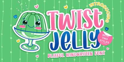 Proudly Presenting, Twist Jelly a Playful Handwritten Font with two styles, Basic and Slab Serif. Twist Jelly is perfect for any tittles, logo, product packaging, branding project, megazine, social media, wedding, or just used to express words above the background. Twist Jelly come with Multi-Lingual Support for each style. Enjoy the font, feel free to comment or feedback, send me PM or email. Thank You!
 - M Felt Pen HK by Monotype HK,
$523.99 To blend a handwritten style with a graphical aesthetic, Monotype designers paid attention to the balance between the two, hence harmoniously combine their qualities like a mix of tradition and modern. M Felt Pen references the unified stroke thickness and rounded terminals of rounded Heiti typefaces, imitating the fluidity of marker writing. The linked strokes are vivid and suggest the presence of the human hand.
 - Samsara by W Type Foundry,
$15.00 Samsara is a cursive typeface inspired by calligraphy tools. Its shapes and gestures convey an organic-modern style which generates the texture of a brush tip. Samsara not only has a great versatility, but also is suitably to create short texts such as branding and short messages. It comes with OpenType features, stylistic sets, special ligatures, and swashes, which were designed specially to let your imagination fly.
 - That’s All Folks by Comicraft,
$19.00 Run amuck and head on down to Toon Town with us to enjoy some Madcap Laffs with our latest Frolicking Font, 'THAT'S ALL FOLKS'. It's good, clean family fun for all your favorite comic cuts and looney'toons! What's more, it's (sing along) S-O-E, A-S-Y, T-O-U-S-E! Includes new Inline Regular and Bold weights, Western European accents, and Crossbar I Technology!
 - Horseman by Ngene,
$10.00 Horseman Font Duo is handmade vintage script monoline and sans-serif inspired by classic western culture and combining with vintage touch. These two fonts would be perfect to combine in your design, especially on vintage design. This fonts are great for logotype, badges, clothing, poster, and much more. This fonts comes with OpenType features as well as many alternative characters to improve your design.
 - Acaraje by Latinotype,
$39.00 Acarajé is a grotesque font that stands out thanks to its versatility. Its personality blossoms through its particular modulation, which grows with weights; making it a rather jovial typeface that does not abandon the characteristics of more classic grotesques. With two styles available: normal and italic, and a variety of 7 weights that range from "Black" to "Regular", this font offers incredible flexibility for your designs.
 - Motto by FaceType,
$30.00 Motto is a beautiful Art Deco font in the tradition of the Italian Futurismo of the early 20th Century. Please Note: Combining Bicolor A and B you will create astounding multicolored pieces of typography. To achieve the two-tone effect shown in the samples, you need to use an application that supports layers such as Adobe Illustrator, Adobe InDesign, Adobe PhotoShop, CorelDRAW or Quark.
 - Quatsity by Ingrimayne Type,
$5.00 Quatsity is a squarish or boxy serifed font with rounded corners. Quatsity is is suitable for titles or signage and legible enough for small blocks of text. Quatsity-Light was constructed in 1995 by blending two very different faces, a typeface very similar to Kwersity (with low contrast) and one similar to Qwatick (with high contrast). The other seven styles were added in 2020.
 - Costa Mala by Larin Type Co,
$14.00 Costa Mala feels playfully nostalgic and delivers an incredible vintage aesthetic.this font will look outstanding in both formal and non-formal designs. It will add charm and create a unique atmosphere in your design project. This font includes two styles: regular and outline, and also has alternatives that you can use to play with font dynamics. This font is easy to use and has OpenType features.
 - Casira Script by Krafted,
$10.00 We live only to discover beauty, all else is a form of waiting. --- Khalil Gibran Wait no more, this beautiful font can be yours right now! This custom made font was specifically designed to fit whatever you need! The curvature of the Casira Script was fully thought out to easily meld inside your designs. These fonts make a good foundation of what you want it to be! Discover the beauty in your own imagination while this font gives you a quick kickstart to what it can be. Everything’s well with cursive! Show your opulence and decadence with this fancy font and blow your audience’s mind away as you put these cursive letters in your projects. Communicate the extent of your mind so that whoever views your designs understand not just what you write, but also the tone and feel of it! The Casira Script makes a perfect addition for your collection of fonts, show love and bring out the true you! Feel free to contact us if you need anything else! If you have a request on what kind of fonts you’d like to see, tell us that too!
 - Romp by Positype,
$30.00 With all ego aside, Romp was designed and influenced by my daughter, Angel. For some time now, she has wanted me to design a font based on her handwriting. But each time I sit down to do it, I run into more that she needs to do and redo. On a recent attempt, I ran into the same situation again. Instead of moving on to something else, I decided to whip out a sumi brush and start making letters...for me, type design is something a little ‘serious’ and never a time to just have fun. This typeface proved that notion wrong—it really was fun. As a result, each letter encouraged another and the design grew...and grew! The happy result spawned 3 separate sets of letters & numerals (small caps and some ligatures too!). Using the beauty of OpenType, these 3 sets have been fused into one, randomly generating font set. If you are using any type of OpenType enabled application, then the Romp Pro typeface is the way to go. They include everything found in the 3 separate variants for each style as well as entirely expanding offering of additional small cap and ligature sets.
 - Booer by Product Type,
$18.00 Introduce the Booer Font Express Your Creativity with a Powerful and Modern Gaming Style. Booer display is a font that reflects the power and style of the gaming world in a sharp, modern package. Booer is the perfect solution for a variety of projects that require a unique theme, whether it's a film, game, or streaming event. Her bold and exciting style provides room for creativity to flourish. What Makes Booer Special: Powerful Gaming Style, Booer Design exudes power, capturing the essence of the gaming world. Each letter is a statement of dominance and modernity. Two Style Families: The Booer font offers two different style families: Regular and Italic. This advantage allows you to adapt your designs to various contexts, whether requiring a strong presence or an elegant touch. Multilingual Support: Booer Font supports multiple languages, allowing you to connect with a global audience easily. Enhance your designs and make an impact with Booer Fonts. It's not just a font; it's a gateway to a bold, modern, and compelling visual world. Download Font Booer now and experience the thrill of creating unforgettable designs!
 - Pollen by TypeTogether,
$49.00 This typeface finds a perfect balance between technical excellence, careful design of letter forms for extended reading, and a measured dose of charm and personality. Its informal feel allows for successfully typesetting a wide range of applications, from magazines and fiction books to advertising and websites. Calligraphy, be it done with the broad-edge pen, brush, or other tools, has been fundamental in the development of Pollen. Its influence is clearly visible in the construction of the top serifs contrasting the curved bottom serifs and the fluid aspect of terminals and tails, such as on “g” and “r”. The shapes of the diagonal letters are based on a less formal calligraphic model, but still uses the broad edge pen. The letters were then subject to a further process of pencil drawing and digital re-interpretation, which gave them the final shape. The designs of “e” and “c” are derived from drawings made with only one continuous line, with the pencil always touching the paper. The letters “g” and “y” express the intention to bring informal elements to a typeface intended for long text reading, usually characteristic of casual writing. Pollen consists of 3 basic styles with an extended OpenType Pro character set and large language support, perfectly serving the most common typographic needs.
 - Odds by DearType,
$30.00 Say hello to Odds - a versatile, chunky casual sans with lots of personality! It’s fresh, friendly and easy to read. It is also a great mix of boldness and cuteness, so it definitely captures attention. The Odds family comes in five distinct fonts styles : - Odds - an artistic handwritten-style sans - Odds Sans - a typical neat and clean sans (caps and small caps which you can mix & match) - Odds Narrow - a cute handwritten narrow sans (uppercase and lowercase), and two awesome sets of goodies: - Odds Extras - borders, arrows, speech bubbles, etc. - Odds Symbols - palm leaves, plants, fruits and other useful objects. Odds works great on a variety of mediums from web to print, but you can find it particularly useful if you're designing food packaging (actually any packaging) and clothes. Other awesome usages include posters, signage, ads, printed and personalized cards, t-shirts, sale banners, everything kids related - merchandise, toys, you name it. Its quirky character and fat letters make up for bold and friendly presentation while the slender letters of the Odds Sans and Odds Narrow are perfect for plain text. And yes, all fonts have Cyrillic! They also have some neat ligatures and alternates to spice up your designs and create more interest!
 - Poultry Sign by Ingrimayne Type,
$5.95 While searching through microfilm of an old, 1932 newspaper, I stumbled on the word "Poultry" written with trapezoidal letters. I did not recall seeing lettering like this and it inspired me to design a typeface that could produce a similar result. Poultry Sign has two widths each with three weights giving the family six styles. It is monoline, monospaced, and all caps. The letters on the lower-case keys reverse the trapezoid of those on the upper-case keys. The designer's expectation is that the most common use for this typeface will alternate upper-case and lower-case keys, and to make this effect easy, included in the font is a contextual alternatives (calt) OpenType feature that automatically produces this result if your word processor supports this feature. To get text with all letters with big bottoms or all letters with with big tops, this feature must be turned off. The spacing of the letters is identical within each width so the styles can be layered to produce bi-colored or tri-colored letters. There is a second set of numbers that can be accessed with an OpenType stylistic alternative. Also accessible with OpenType stylistic alternatives are variations of letters T, N, L, Y, and V.
 - Ghouliez by MADType,
$21.00 This face was drawn on paper with a calligraphy pen and way too much ink. It's perfect for that spooky globular look.
 - Liaisons by The Ampersand Forest,
$35.00 A Belle Époque humanist serif in two styles: crisp, high-contrast Haut-Monde and soft, low-contrast Demimonde… When you design a lot of display pieces, you’re often in need of tall, slim type. Liaisons provides that, in a distinct fin-de-siècle style inspired by the great posters of the Gilded Age from Sweden, Denmark, France, and Scotland. (The ampersand alone is a bit of a love letter to Charles Rennie Mackintosh!) Both styles use the same slim skeleton, and are named after the stratum of society where one might find… a “dancing partner.” HAUT-MONDE is a high contrast face of the sort that says “High Society.” Elegant and sleek, it speaks to the refinement of the moneyed classes of a bygone era. Great for high-end products, too! DEMIMONDE is soft and low-contrast — more reminiscent of hand-lettering on Art Nouveau/Jugendstil/Wiener Werkstätte advertisements and posters. A comfortably chic display face all around! Both typefaces feature full Western and Eastern Latin character sets, as well as full Cyrillic/Slavic ones. And, perhaps best of all, both typefaces feature capitals with high, middle, and low waists, so you can change up the look as you see fit! Part of The Ampersand Forest's Sondheim Series
 - Bohemio by Wiescher Design,
$39.50 Bohemio was designed in memory of Gunter Böhmer, an artist famous for his many book covers of the 1950s in Germany. The cover I took as an inspiration for this font is that of a book called Stiller (by Max Frisch). Bohemio sounds similar to "Böhmer" (which means the one from Bohemia) and it is also an alliteration to artisty. I thought "Bohemio" to be a nice name for this very strong, almost expressionist design. Yours very artsy craftsy Gert Wiescher
 - GROCHES by Surotype,
$20.00 Groches is a contemporary typeface. The typeface can span from a refined vintage feel to an industrial futuristic vibe. Forged from geometric and technical styles with wide characters, make this font type so strong and bold. Comes in two different styles, clean and rusty it brings a vintage touch to any creative project and elevates contemporary editorial layouts. Groches very suitable to use for headlines, sign, display, and logotype, or take it for a spin with short-form body copy.
 - Dexa Pro Variable by Artegra,
$79.00 Dexa Pro is now available on variable version. The family was designed by Ceyhun Birinci in 2020 with an inspiration to create a contemporary super family with inspiration from classic sans serif families. It's a workhorse family consisting of condensed, narrow, normal and expanded widths. Each width has a wide weight range from thin to black, along with their true italic counterparts. With more than 770 glyphs per font, It offers a ton of language support from all the Latin languages to Cyrillic.
 - Super Discount by Mozatype,
$17.00 Hello there, Proudly presenting SUPER DISCOUNT. It is stylish marker font. It’s in two styles: Regular and Bold. SUPER DISCOUNT was designed to make logotype and lettering for your brands. And it’s would perfect for t-shirts/ apparel, promotional materials, sports, music festival, quotes, special events, or anything. What’s Included : Works on PC & Mac Easy to use ( Installations ) Easy Convert to Webfont Compatibility Windows, Apple, Linux, Cricut, Silhouette, and Other cutting machines Thanks for downloading, and I hope you enjoy it!
 - Mexico by Struvictory.art,
$16.00 We want to introduce Mexico Font Family. The letters of the display font are decorated with floral ornaments based on Mexican landscapes. The typeface is presented in two styles: decorative and blank, сombine them to get your unique design. Mexico font is suitable for lettering posters and cards, tourist brochures, photo overlays, book covers and article titles. The font also works great for printing clothes, products branding and packaging. Also use individual letters and symbols to create logos and monograms.
 - Bivona by Rocket Type,
$- Bivona is a superific, energetic font! Its fun and playful and begs to be included in anything that requires a large amount of zazz. It contains a full Mac OS character set with Latin Support. Most European languages are supported. We'd love to see what you use it for! Would be great on a candy or cereal box packaging. Also would be great to see on a toy package or even a billboard somewhere. Your imagination is the limit with Bivona ; D
 - Water Splash by Putracetol,
$21.00 Water Splash is a unique display font. This font is inspired by the water splash shape. There are 3 directions for the splash water (direction to the left, up and down and to the right), and they are alternate from this lowercase font. With these variations, it will make it easier for you to create creativity for your project. Water Splash would be perfect for branding, logo, product, title, quotes, doodle, comic, books, greeting cards, toys, posters, baby clothing, picture books, etc.
 - Wandering Pencil by Hanoded,
$15.00 I have a lot of pencils, but when I need one, they seem to have grown legs and have disappeared! When I decided I wanted to create a pencil font, it took me a long time to find the right pencil for the job! Wandering Pencil is a nice, handmade font. It is a bit shaky, a bit rough, but it does have class and will look nice on your designs! Comes with diacritics and double letter ligatures for the lower case.
 - Ela Demiserif by Wiescher Design,
$39.50Ela Demiserif is the typeface I originally designed for the business of my second wife and mother of my two sons; her name is, of course, Michaela. Ela - the typeface - is suitable for magazines, newspapers, posters, advertiments, books, text, documentation/business reports, business correspondence, multimedia, and corporate design. Because lately this typeface became very popular I decided to extend it to eight weights and I added italic and smallcaps versions to it. So now Ela is a full fledged typeface. - VT Redzone Classic by VarsityType,
$18.00 Raw and uncut, this sharp square sans is ready to rip. Originally released in October 2017, VTF Redzone Classic is the first published typeface by CJ Zilligen. It’s raw and uncut — built with sharp terminals and spur serifs that give off an aggressive appearance. VTF Redzone Classic was refreshed in May 2020 to include nearly 200 new characters, extensive language support, and a sleek and long-anticipated Oblique version. This titlecase display typeface is tooled to give any project a competitive edge.
 - Joules et Jacques by Nicky Laatz,
$18.00 Say hello to Joules et Jacques! A stylish modern font duo consisting of a natural handwritten script and a refined, elegant serif font. Perfect for making bold stylish statments - or adding a touch of class to your designs. The script has a multitude of natural looking ligatures in its OpenType features - making the font look as close to natural handwriting as possible. The Serif includes two weights - regular and bold - and built-in OpenType kerning features for a professional touch.
 - BD Roylac by Typedifferent,
$30.00 The BD Roylac typeface has its roots in some lowercase glyphs drawn by Jacques Loison in 1972. Some of these characters are included in the use of stylistic alternates. Filed under a retro-futuristic design the font separates two filled shapes by a thin and curvy line; sometimes following to the path leaning readability and sometimes interfere with it. The font is dedicated to the BD fanboy Monsieur «Eric de Broche des Combes» aka «Roy La Combe» to his fiftieth anniversary.
 - Absolute Beauty by My Creative Land,
$34.99 Absolute Beauty is a happy family of a smooth casual monoline signature script and a high contrast elegant didone serif. The signature script comes in three weights to cover as much design needs as possible - from websites to brand design, from magazines to billboards. It compliments from OpenType features such as ligatures, swashes, stylistic and contextual alternates, and is fully unicode mapped. Absolute Beauty serif is an ideal partner for the script: it features the same elegance and comes in two weights.
 - Rebeck by OhType!,
$31.99 Rebeck Black is a typeface that evokes the best of two worlds, the classic and refined lines, the high contrast and forceful movements of the 18th century together with fresh strokes and risky characters that combine perfectly to place this typeface in the modern and avant-garde times of the 21st century. Created to be different, generate power and visual impact, it is ideal for use in identities, headers and all types of graphic pieces that seek to enhance the message.
 - Toggle by Thinkdust,
$10.00 Toggle is a welcoming font with a charming and friendly demeanour. An all-caps display set with built-in layers of customisability in the form of two different cuts, regular and stencil, Toggle is happy to go along with whatever suits you best. The quirky corners and upbeat details flirt with tradition without conforming to what has been before, giving you confidence in Toggle’s quality type credentials while simultaneously freeing you to use it in a huge variety of situations.
 - MFC Phonograph Monogram by Monogram Fonts Co.,
$19.00 The inspiration source for MFC Phonograph Monogram is a vintage monogram specimen named “Kent” showing only a CBA sample. It was a style I could find no other reference for, but was desperate to recreate this record like styling of monogram. Finally, it all comes to life in MFC Phonograph Monogram. I even threw in a little dog and phonograph icons hidden in the font as decorative icons reminicent of old Victrola records. Phonograph Monogram supports two and three letter monograms, although the two letter style break from the circular record design and creates a zulu style shield design. MFC Phonograph Monogram uses the Ligatures feature, available in most OpenType savvy applications, such as Adobe Illustrator CS (see Fig. 1). The Ligatures feature is typically enabled automatically, but you may need to confirm this in your program if you are not certain. If any second lowercase letter typed does not automatically switch to form the right side of the rounded form, you do not have Ligatures enabled.
 - Headlight Blue by Kitchen Table Type Foundry,
$16.00 Several roads have been closed around my village, so I need to drive alongside narrow country roads ro get my groceries done. The roads are so narrow that two cars cannot pass, so you need to use the (muddy) kerbs. A lot of cars these days have Xenon lights and they shine really bright and blue. I am non xenon-phobic, but I can tell you that the ‘old’ yellowish headlight were softer on the eyes, especially when you’re trying to navigate narrow country roads! Yes, I know, a long story leading nowhere, but a little personal story (in my opinion) is better than a boring text full of technical bla bla. A font is a font after all and I don’t need to explain what it looks like, because you can see that for yourself! Headlight Blue is a handmade, all caps display font. It comes with all the trimmings, including two sets of alternates that cycle as you type.
 - Beethink by Gassstype,
$25.00 Bee Think This is a Rough Brush Typeface that is written casually and quickly. comes in two mode Standart this font are made with brushes on Procreate. Then crafted carefully drawn into vector format. That is why Bee Think has Rough and strong characteristic more natural look to your text with a more modern look to your text. You can activate Ligature OpenType panel to make these two styles. Bee Think is perfect for homeware designs,branding projects, Logo design, Quotes product packaging, especially with horror and scary themes Bee Think a natural Hand Drawn feel. This handmade font will make your design has a beautiful natural touch for each details. It is perfect for any design project as Invitation,logo, book cover, craft or any design purposes,photos, photography overlays, signs, window art, scrapbooking, tags and so much more! That is has charming, authentic and relaxed characteristic more natural look to your text.
 - Times Eighteen by Linotype,
$29.00In 1931, The Times of London commissioned a new text type design from Stanley Morison and the Monotype Corporation, after Morison had written an article criticizing The Times for being badly printed and typographically behind the times. The new design was supervised by Stanley Morison and drawn by Victor Lardent, an artist from the advertising department of The Times. Morison used an older typeface, Plantin, as the basis for his design, but made revisions for legibility and economy of space (always important concerns for newspapers). As the old type used by the newspaper had been called Times Old Roman," Morison's revision became "Times New Roman." The Times of London debuted the new typeface in October 1932, and after one year the design was released for commercial sale. The Linotype version, called simply "Times," was optimized for line-casting technology, though the differences in the basic design are subtle. The typeface was very successful for the Times of London, which used a higher grade of newsprint than most newspapers. The better, whiter paper enhanced the new typeface's high degree of contrast and sharp serifs, and created a sparkling, modern look. In 1972, Walter Tracy designed Times Europa for The Times of London. This was a sturdier version, and it was needed to hold up to the newest demands of newspaper printing: faster presses and cheaper paper. In the United States, the Times font family has enjoyed popularity as a magazine and book type since the 1940s. Times continues to be very popular around the world because of its versatility and readability. And because it is a standard font on most computers and digital printers, it has become universally familiar as the office workhorse. Times™, Times™ Europa, and Times New Roman™ are sure bets for proposals, annual reports, office correspondence, magazines, and newspapers. Linotype offers many versions of this font: Times™ is the universal version of Times, used formerly as the matrices for the Linotype hot metal line-casting machines. The basic four weights of roman, italic, bold and bold italic are standard fonts on most printers. There are also small caps, Old style Figures, phonetic characters, and Central European characters. Times™ Ten is the version specially designed for smaller text (12 point and below); its characters are wider and the hairlines are a little stronger. Times Ten has many weights for Latin typography, as well as several weights for Central European, Cyrillic, and Greek typesetting. Times™ Eighteen is the headline version, ideal for point sizes of 18 and larger. The characters are subtly condensed and the hairlines are finer. Times™ Europa is the Walter Tracy re-design of 1972, its sturdier characters and open counterspaces maintain readability in rougher printing conditions. Times New Roman™ is the historic font version first drawn by Victor Lardent and Stanley Morison for the Monotype hot metal caster."