10,000 search results
(0.033 seconds)
- Ringlings by Yanky Goldman,
$29.00 Ringlings stems from Yanky Goldman’s quest for a fresh and innovative display font that subtly attracts. Thus, this lively, dancing-in-the-sun typeface was created. Ringlings is ideal for logo design, package design, headlines and more. This single-stroke, semi-serif font family includes over 1,100 glyphs including uppercase, lowercase, stylistic sets, titling, petite caps, deco caps, ligatures, borders & ornaments and more. It supports most Latin and European languages. Ringlings is airy, light and quite versatile.
 - Sailor Gothic by Design is Culture,
$39.00A font by Christian Acker (2003), based upon the practice of the Americana folk art tradition of tattoo design. Throughout the late 19th and 20th Centuries sailors would popularize and spread motifs, designs and styles by carrying this art around the world on their sleeves. A family of four fonts representing traditional styles is now available as a digital font. An accompanying collection of over 60 eps illustrations of tattoo "flash" are also available at cubanica.com. - Yellawolfs by Maulana Creative,
$15.00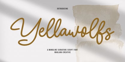 Yellawolfs is a casual handwritten script font. With bold consist mono-line stroke, fun character with a bit of ligatures and alternates. To give you an extra creative work. Yellawolfs font support multilingual more than 100+ language. This font is good for logo design, Social media, Movie Titles, Books Titles, a short text even a long text letter and good for your secondary text font with sans or serif. Make a stunning work with Yellawolfs font. Cheers, Maulana Creative
 - Galber by Craft Supply Co,
$20.00 Introducing Galber - Compressed Sans Serif: A commanding typeface that captures the eye with its bold, condensed design. With its impactful lines and modern allure, Galber adds a strong touch to your projects. Elevate your designs with Galber's assertive style, making a striking statement that simply can't be ignored. This typeface is ideal for greeting card, packaging, brand identity, poster, or any purpose to make your design project look eye catching and trendy. Feel free to play with this typeface!
 - Hollestik by Maulana Creative,
$15.00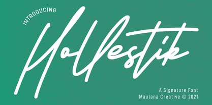 Hollestik is a casual signature font. With mono-line stroke, slanted and fun character with a bit of ligatures and lowercase alternates. To give you an extra creative work. Hollestik font support multilingual more than 100+ language. This font is good for logo design, Social media, Movie Titles, Books Titles, a short text even a long text letter and good for your secondary text font with sans or serif. Make a stunning work with Hollestik font. Cheers, MaulanaCreative
 - Baby Algutta by IM Studio,
$19.00 Baby Algutta is a modern, handwritten and modern calligraphy font. The shape is modern and unique and the writing style is very natural. The Baby Algutta features a varied baseline, smooth lines, beautiful glyphs, and amazing alternatives. Hand-drawn design elements allow you to create many beautiful typographic designs in an instant such as branding, web and editorial design, prints, crafts, quotes, It's great for logos, wedding invitations, romantic cards, labels, packaging, name spelling, and more. Thank you.
 - Salacious by PizzaDude.dk,
$18.00 Salacious is my soft/rough all-caps font, inspired by both comics and grafitti. The weight and width of the letters varies a bit. Not in a disturbing way, but more in a lively and organic way. I've added 5 (slightly) different versions of each letter (which automatically cycles as you type!) The letter shapes are a bit rough, due to the fact that they are handmade, and all corners are rounded, which gives a nice soft look!
 - Dear Rae, Love Dad by Outside the Line,
$19.00 Dear Rae, Love Dad is a modern calligraphy font drawn by hand using ink and a folded nib dip pen on rough watercolor paper. Best used in Open Type apps, it has automatically changing alternates. It is upright, dramatic, and personal. It is named Dear Rae, Love Dad because who wouldn't like to get a letter signed, Love Dad. There is also a freebie font of several blobs and some hearts. Because it just seems right.
 - Vedacity by Konstantine Studio,
$18.00 Vedacity is a sophisticated glamorous script font, with modern calligraphy style that you'll hard to resist like the nowadays trend. Inspired from the society behaviour who always craving for the trends but still want to show something different yet special from it. Yes, that's why it came with a bunch of Stylistic Alternates of each letters because everybody loves a choices, in a pack. And also the Ligatures for every double letters to get the seamlessly handwritten looks.
 - Lineare by Tipo,
$35.00 Lineare Serif is an attempt at solving the difficult problem of creating readable text type, seeking new ways to provide readers with some pleasure and rest as they walk along each line, creating a space where there is harmony between man and the printed form. Asymmetric serifs both in their height and width, medium contrast in the stroke, and balanced upward and downward movements make “Lineare Serif” a typeface featuring both attitude and aptitude for editorial purposes.
 - Oblonga by Eurotypo,
$28.00 Oblonga shows thin, elegant lines. The continuity of the trace is only suggested through the curves of the letters, a soft effect of bonding that maintains the identity of each character. Oblonga is an Art-Déco font proposed in a modern key, a revival performed without aggression. More than three hundred glyphs (regular and Italic) that ensure legibility in Central-European and Slavic languages, enriched by some appropriate discretionary ligatures that enhance the charme of a time gone away.
 - Juggling Squad by Bogstav,
$19.00 The name of the font is from the hilarious movie "21 Jump Street" - and that is where the similarity ends. While the movie is quite funny, it is also super goofy! I can't say the same about the font, because terms like organic and organic comes to my mind. Strange, yes! And I have really no good reason for this naming, other that its an odd way to tribute this one of my all time favourite comic movies! :)
 - Boyflare by Maulana Creative,
$12.00 Boyflare is a cursive handwritten script font. With bold mono-line stroke, fun character with a bit of ligatures and alternates. To give you an extra creative work. Boyflare font support multilingual more than 100+ language. This font is good for logo design, Social media, Movie Titles, Books Titles, a short text even a long text letter and good for your secondary text font with sans or serif. Make a stunning work with Boyflare font. Cheers, Maulana Creative
 - Oldion by Locomotype,
$19.00 Oldion is a captivating display font, draws inspiration from the boundless realms of science fiction and modern technology. With its distinctive and futuristic accents adorning each letter, Oldion breathes life and dynamism into your projects. Available in both regular and rounded styles, infuses a touch of innovation and intrigue into your designs. Oldion is your ideal choice for a wide range of creative applications, from commanding movie posters and attention-grabbing headlines to captivating packaging and distinctive logotypes.
 - TA Bankslab Shadow by Tural Alisoy,
$40.00 TA Bankslab Shadow I created the font in 10 styles. 7 weight from Thin to Extra Black, an Outline, Shadow, and Art Nouveau. The Art Nouveau style was inspired by the texture in the background used for the text on the building. The texture I applied to capital letters adds beauty to the font. If you like the font feel free to use it or simply let me know if your current alphabet doesn't support this font.
 - Nocken by skillyas studio,
$15.00 Nocken is a sleek and modern sans-serif font that exudes elegance and simplicity. With its clean lines and minimalistic design, Its versatility allows it to be used for a wide range of projects, from branding and logo design to web and print materials. Nocken's balanced proportions and subtle details make it highly legible and visually appealing, ensuring that your message will be conveyed with clarity and style. to see more our work visit our website: skillyasstudio.com
 - Shaliya by Juliawan90,
$15.00 Shaliya is a beautiful font. This font perfectly made to be applied especially in logo, and the other various formal forms such as invitations, labels, logos, magazines, books, greeting / wedding cards, packaging, fashion, make up, stationery, novels, labels or any type of advertising purpose. We highly recommend using a program that supports OpenType features and Glyphs panels like many of Adobe apps and Corel Draw, so you can see and access all Glyph variations. Happy Designing!
 - Maryam by Outras Fontes,
$24.00 Maryam is an Outras Fontes type family designed by Ricardo Esteves Gomes. With moderate contrast, these fonts have elegant and very legible forms even in small x-height sizes. There are more then 70 ligatures in each font, providing a lot of letterform variations that make this type family looks like a real handwriting on a page. It is currently available in two versions (Regular and Alternate) that you can combine with each other as you wish.
 - Ponpewd Signature by Maulana Creative,
$11.00 Ponpewd is a Signature Script Brush Font. With bold mono-line stroke, slant and fun character with a bit of ligatures. To give you an extra creative work. Ponpewd font support multilingual more than 100+ language. This font is good for logo design, Social media, Movie Titles, Books Titles, a short text even a long text letter and good for your secondary text font with sans or serif. Make a stunning work with Ponpewd font. Cheers, MaulanaCreative
 - Prumo Display by DSType,
$40.00 Prumo is a new type system, based on a unique skeleton that flows, like a pendulum, from high contrast to low contrast. It’s a sort of typographic journey, from the 18th century typefaces to the 19th century slab serif typefaces, gathering information from the Scotch Roman fonts on its journey. Prumo is a type family with classic proportions that takes advantage of the recent type production technology while looking carefully at the most important historical references.
 - The VTC-RoughedUp font by Vigilante Typeface Corporation (VTC) stands out as a distinctive typeface that captures the essence of raw, gritty, and unrefined aesthetics. The design embodies a rugged ch...
- Leokadia Deco, crafted with precision and an eye for elegance by Gophmann A.L., stands as a vibrant testament to the marriage between art deco sensibilities and contemporary design techniques. This f...
- The essence of the Graffiti font mirrors the vibrant, expressive, and sometimes rebellious spirit of street art from which it draws inspiration. This type of font captures the raw energy and boldness...
- Teeshirt by Typodermic,
$11.95 Hey there, so you want to look like a walking throwback to the 1980s? Well, lucky for you, Teeshirt is here to help you achieve that coveted slovenly appearance. If you’re looking for a typeface that screams, “I don’t care” then Teeshirt is your new best friend. It’s designed to mimic vintage t-shirt lettering, so you can rock that “I just rolled out of bed and put on the first thing I found on my floor” look. And if you’re worried about being too uniform with your letters, fear not! Teeshirt has got you covered with letter pair ligatures. Because who wants to look like they put any effort into their appearance, right? And if you’re feeling adventurous and want to shake things up a bit, you can always disable the “standard ligatures” feature in your application. Teeshirt comes in two styles: Regular and Pressed. The bouncy Regular style will make it look like your letters are ready to jump right off your shirt, while the orderly Pressed style will give you that crisp, just-ironed look (although let’s be real, who has time for ironing?). So what are you waiting for? Embrace your inner sloth and give Teeshirt a try. Because who needs effort and a polished appearance when you can look like a hot mess instead? Most Latin-based European writing systems are supported, including the following languages. Afaan Oromo, Afar, Afrikaans, Albanian, Alsatian, Aromanian, Aymara, Bashkir (Latin), Basque, Belarusian (Latin), Bemba, Bikol, Bosnian, Breton, Cape Verdean, Creole, Catalan, Cebuano, Chamorro, Chavacano, Chichewa, Crimean Tatar (Latin), Croatian, Czech, Danish, Dawan, Dholuo, Dutch, English, Estonian, Faroese, Fijian, Filipino, Finnish, French, Frisian, Friulian, Gagauz (Latin), Galician, Ganda, Genoese, German, Greenlandic, Guadeloupean Creole, Haitian Creole, Hawaiian, Hiligaynon, Hungarian, Icelandic, Ilocano, Indonesian, Irish, Italian, Jamaican, Kaqchikel, Karakalpak (Latin), Kashubian, Kikongo, Kinyarwanda, Kirundi, Kurdish (Latin), Latvian, Lithuanian, Lombard, Low Saxon, Luxembourgish, Maasai, Makhuwa, Malay, Maltese, Māori, Moldovan, Montenegrin, Ndebele, Neapolitan, Norwegian, Novial, Occitan, Ossetian (Latin), Papiamento, Piedmontese, Polish, Portuguese, Quechua, Rarotongan, Romanian, Romansh, Sami, Sango, Saramaccan, Sardinian, Scottish Gaelic, Serbian (Latin), Shona, Sicilian, Silesian, Slovak, Slovenian, Somali, Sorbian, Sotho, Spanish, Swahili, Swazi, Swedish, Tagalog, Tahitian, Tetum, Tongan, Tshiluba, Tsonga, Tswana, Tumbuka, Turkish, Turkmen (Latin), Tuvaluan, Uzbek (Latin), Venetian, Vepsian, Võro, Walloon, Waray-Waray, Wayuu, Welsh, Wolof, Xhosa, Yapese, Zapotec Zulu and Zuni.
 - Robur by Canada Type,
$24.95 It shouldn't be a surprise to anyone that these letter shapes are familiar. They have the unmistakable color and weight of Cooper Black, Oswald Cooper's most famous typeface from 1921. What should be a surprise is that these letters are actually from George Auriol's Robur Noir (or Robur Black), published in France circa 1909 by the Peignot foundry as a bolder, solid counterpart to its popular Auriol typeface (1901). This face precedes Cooper Black by a dozen of years and a whole Great War. Cooper Black has always been a bit of a strange typographical apparition to anyone who tried to explain its original purpose, instant popularity in the 1920s, and major revival in the late 1960s. BB&S and Oswald Cooper PR aside, it is quite evident that the majority of Cooper Black's forms did not evolve from Cooper Old Style, as its originators claimed. And the claim that it collected various Art Nouveau elements is of course too ambiguous to be questioned. But when compared with Robur Noir, the "elements" in question can hardly be debated. The chronology of this "machine age" ad face in metal is amusing and stands as somewhat of a general index of post-Great War global industrial competition: - 1901: Peignot releases Auriol, based on the handwriting of George Auriol (the "quintessential Art Nouveau designer," according to Steven Heller and Louise Fili), and it becomes very popular. - 1909-1912: Peignot releases the Robur family of faces. The eight styles released are Robur Noir and its italic, a condensed version called Robur Noir Allongée (Elongated) and its italic, an outline version called Clair De Lune and its condensed/elongated, a lined/striped version called Robur Tigre, and its condensed/elongated counterpart. - 1914 to 1918: World War One uses up economies on both sides of the Atlantic, claims Georges Peignot with a bullet to the forehead, and non-war industry stalls for 4 years. - 1921: BB&S releases Cooper Black with a lot of hype to hungry publishing, manufacturing and advertising industries. - 1924: Robert Middleton releases Ludlow Black. - 1924: The Stevens Shanks foundry, the British successor to the Figgins legacy, releases its own exact copies of Robur Noir and Robur Noir Allongée, alongside a lined version called Royal Lining. - 1925: Oswald Cooper releases his Cooper Black Condensed, with similar math to Robur Noir Allongée (20% reduction in width and vectical stroke). - 1925: Monotype releases Frederick Goudy's Goudy Heavy, an "answer to Cooper Black". Type historians gravely note it as the "teacher steals from his student" scandal. Goudy Heavy Condensed follows a few years later. - 1928: Linotype releases Chauncey Griffith's Pabst Extra Bold. The condensed counterpart is released in 1931. When type production technologies changed and it was time to retool the old faces for the Typositor age, Cooper Black was a frontrunning candidate, while Robur Noir was all but erased from history. This was mostly due to its commercial revival by flourishing and media-driven music and advertising industries. By the late 1960s variations and spinoffs of Cooper Black were in every typesetting catalog. In the early- to mid-1970s, VGC, wanting to capitalize on the Art Nouveau onslaught, published an uncredited exact copy of Robur Black under the name Skylark. But that also went with the dust of history and PR when digital tech came around, and Cooper Black was once again a prime retooling candidate. The "old fellows stole all of our best ideas" indeed. So almost a hundred years after its initial fizz, Robur is here in digital form, to reclaim its rightful position as the inspiration for, and the best alternative to, Cooper Black. Given that its forms date back to the turn of the century, a time when foundry output had a closer relationship to calligraphic and humanist craft, its shapes are truer to brush strokes and much more idiosyncratic than Cooper Black in their totality's construct. Robur and Robur Italic come in all popular font formats. Language support includes Western, Central and Eastern European character sets, as well as Baltic, Esperanto, Maltese, Turkish, and Celtic/Welsh languages. A range of complementary f-ligatures and a few alternates letters are included within the fonts.
 - The Matrix font, inspired by the iconic science fiction movie "The Matrix," echoes the digital rain imagery synonymous with the film's unique visual style. Picture those cascading green characters, r...
- Madison Ave. by Funk King,
$10.00 The Madison Ave. family started from Madison Ave. at Fontstruct.com. As my most downloaded font, this was an easy, although not necessarily logical choice to make – regarding taking an existing free font and attempting to offer it for purchase. The font is very basic and simple in its layout, but has achieved popularity over at Dafont with almost 80,000 downloads with its cool, understated nature and inherent sophistication. The original Madison Ave. is now 95 Madison Ave. A couple of glyphs have changed from the original, but mostly the set is the same. The big news here is the availability of multiple variations on the original. Ninety-five refers to the filter settings used to achieve the faint cross lines in the font. The sequence 95-100 provides a gradual fade to solid effect when used together. The other versions use variations on the filter settings that allow each its own distinctive flavor, while at the same time maintaining inherent characteristics of the original. Ninety-five is now joined by 55, 75, 97, 99, 100, 102, 105, 155, 175, 201, 202, and 275. 100 is the solid version which doesn’t contain the trademark lines found in 95. In 95-99, the line width varies to achieve subtle effects. 50 and 85 are distorted by reducing the filter settings in a somewhat minimizing fashion. In 102-205, these are distorted by increasing the filter settings above the normal which is what 100 represents. While some of the effects are extreme and challenge the legibility of text, these can be fun or edgy. They offer a cohesion that can be used to advantage for different projects that require the use of a modern font family.
 - Hispania Script by HiH,
$10.00 Hispania Script is a distinctive and distinctly nineteenth century script. It was released by Schelter & Giesecke of Leipzig, Germany around 1890. Particularly noteworthy are the sharply-pointed legs of the upper case ‘K’ & ‘R’ that seem to be characteristic of the period. Similar strokes, often with a slight curve, may be seen in typefaces like Alt-Romanish and Tinteretto by Schelter & Giesecke, Artistic and Lateinsch by Bauer and Berthold and the poster lettering of Edward Penfield. The angle of this script (approximately 24 degrees) and the sharp delicate points must have made the manufacture of this face in metal type a challenge. The resulting type was probably quite fragile and subject to accidental damage. Additionally, the sharp points would be subject to wear. With digital type, these concerns are eliminated. As far as I know, no one has ever dropped a digital letter on the floor. Nonetheless, creating a digital outline for a typeface like Hispania Script, with many crossing strokes, can be quite time-consuming. Even with an accurate scan of a good quality original, it is usually necessary to construct each crossing stroke separately and then remove the overlap in order to obtain a sharp and convincing intersection. Steep internal angles are often defined with two points, rather than one, to minimize ink or toner fill that can muddy the rendering in smaller sizes. Like all formal scripts, Hispania Script is always useful for announcements and invitations. However, the distinctiveness of of this design strongly suggests that there are other applications that may benefit from its use. Step outside the box and try it in some unexpected places. It is the unexpected that often draws a person’s eye.
 - FS Pimlico by Fontsmith,
$80.00 Born in the 70s Personal influences are unavoidable in type design and usually find their way through into finished fonts. At Fontsmith, one period in particular provides inspiration, according to FS Pimlico designer, Fernando Mello. “Jason and Phil have always known that I’m very into the visual language of the 70s. I know that Jason shares my love of the 70s and Phil will sometimes admit to being a fan, too. I think that’s the reason they were both so supportive in the development of this font. “And, of course, we all share an interest in good-humoured and intelligent design. We like to think it’s a Fontsmith characteristic.” Back from black FS Pimlico started in an unusual place: with a tubby, penguin-like lowercase “a” that Fernando Mello had been sketching. From “a” grew the rest of the alphabet – a bubbly, fat, friendly family with a brush-written quality that became FS Pimlico Black. The black weight certainly isn’t the normal starting point for creating a regular and bold weight, but Fernando pressed on, driven by a glut of influences: brush-writing; Letraset and early digital systems catalogues; the type of Herb Lubalin and Tony di Spigna; 70s clothes and vinyl; and 70s revival disco nights in London’s Pimlico and Vauxhall. Natural or flourished Not often do fonts come along that seem to span the ages. FS Pimlico is at home in an office environment providing a fresh clear identity in communications or providing text that’s clear and easy to read. But it likes to party, too, 70s style. With the OpenType features switched on, a designer can totally change the look of their work, and create point-of-sale, headlines and titles that stand out and get noticed.
 - Bright Flicks by Nathatype,
$29.00 Bright Flicks is a delightful script font that embodies a playful and whimsical spirit. With its rounded letterforms and charming swings at the ends of some letters, this typeface adds a joyful and lively touch to your designs. The defining feature of this script lies in its rounded shape, which gives the font a friendly and approachable appearance. The letterforms flow smoothly, creating a sense of fluidity and movement. Each letter flows into the next, creating a harmonious and lively composition. The uppercase letterforms are crafted with precision and creativity, maintaining legibility while embracing the playful nature of the font. Adding to its character are the swings at the ends of select letters, adding a touch of playfulness and spontaneity. Bright Flicks captures the essence of creativity and imagination. The rounded shapes evoke a sense of warmth and friendliness, while the swings at the ends of certain letters add a touch of whimsy and fun. This font brings a sense of joy and positive energy to your designs. You can also enjoy the various features available in this font. Features: Stylistic Sets Ligatures Multilingual Supports PUA Encoded Numerals and Punctuations Bright Flicks fits in logos, branding materials, packaging, and any design project that aims to evoke a sense of cheerfulness and creativity. Whether you're working on invitations, greeting cards, posters, or any project that needs a touch of playfulness, this font will bring a vibrant and lively vibe. Find out more ways to use this font by taking a look at the font preview. Thanks for purchasing our fonts. Hopefully, you have a great time using our font. Feel free to contact us anytime for further information or when you have trouble with the font. Thanks a lot and happy designing.
 - DT Decopolis Hotel by Dragon Tongue Foundry,
$9.00 DT Decopolis Hotel is a sharply stylised Sans Serif Art Deco font, crafted with a wide oval, dissected and contrasted against precision straight edges and pixel sharp corners. The Capitals have a raised centre line, aligning with the tall lowercase height. A nostalgic looking Art Deco font referencing the 1920's to 1940's during the Golden age of Hollywood, Art Moderne and the rise of luxury items from 100 years ago. Totally geometric with great variations in glyph widths designed to attract attention and create Headlines. DT Decopolis Hotel is a display font with clean simple lines, intended to create a sleek elegance that displays the sophistication of a by-gone era. With both upper and lower-case, this font is Great for Logotypes, Headlines, Strap-lines and smaller descriptive text to give that authentic Art Deco look and feel. Evoking the Art Deco Era of the Great Gatsby, glamorous Hotels and Movie Theatres of the period. Packed with over 500 glyphs, you will enjoy the uniqueness of this typeface! Inspired by 1920's Art Deco, Artisual Deco is a 2020's celebration dedicated to the hundred-year-old history of geometric design. This retro typeface will be the perfect fit for your logo designs or graphic project. DT Decopolis Hotel is a perfect choice for designs with a luxurious but minimalist look and feel. Useful in headlines, logos or product packaging it will match perfectly against sloped script fonts. The typeface works perfectly in both All-Caps or full Upper and lower case. Use with Contextual/Standard Ligatures turned on when possible. to allow the letters to match their neighbours. This will also enable larger Caps for the first letter of a new sentence.
 - Franzi by Wannatype,
$26.00 The new sans-serif Franzi typeface family – as neutral as can be, but at the same time individual and striking. Its unmistakable character lies in the detail, with no effect pushing itself to the fore. As a wide-running typeface with a relatively large x-height, the typeface family is perfectly suited to small text sizes but, with its elegant details, it leaves nothing to be desired in display applications either. Originally designed with constructed, often rectangular elements, Franzi has gradually been rounded during the development process and is now less hard in order to guarantee optimal legibility. A total of 20 well-developed fonts are available: 10 line thicknesses from hairline to black, each of which can be upright and italic. The italics are softly and elegantly drawn, while the upright characters appear much more severe. The design appeal reveals itself in the two-storey ‘a’ – a tribute to legibility in body copy; however, for those who prefer the geometric in applications, an alternative single-storey ‘a’ is also available. All styles have small caps, superscript and subscript lowercase letters, lining, non-lining and small caps figures, fractions as well as several ligatures, alternative fonts, symbols and arrows. The Latin uppercase letters are also available as discreet swash variants. In addition to the extended Latin alphabet, the typeface family also includes the complete Greek, Cyrillic and International Phonetic Alphabet IPA. Franzi was created as a further development of an order to produce a sign for a therapy practice in Vienna’s Franz-Hochedlinger-Gasse – hence the name, which is more common as an abbreviation for Franziska than as a diminutive for the male name Franz: Franzi is therefore a hybrid typeface name which has female tendencies.
 - FS Pimlico Variable by Fontsmith,
$249.99Born in the 70s Personal influences are unavoidable in type design and usually find their way through into finished fonts. At Fontsmith, one period in particular provides inspiration, according to FS Pimlico designer, Fernando Mello. “Jason and Phil have always known that I’m very into the visual language of the 70s. I know that Jason shares my love of the 70s and Phil will sometimes admit to being a fan, too. I think that’s the reason they were both so supportive in the development of this font. “And, of course, we all share an interest in good-humoured and intelligent design. We like to think it’s a Fontsmith characteristic.” Back from black FS Pimlico started in an unusual place: with a tubby, penguin-like lowercase “a” that Fernando Mello had been sketching. From “a” grew the rest of the alphabet – a bubbly, fat, friendly family with a brush-written quality that became FS Pimlico Black. The black weight certainly isn’t the normal starting point for creating a regular and bold weight, but Fernando pressed on, driven by a glut of influences: brush-writing; Letraset and early digital systems catalogues; the type of Herb Lubalin and Tony di Spigna; 70s clothes and vinyl; and 70s revival disco nights in London’s Pimlico and Vauxhall. Natural or flourished Not often do fonts come along that seem to span the ages. FS Pimlico is at home in an office environment providing a fresh clear identity in communications or providing text that’s clear and easy to read. But it likes to party, too, 70s style. With the OpenType features switched on, a designer can totally change the look of their work, and create point-of-sale, headlines and titles that stand out and get noticed. - Erotique by Zetafonts,
$39.00 Designed by Cosimo Lorenzo Pancini and Mariachiara Fantini with the help of Solenn Bordeau, Erotique is an evolution of the original design by Zetafonts for Lovelace, that challenges its romantic curves with the glitchy and fluid aesthetic of trans-modern neo-brutalist typography. The seductive "evil serif" look of the Pheimester-like Oldstyle letter shapes is made edgier by the quirky connections and unexpected calligraphic twirls that marry digital distortions to traditional penmanship. Sensuous but sharp, Erotique speaks the language of teasing, and unrequited love, over-the-top and restrained like a show of Japanese Kinbaku, and beautifully heartbreaking like a friendzone valentine. Designed for display use, this high-contrast serif typeface is ready to take center stage in projects where a subtle elegance and an edgy, aggressive touch are required. For branding use it is paired by a Erotique Ornaments, a set of interlocking patterns based on the font letter-shapes, allowing for striking packaging, digital and ambient design. For editorial use it can add a sharp sensuality to logos and titles thanks to an impressive array of alternate glyphs, subtle ligatures and a set of whiplike fleurons, collected in the Erotique Flourishes pack. The typeface has been developed in the regular, medium and bold weight plus a monoline version, all of which have been paired with an Alternate version to give immediate access the more exotic alternate letterforms. With a character set of over five hundred glyphs, all the the weights of Erotique cover almost 200 languages using extended latin, and include advanced Open Type features as Stylistic Alternates, Standard and Discretionary Ligatures, Positional Numerals, Swash and Case Sensitive Forms. If you are a typeface lover, be warned: Erotique could be your fatal attraction!
 - Turbinado by Aerotype,
$48.00 The ten font Turbinado™ Set was designed to be clear and easy to read with a friendly personality, ideal for advertising and packaging in both text and display settings. Included are three weights of brushed casual script, each with a dry version, two condensed all caps faces, another hand printed caps face and an Elements package with 100 brushed elements that include swashes, botanicals, shells, arrows, repeatable patterns and a few other doodads that play well with the fonts. Like our most recent release Fave, all of the fonts use the OpenType standard ligature feature to automatically differentiate consecutive lowercase letters and numbers, using separate glyphs rather than a single ligature so they can be set on a curve or colored separately, etc. They also automatically differentiate like characters that are separated by another letter when standard ligatures is enabled. The script fonts have alternate characters like swash glyphs for ends of words and a few ligatures too; single crossbar to unite the At and Att letter combinations etc. The two condensed faces also have a third set of less uniform glyphs that can be used to create a more quirky, fun and bouncy effect (see the ‘she sells seashells’ graphic above) when the discretionary ligature feature is on. The script fonts have 10+ lowercase t (and double t) crossbar alternates that can be selected from the OpenType glyph table manually, or you can enable the contextual alternates feature to automatically insert a bigger crossbar as the surrounding letters allow throughout a text box or document. Hello? Are you still there? :) And for those intrepid typographers who would rather fashion their own lowercase t to custom fit a specific design, all of the lowercase t ascenders and crossbars are also available separately in the glyph table, and can be combined manually.
 - Lapis Pro by Canada Type,
$29.95 Lapis was Jim Rimmer's venture into a territory he'd earlier explored with his Lancelot and Fellowship faces. This time he stayed much longer, dug pretty deep, and had plenty of fun in there. The end result is the kind of mosaic of influences only a guy like Jim could consider, gather, manage and apply in a way that ultimately makes sense and works as a type family. On the surface Lapis seems like something that can be billed as what Jim would have called an "advertising text face". But under the hood, it's a whole other story. On top of the calligraphic, nib-driven base Jim usually employed in his faces, Lapis shows plenty of typographic traits from a variety of genres, from Egyptian to Latin, from blackletter angularity to Dutch-like curvature, with an overall tension even reminiscent of wood type. There are some Goudy-informed shapes that somehow fit comfortably within all this. Then it's all strung together with a mix of wedged, tapered and leaning serifs, placed with precision to reveal expert spontaneity and a great command of guiding the forms through counterspace. In the fall of 2013, the Lapis fonts were scrutinized and remastered into versatile performers for sizes large and small. The three weights and their italic counterparts have been refined and expanded across the board to include small caps, alternates, ligatures, ordinals, case-sensitive forms, six kinds of figures, automatic fractions, and a character set that covers an extended range of Latin languages. Each of the Lapis Pro fonts contains over 760 glyphs. For more details on the fonts' features, text and display specimens and print tests, consult the Lapis Pro PDF availabe in the Gallery section of this page. 20% of Lapis Pro's revenues will be donated to the Canada Type Scholarship Fund, supporting higher typography education in Canada.
 - Mifelin by Nathatype,
$29.00 Mifelin is a well-defined serif font. Serifs are small ornaments that appear at the ends of the lines of letters, giving them a neater, more structured appearance. The well-defined serifs in this font create an elegant and professional impression. This serif font has a balanced and harmonious proportion of height and width. The proportions ensure that each letter looks proportional and easy to read. The line of letters in this font has a smoothness and clarity that distinguishes each character. Sharp, clear lines give off a professional and organized impression. This clarity also helps strengthen the legibility of the font in a variety of design settings. This serif font with an elegant look has a classic style that remains relevant in modern designs. Despite having strong roots in traditional typographic design, this font is able to adapt to more contemporary design contexts and give it a touch of elegance and class. Even though it has a touch of elegance, this serif font still prioritizes good readability. Each letter is carefully designed to ensure that the text remains easy to read and understand for the reader. Prominent readability is the hallmark of this font. Enjoy the various features available in this font. Features: Stylistic Sets Ligatures Multilingual Supports PUA Encoded Numerals and Punctuations Mifelin is suitable for any designs that require a formal and official impression. This font is can be used in the design of books, magazines, reports, formal invitations, brand identities, and other design projects that require elegance and professionalism. Find out more ways to use this font by taking a look at the font preview. Thanks for purchasing our fonts. Hopefully, you have a great time using our font. Feel free to contact us anytime for further information or when you have trouble with the font. Thanks a lot and happy designing.
 - Coomeec by Linotype,
$29.99 Although Andi AW. Masry designed his Coomeec typeface with one eye on comic books, this is more than just another cartoon font. Even in our short profile of the font below, we're sure you'll find enough to be surprised by the calligraphic aesthetic and the wide range of potential uses of Coomeec. Typography had been one of Andy AW. Masry's hobbies before he turned professional in 2008 and formed his own agency in Jakarta in Indonesia. The former construction engineer had already spent many hours of his leisure time in following his pastimes of designing, photography and Latin typography. Fascinated by the close interaction between text and image in comic books, one of his first projects was the development of his font Coomeec™. The condensed letters of Coomeec seem to have more in common with a calligraphic brush typeface than a more conventional cartoon font. With the characteristic line forms of a brush font, the not unextensive variations in line thickness and numerous small embellishments to the glyphs, Coomeec can be used to enhance your projects with animated effects. You can achieve this not just in the larger font sizes; the font is also very legible in small sizes thanks to its large x-height. There are certain unusual letter forms, such as that of lowercase 'g', 's' and uppercase 'Y', that provide Coomeec with a touch of the exotic. As Coomeec has numerous character alternatives, you can use it not only to create diverse designs but also to ring the changes with the character of the text itself. There are variants for most lowercase letters, some of which exhibit only minor differences, such as the lack of a curlicue on the 'b', a modified downstroke on the 'h' and an elongated base for the 'k'. In the case of other letters, such as the 'q' and the 'r', there are significant disparities between variants. The uppercase characters are also available in a lively swash style with significantly extended terminals. Among the range of characters of Coomeec are oldstyle and lining figures designed for proportional and tabular setting. All alternatives are available in the form of the corresponding OpenType versions. Coomeec comes in two weights; Regular and Bold, each with its Italic version. The form of the slightly inclined Italic characters is identical to that of their upright counterparts with the exception of the lowercase 'f', which has an ascender in its Italic version. As an OpenType Pro font, the glyphs available for Coomeec ensure that it can be used to set not only western European but also central European texts. Coomeec is not just at home when used to set headlines. The excellent legibility of this individual and vibrant typeface means that it's also ideal for setting shorter texts. The various alternative letters provide the designer with the opportunity to vary the textual appearance, and to choose between creating a more formal or more light-hearted effect. Coomeec is not only available in an OpenType version but is also obtainable as a web font, so that you can employ its exotic features to good effect when creating internet pages.
 - Gorod.Volgograd by FontCity,
$15.00The general idea: Can You imagine to yourself, what the hydroelectric power station is? The building of this electricity production foundry is half hidden under the water, but the visible above-water part astonishes your sense. It is a construction almost 1,5 km length dammed out the powerful river stream. Besides thousand of electricity conduction lines supports it bears also the highway and the railroad. From a faraway distance the train seems like a caterpillar that has climbed up the stout tree. There are also the navigable sluices, the flood channels and other erections. The idea of this typeface outlines arrived to the authors exactly on the viewing platform, under the impression of the waterfalls, which are escaping from the dam womb, falling from almost 50 meters altitude and becoming white-haired during this flight. Release: in the form of "gorod.Volgograd" font with the one style. We work with other styles now and sometime we will be very glad to introduce the Bold and Italic styles to You. We should explain the font name meaning. "Gorod" is "city of" in Russian and Volgograd is the old, big and famous Russian city. The Volga hydroelectric power station of a name of XXII congress of the CPSU caused the Volgograd sea formation. It expands of 14 km width and more than 600 km along the Volga river-bed. But HEPS isn't the sole Volgograd sight. There are many interesting places here. The most known tourist sight, the visit card of Volgograd is the Mamaev Hill. Being here You can see almost all 100 kilometers of city length. Due to its geographical position, Mamaev Hill has got a great importance during the Great Patriotic War (1941-1945). It became and still is the Main Height of Russia. Soviet people have built the huge stately memorial ensemble here. There are many other witnesses of the heroic past of Volgograd: the Alley of Heroes, the Perished Fighters Square, the Soldiers Field and others. The line of tank turrets is stretched out along all town not far from Volga bank. It marks the line, where fascist troops was stopped in 1943. It is very amazingly when You dive under the ground on a usual tram. Volgograders have built a few underground station for the high-speed tramway. The river tram need a quarter of an hour to get an island in the Volga. And You need the same time to walk across the river station. The Volga-Don navigable channel starts from Volgograd. There are planetarium, circus, some theatres, many museums in Volgograd. One of football matches of Euro-2004 qualifying round took a place in the "Rotor" stadium in Volgograd. Volgograd holds the longest - above 50 km - park in the world. Its avenues, squares, embankments are beautiful, Volgograd central districts are built in unique architecture style called the Stalin Empire. You can enjoy fountains, parks, attractions, water-pools and other Volgograd sights. If You visit Volgograd once You'll never forget it. You can read about the ancient history of Volgograd city on the Tsaritsyn font page. Also we plan to create the Stalingrad font and give You a short story about another period in Tsaritsyn-Stalingrad-Volgograd history. - FM Bolyar TypeCraft by The Fontmaker,
$29.00 A super font family mastered to an unparalleled level of precision, Bolyar TypeCraft is a collection multiple textured styles that represent historical printing techniques. A proud member of our successful Bolyar lineage this unique type family provides unlimited options for your creativity and is quite able to satisfy every typographic taste. If you are addicted to classic vintage style, then you could easily use Bolyar TypeCraft for almost any project of desire - from letterheads, logos and catchy headlines to elegant packaging, book covers and wine labels. Alternates, Swashes and Ligatures will help you customize almost every single letter and fit perfectly to your artwork. Bolyar TypeCraft provides a broad range of advanced typographical features: Multiple subfamilies each packing the two classic Bolyar styles - Regular (N) and Ornate (O). Five weights per style ranging from thin (100) to black (900) with full multilingual support for all Latin based languages as well as Cyrillic. A 1000+ glyphs per weight including three multilingual stylistic sets, swash designs and useful discretionary ligatures. Sub- and superscript basic Latin and Cyrillic glyphs as well as figures. Two positional models for lowercase accessed as OpenType case sensitive forms - baseline (default) or vertical centering. Contextual alternates and special stylistic set with different contour roughness exclusively developed for Bolyar Rough subfamily. A multifunctional Bolyar Shadow family witch can be flawlessly paired with any of the sub-family styles provided. Check out some great examples of Bolyar TypeCraft in use by the Labelmaker