10,000 search results (0.022 seconds)
  1. Selfish - 100% free
  2. Automania - Unknown license
  3. Slang King - 100% free
  4. Marquee Moon - Unknown license
  5. 687-CAI978 - Personal use only
  6. Cinquenta Mil Meticais - Unknown license
  7. AB Engraved - 100% free
  8. LT Nutshell Library - Personal use only
  9. Twist n Curves - Personal use only
  10. Dr.Po GothicRu - Unknown license
  11. Denne Angel - Personal use only
  12. Raydiate (BRK) - 100% free
  13. Raslani Ancient Script - Unknown license
  14. boards - Unknown license
  15. KAVIVA - Unknown license
  16. Koch-Antiqua Zier - Personal use only
  17. Bold Ugly Sweater - 100% free
  18. Gambino by Monotype, $15.99
    Childlike, sure; utterly affable, yes, but ultimately actually very cool. Yup, that’s Gambino. This chalky, super textured, semi connected script is a kooky playground pal and a grown-up technically savvy typeface all rolled into one. Upright yet tumbling, these simple, crayon-like letterforms are a delight.
  19. Monica by FSD, $39.00
    Geometric stencil font completely based on curved lines. Soft techno style.
  20. Nicomedia by Artegra, $29.00
    Nicomedia is a modern sans serif type family with a contemporary, technical look that reflects the high-tech industrial age that we're living in. From thin to black, it contains 18 fonts in 9 weights with their true italic counterparts. With 529 glyphs, it offers support for all the languages with Latin script. When it comes to OpenType features it has stylistic alternates (for a, g, l, 0, 1), tabular lining, ligatures, superscript, subscript, denominators, numerators and fractions. It's perfect to create engaging brands, ads, websites, apps, animations and user interfaces.
  21. D3 Labyrinthism katakana - Unknown license
  22. Crowbar by Hanoded, $15.00
    Technically a crowbar is a straight metal rod used for digging. The tool I had in mind when I named this font is called a jemmy or pry bar, but I guess I liked the name crowbar better. Crowbar font, like its namesake, is a very useful tool: its brush-like appearance fits any design, especially if you are aiming for the ‘scary’ look. Comes with a toolbox full of diacritics too!
  23. Construct by Breitenlauf, $20.00
    Construct is a technically based headline font that can also be used as body text. The font has some new ligatures that are automatically applied. Construct particularly suitable for headlines which should have a urban and technical character.
  24. Pilatus by Milan Rohrer Studio, $20.00
    The Pilatus font is a sans-serif standard technical font based on the ISO 3098 standard. The standard was developed for a good reading when reducing technical plans on films. The font follows clear rules and geometric proportions.
  25. Planny by Kaer, $19.00
    Planny is a blueprint font created for the reproduction of a technical drawing or engineering drawing. All characters were designed with construction lines. The blueprint process was characterized by white lines on a blue background, a negative of the original. What you will get: Regular style Uppercase and lowercase glyphs Multilingual support Numbers and symbols Please feel free to request to add characters you need: kaer.pro@gmail.com
  26. Orbitron - 100% free
  27. Telegrama - 100% free
  28. Operational Amplifier - Unknown license
  29. Digital Readout Upright - Unknown license
  30. Multistrokes - Unknown license
  31. Televisio by Suomi, $25.00
    Televisio is a headline font witha technical retro feel.
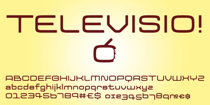
  32. Kaneda Gothic by Dharma Type, $19.99
    Kaneda Gothic is a whole new basic gothic. Philosophically, Kaneda Gothic is the one of the niche answers in the interspace between these antinomies. Image of near-future and giant metropolis in 80s, 90s vs our real life in the 2010s,20s. What we acquired by Industrial, scientific developments vs our emotional demands, imagination in our brain. Design transition in short period of time vs the consistency of real function which laid along the human history. Technically, Kaneda Gothic has a geometric letterform which called “gaspipe” or “Gothic” in woodtype era. But Kaneda has very sharp curves and lines for contemporary demands, that is to say, impact and clearness. Geometric and clear letterform is perfect for eye-catching part such like company logo, movie title and picture’s captions. Consists of seven weights and their matching italics. Supporting almost all latin languages.
  33. Aklimat MF by Masterfont, $59.00
    Elegant font family with a technical twist, formal yet elegant.
  34. Maiers Nr 21 Pro by Ingo, $42.00
    A handwritten ”font for technicians“ from ca. 1900. Very geometrical, rigid forms borrowed from the typical characteristics of Jugendstil / Art Nouveau. This script is found in a magazine from the Otto Maier publishing house, Ravensburg, which was issued sometime in the years shortly before WWI. The magazine is entitled ”Schriften-Sammlung für Techniker: Verkleinerte Schriften der wichtigsten Alphabete“ (Collection of scripts for technical specialists: reduced scripts of the most significant alphabets) and published by Karl O. Maier. The original copy, produced by means of a galvanized plate, is just 7 centimeters wide. It served as the model for technical professions in which, at that time, the captions of drawings were still done by hand. The characters have been scanned, digitized and greatly magnified. Special attention was given to ensure the ”uneven“ edges, typical of handwritten script, remained effectively noticeable even in the digitized form. As a result, this ”technical“ font retains a handmade touch. Especially worthy of note are the Jugendstil forms characteristic at the turn of the19th century. In comparison, many alleged ”ultramodern“ font types of today suddenly look quite old-fashioned. Maier’s Nr. 21 Pro is suitable for all European languages. It includes ”Latin Extended-A,“ for Central and Eastern Europe incl. Turkish, and even Cyrillic and Greek, too. The font includes several stylistic alternates as well as a number of ligatures.
  35. Ellograph CF by Connary Fagen, $35.00
    Ellograph® CF is a charming monospaced font family with easy readability and striking cursive italics. A generous x-height and short descenders allow for even, organized lines of text. Beautiful as a coding font and in logos, headlines, and text. With its clean construction and expressive italics, Ellograph® CF stands as a versatile font family on its own. It also pairs well with a wide array of typefaces – contrasting Ellograph with a serif like Artifex CF or Wayfinder CF is effective and beautiful. All typefaces from Connary Fagen include free updates, including new features, and free technical support.
  36. ISZO by Sryga, $22.00
    ISZO is a modern precision, seamlessly blending tech innovation with humanist elegance. Sleek lines and meticulous geometry reflect architectural brilliance. Subtle curves evoke approachable essence. Resonating with standardization and excellence, ISZO captures the contemporary design and typography's future—a harmonious balance of allure and human connection, ideal for conveying technical prowess and artistic sensibility.
  37. Caracas by John Moore Type Foundry, $20.00
    Caracas is a new family of sans serif fonts, looking friendly, sweet and comfortable to read. Where text flow between straight lines and round by becoming transparent in the interest of readability. Caracas is ideal for working in small letters and texts of a technical nature. Caracas is a humanistic approach to reading sans forms.
  38. RBNo2.1 by René Bieder, $25.00
    RBNo2.1 is a condensed sans serif typeface with a technical and geometric appearance. The family includes 2 versions (RBNo2.1a and RBNo2.1b) and has 7 weights with matching italics. RBNo2.1 feels comfortable in technical surroundings with short text passages, in brochures, catalogs, magazines, posters, websites headlines and logos.
  39. Typical Pro by Typicaltype, $25.00
    Get ready for a modern spin on your typographic projects with the Typical Pro Sans Serif Font 9 Weight. This font offers a clean, grotesk feel that is perfect for any technical or heading design. Its contemporary design makes a perfect choice for projects with a modern flair. With clean lines, tight letter spacing, and a classic sans serif style, this font is sure to bring a unique edge to any project. Enjoy the perfect mix of texture and proportion with this modern font. Get ready to take your typography to the next level with Typical Pro Sans Serif Font 9 Weight. Typical Pro Sans Serif Font is a grotesk typeface of modern design, with technical precision and a clean finish. Its 9 weight offers clear and refined letters that provide perfect legibility for headlines and other text styles. Its line height is consistent and balanced, making it suitable for producing high-impact visual messages. Its modern, straightforward letterforms give projects an air of sophistication, while retaining a firm technical backbone. With nine different weights, it is the perfect choice for any heading or label that requires a strong, contemporary look.
  40. Memphis by Linotype, $40.99
    Because of the geometric basis of its forms, Memphis is often thought of as a font for technical fields, making a rational, purposeful impression. This emphasis on objectivity is well-suited to technical texts, but Memphis is appropriate for any text which should exhibit a clear, neutral character.
Looking for more fonts? Check out our New, Sans, Script, Handwriting fonts or Categories
abstract fontscontact usprivacy policyweb font generator
Processing