10,000 search results
(0.069 seconds)
- Black Lonthe by Letterafandi Studio,
$20.00 Black Lonthe is an exquisite blackletter font that exudes timeless elegance. With its bold and ornate strokes, it captures the essence of traditional calligraphy while adding a modern twist. The sleek, sophisticated design of Black Lonthe makes it perfect for creating eye-catching titles, logos, and invitations that leave a lasting impression.
 - Ardenson by Tower of Babel,
$10.00 Ardenson is an invitingly delightful script with a retro flair. Inspired by apartment signage of the 1950s and 60s, Ardenson strikes a vintage note that also feels at home in the present time. Perfect for any logo, signage, label design or any other project that needs a unique charm and laid back attitude.
 - Labyrinthus Rounded by Cerri Antonio,
$30.00 Labyrinthus Rounded is a multiline decorative font that works very well for identity logos, posters and 3D-works. It continues the tradition of the precedent Labyrinthus but with a softer rounded impact. It's interesting to note that with it it's possible to play with the multiline concept to create endless overlapping geometric creations.
 - Allabbad by Abjad,
$5.00 Allabbad typeface was inspired by one of the hand letterings that belong to the godfather of Arab graphic design, Mohieddine Allabbad. The typeface is part of the Arsheef Alkhatt Project, a platform that revives and tributes classical Arabic lettering from different resources and presents them as affordable, digital fonts for independent designers.
 - Ready Kid by Flying Fuzzball,
$22.00 Ready Kid is a versatile, funky display typeface that is inspired by freehand signpainting with a dose of childhood nostalgia. It's perfect for children's birthday party invitations, punk band marketing, or packaging for art supplies. There are six sets of stylistic alternatives, 340+ ligatures, and 1200+ glyphs that cover over 200 languages.
 - Hiruko by Thinkdust,
$10.00 With 15 different styles and support for all sorts of languages, Hiruko is the open and easy sort of font that can be used in almost any situation, as long as you want your message to be readable. Smooth, simple and clear, Hiruko takes inspiration from both Swiss and Japanese styles, focusing on minimalism and function within its form, the idea that less is more and the careful, exquisite craftsmanship that makes such minor changes have a big impact. From extra-light to thick, black weights, in italics or in outlines, Hiruko can be used to convey messages in such a variety of styles that you’ll never be disappointed. Alternatively if you're looking for something a little more comprehensive, why not check out the follow up to this family Hiruko Pro.
 - Wonderful Melanesia by Arterfak Project,
$15.00 Say hello to Wonderful Melanesia. A fancy font combination, minimalist signature, and elegant serif. These fonts are carefully designed with attention to every detail of the letterforms, which makes the perfect font combination that you can apply for your design that needs an elegant touch, classy looks, and minimalist. The serif font is designed with a few spacing so that it provides more clarity when reading it, and the signature font designed with dynamic strokes that give it the more natural handwriting. Wonderful Melanesia has equipped with many OpenType features. There are beautiful ligatures, Stylistic alternates, and swashes which you can use it to get your design more softly. Fonts featured : Uppercase Lowercase Numbers Punctuation & symbols Stylistic alternates Ligatures Swashes Accented characters : ÀÁÂÃÄÅÆÇÈÉÊËÌÍÎÏÐÑÒÓÔÕÖØÙÚÛÜÝÞßàáâãäåæçèéêëìíîïñòóôõöøùúûüýþÿıŁłŒœŠšŸŽž Thank you for watching and have a wonderful day!
 - HS Almohandis by Hiba Studio,
$59.00 HS Almohandis is an Arabic display typeface. It is useful for book titles and graphic projects where a contemporary, streamlined look is desired. The font is based on the simple lines of modern and simplified Kufi calligraphy, that support Arabic, Persian and Urdu. This font was created in the beginning as regular weight with the font HS Alhandasi in 2007 for use in technical and engineering company. The company tends to follow the geometrical shape with equal dimensions in both vertical and horizontal storks. There is also a tendency to make all characters to be similar to oval shape with the impression that they are all geometrical and clear. I followed that with Bold weight in 2011. The difference between this font and HS Almohandis is that its characters have a sharp baseline.
 - Smokehouse by Dear Alison,
$24.00Have you ever wondered what sign painters and rib joints have in common other than the fact that they can both make a mess? What do they know that you don't which would have them pair a sexy casual script with a down south barbeque restaurant? Smokehouse is all about association. You'll find that this sexy casual script pairs well with a wide range of associations, from barbeque shacks to fairy princesses and everywhere in-between. It makes choosing the right font for the job an easy one, and for those that need to fill a little more space you'll find Smokehouse Wide is up to the task. Discover the power of association, and see how Smokehouse fits into your font collection. Buy both Smokehouse and Smokehouse Wide together as a family and save! - Mastro by Ndiscover,
$49.00 Mastro is a contemporary design comprising 72 styles. With 9 weights and 4 optical sizes: Caption, Text, Sub-head and Display. A super versatile font family ideal for editorial, graphic design, branding and web. Filled with iconic unusual shapes, yet with a super rigorous professional look this design will stand out and work efficiently. Caption styles are meant for very small text like footnotes; Text styles are meant for long strings of text; Subhead styles are meant for sub-headlines; Display styles are meant for large size type setting. Mastro has many OpenType features such as Small Caps, Standard and Discretionary Ligatures, Superscript Letters, Case Sensitive Forms, Lining Figures, Old Style Figures, Tabular and Proportional Numbers, and more. If you want to enlarge this font family make sure you get its sans counterpart: Mastro Sans.
 - Scriptissimo by Wiescher Design,
$39.50 Scriptissimo is, as the name says, very much of a script! It is in the best American tradition. A script that could have served for writing the Constitution with, if only they would have had computers at that time. Scriptissimo consists of three different scripts that are meant to be used together. One is the script with the more or less plain characters. Two is the version for characters to start a word with. Three is the cut that has the characters for the end of a word. Ligatures is used for, well, ligatures and some glyphs like Ltd., GmbH, and so on. Scriptissimo is a very elegant and versatile script. It can be used for chocolate bars as well as stock certificates. I really enjoyed designing it. Yours scriptissimo, Gert Wiescher
 - Monvar by Flavortype,
$15.00 Monvar, A new Cooper with layered typefaces. It’s Simple, Bold, Versatile, and Friendly feel that you get in Monvar Typefaces. Monvar comes with 5 Layers : (that you can mix and match the looks as you like) Base Inset Outline Shadow 1 Shadow 2 Monvar Created with an All Caps that the uppercase are using an initial swashes. Perfect fitted layer to give you a more contrast, more bold look of the title. Every glyphs including the alternate characters are curated for the best and possible without eliminate characteristic of this fonts. Our creation on the display to give you a reference what it looks like on your project. such as Branding, Header, Logotype, Poster, Magazine, Packaging, Food Menus, and etc. It shows that Monvar clearly can accommodate various design style.
 - Cosmic Hippie by Hipfonts,
$9.00 Transport yourself back to the vibrant era of the 1970s with Comisc Hippie, a groovy font that embodies the essence of that extraordinary decade. This typeface is a nostalgic journey through time, with its swirling curves and playful letterforms. Inspired by the counterculture movement, Comisc Hippie exudes a sense of peace, love, and individuality. Its bold and psychedelic style captures the free-spiritedness of the era, making it an ideal choice for adding a touch of retro charm to your designs. Whether you're working on posters, album covers, or any project that calls for a dose of nostalgia, Comisc Hippie will transport you to a groovy world of colorful expression and timeless coolness. Let the spirit of the 70s shine through with this font that embodies the era's iconic aesthetics.
 - Brutman by Sardiez,
$36.00 The purpose of Brutman was to create a typeface that reimagined the incise style for the 21st century. Its roots emerge from the humanistic style, adopting the structures of the roman capitals for the upright version and some features of the chancery style for the italics. On the other side, its contours are forged by the frankness of the brutalist style, which can be seen in the asymmetrical flared terminations, the sharp shoulders and the diagonal cuts that emulate the stress of the broad nib pen. The result is a typeface that combines a sleek character with a historical flair. It conveys a feeling of modernity and sophistication when it comes to shine in big sizes, but on the functional size has sharp shapes that make it perform very well on small ones.
 - Sancoale by insigne,
$22.00 Sancoale is a new sans serif that is simple and geometric. It is a contemporary design that is distinctive and unique, but not too far outside the box. This makes for a typeface family that is very useful for many applications. The design is simplified without stems or spurs in the default character set. The OpenType alternates do include alternates with stems, and there are six weights with true italics. Please see the informative .pdf brochure to see these features in action. OpenType capable applications such as Quark or the Adobe suite can take full advantage of the automatically replacing ligatures and alternates. This family also includes the glyphs to support a wide range of languages. Sancoale is a great choice for a professional designer that wants to achieve a simple but still unique look.
 - Teenage Rockstar by Teenage Foundry,
$19.00 TF Teenage Rockstar Display Script Font - a stylized design that is sure to bring a touch of elegance and sophistication to your projects. Our font features swooping tails on select lowercase letters, adding an extra level of flourish and personality that is sure to capture attention. There are 2 styles available (Regular & Extrude). Both font versions are meticulously crafted with attention to detail, ensuring that each letterform maintains its structural integrity while still conveying its unique style. With our display script font, you can create designs that are both elegant and impactful, giving you the freedom to express your creativity with confidence. Features: Uppercase, Lowercase, Numeral, Opentype Features, Punctuation & Multilingual. Note: To access tails, just type underscore + underscore + numeral. The alternates feature must be active. Example __3 For any questions please contact me 🙂 Thanks!
 - Decoral Soft by Totem,
$30.00 Decoral Soft depicts the character of Art Deco period typography and reinterprets it into modern approaches. This typeface is a friendly and flexible family that is fun to use. It comes with a set of 670 characters per weight, supporting over 50 different languages using the Latin alphabet. Decoral Soft also comes with special stylistic sets and swash characters that allow the user to be creative and playful with the type, helps enhance many different possibilities that certainly will spice up your design. Decoral Soft will satisfy all your typographic needs, from book jackets to monograms to packaging, logos, and even wedding invitations—timelessly elegant, with a distinctive flair that exudes Art Deco typography in a fresh, modern way. The wide selection of titling alternates and ligatures make copyfitting a delight.
 - Like Butterflies by Bogstav,
$10.00 Now here's a font that is named Like Butterflies, but has got nothing to do with butterflies! What? Why? Well, I recently heard the song "Even flow" by Pearl Jam and took a trip down memory lane - back to my early twenties. I remember how the lyrics affected me, and had an impact on how my life changed the years to follow. Maybe the style of the font does not reflect the inner meaning of the song, but it does reflect a look back in time for me - and the change that took place. Nevertheless, I hope you enjoy the somewhat simple, handmade style of Like Butterflies and the 4 versions that works very well together! Please notice that each letter has got 5 slightly different versions to choose from!
 - Affair by Sudtipos,
$99.00 Type designers are crazy people. Not crazy in the sense that they think we are Napoleon, but in the sense that the sky can be falling, wars tearing the world apart, disasters splitting the very ground we walk on, plagues circling continents to pick victims randomly, yet we will still perform our ever optimistic task of making some little spot of the world more appealing to the human eye. We ought to be proud of ourselves, I believe. Optimism is hard to come by these days. Regardless of our own personal reasons for doing what we do, the very thing we do is in itself an act of optimism and belief in the inherent beauty that exists within humanity. As recently as ten years ago, I wouldn't have been able to choose the amazing obscure profession I now have, wouldn't have been able to be humbled by the history that falls into my hands and slides in front of my eyes every day, wouldn't have been able to live and work across previously impenetrable cultural lines as I do now, and wouldn't have been able to raise my glass of Malbeck wine to toast every type designer who was before me, is with me, and will be after me. As recently as ten years ago, I wouldn't have been able to mean these words as I wrote them: It’s a small world. Yes, it is a small world, and a wonderfully complex one too. With so much information drowning our senses by the minute, it has become difficult to find clear meaning in almost anything. Something throughout the day is bound to make us feel even smaller in this small world. Most of us find comfort in a routine. Some of us find extended families. But in the end we are all Eleanor Rigbys, lonely on the inside and waiting for a miracle to come. If a miracle can make the world small, another one can perhaps give us meaning. And sometimes a miracle happens for a split second, then gets buried until a crazy type designer finds it. I was on my honeymoon in New York City when I first stumbled upon the letters that eventually started this Affair. A simple, content tourist walking down the streets formerly unknown to me except through pop music and film references. Browsing the shops of the city that made Bob Dylan, Lou Reed, and a thousand other artists. Trying to chase away the tourist mentality, wondering what it would be like to actually live in the city of a billion tiny lights. Tourists don't go to libraries in foreign cities. So I walked into one. Two hours later I wasn't in New York anymore. I wasn't anywhere substantial. I was the crazy type designer at the apex of insanity. La La Land, alphabet heaven, curves and twirls and loops and swashes, ribbons and bows and naked letters. I'm probably not the very first person on this planet to be seduced into starting an Affair while on his honeymoon, but it is something to tease my better half about once in a while. To this day I can't decide if I actually found the worn book, or if the book itself called for me. Its spine was nothing special, sitting on a shelf, tightly flanked by similar spines on either side. Yet it was the only one I picked off that shelf. And I looked at only one page in it before walking to the photocopier and cheating it with an Argentine coin, since I didn't have the American quarter it wanted. That was the beginning. I am now writing this after the Affair is over. And it was an Affair to remember, to pull a phrase. Right now, long after I have drawn and digitized and tested this alphabet, and long after I saw what some of this generation’s type designers saw in it, I have the luxury to speculate on what Affair really is, what made me begin and finish it, what cultural expressions it has, and so on. But in all honesty it wasn't like that. Much like in my Ministry Script experience, I was a driven man, a lover walking the ledge, an infatuated student following the instructions of his teacher while seeing her as a perfect angel. I am not exaggerating when I say that the letters themselves told me how to extend them. I was exploited by an alphabet, and it felt great. Unlike my experience with Ministry Script, where the objective was to push the technology to its limits, this Affair felt like the most natural and casual sequence of processions in the world – my hand following the grid, the grid following what my hand had already done – a circle of creation contained in one square computer cell, then doing it all over again. By contrast, it was the lousiest feeling in the world when I finally reached the conclusion that the Affair was done. What would I do now? Would any commitment I make from now on constitute a betrayal of these past precious months? I'm largely over all that now, of course. I like to think I'm a better man now because of the experience. Affair is an enormous, intricately calligraphic OpenType font based on a 9x9 photocopy of a page from a 1950s lettering book. In any calligraphic font, the global parameters for developing the characters are usually quite volatile and hard to pin down, but in this case it was particularly difficult because the photocopy was too gray and the letters were of different sizes, very intertwined and scan-impossible. So finishing the first few characters in order to establish the global rhythm was quite a long process, after which the work became a unique soothing, numbing routine by which I will always remember this Affair. The result of all the work, at least to the eyes of this crazy designer, is 1950s American lettering with a very Argentine wrapper. My Affair is infused with the spirit of filete, dulce de leche, yerba mate, and Carlos Gardel. Upon finishing the font I was fortunate enough that a few of my colleagues, great type designers and probably much saner than I am, agreed to show me how they envision my Affair in action. The beauty they showed me makes me feel small and yearn for the world to be even smaller now – at least small enough so that my international colleagues and I can meet and exchange stories over a good parrilla. These people, whose kindness is very deserving of my gratitude, and whose beautiful art is very deserving of your appreciation, are in no particular order: Corey Holms, Mariano Lopez Hiriart, Xavier Dupré, Alejandro Ros, Rebecca Alaccari, Laura Meseguer, Neil Summerour, Eduardo Manso, and the Doma group. You can see how they envisioned using Affair in the section of this booklet entitled A Foreign Affair. The rest of this booklet contains all the obligatory technical details that should come with a font this massive. I hope this Affair can bring you as much peace and satisfaction as it brought me, and I hope it can help your imagination soar like mine did when I was doing my duty for beauty.
 - Atocha by Sudtipos,
$49.00 It was expected that Joluvian’s third type font would be inspired by the city where he currently resides: Madrid, Spain. His previous creations had originated in Venezuela (Zulia) and The Philippines (Salamat), both, places where he had once lived. Joluvian believes “now is the time to pay tribute and show gratitude towards a city that has bestowed me with so many fortunes.” He considers that Madrid’s people, streets, scents, flavor and sounds are gift enough to awaken the creative urgency in any artist. This time around, it is being expressed through the crafts of the Typographic industry. Since his arrival in Spain, Joluvian has been attached to the city’s central area, specifically to the renowned Atocha Street and its railroad station. It was precisely on that street that Joluvian and Mauco Sosa, his friend and partner, decided to establish the Patera Studio: a charming creative space that birthed the concept for this new font which they proudly named Atocha Script. The artists where still in the final phases of their previous script, Salamat, when the idea for Atocha came about. This dynamic is actually very typical of the artistic process, in which every finished product spawns the need to create its next level offspring. “Working on Atocha and Atocha Caps has been a very pleasant journey. We have given our best efforts, for we wanted to offer a typeface that was both versatile and user-friendly on a number of applications, showing a wide scope of alternatives in our glyphs,” says the artist. The illustrations were created by Mauco, to ensure visual integration that would showcase the work of both members of the Patera Studio and their complementing aesthetic voices. Atocha, as Salamat and Zulia before, was digitized by Alejandro Paul.
 - Zaftig Pro by Typeco,
$49.00Many current poster artists like to reference the graphic type styles that were popular in the ’60s and ’70s. Zaftig is a contemporary font that takes the geometric and blocky inspiration from that era but then steps off in a modern direction. At first glance, it may appear that the capitals of Zaftig all take up the same amount of space, but certain letters have been designed proportionally for a better flow. However, if the designer would prefer to stack the capital letters in even columns, like blocks, then one can use the Titling Alternates feature. In this feature the metrics of all the capital letters are the same, and certain letters have been designed narrower, allowing for seamless stacking. The space, bullet, asterisk have also been given the same monospaced metrics in this feature to make stacking easy. The Small Caps feature in Zaftig is designed so that the small cap glyphs are the same height as the lowercase. This allows the graphic designer not only the option of small caps, but also the ability to mix and match both kinds of letters to create a distinctive style. There are also alternate numerals in the Small Caps feature that match the height of the small caps. In Stylistic Alternates 1 you will find alternate designs for the Q, A, I, J, L, n, and u glyphs. Or you can find alternates in the Glyph Pallet of your favorite OpenType savvy application. Zaftig is more than it appears on the surface. This OpenType font contains over 1200 glyphs and language support. That makes it an international font which contains letters for most languages that use Latin, Central European, Cyrillic, and Greek scripts. - Schizophrenia G - Unknown license

- Quropa Hollow - Unknown license

- Hebrew Esther Std by Samtype,
$59.00 This is a revival of a modern classic, exceptionally good for books and small texts.
 - Remarkably Dressed by Bogstav,
$12.00 A handmade layered font that wants to be a part of your next creative project!
 - KG Red Hands by Kimberly Geswein,
$5.00 A chunky fat font perfect for titles. Still neat and legible while being super chunky.
 - Primal Scream by Comicraft,
$19.00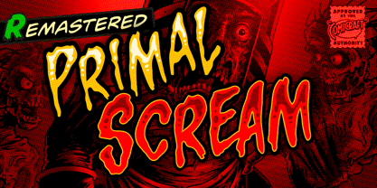 AAAAAAAARRRRRR RAGGGHHHHHHHHH HHHHGRRRRAAAAA GGHHHHHHHHHHAIE EEEEERGHHHHHHHH HHHGRAARGHHGHH HHHHKKKKKAAAAA IIIEEEEEEEEEEEEHHH HHHHHHHHGGGGGG HHHHHHHHRRRARRRRRRRRRGHRRRRR AAAAAAAAAAAARRRRRRR!!!!!!!!!!!!!! Ahhh. That felt good.
 - Tara by Haiku Monkey,
$10.00Tara is a bold, fun handwriting font that scales really well to large point sizes. - Bacchante by Vladislav Ivanov,
$20.00 Bacchante is a hand-written font with retro touch, perfect for collages or simple text.
 - Richler by Shinntype,
$29.00 An open, evenly spaced book face designed for quality headlines and enhanced readability in text.
 - TDR by VSF,
$16.00 A heavy futuristic display font that can be strecthed and squiched without losing its identity.
 - Hebrew Vilna Std by Samtype,
$59.00 This is a classic font. You can use to any kind of book or text.
 - The Only Exception by Kimberly Geswein,
$5.00 This font was inspired by my sister Emily's handwriting. She has neat, fluid cursive handwriting.
 - Wee Ian by m u r,
$10.00Searching for a font that resembled true children's handwriting. Ideal for anything related to children. - Hebrew Mairi by Samtype,
$39.00 The beautiful and elegant typeface, excellent use in wedding invitations, arts, posters, and small texts.
 - Janda Celebration Script by Kimberly Geswein,
$5.00 This beautiful script has lovely connections and swirls that create an elegant, hand-written look.
 - Hebrew Compressed by Samtype,
$39.00 Modern Sans Serif Hebrew type. This font isbest for use in titles and small texts.
 - Babo by Nedamamo,
$15.00 A Handdrawn typeface that can be used to create almost all types of design projects.
 - Stomper by MADType,
$21.00 Inky and grungy, Stomper is perfect for your layouts that require the look of imperfection.
 - Falace by TeGeType,
$29.00 The Falace family, a contemporary interpretation of the Didone typefaces, is designed for text applications.

