10,000 search results
(0.021 seconds)
- Ransom by Sensatype Studio,
$15.00 Ransom is a Modern Technology font that created special for Technology, Sci-fi, modern and more stand out typography needs with futuristic style, with modern styles that make your design more memorable. It's so perfect to add your style better for headline overview for future, technology, actions, and technology theme. And specially for this font, we crafted for bold action style and modern feels so enjoy to create any project that will show your main idea out. Ransom Modern Technology font ready with: Ransom characters prepared to get creative on Technology Preview as a inspirations that you can do Ready with All Uppercase characters Wish you enjoy our font. :)
 - Merodine by Letterhend,
$19.00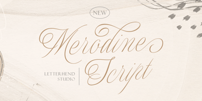 Merodine Script. A Beautiful and classy script that has many swashes that allows you to create beautiful lettering instantly. it has many stylistic set alternates that you can choose from. This font perfectly made to be applied especially in logo, and the other various formal forms such as invitations, labels, logos, magazines, books, greeting / wedding cards, packaging, fashion, make up, stationery, novels, labels or any type of advertising purpose. Features : uppercase & lowercase numbers and punctuation multilingual ligatures alternates swashes PUA encoded We highly recommend using a program that supports OpenType features and Glyphs panels like many of Adobe apps and Corel Draw, so you can see and access all Glyph variations.
 - Serath by Letterara,
$24.00 Step into a world of bold sophistication with Serath, a remarkable blackletter font that exudes power and elegance. Its distinct and imposing design showcases uniquely shaped letters, making it the perfect choice for creations that demand a touch of distinction. Whether you're working on product packaging, branding, or any project that requires bold and daring typography, Serath will effortlessly make a statement. Unlock its full potential with its PUA encoding, granting you easy access to a wide array of glyphs and swashes. Embrace the confidence that comes with incorporating Serath into your projects, and prepare to be amazed by the remarkable results it delivers.
 - Avega SS by Sensatype Studio,
$15.00 AVEGA is a Modern Sport font that created special for Branding, Title and more stand out typography needs, with extra alternative styles that make your design more memorable. It's so perfect to add your style and headline overview for sport, technology, actions, and fighting theme. And specially for this font, we crafted for bold action style and modern feels so enjoy to create any project that will show your main idea out. AVEGA Modern Sport font ready with: 4 Font variation characters prepared to get creative alternatives Preview as a inspirations that you can do with AVEGA font Ready with All Uppercase characters Wish you enjoy our font. :)
 - Villantez by Ilhamtaro,
$23.00 VILLANTEZ is a display that is basically a serif font that has been modified in such a way that there are breaks or distances at the body meeting of each letter, almost like in stencil letters. Creating a more attractive and different impression from other display serifs, this font can also be categorized in a more modern Victorian style by carrying a slight stencil modification. This font is also an all caps font with different letter and character heights in the uppercase and lowercase. To enable the OpenType Stylistic alternates, you need a program that supports OpenType features such as Adobe Illustrator CS, Adobe Indesign & CorelDraw X6-X7. Cheers!
 - Layer by Sensatype Studio,
$15.00 Layer is a Layered Logo Modern Font that created special for Branding, Title and more stand out typography needs, with extra alternative styles that make your design more memorable. It's so perfect to add your style and headline overview for sport, technology, actions, and fighting theme. And specially for this font, we crafted for bold action style and modern feels so enjoy to create any project that will show your main idea out. Layer - Layered Logo Modern Font ready with: Font variation characters prepared to get creative alternatives Preview as a inspirations that you can do with Layer font Ready with All Uppercase characters Wish you enjoy our font. :)
 - Morality by Sensatype Studio,
$15.00 Morality is a Modern Elegant Sans Serif Font that perfect for branding, logotyp, poster design, etc A new San Serif Font that we created special for Headline, Title and more stand out typography needs. It's so perfect to add your style and headline overview. And specially for Headline font, we crafted for unique style and modern feels so enjoy to create any project that will show your main idea out. Morality Modern Elegant Sans Serif Font ready with: Any options to get creative variations Preview as a inspirations that you can do with Morality font Ready with All characters Wish you enjoy our font. :)
 - Askey by Craft Supply Co,
$20.00 Askey - The Funky Serif Font is a bold and expressive typeface that channels the spirit of funk and creativity. With its unique and unconventional serifs, Askey exudes a sense of artistic flair and individuality. This font is perfect for projects that seek to make a statement and stand out from the crowd. Whether you're working on posters, album covers, or any design that demands a touch of funkiness, Askey adds a distinctive and charismatic charm. Askey is like a burst of creativity in the world of typography, making it an ideal choice for projects that want to embrace a bold and unconventional style, exuding confidence and originality.
 - Roaster SS by Sensatype Studio,
$15.00 Roaster is a Stylish Elegant Font In a new generations, we analyze that any designer or brand owner need to make their brand standout. As our focus that analyze any typeface that helps to leverage any logo design to look more modern and unique. We prepared this font with any unique characters to help you create unlimited variations for your creative needs. Roaster font ready with: Any options to get creative variations with unique letters 5 Styles Font (Black,Bold,Reguler,Thin,Light) Preview as a inspirations that you can do with Roaster font Ready with Lowercase and Uppercase characters Wish you enjoy our font. :)
 - Flinscher by Greater Albion Typefounders,
$16.00 The Flinscher family contains twenty display typefaces, in weights that vary from light to black, and widths that extend from condensed to expanded. The family’s design inspiration traces its roots to the early portion of the twentieth century. In essence, it is a calligraphic script typeface family with blackletter influences. The letter forms are decorative and distinctive, yet clear and easy to read, and in use set up a regular rhythm that leads the eye from character to character. The Flinscher typefaces are well suited to design work that needs to combine formality with fun. Just the thing for a certificate or a book cover!
 - Asteric Vintage by BlackLotus,
$12.00 Asteric Vintage is a retro-vintage font family with an amazing set of ornaments. It comes in 3 different styles: Regular, Rough, Display, and also presents 26 beautiful and luxurious ornaments . The Rough Style has a characteristic that resembles rust on each character, thus creating results that seem strong and hard. The Display Style is very suitable for display, every work created with it becomes luxurious, wrapped in a classic atmosphere. The Regular Style is a style that has a clean character but still carries a classic scent that is thick and unique. This style is very suitable for use in magazines, books, newspapers, etc.
 - Sweet Honey by BlackLotus,
$12.00 Sweet Honey is a display font inspired by the cuteness and joy of childhood. Any design made using this font will bring out a cheerful, cute, and unique feel that blends together. Each Uppercase and Lowercase character in this font is made as unique as possible, so that this font can stand out and be easy to remember whenever people look at it. This font has 2 styles, namely regular and bubble, these styles make this font more varied so that it adds inspiration to every design that is made. Sweet Honey is perfect for use in brochures, book titles, magazines, posters, announcements, and more.
 - Soyuz Crash by Sensatype Studio,
$15.00 Soyuz Crash is a Modern Sci-fi font that created special for Technology, Sci-fi, modern and more stand out typography needs, with extra alternative styles that make your design more memorable. It's so perfect to add your style and headline overview for future, technology, actions, and technology theme. And specially for this font, we crafted for bold action style and modern feels so enjoy to create any project that will show your main idea out. Soyuz Crash Modern Sci-fi font ready with: Modern Font variation characters prepared to get creative Preview as a inspirations that you can do Ready with All Uppercase characters Wish you enjoy our font. :)
 - Rover Pro by Fontforecast,
$24.00 Rover Pro is a hand painted font family that comes in 5 styles: Regular, Bold, Bold Shadow, Bold Rough and Extra. It was designed with retail in mind, but is also perfectly suited for other uses. The flat brush that was used to hand paint all 424 glyphs creates a nonchalant stroke that adds a personal touch and plenty of pizzaz to your design. Combine Rover Pro Bold Shadow with the Bold and Rough styles for more variety and beautiful designs. For extra fun Rover Pro Extra adds another 85 glyphs to play around with. All in all Rover Pro is a smashing painted font family for virtually every project. Rover Pro is PUA encoded. This means that all Rover Pro's characters are fully accessible via Character Map or Font Book (that come with your PC or Mac).
 - American Auto by Miller Type Foundry,
$26.99 Hot Dogs, Apple Pie, Baseball and great TYPOGRAPHY are deeply rooted in American culture. American Auto is a Type Family that embodies that culture visually. It joins a robust workhorse sans with a playful script that brings you back to 70+ years ago, while at the same time remaining as contemporary as any new 2019 design. This unique pair work together in harmony to create wonderful designs for a variety of uses. From book covers to posters, web sites to apps, American Auto is an excellent choice to create striking designs that stand out from the crowd! American Auto also features many Opentype Features such as: Alternate Characters, Initial & Final Forms, Contextual Alternates, Old Style Figures, Lining Figures, Numerators & Denominators, Fractions, and more! This typeface has really been designed to meet any challenge that a designer can throw at it!
 - Nostalgic Remain by Ardian Nuvianto,
$23.00 The Nostalgic Remain is a chic modern and timeless serif font that evokes a sense of nostalgia and old-world charm. Its elegant and refined letterforms are perfect for creating designs that require a touch of sophistication and tradition. This font is ideal for vintage logos, book covers, editorial designs, and any project that needs a touch of old-school glamour. With its graceful curves and delicate serifs, Nostalgic Remain is a versatile font that can be used for both digital and print projects. Its timeless appeal makes it a great choice for designers who want to create a sense of heritage and history in their designs. Whether you’re designing for a fashion brand, a restaurant, or a publishing house, Nostalgic Remain is a font that will add a touch of class and elegance to your work.
 - Sabana by fragTYPE,
$20.00 Sabana is my first step in font design. A font that is born from the organic, from a creative process that starts from improvisation as a result of my training as an artist. To design Sabana I asked myself the question, why not make a font that emulates my own writing? as I found it fun to see my handwriting on a computer. This font can be used in a wide range of projects such as editorial design, motion graphics, web, advertising and branding where emulating handwriting is a necessity. The font has coverage for more than 200 languages ??derived of the latin alphabet in addition to Cyrillic. Sabana is where I come from, where I am from, a constant on the horizon that is occasionally interrupted by vertical lines and that together make a perfect visual symphony.
 - Undulate by Ingrimayne Type,
$10.00 Undulate was designed as an alternating-letter font in which two sets of characters alternate. The alternating is done automatically in applications that support the OpenType feature contextual alternatives (calt). Some individual characters look strange in isolation but they fit into a wave-like pattern in which shapes that bulge up alternate with shapes that bulge down. Undulate has monospaced and monoline letters. The letter spacing is very tight to accentuate the ripple pattern. The family includes an outline style that can be used in a layer above the regular style to add color. Undulate was not designed for any particular use but as a challenge to fit letters into a particular geometric shape. The unusual patterns that a result are eye-catching and may be useful for advertising or signage and in other places where one wants attention-grabbing lettering.
 - Segnieur Modern by Paavola Type Studio,
$37.00 Segnieur Modern is a modern sans-serif font that redefines elegance in the digital age. Its precise geometry, distinctive letterforms, and versatility make it an excellent choice for designers seeking a font that effortlessly combines modernity with timeless style. Elevate your projects with Segnieur Modern's sleek and sophisticated aesthetic. Segnieur Modern is highly versatile, making it suitable for a wide array of design applications, including corporate branding, product branding, editorian design and advertising. Branding: Elevate your brand's identity with a font that radiates professionalism and contemporary appeal. Editorial Design: Whether it's magazines, brochures, or posters, this font enhances readability while maintaining a sleek appearance. Advertising: Make your advertisements stand out with a font that combines sophistication and readability. The font includes an extensive character set that covers multiple languages and special characters, ensuring global usability and versatility.
 - Sunwind by Wiescher Design,
$39.50 Sunwind is not really made to write long copy. It is a font for shopsigns and short sentences that need that hot, sunny and windy touch. And that is how I got around to designing it: I saw some letters on a shopsign in Cannes when driving into town. I shouted at my son Julius: "Quick take a picture of that sign, the blue one." That's what he did, only he used the macro setting, so I had a very small sign but lots of nice background. Anyway I got the basic idea! Then I made a lot of sketches and this is what came out. I added a smallcaps set and I also made some initials as a rough version, so they look like written with a brush on heavygrain paper. Swinging that brush is yours truly Gert Wiescher
 - Thronemy by Invasi Studio,
$19.00 This elegant condensed serif display typeface is perfect for designs that require a touch of class and nostalgia. Inspired by ancient concepts and the nostalgic classic era, Thronemy Font adds a timeless and sophisticated look to any design project. The condensed serif design of Thronemy Font is both elegant and easy to read, making it perfect for headlines, titles, and other design elements that need to be easily understood. Plus, its retro style is perfect for creating logos and headings that will make your designs stand out from the rest. Thronemy Font is a versatile font that can be used in a variety of design projects such as invitations, posters, book covers, packaging, magazine layouts, and more. No matter what your project requires, Thronemy Font can help you achieve a timeless and sophisticated design that will leave a lasting impression.
 - Ateknov by Twinletter,
$17.00 Introducing Ateknov, a retro condensed font that embodies classic elegance. This font is perfect for designers looking for a touch of nostalgia in their work. Ateknov features a clean and polished design with sharp edges and a condensed appearance that makes it a great choice for headlines, logos, and branding. Ateknov comes equipped with alternate characters and ligatures, each with a unique and beautiful design that adds depth and character to your projects. The font also supports multilingual characters, making it accessible to a global audience. Whether you’re creating a vintage-inspired design or a modern twist on a classic aesthetic, Ateknov is a versatile font that will elevate your work to the next level. Download it today and start exploring the possibilities. What’s Included : - File font - All glyphs Iso Latin 1 - Alternate, Ligature - Simple installations - We highly recommend using a program that supports OpenType features and Glyphs panels like many Adobe apps and Corel Draw so that you can see and access all Glyph variations. - PUA Encoded Characters – Fully accessible without additional design software. - Fonts include Multilingual support
 - Meisuer by Craft Supply Co,
$20.00 Introducing Meisuer – Handwritten Font A Delightfully Cute and Fun Script Meisuer – Handwritten Font is more than just a font; it’s a charming and whimsical script cursive typeface that brings a cheerful and playful vibe to your designs. Irresistibly Cute Meisuer is undeniably cute; each character exudes cuteness with its endearing strokes and whimsical swirls. It’s perfect for creating designs that radiate positivity and cuteness, making it impossible to resist. Infusing Playfulness Furthermore, this font effortlessly injects playfulness into your projects. Whether it’s greeting cards, invitations, or children’s books, Meisuer adds a touch of joy and lightheartedness that takes your design to the next level. Versatile Cheerfulness Meisuer’s versatility shines in various design applications. Its friendly appearance appeals to all age groups, making it a go-to choice for cheerful projects that need to reach a wide audience. In Conclusion In conclusion, Meisuer – Handwritten Font is your ultimate tool for creating designs that are cute, fun, and filled with cheerful vibes. Embrace the whimsical charm of Meisuer, and infuse your projects with a delightful playfulness that captivates hearts and brings smiles to faces.
 - Cinefile by Eurotypo,
$22.00 The 50’s were the golden years for cinema and consequently also for the artists who lettered on the posters. Cinefile is a brushed disconnected script included in a family font that evokes the soul of that vintage brush but with a modern touch. The main characteristics of Cinefile are soft and rounded shapes and a very high x-height, clean and easy to read. Cinefile Family includes 3 fonts: Cinefile, a very versatile script font with initial forms, and a generous complement of alternate characters, ligatures, ordinals, Cinefile Slab Serif and Cinefil Ornaments that combine perfectly and give you many options to your designs. Remember that to access to all additional characters, you must use software that is truly compatible with OpenType, such as Adobe CS applications, or we recommend using the Glyphs palette. Cinefile is a friendly and fluid family font that adapts well to titles, packages, invitations, greeting cards, magazines and book covers, children's material, fashion, logos and, posters and wherever you need a fun and sympathetic display font.
 - Aeolus Pro by DBSV,
$50.00 Aeolus Pro is a second attempt at writing a monoline style. Completed after many design transformations. And here (as in KhamaiPro) attempted to provide a different visual design with style as Staccato: (dashed line) Rail: (double line) Tribe: (triple line) and finally a New style Shadow. Also (Bold, BoldItalic) has the advantage of involving between styles… (Rail, RailItalic, Tribe, TribeItalic, Shadow and ShadowItalic) for example: …you have a text frame with some text or one word or one letter with Bold or BoldItalic style with e.g. (color blue), if you duplicate the text frame or duplicate the Layer (as is, without shifting position - text) and you make changes ONLY (the Style* and color of text) in second text frame, would have the effect of filling the gap at the following styles... *(Rail, RailItalic, Tribe, TribeItalic, Shadow and ShadowItalic) you can see the presentation of the photo “Multiplex”. This series of 20 fonts with 624 glyphs each is composed and includes true italics and supports Latin, Greek and Cyrillic.
 - Baissano by Asensò,
$10.00 Baissano is an all-caps display typeface that is inspired by the Mediterranean culture, environment and typographical landscape. Its letterforms have been directly inspired by the many alphabets found all around the Mediterranean. For instance, the E is inspired by the Caucasian Albanian alphabet and the Y is inspired by the Greek psi letter (ψ), and that’s just to cite a few examples. Baissano also expresses the interconnection between nature and culture that has profoundly shaped the Mediterranean history and civilization. The letters have powerful and geometric stems, man-made elements, that express the notion of culture. Those are combined with smooth and curved nature-like loops and bowls that refer to the organic world. The combination of these two elements creates a poetic and unique typeface, that captures the Mediterranean spirit, its cultural heritage and its natural environment. Baissano is a titling typeface that is designed specifically for use at larger sizes, in titles and headlines, for example. Features : Uppercase Numbers and punctuation Alternates & ligatures Supported languages: English, French You can learn more about the Baissano typeface here.
 - Oceanwide Pro by California Type Foundry,
$47.00 A font perfect for not just one, but many projects! Introducing Oceanwide Pro, a sans that loves to be used in just about any situation! Designed with ultra clean lines and versatility in mind, Oceanwide wants to be your new favorite sans! Oceanwide’s ultra clean letters work anywhere you want to communicate orderliness and competence, and designed to build trust and rapport with your audience. Its wide proportions make it ideal for display and logo use. Oceanwide especially shines for white/bright letters on black/dark backgrounds! That’s because the inside shapes are nearly perfect circles in many weights. Here's a quick video tour of Oceanwide Pro by Dave Lawrence, including all the great things Oceanwide can be used for! We've tested Oceanwide for these industries, with stunning results!: Tech Arts Fashion & Style Business & Branding Corporations Logistics Architecture Food and many more... Oceanwide can be used for: Headers Subheadlines Logos Even body text, if tracked. Print & Screen The styles it can take are also many. It's great for: Modern/minimalist design Flat design Cut out design User Interface (UI) Technical designs In combination with text effects, even for grunge and other situations. And many others... DESIGN FEATURES Simplicity Tall x-height Hand-sloped obliques (italics) Narrow spacing Semi-wide proportions Expert kerning Well proportioned, usable lights & extra lights Large caps Great ALL CAPS MODE Uppercase punctuation Uppercase spacing with California Type Foundry’s Smart Tracking™ Advanced fraction support Proportional lining figures Thick joins Smooth curves Sturdy—great for textures and effects Variable font available Latin Pro character set for Central European languages. That's the writing for over 782 languages and transliterations worldwide! DESIGN STORY—THE FORGOTTEN SANS by Dave Lawrence, Lead Designer, California Type Foundry Adrian Frutiger was the 20th century master of sans, but I didn't realize he had made—not one—but TWO geometric sans! It wasn't until I had purchased the book “Adrian Frutiger: Typefaces”. I had hoped to someday meet Adrian Frutiger, but he passed away that very same year. Here is the story of Frutiger's forgotten sans. Back in 1968, Frutiger was approached by Pentagram to make a design for British Petroleum. They wanted a "new version of Futura". However, they wanted him to make a couple adjustments. First, they felt that Futura was "too fiddly." By this, they meant that it narrowed too much at the joins. (Joins are for example where the round and straight parts of the 'd' meet.) This is something that is necessary for small print text (to prevent ink clogging), but is not necessary at large sizes. Second, they wanted it to be entirely geometric, using the circular shape with minimal optical corrections. Unfortunately this font was not even used very consistently in the BP brand. A haphazard mix of Futura and Frutiger's BP font ensued. It was then replaced by another font design very soon after. My design is different in several ways. First, the commas and quotes are a more modern style. I tried his original commas, but these just didn’t work to 21st century eyes. Second, in his drawings, Frutiger went for a more standard u with a downstroke on the right. However, Oceanwide has a simpler u. Third, I made more optical adjustments. At the direction of his employer, Frutiger reluctantly put no font optical corrections into the letters. So I think my optical adjustments are similar to what Frutiger would have wanted. Fourth, I extended the weight into the light and extra light ranges. Fifth, the rest of the font I created according to the principles of Adrian Frutiger, but with no sources for inspiration. Here is Frutiger’s design philosophy, in his own words: “If you remember the shape of your spoon at lunch, it has to be the wrong shape. The spoon and the letter are tools; one to take food from the bowl, the other to take information off the page... When it is a good design, the reader has to feel comfortable because the letter is both banal and beautiful.” The words about the spoon were the ones I kept in my mind as I tried to make the curves ultra smooth, and the shapes ultra simple. Hopefully this font is a worthy successor to the font that inspired it. Released on the 93rd birthday of Adrian Frutiger, to celebrate the life and achievements of this amazing designer. ——————— Simplicity. Versatility. Oceanwide.
 - Sihmittree by Ingrimayne Type,
$9.00 Sihmitree is a gimmick typeface in which all glyphs have reflective (mirror) or rotational symmetry (or both). Sihmitree has two weights and is caps only, with most of the lower-case letters identical to the upper-case letters. It includes only those accented characters that are symmetrical. The letters of the alphabet are often used to explain symmetry. BCDEK are given as examples of shapes that can easily be formed with symmetry over a horizontal line. AMQTUVWY can easily be formed so that they mirror over a vertical line. Letters HIOX can be formed so they mirror over both horizontal and vertical lines, and as a result they will also have rotational symmetry. Letters NSZ can be formed so that they reproduce themselves with a rotation of 180º. That leaves letters FGJLPR, which are usually considered examples of asymmetry. However, there are script versions of J, L, and R that can be formed with symmetry, and variants of lower-case f and g can be made that are symmetrical. P looks a lot like the thorn character. Some of the numbers also present challenges when trying to form them symmetrically. The symmetrical alphabet is not stylistically harmonious and has limited use other than as an exploration of symmetry.
 - Berimbau by PintassilgoPrints,
$29.00 Berimbau is a whimsical narrow hand-drawn typeface. It’s stylish, versatile and loaded with amazing OpenType features that do their magic in OpenType savvy applications. Its sprightly swashes and twisting stylistic alternates (say that 3 times fast!) play together to deliver a really cool contextual feature that, in a push-button way, substitutes the first letter in a word with its left swash version and the last letter with its right swash version (please type a space before and after the words).The feature also applies stylistic variants to some of the intermediate letters. Which button to push? The Contextual Alternates one! If you're not a one-click-way-person you can pick your preferred glyphs through the glyphs palette. There you’ll find at least 4 variations for each letter: left swash, right swash and 2 regular forms that correspond to the upper and lower case keys. Some letters also have a 5th variation that acts as stylistic alternate. This font is conveniently packed with the ‘access all alternates’ functionality, so when you click on a glyph at the glyphs palette you’ll see all variations available for it, making it easier to choose the one that will fit better. A bold weight was made to provide that extra-strength when a bit of… boldness is needed. Please note that it doesn’t have the advanced OpenType features (but is still very charming!). Yet, both weights have a handy set of ornaments for added yumminess.
 - Balance by Victory Type,
$12.00The three typefaces that make up the Balance font set are legible, funky and stylish. Every character has been spaced and designed on a uniform geometric grid to insure true typographic "balance." There are only two shapes that make up every character: a parallelogram and a quarter circle. This design renders Balance a distinct family of fonts which are appropriate for all documents. Balance Regular is legible, funky and stylish. Every character has been spaced and designed on a uniform geometric grid to insure true typographic "balance." There are only two shapes that make up every character: a parallelogram and a quarter circle. This design renders Balance Regular a distinct font that is appropriate for all documents. Balance Light is legible, funky and stylish. Every character has been spaced and designed on a uniform geometric grid to insure true typographic "balance." There are only two shapes that make up every character: a parallelogram and a quarter circle. This design renders Balance Light a distinct font that is appropriate for all documents. Balance Unicase is legible, funky and stylish. Every character has been spaced and designed on a uniform geometric grid to insure true typographic "balance." Each letter, in this unicase version of Balance uses a single character height. There are only two shapes that make up every character: a parallelogram and a quarter circle. This design renders Balance Unicase a distinct font that is appropriate for all documents. - KG This Is Not Goodbye by Kimberly Geswein,
$5.00 Neat, calligraphy-style handwriting using a chisel-tipped marker.
 - KG Thinking Out Loud by Kimberly Geswein,
$5.00 A neat upright font with a small x-height.
 - Buddy Suit by PizzaDude.dk,
$15.00A drippy text font, or slimy if you prefer! - South Beach by BA Graphics,
$45.00A retro looking gothic with that "South Beach" look. - ADD by Sea Types,
$20.00 A minimalist typography for short texts and individual words.
 - Orange Whip by G. Alex Gonzalez,
$10.00Get that vintage sign lettering look with Orange Whip. - KG Eliza Schuyler Script by Kimberly Geswein,
$5.00 A pretty, upright handwritten script that is highly legible.
 - Zugarbody by PizzaDude.dk,
$20.00Zugarbody is brushdrawn and compliments all kinds of texts! - Bowling Script by Sudtipos,
$69.00 There is plenty of lyric and literature about looking over one's shoulder in contemplation. What would you have done differently if you knew then what you know now? This is the kind of question that comes out of nowhere. When it does and whether its context is personal or professional make very little difference. It's a question that can cause emotions to rise and passions to run hot. It can trigger priority shifts and identity crises. It's never easy to answer. Three years ago, I published a font called Semilla. My aim with that was to distill the work of Bentele, a lettering artist from early 1950s Germany. Picking such an obscure figure back then was my way of pondering the meaning and efficiency of objectivity in a world where real human events and existences are inevitably filtered through decades of unavoidably subjective written, printed and oral history. And maybe to pat myself on the back for surviving surprises mild and pleasant. Having been fortunate enough to follow my professional whims for quite some time now, I took another, longer look at my idea of distilling Bentele's work again. I suppose the concepts of established history and objectivity can become quite malleable when personal experience is added to the mix. I say that because there I was, three years later, second-guessing myself and opining that Bentele's work can be distilled differently, in a manner more suited to current cultural angles. So I embarked on that mission, and Bowling Script is the result. I realize that it's difficult to reconcile this soft and happy calligraphic outcome with the introspection I've blathered about so far, but it is what is. I guess even self-created first world problems need to be resolved somehow, and the resolution can happen in mysterious ways. Bowling Script is what people who like my work would expect from me. It's yet another script loaded with all kinds of alternation, swashing and over-the-top stuff. All of that is in here. These days I think I just do all that stuff without even blinking. But there are two additional twists. The more noticeable one is ornamental: The stroke endings in the main font are of the typical sharp and curly variety found in sign painting, while the other font complements that with ball endings, sometimes with an added-on-afterwards impression rather than an extension of the actual stroke. In the philosophical terms I was mumbling earlier, this is the equivalent of alternate realities in a world of historical reduxes that by their very nature can never properly translate original fact. The second twist has to do with the disruption of angular rhythm in calligraphic alphabets. Of course, this is the kind of lettering where the very concept of rhythm can be quite flexible, but it still counts for something, and experimenting with angular white space in a project of a very dense footprint was irresistible. After playing for a bit, I decided that it would interesting to include the option of using optically back-slanted forms in the fonts. Most scripts out there, including mine, have a rhythm sonically comparable to four-to-the-floor club beats. So the weirdly angled stuff here is your chance to do the occasional drumroll. Everyone knows we need one of those sometimes. Bowling Script and Bowling Script Balls fonts comes with 1600 characters and features extended Latin-based language support. There are also a basic version of both fonts without all the alternates and extra OpenType features. Bowling family ships in cross-platform OpenType format. We also want to present “Mute”, a visual essay narated by Tomás García and Valentín Muro, about digital life created specially to introduce Bowling Script.
 - Tomato by Canada Type,
$22.95Tomato is the digitization and quite elaborate expansion of an early 1970s Franklin Photolettering film type called Viola Flare. This typeface is an obvious child of funk, the audio-visual revolution that swept America and put an end to the art nouveau period we now associate with the hippy era. Funk is of course little more than jazz with a chorus and an emphatic beat. Nevertheless, it became the definition of cool in the 1970s, thanks to blaxploitation movies with excellent soundtracks like Shaft and Superfly. Funk began as a commercial audio experience, then later expanded its signature to cover everything, from design to fashion to the later birth of disco, which is really a further simplification of funk. Funk had very strong and unique typographical elements, particularly a kind of titling with an essentially western, wooden core that suddenly changed and flared in unexpected areas until a very individual brand was achieved. Everything that can be tacked on to the alphabet was used towards that individuality. Things like curls, swirls, swashes, ligatures were always plentiful in funk, sometimes giving the titling a specific gender, sometimes bulging, sometimes speeding, sometimes fading in the distance, sometimes doing nothing but crazily aligning with other design elements, but the result was always a fascinating creature that seemed to invariably want to dance and have fun. Tomato was built in exactly that spirit. The original film type certainly had enough swashes and curls to be an unmistakable funk font in itself, but our further expansion of it cements it and makes it the definite font for the genre. With as many as 12 different possibilities for some letters, the designer's choices for a titling set in Tomato are virtually limitless. The Postscript and True Type versions of Tomato come in five fonts, including two fonts for alternates, one font for ligatures, and one font for swashes. These are split into two affordable packages. The entire family package is also available at an even more affordable price, and includes complimentary Cyrillic, Greek, Turkish, and Central European versions of Tomato. A Tomato Pro OpenType version is also available. It is a single font that includes over 650 characters, glued together with extensive programming for convenience of use in OpenType-friendly applications, where you can watch the letters morph and dance as you push the buttons and change the options of your OT palette. Now you know which font will come to mind when someone says the word "funky".