10,000 search results
(0.024 seconds)
- Moklan by Jadatype,
$12.00 Moklan is an all caps bold display font that has a funky and playful style. suitable for logotype, branding, social media, posters, advertisements, and so on. contains standard English letters, numbers, punctuation, and several accents that support multilingualism.
 - Naghma by Arendxstudio,
$13.00 Naghma - Groovy Display Font is a free style font that has the characteristics of street art that shows freedom and is filled with unique characters Features : • Character Set A-Z • Numerals & Punctuations (OpenType Standard) • Accents (Multilingual characters) Outline
 - No Help by Jadatype,
$15.00 No Help is an all caps display font that comes with a scary-dark-black-halloween style. suitable for tshirt, branding, social media, and so on. contains standard English letters, numbers, punctuation, and several accents that support multilingualism.
 - King George by Chank,
$59.00King George is a chaotic, bouncy, flyer display font that harkens back to Chank's roots as a grunge alphabetician. It also has a ransom note feel that reflects the stresses and randomness of this American life. Pure rebellion! - Big Vibe by Heyfonts,
$13.00 Big Vibe - Display Font is a graffiti display font . Big Vibe is a free-style font that has the characteristics of street art that shows freedom and is filled with unique characters to make your projects stand out.
 - Buttercut by PizzaDude.dk,
$15.00 Buttercut was inspired by classic slab serif fonts, such as Roboto Slab and Rockwell. However, Buttercut is way more bouncy and “off grid” - maybe the reason for that is that it was influenced by both grafitti and comics?!
 - Great Dunker by Arendxstudio,
$13.00 Great Dunker Graffiti Font is a free style font that has the characteristics of street art that shows freedom and is filled with unique characters Features : • Character Set A-Z • Numerals & Punctuations (OpenType Standard) • Accents (Multilingual characters) Outline
 - Andora Ardelion by Gittype,
$18.00 Andora Ardelion is a stylish and elegant new calligraphy font, suitable for designs that need both a touch of elegance and modernity. This font has a lot of swashes that can help anchor your projects in ornamental glamour.
 - Ditto by Talbot Type,
$17.99 Ditto is a confident and striking, geometric, inline display face. Based on Talbot Type Kamerik, both Kamerik and Kamerik Text make ideal text fonts to accompany Ditto. Ditto includes all accented characters for Western and Central European languages.
 - Hauntress by Jadatype,
$15.00 Hauntess is a Serif Font that comes with a scary sharp-display's style. suitable for posters, logotype, branding, social media, book, movie and so on. contains standard English letters, numbers, punctuation, alternates, and several accents that support multilingualism.
 - Rocker stage by Jehansyah,
$9.00 This font is very beautiful if we combine it into a design that wants to appear bold, bold and unique, there are several alternatives that you can use to make this font as support for your design project.
 - Free Zone by Aboutype,
$24.99A Sans serif design that follows a continental style with design characteristics that combine condensed and open counters. The lowercase has tall ascenders. Family includes common capitals and alternate lowercase characters. FreeZone requires subjective display kerning and compensation. - Loveslick by PizzaDude.dk,
$20.00A playful font that just smells like love! - Kermel by La Boîte Graphique,
$25.00 Handwriting font. Usage recommendations: Title, short text, logo.
 - Meichic by Typotheticals,
$6.00A plain text face without any outstanding features. - Telltale by Suomi,
$35.00 Telltale is made for headline and text use.
 - Visual Street by Arendxstudio,
$13.00 Visual Street - Graffiti Font is a free style font that has the characteristics of street art that shows freedom and is filled with unique characters Features : • Character Set A-Z • Numerals & Punctuations (OpenType Standard) • Accents (Multilingual characters) • Ligature • Alternate
 - Street Heroes by Arendxstudio,
$13.00 Street Heroes – Graffiti Font Font is a free style font that has the characteristics of street art that shows freedom and is filled with unique characters Features : • Character Set A-Z • Numerals & Punctuations (OpenType Standard) • Accents (Multilingual characters) Outline
 - TPG Tolle One by Tolstrup Pryds Graphics,
$15.00 TolleOne - a display font family of five weights, named after my wife, whose nickname is Tolle. The “One” indicates that she is number one, of course, but also that this is the first set of fonts I have published.
 - Milonia by Khoir,
$15.00 Milonia - Serif font that prioritizes beauty with beautiful letter shapes and beautiful tails, has many alternative font choices that can support your design to be perfect. What's included? Uppercase Characters Lowercase Characters Support 75+ Language 87 Alternative FEATURES Milonia
 - Music To My Eyes by Comicraft,
$19.00 This singsong font is Chock Full o’Notes to help semibreviate your lettering with melodic minims, quarter notes and quavers! NOTE, however that we cannot take responsibility for any arrangement that my seem out of tune to the trained eye.
 - Vanigar Display by Tony Type Studio,
$15.00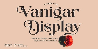 Vanigar Display is a serif font that comes with a very beautiful change character that will bring a touch of luxury and style to your projects. Vanigar Display is perfect for editorial design, branding, headings, logos, magazines and more.
 - Cool Sensation by Arendxstudio,
$13.00 Cool Sensation - Graffiti Font is a free style font that has the characteristics of street art that shows freedom and is filled with unique characters Features : • Character Set A-Z • Numerals & Punctuations (OpenType Standard) • Accents (Multilingual characters) • Ligature • Alternate
 - Funky Star by Arendxstudio,
$13.00 Funky Star - Graffiti Font is a free style font that has the characteristics of street art that shows freedom and is filled with unique characters Features : • Character Set A-Z • Numerals & Punctuations (OpenType Standard) • Accents (Multilingual characters) • Ligature • Alternate
 - Ysobel by Monotype,
$29.99 The Ysobel™ typeface family is not only elegant; it is also exceptionally legible and space economical. A collaborative design effort between Robin Nicholas, as lead designer and project director, Delve Withrington and Alice Savoie of Monotype Imaging, the project had the primary design goal of creating a typeface family for setting text in newspapers and periodicals. The result, however, is also ideal for any application that requires quick and easy assimilation of text. According to Nicholas, “The idea for the design started when I was asked to develop a custom version of Century Schoolbook. I wanted to give the design a more contemporary feel, although the client ultimately decided to keep their typeface closer to the original. The project nevertheless gave me ideas for a new design. Since designing Nimrod, some 30 years ago, I had wanted to make a more modern typeface family for newspapers and magazines – this seemed the ideal candidate.” Ysobel (pronounced “Isabel”) has the soft, inviting letter shapes of Century Schoolbook but contrasts these with more incised serifs and terminals. Its capitals are also narrower than those of Century Schoolbook, and care was taken to ensure that they harmonize perfectly with the lowercase. Ysobel’s x-height is full-bodied without disrupting lowercase proportions. In addition, curved terminals, such as those in the “C,” “c” and “e,” were drawn more open as an aid to legibility and readability in text copy. Weight stress is near vertical, and hairlines are robust to ensure character fidelity in small point sizes. Development began with the text version of the family, which has four weights, each with an italic companion. All weights feature lining and old style numerals, fractions, superiors and extended Latin language coverage. Small caps are also available in the Roman Regular design. Ysobel Display is a completely redrawn version of the typeface; it is narrower, and has a slightly smaller x-height, thinner hairlines and subtle design changes to improve its appearance when set at large sizes. The Display Italic received particular attention to make it ideal for setting headlines, subheads and short blocks of copy. Changes include a slightly greater italic angle and more cursive treatment of some letter shapes. Alternative styles of capital “J” and “Q,” to provide variation, are available in all weights.
 - Lektorat by TypeTogether,
$35.00 Florian Fecher’s Lektorat font family is one for the books, and for the screens, and for the magazines. While an editorial’s main goals are to entertain, inform, and persuade, more should be considered. For example, clear divisions are necessary, not just from one article to the next, but in how each is positioned as op-ed or fact-based, infographic or table, vilifying or uplifting. From masthead to colophon, Lektorat has six concise text styles and 21 display styles to captivate, educate, and motivate within any editorial purpose. Magazines and related publications are notoriously difficult to brand and then to format accordingly. The research behind Lektorat focused on expression versus communication and what it takes for a great typeface to accomplish both tasks. In the changeover from the 19th to 20th century, German type foundry Schelter & Giesecke published several grotesque families that would become Lektorat’s partial inspiration. Experimentation with concepts from different exemplars gave birth to Lektorat’s manifest character traits: raised shoulders, deep incisions within highly contrasted junctions, and asymmetrical counters in a sans family. After thoroughly analysing magazine publishing and editorial designs, Florian discovered that a concise setup is sufficient for general paragraph text. So Lektorat’s text offering is concentrated into six total styles: regular, semibold, and bold with their obliques. Stylistic sets are equally minimal; an alternate ‘k, K’ and tail-less ‘a’ appear in text only. No fluff, no wasted “good intentions”, just a laser-like suite to focus the reader on the words. The display styles were another matter. They aim to attract attention in banners, as oversized type filling small spaces, photo knockouts, and in subsidiary headings like decks, callouts, sections, and more. For these reasons, three dialed-in widths — Narrow, Condensed, and Compressed — complete the display offerings in seven upright weights each, flaunting 21 headlining fonts in total. If being on font technology’s cutting edge is more your goal, the Lektorat type family is optionally available in three small variable font files for ultimate control and data savings. The Lektorat typeface was forged with a steel spine for pixel and print publishing. It unwaveringly informs, convincingly persuades, and aesthetically entertains when the tone calls for it. Its sans serif forms expand in methodical ways until the heaviest two weights close in, highlighting its irrepressible usefulness to the very end. Lektorat is an example of how much we relish entering into an agreed battle of persuasion — one which both sides actually enjoy.
 - Gamory by Alit Design,
$21.00 🌿 Embrace the beauty of the natural world and the sophistication of elegant design with the Garmony Typeface. This exquisite font is a harmonious blend of nature-inspired decorative leaf illustrations and a versatile typeface that effortlessly combines two styles: Serif and Elegant Script. Whether you're working on a project for your wedding, branding, or any creative endeavor, Garmony brings the perfect balance of organic charm and refined aesthetics. ✒️ Serif Meets Script: Garmony Typeface seamlessly marries two distinct design styles. The serif characters exude a timeless and classical feel, while the elegant script elements add a touch of fluidity and grace. This dynamic fusion makes Garmony Typeface exceptionally versatile, suitable for various applications and themes. 🌱 Nature-Inspired Decorative Leaves: Each character within Garmony Typeface is adorned with delicate decorative leaf illustrations, reminiscent of lush foliage. These charming details infuse your text with a touch of nature, making it ideal for eco-friendly, organic, or natural-themed projects. 🎨 Dynamic Ligatures and Alternatives: Garmony Typeface includes an array of dynamic ligatures and alternative characters, enhancing the fluidity and elegance of your designs. With these options at your disposal, you can create text that appears hand-crafted and truly unique. 🌐 PUA Unicode and Multilingual Support: No matter where your project takes you, Garmony Typeface is fully equipped to meet your linguistic needs. It includes PUA (Private Use Area) Unicode, ensuring compatibility with various design software and providing support for multiple languages. This international versatility ensures your message reaches a global audience with style. 🌾 Swash and Swirl Delight: Elevate your design with Garmony's swash and swirl elements, perfect for adding an extra dash of sophistication to headlines, titles, and logos. These intricate details showcase the font's elegance, making it stand out in any context. 🌏 Versatility and Style: From wedding invitations to logos, product packaging to blog headers, Garmony Typeface brings unparalleled versatility and style to your creative projects. It's the perfect choice for designers, creatives, and individuals seeking a font that combines the beauty of the natural world with the grace of elegant design. Embrace the harmony of nature and elegance with Garmony Typeface. Unleash your creativity and let your designs flourish with the timeless charm and artistic sophistication that only Garmony can provide. Experience the magic of Garmony Typeface today and elevate your projects to a new level of style and allure.
 - Azbuka by Monotype,
$29.99 The Azbuka™ typeface family has its roots in a fairly pedestrian source. “The idea came in part from an old sign in London that read ‘SPRINKLER STOP VALVE’,” says Dave Farey, designer of the typeface. Like all good sign spotters, Farey took a photograph of the sign and filed it away for possible use in a lettering or typeface design project. In Prague a number of years later, the street signs reminded Farey of the London signage - and his camera came out again. Comparing the two back in his studio, he realized that the signs from London and Prague were not as similar as he initially thought. However, they were enough alike to serve as the foundation for a no-frills, 21st century sans serif typeface family. “I wanted to draw a wide range of weights, italic and condensed designs all in one go,” recalls Farey, “rather than add on to the family later.” His goal was to create a family that could be used for text and display copy, with sufficient weights to provide a broad typographic palette. Indeed, the completed design, created in collaboration with fellow type designer Richard Dawson, consists of twenty typefaces in eight weights ranging from extra light to extra black. The five mid-range designs have complementary italics. Seven condensed designs round out the family. Azbuka’s lighter weights perform remarkably well in blocks of text composition. “They’re clean and legible - and perhaps a little boring,” says Farey, “but they are perfect for copy with a down-to-earth, yet contemporary flavor.” The heavier weights are equally well suited for a variety of display uses. The designs are authoritative but not overbearing and will readily make a strong statement without calling attention to themselves. The condensed weights of Azbuka are ideal for those instances where you have a lot to say - and not much room to say it. The name Azbuka? It’s Russian for “alphabet.” And what more appropriate name could there be for this utilitarian, industrial-strength type family than alphabet? The Azbuka family is available as a suite of OpenType Pro fonts. Graphic communicators can now work with this versatile design while taking advantage of OpenType’s capabilities. The Azbuka Pro fonts also offer an extended character set that supports most Central European and many Eastern European languages
 - Zrnic by Typodermic,
$11.95 Looking for a typeface that perfectly captures the essence of industrial precision and futuristic design? Look no further than Zrnic. With its unique blend of boxy, plastic letterforms and strategically placed gaps, Zrnic delivers a stark, high-tech look that’s perfect for conveying your message with clarity and impact. Zrnic’s six weights and italics give you a range of options to choose from, allowing you to fine-tune the look and feel of your designs to perfectly match your needs. Whether you’re creating technical documentation, product manuals, or other materials that require a precise, professional look, Zrnic has got you covered. With Zrnic, you don’t have to worry about your message getting lost in the noise. Our unique design allows your text to stand out with crystal-clear precision, ensuring that your audience can quickly and easily understand your message. Zrnic’s gaps are strategically placed to reduce overall weight, giving you a clean, minimalistic look that’s perfect for modern designs. These gaps also provide increased impact, allowing your text to stand out and capture your audience’s attention. Zrnic is the ultimate tool for designers who want to convey the notion of technological precision with their designs. With its high-tech, industrial look and range of weights and italics, Zrnic is the perfect choice for technical documentation, product manuals, and other materials that demand a precise, professional look. Most Latin-based European writing systems are supported, including the following languages. Afaan Oromo, Afar, Afrikaans, Albanian, Alsatian, Aromanian, Aymara, Bashkir (Latin), Basque, Belarusian (Latin), Bemba, Bikol, Bosnian, Breton, Cape Verdean, Creole, Catalan, Cebuano, Chamorro, Chavacano, Chichewa, Crimean Tatar (Latin), Croatian, Czech, Danish, Dawan, Dholuo, Dutch, English, Estonian, Faroese, Fijian, Filipino, Finnish, French, Frisian, Friulian, Gagauz (Latin), Galician, Ganda, Genoese, German, Greenlandic, Guadeloupean Creole, Haitian Creole, Hawaiian, Hiligaynon, Hungarian, Icelandic, Ilocano, Indonesian, Irish, Italian, Jamaican, Kaqchikel, Karakalpak (Latin), Kashubian, Kikongo, Kinyarwanda, Kirundi, Kurdish (Latin), Latvian, Lithuanian, Lombard, Low Saxon, Luxembourgish, Maasai, Makhuwa, Malay, Maltese, Māori, Moldovan, Montenegrin, Ndebele, Neapolitan, Norwegian, Novial, Occitan, Ossetian (Latin), Papiamento, Piedmontese, Polish, Portuguese, Quechua, Rarotongan, Romanian, Romansh, Sami, Sango, Saramaccan, Sardinian, Scottish Gaelic, Serbian (Latin), Shona, Sicilian, Silesian, Slovak, Slovenian, Somali, Sorbian, Sotho, Spanish, Swahili, Swazi, Swedish, Tagalog, Tahitian, Tetum, Tongan, Tshiluba, Tsonga, Tswana, Tumbuka, Turkish, Turkmen (Latin), Tuvaluan, Uzbek (Latin), Venetian, Vepsian, Võro, Walloon, Waray-Waray, Wayuu, Welsh, Wolof, Xhosa, Yapese, Zapotec Zulu and Zuni.
 - Refuel by Typodermic,
$11.95 Introducing Refuel—a typeface that’s precise and unapologetically robust. Inspired by military aviation markings, Refuel features octagonal letterforms that exude strength and authority, making it perfect for your design projects that require a no-nonsense, technical look. One of the unique features of Refuel is that it automatically produces serifs when a capital “I” is followed by a lowercase “L”. This increases legibility and gives your text a professional touch. With six weights, six widths, and italics, Refuel is a versatile typeface that can be used for a range of design projects, from logos to headlines to body text. Whether you’re designing a brochure, a website, or a billboard, Refuel will help your message stand out with its clean lines, geometric shapes, and commanding presence. It’s the typeface you need when you want to make a statement without saying a word. So if you’re ready to refuel your design projects with a typeface that’s both technical and visually stunning, look no further than Refuel. It’s the perfect choice for designers who want to make an impact with their typography. Most Latin-based European, Vietnamese, Greek, and most Cyrillic-based writing systems are supported, including the following languages. Afaan Oromo, Afar, Afrikaans, Albanian, Alsatian, Aromanian, Aymara, Azerbaijani, Bashkir, Bashkir (Latin), Basque, Belarusian, Belarusian (Latin), Bemba, Bikol, Bosnian, Breton, Bulgarian, Buryat, Cape Verdean, Creole, Catalan, Cebuano, Chamorro, Chavacano, Chichewa, Crimean Tatar (Latin), Croatian, Czech, Danish, Dawan, Dholuo, Dungan, Dutch, English, Estonian, Faroese, Fijian, Filipino, Finnish, French, Frisian, Friulian, Gagauz (Latin), Galician, Ganda, Genoese, German, Gikuyu, Greenlandic, Guadeloupean Creole, Haitian Creole, Hawaiian, Hiligaynon, Hungarian, Icelandic, Igbo, Ilocano, Indonesian, Irish, Italian, Jamaican, Kaingang, Khalkha, Kalmyk, Kanuri, Kaqchikel, Karakalpak (Latin), Kashubian, Kazakh, Kikongo, Kinyarwanda, Kirundi, Komi-Permyak, Kurdish, Kurdish (Latin), Kyrgyz, Latvian, Lithuanian, Lombard, Low Saxon, Luxembourgish, Maasai, Macedonian, Makhuwa, Malay, Maltese, Māori, Moldovan, Montenegrin, Nahuatl, Ndebele, Neapolitan, Norwegian, Novial, Occitan, Ossetian, Ossetian (Latin), Papiamento, Piedmontese, Polish, Portuguese, Quechua, Rarotongan, Romanian, Romansh, Russian, Rusyn, Sami, Sango, Saramaccan, Sardinian, Scottish Gaelic, Serbian, Serbian (Latin), Shona, Sicilian, Silesian, Slovak, Slovenian, Somali, Sorbian, Sotho, Spanish, Swahili, Swazi, Swedish, Tagalog, Tahitian, Tajik, Tatar, Tetum, Tongan, Tshiluba, Tsonga, Tswana, Tumbuka, Turkish, Turkmen (Latin), Tuvaluan, Ukrainian, Uzbek, Uzbek (Latin), Venda, Venetian, Vepsian, Vietnamese, Võro, Walloon, Waray-Waray, Wayuu, Welsh, Wolof, Xavante, Xhosa, Yapese, Zapotec, Zarma, Zazaki, Zulu and Zuni.
 - Structia by Typodermic,
$11.95 As you consider the words you need to convey, it’s clear that you’re looking for something that feels just as precise and intentional as the message you’re promoting. Structia is a typeface that does not shy away from its influence—it leans into the hard edges and geometries that are typically associated with brutalist architecture. And yet, even as it draws inspiration from an austere and somewhat daunting aesthetic, Structia also possesses a sense of control and discipline that is undeniably alluring. At the core of Structia’s appeal is its mechanical precision. Every line, every curve, is carefully calculated and crafted to create a sense of mathematical accuracy that is difficult to resist. There is no room for error or imperfection in Structia—every stroke is sharp and precise, with chamfered corners that add an extra layer of texture and visual interest. This is not a typeface that allows for ambiguity—it demands clarity and specificity, and it delivers both with remarkable consistency. But Structia is more than just a collection of angular shapes and precise lines. It is a typeface that conveys a sense of scientific accuracy and chilly logic—a kind of elegance and refinement that is unexpected. There is a beauty in the way that Structia balances the hard-edged geometries of brutalism with a sense of control and finesse that is undeniably modern. It is a typeface that feels at once futuristic and timeless—a design that can be used in a wide variety of contexts and still feel fresh and relevant. And then there are the two effect styles—Structia Panel and Structia War—which take the basic geometry of the typeface and push it even further into the realm of science fiction. Structia Panel feels like something you might see on a spacecraft or in the architecture of an alien planet, with thin, laser-like struts that give it a futuristic edge. Structia War, meanwhile, takes the concept of Structia Panel and adds a layer of battle damage, as if the letters have been through a cosmic conflict and emerged victorious. In the end, Structia is a typeface that demands attention and respect. It is not a typeface that will fade into the background or blend in with the crowd—it is a design that is meant to be noticed and admired. And yet, even as it draws your eye with its hard-edged geometries and precise lines, it also possesses a sense of elegance and refinement that is undeniably alluring. Structia is a typeface that balances the old and the new, the hard and the soft, the mechanical and the human—and the result is something truly remarkable. Most Latin-based European, and some Cyrillic-based writing systems are supported, including the following languages. A Afaan Oromo, Afar, Afrikaans, Albanian, Alsatian, Aromanian, Aymara, Bashkir (Latin), Basque, Belarusian (Latin), Bemba, Bikol, Bosnian, Breton, Bulgarian, Cape Verdean, Creole, Catalan, Cebuano, Chamorro, Chavacano, Chichewa, Crimean Tatar (Latin), Croatian, Czech, Danish, Dawan, Dholuo, Dutch, English, Estonian, Faroese, Fijian, Filipino, Finnish, French, Frisian, Friulian, Gagauz (Latin), Galician, Ganda, Genoese, German, Greenlandic, Guadeloupean Creole, Haitian Creole, Hawaiian, Hiligaynon, Hungarian, Icelandic, Ilocano, Indonesian, Irish, Italian, Jamaican, Kaqchikel, Karakalpak (Latin), Kashubian, Kikongo, Kinyarwanda, Kirundi, Komi-Permyak, Kurdish (Latin), Latvian, Lithuanian, Lombard, Low Saxon, Luxembourgish, Maasai, Macedonian, Makhuwa, Malay, Maltese, Māori, Moldovan, Montenegrin, Ndebele, Neapolitan, Norwegian, Novial, Occitan, Ossetian, Ossetian (Latin), Papiamento, Piedmontese, Polish, Portuguese, Quechua, Rarotongan, Romanian, Romansh, Russian, Sami, Sango, Saramaccan, Sardinian, Scottish Gaelic, Serbian, Serbian (Latin), Shona, Sicilian, Silesian, Slovak, Slovenian, Somali, Sorbian, Sotho, Spanish, Swahili, Swazi, Swedish, Tagalog, Tahitian, Tetum, Tongan, Tshiluba, Tsonga, Tswana, Tumbuka, Turkish, Turkmen (Latin), Tuvaluan, Uzbek (Latin), Venetian, Vepsian, Võro, Walloon, Waray-Waray, Wayuu, Welsh, Wolof, Xhosa, Yapese, Zapotec Zulu and Zuni.
 - Comicraft by Comicraft,
$19.00 FIFTEEN YEARS! Hundreds of fonts of Unique Design, Thousands of pages of Fine Lettering, Millions of satisfied customers and Elephantmen served! Yes, this month marks Comicraft's fifteenth anniversary and we're celebrating with the relaunch of the COMICRAFT website and the launch of a brand new font... a font that's not just a bunch of letters arranged in alphabetical order... this one's Carefree, Original, Mirthful and Interesting, it's Clever, it's a little bit Raunchy, a little bit Adventurous, Friendly and Tenacious all at the same time -- and if that doesn't spell COMICRAFT, then we just didn't eat enough chocolate today. COMICRAFT: Stimulating the release of endorphins in your system preferences since 1992.
 - Mr Black by Hipopotam Studio,
$20.00 To design Mr Black, we used old ('70-'80) dry transfer lettering sheets that were used by my grandfather who was a military cartographer. We had only two almost used-up sheets. The letters didn't transfer so well but we liked the way they were damaged. All of the characters have a very high resolution so they can be used in a large scale. Mr Black doesn't have lowercases but has up to three alternate uppercase for each letter. Checkout Mr Tiger if your looking for lowercase letters with the same distortion effect. We designed it for our book for children, “Who eats Whom”
 - Charlies BarBQ JNL by Jeff Levine,
$29.00If one were to be visiting Dania Beach in South Florida, they would find on the West side of US 1 just North of Sheridan Street a Bar-B-Q joint located smack dab between a McDonald’s and an all-you-can-eat buffet that took over a closed down Pizza Hut. Charlie’s BarBQ JNL is Jeff Levine’s homage to some great Texas Bar-B-Q - cooked by a Cuban immigrant - served in South Florida... A true American success story, but with a sad ending. Charlie's closed because the landlord wanted the property. for his own use. Charlie now resides in Leon, Nicaragua and runs some successful business ventures there. - Charles S. - Personal use only

- Batmeton by Aqeela Studio,
$20.00 Batmeton Script is a free-flowing script font created for packaging products, invitation cards, flyers, mockups, event posters, and anything else that requires high-quality vibes. It has a beautiful and balanced character, that fits well with the large design pool.
 - Novantico by Typofactura,
$14.00 Novantico is an all capitals typeface, influenced mainly by roman inscriptional capitals and renaissance typefaces. Classicly designed forms give text a noble and elegant feel. It is intended to be used for relatively short and important texts, titles, headings, quotes, etc.
 - Chenilo by PizzaDude.dk,
$20.00 A grunge font that comes with different upper- and lowercase, alternate letters and ligatures for both double numbers and double letters - and on top of that, unique accented characters! You will need to use OpenType supporting applications to use the autoligatures.
 - Neon Ring by Arendxstudio,
$13.00 Neon Ring - Graffiti Display Font is a free style font that has the characteristics of street art that shows freedom and is filled with unique characters Features : • Character Set A-Z • Numerals & Punctuations (OpenType Standard) • Accents (Multilingual characters) • Ligature • Alternate
 - Khatulistiwa by Arendxstudio,
$16.00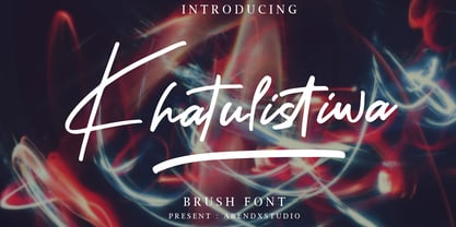 Khatulistiwa is a handwritten font that is very charismatic and with a strong character, that will be very suitable for the various needs of your design projects. Features : • Character Set A-Z • Numerals & Punctuations (OpenType Standard) • Accents (Multilingual characters) • Ligature • Swash
