7,952 search results
(0.04 seconds)
- Sidra Sans by Blythe Green,
$10.00 Sidra Sans is an upper-case font with an authentic, handwritten feel. It's perfect for: logos, playful branding, greeting cards, shirts, quotes, textiles, posters, magazines, social media, planners, prints, and more. FEATURES: Consistent stroke widths for linear designs Multilingual characters for the global designer
 - Safirah Moon by Silverdav,
$14.00 Safirah moon font is a straightforward handwritten font, this font is very beautiful, and is perfect for your design needs, this font is very neat, and uses little nodes Safirah moon font, suitable for branding, logos, signatures, t-shirts, magazines, book covers, and many more,
 - Ultra Break by Lumiks Design,
$15.00 Ultra Break is a handwritten all-caps font with condensed proportions and dynamic feeling, with a lot of ligatures available. The uppercase has the main letters and the lowercase has alternate letters. It is great for display, branding, packaging, advertising, sports, titles, posters, and more!
 - Merry Fleurons by Greater Albion Typefounders,
$3.95 Merry Fleurons is a bit of fun for Christmas, New Year and the holidays. It's ideal for decorating your own cards, party banners and any sort of Christmas publications. Need Holly? Christmas Trees? Baubles? Candy Canes? Angels? Merry Fleurons is just what you need.
 - Vector Type by Garisman Studio,
$20.00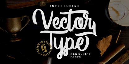 Welcome to our newest product: VECTOR TYPE In addition, this font is very suitable for design t-shirts, branding projects, wedding designs, social media posts, advertisements, product packaging, product, and logo. designs, labels, photography, watermark, invitation, stationery and any projects that need handwriting taste.
 - Aviation Cocktail by Vozzy,
$5.00 Introducing a vintage look label font named "Aviation Cocktail". All available characters you can see at the screenshot. This font have 6 styles (including layered shadow effect style). This font will good viewed on any retro design like poster, t-shirt, label, logo etc.
 - Scout Athletic Typeface by Hipfonts,
$18.00 Scout is a sharp, clean, and bold athletic font. It is a very versatile display typeface perfect for sports branding, emblems, jerseys, posters, apparel design, magazine headlines, labels and so much more. Scout is fully-kerned and ready to be used right out the box.
 - ITC Gramophone by ITC,
$29.99ITC Gramophone is a work of Canadian designer Serge Pichii. The distinguishing feature is the large spiral which is part of the form of almost every capital letter as well as many other characters. The capitals can also be used as drop capitals. The forms of ITC Gramophone are perfect for displays and will surely catch the eye of any reader. - Becker Monoline Modern NF by Nick's Fonts,
$10.00The first in a series of typefaces based on the work of legendary lettering artist Alf Becker, whose works appeared in Signs of the Times magazine for almost thirty years. Originally titled "Extreme Thin Gothic", this was Becker’s 185th design for the magazine. Both versions of the font include the 1252 Latin and 1250 CE character sets (with localization for Romanian and Moldovan). - Cindie Mono by Lewis McGuffie Type,
$34.99 Cindie Mono is a multi-width display font. Six different widths – A (condensed) through F (super extended) – mathematically correspond with one-another creating a stackable type family. Each face contains all caps full West, Central and East European language support. All diacritics and marks are done in a hairline to add style and contrast. And Cindie Mono is ideal for posters, headlines and display lettering. The inspiration for Cindie Mono came from the lettering styles on optometrists sight-test posters. Then through several stages of development the overall concept for Cindie became of a half-broken Commodore64 and the computer from the 1985 movie 'Weird Science' hooked up to a dot-matrix printer spitting out reams of mechanical but distorted mono-lettering all the while an old modem you can't seem find keeps beeping and beeping and beeping...
 - Bathysphere by Kickingbird,
$24.00 This steam era typeface, created by Gustav Schroeder in 1884, found popular use on soap box labels and tobacco tins during its initial release. Then, later, a successful and stout revival of Gustav's face, named Othello, was carried out by Morris Fuller Benton in 1934, and the typeface's appeal widened to include items such as broadside posters featuring Boris Karloff's Frankenstein. After metal gave way to film type, Gustav's creation experienced a brief fashion moment in the 1960's, but then disappeared entirely, never re-surfacing as a full digital typeface. With the release of Bathysphere, the typeface comes full circle, having been completely redrawn from scratch using Gustav's original specimens. The new extended language support establishes the typeface firmly in the modern era, while Bathysphere's refinement of subtle blunt corners restores a deep-sea grace to this iron giant.
 - Gazi by Fontuma,
$24.00 Gazi is the honorary title given by the state to the commanders who defeated the enemy by showing extraordinary benefits. This title was first given to Mustafa Kemal Atatürk by the Turkish Grand National Assembly on September 19, 1921. Gazi font was designed for Mustafa Kemal Atatürk, who founded the Turkish Republic. This type face consists of two families:: ▪ Gazi: Font family with Latin alphabets ▪ Gazi Pro: Font family including Latin and Arabic alphabets The Gazi font family is ideal for those looking for a new and aesthetic serif font. This font with modern lines can be used in all broadcast and printing areas. Gazi font will meet your needs and expectations in terms of the number of glyphs and the languages it supports. The font family includes many open type features, as well as some ligatures, and many currency symbols.
 - Plinc Bubble Gum by House Industries,
$33.00 Bubble Gum is a juicy multi-dimensional gob of goodness that’s bursting at the seams with loads of alphabetic appeal. Its well-padded figure transforms the ample letterforms found in classic comic strip word balloons into a warm and casual display font with a little extra kick. Cooked up by Dave West for Photo-Lettering, Inc. between the late 1960s and early 70s, Bubble Gum was finally digitized by Jess Collins in 2011. Please note that the shaded version of the typeface is composed by layering the Regular font and a separate Drop Shadow font. Some assembly required. Like all good subversives, House Industries hides in plain sight while amplifying the look, feel and style of the world’s most interesting brands, products and people. Based in Delaware, visually influencing the world. Featured in: Best Fonts for Logos
 - Bernat by Designova,
$15.00 BERNAT is a unique display typeface perfect for headlines, big text, brandings, logotypes & graphic design purposes such as posters, flyers, and advertisements. This all-caps font can be an excellent choice for creating outstanding logos, promotional content, and marketing presentations that bring uniqueness and freshness. The font is very flexible in terms of your creativity, you can adjust the letterspacing to design unique textual presentations, especially for creating amazing logotypes and branding designs. Please see the examples shown above to get an idea of the capability of this typeface. Extra Features: BERNAT features a Stylistic Alternatives Set of 22 glyphs covering major glyphs which will give you more possibilities to create unique design combinations. The font comes with extended language support including Western European, Central European, and South-Eastern European character sets (a total of 290 glyphs).
 - Cachet by Monotype,
$50.99According to designer David Farey, Cachet is a monospaced, monostroke typeface -- that isn't."" Why the sleight of hand? Typefaces that are limited to a single character and stroke width suffer in terms of legibility. Farey's goal in drawing Cachet was to create a typeface that gives the illusion of monospacing, while delivering a subliminal dose of reader-friendliness. At first glance, Cachet appears to be constructed of straight and nearly-straight strokes. A closer look, however, reveals several subtleties. Curved strokes have an almost calligraphic spontaneity. Places where character strokes meet are tapered slightly, while stroke ends have been flared. These quiet deviations from geometric uniformity give the design a human, organic, and decidedly non-digital look. An added benefit is that the subtle design modulation benefits readability. Farey's subtle design modulation results in a legible and highly usable new typeface. - Gazi Pro by Fontuma,
$38.00 Gazi is the honorary title given by the state to the commanders who defeated the enemy by showing extraordinary benefits. This title was first given to Mustafa Kemal Atatürk by the Turkish Grand National Assembly on September 19, 1921. Gazi font was designed for Mustafa Kemal Atatürk, who founded the Turkish Republic. This type face consists of two families:: ▪ Gazi: Font family with Latin alphabets ▪ Gazi Pro: Font family including Latin and Arabic alphabets The Gazi font family is ideal for those looking for a new and aesthetic serif font. This font with modern lines can be used in all broadcast and printing areas. Gazi font will meet your needs and expectations in terms of the number of glyphs and the languages it supports. The font family includes many open type features, as well as some ligatures, and many currency symbols.
 - Ukiyo Mind by Kitchen Table Type Foundry,
$15.00 By chance I stumbled upon an unfinished font in my fonts folder (while looking for something else). It had a stupid working name, but when I opened it, the font looked really nice! I have no idea why I never finished it. I renamed it Ukiyo Mind, because the font looked a bit like Japanese brush strokes. Ukiyo is a Japanese term which roughly translates as ‘the fleeting/transient world’. In mediaval Japan, the word was associated with Buddhism, but later it was used to describe the urban lifestyle and the pleasure seeking aspects of it. Nowadays it refers to a ‘living in the moment’ state of mind. Ukiyo Mind is a really nice brush font, which I probably made using Chinese ink and a brush. It comes with extensive language support and a set of alternates for the lower case glyphs.
 - Technopen JNL by Jeff Levine,
$29.00 At first glance, the lettering style of Technopen JNL seems to emulate the computer-age fonts of the 1980s. In actuality, this font is derived from an alphabet sample found in an instructional booklet for the Esterbrook Drawlet Pens. The Drawlet line was Esterbrook's answer to the iconic Speedball pen points sold through their chief competitor, the Hunt Pen Manufacturing Company. So, what seems to be late 20th Century typography is actually from vintage source material. In fact, the entire contents of the instructional booklet were copyright 1929! A few minor changes were made to the original A-Z alphabet and additional characters were added. The name Technopen is a shortening of the term 'technical pen', which is both a nod to the techno age of the 80s and the technical instruments of the past utilized for drawing and lettering.
 - Maketa - Personal use only

- Oxona - Personal use only

- OXIDO ExtBd ExtCond - Personal use only

- WARFIELD - Personal use only

- Oxona Caps - Personal use only

- Loyolliams by Eyad Al-Samman,
$5.00 “Loyolliams” is my first designed Latin typeface which has special meanings and unforgettable memories for me. The font's name, Loyolliams, consists of two mixed syllables stand for two different names. The first syllable is derived from the name “Loyola” and the second syllable is derived from the last five letters of the name “Williams.” These two names are related to “Concordia University”—located in Montreal in Canada—where I studied at a short academic term and spent in a very special period of my life in the late 2005. This renowned Canadian academic institution was created following the 1974 merger of “Loyola College” (1896) and “Sir George Williams University” (1926). This conglomeration formed “Concordia University” and the name Concordia itself was taken from the motto of the city of Montreal, Concordia salus (meaning ‘well-being through harmony’). This font comes in two different weights; light and regular. “Loyolliams” is a square, geometric, techno, and modern font. It is suitable for T-shirts, books' covers, websites’ addresses, advertisement light boards, and titles in technical, artistic, and other types of magazines and signboards. “Loyolliams” can be used also in posters, surfaces of electrical and electronic tools, digital devices and chips, geometrical machines, trucks, tractors, calculators, mobile phones, watches, laptops, personal computers, power equipments, digital cameras, technical magazines, and other digital and electronic tools. This fonts can be effectively used in titles especially when its uppercase and lowercase letters are mixed together and when it is used in its italic mode. "Loyolliams" is suitable for writing and printing small textual paragraphs in cards, magazines advertisements, and also posters. The main characteristic of "Loyolliams" Typeface is its non-curve style in most of its alphanumeric letters. The characters are deliberately designed to have only angular and square shapes.
 - Happy Brain Creepy Thalamus by TypoGraphicDesign,
$19.00 CONCEPT/ CHARACTERISTICS The base was a head-vein illustration. This served as a design grid. Novel letterforms were sought and found. Hand-drawn analog and digitized later. Experimentally, novel, fresh and an eye-catcher. Completely new insights into the human brain. A font for happy thoughts. ghostly visions, or simply for the next freshen party flyers. APPLICATION AREA The happy, creepy, Horror handmade font »Happy Brain Creepy Thalamus« with many language support would look good at headlines. Magazines or websites, party flyer, movie posters, music Poster, music covers or webbanner. TECHNICAL SPECIFICATIONS Headline Font | Display Font | Handmade Horror Font "Happy Brain Creepy Thalamus" OpenType Font with 283 glyphs, alternative letters and ligatures (with accents & €) & 1 style (regular).
 - Boldye by Logofonts,
$10.00 Boldye Font Inspired by the Reebok Logo and Sport typeface style. Boldye are strong on the curves and sharp on the edges of some of the letters suitable for logo projects, branding, posters with sports themes. Easily creates your own logo type with fonts. Boldye has an Open Type feature to access a large selection of unique alternative letters and many ligatures to make it easier for you to create. Boldye can be accessed perfectly on design applications such as Adobe Illustrator, Adobe Photoshop, Corel Draw, Affinity Designer but does not rule out the possibility that it can also be accessed using web-based applications such as kittl, canva, artboard studio and others.
 - Canelo by Flawlessandco,
$9.00 Introducing "Canelo" is a playful handwritten font. Dive into the world of joyous design with "Canelo," a delightful handwritten font that brings an element of fun to every project. This font contains a regular style and fun style, which is equipped with patterns in fun-style fonts. There's some connected letters and some alternates that suitable for any graphic designs such as branding materials, t-shirt, print, business cards, logo, poster, t-shirt, photography, quotes .etc This font support for some multilingual. Also contains uppercase A-Z and lowercase a-z, alternate character, numbers 0-9, and some punctuation. If you need help, just write me! Thanks so much for checking out my shop!
 - Marson by Flawlessandco,
$9.00 Introducing "Marson" - A Groovy Retro Typeface. Unleash the nostalgic charm of the past with Marson, a captivating groovy retro typeface designed to transport your designs back in time. With its sleek lines, bold curves, and distinct 70s-inspired aesthetic, Marson brings an essence of vintage coolness to any project. There's some connected letters and some alternates that suitable for any graphic designs such as branding materials, t-shirt, print, business cards, logo, poster, t-shirt, photography, quotes .etc This font support for some multilingual. Also contains uppercase A-Z and lowercase a-z, alternate character, numbers 0-9, and some punctuation. If you need help, just write me! Thanks so much for checking out my shop!
 - Freudian by Garisman Studio,
$18.00 Welcome to Freudian Typeface! This font gives a feeling of vintage, classic, old, and handmade. It's already PUA Encoded! I think this font is perfect for people looking for vintage aesthetic or hand-drawn logo. Suitable for any graphic designs such as branding materials, t-shirt, print, business cards, logo, poster, t-shirt, photography, quotes, etc. Advantages: - Simple installation - Support for MAC and PC - OpenType features (support untuk Adobe Illustrator, Photoshop, Indesign, Corel Draw X6-X8, and other software support opentype) - Support for 23 Languages: Afrikaans, Albanian, Catalan, Croatian, Czech, Danish, Dutch, English, Estonian, Finnish, French, Hungarian, Icelandic, Italian, Norwegian, Polish, Portuguese, Slovak, Slovenian, Spanish, Swedish and Zulu - Opentype ligatures - Pairing fonts
 - 1871 Dreamer Script by GLC,
$38.00 This script font was inspired from a lot of manuscripts, notes and drafts, written by the famous American poet Walt Whitman. It is a very elegant type, in spite of a few curious ligatures, often concerning the r or z small letters. Notice the very characteristic “th”. It is used as variously as web-site titles, posters and fliers design or greeting cards, all various sorts of presentations, menus, certificates, letters. This font, in spite of its small size, supports very strong enlargements as well as small sizes ( the original size was about 36 to 48 pts ). When printed, it remains perfectly legible and elegant from 9/11 pts even if using an ordinary inkjet printer.
 - Khalid by Flawlessandco,
$9.00 Khalid is a modern Arabic font that combines traditional elements with a fresh, contemporary aesthetic. This versatile font is perfect for creating eye-catching designs for both digital and print projects. With its unique alternates and ligatures, Khalid offers a level of customization that sets it apart from other Arabic fonts. There's some connected letters and some alternates that suitable for any graphic designs such as branding materials, t-shirt, print, business cards, logo, poster, t-shirt, photography, quotes .etc This font support for some multilingual. Also contains uppercase A-Z and lowercase a-z, alternate character, numbers 0-9, and some punctuation. If you need help, just write me! Thanks so much for checking out my shop!
 - Respati by Flawlessandco,
$9.00 Introducing Respati: A Modern Kufic Calligraphy Font. Respati is an exquisite and captivating typeface that beautifully merges the timeless elegance of Kufic calligraphy with a modern twist. With its distinct and sophisticated design, Respati is the perfect choice for adding a touch of refinement to your projects. There's some connected letters and some alternates that suitable for any graphic designs such as branding materials, t-shirt, print, business cards, logo, poster, t-shirt, photography, quotes .etc This font support for some multilingual. Also contains uppercase A-Z and lowercase a-z, alternate character, numbers 0-9, and some punctuation. If you need help, just write me! Thanks so much for checking out my shop!
 - Trasandina by TipoType,
$24.00 Trasandina is a very unique font-family: a modern, versatile, workhorse typeface with a special personality, given by the mix of humanist and geometric models, remaining far from both extremes. This typeface has 9 styles plus their matching italics, it has an incredible wide range of weights, from very thin to an ultra thick stem. This was made following the Luc(as) de Groot’s Interpolation Theory. Trasandina’s versatility also resides in the +800 characters that each weight includes, having several open type features and language support for more than 200 languages. This font has been specially designed for web (using hinting instructions), making it work in small and large sizes on different types of screen resolutions. Trasandina’s most interesting feature is its flexibility: On one hand, is easy to read thanks to its humanistic letterforms which allow this typeface to be legible in small sizes while remaining neutral (specially around its middle weights). And, at the same time, it’s perfect for logos and posters that need a lot more personality, this is mainly due to its more geometric nature in light and bold weights. Thank you for your support! It’s people like you that allow our team to keep enjoying creating new fonts. That’s why we’d like to hear from you! Send us your work using our fonts: info@tipotype.com, and you'll have a special 50% OFF on Tipotype at Myfonts
 - VLNL Thueringer by VetteLetters,
$30.00 We cannot imagine anyone not liking beer. Especially on a warm summer night there is simply little that can top an ice cold brewski. And with the current wave of home-brewed ales and lagers, Vette Letters decided to not stay behind and brew its own brand. Just so we can design our own beer bottle label using our own font. VLNL Thueringer comes from the drawing board of Jacques Le Bailly (a.k.a. Baron von Fonthausen), the German-French specialist in the fields of both beer and type design. One day Jacques got inspired by Albrecht Dürers 15th century Fraktur (blackletter) alphabet, and decided to design a contemporary rounded version of it. Although the historic context is clearly visible, Thueringer definitely stands its own ground. It's a modern techno-style blackletter with a (beer)truckload of interesting design details. Thueringer contains a number of ligatures and an alternate set of numbers. Apart from the regular uses like logos, posters, flyers and headlines we definitely would like to see our Thueringer used on beer bottle labels and crates, but also cafés and hipster bars would do well with this modern-day blackletter. Hell, even wine or liquor labels, football team jerseys, Oktoberfest flyers, it's just too much to mention. As long as it is accompanied by a cold beer.
 - Futura Now Variable by Monotype,
$383.99 For nearly 90 years, Paul Renner’s Futura has been as popular as it is versatile—from children’s books to fashion magazines to the plaque on the Moon. Futura is a typographic icon. Futura Now offers designers a chance to see Futura with fresh eyes. It’s more truly Futura-like than any digital version you’ve ever worked with. “It brings some much-needed humanity back to the world of geometric sans serifs,” says Steve Matteson, Monotype’s Creative Type Director who led the design team. “Despite its reputation as the ultimate modern typeface, Futura Now is surprisingly warm,” he explains. “It’s just as at home set next to a leafy tree as it is next to a stainless-steel table, because it skillfully navigates the border between super-clean geometry and humanist warmth.” Futura Now—the definitive Futura—contains 102 styles, including: new Headline and Text weights; new Script and Display weights and styles; and new decorative variants (outlines, inlines, shadows, and fill). Its contemporary alignment of names and weights makes the family easier to understand and use, and its comfortable Text and judicious Headline subfamilies provide instantly refined spacing. With a large Latin, Greek, and Cyrillic character-set, Futura Now serves a wider international creative community. Futura Now is available both as individual OpenType fonts and as a set of Variable fonts, delivering limitless styles in a tidy digital footprint.
 - Kuschelfraktur by Catharsis Fonts,
$36.00 Kuschelfraktur is a unique, eye-catching take on the theme of blackletter that replaces the broad nib with a brush pen and achieves stroke modulation through stencil-like gaps. It combines the texture and dignity of blackletter with the human warmth of informal handwriting. Kuschelfraktur offers five separate sets of capital letters and several additional customization option via stylistic alternates. The degree of ornamentation in the blackletter capitals can be increased (SS02) or decreased (SS07), while SS04 and SS05 offer two simpler approaches to capital letters that bridge from blackletter to Roman letters (Antiqua). The default single-storey �a� can be replaced with a two-storey version in SS01, and SS08 offers a single-storey capital �A� for the simple capitals. Finally, SS03 restores some of the more unique letter shapes of the Fraktur style of blackletter. The old-style figures can be replaced with lining and/or tabular figures. All these stylistic sets are accessible via OpenType from the main font, Kuschelfraktur, whereas the spin-off fonts (Traditional, Verziert, Text, Schlicht, Antiqua) offer convenient access to those sets even in environments without OpenType support. I am grateful to the helpful souls on the TypeDrawers and Typographie.info forums for encouragement and constructive feedback, and to the Glyphs team for their fantastic type editor. Kuschelfraktur is dedicated to my son Marius.
 - Banana Yeti by Zetafonts,
$29.00 Banana Yeti is a brush script typeface with a condensed vertical slant, inspired by a handmade sample drawn by the calligrapher Ross Frederic George and depicted in Speedball 1947 Textbook Manual. Banana Yeti has a vintage brush script look, perfect for food packaging, display and logo design and period advertising. The original design has been completely reworked and extended by the Zetafonts Masterclass 2016 Team to provide three lighter weights, and a monoline variant, as well as to produce an extended character set with open type support for ligatures, alternates, European languages and ending swashes. Banana Yeti covers over 40 languages that use the Latin alphabet, with a full range of accents and diacritics. It comes in four weights plus a special monoline weight. Banana Yeti makes full use of Open Type ligatures to provide swashes, arching letters and a wide array of ligature characters for a more handmade, natural look. Swashes can be accessed through glyph palette or by typing one to six underscores after the letter. Typing an underscore before a phrase creates arching text; close arch with another underscore. Variant ampersands can be accessed through glyph palette or by typing multiple ampersand characters. Take care: open type features are developed using open type technology, fully compatible with Adobe software and major design softwares and OS, but not supported by every software. Check before buying!
 - Futura Now for Leica by Monotype,
$53.99For nearly 90 years, Paul Renner’s Futura has been as popular as it is versatile—from children’s books to fashion magazines to the plaque on the Moon. Futura is a typographic icon. Futura Now offers designers a chance to see Futura with fresh eyes. It’s more truly Futura-like than any digital version you’ve ever worked with. “It brings some much-needed humanity back to the world of geometric sans serifs,” says Steve Matteson, Monotype’s Creative Type Director who led the design team. “Despite its reputation as the ultimate modern typeface, Futura Now is surprisingly warm,” he explains. “It’s just as at home set next to a leafy tree as it is next to a stainless-steel table, because it skillfully navigates the border between super-clean geometry and humanist warmth.” Futura Now—the definitive Futura—contains 102 styles, including: new Headline and Text weights; new Script and Display weights and styles; and new decorative variants (outlines, inlines, shadows, and fill). Its contemporary alignment of names and weights makes the family easier to understand and use, and its comfortable Text and judicious Headline subfamilies provide instantly refined spacing. With a large Latin, Greek, and Cyrillic character-set, Futura Now serves a wider international creative community. Futura Now is available both as individual OpenType fonts and as a set of Variable fonts, delivering limitless styles in a tidy digital footprint. - Futura Now by Monotype,
$53.99 For nearly 90 years, Paul Renner’s Futura has been as popular as it is versatile—from children’s books to fashion magazines to the plaque on the Moon. Futura is a typographic icon. Futura Now offers designers a chance to see Futura with fresh eyes. It’s more truly Futura-like than any digital version you’ve ever worked with. “It brings some much-needed humanity back to the world of geometric sans serifs,” says Steve Matteson, Monotype’s Creative Type Director who led the design team. “Despite its reputation as the ultimate modern typeface, Futura Now is surprisingly warm,” he explains. “It’s just as at home set next to a leafy tree as it is next to a stainless-steel table, because it skillfully navigates the border between super-clean geometry and humanist warmth.” Futura Now—the definitive Futura—contains 102 styles, including: new Headline and Text weights; new Script and Display weights and styles; and new decorative variants (outlines, inlines, shadows, and fill). Its contemporary alignment of names and weights makes the family easier to understand and use, and its comfortable Text and judicious Headline subfamilies provide instantly refined spacing. With a large Latin, Greek, and Cyrillic character-set, Futura Now serves a wider international creative community. Futura Now is available both as individual OpenType fonts and as a set of Variable fonts, delivering limitless styles in a tidy digital footprint.
 - Smallstep Pro by Evolutionfonts,
$- Smallstep - One geometric sans serif with a free spirit. If we presume that geometric typefaces play with the idea of what typography would look like in the future when all unnecessary elements would disappear, than most of their designers seem to envision the future in a rather metropolisque kind of way. We love geometric faces, but the cold and heartless feelings that most of them leave is just not our cup of tea. That is why we are happy to bring some optimism in that genre with our new typeface. We called it Smallstep. Smallstep is a typeface that follows the traditions of classic geometric sans serifs like “Futura”, but is at the same time friendly and whimsical. We took the liberty to deviate from the standard sans serif glyphs while drawing some characters (such as ”a” and ”r” ), others (“w” “k”) are completely redesigned. Probably the biggest trademark of this typeface is the way vertical lines in most lower case characters are “cut” so they end in a 60 degree angle. Smallstep is over all a expressive face, which means it brings some emotions to your design and feelings in itself, and should be used accordingly. Other than that, it is suitable for both headline and body text, print and web. So what kind of name is “Smallstep”? We view the type design process as a form of evolution: There can be no typeface that differs drastically from the current standards, since its characters would be unrecognizable and thus unreadable. But at the same time there are hundreds of faces that differ a little, and still manage to make a difference by moving with small steps towards better and more refined looks. Smallstep consist of 4 weights, that cover all the features, that are expected of a modern Opentype face: kerning pairs, ligatures, true italics and alternative characters, plus a set of symbols, that will help you start off your designs more easily.


