10,000 search results
(0.043 seconds)
- Smashing by PintassilgoPrints,
$26.00 Smashing is a stout typeface, with a twist. It’s a massive all-caps font with bouncing glyphs, positively bold yet quite good-humored. Its upper and lower case slots stores different lettershapes, providing handy options to choose from. When working with OpenType savvy applications you can turn on the contextual alternates feature to instantly get alternating glyphs, which add spontaneity to your artwork and prevent neighbor double letters from using the same glyph. Also try the discretionary ligatures feature to get some cool interlocking pairs. A smashing font for truly smashing designs!
 - Mellifret by Java Pep,
$13.00 Mellifret is a semi-bold script font which has strong, bold, and elegant characters. Mellifret is suitable for posters, logos, book covers and magazines, website tittles, wedding cards and more. Mellifrent offers: 1. Multi-lingual support for Danish, Cornish, Croatian, Czech, Filipino, French, Portuguese, Hungarian, Irish, English, Finnish, Norwegian, Polish, Romansh, Italian, Swiss German and others. 2. Includes ligatures set, alternates and swash characters set. I hope you enjoy using Mellifret! If you have any question about this font, please let me know with your comments. Thanks for watching!
 - Rum Raisin Pro by Stiggy & Sands,
$29.00 Our Rum Raisin Pro was inspired by the lettering from a vintage Kellogg's Raisin Bran cereal box, yet is has expanded from what was originally a unicase design to include a lowercase character set. For those seeking to use the original unicase A, you can find it in the Delta character slot. Fun and festive, this font plays the comic clown to perfection. The SmallCaps and extensive figure sets offer a change up to a slightly more serious tone or alternate personality for a wider range of use.
 - ITC Pino by ITC,
$29.99The ITC Pino™ typeface family is Slobodan Jelesijevic’s second suite of commercial fonts. Although a small family of three weights, it is remarkably versatile. Like many typefaces, Pino grew out of a desire for a particular kind of design. Jelesijevic was creating a series of illustrations for a children’s magazine and needed a typeface that was lighthearted, legible and would complement his illustrative style. Unable to find exactly what he needed, he decided to make his own font. “I spent the better part of a day looking for just the right typeface,” he recalls. “Of course, the hard part was finding something that would harmonize perfectly with my drawings. A custom font was not part of the project brief or budget, but I thought that perhaps I could use it again.” The regular weight of Pino became the solution to Jelesijevic’s problem. Jelesijevic did use the font again, but quickly realized that the single weight needed companion designs. Pino Bold and Black followed in quick succession. Before licensing the designs to ITC, the three-weight family provided headlines, book cover titles and even short blocks of text copy in several of Jelesijevic’s design projects. Born in Gornji Milanovac, Serbia, in 1951, Jelesijevic graduated with a degree in graphic communication and lettering from the Faculty of Applied Arts in the University of Arts in Belgrade. Currently, in addition to typeface design, he is sought out as a graphic designer and illustrator. When not working on design projects, he teaches graphic communications at the Faculty of Art in the University of Niš, Serbia. Pino is a stressed sans of slightly condensed proportions. Pino’s generous x-height, clearly defined counters and distinctive character shapes enable it to fulfill a wide variety of typographic applications. Friendly without being sanguine, the Pino type family will communicate with charm and vitality. - Josef K Paneuropean by Juliasys,
$38.95 With the Josef K *, Julia Sysmäläinen continues her artistic debate on Franz Kafka’s writing style. This time the designer of FF Mister K is not drawn to Kafka’s literary works created at night but to those the writer produced at daytime as a high-ranking, confident bureaucrat – Dr Franz Kafka. The typefaces Josef K “Paneuropean” and “Strong European” echoe Kafka’s prestigious status at the Workmen’s Accident Insurance Institute of the Austro-Hungarian Empire. Their ductus, originating from a broad-nibbed ink pen combines a clear, self-confident stroke with the calligraphic features so typical for Franz Kafka’s handwriting. While both typefaces are more straightforward and bolder than the wonderfully erratic fonts of the FF Mister K family Josef K Paneuropean is best characterized as a semibold handwriting textface. Josef K Strong European, Sysmäläinen’s latest “K”-accomplishment, provides an ideal complement to it as a distinctly bold display face – great for headlines, product names and branding. It combines perfectly not only with Josef K Paneuropean but also with all the FF Mister K textfaces. Both Josef K Paneuropean and Josef K Strong European have Western, Central European and Extended Cyrillic character sets. With more than 2500 glyphs they support over 100 languages. *Kafka’s persona Josef K is a leading bank officer – reminiscent of the author himself – in the novel The Trial.
 - Gelato Luxe by Eclectotype,
$60.00 Back in 2011, Gelato Script was the best-selling brush script font on MyFonts, and has remained popular, appearing on everything from designer handbags to primetime TV shows; from food blogs to wedding invitations; from glossy magazines to (not so imaginatively!) ice cream shops. All these years on, and it struck me that there is much that could be improved on; there are certain glyphs that never quite felt right. So I decided to update Gelato Script, and this is the result, Gelato Luxe. What started as a simple update quickly spiralled into a total overhaul. There is not a single glyph in the new version that’s the same. The entire font has been tweaked and tinkered with and redrawn and respaced and rekerned to get it to this point. While I wanted to maintain the feel of Gelato Script, Gelato Luxe represents a massive leap in sophistication, with new alternates for smoother connections, and a totally new OpenType engine, with no fewer than seventeen stylistic sets. Gelato Luxe is a truly versatile script font. You can effortlessly change the feel by playing with the many OpenType features. Make sure contextual alternates and standard ligatures are switched on, and it will work like a charm right out of the box. See also Gelato Fresco for a further updated version, this time with extra weights!
 - YT metaphor Latin by Yangtype,
$9.00This font is artistic. The shape of the letters was taken from the dot art that I worked on consistently. Letters are read by habit and feeling. Sometimes I also think for a moment about what this letter is. But, you soon find out. A brief pause and continuation is refreshing. - RAN by URW Type Foundry,
$35.99 RAN Reformed Typeface for Beginners by Georg Salden - a headstrong and courageous approach to an improved handling of handwriting. Diverse and sometimes irreconcilable theories exist about how beginners are supposed to learn writing and reading. This has led to fierce discussions among experts already. We don’t want to pour more oil on the fire, but hope to create a new awareness for this topic, which is important to everyone of us. For beginners the combination of single characters (sounds) to whole words is essential during the acquirement of reading and writing. In this process they develop the skill to recall entire terms from memory. Therefore, after current practice, every word shall be written in a single stroke without lifting the pen in between. Georg Salden contradicts this postulate and warns, that coercively holding the pen down within a word can easily lead to exaggerated loop formations and a general meandering of the written text. The intellectual process in connecting single sounds to words while writing would happen anyway and the prohibition to lift the pen would often lead to tensions. To still support the necessary connections in general and to simplify the connecting, he teaches to write all round letters like a, e, g, o with inclusion of the connecting stroke, so that the spacing and combining with the next character arise by themselves. By settling the stroke at certain points and with a clear and logical writing method, a conscious and careful contact with the various strokes arises. All this automatically leads, together with a certain deceleration, to an increase of beauty and readability in the handwriting. The repeatedly discussed topic »connected or unconnected« appears to be solved in the most comfortable way as, depending on the particular character combination, both solutions are possible.
 - Apresia Script by Asritype,
$42.00 Inspired by various shapes such as leaves, flowers, hearts etc., Apresia Script is harmonically crafted. My first intention is only for standard design, but, later added simpler characters for normal(standard) typings. Apresia Script is rich with capital letter variants and ornaments. There are also lowercase variants in lesser numbers. I assume that many or perhaps most people want to have their name or the other of their important designs to be written with some letters that are in various shapes harmoniously. Apresia Script with more then 4000 glyphs support this aim, also support many latin based languages. However, because of many variations, except the standard characters, the full marked capitals are only set in two variants; in ss01 and ss02, which is also some marked lowercases included here. Swash variants (swsh) consist only one variant of every uppercase and lowercase characters, but no marked characters. All the others capital and lowercase variants are put in stlystic alternatives (salt). There are tens of unmarked caps and fewer for unmarked lowercase in salt (see Apresia Script opentype features(1) poster for some). The ornaments can be accessed via opentype ornaments(ornm), using less() characters for easier access. There are also beginning small letter(lowercase) ornaments, end word(lowercase) ornaments and insertion ornaments to make your typing/design more flourish, using ornm via “[“ (bracketleft), “]” (bracketright) and “\” (backslash), respectively. For marks; marks via combining marks and mkmk was set for many characters variants, however, it seem most applications not yet support this features. Alternatively, you can add non standard unicode combining marks via ornaments for the language supported: asterisk “*” list for uppercase marks above letters; ASCIIcircum “^” list for lowercase marks above letters; underscore “_” for uppercase and lowercase marks below the letters; numbersign “#” for slashing characters, horn, caron alternate and reversed comma for g, (see Apresia Script opentype features(2) poster and save it if you download the font). Thus, it is recommended to have the application which are support these opentype features such as: Adobe in Design, Adobe Illustrator, CorelDRAW or others for easier accessing the glyphs. Still, for non supported applications, you can insert these glyphs via Character maps, insert symbols or other similar tools. Apresia Script will go for most typing/design such as invitation, wedding card, greeting card, banners, logos and many others. Use it for whatever you intended to, Apresia script will give an amazing end design, though you are not a designer. As intended to be able to be used by many, this font is set in an affordable price. Thank you very much for downloading this font.
 - Diane Script by GroupType,
$27.00 In 1995, FontHaus came upon a rare opportunity to create a revival of Aries, a little known and previously unavailable typeface by the legendary Eric Gill. Discovering a lost typeface by one of the major designers of the 20th Century, was the discovery of a buried treasure, and being the first type company to release it was an honor. Thirteen years later, FontHaus came across another little known typeface treasure: Diane. Designed by the legendary French designer Roger Excoffon in 1956, this remarkable script has never been faithfully recreated until now. In close collaboration with Mark Simonson, FontHaus and Mr. Simonson painstakingly researched rare type books, publications, European metal type services, and period showings from the United States, England, Germany and from the University of Groningen in the Netherlands. Finding full specimens of the font turned out to be quite a challenge. In most cases, only the caps and lowercase were shown. Furthermore, the more we researched Diane, many curious facts came to light. The caps in earlier specimens of Diane are completely different from specimens published later, suggesting that the face was redesigned at some point, perhaps in the mid-1960s. So we are left with two different sets of caps. The original had very elaborate, swirly strokes, very characteristic of Excoffon¹s gestural designs for posters and logos. Later on, these appear to have been replaced by a set of simpler, more traditional script caps. The original caps are criticized in one source Mark found (Practical Handbook on Display Typefaces, 1959) as being "exquisite" but "not highly legible". Perhaps this is what led to the simpler caps being introduced. Nevertheless, FontHaus's release includes not only both sets of caps, but a range of alternates and a number of new characters not originally available such as the Euro, and a magnificent alternate Ampersand to name a few.
 - Geometria by Brownfox,
$44.99 Although geometric Sans Serifs have been in vogue for nearly a century, they have never been as ubiquitous. It is not improbable that the old adage would be phrased: “When in doubt, set it in geometric sans”, had it been composed today. Have we not had enough? We think, not. Postmodern times demand a variety of expressions. The vision behind Geometria was to revisit the perennial favorite to lend subtle individuality to its tried and true forms. Geometria stands out in the crowd of similar fonts thanks to its complicated nature. It combines dynamic elements with a certain degree of stability. A slightly higher waistline of the capitals contributes to their distinctive appearance. If the upper case refers to the American grotesques of the 19th century, the lower case tends toward the forms of the Renaissance in its proportions. Geometria is a typeface of clean shapes that is well-suited for continuous reading, and it sets remarkably well. At the same time, it can be friendly, even flirtatious. Its distinct personality combines seeming opposites. At times it may appear serious, at times playful. On occasion, it may be deliberate, other times dynamic. It could seem rigid, then elegant. It is a typeface that could be perceived either as cutting-edge, or as nostalgic. A careful and discerning typographer will bring out and emphasize those aspects of its multifaceted personality that are needed to solve the problem at hand. Geometria consists of 24 fonts — eight weights with matching italics and narrow styles. The font includes multiple sets of figures and currency signs, alternate glyphs, a variety of experimental ligatures, and punctuation marks for the two cases. The 835 glyphs support 72 languages. Granshan 2013 award.
 - Megatropolis by Just My Type,
$35.00 Introducing Megatropolis : intellectual, architectural, urban and urbane. What started as an idea where the counters would be letters (3 scribbled glyphs on a piece of scrap paper), has grown into a mighty font family of eight stackable fonts. First came Megatropolis itself, a Deco font within a Deco font; Double Deco, you might say. In Illustrator, you can deconstruct it to make solid letters, outline letters or just the inset letters on their own, and you can stack them how you wish. Or you can get the whole Megatropolis family with Black , Outline , Inset , Smog , Shade and Shade with Inset and keep them all separate stackable, editable fonts. In addition, there’s Megatropolis Benday (available in TT only), with its fabulous stackable comic dots. Megatropolis is a typographer’s playground.
 - Storehouse by Creative Toucan,
$15.00 Storehouse Font is an old fashioned typeface with a modern touch. Inspired by tradition, hardworking brewers and 1800s it come up with 10 strong, confident and powerful styles, included: Regular, Italic, Thin, Black, Outline, Shadow, Used, Wide, Soft and Stencil. The font looks great when put on signs, shirts or labels of the bottles. Also, it works perfect as font for a branding and commercial uses. What is included: Shapes: 1.Storehouse Shapes EPS – EPS file 2.Storehouse Shapes PDF – PDF file Fonts: Storehouse Regular - OpenType font file - Regular old fashioned typeface with a modern touch. Full set of uppercase letters, international support, punctuation, and a wide variety of extra characters. Storehouse Thin - OpenType font file - Thin version. Full set of uppercase letters, international support, punctuation, and a wide variety of extra characters. Storehouse Wide - OpenType font file – Wide version, big spaces. Full set of uppercase letters, international support, punctuation, and a wide variety of extra characters. Storehouse Black - OpenType font file - Extra, extra bold version. Full set of uppercase letters, international support, punctuation, and a wide variety of extra characters. Storehouse Outline - OpenType font file – Outline version of regular version, amazing in matching with regular version as a back shadow. full set of uppercase letters, international support, punctuation, and a wide variety of extra characters. Storehouse Shadow - OpenType font file – Old fashioned shadow of regular version. Full set of uppercase letters, international support, punctuation, and a wide variety of extra characters. Storehouse Italic - OpenType font file – Regular version with smooth edges. Full set of uppercase letters, international support, punctuation, and a wide variety of extra characters. Storehouse Soft - OpenType font file - full set of uppercase letters, international support, punctuation, and a wide variety of extra characters. Storehouse Stencil - OpenType font file – Stencil font with amazing old fashioned modern touch. Full set of uppercase letters, international support, punctuation, and a wide variety of extra characters. Storehouse Used- OpenType font file – Softer edges, smooth lines. Full set of uppercase letters, international support, punctuation, and a wide variety of extra characters. Multilanguage Support: English, Albanian, Danish, Dutch, Estonian, Croatian, Bosnian, Slovenian, Finnish, French, German, Icelandic, Italian, Norwegian, Portugese, Spanish, Swedish with a lot of other languages; see Full Character List. Note: To access the extra alternate letters, you will need to use the glyphs panel. Many design programs offer this ability, including Adobe Photoshop CC 2015 , Adobe Illustrator, Adobe Indesign. Works with Cricut, Silhouette, PicMonkey, Photoshop, Illustrator and many more applications!
 - Getaliss by Gatype,
$12.00 Getaliss is a casual script font suitable for a variety of projects, such as branding, invitations, merchandise, websites, advertisements, magazines and more. You'll get a full set of lowercase and uppercase letters, numbers and punctuation, multilingual symbols, ligatures, and extra strokes. Please message if you have any questions or concerns, and don't hesitate to say hello. Thank You!
 - Falfurrias NF by Nick's Fonts,
$10.00Another in the Whiz-Bang Woodtype series, based on authentic xylographic designs from the late nineteenth century. Named after (surprise!) a small town in Texas. The net effect is a typeface which can add style and warmth to any project. Both versions of this font include the complete Unicode 1252 Latin and Unicode 1250 Central European character sets. - Atipla ND by Nicolas Deslé,
$20.00 Atipla ND is a contemporary sans serif typeface. It works best at large sizes, with softened ink traps pair legibility with aesthetic, while its strict horizontal and vertical terminals give it a rigid yet friendly appearance. The typeface contains a stylistic set, case sensitive forms, symbols and arrows, and the font covers all Latin Extended-A languages.
 - Mirabelle by Magpie Paper Works,
$14.00 Mirabelle from Magpie Paper Works is a family of four hand-lettered fonts designed to coordinate with each other or stand alone as display faces. Each font was created with a felt-tipped pen & ink, and includes a full set of capital and lowercase letters, as well as multi-lingual support, currency figures, numerals, and punctuation.
 - Adorable Margherita by Cititype,
$19.00 Adorable Margherita is an organic and chic handwritten font. It is a great choice for branding, signature, wedding invitation, promotion, product packaging, and other needs. This font is modern, luxe, simple and authentic. You will get full set of lowercase and uppercase letters, numerals and punctuation, multilingual symbols, lowercase beginning and ending swashes and a ton of charming ligatures.
 - Trackpad by ITC,
$29.00Trackpad is the work of British designer Timothy Donaldson, an easy, free-spirited typeface. Don't let the undisciplined style fool you. Despite its casual appearance, it has been carefully worked to ensure legibility even in small sizes and retain its handwritten appearance. The jagged features of Trackpad give text a pleasing texture and produce an informal yet striking appearance. - Dirty Money SRF by Stella Roberts Fonts,
$25.00 Dirty Money SRF is a novelty font with a limited character set emulating the lettering found on U.S. currency. The typeface was designed by Brad O. Nelson of the Brain Eaters Font Company. The net profits from my font sales help defer medical expenses for my siblings, who both suffer with Cystic Fibrosis and diabetes. Thank you.
 - Bold Line Icons Font by Howcolour,
$42.00 Enjoy this exclusive set of line vector icons font pack including 3700 icons with a cheat sheet. They are pixel perfect and infinitely scalable. You can use these icons to design websites, apps, blogs prints. Created with taste and passion! Please Send a message to info@howcolour.com with your order code to get a link to Cheatsheets file.
 - Marige by Azzam Ridhamalik,
$16.00 Introducing Marige, a bold, high contrast typeface that stands out and exudes strength and confidence. Marige has 550+ glyphs, including advanced open type features like stylistic set, standard ligature, discretionary ligature, oldstyle figure, and smallcap. Ideal for any aspect of design, such as logos, headlines, posters, and so on, and will give your projects a classic yet contemporary look.
 - Lobby Poster JNL by Jeff Levine,
$29.00 The hand lettered cast credits for the 1932 George Arliss film “The Man Who Played God” inspired Lobby Poster JNL, which is available in both regular and oblique versions. A bold and playful Art Deco poster alphabet, its nonconformist character widths and shapes are casual enough for informal designs yet bold enough to get any point across.
 - Arts District JNL by Jeff Levine,
$29.00 Although the model for Arts District JNL was a set of wood type, the design influence is clearly from the Art Nouveau era. Note the combination of unusual flat and curved sides on many letters. Decorative, yet legible; Arts District JNL works well with any period piece or as a pleasant alternative to traditional headline fonts.
 - Flacon by jpFonts,
$19.95 Flacon is a friendly, round and soft, yet elegant and extremely versatile typeface family with each seven weights for roman and italic. All fonts have an extended character set including small caps, ligatures and swash letters for better typography. Flacon can be used for texts as well as for headlines, logos, packaging, stationary and much more.
 - Mr Halloween by Orenari,
$17.00 Boo! Welcome Halloween with Mr. Halloween font! Mr. Halloween font is specially designed for Halloween or another spooky yet horror occasion. This font has rough texture, so it will bring the creepy atmosphere in every glyph. It's really horror when your project didn't meet the perfect font. So let Mr. Halloween be friends with your design and craft projects.
 - Sticky Notes by Hendra Pratama,
$19.00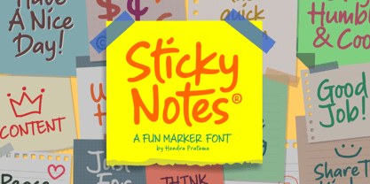 Sticky Notes is a handmade font, made from a marker pen. It's fun yet playful font for variety design graphics project. From Logotype, Poster, Quotes design, Comics book or illustration, T-shirt design, Magazine titles and many more. Sticky Notes is Good used in small or large size. Please check out all the preview images. Best!
 - Slapdash Deco NF by Nick's Fonts,
$10.00This casual, carefree face is based on a showcard alphabet presented by Cecil Wade in his Manual of Lettering. Its extrabold weight, sketchy styling and playful letterforms make it perfect for attention-getting headlines. Both versions of this font contain the Unicode 1252 Latin and Unicode 1250 Central European character sets, with localization for Romanian and Moldovan. - Artegra Slab by Artegra,
$29.00 Artegra Slab is the latest addition to the Artegra superfamily. It contains 54 fonts with over 1000 glyphs per font in condensed, normal and extended widths. With Cyrillic and Greek sets it supports more than a hundred languages. It’s based on the perfectionist geometric shapes of Artegra Sans, which makes it beautiful to look at and easy to read.
 - Arizona Airways NF by Nick's Fonts,
$10.00A 1947 timetable for—who’d a-thunk it?—Arizona Airways provided the pattern for this unusual, yet endearing, face. Its Art-Deco-meets-Apache vibe ensures that your headlines will be warmly received. Both versions include the complete Unicode Latin 1252, Central European 1250 and Turkish 1254 character sets, as well as localization for Lithuanian, Moldovan and Romanian. - Natube by Dhan Studio,
$14.99 Natube is a font that is scratched with a brush pen, to get a natural texture, so this font will display the characteristics of the hand. This font is very suitable for a variety of places such as clothing, poster, tittle books, stationery designs, quotes, branding, logos, invitations, greeting cards, t-shirts, packaging designs and more.
 - Fenggasta by Gatype,
$9.00 Fenggasta is a font that is scratched with a brush pen, to get a natural texture, so this font will display the characteristics of the hand. This font is very suitable for a variety of places such as clothing, poster, tittle books, stationery designs, quotes, branding, logos, invitations, greeting cards, t-shirts, packaging designs and more.
 - Clinica Pro by Mint Type,
$- Clinica Pro is a modern take on Swiss grotesques, with a little bit of an added personality. It features 8 weights, italics, 6 sets of figures, small caps and a bunch of ligatures. Still relatively neutral, it lets a brand stand out of the grotesque-crowded environment with support for multiple languages as well as Cyrillic script.
 - Pabean Market by Nasir Udin,
$24.00 Pabean Market is an interpretation of the incription on the oldest market in Surabaya, Indonesia, which was established on 1849. The unique character inspired me to make a complete set of typeface. It’s a retro typeface but has a futuristic aura yet a festive vibes. This font comes in single style and has several Discretional Ligatures. -- Uppercase
 - Woodchip by Fontasmic,
$16.99 The Woodchip fonts are a collection of fun and edgy, worn and pitted, rough and crunchy typefaces. Styled to be comic & playful enough for children's products, yet edgy enough to advertise a dirt bike/monster truck marathon and anything in between. Sink your teeth in. It’s suitable for some interesting titling and short bits of copy.
 - Nanki Poo NF by Nick's Fonts,
$10.00This little gem is based on a typeface discovered in a Boston Type Foundry catalog from the late 1800s, originally called "Mikado". This font gets its name from one of the more memorable characters in Gilbert and Sullivan’s operetta. Both versions of this font include the complete Unicode Latin 1252 and Central European 1250 character sets. - Going Places JNL by Jeff Levine,
$29.00 Based on hand lettering from a January 26, 1930 ad for the 1930 Fox Studios film "Let's Go Places", the lettering is an ultra bold serif design with numerous ball terminals throughout the character set. The typeface is both formal, yet casual and playful in appearance. Going Places JNL is available in both regular and oblique versions.
 - Baloon Everyday by Arterfak Project,
$16.00 Baloon every day is a layered font. Consists of 4 elements that you can combine to get a cute & stylish word. There is Regular, Shadow, Emboss, and Glossy. This font set is bold, fatty, rounded and funny and suitable for kids' themes or entertaining design. Equipped with stylistic alternates and multilingual support. Thank you for watching!
 - Snow Crystals 2 by Deniart Systems,
$20.00 Snow, snow and more snow! Deniart's Snow Crystals 2 typeface is an original design featuring 62 unique symbols. These charming snow crystals are sure to add elegance to all your winter designs - the set includes traditional style snow crystals. This font comes with a PDF guide to put all these special characters right at your fingertips!
 - Eat More Fruit JNL by Jeff Levine,
$29.00 Eat More Fruit JNL is an odd name for a typeface, but then again the lettering style of the font is just as unusual. Named for a 1940s-era poster espousing "Put more pep in your step... eat more fruit", the lettering (although Art Deco in nature) also evokes images of 1960s and 1970s hippie-era concert posters.