10,000 search results
(0.036 seconds)
- Moku Brush by Deltatype,
$49.00 Moku Brush is a structural brush script inspired from handwriting with brush, with straight letterform you will get less formal but more sweet! Moku Brush come with nine weights, so you can use as body text or even better with headline. With nine variations, you can use this font in different sizes with different weights, you will get better balance when do type setup.
 - PGF Now by PeGGO Fonts,
$24.00 Geometric Sans with Humanistic proportions Typeface (Roman a.k.a. ‘Capitalis Monumentalis’), Inspired on vintage minimalism, with a subtle Art Déco air, where the configuration of the basic and open shape (long ascenders/descenders and a moderate ‘x’ height) star a crisp and luminous look, manufactured under an analytical and handmade process as used to be in ancient times. Among its graphic virtues are a special focus on relaxed and fluid reading rhythm while looking clear and sophisticated, an upright version representing a formal voice paired with an Italic with a more expressive vocal tone, easily distinguished as a second quoted content in Editorial and Branding communicational contexts. Equipped with generous stylistic options controlled by OpenType features as: 17 glyphs variations stored as stylistic sets Standard and Discretionary Ligatures Lining and Old Style Numeral forms Tabular forms Superior and Inferior Scientific Numeric Notation Numerators and Denominators for fractional compositions Pre-Composed Fractions, ordinals Dotted Zero for alphanumeric contexts Circled numbers An Art Déco style Border Set Bullets set for multiple levels ordered list Arrow set Monetary Symbols Mathematical Operators Publishing and Social Media Markers Wide range of Diacritics allowing you to set contents in more than 200 Latin base languages. The access to all these options is also possible via character set panel. With no hesitation, PGF Now is a highly valuable publishing and Branding tool that deserves to flaunt in the more elegant contexts but also daily situations that need a clear and modern voice.
 - Fangs ALot by Ingrimayne Type,
$9.00 FangsALot is a bizarre typeface family that was designed to alternate two character sets. These sets are alternated automatically in applications that support the OpenType feature Contextual Alternatives (calt). The template used to design characters is a distorted triangle that resembles a curved tooth or a fang. This shape can be flipped horizontally, vertically, and both horizontally and vertically to give four orientations. Two of these orientations are used in the regular style and two in what is called the italic style. I thought the fang motif did not come through clearly in the regular and italic styles. Rather the impression they give is more like graffiti lettering. To emphasize the fang motif I added two more members to the family by filling fang outlines with unadorned sans-serif characters. Then to allow more color in lettering, I added two more styles with letters on black. I then had six styles based on triangles skewed left and right. Why not fill the family out with three more styles based on an isosceles triangle? The end result is a family of nine. All members of the family are monospaced and are hard to read. The three graffiti-like styles have some alternative letters that can be accessed with the OpenType feature Stylistic Sets. Also, for each style it is possible to use only one set of characters by adding a space after each letter and then adjusting the character spacing. The graffiti-like styles can be useful in situations where the hard-to-read property is not important but where a menacing and vicious touch is needed, such as topics of sharks, teeth, biting, and vampires.
 - Bodoni Ornamental by FontMesa,
$30.00 New for 2020 Bodoni Ornamental now has two italics to choose from, one basic italic and a second which is more of a true italic with a few uppercase letters that have been stylized. Only one italic can be style linked to the regular upright version so in the second italic we've added Avanti to the name which means forward in Italian. When purchasing the regular upright and Avanti italic together they will install as two separate families. Bodoni Ornamental is a revival of a very old typeface based on the Poster Bodoni letter shape. Giambattista Bodoni passed away in 1813, this decorative version was created in the 1820’s or 1830’s which was the time period when many of these ultra bold decorated type faces began to appear, the original artist is currently unknown. The original version of this ornate classic was only available as a set of uppercase letters, today over one hundred eighty years later this font is now complete with a new lowercase, numbers and accented characters for Eastern, Central and Western European countries. Due to the ornate detail in Bodoni Ornamental when printing itís recommended to use a laser printer 600dpi or greater, a 1200dpi printer will give you the best results rendering the most detail at the smallest possible point size for this font. Small home user Ink Jet printers are not recommended for Bodoni Ornamental unless you set the font to a very large point size. With Ink Jet printers much of the detail in the letters will bleed together as the ink hits the page, commercial Ink Jet printers such as GiclÈe printers may give good results. When using Bodoni Ornamental for digital images including web site graphics it may help to add a one pixel stroke fill around the letters setting color to white or grey, this may help the web site images display better on some computer's. You will need a photo editing application such as Adobe Photoshop to create your image adding the stroke fill and save as a jpg , png or gif file. I hope you enjoy this old font as much as I did making it. Note: When previewing the Bodoni Ornamental font in the Windows font preview you may notice some letters appearing lighter and some darker, this is a problem with the preview window and some ornate fonts, Bodoni Ornamental will print normal and not with mixed light and dark letters.
 - Elipses by Lián Types,
$30.00 It all began with an ellipse. Like an artist who goes from a pictorical logic to a more abstract one, in Elipses geometry is stripped of any distractive or ornamental detail. The font is naked and it shows that it does not need complex shapes or decisions in order to be very attractive. The font is a compendium of ellipses and stems, with a didone 'pensiero'. It also gets some inspiration from the art-deco letters and architecture, due to obvious reasons. Geometry at its best. Elipses will be useful for magazines, books, ads, or any piece of design that needs elegant letters. Note about the styles The styles named "Alt" (from Alternative) have their swashes with less loops. Use them if you are more into naked geometry. Apart from many alternates and ligatures, I've included some different sized glyphs in all the styles so you can also play on the rhythm! Have fun!
 - Basmala by Afkari Studio,
$17.00 Basmala - An Arabic Style Typeface NEW Ramadhan and Islamic font, Basmala, is an Arabic-styled display typeface. This Islamic Ramadhan Arabic font is perfect for any graphic design related to the Islamic style. You will get an Arabic feel to every text you type using this font. Made with Latin characters so that it can be read internationally which does not have to be able to read Arabic characters This Islamic font is suitable for branding, product packaging, quotes, flyers, posters, logotype, apparel, T-shirt, Hoodie, book covers, movie title, advertising, and more. Features; - Uppercase, Lowercase, Number, and Punctuation - Special Alternates and ligatures - Works on PC & Mac - Simple installations - Accessible in Adobe Illustrator, Adobe Photoshop, Adobe InDesign, even work on Microsoft Word - Fully accessible without additional design software. - Mültîlíñgúãl Sùppört for; ä ö ü Ä Ö Ü ß ¿ ¡ Hope you enjoy our font and this font is useful font for your projects!
 - JAF Facit by Just Another Foundry,
$42.00 Facit is a contemporary sans serif text face. It is designed to be a highly legible and flexible font that does not draw the attention to itself. Instead of being original by itself it is the result of a careful examination of ancient as well as modern formal concepts. “It is by definition impossible to design an un-conventional typeface. Type is pure convention, this is why we can read each other’s written words”, says its designer Tim Ahrens. However, rather than generating an average, existing principles were consciously combined into a unique design solution: The word ‘Facit’, in its German version, means ‘conclusion’. The fonts are provided in OpenType format. Each font contains 720 glyphs. Technically, they follow the Adobe Pro fonts and provide the same glyph set and OpenType functionality. OpenType features include ligatures, true small capitals, superiors, inferiors, numerators and denominators. Every font contains old style and lining figures, both in a proportional and a tabular design. For some letters there alternate characters.
 - 1863 Gettysburg by GLC,
$38.00 This script font was inspired by a lot of autographs, notes and drafts, written by President Abraham Lincoln, mainly the Gettysburg address, first draft and copies, but also the emancipation proclamation. It is an attempt to offer a typical manual script from this American period, not to propose the exact writing from A. Lincoln himself. This font is a little fat and monotone, maybe Abraham Lincoln used a smooth or rounded pen, but some letters I have consulted were written obviously with a sharp one, so, in the future, I will certainly produce a slim version of this font. It is used as variously as web-site titles, posters and fliers design or greeting cards, all various sorts of presentations, menus, certificates, letters. This font supports enlargement as well as small size, though the original size was about 18 to 24 pts. When printed, it remain perfectly legible from 10 to 12 pts.
 - Simplified by Redy Studio,
$19.00 Simplified – Casual Chic Font Simplified is a casual and natural font, with a spirit of clean-cut modern and classic. This typeface has been specially designed to give a feeling of casual luxury. This is not easy typography! We have done a lot of effort to build this font. In the past, we have experimented with a ton of fonts that are similar to Simplified, and Simplified is better in every aspect that I have found, including some OpenType features and ligatures, lowercase beginning & ending swashes that you can use to make your own style. In short, it’s a typeface that you must have! Simplified features: A full set of upper & lowercase characters Numbers & punctuation 63 Gorgeous ligatures Lowercase beginning swashes Lowercase ending swashes Multilingual symbols PUA Encoded Characters – Fully accessible without additional design software. Feel free to give me a message if you have a problem or question. Thank you so much for taking the time to look at one of our products.
 - Saleha by Afkari Studio,
$19.00 Saleha - An Arabic Style Typeface NEW Ramadan and Islamic font, Saleha, is an Arabic-styled display typeface. This Islamic Ramadhan Arabic font is perfect for any graphic design related to the Islamic or Arabic style. You will get an Arabic feel to every text you type using this font. Made with Latin characters so that it can be read internationally which does not have to be able to read Arabic characters This Islamic font is suitable for branding, product packaging, quotes, flyers, posters, logotype, apparel, T-shirt, Hoodie, book covers, movie title, advertising, and more. Features; - Uppercase, Lowercase, Number, and Punctuation - Special Alternates and ligatures - Works on PC & Mac - Simple installations - Accessible in Adobe Illustrator, Adobe Photoshop, Adobe InDesign, even work on Microsoft Word - Fully accessible without additional design software. - Mültîlíñgúãl Sùppört for; ä ö ü Ä Ö Ü ß ¿ ¡ Hope you enjoy our font and this font is useful font for your projects!
 - Halogen Slab by Positype,
$29.00 When I released Halogen, I asked ‘Who doesn't want or need an expansive contemporary extended sans that has a sense of style and swagger… what if it had a lowercase, small caps and various numeral options… how could you say no?’ Go, click on the Halogen link and read on, if you're interested. Halogen was well-received, so I decided to take it further with Halogen Slab (the name kinda tips you off as to what kind of typeface it is, don't ya think?). As always, I prefer not to take short cuts and provide an anemic offering of glyphs — a modern typeface offered today must provide more than just the basics and this one does — lowercase, smallcaps, old style numerals, tabular forms, stylistic and titling alternates, fractions, case-sensitive features, and even an alternate uppercase ordinal set is included. Now go make cool print and digital things with it, and share them with me.
 - Montague Script by Stephen Rapp,
$59.00 Montague Script takes its name from a small hilltown of western Massachusetts rich in culture and history. I lived in this beloved community for a number of years and it’s where I first began my study of calligraphy and lettering. While most brush scripts take their cue from mid-twentieth century samples, Montague Script is a fresh, contemporary alternative. It comes directly from lettering written with a #3 sable brush on smooth vellum and is digitized with the same sensibility a lettering artist writes with. Montague reflects a dynamic interplay between form and rhythm not usually associated with type. Words suggest a baseline, yet are not bound by it. Beginnings, endings, alternates and ligatures come in as needed while you type. Many more alternates are available in the glyph palette of most current graphic software. Exuberant swash versions of upper and lowercase letters, as well as ligatures can be accessed through both the type and glyph palettes. Montague Script is a natural for advertising, point of purchase displays, packaging and logo design, cards, invitations, journals and much more. You will be delighted at how well it can dress up a project and how easily it sets.
 - Diamant Handwriting by 38-lineart,
$14.00 Diamant Handwriting is an upright handwritten font, which looks like a thick pen stroke. Form orientation is generally flowing horizontally, this is a reflection of composure in writing, we set the rhythm of each glyph so that the combination of high and low letters is very soft, try it, whatever you type with this font looks very calm. Activate the OpenType feature, because this font is equipped with ligatures (liga), Stylistic(salt), Contextual(calt) and initial alternates. We present all of this so that your writing is automatically setup, we also provide access to all alternates (aalt) features, this allows you to choose the glyph you like manually. We designed this font only for brand identity. Your brand will look different from other brands. You can also use it for short slogans to further amaze views and attract more customers to see you closer. 'Diamant' is another word of diamond that is often used in Europe, we give this name as a representation of the whole font as a symbol of luxury, brilliance and stability and comfort. We do not extend the theory and philosophy of this font, you better try it yourself, and you will be amazed. thank you
 - Lager by Fenotype,
$50.00 Lager is a plump, sympathetic and tasty script family inspired by good old American commercial lettering of mid-1900s – yet there’s more to it than meets the eye. Implemented with an exceptional feature called Intelligent Swash Lager delivers perfected results with an handmade feel. Depending on the choice of letters Intelligent Swash grows and stretches swashes automatically. Accompanied by various ligatures and stylistic alternates, Lager creates beautifully completed words with minimal effort. Just make sure you activate Titling Alternates from your OpenType-menu. The Lager package will be delivered with 5 complete weights, 2 sets of well-groomed numerals and Small Caps as a great companion for the script style. Get high on Lager, it won't leave you short.
 - Orion MD by Alphabet Soup,
$45.00 A font where "each word that's set approaches becoming its own logo" is how some have described this unique typeface. Originally inspired by an enamel sign he picked up at a Paris flea market, Michael Doret says that the seven letters contained in the sign were enough to suggest to him that here were letterforms put together in a way that he had never seen in a contemporary digital font. Always eager to create something a little out of the ordinary, he took up the challenge to flesh out the forms into a complete font. Orion can be defined as a geometric, connecting script that is at once contemporary, yet classic and timeless.
 - Pola Perca by Invasi Studio,
$19.00 Get ready to embark on a playful adventure with Pola Perca, the tiki-inspired display font that's full of fun! Drawing inspiration from the ancient art form of tiki style, which celebrates the rich Polynesian culture, we've put our own twist on it, adding a playful and random baseline to the typeface. The result? A font that exudes a delightful and lighthearted look, guaranteed to make typing letters an absolute blast! But don't let the fun and games fool you - Pola Perca is also highly legible and easy to read, making it the perfect choice for headlines, titles, packaging, logos, and any design element that needs to convey its message with clarity and style.
 - Polias by Esintype,
$23.00 Polias is an all-caps uniwidth typeface inspired by an ancient inscription carved on a monoblock stone in hybrid characters — between no-contrast linear sans to low-contrast flared serif. The inspiring inscription is the dedication by Alexander the Great, discovered in the Temple of Athena Polias in the ancient Ionian city of Priene. Stanley Morison mentioned this inscription in one of his lectures: “The distinctive feature of this inscription consists of a consistent thickening towards the ends of perpendiculars and horizontals.” … “We have not the right to say that the serif was invented for Alexander the Great's inscription, only that this is its first datable appearance.” The letter proportions are almost identical to the original, but the stroke features have been reinterpreted and characterized. Serif-like nodes at the end of the strokes are subtle extensions that serve to accentuate rather than break its monoline elegance. With an analogy, they are not flowers, but like blooming buds. Polias is a flared sans typeface which is closer to sans-serif forms on the spectrum between sans and serif. It’s especially light looking by design to convey rather thin and white typographic color of its original monumental look. It comes in eight weights and a variable font, scaled from Thin to Bold. It is multiplexed, so the weights do not affect text lengths. Light weights are closely based on the actual carving of the inscription. Thicker weights can be used on smaller typesettings to compensate for the weight difference of larger letters’ strokes, and to keeping the monoline appearance of the entire text block intact. This method can be used for any purpose, such as setting a hierarchy between the lines or to justify their lengths. Some of the original letterforms have been preserved and stylistic alternatives such as Ionic four-bar Sigma, dotted Theta, palm Y are provided as open type feature. Some of the other ancient forms, such as the three-bar Sigma (S), the pointed U, were also added for both the Greek and Latin scripts. Polias is preferable for big type settings such as logos and headlines as a modern representation of perennial classical forms. Its a fine fit for product branding, movie posters, book covers, packaging materials, and more, which require an epic look to attracting attention with a distinctive elegance. Polias can be considered for distinctiveness wherever Roman Capitals work. As a noun, Polias is one of the epithets of Athena / Minerva, and in this case referring to her role as the protector of the city of Priene. Polias is one of the seven typeface designs in Esintype's ancient scripts of Anatolia project, Tituli Anatolian series.
 - Polias Varia by Esintype,
$140.00 Polias Varia is an all-caps uniwidth variable weight typeface inspired by an ancient inscription carved on a monoblock stone in hybrid characters — between no-contrast linear sans to low-contrast flared serif. The inspiring inscription is the dedication by Alexander the Great, discovered in the Temple of Athena Polias in the ancient Ionian city of Priene. Stanley Morison mentioned this inscription in one of his lectures: “The distinctive feature of this inscription consists of a consistent thickening towards the ends of perpendiculars and horizontals.” … “We have not the right to say that the serif was invented for Alexander the Great’s inscription, only that this is its first datable appearance.” In Polias Varia, the letter proportions are almost identical to the original, but the stroke features have been reinterpreted and characterized. Serif-like nodes at the end of the strokes are subtle extensions that serve to accentuate rather than break its monoline elegance. With an analogy, they are not flowers, but like blooming buds. Polias Varia is a flared sans typeface which is closer to sans-serif forms on the spectrum between sans and serif. It’s especially light looking by design to convey rather thin and white typographic color of its original monumental look. It comes in eight weights and a variable font, scaled from Thin to Bold. It is multiplexed, so the weights do not affect text lengths. Light weights are closely based on the actual carving of the inscription. Thicker weights can be used on smaller typesettings to compensate for the weight difference of larger letters’ strokes, and to keeping the monoline appearance of the entire text block intact. This method can be used for any purpose, such as setting a hierarchy between the lines or to justify their lengths. Some of the original letterforms have been preserved and stylistic alternatives such as Ionic four-bar Sigma, dotted Theta, palm Y are provided as open type feature. Some of the other ancient forms, such as the three-bar Sigma (S), the pointed U, were also added for both the Greek and Latin scripts. Polias Varia is preferable for big type settings such as logos and headlines as a modern representation of perennial classical forms. Its a fine fit for product branding, movie posters, book covers, packaging materials, and more, which require an epic look to attracting attention with a distinctive elegance. Polias Varia can be considered for distinctiveness wherever Roman Capitals work. As a noun, Polias is one of the epithets of Athena / Minerva, and in this case referring to her role as the protector of the city of Priene. Polias (family) is one of the seven typeface designs in Esintype’s ancient scripts of Anatolia project, Tituli Anatolian series.
 - Retorica by Type-Ø-Tones,
$40.00 Retorica, by Enric Jardí. With its simple geometry, Retorica stands out as our Art Déco typeface. Retorica has two styles: one solid version and one hollowed. In addition, each one has a Small Caps set, available by OT features.
 - Grayfel by insigne,
$- As designers, we seek perfection and originality. The more we step back and look at our work, the more changes we tend to find necessary. Drastic modifications are inevitable. The same is true of Grayfel. Grayfel began as an exercise at insigne to explore the crowded space of neutral sans. While the world of sans serifs is admittedly crowded, I still managed to find something new and different. The final Grayfel consists of 42 full-featured OpenType fonts containing three widths: Regular, Condensed, and Extended. Every width consists of 14 fonts--seven weights with matching italics, making it a good companion for setting clear text and headlines for print and screen. OpenType features are also available. There’s figure choices, such as proportional and old style figures. Additionally, Greyfel includes sophisticated typographic attributes: ligatures, fractions, alternate characters, small caps, superscripts and subscripts. Its extended character set supports Central, Western and Eastern European languages. Optical compensations also mean the outcome of this family is a hybrid of humanistic proportions. It’s a well-finished design with optimized kerning gives it a friendly look. If you like sans serifs within the tradition of Futura, Helvetica, Avant Garde and Avenir, then you’ll love Greyfel, too. Grayfel works well in a variety of applications. Subtly neutral yet fun, it’s suitable for headlines of all sizes as well as for text. Put it to the task for marketing, packaging, editorial work, branding and even on-screen projects. Try it out: it’s not just fun and playful; it’s Grayfel.
 - Gineso by insigne,
$- Michaelangelo. da Vinci. Bellini. Rafael. Masters of Italian art whose names have dwarfed those of many other great Italian artists. Yet relics from these other artists remain, though often unnoticed because of their practical nature. These unknowns are the Italian Masters of vernacular sign painting, and insigne now gives a nod to their work with its new sans serif, Gineso. Based on its inspiration, Gineso was created for posters, headlines and logotypes. (It does well in apps, too, though the sign painters probably weren’t thinking about that at the time.) Aesthetically remedied, yet still with an uncut charm, Gineso’s condensed qualities make it especially nice for signs and titling where horizontal space is at a premium. The tight, narrow forms of its geometric design leave you with a robust flavor that will remind you of mamma’s spaghetti. But don’t worry; the font’s ample counters ensure your audience won’t be reading through a bowl of pasta. These condensed forms look great on their own or when their seven different weights and matching italics are utilized together. With the included OpenType features, fractions and superior/inferior positions are also available to broaden your palette. Even more, this font is ready for complex, professional typography with OpenType features like alternate letters and a large character set including Central and Eastern European Languages. So when you find yourself (or your project) in a tight space, stir in Gineso to get the right taste for your copy. It may just make all the difference.
 - Dopelton by Variatype,
$22.00 Introducing Dopelton, a signature font that transcends the ordinary, embodying the essence of personal style and sophistication. Crafted with meticulous attention to detail, Dopelton is more than a font; it’s a stroke of individuality, a visual symphony that transforms signatures into works of art. Each letter in Dopelton carries a distinctive flair, reminiscent of a signature penned by a hand writer. The fluid strokes seamlessly merge, creating a harmonious rhythm that captures the art of the handwritten with a contemporary twist. The balance between elegance and readability is finely tuned, making Dopelton versatile for various design purposes. Dopelton is not confined to the limits of static characters; it adapts to the natural flow of the hand, ensuring a unique signature experience every time. The font’s dynamic nature brings authenticity to digital signatures, providing a touch of human warmth in the digital realm. The details of Dopelton are a testament to its craftsmanship. Subtle curves, refined loops, and a tasteful interplay of thick and thin lines give each letter a signature-worthy personality. Whether used for branding, invitations, or personalized stationery, Dopelton adds a touch of refined charm to any project. This signature font is designed to make a statement—bold yet graceful, modern yet timeless. Dopelton is more than a font; it’s an extension of your identity, a signature that leaves a lasting impression. Elevate your designs with Dopelton and let your words carry the unmistakable touch of personalized elegance. FONT FEATURES Additional Accents 68 Languages Kerning Alternates Ligatures Swashes
 - Merengue Script by Sudtipos,
$59.00 Merengue Script is the second typeface designed by Panco, once again together with Ale Paul, who supervised the whole development. In this opportunity, the process of shape research and the systematization of signs led him to dive into new waters. The objective was to generate a system of signs in which the construction of such was not directly bound to traditional calligraphy, nor to texts typography. Instead, the point was to create signs inspired in “Brush pen” calligraphy but with their main features drawn or literally illustrated. The result was a font with personality, authenticity and uncommon formal aspects that make Merengue Script an interesting, highly attractive and rather unusual font. From the very beginning, the search was based on creating a font with weight and good presence in big formats, but, at the same time, efficient for brief texts of small formats. The aim was to make it usable mainly in candy, sweets and chocolate packaging. The predominance of round shapes, harmonious modulations and funny and friendly-looking visual rhythms spark a special effect in the usage of Merengue Script. Texts are enhanced with an interesting visual charm, capable of transforming a very simple text into a virtual illustration that semantically reinforces the messages in a simple way, without putting legibility at risk. With a basic set of stylistic alternatives full of frills and flounces for initials, ornamental and final letters, plus a set of disconnected signs, Merengue Script offers a wide and versatile range of options for graphic designers in the process of packaging design.
 - Antique Tuscan No 9 by HiH,
$8.00 Antique Tuscan No.9 was one of the earlier wood-type designs by William Hamilton Page. It was first shown among the specimens produced in 1859, shortly after Page entered into a new partnership with Samuel Mowry, owner of the Mowry Axle Company. The new company was named Page and Company and was located at the Mowry facility in the Greenville section of Norwich, Connecticut. Antique Tuscan No.9 is an extra-condensed version of the tuscan style that had been released in moveable type by Vincent Figgins of London in 1817 and had become so popular for advertising in the intervening years. Because of the extreme compression in the design, we might be tempted to describe it as "Triple-X," but that might be misleading. The analogy would, of course, be to clothing sizes, not movie ratings. Because of the compression, this typeface reads best when set extra-extra-extra large. For printing, we recommend 36 points or larger. For the screen, we suggest at least 72 points. An unusual and distinctive design, it is best used with discretion. If I were doing a term paper for school or submitting an article to a magazine for publication, I might use it for the title page, to grab someone’s attention. I would certainly not use it for the main body of text - not if I expected anyone to read what I wrote. If you wonder why we make this recommendation, take the Ten-Point challenge. Print this paragraph using Antique Tuscan No.9 and set the font size at 10 points. If you are young and blessed with good eyesight, you will probably be able to read it - with effort. So, here is the challenge: hand it to your Grandmother and ask HER to read it.
 - Lost and Foundry by Fontsmith,
$15.00 Breaking the cycle of homelessness We are partnered with The House of St. Barnabas, a private members club in Soho Square, whose work as a not for profit charity aims to break the cycle of homelessness in London. Each purchase (of the family pack) comes with a one month membership to The House and 100% of the proceeds from sales of fonts go directly to the charity to help their essential work. This unique collection of 7 typefaces is based on the disappearing signs of Soho, at risk of being lost forever due to the ever changing landscape of the area. By re-imaging the signage as complete fonts, we have rescued this rich visual history from the streets and present the typefaces into a contemporary context for a bright optimistic future. FS Berwick Thanks to its humble tiled origins, this Egyptian serif type maintains a uniform character width, creating the irregular letter proportions found in the final alphabet. Broad-shouldered, the bracketed serifs firmly ground the font, whilst its extreme hairlines become a necessity due to the uniform width. Of note is the upside down ‘S’, to be found on the original sign on Berwick Street. Perhaps due to its ceramic origins, there is a surprising ‘slippiness’ to its final appearance. FS Cattle Cattle & Son is best described as a wide, but not overly extended, grotesque-style sans serif, showing a uniform width and carrying a robust strength to its form. Whilst lightly functional overall, the purposeful diagonal legs of the ‘K’, ‘R’ and the tail of the ‘Q’ add an urgency to its appearance. The reduced size of the ampersand gives away Cattle & Son’s hand-painted origins, and the oblique compacted ‘LTD’ found on the original sign is also included in the final set. This beautiful sign is tucked away under an arch in Portland Mews, sheltering from the weather. Perhaps this is why it has lasted so long. FS Century This somewhat elongated set of Roman capitals was originally rendered in paint circa 1940, but its roots trace back to the Trajan Column in Rome. Witness the slightly unbalanced ‘W’ and the painter’s hand is revealed. Century’s flared serif style is extremely short, sharp and bracketed. The ‘M’ is splayed and has no top serifs. Century has a uniform appearance of width, probably due to its sign-written origins. Yet is elegant, classic and exudes sophistication. FS Charity A true Tuscan letterform, the original is located on The House of St. Barnabas in ceramic tiles and was revealed in all its broken glory in 2014. FS Charity retains the option of using these incorrect characters (try typing lowercase in the test drive above and compare with the more uniform uppercase characters). FS Charity features fishtailed terminals on its strokes, a curious branched ‘T’ and the ‘S’ displays tear-drop ends to its serifs. Almost uniform in width, the ‘A’, ‘M’ and ‘W’ are the widest characters in this set. FS Marlborough The elongated Marlborough features diagonal terminals to some characters and numerals. Also retained is the space-saving contracted ‘T’ glyph from the original sign, while the ‘R’ features a distinctive wedge-shaped leg. Highly individual in this form, similar signage appears around Soho, but featuring a variety of widths in their design. FS Portland The sister type to Cattle & Son, Portland is oblique rather than italic. The serifs are not overly long, yet still enhance its rather rigid cap height and baseline appearance. Its ‘A’ has a top serif, the ‘M’ is square and the ‘G’ foregoes any spur. Particularly delightful is the open ampersand. Numerals align to encourage the horizontal flavour of the oblique style. Overall, Portland is both confident and graceful. FS St James A lineal Continental style, St James also displays a true sense of ‘Londoness’ in its titling form, perhaps influenced by early Underground signage. Irregular letterforms display a continental flavour, particularly evident in its Deco style ‘W’, ampersand and numerals. The rather high cross bar in the ‘A’ is also reflected in the raised middle strokes of the ‘M’. Noteworthy are the distinctive unions found on all of the characters and the additional small caps. The original lettering is still located on Greek St.
 - Amalitha by Attype Studio,
$12.00 Amalitha is a Layered script font with stylistic set. Combine Amalitha with extrude & outline version to get amazing 3D letterform! Fall in love with its incredibly versatile style and use it to create spectacular designs! Amalitha is perfect for branding, logo, invitation, quotes, apparel design, product packaging, merchandise, game titles, cute style design, Book/Cover Title and more. What's Included : - Amalitha - Extrude.otf - Amalitha - Outline.otf - Stylistic Set character - Multilingual Support
 - Ascendant by Ef Studio,
$10.00 Ascendant is a font duo, with contemporary serif family font and script. It’s so versatile to mix and match. Perfect for branding, editorial design, logo, book, poster, magazine, and so on. You will get : Ascendant Serif font with full set of lowercase and uppercase letters, numerals and punctuation, multilingual characters, standard ligature. Ascendant Script font with full set of lowercase and uppercase letters, numerals and punctuation, multilingual characters, ligatures, and alternate.
 - Sheik Of Araby NF by Nick's Fonts,
$10.00This unusual penscript is based on letterforms discovered in the classic Zanerian Manual of Alphabets and Engrossing. The economy and the sinuous quality of the pen strokes, combined with the severe backslant, suggest--without mimicking--the grace and beauty of fine Arabic calligraphy. The Opentype, Truetype and Windows Postscript versions of this font contain both the Windows 1252/ANSI character set and the 1250/Central European character set. - Good Grief PB by Pink Broccoli,
$14.00 An ever so slightly off kilter sans-serif, Good Grief started as a digitization of a film typeface called Carmel by LetterGraphics. From there, this fun and friendly typeface was taken from its limited character set and fleshed out to a fully functional typeface. With the legibility of a text typeface, yet the personality of a display type, Good Grief - why haven't you gotten this fantastic font yet?
 - Cotane Beach by EKNOJI,
$17.00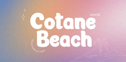 Cotane Beach It is perfect monoline Font for branding, logo, every other design which needs a Display. What you get? - Character set A-Z - Character set a-z - Support multi-language glyphs - Works on PC & Mac - Simple installations - Accessible in the Adobe Illustrator, Adobe Photoshop, Adobe InDesign, even work on Microsoft Word. Please kindly message us for any question or issue about our product. Hope you love it!!
 - Hearty Chintya by Attype Studio,
$10.00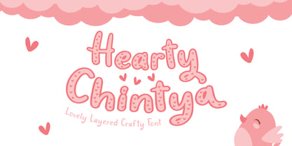 Hearty Chintya is a Lovely Layered Crafty font with stylistic set. Combine Hearty Chintya with display & outline version to get amazing 3D letterform! Fall in love with its incredibly versatile style and use it to create spectacular designs! Hearty Chintya is perfect for branding, logo, invitation, quotes, apparel design, product packaging, merchandise, game titles, cute style design, Book/Cover Title and more. What's Included : - Stylistic Set character - Multilingual Support
 - Saitama by Khurasan,
$9.00 Saitama is a new calligraphy handwritten typeface, elegant and vintage feel character set. Saitama includes a full set capital and lowercase letters, as well as multi-lingual support, currency figures, numerals, punctuation & some extra glyphs. Thank you for checking and i hope you enjoy it. Always put your heart into it and don’t worry to try. I hope you have as much fun using it as i did making it. Khurasan
 - Halau Serif by Vintage Voyage Design Supply,
$10.00 Introducing mid-century modern font family – Halau Serif. Classic mid-century serif with characteristic cartoon look. Straight for your summer projects. More fun, more sun and more retro-modern! Play with it and get really cool retro-lettering style. Also, you can use some alternates (A, E, K, R, Y, a, g, l, k). Also, you get Mid-Century Modern style graphic objects set as letters and numerals alternates (36 Total).
 - Bushing by Hackberry Font Foundry,
$13.95 Bushing is a quick serif experiment going for open light display type. For years I have always stopped and really liked what I saw with fonts like the original Cushing from the turn of the 20th century. This time the desire for a font was stirred by Felici's article in CreativePro on fonts from the beginning of the 20th century, especially his captures of Cushing No. 2 and the version commissioned for Norwood press from ATF. I'm not interested in historically accurate reconstructions. My desire is for the general feel I get when I see a font. As a result, Bushing has little to do with Cushing (other than the last six letters). But it is a Serif font with small serifs and a huge x-height with a very open feel. I like it. I hope you do also. I made it into a limited display version of OpenType Pro. I added small caps and oldstyle figures, as I can hardly work without them. But ligatures seemed silly for this one.
 - Quendel by URW Type Foundry,
$39.99 Quendel has been expanded to become Quendel Happy Family. Apart from the new Bold weight for easy distinction and emphasis, there are now four other very exciting variants, rendering different writing tools and writing materials. The basic form of Quendel was written with a Japanese bamboo tip and therefore embodies a form letter of natural flow. The new versions show other features that provide the feel of written scripts. While the styles Wood and Crayon include some alternate characters, Q Marking Pen and Q Fingertip, due to their apparently more complex enacted forms, do not need additional alternates without looking stiff or boring. The wood relief of Quendel Wood was created by a freehand wood relief drawn with oiled chalk. Quendel Marking Pen seems to be written with a felt-tip pen soon depleted. At the same time it is also reminiscent of the blooming effect, which we know from photography. The name of Quendel Fingertip suggests what can be seen - someone seems to have written with the finger in a grainy material. One would like to try it himself. The effect of broken lines which can be gained by writing with chalk as reflected in Quendel Crayon. Almost like parched sandy soil, the writing material seems to crumble.
 - Margarine Pro by Stiggy & Sands,
$29.00 Our Margarine Pro draws its roots loosely from numerous inspirations, but its unique thick marker weight and deliberate carrying of rounds into regularly straightened letterforms allows this typeface to stand on its own. The lively letterforms are legible yet slightly offbeat, while the SmallCaps and extensive figure sets expand the range of usability and appeal. Opentype features include: - SmallCaps. - Full set of Inferiors and Superiors for limitless fractions. - Tabular, Proportional, and Oldstyle figure sets (along with SmallCaps versions of the figures). - Stylistic Alternates for Caps to SmallCaps conversion.
 - Hand Stamped JNL by Jeff Levine,
$29.00Years before the many "modern" ways to creates signs and posters, the popular method was the rubber stamp printing set. Many of these sets used the classic DeVinne typeface, and were manufactured by at least a half dozen different companies. The "sign and chart printers" (as they were known) often consisted of both upper and lower case letters, numbers, punctuation, pointing hands and other symbols. "Hand Stamped JNL" puts all the fun of the rubber stamp printing set into an easy-to-use digital font with no messy ink spills or clean-up. - Dear Sans by Stiggy & Sands,
$24.00 The Dear Sans Collection is comprised of four widths ranging from Condensed, Regular, Expanded, and Wide; each of which are comprised of a three font family of weights: Book, Regular & Bold. Cleanly readable, with just a slight hint of silliness, the Dear Sans Collection brings adds the perfect level of lightheartedness to your designs. The Dear Sans Collection comes with: - Approx. 367 Character Glyph Set per font - including standard & punctuation, international language support, and basic “fi fl” ligatures per font. - 3 Weights per family including: Book, Regular, and Bold. - Loads of Personality for your designs.
 - Englebert Pro by Stiggy & Sands,
$29.00 Our Englebert Pro draws inspiration from the title screen of the 1930's film entitled, "Der Blaue Engel", starring Marlene Dietrich. Playful but subdued, yet striking enough to catch the eye, this casual sans has a distinct signature look to it. The offbeat letterforms engage the reader, while the SmallCaps and extensive figure sets lend a wider versatility to the typeface. Opentype features include: - SmallCaps. - Full set of Inferiors and Superiors for limitless fractions. - Tabular, Proportional, and Oldstyle figure sets (along with SmallCaps versions of the figures). - Stylistic Alternates for Caps to SmallCaps conversion.
 - Smoothing by Hanzel Space,
$25.00 Smoothing is a stylish modern calligraphic font in an original handwriting style. It's perfect for branding, wedding invitations and cards, and maybe for red wine labels. Smoothing includes a full set of beautiful upper and lower case letters, numbers, a wide variety of punctuation marks and 46 ligatures. All lowercase letters include initial and final strokes, giving a realistic handwritten style. What did you get, honey? Full Set of standard alphabet and punctuation Extra set of ending swashed lowercase Handwritten ligatures Thanks so much for checking out my shop! Happy creating! Cheers! Hanief - Hanzel Space