10,000 search results
(0.049 seconds)
- Hillusy by BaronWNM,
$12.00 Hillusy is a scrip font traced from handwriting using a pen monoline. displays a variety of letters so that it looks more casual and less stiff. This font is suitable for use in almost any casual style design and is not rigid, such as branding, advertising, printing, portfolio, business cards,signature, etc.
 - Turista Flaca NF by Nick's Fonts,
$10.00This Art Deco-inspired face is based on the Baltimore Type Foundry’s Tourist Extra Condensed. Graceful and elegant, this typeface’s compact design also packs a lot of information into very little space. This font contains the complete Latin language character set (Unicode 1252) plus support for Central European (Unicode 1250) languages as well. - Airways by Mans Greback,
$59.00 A typeface fast and light enough to fly! Airways is a vintage script font, with an airy yet confident style. It was carefully drawn by Måns Grebäck in 2016, and contains a lot of contextual alternates and ligatures. The font is useful in logotypes and advertising material that requires your customers' attention.
 - Old Number Ten NF by Nick's Fonts,
$10.00 Here is a faithful revival of Gothic Number Ten, released by the Cincinnati Type Foundry in the late 1800s. Not your garden-variety sans-serif, its quirky caps will warm up your headlines. Both flavors of this font feature the 1252 Latin, 1250 Central European, 1254 Turkish and 1257 Baltic character sets.
 - Autoray by PizzaDude.dk,
$16.00 Usually fonts that are related to computers, space, future are not handmade, but rather digital made. Autoray is 100% handmade, and I am not sure which category it fits in. It has this futuristic and intergalactic look, but at the same time the handmade details are pointing in a more grafitti and comic way. I will let you decide where to go with Autoray! I have added 5 different versions of each letter, and they automatically changes as you type - and of course, there's multilingual support - and even intergalactic gravity! :)
 - Zigzag by Volcano Type,
$60.00 ZIGZAG is a funny font family whose letters have four varieties each in order to multiply expressions and attract the eye by breaking the rhythm of reading. There are two styles available Rounded and Not Rounded. The variations oscillate between a hand-drawn design and a geometric or imaginative drawing. Opentype’s function lets you choose between different variations of each glyph and contextual variables allow to mix the styles. Benoît Bodhuin designed ZIGZAG Rounded in 2011/12 for the theatre Vivat. In 2013 ZIGZAG Rounded was supplemented by ZIGZAG Not Rounded.
 - Jarvis by Alan Smithee Studio,
$9.00 Jarvis is a hybrid. Not a pure grotesque, not a humanist sans, but the best of both worlds. Its open counters and strong geometry, coupled with smooth curves and features give it a unique personality. Very legible even at small sizes, instantly recognisable at large sizes, it is an ideal candidate for corporate identity as well as print and digital communications of all kind. Its wide range of weights (from Thin to Black), extensive OpenType features, circled numbers, and extended character-set are the hallmark of the highest technical level.
 - Jantar Flow by CAST,
$45.00 Jantar Flow is a humanist sanserif type family tailored for continuous reading for both printing and screen. With its large x-height and low contrast it also performs very well in captions, side notes, and short paragraphs set in small sizes. Jantar Flow Italic is distinct and readable. Following a proper italic construction, it shows the fun side of the family yet keeps the features of the upright. Jantar Flow – as well as its teammate Jantar Sharp – comes in seven weights from ExtraLight to Heavy, each with accompanying italics. It has a tabular and proportional set of figures in both old style and lining options, and also a special set of hybrid figures sitting between x-height and capitals. Superscripts and subscripts are provided together with a vast collection of diacritics covering all European languages as well as a set of case-sensitive characters. Jantar, the pairing superfamily. ‘Jantar’ is an old Polish name for ‘amber’, a fossilised resin – a substance that is robust and organic at the same time. These qualities somehow reflect the feeling behind the Jantar families, ‘Flow’ and ‘Sharp’. Jantar Flow was designed along with Jantar Sharp. As part of the Jantar superfamily these two faces are perfectly paired: though not based on the same skeleton, they share the same design parameters and the same character set, but each one works independently with its peculiar features. Designed for publishing for print and web, as well as for branding, the Jantar superfamily was inspired by common font pairings of the digital age like Helvetica/Times or Verdana/Georgia. Jantar Flow and Jantar Sharp communicate with individual yet complementing voices, just like two trained acrobats can perform alone but also know well how to perform together.
 - Quiza Pro by Mint Type,
$- Quiza Pro is a geometric display sans with added playfulness created around a single dot. Its peculiar rounded diamond shape has inspired many additional details such as similar cuts in diagonal strokes, or occasional serifs in ascenders and capital letters. Its low x-height together with friendly character makes Quiza Pro an interesting choice for packaging and branding purposes. Additionally, its balanced rhythm allows paragraph typesetting in corporate editorial projects – making it a real workhorse for an identity designer. Quiza Pro comes in 8 weights + matching italics each supporting numerous Latin-based languages as well as major Cyrillic languages. It is packed with OpenType features like ligatures, small caps, 6 sets of digits, 3 stylistic sets, superiors and inferiors, fractions, ordinals, respective punctuation varieties including all-cap punctuation, as well as language-specific alternates.
 - Circe Rounded by ParaType,
$40.00 Circe Rounded is an extension for a popular Circe typeface, with rounded terminals. Bold and ExtraBold faces have two variants with different radius of the roundings. Circe Rounded is even more friendly than the original Circe. The typeface is designed by Alexandra Korolkova and Alexander Lubovenko and released by ParaType in 2015. It is known that the Circe typeface is distinguished by mild and humanist nature being formally a geometric sans-serif. However, as an experiment we decided to make it even softer: Circe now has a version with rounded terminals — Circe Rounded. Rounding is generally regarded as a mechanical operation, but in this case a lot of manual adjustment was needed because of the humanist nature and peculiarities of type design. Moreover, the two bold styles now have two options: a basic one is slightly rounded and an alternate one is fully rounded. In Circe Rounded we decided to dismiss characters with swashes that are rather inappropriate in such a rounded font, but the stylistic sets and alternate characters are remaining. Rounded terminals make an open and friendly typeface even more childish. For example, in quite large point sizes (because the x-height is still not big) it can be used as a body type in infant books. Circe Rounded, similar to Circe, has alternative forms of lowercase characters, which are called “infant” and are used in publications for children’s reading. However, a humanist basis is preserved alongside with its softness and it does not allow it to be as “plasticine” as many other rounded fonts. Two of the most obvious areas of possible application of Circe Rounded are everything for children and everything edible, especially all that is sweet and puff. However, we believe that there are other options.
 - Hawkes by Kimmy Design,
$15.00 Hawkes is an extensive handmade typeface family that comes with a bundle of weights, widths and styles, all designed to work cohesively. Here is a breakdown of the Hawkes family. Hawkes Sans: The primary subfamily is a sans-serif typeface that includes nine fonts: three weights (light, medium and bold) and three widths (narrow, regular and wide). Within this set are an array of stylistic features; including small capitals, character style alternatives, discretionary ligatures and contextual alternatives. See details below for more information on OpenType Features. Hawkes Variable Width Sans: The secondary subfamily is the same base sans-serif fonts but combined in variating widths. Essentially, it takes all three widths of each weight and randomly mixes them together. This creates a funky and creative alternative to the more traditional sans-serif set. The variations are for the uppercase, lowercase, small capitals, ligatures and numbers. Hawkes Script: The last subfamily is the script typeface. It’s a quirky script with variations of its own, including ligatures, swashes and contextual alternatives (again, see below for further details.) The script font works great as a complimentary style to the sans-serif, or on it’s own. FEATURES Alright, let’s get into all the extra goodies this typeface has to offer. Small Capitals: Small caps are short capital letters designed to blend with lowercase text. These aren’t just capital letters just scaled down but designed to fit with the weight of both the lowercase and capitals. With Hawkes, small caps can either sit on the baseline (in line with the base of the capital and lowercase) or to be lifted to match the height of the capital letters by applying the discretionary ligature setting in the OpenType panel. These small capitals have a dot underlining them that sit along the baseline. The feature offers a unique display affect that is great for logos, titles and other headline needs. Discretionary Ligatures: A discretionary ligature is more decorative and unique combination than a standard ligature and can be applied at the users discretion (as the name indicates.) The specific styling for these ligatures varies for different fonts. With Hawkes, they are used as an all capital styling feature, or to lift the small capitals to align with the height of the capitals. In the former setting, both lowercase and uppercase letters are first changed to all capitals, then a specialized set of letter combinations are transitioned so small characters are positioned within a main capital letter. These combinations only happen with main characters that include an applicable stem, such as C F K L R T Y. Some of these combinations include two or three characters. When Small Caps is turned ‘on’, this feature will lift the small caps to the height of the capital letter. For more information, please check out the user guide! Stylistic Alternatives: Stylistic alternates are a secondary form of a character, often used to enhance the look or style of a font. For Hawkes, these alternatives provide a slightly more handmade feel. A - the capital and small capital A will lose its pointed apex and become rounded. Think of it more as an upside-down U than an up-side-down V ;-) Oo, G, Ss, Cc- these characters’ topmost terminal becomes a loop. The O is applied automatically, the G S and C need to be turn on individually. Titling Alternatives: This feature does sort of the opposite of what it intends. Instead of being used for titling purposes, this feature makes the text look better in paragraph text settings. Kk Rr h n m - curved terminals on the are straightened e - the counter stroke also gets straightened from a more looping motion y - the shape of y is changed from a rounded character to a sharper apex (think more like a ‘v’ than ‘u’) Contextual Alternatives: Contextual alternates are glyphs designed to work within context of other adjacent glyphs. With Hawkes Sans, there are three slightly different variations per character. The feature rotates the application of each variation. This helps with organic authenticity, so if you have two e’s next to each other, they won’t look identical (reflecting the natural variations in handwriting and lettering.) With Hawkes Variable width fonts, I have created a contextual pattern that randomizes the widths of each character. So, when the feature is turned ‘on’ in the OpenType panel, the widths would alternate in a pattern such as: Narrow, Wide, Regular, Narrow, Regular Wide, Narrow, etc. It happens automatically so the user doesn’t have to think or worry about getting a random seed. With Hawkes Script, contextual alternates allow strokes to connect properly from one character to the next while maintaining a believable, natural flow. Connecting strokes are present for two letters next to each other but are replaced by a shorter stroke when located at the end of a word or sentence. Some characters have in-strokes when located at the start of a word. When a character is preceded by a capital letter that doesn’t connect, it too needs an in-stroke or altered spacing. This feature is complicated and messy, but luckily you don’t really have to think about it! I’ve done all the coding so all you have to do is turn ‘on’ the feature in the OpenType panel and you are off to the races! I’m just letting you know what’s happening behind the scenes. Swashes: These are just for Hawkes Script and provide tail swashes to the start and ends of letters. There are three different options. You can pick the basic option by turning ‘on’ the swash feature in the OpenType panel, or you can pick using the Glyph panel. Stylistic Sets: This feature work in new versions of Illustrator CC and InDesign CC. You can pick specific styling sets instead of turning on an entire feature. For example, let’s say you want to have a loopy S, but not a loopy C or O, you can just turn on the S in the Style Set. It also helps create the little drop box that pops up when you hover over a character, showing you the alternates associated with that character. This makes it easy to pick and choose specific styles you want in a word or headline. ---------- And there it is folks! That’s all the basic info on Hawkes, I know it’s been a lot and I appreciate you hanging on. If you are like me and need more of a visual reference to accessing all these goodies, I’ve made a user guide to help navigate Hawkes and everything it has to offer. Altogether this extensive family boasts 14 total fonts in a wide array of styles, weights and widths, making it a great addition to any handmade type collection. Enjoy!
 - Proteron - Unknown license

- Tuesday - Unknown license

- Unitext Variable by Monotype,
$155.99Unitext Variable Regular is a single font file that features one axis: Weight. TFor your convenience, the Weight axis has preset instances from Hairline to Black. This Roman (upright) font is provided as an option to customers who do not need Italics, and want to keep file sizes to a minimum. - Capsule by Eclectotype,
$40.00 Capsule is a reverse-stress, high-contrast, rounded sans-serif font with two distinct personalities. An all-caps face, there are however variations of some letters in the lowercase slots. The lowercase variants are more playful, with more bulbous elements that riff on phototype faces like Amelia and Data 70, but all can work together and be mixed and matched to your heart's content. Capsule boasts a bunch of esoteric discretionary ligatures to play around with, and stylistic alternates for 4, 7 and £. The language support is extensive enough to set essays in most Latin-based languages, even though that's the last thing you should be doing with this font! Capsule should be set large. The fit is tight and the kerning is aggressive. It's not what you'd call a workhorse, but Capsule is an All-Caps you'll (see what I did there?!) want to use for impactful headlines, cutting edge logos and post-modern layouts.
 - Fishwrapper by E-phemera,
$25.00 Fishwrapper is a three-member font family (Regular, Bold, and Italic) designed to replicate the look of authentic vintage newspaper typography. The fonts are rough and are meant to be used at newspaper sizes. All three fonts have a complete alternate alphabet built in: using the contextual alternates feature will automatically substitute alternate versions of most glyphs, so that identical characters do not appear side by side, thus helping to create the look of metal type. Fishwrapper Regular has a complete set of small caps built in. Each font features assorted rule lines and other decorative material, many accessible through the discretionary ligature OpenType feature (three em dashes in a row, for example, will become a rule line), as well as fractions and a full international character set. Used in conjunction with some of E-phemera's vintage headline fonts, the Fishwrapper family is intended as a complete vintage newspaper and job-printing type solution.
 - Rhonda by BBA Key,
$14.00 Rhonda Script is a new fresh and modern handmade calligraphy with decorative characters and dancing lineage! So wonderful on invitations, greeting cards, branding material, business cards, quotes, posters, and more. Rhonda Script comes with 489 glyphs. Alternate characters are divided into several Open Type features such as Swash, Stylistic Sets, Stylistic Alternates, Contextual Alternates. OpenType features are accessible by using OpenType savvy programs such as Adobe Illustrator, Adobe InDesign, Adobe Photoshop Corel Draw X versions, and Microsoft Word. And this font has code PUA unicode so that all alternative characters can be easily accessed by craftsmen or designers. Rhonda Script contains uppercase and lowercase, International lingual support, signature and symbols, Punctuation and PUA numbers, Unicode Style, Alternative Styles, Style Range 1-11, Contextual Character Variations. If you do not have programs that support OpenType features like Adobe Illustrator and CorelDraw X Versions, you can access all alternative sets using Font Book (Mac) or Character Map (Windows).
 - CHILD & MOMSKY by Rhd Studio,
$15.00 Style and Grace personified - say Child Momsky. This typeface has two main styles, Regular and Italic, that are designed to work elegantly in unison and apart. The serif has a boldy different ' f', which sets it apart from regular serifs.....as Child Momsky likes to stand out from the rest. A regular 'f' is included in its alternates, and a extra font style with a regular f is included for projects that require a more staid elegance. The Italic style is dreamy, sultry and light-footed - a perfect partner for the more serious serif. Use them together or apart for stylish, stand-out type designs and projects. For those of you who do not have access to Opentype Software, such as Canva Users, a separately available 'extra letters' font set will be available for purchase soon. Language Supported : Danish, English, French, German, German (Switzerland), Italian, Low German, Luxembourgish, Norwegian Bokmål, Norwegian Nynorsk, Portuguese, Swedish, Swiss German. Enjoy
 - Charcuterie by Laura Worthington,
$20.00 Charcuterie is a collection of ten distinct yet related typefaces, and three ornamental typefaces. Used individually or blended with other fonts from this large family, elements of Charcuterie are well suited for headlines, titling, logos, display, packaging, signage, or advertising. The entire collection lends itself to experimentation, acting as a complete and complex toolbox, enabling you to work in extraordinarily varied ways. Each Charcuterie typeface has different, yet complementary features. Engraved features 135 swash alternates and Cursive boasts 275. Frames offers a broad and endless approach to creating frames of any proportion and style. Catchwords features nine different styles for a total of 82 glyphs. 100 Ornaments include a vast array of arrows, brackets, rules, icons, ribbons and more. See what’s included! http://bit.ly/2c5OzoK *NOTE* Basic versions DO NOT include swashes, alternates or ornaments These fonts have been specially coded for access of all the swashes, alternates and ornaments without the need for professional design software! Info and instructions here: http://lauraworthingtontype.com/faqs/
 - Paper - Personal use only

- Fabrice by Fabulous Rice,
$30.00 Fabrice is a font based on my handwriting, which has been reworked to be turned into a font. I write differently with each pen I use, and this font corresponds to my handwriting while using a pen I refill myself with special inks. It contains a wide range of characters, and will be readable anywhere, yet different!
 - Qindom by Realtype,
$16.00 Qindom is inspired by natural brush typography. Written in rapid motion using a slightly dry brush pen. This will give you a fresh and modern design. Qindom comes with uppercase and lowercase letters, large sets and small sets, numbers, alternative styles for several lowercase characters are also available that make your text and design more attractive.
 - Million Orcids by Four Lines Std,
$15.00 Million Orchids Font: Where Script Meets Blooming Brilliance! Get ready to unleash your creativity and watch your designs blossom with this delightful script font. It's like having a million orchids at your fingertips, adding a touch of elegance and charm to every project. Let your imagination take root and let the million orchids font bring your designs to life!
 - Stencil Mark JNL by Jeff Levine,
$29.00 The set of vintage brass alphabet stencils that inspired Stencil Mark JNL was manufactured by the Chicago Firm of Meyer and Wenthe. Pete Skoglund of Unadilla, NY was selling a set of these stencils on Ebay, and was nice enough to provide Jeff Levine some images to use as models for the design of this typeface.
 - Avalaqus by Amera Type,
$10.00 Avalaqus is a font inspired by certificate, labels, posters, F&B packaging and has ligatures with alternate style that can make your display better than before. You will get a decorative font, sans, serif with bold and outline styles. And you will also get a set of badges with the open type feature format that match this typeface
 - Betterlove by Good Java Studio,
$21.00 Betterlove is a beautiful script font with many swashes at the beginning and end strokes, which let you make beautiful swash characters. This font includes full set of swash heart lowercase letters, numerals, and punctuation. Also it includes OpenType ligatures and stylistic set. This is so perfect for invitations, monograms, weddings, fashion, branding, labels, or logotype.
 - Handlettery by Scratch Design,
$10.00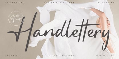 Handlettery is a modern script and handwritten font, which is suit for casual and feminine design stuff. This font is suitable for signature, wedding invitation, branding, promotion, product packaging, poster, and others. You will get a full set of lowercase and uppercase letters, numerals and punctuation, multilingual language, multilingual symbols, swashes, and ligatures. What You Get : Swashes Stylistic Alternates
 - Swish by TypeFaith Fonts,
$10.00 Swish is a contemporary geometric font with two 3D orientations that create an alienating effect. The direction is shifted around the center of the horizontal axis. The font is inspired by the change of perspective that the artist Escher used in his drawings. It is a complete Latin font in which all the accents are present. The unique thing about this font is that it is also a stencil letter. The Swish font is designed to work in any printed and on-screen contexts, including logo design, brand identities, websites, packaging, posters and headlines. Optimized for latin based languages. Leon Hulst for TypeFaith Fonts.
 - Yink by Eclectotype,
$40.00 Yink takes big, bulbous, ball terminals up a notch, by repeating the shapes not only in the black but in the white space too. This interplay between black and white shapes is reminiscent of the yinyang symbol in places, which is where the name Yink originates. It's a shamelessly over-the-top font, and should be set large. There's a handful of OpenType features, including ligatures and alternates: Ligatures for ff, fft, ft, tt, gj Alternates are grouped into stylistic sets: 1. An alternate u, possibly more legible, but definitely not as much fun! 2. Again, a more boring version of m, just in case the default is ambiguous. 3. A more exuberant L 4. A blackletter informed T 5. Alternate P and R 6. An alternate 1 (one)
 - Lorraine Braille by Echopraxium,
$9.50 This is a decorative and steganographic Braille font based on Lorraine Cross pattern. As the Lorraine cross splits space into six areas, it may be used to represent Braille glyphs. Provided Glyphs * Lowercase letters (a..z): a White cross and Black square dots * Uppercasecase letters (A..Z): a Black cross and White square dots * Special characters (e.g. !#$%*+<>{}()[]...) * Decorative glyphs (provided in black and white as well) Glyph code intervals - Codes 48..57: Bullets (0..9 digits) - Codes 130..150: 'White Stars' - Codes 192..233: 'Black Stars', Black border glyphs and other black patterns. - Codes 214..233: Border/Decorative glyphs (Black) - Codes 235..255: Border/Decorative glyphs (White) - Codes for Cross w/o dots: Black (192), White (235) - Codes for Cross and 6 dots: Black (191), White (234) - Code for 'Half-width space' (166) Posters 1. Logo: illustrates usage of border glyphs 2. Meta: Two big Lorraine Braille glyphs drawn with pattern glyphs 3. Stars: illustrates usage of 'Star' and pattern glyphs 4. Bullets: illustrates usage of bullet glyphs (0..9) 5. Human rights - Article 1 NB: - Encoding is: Windows Latin ("ANSI") - Published in two versions: Commercial and Free for personal use
 - Jazm by Arabetics,
$34.00 Jazm is an Arabetic typeface design with connected glyphs. Jazm was the earliest, pre-Islamic, script style of the modern Arabic script, before branching into Kufi and Naskh styles. The initial script had a lot less, position-dependent shapes and ligatures, and was not strictly connected. It occasionally included minuscule dots to distinguish identical shapes. This font family design is a modern visualization by the designer of the historical Jazm letter shapes following the guidelines of the Mutamathil Taqlidi type style with one glyph for every basic Arabic Unicode character or letter, as defined in Unicode Standards, and one additional final form glyph for each Arabic letter that can connect with other letters from both sides in traditional cursive Arabic strings. Jazm employs variable x-height values. It includes all required Lam-Alif ligatures and selected marks. Tatweel (or Kashida) glyph is a zero width space. Keying it before any glyph will display that glyph isolated form, if desired. Keying Tatweel before Alif Lam Lam Ha will display the Allah ligature. Jazm typeface family includes both Arabic and Arabic-Indic numerals; all required diacritic marks, in addition to Standard English keyboard punctuations and major currency symbols. Jazm is available in regular, bold, black, and corresponding italic (slated to the left) styles.
 - Six Hands by ParaType,
$10.00 Six Hands is a set of handwritten fonts based on various writing tools, such as pencil, felt-tip pen, ball-point pen, and brush. The character set of each of these fonts supports the Cyrillic alphabet, as well as the extended Latin script for all European languages. Most of the styles also contain additional alternatives that have the capability of automatically interchanging in the setting, which significantly variegates and humanizes the text. Six Hands is quite a rare combination of diverse display fonts that work well together. It is made for talented designers who can use it creatively in packaging, advertising, displays, posters, menus, invitations and so on. The design of Six Hands was a result of collaboration between Alexandra Korolkova, Alexander Lubovenko and all those who assist them in this work. This set of fonts was released by Paratype in 2018.
 - Aaux Next Wide by Positype,
$22.00 When the original Aaux was introduced in 2002, I intended to go back and expand the family to offer more versatility. Years went by before I was willing to pick it up again and invest the proper time into building a viable and useful recut. Just putting a new designation and tweaking a few glyphs here and there would not do the designer or the typeface justice; instead, I chose to redraw each glyph's skeleton from scratch for the four main subsets of the super family along with their italics. Each glyph across the super family is 'connected at the hip' with each style—each character carries the no frills, simple architecture that endeared so many users to it. The new recut expands the family to an enormous 72 typefaces! The original has spawned Compressed, Condensed and Wide subsets—all with corresponding weights—for complete flexibility. Additionally, all of the original weight variants have all been incorporated within the OpenType shell: Small Caps and Old Style Figures are there along with new tabular figures, numerators and denominators, expanded f-ligatures and a complete Central European character set.
 - Aaux Next by Positype,
$22.00 When the original Aaux was introduced in 2002, I intended to go back and expand the family to offer more versatility. Years went by before I was willing to pick it up again and invest the proper time into building a viable and useful recut. Just putting a new designation and tweaking a few glyphs here and there would not do the designer or the typeface justice; instead, I chose to redraw each glyph's skeleton from scratch for the four main subsets of the super family along with their italics. Each glyph across the super family is 'connected at the hip' with each style—each character carries the no frills, simple architecture that endeared so many users to it. The new recut expands the family to an enormous 72 typefaces! The original has spawned Compressed, Condensed and Wide subsets—all with corresponding weights—for complete flexibility. Additionally, all of the original weight variants have all been incorporated within the OpenType shell: Small Caps and Old Style Figures are there along with new tabular figures, numerators and denominators, expanded f-ligatures and a complete Central European character set.
 - Ulga Grid Rounded by ULGA Type,
$19.00 ULGA Grid Rounded is the smooth, rounded sibling of ULGA Grid and ULGA Grid Solid. The typeface consists of three weights, regular, medium and bold, with corresponding oblique styles. Every character in the extended ULGA Grid family shares the same width. ULGA Grid Rounded features a rounded square design, giving this typeface a soft, yet sturdy appearance. A contradictory mix of stiffness and suppleness, characters slide around like lead-filled snakes trying to find their way through a maze. If this typeface were a snack, it would be a smooth, chocolatey treat - too much of it and you’ll feel dizzy and a bit sick. But, hey, I’m not your dad, do what you want. Learn from your mistakes, that’s what I say. A versatile display typeface that can be used for a wide range of purposes including CD covers, posters, packaging, advertising, name badges for robots, brochures and film titles. Mix and match with ULGA Grid and ULGA Grid Solid, use the alternatives, sneak in an oblique style to spice things up, but most of all this is a fun typeface family. The character set supports Western Europe, Vietnamese, Central/Eastern Europe, Baltic, Turkish and Romanian.
 - Lovingly Friends by My Creative Land,
$35.00 Introducing “Lovingly Friends” - a community of fonts that get along together as good as best friends do. All of the fonts - Sans, Serif, Notes, Script and Extras are packed with stylistic alternates and ligatures, you can combine them the way you like - they will look balanced together as well as individually. Script and Engraved fonts also have a Shadow style - to add more personality to your designs. You can download the Specimen & Instructions pdf here http://bit.ly/2x975US Since the Christmas is not that far away (time flies!), the Extras font has a set of Winter Holidays elements - so you could create and send your best wishes to your friends in no time. While all the fonts are fully unicode mapped so you can use them in ANY application, they are still best used in an OpenType aware application. If the application you are using doesn’t support OpenType features, you can use Character Map (Windows) or Font Book (Mac) to select the glyphs you need. Hope you enjoy the fonts as much as I enjoyed creating them! P.S. The flowers used in the preview images are from Liza Glanz 4 in 1 Elegant Watercolor Collection https://crmrkt.com/do4Wpb
 - Librum E by Hackberry Font Foundry,
$24.95 The major focus of my life and ministry at this point is book design. In the brave new world of 21st century self-publishing a new paradigm has arisen: the indie small shop. One of the problems is that all books are published as ebooks, and many books are published only as ebooks. There are two problems with this: character availability and licensing. The licensing problem is solved by including an ebook license with all of the Librum E fonts. The character availability is the core of the design. OpenType features do not work yet with ePUBs [though it is in the spec, if I understand correctly]. Kerning doesn't work, and so on. So these five fonts have only the 256-character [or less] ASCII set. A separate small caps is included. It has lining figures {proportional} and small caps instead of the graphics. The other four fonts have graphics to give bullet choices in lists, oldstyle figures {proportional}, and care given to character shapes so they will work better without kerning. For a great deal, see Librum Book Design Group , for a package containing all fifteen fonts!
 - Aaux Next Cond by Positype,
$22.00 When the original Aaux was introduced in 2002, I intended to go back and expand the family to offer more versatility. Years went by before I was willing to pick it up again and invest the proper time into building a viable and useful recut. Just putting a new designation and tweaking a few glyphs here and there would not do the designer or the typeface justice; instead, I chose to redraw each glyph's skeleton from scratch for the four main subsets of the super family along with their italics. Each glyph across the super family is 'connected at the hip' with each style—each character carries the no frills, simple architecture that endeared so many users to it. The new recut expands the family to an enormous 72 typefaces! The original has spawned Compressed, Condensed and Wide subsets—all with corresponding weights—for complete flexibility. Additionally, all of the original weight variants have all been incorporated within the OpenType shell: Small Caps and Old Style Figures are there along with new tabular figures, numerators and denominators, expanded f-ligatures and a complete Central European character set.
 - Ed's Market by Laura Worthington,
$29.00 It’s like hiring your own professional sign painter with a solid repertoire of styles; each one is distinctive, yet clearly by the same hand. No variants were created on the computer – each weight and version was individually hand-lettered. Ed’s Market lets you evoke the warm, inviting vibe of classic 20th-century grocery posters and showcard lettering right from your type menu. Smart programming ensures that digital perfection doesn't trump human charm: each display face features three variations of each letter, to ensure a natural hand-painted look when characters repeat. Ed’s Market includes three script styles, each with more than 100 alternate characters and swash forms. Seven display faces feature three variations of each letter, to ensure a natural hand-painted look when characters repeat. Design Elements offer expandable arrows, rules and ribbons; along with badges, swashes, scribbles, clouds and snipes. See what’s included! http://bit.ly/1Mzurs3 *NOTE* Basic versions DO NOT include swashes, alternates or ornaments These fonts have been specially coded for access of all the swashes, alternates and ornaments without the need for professional design software! Info and instructions here: http://lauraworthingtontype.com/faqs/
 - Aaux Next Comp by Positype,
$22.00 When the original Aaux was introduced in 2002, I intended to go back and expand the family to offer more versatility. Years went by before I was willing to pick it up again and invest the proper time into building a viable and useful recut. Just putting a new designation and tweaking a few glyphs here and there would not do the designer or the typeface justice; instead, I chose to redraw each glyph's skeleton from scratch for the four main subsets of the super family along with their italics. Each glyph across the super family is 'connected at the hip' with each style—each character carries the no frills, simple architecture that endeared so many users to it. The new recut expands the family to an enormous 72 typefaces! The original has spawned Compressed, Condensed and Wide subsets—all with corresponding weights—for complete flexibility. Additionally, all of the original weight variants have all been incorporated within the OpenType shell: Small Caps and Old Style Figures are there along with new tabular figures, numerators and denominators, expanded f-ligatures and a complete Central European character set.


