10,000 search results
(0.037 seconds)
- Roughen by Mans Greback,
$59.00 Roughen is a fast handwriting typeface. It was drawn and created by Måns Grebäck between 2017 and 2020. Roughen has a rugged and active style, designed with a wet calligraphy pen. It contains multiple alphabets, automatically applied with contextual alternates to simulate the variation of handwriting, or manually with stylistic alternates. The font is multilingual and contain all characters you'll ever need, including all punctuation and numbers.
 - Squirrely Shirley NF by Nick's Fonts,
$10.00Another entry in the trusty old "Schriftatlas" named Phoenix—original source and designer unknown—provided the inspiration for this bouncy bit of alphabetical tomfoolery. Its animated typeforms, definitely retro chic, will put some bounce in the step of any headline it graces. Both versions of the font include complete Latin 1252, Central European 1250 and Turkish 1524 character sets, with localization for Moldovan, Romanian and Turkish - Slugfest NF by Nick's Fonts,
$10.00A Japanese design firm called Maniackers put together a typeface design in 2001, which they called Snail. This typeface is based on that design, with a few tasty modifications and some industrial-strength kerning, so that the letters literally slither across the page. This font contains the complete Latin language character set (Unicode 1252) plus support for Central European (Unicode 1250) languages as well. - Habbly by Robert Corseanschi,
$25.00 Habbly is a handwritten brush pen font with smooth ligatures and alternates which makes it look more realistic and natural. The font has a slight bold feeling. In order to get the most out of this typeface be sure to use a program that has opentype capabilities. Suitable for wedding invitations, coffee packages, badges, logos, apparel, stationery, magazines, letterpress, film, books and many others.
 - Deco Roundpoint JNL by Jeff Levine,
$29.00 On the sheet music cover of the 1931 song "When the Autumn Leaves of Life Begin to Fall", the title is hand-lettered using a round tipped nib pen. The combination of both an Art Deco lettering style and the rounded ends of the characters creates an exquisite, yet simple type design digitally preserved as Deco Roundpoint JNL; available in both regular and oblique versions.
 - Kehunix by Twinletter,
$15.00 Introducing New font KEHUNIX This Halloween Font is the perfect way to create a fun Halloween invitation, party poster, or another type. Simply download and add it to your design using simple instructions and let your imagination go! Of course with this font your various design projects will be perfect and amazing, get a beautiful title and start using our font for your special project.
 - Champloo by One Fonty Day,
$10.00 Champloo is very unique typeface which combines serif features and brush stroke. Some letters have serif, but some don’t. Serif to be found on left side of stem only. It gives a quirky impression on short text. However the larger the text become, the more consistent look it gets as a whole. These two versatile weights let you play with the typeface freely and beautifully.
 - FP Head Pro by Fontpartners,
$29.00 Architectural yet human, as if the letter forms had been delicately carved in stone; their rounded stroke edges and corners lovingly eroded by the surf of the Baltic Sea; slightly overexposed, radiating comforting warmth, giving the impression one was looking at the characters against the setting sun. FP Head Pro reviewed by Yves Peters and Typographica.org: One of the most noteworthy typefaces for 2008.
 - White Gray by Sulthan Studio,
$14.00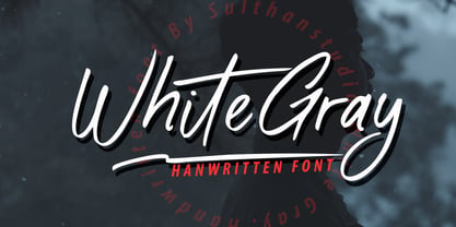 White Gray is a signature script font with natural handwriting, this font is perfect for watermarks, invitations, stationery, wedding designs, social media posts, advertisements, product packaging, product designs, labels, photography, logos, special events and more. . White Gray comes with many additional features which allow you to customize your text. You will get a complete set of separate upper and lowercase, multilingual, punctuation, ligatures, and swashes
 - Note by Little Fonts,
$15.00 Note is a fresh and dynamic hand writing font. Inspired by graffitti and street style writing, executed using a flat tip calligraphy pen. The typeface is hand drawn on paper, then the resulting alphabets and punctuation scanned in and rendered to create the font. The resulting characters are bold yet energetic with an obvious human touch creating an interesting and original hand drawn typeface.
 - Alexa by Adobe,
$29.00In 1994, John Benson designed Alexa, Caliban and Balzano, three typefaces with a similar style. Characteristic of all of them is their calligraphic touch and the likeness to handwriting. Alexa shows a hint of a broad tipped pen style and its legible figures are reserved yet lively. Alexa is best for short and midsized texts as well as headlines and gives texts a personal, classic look. - Bad Dookie NF by Nick's Fonts,
$10.00The inspiration for this typeface was found tucked away in what is arguably the worst book of advertising clip art ever published (cleverly entitled The Advertising Cartoon Clip Art Book from 1971). It’s so bad, it’s good—at least at getting your attention. Both versions of this font include the complete Latin 1252 and CE 1250 character sets, with localization for Romanian and Moldovan. - Djoker State by Letterara,
$8.00 Djoker State is a cool typeface which can be used for various purposes such as: quotes, advertising, headings, logos, badges, posters, book covers, newspapers and much more! Don't wait anymore, put it in your shopping basket :) and follow me, because there will be many promos! Thanks for checking out my store, and feel free to get in touch if you have any questions! thomasaradea@gmail.com Thank you :)
 - Yan 333 Pro by JY&A,
$45.00 JY&A’s most distinctive calligraphic font, Yan Series 333 is usable at all resolutions and remains legible. Even though it has a strong calligraphic influence, the Yan Series is ideal for text settings that have to appear special. Designed by Jack Yan, the family was developed between 1987 and 1993. Yan studied the effect of a nylon-tip, rather than steel-nib, pen on paper.
 - Morton by Deltatype,
$59.00 Morton, another modern grotesque typeface which deliver a extraordinary unique within typeface with the style of condensed let you create more impact with your design. Morton Type Family available in nine weights, the Thin weight deliver you a simple hair line stem until you reach the bold weight, you will get more dynamic with three stem weights which give you a modern, old school look and feel.
 - Recepts NF by Nick's Fonts,
$10.00Here’s a futuristic face with a neo-retro twist, based on the logotype for the 1990s tank-warfare videogame for the Mac, Spectre. Whether you're going back to the future or resurrecting a blast from the past, this face will get you there in style. Both versions of this font include the complete Unicode Latin 1252, Central European 1250 and Turkish 1254 character sets. - Sincery Bartlow by Ditatype,
$29.00 Sincery Bartlow is a gorgeous handwritten font, created with the help of a brush pen. It's sweet and round characters make a very versatile font, suitable to a wide variety of projects. Get inspired by Sincery Bartlow’s authenticity, and write breathtaking wedding invitations, logos, birthday invitations, greeting cards, and so much more. Featured : Accents (Multilingual characters) PUA encoded Numerals and Punctuation (OpenType Standard) Full Support Dita Type
 - Modernline by Ef Studio,
$10.00 NEW UPDATE : BOLD VERSION Modernline is an organic handwritten font that is suitable for branding, signature, wedding invitation, promotion, product packaging, and other needs. This font is modern, simple, but still authentic. You will get full set of lowercase and uppercase letters, numerals and punctuation, multilingual symbols, lowercase beginning and ending swashes, ligatures and extra swashes. Now come with 2 weights, regular and bold.
 - Grizzly by Victory Type,
$15.00Grizzly is a handwritten display style typeface. It was designed by hand using a flair pen, then scanned in, vector traced and fontisized. It is a very detailed typeface that looks great at large point sizes on screen and in print. Grizzly"s aggressive, chicken scratch appearance definitely adds pizzazz to every document. Grizzly features a full character set including European and alternate characters! - Nina by Microsoft Corporation,
$49.00Nina™ Family is a new condensed sans serif typeface designed to be as readable as possible at small sizes, whilst squeezing in as many characters per inch as feasibly possible. Nina Family typeface was designed for Microsoft by world renowned type designer Matthew Carter, and hand-instructed by leading hinting expert, Tom Rickner. Character Set: Latin-1, WGL Pan-European (Eastern Europe, Cyrillic, Greek and Turkish). - Anza by Surplus Type Co,
$16.00 Anza is a tall condensed sans serif display font with exaggerated ink trap stylings. This typeface could be perfect for use in large titles, headlines, branding projects, editorial layouts & so much more! It includes a handful of alternate characters as well as some ligatures to optimize the appearance in awkward pairings. You'll get the regular & oblique styles, each with a full set of multilingual characters.
 - Heberling Casual NF by Nick's Fonts,
$10.00This delightfully playful font is based on a single-stroke pen font from the 1922 tome Heberling’s Basic Lettering, and elements of composition, color harmony, gilding, embossing-processes, etc. by Walter A. Heberling. Swoopy, loopy, but never poopy, this font delivers on the fun. This font contains the complete Latin language character set (Unicode 1252) plus support for Central European (Unicode 1250) languages as well. - Sign Template JNL by Jeff Levine,
$29.00 Sign Template JNL is based on one of the many plastic lettering guides manufactured by the now-defunct Wright-Regan Instrument Company (also known as WRICO). Aside from their engineering and drafting templates and tools, WRICO had a line of "Sign-Maker" sets which featured various styles of lettering, special ink pens and metal alignment guides to assure clean, crisp lettering with little effort.
 - Catchfire by Alan Smithee Studio,
$10.00 Warm and human, yet reliable and precise. Catchfire blends humanist proportions and geometric features. The result is a sans serif typeface with strong personality traits, but that can fulfil everyday needs. It is very legible due to its open counters. It boasts a large character-set, OpenType features, circled numbers, wide range of weights, cursive italics : everything needed to become your new companion for years to come!
 - Saint Onki by Atom,
$10.00 Saint Onki is a natural brush font with 4 styles that will give a casual impression to your design. With stylistic sets and original handmade quality, your design will stand out more. You will get Saint Onki Regular Saint Onki Italic Saint Onki All Caps Saint Onki All Caps Bold Saint Onki Swash Hope you like it with this font. Have a great day and happy buying.
 - Master Photograph by Subectype,
$17.00 Master Photograph is a Monoline Signature Font, font with a touch of handwriting style. This font is perfect for creating signature logos and watermarks for photography studio or wedding invitation. Master Photograph includes full set of beautiful hand lettered uppercase and lowercase letters, numerals, a large range of punctuation and many beautiful ligatures. You will get: Regular and Italic Version 100+ Ligatures Thank You, Subectype
 - Louisa by Julia Hanft,
$30.00 Louisa is a monospaced font-family designed and optimized specifically for small font sizes. But even as headline font it looks good. It has a very good distinguishability of letter forms and legibility even in longer text paragraphs. The character of Louisa is a combination of strong elements and warm, friendly forms. The font family is not only designed for coding and tabular layout, but can be used in different fields of communication design. Therefore it provides two stylistic sets with different letter forms: one with the look of serious modern typewriter font, the second with more soft letter forms and elements of a real italic. Additionally it consists oldstyle numbers (and of course tabular numbers) and a set arrows. The font is available in four styles: regular, italic, bold and bold italic.
 - Clip by Setup,
$19.95 Clip is a display typeface inspired by the shape of a paperclip, but it’s not designed with the usual minimalistic modular approach. Instead, Clip mimics the construction, proportions and contrast of classic bold text typefaces and has one unique characteristic: each of its characters is drawn with only one single line. Clip family consists of 3 fonts, Hair, Light and Regular, each with 745 glyphs (supporting more than 70 latin based languages), 4 stylistic sets and advanced OpenType features. When Stylistic set 1 is activated, the overlapping loops contract, giving the text a whole new character. Moreover, every uppercase character is also available in an ornamental swash variant, which means most of the capitals have four different versions. Learn more about the OpenType features in Clip fonts at http://www.urtd.net/clip.
 - Soto by Thinkdust,
$10.00 A grungy, blocky, sans-serif font, Soto has one goal: get the message across. Saying it plain and simple, in a way that no-one can misunderstand, Soto’s very slight angles and thick style carry a weight and impact that make it stand out. With the textured finish it even jumps out from the backgrounds it’s placed on, so you can make use of the contrast to draw people in. Soto is best used in headlines and announcements that want to get their message across in an interesting and quick way. Stand out from the crowd and make people want to read what you’re writing by using a font like Soho to shout it out. If you like Soto but you're not feeling the grunge texture, then check out Ebisu.
 - Rethink by Viktor Nübel Type Design,
$35.00 The robust and contemporary sans-serif typeface Rethink, comes with strong characteristics. The typeface is made for work in text as well as in display. It features nine weights in two styles, including Small Caps, a set of contemporary OpenType functions, multiple figure sets and a rich language support. Rethinks main characteristics are the non-straight stroke endings and a slope that might come in an unexpected direction. It brings a bit of movement to the baseline and some attraction to the shapes in bigger sizes. These details are designed to ‘disappear’ in smaller sizes and to not disturb a reading process. Rethink was designed with the idea to help spreading bold ideas ond strong opinions, to support the work of activists in contemporary movements, to design statements with impact and meaningfulness.
 - Narrow Way by Ingrimayne Type,
$9.00 NarrowWay is a family of 18 condensed and ultra-condensed sans-serif typefaces. The family started with the ultra-condensed widths, then the condensed and regular widths (the regular is still quite condensed) were added. All widths have three weights and each weight has an italics style. These 18 styles lack a true lowercase but rather have a set of alternative characters, some based on lower-case forms, on the lower-case keys. Some alternative letters can be reached with the OpenType feature of stylistic sets. The character spacing in most of the styles is quite loose and it can be tightened with an application's character spacing if needed. These typefaces are display faces that can be useful for squeezing tall lettering into tight spaces. They are not readable at small point sizes.
 - Pounder by CozyFonts,
$20.00 Pounder Fonts were designed by Tom Nikosey / CozyFonts Foundry. This font, as all my fonts started with pencil sketches based on the letter O. Once I arrived at the comfortable shape I worked out the C, G, & Q. The H, M, T matched the visual weight and so I moved on to E & S. As the E & S are 2 of the most repeated characters in fonts' I wanted a little bit extra here. The font is obviously heavy weighted yet very legible and almost architectural in presence. There are flashes of Art Deco yet futuristic style. After sketching the feel of this font I was excited by the possibility of the numerals styling. I can see these used for many applications. Why the title Pounder? Why not it seems to fit.
 - Estragon Pro by Stabenfonts,
$45.00 Estragon is a vivid sans-serif text face with venetian influences, suitable especially for books. It is remarkable for: its light slant, to the right, for most of the verticals, its small sized uppercase letters making it suitable for languages where they are often used (for example German,) and its just lightly inclined true italics. For a wide language support, Estragon contains a lot of accented characters including the polish kreska. It is generously equipped with ligatures, special and alternate characters as well as various kinds of numbers: besides the standard old-style figures to be set as part of text copy there are small-cap and tabular numbers as well as a set of fraction figures. Estragon comes with two weights, uprights and true italics, each with small-caps.
 - Piedmont by 38-lineart,
$17.00 Hello good people. introducing our new font 'Piedmond' This time we wanted to create a gallant signature font. Inspired by men's hand strokes, with a decisive pattern, each glyph is formed through the pressing of the pen, the orientation of the shape is almost constant with the direction of the pattern that continues to point forward and ends with a strong pressing of the pen. We call it the masculine signature type, reflecting a confident attitude, a definite decision and full confidence. We design this font for modern product branding, not only for men, but women also love this masculine side. This font is equipped with swashes, alternates and additional ligatures for the lowercase. By using this font, it will give your brand more confidence to appear wider. Thanks
 - FE Planking 2020 by Egor Stremousov,
$50.00 Experimental and accidental unicase grotesque. A font in which all the letters and numbers fell down and deformed under the force of gravity. Everything that was hanging fell down. Everything that was curved horizontally straightened. The form and principle of construction of each symbol in the font is dictated not by tradition, but by physics. This makes FE Planking 2020 an excellent tool for creating phrases and statements in advertising and art projects that attract attention and make your head spin. The first free version with a minimum set of Latin and Cyrillic alphabets was released in 2019, and in 2020 the font was updated and supplemented with an expanded set of characters. Dedicated to @Serge Rachok, who invented the Planking Game before it was invented by others.
 - Pagkaki by Nantia.co,
$8.00 Pagkaki Font is a fun display font, with support for Extended Latin and Greek characters. Of course, with this typeface, you have access to a Greek set of characters. Pagkaki Handcrafted Greek Font is a multilingual font that can transform any project into a bold graphic design statement. Also, this handmade font supports both uppercase and lowercase characters, and it is a powerful, bold handwritten font. Additionally, the font supports all the European languages with the Extended Latin character set. This craft font looks perfect on baby shower invitations, but not too childish. Again, if you are loving crafts this is the scrapbooking font for you! In addition, I have to mention the endless applications of this lettering font in food products, restaurant menus, hotels, and generally in the food and hospitality industries.
 - Ioana by Octopi,
$20.00 Ioana is an inoffensive, slightly quirky, slightly fattened sans serif font. It has a full character set as well as ligatures, small caps, superiors, inferiors, numerators, denominators and auto-fractions. Ioana came about as a direct result of 3 previous, private commissions that were all based on an artists hand-writing. For Ioana, I wanted a more regimented (but not boring) sans serif that could be used for headlines, posters and flyers with larger body text. Ioana Lighter is an inoffensive, slightly quirky, slightly lighter sans serif font. It is the lighter weight of Ioana and has a full character set as well as ligatures, small caps, superiors, inferiors, numerators, denominators, old style figures and auto-fractions. These OpenType fonts have support for CE languages and I hope you like it.
 - Bitstream Vera Sans - Unknown license

- Optima Cyrillic by Linotype,
$65.00Many typefaces are distinctive or attractive at the expense of legibility and versatility. Not so the Optima® family. Simultaneously standing out and fitting in, there are few projects or imaging environments outside of its range. Although Optima is almost always grouped with sans serif typefaces, it should be considered a serifless roman. True to its Roman heritage, Optima has wide, full-bodied characters – especially in the capitals. Only the E, F and L deviate with narrow forms. Consistent with other Zapf designs, the cap S in Optima appears slightly top-heavy with a slight tilt to the right. The M is splayed, and the N, like a serif design, has light vertical strokes. The lowercase a and g in Optima are high-legibility two-storied designs. Optima can be set within a wide choice of line spacing values – from very tight to very open. In fact, there are few limits to the amount of white space that can be added between lines of text. Optima also benefits from a wide range of letter spacing capability. It can be set quite tight, or even slightly open – especially the capitals. If there are any guidelines, Optima should be set more open than tight. It’s not that readability is affected that much when Optima is set on the snug side; it’s just that the unhurried elegance and light gray typographic color created by the face are disrupted when letters are set too tight. Optima is also about as gregarious as a typeface can be. It mixes well with virtually any serif design and a surprisingly large number of sans serif faces. The Optima family is available in six weights, from roman to extra black, each with an italic counterpart. In addition, the family is available as a suite of OpenType® Pro fonts, providing for the automatic insertion of small caps, ligatures and alternate characters, in addition to offering an extended character set supporting most Central European and many Eastern European languages. When you’re ready to find its perfect pairing, browse these fantastic matches: Monotype Century Old Style™, Dante®, Frutiger® Serif, Joanna® Nova, Malabar™, and Soho®. - Optima by Linotype,
$45.99 Many typefaces are distinctive or attractive at the expense of legibility and versatility. Not so the Optima® family. Simultaneously standing out and fitting in, there are few projects or imaging environments outside of its range. Although Optima is almost always grouped with sans serif typefaces, it should be considered a serifless roman. True to its Roman heritage, Optima has wide, full-bodied characters – especially in the capitals. Only the E, F and L deviate with narrow forms. Consistent with other Zapf designs, the cap S in Optima appears slightly top-heavy with a slight tilt to the right. The M is splayed, and the N, like a serif design, has light vertical strokes. The lowercase a and g in Optima are high-legibility two-storied designs. Optima can be set within a wide choice of line spacing values – from very tight to very open. In fact, there are few limits to the amount of white space that can be added between lines of text. Optima also benefits from a wide range of letter spacing capability. It can be set quite tight, or even slightly open – especially the capitals. If there are any guidelines, Optima should be set more open than tight. It’s not that readability is affected that much when Optima is set on the snug side; it’s just that the unhurried elegance and light gray typographic color created by the face are disrupted when letters are set too tight. Optima is also about as gregarious as a typeface can be. It mixes well with virtually any serif design and a surprisingly large number of sans serif faces. The Optima family is available in six weights, from roman to extra black, each with an italic counterpart. In addition, the family is available as a suite of OpenType® Pro fonts, providing for the automatic insertion of small caps, ligatures and alternate characters, in addition to offering an extended character set supporting most Central European and many Eastern European languages. When you’re ready to find its perfect pairing, browse these fantastic matches: Monotype Century Old Style™, Dante®, Frutiger® Serif, Joanna® Nova, Malabar™ and Soho®.
