10,000 search results
(0.133 seconds)
- Cooperative by Hafontia,
$99.00 Cooperative is a retro style poster font in Hebrew and Latin. Is based on a printed example of a vintage handmade wood type from the 1950's. This sans serif font is available in both regular and bold versions, with a dirty and grungy styles as well in regular and bold.
 - Katerina P Rounded by NicolassFonts,
$25.00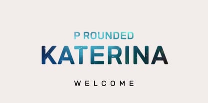 Katerina P Rounded is a modern versatile sans-serif typeface. What differentiates Katerina P Rounded from the other fonts is an exceptionally distinctive design. It is brilliantly suited for graphic design and display use and perfect for logotypes, t-shirts, packaging, brand identity, books, magazines, newspapers, posters, billboards, and advertising.
 - Brunches by Trustha,
$18.00 Brunches is a sans serif font family with five different styles. Basically this font is designed with geometric principles. There are several possibilities of styles to choose from as needed. Suitable for all creative project. Brunches will make each project easier and more colorful because it has several different styles.
 - Grounds Crew Stencil JNL by Jeff Levine,
$29.00 The opening title from the 1943 Abbott and Costello comedy ”It Ain't Hay” shows a park bench with the words “Universal Presents” stenciled on it in a chamfered sans serif style. This served as the design model for Grounds Crew Stencil JNL, which is available in both regular and oblique versions.
 - Edigna by Johannes Hoffmann,
$25.00 Edigna is a clean, rounded sans-serif with a tall x-height. It contains five different weights and a matching inline style. The font family supports a variety of languages, including Western, Southern, Northern and Central European as well as Eastern European. It's good for headlines, posters, brands, and magazines.
 - Garetha by Din Studio,
$29.00 Garetha is modern sans serif font. Made for any professional project branding. It is the best for branding, printing, wedding and quotes. Every letter has a unique and beautiful touch. Features: Swashes Stylistic Sets PUA Encoded Multilingual Support Numerals and Punctuation Thank you for downloading premium fonts from Din Studio
 - Drama Deco JNL by Jeff Levine,
$29.00 The movie poster for the 1936 film “Dodsworth” had its title hand lettered in a thin Art Deco sans serif with a mix of both stylized and squared characters. Expanding on this unusual lettering combination, the final results became Drama Deco JNL, which is available in both regular and oblique versions.
 - KyivType Variable by Dmitry Rastvortsev,
$- KyivType superfamily, consisting of three subfamilies: Sans, Serif and Titling. Fonts have variability in weight and contrast. There are also alternates. Initiated by Projector, Dmytro Bulanov Creative Büro, and Banda Agency for Kyiv city (Ukraine) identification and promotion. Freeware. Fonts are free for commercial and non-commercial use. More at Behance
 - Alto Rey NF by Nick's Fonts,
$10.00 Originally issued by the Palmer and Rey Type Foundry of San Francisco in 1884, this typeface bore the name Octagon Condensed, and is as fresh today as it was way back when. Both versions of this font support the Latin 1252, Central European 1250, Turkish 1254 and Baltic 1257 codepages.
 - AZ Text by Artist of Design,
$20.00 AZ Text font was inspired from a need for a generic worn san serif text of letters that looks old. This font utilizes an "old look" to the line work which is designed to have a "worn feel" to it. Ideal for use as the body or text in your design.
 - Soage by Din Studio,
$29.00 Soage is modern sans serif font. Made for any professional project branding. It is the best for branding, printing, wedding and quotes. Every letter has a unique and beautiful touch. Features: Alternates Stylistic Set PUA Encoded Multilingual Support Numerals and Punctuation Thank you for downloading premium fonts from Din Studio
 - Movie Star Deco JNL by Jeff Levine,
$29.00 Here’s a jaunty little Art Deco sans serif type design inspired by the headline of a feature article on Carole Lombard found in the August, 1937 issue of Hollywood magazine. This served as the inspirational model for Movie Star Deco JNL, and is available in both regular and oblique versions.
 - Holland Treasure by Lone Army,
$10.00 Introducing Holland Treasure, a hybrid font that merges script and sans serif styles. With two variations, Holland Treasure Display and Holland Treasure Regular, this font set is designed for both display and text purposes. Experience the modern luxury of Holland Treasure as it adds elegance and sophistication to your designs.
 - Citta Novela by Jvne77 Studio,
$12.00 Jvne77 Studio presents: Cittá Novela is an upright typeface family inspired by vintage architecture from the mid 20's to the 60's. A classy and didonesque streamlined sans which will perfectly set in a poor line space for Titling and text. Multilingual, diacritics, ligatures and alternates for near 570 glyphes.
 - Three Candy by Mazkicibe,
$11.00 Three Candy Font is Sans Serif and modern font combined with a sweet touch and beautifully curved each letter. using a touch of soft curves so that it is pleasing to the eye. Three Candy Font Spirit is great for: Wedding invitations, fashion magazines, logos, signatures, and suitable for watermark photography.
 - SK Moreau by Salih Kizilkaya,
$12.99 SK Moreau is a sans serif font named after the famous science fiction novel "The Island of Doctor Moreau" written by H. G. Wells. This font family includes a total of 12 fonts and 7812 glyphs. In this way, it contains all the typographic elements you will need in your designs.
 - Modern Gothic by Pau Gomas Studio,
$14.99 Experimental Font designed to be used as a Display Typeface. Modern Gothic Family is inspired by Old Black Letter and Sans Serif Fonts. Its strokes have High Contrast. It has no ornaments to be readable in small sizes too. If you seek exclusive design, this font is perfect to create it.
 - Rosegar by Muksal Creatives,
$15.00 Rosegar Modern sans serif typeface with beautiful alternete, special glyphs, ornament and multilingual support. It's a very versatile font that works great in large and small sizes. Perfect for editorial projects, Logo design, Clothing Branding, product packaging, magazine headers, or simply as a stylish text overlay to any background image.
 - Lexikos by ITC,
$29.00Lexikos was designed by Vince Whitlock and based on the design of the typeface Corinthian. It is a condensed sans serif typestyle with heavier horizontal weights as vertical. Lexikos is best used with close letter and word spacing and is an excellent choice for applications requiring a clean, contemporary look. - Minimal by Kmaz,
$10.00 Minimal is a distinguished sans serif display family with minimalistic modern edges, designed by Khalid Al-Mazrouei and published by Kmaz. Minimal packs a complete set of uppercase and lowercase letters, numbers and punctuation and comes in 3 weights (Thin, Regular, and Bold). Perfect for headlines, magazines, and much more.
 - Ragtime by ITC,
$29.00Ragtime was designed by Alan Meetks, an all capital condensed sans serif typeface. It features thick/thin weight variances and fine line casing adornment which recalls magazine styles of the 1940s. This typeface should not be letter spaced too closely. Ragtime is excellent for anything requiring an elegant, refined look. - Biliner Meclan by madeDeduk,
$16.00 Biliner Meclan is a Minimalist Sans, use this font for any branding, product packaging, invitation, fashion, label, poster, logo etc. Feature Uppercase & Lowercase Number & Symbol International Glyphs Multilingual support Alternative Ligature Feel free to drop us a message any time and follow my shop for upcoming updates Hope you enjoy it.
 - Dance Band JNL by Jeff Levine,
$29.00 Sheet music for the song "I'm the One That Loves You" has the title hand lettered in a narrow, Art Deco-influenced sans serif, which is now available digitally as Dance Band JNL in both regular and oblique versions. The 1937 composition was popularized by Tommy Dorsey and Sammy Kaye.
 - JAF Zalamander by Just Another Foundry,
$42.00 Blackletter, sans serif, graffiti, constructivism: all these influences are combined into a lively and dynamic – and somehow “disobedient” – typeface. Since blackletter fonts typically don’t look great when used in all-caps, Zalamander comes with a special Caps version that contains letter variants that combine nicely in uppercase. All fonts support Cyrillic.
 - Moon Dream by Eotype,
$12.00 Moon Dream is a wide sans serif display font that has beautiful curves. Each end is made slightly rounded giving the impression of a comfortable and friendly. Moon dream provides a collection of glyphs with unique shapes. With alternative styles and ligature features, this font is perfect for complementing various projects.
 - Dreamy Night by Fidan Fonts,
$18.40 Dreamy Night is an uppercase decorative font. We've tried to create a cute and simple hand-lettered bubbly sans serif font. This font would be perfect for party invitations, baby showers, birthday cards and more. It includes uppercase basic characters, multilingual symbols, numerals and punctuation. Latin-based Language Support. Happy creating!
 - Retail Price JNL by Jeff Levine,
$29.00 Redrawn from lettering found on a British publication circa the 1930s, Retail Price JNL is an extra bold display inline sans that’s great for catchy headlines, price cards, banners or any other attention-getters. Retail Price JNL is offered in regular, oblique, solid and solid oblique versions. Caps only Fonts.
 - Ahimsa by Satori TF,
$12.00 Ahimsa is a dynamic humanist sans serif family. It comes in 6 weights with matching italics. It contains a lot of contrast in the connection to the stems in order to give it a more dynamic feel, and also has low descenders and a large x-height and great legibility.
 - Shentholla by Liartgraphic,
$23.00 Meet our newest product, we call this product Shentholla font. Shentholla font are sans serif typeface font Whit a uniqe touch and assertive. Shentholla font is very nice to use on: fashion magazine, logos, ,and photography, landing page, fliyer, What’s includes - mutilngual support - alternate - ligature Thank you, salutations Ali Sifak Muftari
 - Opkrop by Jipatype,
$25.00 Opkrom is Thai language mean Crispy or Crunchy. With informal sans serif style look like semi handwriting give feel friendly and warm . It support major Latin scripts and Thai scripts. It have stylistic set for Thai script. Opkrop is suited for headline on packaging, print ad and various graphic work.
 - Cabrito by insigne,
$24.00 After my son was born, I found myself reading him a lot of books. A LOT of books. Some were good, some were great, but I found myself wanting to develop something using my skills and interests to make something that only I could make. In short, I realized my son needed to be indoctrinated—I mean, introduced into the wonderfully wild world of fonts. So, I set about to make a board book to teach about typography, called “The Clothes Letters Wear.” You can learn more about the book here. I’ve made the captivating illustrations bright and colorful, and the use of different letter forms makes for a fascinating read to delight ages young and young at heart. And, as an added bonus, this children’s book has a custom designed font. I’m always looking for an excuse to design a new font, and this book created the perfect alibi. Drum roll, please. I now give you … Cabrito (“little goat” en Español). This new serif typeface incorporates the latest research on typographic legibility for children, features to make it—well, extra legible. A little background: studies show that Bookman Old Style is one of the most readable typefaces, and as a consequence or perhaps the reason why, it is used thoroughly for children’s books. This font became my initial inspiration for the typeface. Then, I found more legibility research saying that (brace yourselves) Comic Sans is also very legible for beginning readers, much due to the large x-height and softer, easily recognizable forms. In addition, forms that are closer to handwriting also seem to be more legible. Once I threw all that into my cauldron and stewed it a bit, the result was a pleasantly rounded typeface that includes not-so-strictly geometric, handwriting-inspired forms for the b, d, p, and q. Es guapo! Cabrito’s slender weights are simple and fun, with extras that turn any “bah humbug” into a smile. Add lighter touches to your project with the typeface’s included sparkles or rainbows (not included). Splash a little more color on the page with the firmer look of the thicker weights. Cabrito’s upright variations across all weights are matched by optically altered italics, too, giving you even more variety with the font family. This modern typeface’s bundle of alternates can be accessed in any OpenType-enabled software. The fashionable options involve a significant team of alternates, swashes, and meticulously refined aspects with ball terminals and alternate titling caps to decorate the font. Also bundled are swash alternates, old style figures, and small caps. Peruse the PDF brochure to check out these options in motion. OpenType-enabled applications like the Adobe suite or Quark allows comprehensive control of ligatures and alternates. This font family also provides the glyphs to aid a variety of languages. Cabrito is a welcoming, everyday font family by Jeremy Dooley. Use it to convey warmth and friendliness on anything from candy and food packages to children’s toys, company IDs or run-of-the-mill promotional material. Cabrito’s unique appearance and high legibility make it equally at home in print as it is on a screen.
 - Tavern by FontMesa,
$25.00 Tavern is a super font family based on our Algerian Mesa design, with Tavern we've greatly expanded the usability by creating light and bold weights plus all new for 2020 with the introduction of extra bold and black weights Tavern is now a five weight family. The addition of the bold weight made it possible to go further with the design by adding open faced shadowed, outline and fill versions. Please note, the fill fonts are aligned to go with the open faced versions, they may work with the outline versions, however you will have to apply them one letter at a time. The Tavern Fill fonts may also be used a stand alone font, however, the spacing is much wider than the regular solid black weights of Tavern. In the old days of printing, fill fonts rarely lined up perfect with the open or outline font, this created a misprinted look that's much in style today. To create that misprinted look using two different colors, try layering the outline fonts offset over the top of the solid black versions. Next we come to the small caps and X versions, for a font that's mostly seen used in all caps we felt a small caps would come in handy. The X in Tavern X stands for higher X-height, we've taken our standard lowercase and raised it for greater visibility in small text and for signage where you want the look of a lowercase but it needs to be readable from the street. In August of 2016 I started the project of expanding this font into more weights after seeing the font in use where someone tried creating a bold version by adding a stroke fill around the letters. The result didn't look very good, the stroke fill also caused the shadow line to merge with the serifs on some letters. This lead me to experiment to see if a new bold weight was possible for this font and I'm pleased to say that it was. After the bold weight was finished I decided to type the regular and bold weights together in a first word thin second word bold combination, however the weight difference between the two wasn't enough contrast. This lead me to wonder if a lighter weight was possible for this font, as you can see yes it was, so now for the first time in the history of this old 1908 type design you can type a first word thin second word bold combination. So why the name change from Algerian to Tavern? Since the original font was designed in England by the Stephenson Blake type foundry I decided to give this font a name that reminded you of the country it came from, however, there were other more technical reasons. During the creation of the bold weight the engraved shadow line was sticking out too far horizontally on the bottom right of the serifs dramatically throwing the whole font off balance. The original font encountered this problem on the uppercase E, L and Z, their solution was a diagonal cut corner which was now needed across any glyph in the new bold weight with a serif on the bottom right side. In order to make the light and regular weights blend well with the bold weight diagonal cut offs were needed and added as well. This changed the look of the font from the original and why I decided to change the name, additional concerns were, if you're designing a period piece where the font needs to be authentic then this font would be too new. Regular vs. Alt version? The alternate version came about after seeing the regular version used as a logo and secondary text on a major product label. I felt that some of the features of the regular version didn't look good as smaller secondary text, this gave me the idea to create an alternate version that would work well for secondary text in an advertising layout. But don't stop there, the alternate version can be used as a logo too and feel free to exchange letters between both regular and alternate versions. Where are the original alternates from Algerian? Original alternates from Algerian are built into the regular versions of Tavern plus new alternates have been created. We're excited to introduce, for the first time, all new swash capitals for this classic font, you're going to love the way they look in your ad layout, sign or logo. The best way to access alternate letters in Tavern is with the glyph map in Adobe Illustrator and Adobe InDesign products, from Adobe Illustrator you can copy and paste into Photoshop as a smart object and take advantage of all the text layer style features Photoshop has to offer. There may be third party character maps available for accessing alternate glyphs but we can't advise you in that area. I know what you're thinking, will there be a Tavern Condensed? It takes a lot of hours to produce a large font family such as this, a future condensed version will depend on how popular this standard version is. If you love Tavern we're happy to introduce the first weathered edge version of this font called Bay Tavern available in February 2020.
 - Armalite Rifle Pro by CheapProFonts,
$10.00 Military style stencil type, badly bruised by shotgun fire, wear and tear. Now ready for action in more languages! Vic Fieger says: "The original letterforms were not the famous military stencil, but were drawn freehand then scanned into Photoshop. Next, they were altered using a series of brushes before being imported into a font. This font has been used in the Flash games Pandemic and Artillery." ALL fonts from CheapProFonts have very extensive language support: They contain some unusual diacritic letters (some of which are contained in the Latin Extended-B Unicode block) supporting: Cornish, Filipino (Tagalog), Guarani, Luxembourgian, Malagasy, Romanian, Ulithian and Welsh. They also contain all glyphs in the Latin Extended-A Unicode block (which among others cover the Central European and Baltic areas) supporting: Afrikaans, Belarusian (Lacinka), Bosnian, Catalan, Chichewa, Croatian, Czech, Dutch, Esperanto, Greenlandic, Hungarian, Kashubian, Kurdish (Kurmanji), Latvian, Lithuanian, Maltese, Maori, Polish, Saami (Inari), Saami (North), Serbian (latin), Slovak(ian), Slovene, Sorbian (Lower), Sorbian (Upper), Turkish and Turkmen. And they of course contain all the usual "Western" glyphs supporting: Albanian, Basque, Breton, Chamorro, Danish, Estonian, Faroese, Finnish, French, Frisian, Galican, German, Icelandic, Indonesian, Irish (Gaelic), Italian, Northern Sotho, Norwegian, Occitan, Portuguese, Rhaeto-Romance, Sami (Lule), Sami (South), Scots (Gaelic), Spanish, Swedish, Tswana, Walloon and Yapese.
 - Telepath by Coniglio Type,
$19.95 TELEPATH Telepath by Coniglio Type, first appeared in 1998. It is now in opentype .otf as of 2021. Telepath is a master sampling of a Royal office typewriter of industrial strength provided by the Miller Furniture store, of Dunkirk, New York. It had a baseline set of numbers to make accounting practices easy and line up nicely on the statements. (No gentile old fashioned numerical ascenders and descenders.) Yet, for a a rather old and stolid machine, it was very luxurious and built to definitely take the test of time. Cudo's for Royal Typewriter Company, is all I can say. The set of images were very carefully gathered and has fallen into the preferred category for a typewriter font that has it all. The font has exceptional value as a text font -and- a display font. It contains a great deal of graphic information and doesn't spike at higher sizes. Telepath presents a strikingly handsome typewriter font with a uniquely intuitive difference. Unlike the original source material—scans of monospaced typewriter copy, every font is painstakingly hand kerned for your most demanding copy fitting work in justified or casually ragged settings for print or the web. All Coniglio Type fonts are 100% embeddable. It will get you there.
 - Protura by MIX.Jpg,
$15.00 Protura Sans Serif Masculine - 9 Font Weights With Italics Introducing Protura Sans Serif Masculine, a versatile and powerful font family designed to make a bold statement in your creative projects. With nine distinct font weights and accompanying italics, Protura offers unmatched flexibility for all your design needs. Key Features: Nine Font Weights: Protura Sans Serif Masculine boasts an extensive range of weights, from Light to Ultra Bold. Whether you're crafting a subtle headline or a powerful logo, you'll find the perfect weight to convey your message. Italics Included: In addition to the standard weights, Protura also provides elegant italic versions for each weight. These italics add a touch of sophistication to your typography, making it ideal for editorial work and branding projects. Masculine Aesthetic: Protura's design exudes strength and masculinity, making it an excellent choice for projects aimed at a bold and assertive audience. Its clean lines and sharp edges give your text a contemporary and impactful look. Versatile Usage: This font family is highly adaptable, suitable for a wide range of design applications, including branding, packaging, editorial design, posters, websites, and more. It's a true workhorse font that performs well in various contexts. Legibility: Protura prioritizes legibility without compromising on style. Its well-crafted letterforms ensure that your text remains clear and readable, even at small sizes. OpenType Features: Take advantage of OpenType features such as ligatures and alternate characters to add subtle design nuances and improve overall visual appeal. Multilingual Support: Protura Sans Serif Masculine supports a multitude of languages, making it a globally accessible font choice for your projects. Applications: Branding: Create impactful logos and brand identities that leave a lasting impression. Editorial Design: Enhance the readability and visual appeal of magazines, newspapers, and books. Web Design: Craft modern and engaging websites that resonate with your target audience. Packaging: Design packaging that stands out on the shelf and communicates product quality. Posters and Flyers: Grab attention with bold and stylish promotional materials. Unleash the power of Protura Sans Serif Masculine to elevate your design projects with a masculine, contemporary, and highly versatile typographic solution. With its extensive weight range and italics, this font family empowers you to create impactful and visually stunning designs.
 - Juergen - Unknown license

- Deconumbers Pi by Linotype,
$40.99This is a set of decorative numeric characters, which can stand alone with one another to create ordinal displays. Several of the shape sets can be used to create two digit numbers, up to 99. The triangle version can even be used as arrows pointing in specific directions. - Ruthless Drippin ONE - Personal use only

- Ruthless Drippin TWO - Personal use only

- Some Weatz Symbols - Personal use only


